Mastering the Data Analysis Dashboard
Discover how a data analysis dashboard transforms raw numbers into clear business insights. Learn key features, design principles, and best practices.

A data analysis dashboard is your business's command center. It pulls together all your most important metrics—your key performance indicators (KPIs)—and displays them visually on a single screen. Think of it like the cockpit of an airplane; instead of sifting through raw data, you get a clear, at-a-glance view of what's happening in real-time.
This allows anyone, from the CEO to a marketing specialist, to check the health of the business, track progress towards goals, and spot trends as they happen.
What Is a Data Analysis Dashboard?
Picture this: you're trying to make a critical business decision. To get the full picture, you have to open a dozen different spreadsheets. One has sales figures, another has marketing campaign stats, a third holds customer support data, and so on. It's a clunky, slow process that makes it nearly impossible to connect the dots.
This is exactly the problem a data analysis dashboard solves. It acts as a central hub, automatically pulling in data from all those separate sources and weaving it into a single, cohesive story. Instead of drowning in rows and columns of numbers, you see interactive charts and graphs that make patterns and insights pop.
From Raw Data to Actionable Intelligence
The real magic of a dashboard is how it turns a mountain of confusing data into clear, actionable intelligence. You don't need to be a data scientist to understand what’s going on or what to do next.
- For Marketing Teams: Imagine seeing your campaign ROI, ad spend, and conversion rates all in one place. You can immediately see which channels are working and shift your budget accordingly.
- For Sales Leaders: A dashboard lets you visualize the entire sales funnel, spot bottlenecks instantly, and see which reps are on track to hit their quotas.
- For Operations Managers: You can track inventory, monitor supply chain logistics, and get alerts about potential delays before they become a problem for your customers.
This kind of power is why the demand for these tools is exploding. The U.S. data analytics market was recently valued at over USD 15 billion, and it's projected to grow dramatically. Dashboard tools are a huge piece of that pie, making up nearly 68% of the software segment. You can see more details on this growth at Precedence Research.
The Foundation of Modern Business Intelligence
At its heart, a dashboard is a powerful application of business intelligence (BI), the practice of using data to make smarter business decisions. It’s all about taking data out of the hands of a few analysts and making it accessible and useful for everyone.
Dashboards are a cornerstone of this movement. If you want to learn more about the bigger picture, you can explore the foundational concepts of Business Intelligence with Power BI.
This storytelling is what makes a dashboard so much more than just a collection of charts. It provides context, highlights what matters most, and gives every person on your team the clarity they need to help move the company forward.
The Core Features of an Effective Dashboard
What separates a truly great dashboard from a mediocre one? It’s not just about pretty charts. A powerful data analysis dashboard is an interactive command center that makes your data come alive, not a static report that just sits there.
The best ones are built with a specific set of features that work together, turning raw, jumbled numbers into clear signals you can act on immediately. Without these, you’re left with a digital file cabinet—full of information, maybe, but not much help for making sharp, in-the-moment decisions.
The infographic below really nails this idea, showing how a dashboard serves as the bridge between raw data and smart business moves.
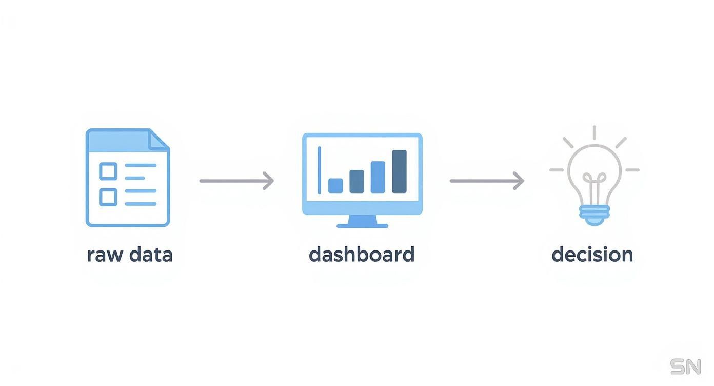
It’s this translation from chaos to clarity that makes a dashboard so indispensable.
Real-Time Data Connectivity
First things first: a top-tier dashboard runs on live data. Making decisions based on stale information is like driving while looking in the rearview mirror. You need a live pulse on your business, and that means pulling data from all your different sources as it happens.
This ensures you’re seeing what’s happening right now, not what happened last week. A great dashboard achieves this by connecting directly to:
- Databases: Pulling operational data straight from sources like PostgreSQL or MySQL.
- Cloud Platforms: Tapping into metrics from services like AWS and Google Cloud.
- APIs: Syncing with your CRM, marketing platforms, and other essential tools.
- Simple Files: Even keeping sources like Google Sheets or shared Excel files in a live sync.
Getting all these connections to work smoothly is the foundation of a reliable dashboard. To get this part right, it helps to follow proven methods. You can dive deeper into this topic in our guide on data integration best practices.
Interactive and Exploratory Elements
A static chart tells you what happened. An interactive one lets you ask why. This is where features like filters, drill-downs, and dynamic timeframes come in. They empower you to dig beneath the surface and explore your data on your own terms.
Think about a marketing manager looking at campaign results. With an interactive dashboard, they can:
- Filter by Channel: Instantly see how social media is performing against email or paid ads.
- Drill Down by Demographics: Click on a specific country or state to see how the campaign landed with different audiences.
- Adjust Timeframes: Zoom in from a monthly view to a daily one to spot a sudden trend.
This turns data from something you just look at into something you can have a conversation with. It lets everyone on the team become their own analyst.
Customization and Personalization
Let's be honest, different people care about different metrics. Your CEO wants the 30,000-foot view of company health, while your supply chain manager needs to get into the weeds of warehouse efficiency. A truly useful dashboard lets users build their own views.
This means a sales leader can create a dashboard focused entirely on pipeline velocity and quota attainment. At the same time, the head of customer support can build one centered on ticket resolution times and CSAT scores. This kind of personalized experience means everyone gets the answers they need in seconds, without having to wade through data that isn't relevant to them.
Automated Alerting and Mobile Access
Finally, the best dashboards don't just wait for you to spot a problem—they bring it straight to you. Automated alerting is a game-changer. You can set up rules to get notified the moment a key metric goes off track. Imagine getting an instant ping if website traffic drops by 20% or if customer churn suddenly spikes.
This proactive approach allows teams to jump on issues before they spiral out of control. When you pair that with solid mobile access, you have a system that delivers critical insights to the right people, wherever they are. It’s this combination that turns a dashboard from a tool into a vigilant partner in running your business.
How Dashboards Drive Real Business Growth
A data analysis dashboard is much more than a pretty collection of charts. It’s a living, breathing tool that turns abstract numbers into real-world business decisions. Let's move past the theory and look at how teams on the ground use dashboards not just to see what's happening, but to take decisive action. The real magic is in how a well-designed dashboard can solve specific problems, sharpen workflows, and unlock measurable growth across the entire company.
This practical value is exactly why the market is booming. The global dashboard software market was valued at around USD 4.5 billion and is expected to hit USD 9.8 billion in the next decade, growing at a steady clip of about 9.2% annually. Industries like banking and finance were early adopters, using dashboards to watch performance and manage risk in real time. For a deeper dive, you can explore the market drivers in this detailed dashboard software market report.
Marketing Agility and Optimized Spend
Think about a marketing team juggling a dozen campaigns across different channels. Without a dashboard, they’re often stuck waiting weeks for performance reports—long after the budget has been spent. This kind of reactive approach almost always means money wasted on channels that just aren't performing.
A real-time data analysis dashboard completely changes the game.
Imagine a single screen that shows you everything at a glance:
- Return on Ad Spend (ROAS) for every single campaign, updated by the hour.
- Cost Per Acquisition (CPA) broken down by social media, search ads, and email.
- Conversion Rates sliced by geographic region and customer demographics.
With this kind of live feedback, the team can see instantly that a new video ad is crushing it on one platform while static images are falling flat on another. They can then pull budget from the underperformer and push it toward the winner right now, not next month. This agility turns marketing from a guessing game into a precise, data-driven science.
This level of clarity is vital for modern teams. For a closer look at how different departments track success, check out these compelling business intelligence dashboard examples that bring these concepts to life.
Fueling Sales Performance and Efficiency
For a sales team, the sales funnel is their entire world. But when it’s just a concept in a spreadsheet, it’s far too easy for leads to get stuck, opportunities to go cold, and the winning habits of top performers to go unnoticed. A sales dashboard brings the whole pipeline into sharp, immediate focus.
The screenshot below from a SigOS dashboard shows just how clearly key metrics can be presented.

This kind of visual snapshot lets a sales leader see exactly where deals are stalling and which team members are excelling at each stage of the process.
By tracking things like conversion rates between stages, average deal size, and the length of the sales cycle, managers can pinpoint bottlenecks instantly. If leads are turning into meetings but those meetings aren't leading to proposals, the dashboard makes the problem impossible to ignore. That insight can then drive targeted coaching or a much-needed process change. And of course, a leaderboard tracking closed deals and quota attainment is fantastic for fostering healthy competition and firing up the whole team.
Proactive Operations and Supply Chain Management
In operations, efficiency often comes down to one thing: preventing problems before they happen. An operational dashboard gives teams the foresight they need to manage complex systems like supply chains and logistics. It can track inventory levels, monitor shipping times, and flag potential delays from suppliers before they become full-blown crises.
For instance, a dashboard could be set up to send an alert if a shipment is running more than 24 hours late or if inventory for a key product dips below a critical threshold. This gives the operations team a chance to get ahead of the issue—they can proactively communicate with customers, arrange for alternative shipping, or expedite a new order from a backup supplier. It’s a fundamental shift from reactive fire-fighting to proactive management, which minimizes disruptions, cuts costs, and keeps customers happy.
Best Practices for Intuitive Dashboard Design

A data analysis dashboard might be packed with powerful insights, but if it’s clunky or confusing, it’s practically useless. The real magic of a great dashboard is its usability—how quickly and clearly it delivers the answers people need. This isn't just about making things look pretty; it's about building an experience that anticipates questions and provides clear answers on the spot.
The most important rule? Know your audience. Before you even think about dragging and dropping a chart, you have to know who you’re building for. What do they absolutely need to see in the first five seconds? An executive needs a bird's-eye view of business health, while a marketing manager needs to dig into the nitty-gritty of campaign performance.
Designing for the specific user is what separates a dashboard that gets ignored from one that becomes essential to their daily work.
Prioritize Clarity and a Logical Layout
Once you know your audience, it's time to build a clean, logical layout. People naturally look to the top-left of a screen first, so put your most critical Key Performance Indicators (KPIs) right there. That prime real estate should instantly answer the question, "How are we doing right now?"
From there, the dashboard should tell a story, guiding the user's eye from one related insight to the next. Group similar metrics together and use plenty of white space to prevent the screen from feeling cluttered or overwhelming. A well-organized dashboard lowers the mental effort needed to find information, letting insights sink in effortlessly.
This focus on simplicity isn't about dumbing things down; it's about making complex information accessible and actionable.
Choose the Right Visualization for the Job
Let's be clear: not all charts are created equal. The type of visualization you pick can dramatically change how your data is interpreted. The wrong chart can hide important trends or, worse, lead someone to the wrong conclusion. Think of each chart as a specialized tool—you wouldn't use a hammer to turn a screw.
Here are a few go-to choices and when to use them:
- Line Charts: Perfect for tracking a metric's journey over time. Think monthly sales, daily website visitors, or user growth.
- Bar Charts: The best choice for comparing distinct categories. Use them to show things like sales by region or performance across different marketing channels.
- Pie Charts: Use these sparingly to show parts of a whole, but only when you have a few slices. They work well for things like market share or a simple budget breakdown.
- Scatter Plots: Excellent for spotting relationships between two different variables, like seeing if higher ad spending actually leads to more conversions.
Picking the right chart is a fundamental skill. For a deeper dive, check out these core best practices for data visualization to really make your data sing.
A quick reference can make this even easier.
Choosing the Right Chart for Your Data
| Goal | Recommended Chart Type | Best Used For |
|---|---|---|
| Show a trend over time | Line Chart | Tracking progress of a single metric (e.g., monthly revenue, website traffic). |
| Compare values across categories | Bar Chart (Vertical or Horizontal) | Comparing discrete items (e.g., sales by product, performance by team). |
| Show parts of a whole | Pie Chart or Donut Chart | Displaying proportions when there are 6 or fewer categories (e.g., budget allocation). |
| Reveal relationships between variables | Scatter Plot | Identifying correlations and outliers between two numeric variables (e.g., ad spend vs. sales). |
| Visualize geographic data | Map Chart | Showing location-based data (e.g., customers by country, store performance by state). |
This table isn't exhaustive, but it's a solid starting point for making sure your visualizations are telling the right story.
Use Color Strategically, Not Decoratively
Color is one of your most powerful communication tools in a dashboard, but it should always serve a purpose. It's there to add clarity and draw attention, not just for decoration. A rainbow of clashing colors creates visual noise, making it harder for users to focus on what matters.
A better approach is to use a muted, consistent color palette for most of your data and save a single, high-contrast color to flag something important. For example, use shades of gray or blue for your standard bar charts, but make the bar bright red when a KPI drops below a critical threshold. This way, when a user sees that pop of color, they instantly know it needs their attention.
How SigOS Takes Your Dashboard to the Next Level
Knowing what makes a great data analysis dashboard is one thing. Actually building one with the right tool is where the magic happens. While plenty of platforms can spit out charts, SigOS is built to go deeper. It turns your dashboard from a static reporting screen into an intelligent partner that seems to know what you're going to ask next.
The biggest headache in building a useful dashboard is almost always the data itself—getting it clean and all in one place. SigOS tackles this problem first with its straightforward, no-code data integration. You can pull in data from your CRM, support tickets, usage logs, and more without begging for help from engineering. This simple step gets you from messy data to a clear, unified picture in a fraction of the time.
This integrated view is the foundation for getting real answers, fast.
From Manual Digging to AI-Powered Discovery
What really separates a modern dashboard from an old-school one is its ability to find the "unknown unknowns"—the crucial patterns you didn't even know to look for. This is where the AI features in SigOS really stand out. The platform constantly sifts through your data, doing the kind of deep-dive analysis that would take a human analyst weeks.
Instead of just telling you a metric went up or down, SigOS helps you understand why. It automatically finds connections between user behaviors and key business outcomes, like which actions precede a customer churning or what patterns point to a big expansion opportunity.
This completely changes how you use a dashboard:
- Proactive Alerts: You'll get a heads-up when the system spots a worrying trend—like a sudden jump in negative comments about a new feature—before it blows up.
- Root Cause Analysis: The AI connects the dots for you, showing exactly which user actions are behind a drop in your main KPI.
- Opportunity Spotting: You can finally see which feature requests are tied to high-value sales deals, making your roadmap decisions much clearer.
The screenshot below gives you a sense of how SigOS surfaces these AI-driven insights in a way that’s easy to grasp.
It puts the most important issues and opportunities right in front of you, clearly showing their impact on your bottom line.
Putting Actionable Intelligence in Everyone's Hands
At the end of the day, a dashboard should make data useful for everyone, not just the people with "analyst" in their job title. SigOS was built around this idea. By translating complex data patterns into plain English, it gives every person on your team the power to make better decisions.
A standard dashboard shows you numbers. An intelligent platform like SigOS tells you what those numbers mean for your business and what you should do about it.
For a product manager, this means knowing which bug fixes will actually improve user retention the most. For a customer success manager, it’s about spotting at-risk accounts based on their recent support tickets and product usage, long before they start thinking about canceling.
By handling the heavy lifting of data integration and analysis, SigOS frees up your team to focus on strategy and taking action. It ensures every decision is backed by a solid understanding of what your customers are really doing, turning your dashboard from a simple monitoring tool into your company's most valuable strategic asset.
Your Next Steps to Data-Driven Decisions
You’ve now got a solid grasp on how to turn your company’s approach to data on its head. A well-built data analysis dashboard isn't just another piece of software; it's the engine for creating a culture where every single decision is backed by real insights.
The secret to getting started? Don't try to boil the ocean.
Pick one, and only one, critical area of the business that’s crying out for more clarity. It might be your marketing campaign ROI, the speed of your sales pipeline, or how efficiently your support team is resolving tickets. Start there by building a simple, focused dashboard to track a handful of key metrics.
Embrace the Process of Refining
Getting good at data analysis isn’t a one-and-done task. It’s a constant cycle of learning, questioning, and improving. Your first dashboard won't be perfect, and that's completely fine—in fact, it's the whole point.
It will spark new questions. Those questions will lead you to track new metrics and design better charts. This loop of building, testing, and tweaking is where the real breakthroughs happen. Each iteration brings you a little closer to the insights that actually move the needle on business growth.
The goal isn't just to build a dashboard; it's to build a habit of curiosity and inquiry, using data as your guide to ask better questions and find smarter answers.
This is how you turn raw information into your most valuable strategic asset. If you find yourself excited by the power of data analysis dashboards, you might even consider a career in the field. A great first step is learning how to create an effective resume for a data analyst role. And remember, platforms like SigOS are designed to speed up this entire process, helping you turn complex data into clear, actionable intelligence.
Frequently Asked Questions
Even after getting a good grasp on data analysis dashboards, a few practical questions almost always pop up. Let's walk through some of the most common ones to clear up any lingering confusion and get you ready to build your own.
Think of this as the go-to spot for clear, simple answers about putting dashboards to work.
What Is the Main Difference Between a Dashboard and a Report?
It's a great question, and the easiest way to think about it is with a car analogy.
A dashboard is your car's instrument panel. It gives you a live, at-a-glance view of what's happening right now—your speed, fuel level, and engine temperature. It’s interactive and designed to help you make split-second decisions while you're driving the business forward.
A report, on the other hand, is more like a mechanic's summary after a long road trip. It’s a static snapshot—often a PDF or a spreadsheet—that provides a deep-dive analysis of a specific time period. You use it to understand past performance, not to monitor the present.
How Do I Choose the Right KPIs for My Dashboard?
The secret to choosing the right Key Performance Indicators (KPIs) is to work backward from your business goals. Before you even think about metrics, ask yourself: "What are we trying to accomplish?" Your KPIs should be the numbers that tell you if you're getting closer to that goal.
Stay away from "vanity metrics"—those numbers that look good on paper but don't actually move the needle. For every KPI you consider, apply a simple filter: "If this number goes up or down, do we need to take action?" If the answer is a resounding yes, you've found a KPI worth tracking on your dashboard.
The most powerful dashboards tell a clear story with just a handful of critical KPIs. A screen cluttered with dozens of charts creates confusion, not clarity. It’s always better to have five actionable KPIs than twenty that just add noise.
This ruthless focus is what turns a dashboard from a data dump into a decision-making machine.
Do I Need Technical Skills to Build a Dashboard?
Years ago, the answer would have been yes. But not anymore. The game has completely changed, and modern business intelligence tools are built for everyone, not just engineers or data analysts.
Platforms like SigOS have made building a dashboard incredibly straightforward. With intuitive drag-and-drop editors, ready-to-use templates, and simple data connectors, you can create a sophisticated, interactive dashboard without writing a single line of code. This means your marketing, sales, and operations teams can build their own views to track the metrics that matter most to them.
Ready to stop relying on static reports and start seeing your business in real-time? With SigOS, you can build a smart data analysis dashboard that automatically highlights the trends and opportunities you need to see. Start making better, data-backed decisions today at https://sigos.io.