Best Practices Data Visualization: 7 Tips to Drive Action
Discover top best practices data visualization to enhance your insights. Learn how to choose charts, use colors, and tell compelling stories that influence decisions.

In the world of SaaS, product teams are drowning in data. Customer feedback, usage metrics, and support tickets create a constant stream of information, making it difficult to pinpoint what truly matters for strategic growth. Effective data visualization is the essential bridge between this raw data and the actionable insights needed to drive decisions. It transforms complex datasets into clear, compelling stories that can guide product strategy, reduce churn, and unlock new revenue streams.
This article cuts through the clutter. We'll present seven essential best practices for data visualization designed to empower your team to not just see the data, but to understand it, act on it, and achieve meaningful business outcomes. We are moving beyond generic advice to provide specific, actionable strategies tailored for product teams aiming to build better products, faster. To truly transform raw data into clear, actionable insights and achieve decisive action, consider a deeper dive into these data visualization best practices for clear and actionable reports.
Our focus is on practical application, covering everything from choosing the right chart type and using color strategically to eliminating visual clutter and ensuring your visualizations tell a coherent story. By mastering these principles, you will enable your team to turn data overload into a powerful tool for decisive, informed action.
1. Choose the Right Chart Type for Your Data
Selecting the right chart type is the foundational step in effective data visualization. This practice involves matching the structure of your data and the core question you want to answer with the appropriate visual format. Choosing correctly ensures your audience can immediately grasp the intended message without misinterpretation, making it a cornerstone of the best practices in data visualization.
Why It's a Critical First Step
The chart type you select fundamentally shapes the narrative of your data. A bar chart excels at comparing distinct categories, like monthly recurring revenue across different product tiers. In contrast, a line chart is unparalleled for showing trends over a continuous interval, such as user engagement metrics over a fiscal quarter. Using the wrong one can obscure insights or, worse, lead to incorrect conclusions.
For SaaS product teams, this choice directly impacts decision-making. Imagine you're analyzing feature adoption rates. A pie chart might show the proportion of users for each feature at a single point in time, but a stacked area chart would more effectively reveal how those proportions change and grow over several months.
How to Choose the Right Chart
Before you open any visualization tool, start by defining the primary goal of your chart. Are you trying to:
- Compare values? Use bar charts for categorical data or dot plots for more precise comparisons.
- Show a trend over time? Line charts are the standard, while area charts can emphasize volume.
- Illustrate a relationship between variables? Scatter plots are ideal for revealing correlations.
- Display the composition of a whole? Stacked bar charts or treemaps are often clearer than pie charts.
This quick reference summarizes the core purpose of three common chart types.
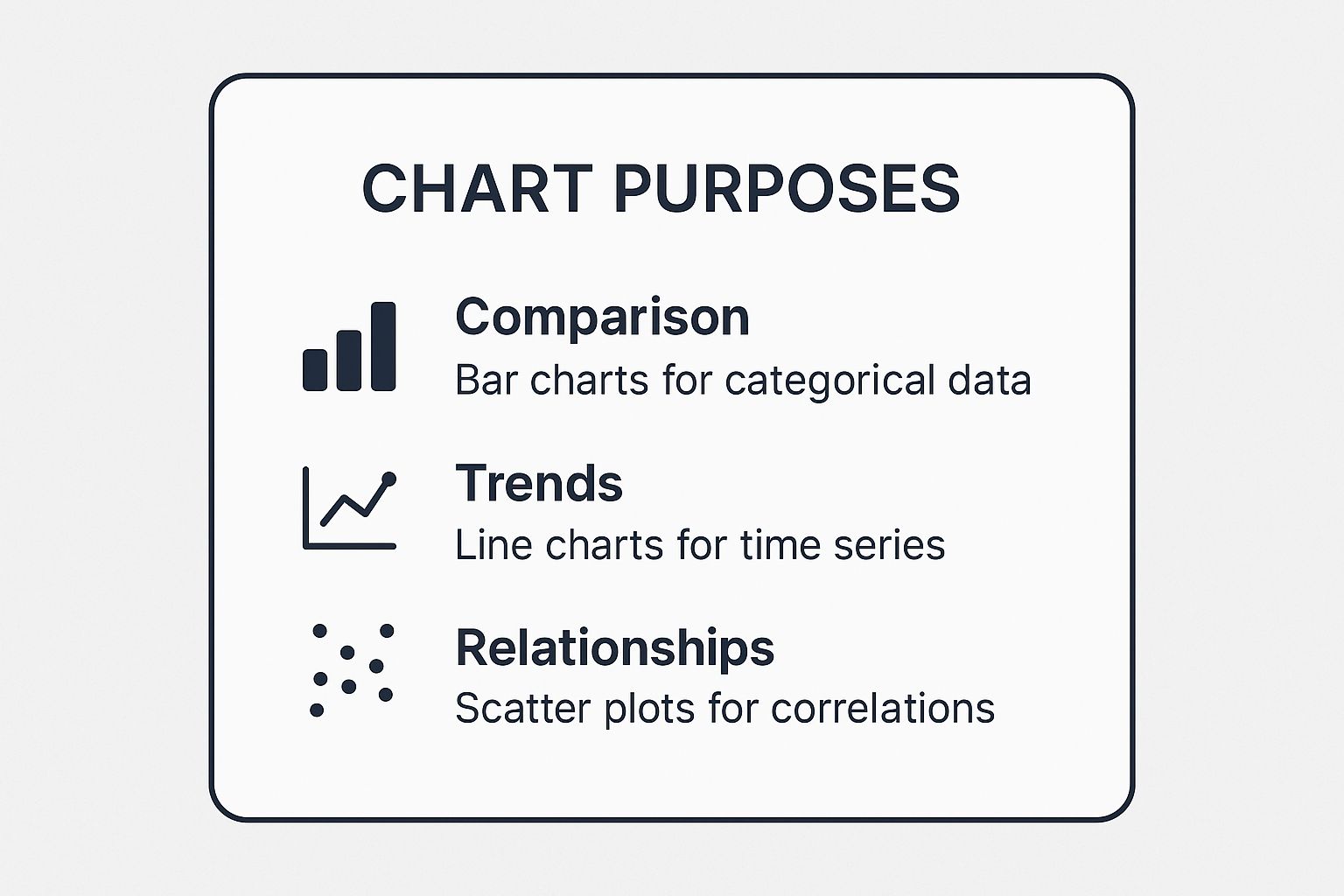
This visual guide helps align your analytical goal-whether it's comparison, trend analysis, or relationship discovery-with a proven chart type. By starting with your objective, you can confidently select a visualization that provides clarity and supports accurate interpretation. For a deeper dive into applying these principles within a business context, explore how enterprise data analytics can drive insights.
2. Use Color Strategically and Purposefully
Color is one of the most powerful tools in data visualization, capable of highlighting key insights, grouping data, and guiding the viewer's eye. This practice moves beyond simple aesthetics, treating color as a strategic element to encode meaning and improve comprehension. Applying color purposefully is a fundamental component of the best practices in data visualization, ensuring clarity and preventing cognitive overload.

Why It's a Critical Element
Strategic color use transforms a confusing chart into an intuitive one. Color can instantly draw attention to critical data points, such as a spike in user churn or an underperforming feature. When used inconsistently or without thought, color creates noise, distracting the audience and obscuring the message. The infamous "rainbow" color scheme, for example, assigns arbitrary hues that have no logical order, forcing viewers to constantly reference the legend.
For SaaS product teams, this has direct implications. A dashboard using a single hue with varying saturation to show feature engagement levels allows for quick, at-a-glance comparisons. In contrast, using different, unrelated colors for each feature would make it difficult to discern which is most or least popular. Effective color choices, like those in Spotify Wrapped's branded visualizations, reinforce brand identity while making personal data engaging and easy to understand.
How to Apply Color Effectively
Before assigning colors, define their purpose within the visualization. Is color being used to differentiate categories, show a sequential range, or highlight a specific value?
- Limit your palette. Stick to a maximum of 3-5 distinct colors to avoid overwhelming your audience.
- Design for accessibility. Use tools like ColorBrewer to select colorblind-safe palettes and ensure your text-to-background contrast ratio is at least 4.5:1.
- Use color to encode meaning, not just decorate. For example, use a neutral color like gray for context and a single, vibrant color to draw attention to the most important data point.
- Reinforce color with other cues. Pair color with labels, icons, or patterns so that the information is still clear if the color is removed or not perceived correctly.
By adopting a disciplined approach to color, you ensure your visualizations are not only beautiful but also accessible, clear, and impactful. This thoughtful application is essential for creating charts that communicate effectively and drive informed decisions. For more on creating accessible palettes, resources from experts like Cynthia Brewer offer invaluable guidance.
3. Eliminate Chartjunk and Visual Clutter
Eliminating chartjunk is the practice of removing any visual elements from a chart that do not contribute to the viewer's understanding of the data. Coined by statistician Edward Tufte, this principle advocates for a minimalist approach where every line, label, and color serves a clear purpose. Adhering to this is one of the most impactful best practices in data visualization for creating clear, compelling data stories.
Why It's a Critical Step
Visual clutter, such as excessive gridlines, decorative fonts, or redundant labels, creates cognitive noise. It forces the audience to expend mental energy processing extraneous information, which distracts from the core message of the data. By removing these elements, you increase the "data-ink ratio," ensuring that the majority of the "ink" on the page is dedicated to displaying essential data.
For a SaaS product team, a cluttered dashboard can lead to misinterpretation and delayed decisions. Imagine a chart tracking user churn with heavy gridlines, 3D effects, and a separate legend. The core insight gets lost. A clean, minimalist version, like those seen in Apple's financial reports, allows the trend to be immediately and unmistakably clear.
How to Reduce Clutter
Start by critically evaluating every element in your visualization. The goal is to strip away anything that doesn't add informational value. Ask yourself if removing an element would change the audience's interpretation of the data. If the answer is no, it should be removed.
Here are actionable steps to declutter your charts:
- Remove chart borders and heavy gridlines. Use light, subtle gridlines only when precise value look-up is necessary.
- Prioritize direct labeling over legends. Placing labels directly on the data points (e.g., at the end of a line or on a bar segment) eliminates the need for the viewer's eyes to jump back and forth.
- Avoid 3D effects, shadows, and busy patterns. These decorative elements distort perception and add no analytical value.
- Use whitespace strategically. Ample whitespace acts as a powerful design element, separating components and guiding the viewer's focus.
By applying these techniques, you help your audience focus entirely on the data's narrative. This minimalist approach doesn't just improve aesthetics; it enhances comprehension, reduces cognitive load, and builds trust by presenting information in a straightforward, honest manner. For more on storytelling with data, Cole Nussbaumer Knaflic’s work at storytellingwithdata.com offers extensive resources.
4. Ensure Accessibility and Inclusivity
Ensuring accessibility and inclusivity means designing visualizations that people with diverse abilities can understand and use. This practice extends beyond simple readability to accommodate users with visual impairments, colorblindness, or cognitive differences. Adopting an inclusive mindset is a core component of the best practices in data visualization, as it ensures your insights are available to the widest possible audience.
Why It's a Critical Design Principle
An inaccessible chart is an incomplete one. When a visualization relies solely on color to convey meaning, it excludes the estimated 300 million people worldwide with color vision deficiency. Similarly, charts without proper text alternatives are invisible to users who rely on screen readers. This doesn't just limit your audience; it can lead to critical information being missed by team members and stakeholders.
For SaaS product teams, an accessible dashboard is non-negotiable. If a product manager with deuteranopia cannot distinguish between "active" and "churned" user segments on a line chart, they cannot make informed decisions. Inclusive design ensures every team member has equal access to the data needed to build, market, and support the product effectively. Microsoft's inclusive design approach in Power BI is a great example of building these principles directly into analytics tools.
How to Implement Accessible Design
Start by thinking beyond a single visual channel. Good design communicates information through multiple methods simultaneously.
- Use multiple encoding methods. Don't rely only on color. Incorporate patterns, shapes, and direct labels to differentiate data series.
- Ensure sufficient color contrast. Use tools like a Colour Contrast Analyser to check that text and visual elements meet Web Content Accessibility Guidelines (WCAG) standards.
- Provide text alternatives. Write descriptive alt text for every chart that explains the key insight or trend. For complex visualizations, include a link to a detailed data table.
- Test with real users. Whenever possible, involve people with disabilities in your design process to get direct feedback on what works and what doesn't.
By embracing these steps, you create visualizations that are not only compliant but also more robust and universally understandable. Your data's story becomes clearer for everyone, solidifying your commitment to effective and ethical communication.
5. Tell a Clear Data Story with Context
Effective data visualization goes beyond presenting raw numbers; it involves structuring your charts to guide viewers through a logical narrative. This practice, a cornerstone of best practices in data visualization, means providing the necessary context, highlighting key insights, and enabling actionable understanding. By adding appropriate titles, annotations, and explanatory text, you transform a chart from a simple graphic into a compelling story that answers not just what the data shows, but what it means.

Why It's a Critical Next Step
Without a narrative, your audience is left to interpret the data on their own, which can lead to confusion or missed insights. A well-told data story directs attention, explains anomalies, and connects data points to a broader business objective. It answers the crucial "so what?" question that every stakeholder has.
For SaaS product teams, storytelling is essential for communicating the impact of new features. A chart showing a spike in daily active users is good, but a chart that annotates the spike with the exact date a new feature was released tells a powerful story of cause and effect. This narrative approach helps secure buy-in for future projects and demonstrates the value of product initiatives.
How to Tell a Data Story
Before building your visualization, identify the single most important message you want to convey. This becomes the central plot of your story.
- Start with a clear, descriptive title: Instead of "User Churn," use "Q3 Churn Rate Decreased by 15% After New Onboarding Flow Launch."
- Provide context with comparisons: Show current performance against historical data, targets, or industry benchmarks to ground the information.
- Use annotations to guide attention: Add short text callouts to highlight significant peaks, dips, or data points that are critical to the story.
- Keep it simple and focused: Remove any visual elements or data points that do not directly support the primary message.
By framing your visualization as a narrative, you make complex information more accessible and memorable. This method is crucial when using customer experience measurement tools to illustrate how user feedback directly correlates with product changes over time. Storytelling turns abstract metrics into a clear, persuasive argument for strategic decisions.
6. Optimize for Mobile and Multiple Devices
Optimizing for mobile and multiple devices means designing visualizations that remain clear, interactive, and effective across various screen sizes, from a large desktop monitor to a small smartphone screen. This practice involves responsive design principles to ensure that data integrity and user experience are maintained, regardless of how the audience accesses the information. Adhering to this is a key component of modern best practices in data visualization.
Why It's a Critical Modern Step
In today's multi-device world, assuming your audience will only view dashboards on a desktop is a critical mistake. Key stakeholders often check metrics on the go, making mobile accessibility a necessity, not a luxury. A complex dashboard that looks great on a large screen can become an unreadable, unusable mess on a phone, completely failing to communicate its intended insights and frustrating the user.
For SaaS product teams, mobile-optimized visualizations are essential for internal monitoring and customer-facing analytics. A product manager reviewing a feature adoption dashboard on their phone needs the same clarity as they would at their desk. Similarly, customers accessing an analytics feature within your mobile app expect a seamless, intuitive experience.
How to Optimize for Responsiveness
Start with a "mobile-first" mindset, designing for the smallest screen and progressively enhancing the experience for larger ones. This forces you to prioritize the most critical information.
- Prioritize Essential Data: On smaller screens, display only the most vital KPIs and charts. Hide secondary information or make it accessible through taps and drill-downs.
- Embrace Vertical Scrolling: Avoid horizontal scrolling, which is notoriously difficult on mobile. Stack charts and elements vertically for a natural, intuitive flow.
- Use Large Touch Targets: Ensure buttons, data points, and interactive elements are large enough to be easily tapped without accidental clicks. A minimum target size of 44x44 pixels is a common guideline.
- Test on Real Devices: Browser simulations are helpful, but nothing replaces testing on actual smartphones and tablets to identify real-world usability issues.
To create visually appealing and effective visualizations on smaller screens, consider delving into fundamental mobile app UI design best practices. By adopting this approach, you ensure your data-driven stories are accessible and impactful for every user, on any device.
7. Maintain Data Integrity and Accuracy
Ensuring that your visualizations accurately represent the underlying data is a non-negotiable ethical and practical standard. This practice involves presenting information without distortion, honestly communicating uncertainty, and being transparent about data sources and methodologies. Upholding data integrity builds trust and ensures that decisions are based on a truthful depiction of reality, making it a crucial component of the best practices in data visualization.
Why It's a Critical Responsibility
A misleading chart can be more damaging than no chart at all. Simple choices, like truncating a y-axis on a bar chart, can dramatically exaggerate differences and lead stakeholders to incorrect conclusions. In a SaaS context, misrepresenting user churn or engagement data could trigger costly and unnecessary strategic pivots. The goal is not just to show data but to present it with honesty and clarity.
Organizations like FiveThirtyEight and Our World in Data are renowned for their commitment to this principle. They consistently visualize uncertainty, cite their sources clearly, and explain their methodologies, setting a high bar for transparent data communication. This builds credibility and empowers their audience to interpret the information with the appropriate context and nuance.
How to Ensure Accuracy
Upholding data integrity requires a conscious and systematic approach to building your visualizations. Before publishing any chart, run through a simple checklist:
- Start bar charts at zero: Unless there is a very specific and compelling reason not to, the baseline for a bar chart's quantitative axis should be zero to avoid distorting proportions.
- Show uncertainty: When working with projections, polls, or statistical models, include confidence intervals or error bars to show the range of potential outcomes.
- Provide clear data source citations: Always credit your data sources. This allows your audience to verify the information and understand its origin.
- Document transformations: If you filtered, aggregated, or transformed the data, make a note of it. Explain what was done and why, so the audience understands the context.
Ultimately, data integrity begins before the visualization is even created; it starts with reliable and unified data sources. For a deeper look into creating a trustworthy data foundation, discover more about customer data integration best practices. By embedding these habits into your workflow, you ensure your visualizations are not only beautiful but also fundamentally truthful.
Best Practices Data Visualization Comparison
| Aspect | Choose the Right Chart Type ⭐🔄📊💡 | Use Color Strategically ⚡📊💡 | Eliminate Chartjunk 🔄📊💡 | Ensure Accessibility ⭐📊💡 | Tell a Clear Data Story ⭐📊💡 | Optimize for Mobile ⚡🔄📊💡 | Maintain Data Integrity ⭐📊💡 |
|---|---|---|---|---|---|---|---|
| Implementation Complexity 🔄 | Medium – requires chart knowledge and evaluation | Medium – requires color theory and accessibility checks | Low to Medium – focused on simplification and testing | Medium – involves multiple accessibility standards | Medium to High – needs writing, design, and context | High – responsive design, multiple devices testing | Medium – rigorous data prep and transparency |
| Resource Requirements | Moderate – time to select and test chart types | Moderate – design tools and color validation tools | Low – mainly design iteration and removal of elements | Moderate – additional dev time for testing and features | Moderate to High – content creation and design effort | High – development for various devices and performance | Moderate – data quality and documentation effort |
| Expected Outcomes 📊 | Clear, accurate communication of different data stories | Enhanced pattern recognition and visual appeal | Cleaner visuals, better focus on data | Inclusive designs that reach wider audiences | Strong narrative with better comprehension and insight | Broad device reach and better user engagement | Trusted, precise, and credible data presentation |
| Ideal Use Cases 💡 | Any data visualization needing tailored visuals | Visuals requiring emphasis, grouping, or segmentation | Presentations requiring clarity and professionalism | Public and diverse audience visuals | Storytelling with complex data | Visualizations for mobile and mixed-device audiences | Any visualization demanding accuracy and transparency |
| Key Advantages ⭐📊 | Prevents misinterpretation; supports multiple data types | Guides attention; improves aesthetics and interpretation | Reduces cognitive load; professional look | Expands access; compliant with legal standards | Increases engagement; reduces misinterpretation | Future-proof, improved SEO and engagement | Builds trust; supports reproducibility |
Turning Visualizations into Revenue-Driving Decisions
We have journeyed through the core principles that elevate data visualization from a simple reporting tool to a strategic business asset. Mastering these best practices in data visualization is not merely an exercise in aesthetics; it is a fundamental requirement for any SaaS team aiming to build a truly customer-centric product. By embracing these techniques, you transform raw data into a universal language that drives alignment, clarity, and decisive action across your organization.
Remember, the goal is not just to present information, but to generate understanding. Every chart you create, every color you choose, and every element you declutter contributes to the ultimate clarity of your message. The difference between a confusing dashboard and an insightful one lies in the deliberate application of the principles we've discussed.
Key Takeaways for Immediate Impact
To start implementing these concepts today, focus on these critical takeaways:
- Clarity Over Complexity: Your primary objective is to make the data's story as easy to understand as possible. If a visualization requires a lengthy explanation, it has likely failed. Always prioritize simplicity and ruthlessly eliminate any "chartjunk" that does not serve the core message.
- Purpose Before Presentation: Before you even select a chart type, ask yourself: What specific decision will this visualization help someone make? This question will guide every choice, from the chart type and color palette to the contextual labels and annotations you include.
- Accessibility is Non-Negotiable: Designing for inclusivity isn't an optional add-on; it's a mark of professional, high-quality work. Accessible visualizations ensure that every stakeholder, regardless of ability, can access and act upon the same critical insights. This broadens your impact and fosters a more inclusive data culture.
From Insight to Action
The journey from raw data to a revenue-driving decision is a multi-stage process. It begins with collecting and analyzing user feedback and behavioral data to identify critical issues. It then moves to translating those findings into clear, compelling visualizations. The final, most crucial step is acting on those insights with confidence.
Applying these best practices in data visualization ensures that the signals from your data are not lost in translation. When a product manager can instantly grasp the user friction point illustrated in a Sankey diagram, or a revenue leader can see the direct impact of a bug on churn rates in a well-designed time-series chart, you have successfully bridged the gap between information and action. You have empowered your team to move faster, make smarter decisions, and build a product that customers not only use but champion.
The power of effective data visualization lies in its ability to create shared understanding at scale. It turns abstract numbers into tangible stories that resonate with engineers, marketers, and executives alike. As you refine your skills, you will find that you are not just creating charts; you are building a more intelligent, responsive, and successful organization.
Ready to automatically surface the most critical, revenue-tied user insights before you even start visualizing them? SigOS uses AI to analyze customer feedback and pinpoint the issues that directly impact your bottom line. See how our platform can feed your team the actionable intelligence they need by visiting us at SigOS.


Ready to find your hidden revenue leaks?
Start analyzing your customer feedback and discover insights that drive revenue.
Start Free Trial →