7 Top Business Intelligence Dashboard Examples for 2025
Explore 7 real-world business intelligence dashboard examples. See best practices, key metrics, and actionable takeaways to build dashboards that drive results.

In today's data-driven landscape, simply collecting information isn't enough. The real challenge is transforming raw data into clear, actionable insights that guide strategic decisions. This is where business intelligence (BI) dashboards excel. They are the command center for modern organizations, visualizing key performance indicators (KPIs) and operational metrics in a way everyone can understand.
However, building a dashboard that is both visually appealing and strategically effective is an art. Many teams struggle to move beyond basic charts, creating visual reports that are cluttered and confusing rather than clear and decisive. This guide moves beyond theory to provide concrete, real-world business intelligence dashboard examples from leading platforms like Tableau, Power BI, and Looker Studio.
We'll dissect what makes each one effective, analyze its strategic purpose, and offer replicable takeaways you can apply to your own projects. Get ready to learn from the best and build dashboards that don't just report data, but drive tangible business outcomes. For further exploration into impactful visual analytics and specific case studies, consider delving into more examples of BI dashboards. Our curated list of 7 top business intelligence dashboard examples provides additional perspectives from industry leaders.
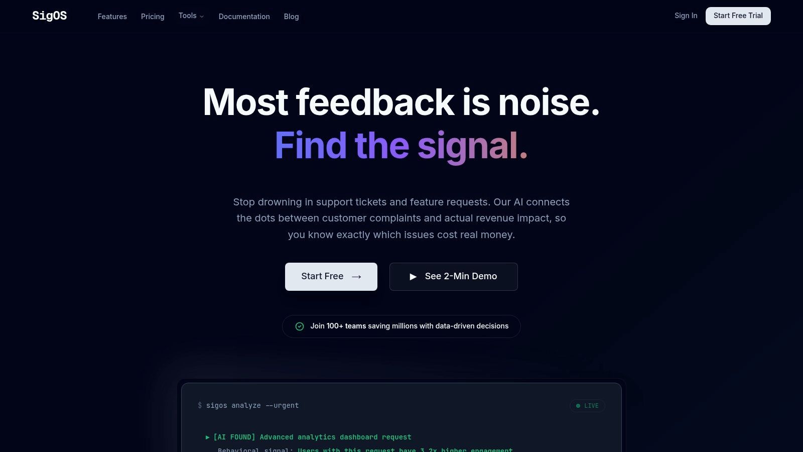
1. SigOS: The AI-Powered Product Intelligence Dashboard
SigOS stands out as a premier example of a modern business intelligence dashboard, specifically engineered for SaaS product and growth teams. It moves beyond traditional BI by leveraging a proprietary AI engine to transform qualitative customer feedback into quantifiable, revenue-centric insights. Instead of merely visualizing historical data, SigOS proactively identifies and prioritizes the most critical issues and feature requests that directly impact churn and expansion.
This platform continuously analyzes behavioral data from a multitude of sources, including support tickets, chat logs, sales calls, and product usage metrics. The result is a highly focused, daily dashboard that presents leadership with the top problems costing the business money and the feature opportunities most likely to drive significant growth.
Strategic Analysis: Why SigOS Excels
The core strength of SigOS lies in its ability to connect customer feedback directly to financial outcomes. The AI-driven analysis achieves an impressive 87% correlation accuracy in predicting customer churn and expansion potential, providing teams with a reliable, data-backed foundation for their product roadmap.
The platform's seamless integrations with essential tools like Zendesk, Intercom, Linear, Jira, and GitHub automate the entire feedback-to-development pipeline. This automation not only saves countless hours of manual analysis but also ensures that high-impact issues are actioned swiftly, complete with revenue scores and contextual data. If you are interested in exploring this topic further, you can discover more about how a product intelligence platform operates and its benefits for modern SaaS companies.
Actionable Insights for Your Team
- Prioritize with Confidence: Use the dashboard's revenue impact scores to build a product roadmap that focuses on features proven to drive customer retention and unlock new revenue streams.
- Mitigate Churn Proactively: Leverage real-time alerts to identify and address emerging customer issues before they escalate, empowering customer success teams to intervene effectively.
- Streamline Your Workflow: Connect SigOS to your existing project management tools to automatically create tickets for prioritized issues, complete with all necessary context and financial data.
Platform Breakdown
| Feature | Benefit |
|---|---|
| AI-Powered Prioritization | Eliminates guesswork by identifying issues with the highest impact on churn and revenue. |
| Multi-Source Data Analysis | Creates a holistic view of the customer experience by analyzing feedback from all touchpoints. |
| Seamless Integrations | Automates workflows and ensures insights are delivered directly to the tools your team already uses. |
| Daily Dashboards & Alerts | Enables proactive decision-making and rapid response to emerging risks and opportunities. |
| Security-First Design | Guarantees data privacy and compliance with encrypted data and non-retraining AI models. |
Website: https://sigos.io
2. Tableau Public — Dashboard Examples Gallery
Tableau Public is less a single example and more an indispensable, interactive library for anyone serious about business intelligence. It serves as a massive, community-driven gallery where Tableau users showcase their work. This makes it one of the richest resources for high-quality business intelligence dashboard examples available online.
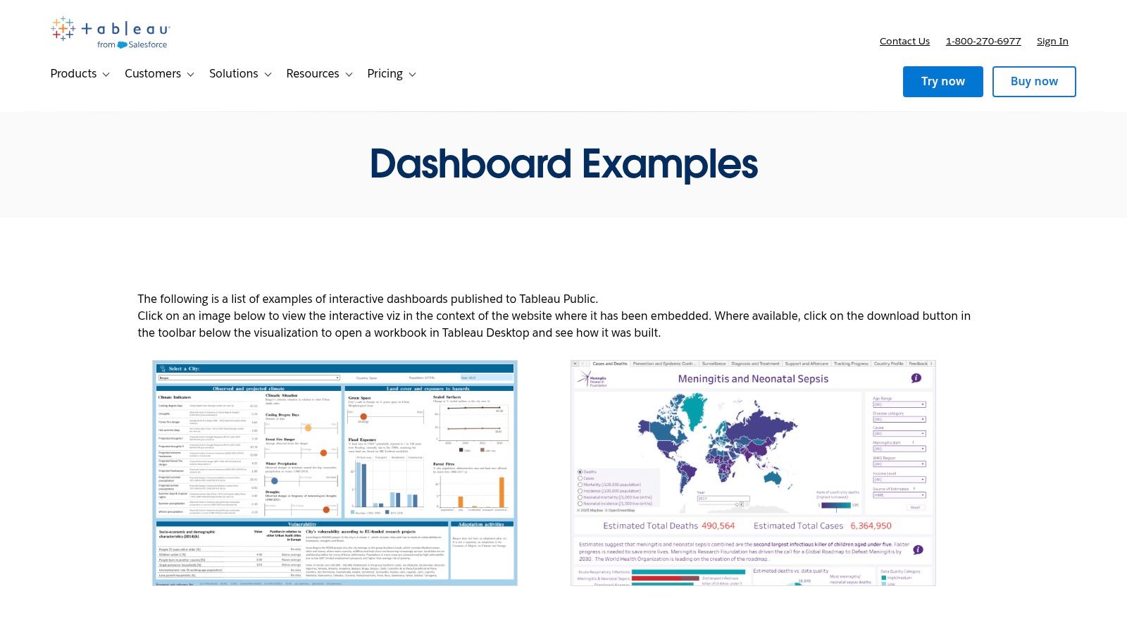
Unlike static image galleries, nearly every dashboard on Tableau Public is fully interactive. You can filter data, hover over elements for details, and experience the dashboard as an end-user would. This hands-on exploration provides a much deeper understanding of effective dashboard design and functionality.
Strategic Breakdown and Unique Offerings
What sets Tableau Public apart is its "look under the hood" capability. Many creators allow you to download the original Tableau Workbook file (.twbx). This gives you direct access to the underlying data, calculated fields, and design configurations. For data analysts and BI developers, this is an unparalleled learning tool.
Practical Tips for Effective Use:
- Filter the Gallery: Use the "Viz of the Day" and curated gallery collections to find high-quality, vetted examples first.
- Download Workbooks: Focus on dashboards that offer downloadable workbooks to reverse-engineer complex visualizations and calculations.
- Follow Creators: Identify authors whose work aligns with your industry or use case and follow them for a continuous stream of relevant inspiration.
Platform Analysis
| Feature | Assessment |
|---|---|
| Content Quality | Varies by author, but the curated galleries feature top-tier, professional work. |
| Interactivity | Excellent. Nearly all dashboards are fully interactive, providing a real-world user experience. |
| Accessibility | Viewing and interacting with dashboards is completely free. A paid Tableau license is needed for advanced features. |
| Learning Value | Exceptional. The ability to download and dissect workbooks makes it a premier educational resource. |
Website: https://www.tableau.com/dashboard-examples
3. Microsoft AppSource — Power BI Apps and Template Apps
Microsoft AppSource serves as a specialized marketplace for enterprise-grade Power BI template apps, offering pre-built dashboards and reports directly from Microsoft and its partners. Instead of providing individual visualizations for inspiration, it delivers complete, deployable solutions, making it an excellent resource for those seeking robust business intelligence dashboard examples that can be implemented quickly within an existing Power BI environment.
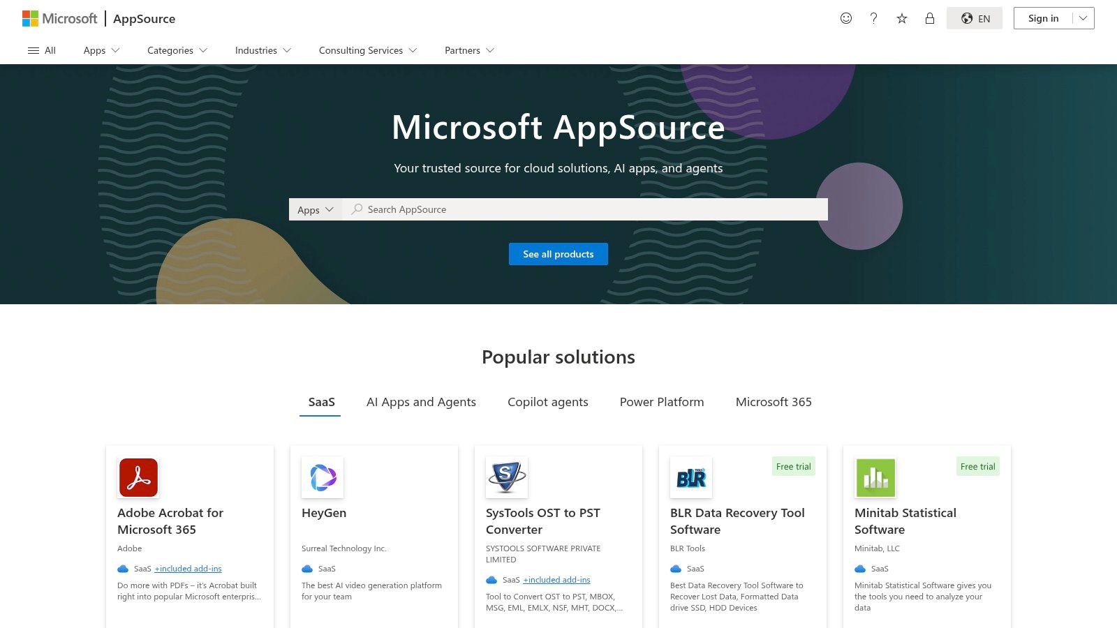
This platform is geared toward rapid deployment rather than creative exploration. Users can find and install fully functional BI applications tailored to specific services like Salesforce, Google Analytics, or Microsoft Dynamics. The focus is on providing immediate value through structured, officially supported dashboard templates that connect to common data sources.
Strategic Breakdown and Unique Offerings
The key differentiator for AppSource is its direct integration with the Power BI service and Microsoft 365 ecosystem. These are not just visual mockups; they are installable applications that come with a pre-configured data model, reports, and dashboards. This allows organizations to bypass weeks of development effort and instantly deploy a proven BI solution.
Practical Tips for Effective Use:
- Search by Connector: Use the marketplace filters to find apps based on the specific data source you use, such as Asana, Kusto, or Mailchimp.
- Check Vendor Requirements: Before installing, review the app details to see if it requires a separate subscription or license with the third-party vendor.
- Leverage for Scaffolding: Install a template app not just for its final dashboards, but to learn how experts structure their data models and DAX calculations for a specific use case.
Platform Analysis
| Feature | Assessment |
|---|---|
| Content Quality | Generally high, as most apps are published by Microsoft or vetted partners, ensuring a level of professional quality and support. |
| Interactivity | Excellent. Once installed in Power BI, the apps and dashboards are fully interactive and customizable. |
| Accessibility | Requires a Power BI Pro or Premium license to install and view apps. Many apps are free, but some require separate service subscriptions. |
| Learning Value | Good. While not as open as Tableau Public for deconstruction, template apps provide great insight into best practices for data modeling and report structure. |
Website: https://appsource.microsoft.com/en-us/home?product=power-bi
4. Google Looker Studio — Report Template Gallery
Google Looker Studio (formerly Data Studio) provides a rich gallery of templates that serve as a powerful launchpad for creating business intelligence dashboards, especially for those invested in the Google ecosystem. It features a mix of official Google-built reports and community-contributed dashboards, offering a wide array of starting points for marketing, analytics, and sales reporting.
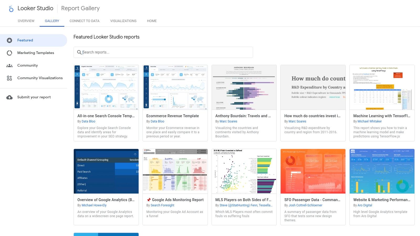
The platform’s strength lies in its simplicity and speed. Users can browse the gallery, find a template that fits their needs- like a Google Analytics or Google Ads report- and with a single click, create a copy. This copy can then be connected to their own data sources, providing a fully functional, interactive dashboard in minutes rather than hours. This makes it an excellent source of business intelligence dashboard examples for rapid deployment.
Strategic Breakdown and Unique Offerings
The key differentiator for Looker Studio's gallery is its "one-click copy" functionality. This dramatically lowers the barrier to entry for creating sophisticated reports. Instead of building from scratch, analysts can leverage professionally designed templates and focus their time on customizing the metrics and insights that matter most to their business.
Practical Tips for Effective Use:
- Start with Official Templates: Begin with templates published by Google for guaranteed quality, robust data connections, and clear documentation.
- Explore Community Connectors: Check the connectors used in a template. Many community dashboards leverage third-party connectors that can unlock data from platforms outside the Google suite.
- Customize Branding and Logic: Use the copied template as a foundation. Immediately update the branding to match your company’s style and tweak the data logic to align with your specific KPIs.
Platform Analysis
| Feature | Assessment |
|---|---|
| Content Quality | Good to excellent for official templates. Community submissions vary in quality and documentation. |
| Interactivity | Very good. Dashboards are fully interactive with filter controls, date ranges, and drill-downs. |
| Accessibility | Completely free. All you need is a Google account to access, copy, and customize templates. |
| Learning Value | Strong for beginners. It provides an easy entry point into dashboard design and data connection principles. |
Website: https://lookerstudio.google.com/gallery
5. Qlik — Dashboard Examples and Community Gallery
Qlik's official dashboard hub provides a curated collection of over 100 examples, showcasing the power of its unique associative engine. It serves as an excellent resource for anyone looking to build highly interactive and exploratory dashboards, offering a mix of official demos and community-contributed apps that highlight modern business intelligence dashboard examples.
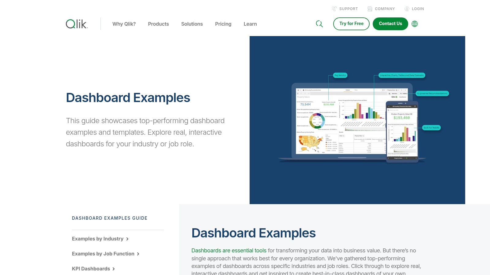
Unlike static galleries, Qlik’s examples are fully interactive live demos. This allows users to experience the platform’s core strength firsthand: making selections in one chart instantly filters the entire data set, revealing hidden connections and outliers. This emphasis on guided, associative exploration is a key differentiator from other BI platforms.
Strategic Breakdown and Unique Offerings
What makes the Qlik gallery stand out is its focus on demonstrating associative exploration. When you click a data point, you don't just filter for that selection; you also see the "grayed out" data, representing values that are not associated. This "power of gray" is a fundamental Qlik concept that helps users discover unexpected insights by revealing what is unrelated to their query.
Practical Tips for Effective Use:
- Explore by Role: Use the filters to view dashboards designed for specific functions like sales, finance, or supply chain to see relevant KPIs and layouts.
- Test the Associative Engine: Actively make selections in different charts and pay close attention to how other visuals respond, particularly the grayed-out data.
- Analyze Design Patterns: Note how Qlik dashboards often start with high-level KPIs before moving into more detailed charts, guiding users from overview to deep analysis.
Platform Analysis
| Feature | Assessment |
|---|---|
| Content Quality | High. The official demos are polished and professional, while community examples offer real-world variety. |
| Interactivity | Excellent. The gallery is built to showcase the fully interactive and associative nature of Qlik Sense dashboards. |
| Accessibility | Viewing and interacting with all examples is free. A Qlik Sense license is required to build or modify dashboards. |
| Learning Value | Strong. It’s an ideal resource for understanding the principles of associative analytics and exploratory dashboard design. |
Website: https://www.qlik.com/us/dashboard-examples
6. Amazon QuickSight — Dashboard Gallery
For businesses deeply integrated into the Amazon Web Services (AWS) ecosystem, the Amazon QuickSight Gallery is an essential resource. It provides a curated collection of dashboards demonstrating the platform's native capabilities across industries like finance, healthcare, and retail. This makes it an ideal starting point for evaluating QuickSight's features before full-scale adoption.
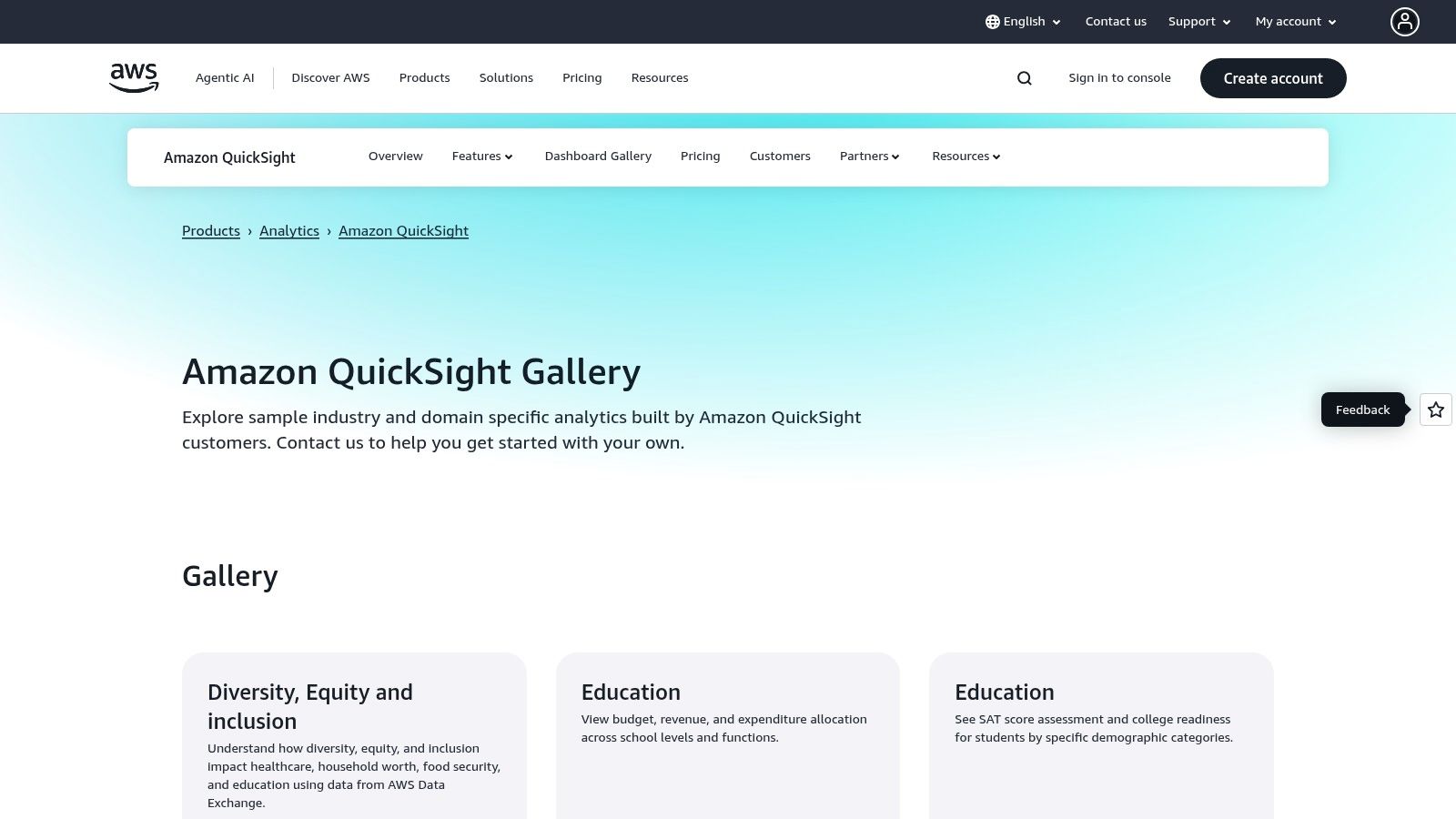
The gallery excels at showcasing how to visualize data directly from AWS sources, such as S3, Redshift, and Athena. Each example serves as a practical blueprint for building operational and cost-management dashboards, offering clear business intelligence dashboard examples that are directly relevant to cloud infrastructure management and enterprise data analytics.
Strategic Breakdown and Unique Offerings
QuickSight’s primary advantage is its seamless integration with the AWS stack, and the gallery highlights this strength. The dashboards are designed to feel like a natural extension of the AWS management console, emphasizing operational metrics, service costs, and performance monitoring. This focus provides a clear pathway for DevOps and finance teams to gain visibility into their cloud spending and resource utilization.
Practical Tips for Effective Use:
- Align with AWS Services: Prioritize examples that visualize data from AWS services you already use to see the most immediate path to value.
- Study Layouts: Pay close attention to QuickSight’s native layouts and visual types to understand its design constraints and strengths before committing to the platform.
- Explore Industry Verticals: Use the industry-specific dashboards (e.g., healthcare, sales) to get pre-built templates for common business use cases.
Platform Analysis
| Feature | Assessment |
|---|---|
| Content Quality | Professional and highly relevant, specifically for use cases within the AWS ecosystem. |
| Interactivity | Good. The gallery dashboards are interactive, allowing for filtering and exploration of features. |
| Accessibility | The gallery is free to view. Using QuickSight requires an AWS account, with pricing based on user roles and session capacity. |
| Learning Value | Strong for AWS users. It provides clear, replicable models for building BI on top of AWS data sources. |
Website: https://aws.amazon.com/quicksight/gallery/
7. Databox — Dashboard Templates and Examples
Databox offers a massive catalog of plug-and-play dashboard templates, making it an excellent resource for teams that need to deploy functional dashboards quickly. Its strength lies in transforming the process from inspiration to implementation, allowing users to connect their own data sources to a pre-built template with just a few clicks. This makes it a standout platform for finding practical and immediately usable business intelligence dashboard examples.
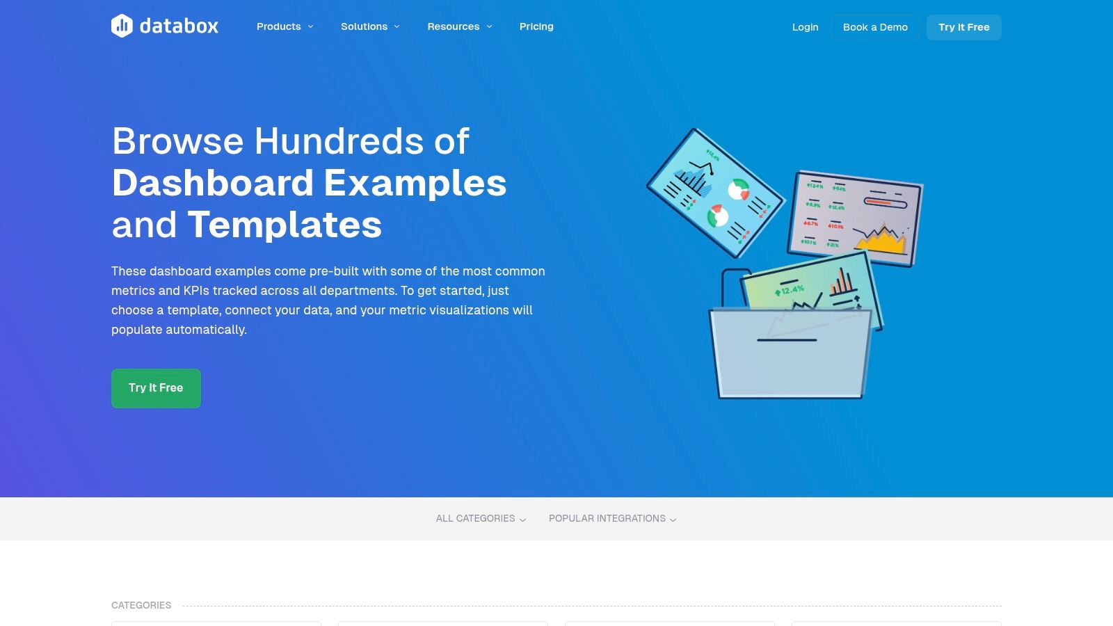
The platform is designed for accessibility, featuring a drag-and-drop editor that empowers non-technical users to customize templates or build dashboards from scratch. With hundreds of examples spanning marketing, sales, finance, and product management, Databox serves as both a gallery and a powerful BI tool. Its integration capabilities make it one of the best tools for product managers looking to consolidate KPIs.
Strategic Breakdown and Unique Offerings
The key differentiator for Databox is its emphasis on rapid deployment. Unlike platforms that are purely for inspiration, Databox bridges the gap by providing templates that are directly connected to a production-ready environment. You can select a Google Analytics dashboard template, connect your account, and have a live, personalized dashboard in minutes, not hours or days.
Practical Tips for Effective Use:
- Start with Templates: Browse the extensive template library to find a dashboard that closely matches your needs, then connect your data to see it in action instantly.
- Leverage One-Click Integrations: Focus on templates that use data sources you already have (e.g., HubSpot, Google Ads, Stripe) for the fastest setup.
- Customize Gradually: Use the pre-built template as your foundation. From there, use the drag-and-drop editor to add, remove, or resize metrics as you identify more specific needs.
Platform Analysis
| Feature | Assessment |
|---|---|
| Content Quality | High. Templates are professionally designed and focused on common business use cases and KPIs. |
| Interactivity | Good. Once a template is live with your data, it's fully interactive and updates automatically. |
| Accessibility | Requires a subscription for continued use; free plans are being discontinued. Setup is very user-friendly. |
| Learning Value | Excellent for understanding which KPIs to track for specific business functions and how to visualize them effectively. |
Website: https://databox.com/dashboard-examples
Comparison of 7 Business Intelligence Dashboard Examples
| Product / Platform | Implementation Complexity 🔄 | Resource Requirements ⚡ | Expected Outcomes 📊 | Ideal Use Cases 💡 | Key Advantages ⭐ |
|---|---|---|---|---|---|
| SigOS | Moderate to High – AI insights require onboarding | Moderate – integrates with existing tools, uses AI | High – Predicts churn/expansion, prioritizes issues | SaaS product teams seeking revenue-driven insights | Accurate AI-driven predictions; real-time alerts; secure data handling |
| Tableau Public — Dashboard Examples Gallery | Low – ready-made dashboards for exploration | Low – free access; no setup needed | Medium – inspiration and learning | Learning dashboard design; exploring diverse examples | Large community sharing; interactive and downloadable workbooks |
| Microsoft AppSource — Power BI Apps & Templates | Moderate – requires Power BI licenses and app install | Moderate to High – Power BI Pro/Premium needed | High – enterprise-ready BI dashboards | Power BI users needing quick deployment | Enterprise-ready apps; seamless MS 365 integration |
| Google Looker Studio — Report Template Gallery | Low – simple copy & customize templates | Low – free with Google account | Medium – fast report creation for marketing/analytics | Marketing and analytics teams using Google ecosystem | Fast onboarding; web-based sharing; free to use |
| Qlik — Dashboard Examples & Community Gallery | Moderate – demos and examples; full reuse needs license | Moderate – Qlik Sense license for full functionality | Medium – learning associative analytics | Users exploring advanced visual analytics design | Interactive demos; mix of official & community examples |
| Amazon QuickSight — Dashboard Gallery | Moderate – AWS environment familiarity required | Moderate – varied pricing; Enterprise features extra | Medium to High – native QuickSight feature showcase | AWS users integrating BI in cloud environment | Strong AWS integration; cost management focus; predictable pricing |
| Databox — Dashboard Templates and Examples | Low to Moderate – drag-and-drop with plug-and-play | Moderate – paid plans after free/Starter expiration | Medium to High – rapid deployment of production dashboards | SMBs and marketing teams needing quick BI setups | Fastest setup; broad data source integrations; easy customization |
Building Your Next Dashboard with Confidence
Throughout this deep dive into business intelligence dashboard examples, a clear pattern has emerged. From the laser-focused product intelligence of SigOS to the sprawling, community-driven galleries of Tableau and Microsoft Power BI, the most effective dashboards are not just data repositories. They are strategic, purpose-built tools designed to answer critical business questions and guide decisive action.
The key lesson is that design and data must serve a specific narrative. A successful dashboard tells a story, whether it's about customer success, operational efficiency, or revenue growth. It cuts through the noise, prioritizing a handful of crucial KPIs over a deluge of vanity metrics. This principle of strategic focus is the common thread connecting all the powerful examples we've analyzed.
Your Blueprint for Action
As you embark on creating your next BI dashboard, it's time to move from inspiration to implementation. The examples from Looker Studio, Qlik, and Databox demonstrate the power of starting with a template, but true value comes from tailoring these frameworks to your unique operational context and strategic goals.
Here are the core principles to guide your process:
- Define Your "Why": Before you drag and drop a single chart, clearly articulate the primary business question your dashboard will answer. Is it "Which features are driving upgrades?" or "How can we reduce customer churn?" The answer to this question becomes your dashboard’s North Star.
- Know Your Audience: A dashboard for a CTO will look vastly different from one for a customer support leader. Tailor the complexity, granularity, and chosen metrics to the specific needs and daily workflow of the end-user. The most impactful designs are those that feel intuitive and immediately relevant to their audience.
- Prioritize Ruthlessly: The best dashboards embrace minimalism. Resist the temptation to include every available metric. Instead, focus on the select few KPIs that directly track progress against your core objectives. A cluttered interface leads to confusion, while a focused one inspires clarity and action.
- Embrace Iteration: Your first version is never your last. Launch your dashboard, gather feedback from your team, and continuously refine it. User behavior and business priorities change, and your BI tools must evolve alongside them.
Choosing the Right Tools and Path Forward
The platform you choose plays a significant role in your dashboard's ultimate success. Consider factors like your existing tech stack, the technical skill level of your team, and your scalability needs. Power BI and Tableau offer immense flexibility and community support, while tools like Databox provide simplicity and rapid deployment through templates. Amazon QuickSight is a strong contender for teams already embedded in the AWS ecosystem.
To help inspire your own creations and provide further insights into effective designs, consider exploring additional business intelligence dashboard examples. By studying a wide variety of approaches, you can borrow design elements, discover new KPI tracking methods, and refine your own strategic vision. Ultimately, the goal is to build more than just a dashboard; it’s to build a catalyst for smarter, data-driven decision-making that propels your entire organization forward with confidence.
Ready to move beyond generic dashboards and unlock deep, actionable insights from your product data? SigOS provides AI-driven product intelligence that connects feature usage directly to revenue, helping you build a BI experience that answers the most critical questions about growth and customer value. See how our purpose-built dashboards can transform your product strategy by visiting SigOS.


Ready to find your hidden revenue leaks?
Start analyzing your customer feedback and discover insights that drive revenue.
Start Free Trial →