How to Measure Product Market Fit
Learn how to measure product market fit with proven qualitative and quantitative methods. A guide to the real metrics that signal sustainable growth.

Measuring product-market fit isn't just about crunching numbers; it’s a blend of hard data and real-world human feedback. A great starting point is the Sean Ellis test. The goal is simple: survey your users and see if at least 40% would be "very disappointed" if your product vanished tomorrow.
What Product-Market Fit Actually Feels Like

Before you get lost in dashboards and spreadsheets, it's crucial to grasp what product-market fit (PMF) feels like. It’s not some final checkbox you get to tick off a list. Instead, think of it as a dynamic state where your product becomes a must-have for a core group of people.
It's easy to fall into the trap of relying on gut feelings. Early excitement from a handful of friendly users can look a lot like genuine market pull, but it often isn't.
That's why a disciplined, data-informed approach is non-negotiable. You need to back up your intuition with cold, hard evidence. Without it, you're just guessing, potentially burning cash on features no one needs or hiring a sales team for a product that can't sell itself.
The Inbound Pull of True PMF
The most undeniable sign of product-market fit is when the market starts pulling the product from you. You'll notice a fundamental shift from constantly pushing for every sale to fielding organic, inbound interest. This feeling shows up in tangible ways long before you run a formal analysis.
You’ll start to see that:
- Sales cycles get shorter. Deals just close faster because prospects arrive already convinced of the value.
- Organic word-of-mouth takes off. Customers turn into your biggest champions, referring new users without you even asking.
- Usage becomes a habit. Your product becomes deeply embedded in your customers' daily routines.
This transition from pushing to pulling is the soul of PMF. Your sales team’s job changes from convincing people to buy to just helping them get started. Your support crew spends less time on complaints and more time sharing tips with happy, engaged users.
Beyond Textbook Definitions
Venture capitalist Marc Andreessen famously defined PMF as “being in a good market with a product that can satisfy that market.” It’s a perfect definition, but the feeling is much more visceral. It’s when your customers would genuinely feel the loss if your product disappeared.
Think about Slack in its early days. It wasn't just another chat app; it completely rewired how teams communicated. People weren't just trying it out—they were moving their entire workflows onto the platform. That’s the kind of indispensable feeling your metrics should be trying to capture.
Keeping this feeling in mind gives you the right context to interpret the data you're about to collect on your own journey toward measuring product-market fit.
The Quantitative Story of Product-Market Fit
While that feeling of product-market fit is a powerful motivator, numbers tell the undeniable story. Quantitative data gives you the hard evidence you need to prove your product isn't just a "nice-to-have"—it's a "must-have" for your target audience. When you start tracking the right metrics, you're no longer operating on hopeful intuition; you're building a strategy backed by cold, hard facts.
These numbers don't exist in a vacuum. Think of them as individual threads that, when woven together, create a clear picture of your product's health and how well it resonates with the market. Learning to read this story is what separates guessing from knowing.
This visual breaks down three of the core pillars you'll be measuring: Conversion Rate, Retention Rate, and the all-important Net Promoter Score.
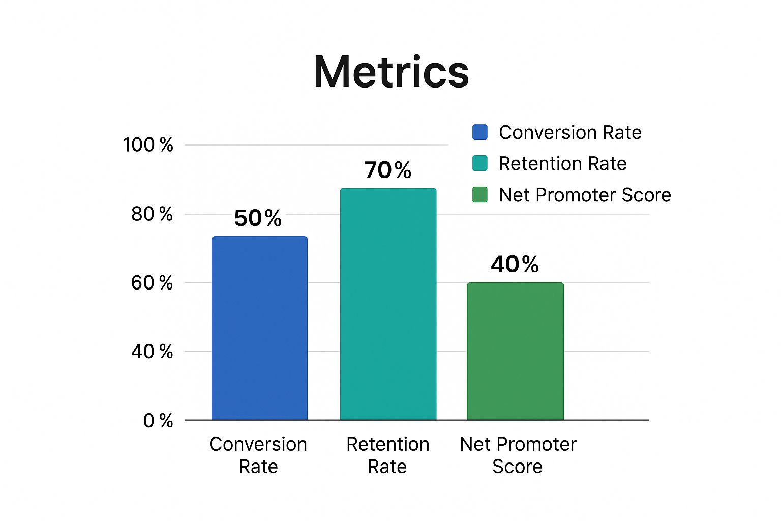
As you can see, strong retention almost always goes hand-in-hand with high customer satisfaction (NPS). Get that flywheel spinning, and you’ve built a powerful engine for real, sustainable growth.
Customer Retention and Churn
Customer Retention Rate (CRR) is probably the most direct signal you have of sustained value. It's simply the percentage of customers who stick around with your product over a specific period. A high retention rate is your proof that users are getting real, ongoing value long after they first signed up.
The flip side of that coin is churn—the rate at which customers leave. Churn is your product’s kryptonite. If you’re losing customers as fast as you acquire them, you don't have a business; you have a leaky bucket. A low churn rate, especially a low revenue churn rate, is a fantastic sign that your most valuable customers are not only staying but often expanding their usage.
The CLV to CAC Ratio
The relationship between Customer Lifetime Value (CLV) and Customer Acquisition Cost (CAC) is the absolute cornerstone of a viable business model. CLV is the total revenue you can realistically expect from a single customer, while CAC is what you spent to get them in the door.
A healthy business must make significantly more from its customers than it spends to acquire them. This isn't just theory; it's a fundamental business principle. Venture capital firm Tribe Capital even developed a quantitative framework that treats PMF assessment like financial accounting. By analyzing hundreds of companies like Facebook and Slack, they zeroed in on the metrics that define efficient, scalable growth.
Their research consistently points to one magic number: a CLV to CAC ratio of at least 3:1. This means for every dollar you spend on marketing and sales, you get three dollars back over that customer's lifetime. It's a clear indicator that you've found an efficient way to monetize a real market need. For a deeper dive, I highly recommend exploring their quantitative approach to product-market fit.
Engagement Metrics That Matter
High-level metrics like retention are crucial, but it's the daily engagement data that truly reveals the "stickiness" of your product. These are the numbers that tell you just how deeply your product is embedded in your users' day-to-day lives and workflows.
A few key engagement indicators to watch closely:
- DAU/MAU Ratio: This ratio of Daily Active Users to Monthly Active Users shows how many of your users are engaging daily. For a SaaS tool designed for daily work, a ratio above 30% is often a fantastic signal of product-market fit.
- Time to Value (TTV): How fast does a new user get that "aha!" moment where they experience the core value of your product? A short TTV is critical—it dramatically increases the odds they'll stick around for the long haul.
- Feature Adoption Rate: Are people actually using the key features you poured so much effort into building? If core features have low adoption, it's a strong sign of a disconnect between what you think is valuable and what your customers actually need.
Shortening Sales Cycles
For B2B companies, here's another powerful quantitative signal that often gets overlooked: the length of your sales cycle. As you get closer and closer to true product-market fit, you'll start to notice the sales process getting smoother and, most importantly, faster.
Prospects will start coming to you with a much better understanding of what you do, often thanks to word-of-mouth from happy customers. They'll skip the basic questions and jump right into implementation details. This shift is huge—it shows that the market not only understands your product but is actively seeking it out. A consistently shortening sales cycle is one of the best signs that you've really hit a nerve.
To help you keep track of these essential figures, here's a quick summary of the key metrics that paint your quantitative PMF picture.
Key Quantitative PMF Metrics at a Glance
| Metric | How to Calculate | What It Signals |
|---|---|---|
| Retention Rate | ((Customers at End of Period - New Customers) / Customers at Start of Period) x 100 | High retention means users are getting sustained value. It's a direct measure of stickiness. |
| Churn Rate | (Customers Lost / Total Customers at Start of Period) x 100 | Low churn indicates a healthy, valuable product. High churn is a "leaky bucket" warning. |
| CLV:CAC Ratio | Customer Lifetime Value / Customer Acquisition Cost | A ratio of 3:1 or higher signals a profitable, sustainable business model. |
| DAU/MAU Ratio | (Daily Active Users / Monthly Active Users) x 100 | Shows how frequently users engage. A high ratio (e.g., >30% for a daily tool) indicates deep integration. |
| Time to Value (TTV) | Time from signup to a user's first "aha!" moment (experiencing core value) | A short TTV is crucial for converting new users into long-term, retained customers. |
Tracking these metrics gives you an objective scoreboard for your product's performance. They move you beyond feelings and into data-driven decisions, which is exactly where you need to be to build a successful, scalable company.
Gathering Qualitative Insights from Your Customers

Quantitative data tells you what is happening. It shows you which features get used, how many users are churning, and where your conversion funnel is leaking. But to really get a handle on product-market fit, you need to uncover the why behind those numbers.
This is where qualitative insight becomes your secret weapon. It’s the human story that connects the dots your analytics dashboards can't. It’s the difference between knowing 20% of users bailed after onboarding and understanding it was because a specific step felt completely backward to them. Listening to your customers gives you the context you need to stop guessing and start making meaningful improvements.
Unpacking the Net Promoter Score
A fantastic tool for this is the Net Promoter Score (NPS). It’s a battle-tested method for gauging customer satisfaction that boils down to one powerful question: “How likely are you to recommend this product to a friend or colleague?”
An NPS above 30 is considered good, but scores over 50 are where you see real customer loyalty and a strong signal that you’re on the right track with product-market fit.
Think about Slack back in 2015. An early survey revealed that 51% of users would be “very disappointed” if the platform vanished. That wasn't just a vanity metric; it was a powerful leading indicator of the massive growth that followed. You can find more examples of how these early signals can predict product-market fit success in a great piece by Mailshake.
Your responses will naturally sort themselves into three groups:
- Promoters (Score 9-10): These are your biggest fans. Pay close attention to their language—they’re telling you your core value proposition in their own words.
- Passives (Score 7-8): These folks are satisfied but not wowed. Their feedback often points to missing features or friction points that are keeping your product from being a "must-have."
- Detractors (Score 0-6): These are your unhappy campers. Their feedback is a gift, shining a bright light on your biggest problems and the most urgent fires you need to put out.
Segmenting and digging into these open-ended responses gives you a surprisingly clear roadmap. Promoters tell you what to double down on, while Detractors show you exactly where you’re failing to deliver.
Conducting Effective Customer Interviews
Surveys are great for getting a pulse on things at scale, but nothing replaces a real conversation. Customer interviews let you dig into the nuances of why people do what they do. The key is to ask open-ended questions that encourage storytelling, not just one-word answers.
Don't ask, "Do you like our new feature?" It’s a dead end.
Instead, try: "Can you walk me through the last time you used the new feature?" This simple shift prompts a narrative that will reveal their goals, their frustrations, and any clever workarounds they’ve invented—all priceless information.
A few of my favorite questions to get people talking:
- "What were you cobbling together to solve this problem before you found us?"
- "If our product disappeared tomorrow, what would be the hardest part of your day?"
- "If you had a magic wand and could change one thing about our product, what would it be and why?"
Remember, your goal here isn't to validate your own assumptions; it's to have them challenged. Let the customer lead. You’ll be amazed at what you uncover when you just listen.
Mining Your Support Tickets for Truth
Your customer support channels—whether it's Zendesk, Intercom, or just a simple email inbox—are a goldmine of raw, qualitative feedback. Every ticket and chat transcript is a story about a user trying to get value from your product and hitting a wall.
Stop thinking of support as just a cost center. It’s an R&D department in disguise.
Start tagging and organizing tickets by theme. Are you seeing the same bug pop up over and over? Is there a lot of confusion around your pricing page? Are customers constantly begging for a specific integration? This is unfiltered feedback, and because it’s not prompted by a survey, it’s often brutally honest.
At SigOS, we believe turning this "noise" into a clear signal is fundamental. When you analyze these interactions, you start to see patterns that directly predict churn risk or highlight opportunities for growth. Suddenly, your support data transforms from a reactive firefighting tool into a proactive source of genuine product intelligence.
Predicting Product-Market Fit with the Sean Ellis Test

While metrics like retention and NPS are great for looking in the rearview mirror, the Sean Ellis Test is your forward-looking radar. It was developed by the OG growth hacker, Sean Ellis, as a simple yet powerful way to get a leading signal on product-market fit. The entire method boils down to one critical question that gets right to the point.
You simply ask your users: "How would you feel if you could no longer use this product?"
The answers are designed to be brutally honest:
- Very disappointed
- Somewhat disappointed
- Not disappointed
This isn't just about stroking your ego. It's about finding the people who have integrated your product into their lives or workflows. This question forces a clean break between the customers who think your product is "nice to have" and those who genuinely can't live without it.
The Magic 40 Percent Benchmark
After running this survey across nearly 100 startups, Sean Ellis noticed a clear dividing line. Companies that were just spinning their wheels and struggling to get off the ground consistently saw fewer than 40% of their users answer "very disappointed." On the flip side, the companies that found real, sustainable growth almost always blew past that number.
If you don't hit 40%, don't panic. It's not a failure; it’s a gift of crucial information. It tells you that you haven't quite nailed your core value or found your ideal customer. It's a clear signal to double down on product development and user research, not to pour more money into marketing.
How to Run the Test the Right Way
Getting clean, actionable data means being strategic. You can't just blast this survey out to everyone and hope for the best. You need to be thoughtful about who you ask and when you ask them.
Who to Survey: This is critical. Do not send this to every person who has ever given you their email address. You want to hear from people who have had a chance to truly experience what your product does. I typically target users who have:
- Used the product at least twice.
- Been active within the last two weeks.
- Engaged with the core, "aha!" features.
Surveying brand-new signups or users who have already churned will just contaminate your results with irrelevant feedback.
When to Survey: Timing matters. You want the user’s experience to be fresh in their mind, but they also need enough time to have formed a real opinion. I’ve found that sending the survey about 2-4 weeks after a user becomes active is a good sweet spot, but you’ll need to tailor this to your product's specific user journey.
Digging for Gold in the Follow-Up Questions
The multiple-choice question sets the stage, but the real magic happens in the open-ended follow-ups. This is where you uncover the why behind the what. These qualitative insights are what will guide your strategy.
Here are the follow-up questions I always use:
- Ask the "Very Disappointed" group: "What is the main benefit you receive from our product?" The answers you get here, in their own words, are your core value proposition. This is the exact language you should be stealing for your homepage, ads, and sales pitches.
- Ask the "Somewhat Disappointed" group: "What would you likely use as an alternative if our product were no longer available?" This reveals your actual competitors. It's often not who you think—it could be a different tool, a spreadsheet, or even just a manual process.
- Ask everyone: "How could we improve the product for you?" This question is a direct feed into your product roadmap, filled with ideas from your most engaged users.
By slicing the feedback this way, you get a crystal-clear roadmap. Your "very disappointed" segment defines your ideal customer and your marketing message. Your "somewhat disappointed" segment shows you where the friction is and what’s holding your product back from being a must-have. You’re not just left with a score, but with a precise, actionable plan to move forward.
Weaving Your Data into a Clear PMF Story
Product-market fit isn’t a single number you hit or a box you check. It's a story, and you need to see how all the chapters connect. One metric can easily lead you down the wrong path, but when several different indicators all start pointing up, you’ve got a powerful, cohesive narrative on your hands. The real skill is weaving your hard numbers and user feedback together to see what’s actually happening.
Relying on isolated metrics is a classic trap. A huge spike in signups feels great, but if those users are gone a month later, it was just a vanity metric. True PMF shows up when you see strong user retention, a healthy business model, organic growth, and customers who are willing to shout your name from the rooftops.
Connecting the Dots Between Your Metrics
Let’s say you run a project management SaaS tool. You just launched a slick new team collaboration feature, and the initial data is… confusing. You're seeing two completely different stories, and your job is to figure out which one is the truth.
Here’s a realistic scenario I’ve seen play out:
- The Good News: Your sign-up rate shot up by 30% since the feature went live. Your DAU/MAU ratio is also climbing, which means people are logging in more frequently.
- The Bad News: At the same time, your churn rate has ticked up a few points, and your support ticket volume has doubled. A lot of users are saying they're confused by the new UI.
So, are you closer to product-market fit or further away? This is where you have to connect the dots. The surge in sign-ups tells you the marketing message is landing—people want what you're selling. But the churn and support tickets scream that there’s a major disconnect between the promise and the reality. The problem isn't the core value; it's how you’re delivering it.
Now, you bring in the qualitative feedback. You fire off a quick survey to users who just churned and a clear theme emerges: they loved the idea of the feature but couldn't figure out how to get it working with their team's existing habits. Boom. You now have a direct, actionable insight: fix the onboarding for the new feature to stop the bleeding.
Building Your PMF Dashboard
To see these connections clearly, you need a central place to monitor your key indicators. A PMF dashboard doesn’t need to be fancy or complex. Its only job is to show you the relationships between different parts of the user journey.
This visual from Wikipedia does a great job of showing the core pieces that build a strong foundation for product-market fit.
The diagram makes it clear: a great user experience and killer features have to solve a real, underserved need to find PMF. Your dashboard should track metrics that cover each of these areas.
A simple but powerful dashboard should track:
- Retention & Churn: The ultimate signal that you're delivering lasting value.
- Engagement (DAU/MAU): Is your product becoming a habit?
- Acquisition (Organic vs. Paid): Is your growth starting to fuel itself?
- Monetization (CLV:CAC Ratio): Do you have a viable business model?
- Satisfaction (NPS & Sean Ellis Score): How do people feel when they use your product?
When you track these metrics side-by-side, you start to see patterns. For example, you might notice that a dip in your NPS score is consistently followed a month later by a rise in churn. That’s a powerful leading indicator, giving you a chance to intervene before it hits your revenue.
Seeing the Complete Picture
One of the most critical numbers to watch is your Customer Retention Rate (CRR), which tells you what percentage of customers stick around over time. To calculate it, take the number of customers at the end of a period, subtract any new customers you gained, divide by the number you started with, and multiply by 100. Many founders I know consider a retention rate hitting or exceeding 50% as a strong sign of PMF—it proves people are getting consistent value. You can dig into more key PMF benchmarks from Growthrocks if you want to go deeper.
But even a great retention rate needs context.
A high retention rate paired with flat or declining engagement could mean you have "zombie" users—customers who are paying but not actively using the product. They are a major churn risk waiting to happen.
You'll know you’ve found PMF when the story is consistent across all your data. Your retention is high because your engagement is strong. Your organic growth is accelerating because your NPS Promoters are doing the marketing for you. Your CLV:CAC ratio is healthy because retained, happy customers are profitable.
When all these signals align, you've moved beyond just looking at data points. You’ve built a compelling, evidence-backed narrative that proves you’ve found your place in the market.
Frequently Asked Questions About Measuring PMF
When you start digging into product-market fit, you'll inevitably run into a few common questions. The path isn't always a straight line, and knowing how to handle these nuances is what separates the teams that find fit from those that just spin their wheels. Let's tackle the questions I hear most often from founders and product managers.
What’s the Difference Between Problem-Solution Fit and Product-Market Fit?
Think of it as two totally different checkpoints on your startup journey.
Problem-solution fit is that first, exhilarating moment of validation. It’s when you prove you’ve found a real, painful problem and your idea for a solution actually clicks with people. You get there through things like customer interviews, testing a rough prototype, and hearing your target audience say, "Yes, I have that problem, and your idea sounds like it would actually solve it."
Product-market fit, on the other hand, comes much later. It’s the proof that you’ve not only built that solution but have also packaged and delivered it in a way the market is willing to embrace and pay for. This is where your beautiful solution collides with the messy reality of competition, pricing, and distribution channels. You can have a perfect problem-solution fit, but if the product is too clunky, overpriced, or impossible to discover, you'll never achieve PMF.
Problem-solution fit means you have the right idea. Product-market fit means you have the right product and business model to make that idea a success.
How Often Should We Be Measuring PMF?
Measuring product-market fit isn't a "one and done" task you can check off a list. The right rhythm really depends on what stage you're at.
- Early Stage (Pre-Launch to Year One): You should be obsessed with this. You're actively hunting for fit, so measure constantly. I recommend running the Sean Ellis test quarterly, but you should be backing that up with continuous customer interviews and a close eye on your retention cohorts. The goal here is to learn and pivot as fast as you can.
- Growth Stage (After You've Found PMF): Once you've confidently surpassed key benchmarks, like the 40% "very disappointed" score, you can ease up a bit. Running a big PMF survey every six to twelve months is a smart way to keep a pulse on things and make sure you aren't drifting. Your quantitative metrics, however—like retention and engagement—should be on a dashboard you check weekly, no exceptions.
Think of this ongoing measurement as your smoke detector. It’ll alert you to subtle shifts in customer needs long before they turn into a fire that torches your revenue.
Is It Possible to Lose Product-Market Fit?
Yes, absolutely. And frankly, this is one of the biggest traps a successful company can fall into. Product-market fit is not a trophy you win and put on a shelf; it's a living, breathing thing that you have to maintain.
Several things can knock you off balance.
Markets change. New technology comes along, customer expectations shift, and suddenly your "must-have" feature feels dated. Just ask BlackBerry. They had incredible PMF until the iPhone completely rewrote the rules of what a smartphone should be.
Competition gets fierce. A new player might enter the market with a slicker, cheaper, or more niche solution that starts chipping away at your customer base. Your product might be the same, but the world around it has changed, and your fit gets weaker as a result.
You create product bloat. This is a classic. In an effort to grow, you start adding feature after feature to please every possible customer segment. Before you know it, the simple, elegant solution your first fans fell in love with is a complicated mess. You've strayed from the core value that got you to PMF in the first place.
This is exactly why you can't stop measuring. Regularly checking in on your PMF score and core metrics is the only way to ensure you're staying in sync with your market and won't get blindsided by a change you should have seen coming.
At SigOS, we help you stay on top of these shifts by turning your customer feedback into clear, actionable signals. Our AI-driven platform analyzes support tickets, sales calls, and usage data to show you what customers really need, ensuring you never lose sight of what matters most. Discover how SigOS can help you maintain and strengthen your product-market fit.
Keep Reading
More insights from our blog


Ready to find your hidden revenue leaks?
Start analyzing your customer feedback and discover insights that drive revenue.
Start Free Trial →