Mastering Churn Rate Analysis to Boost Growth
A practical guide to churn rate analysis. Learn how to calculate, interpret, and reduce customer churn with proven strategies for sustainable business growth.
Churn rate analysis is all about figuring out how many customers you're losing over a certain time—and more importantly, why they're leaving. Think of it as a health check-up for your customer relationships. It’s the process of digging into the data to find the real stories behind why people decide to stop paying you.
This isn't just about numbers; it's about finding actionable insights to boost customer retention, make your product better, and ultimately, grow your bottom line.
Why Churn Rate Can Silently Sink a Business
Picture your business as a bucket. Your sales and marketing teams work tirelessly to fill it with new customers, pouring water in at the top. But churn is a hole in the bottom of that bucket. No matter how hard you work to fill it, that leak means you're constantly losing water. Growth becomes an exhausting, uphill battle.
This is why a deep-dive churn rate analysis isn't just a "nice-to-have" metric. It's a critical vital sign for your company's health. Ignoring it is like driving on a tire with a slow leak—sooner or later, you're going to find yourself stranded on the side of the road.
The Compounding Cost of Lost Customers
On the surface, a small monthly churn rate might not seem like a big deal. A 3% or 5% drop can feel manageable. But the real danger lies in its compounding effect over time. This quiet, steady erosion of your customer base can completely sabotage even your best efforts to acquire new business.
Let's put this into perspective with some hard numbers. A seemingly minor monthly churn rate of 5% actually adds up to losing nearly 46% of your customers over a single year. If your monthly churn hits 10%, you're looking at an annual loss of over 70%. At that point, you’re basically trying to replace your entire customer base every year just to tread water. For a closer look at these figures, the 2025 State of Retention report offers some eye-opening benchmarks.
Turning Defense into Your Best Offense
This is where a solid churn rate analysis really shines. By systematically figuring out who is leaving, when they're leaving, and what's pushing them out the door, you can finally start patching the holes in your bucket. A good analysis turns retention from a defensive move into your most powerful engine for sustainable growth.
It helps you zero in on specific problems, such as:
- Product Gaps: Are people leaving because a competitor does something better or you're missing a key feature?
- Onboarding Failures: Do new customers get lost and frustrated in their first few weeks, never really seeing the value?
- Poor Customer Service: Is a single bad support experience enough to drive a loyal customer away?
- Pricing Mismatches: Is your pricing no longer aligned with the value you provide?
Answering these questions takes you beyond just staring at a percentage on a dashboard. You start to understand the human story behind the data, which gives you the power to make smart decisions that don't just reduce churn, but build a stronger, more profitable business for the long haul.
How to Accurately Calculate Customer Churn

Alright, let's get down to the brass tacks. Moving from the idea of churn to actually measuring it is where the rubber meets the road. While churn seems straightforward—customers leaving—how you calculate it tells very different stories about your company's health.
You need a couple of solid, reliable formulas to get a true picture of customer and revenue attrition. Think of them as two distinct diagnostic tools: one checks your customer count, while the other checks your financial pulse.
The Standard Customer Churn Formula
This is the classic, most common way to measure churn. It's a simple headcount that tells you what percentage of your customers bailed during a specific period. It’s a fundamental metric for tracking the stability of your customer base and a great starting point for any analysis.
The formula couldn’t be simpler:
Let’s put it into practice. Imagine you kick off the month with 1,000 customers. By the end of the month, 50 of them have cancelled.
Here’s the math:
- (50 / 1,000) x 100 = 5%
Your customer churn rate for that month is 5%. This number is vital, but it has one massive blind spot: it treats every single customer as if they have the exact same value.
Calculating Monthly Recurring Revenue Churn
While your customer count is a big deal, revenue is what keeps the lights on. That's where Monthly Recurring Revenue (MRR) Churn comes in. This metric zeroes in on the financial damage caused by lost customers and plan downgrades, giving you a much clearer view of how churn is hitting your bottom line.
This calculation is absolutely critical if you offer different pricing tiers. Think about it: losing one enterprise client paying 10,000/month hurts a whole lot more than losing ten small business clients paying ****50/month each, even though the customer churn count is much lower in the first scenario.
The MRR Churn formula looks like this:
Let's run the numbers again. Say you started the month with $200,000 in MRR. During that month, things got a bit shaky:
- You lost $8,000 in MRR from customers who cancelled completely.
- A few existing customers downgraded their plans, costing you another $2,000 in MRR.
Your total lost MRR is $10,000. So, the calculation is:
- **(****10,000 / **200,000) x 100 = 5%
Your MRR Churn Rate is also 5%. This number shows you the actual monetary bleeding in your business—something the customer churn formula just can’t do on its own.
Why You Absolutely Need Both Metrics
Here’s the thing: looking at just one of these metrics gives you an incomplete, and potentially misleading, picture. To run an effective churn rate analysis and make smart decisions, you have to track both.
A high customer churn rate might set off alarm bells, but if those churning are all on your lowest-priced plan, the revenue impact could be negligible. On the flip side, a low customer churn rate might look fantastic on a dashboard, but if the few customers who left were your highest-value accounts, you've got a serious fire to put out that the headcount number would completely hide.
To drive this point home, here’s a quick comparison of what each metric tells you and where it falls short.
Customer Churn vs Revenue Churn Comparison
| Metric | What It Measures | Primary Use Case | Potential Blind Spot |
|---|---|---|---|
| Customer Churn Rate | The percentage of customers who leave over a specific period. | Understanding overall customer base stability and satisfaction. | Treats all customers equally, regardless of their financial value. |
| MRR Churn Rate | The percentage of recurring revenue lost from churn and downgrades. | Assessing the direct financial impact of customer attrition. | Can be skewed by a single large account, masking smaller trends. |
By calculating and keeping a close eye on both customer and revenue churn, you gain a far more nuanced, multi-dimensional view of retention. It helps you see not just that you're losing customers, but precisely how much financial damage that churn is doing.
Putting Your Churn Rate into Context

So, you’ve calculated your churn rate. Maybe it’s 3%, 5%, or even 10%. But what does that number actually mean? On its own, a churn rate is just data. It’s a number without a story. To make it useful, you need to give it context by comparing it to industry standards and understanding the different forces at play.
Is your 5% churn rate a sign of a healthy, stable business, or is it a five-alarm fire? The answer depends entirely on your industry, business model, and the type of churn you're seeing. This is where your analysis gets interesting—when you move from asking "what" to understanding "so what?"
Voluntary vs. Involuntary Churn
Not all churn is created equal. The first thing to figure out is why customers are leaving. Their reasons usually fall into two big buckets: voluntary and involuntary churn. Each tells a completely different story about your business and, more importantly, requires a totally different fix.
- Voluntary Churn: This is what most of us picture when we hear the word "churn." It’s when a customer makes a conscious choice to hit the "cancel" button. They might be unhappy with your product, found a better deal elsewhere, or their needs have simply changed.
- Involuntary Churn: Think of this as "accidental" churn. It happens when a customer is lost due to a technical hiccup, most often a failed payment. Expired credit cards, insufficient funds, or a snag in bank processing can all lead to involuntary churn, even if the customer never intended to leave.
Sorting your churn into these two categories is critical. High voluntary churn is a red flag pointing to problems with your product, pricing, or customer experience. Involuntary churn, on the other hand, signals a breakdown in your payment and collections systems. Tackling involuntary churn is often one of the quickest wins you can get, since you're just recovering customers who didn't want to leave in the first place.
The Magic of Negative Churn
While the goal is always to keep churn low, the real holy grail for any subscription business is to achieve negative churn. It sounds like a paradox, but it’s a powerful sign of incredible business health and a massive potential for growth.
Negative churn happens when the new revenue from your existing customers—through upgrades, add-ons, and other expansions—is greater than the revenue you lose from the customers who cancel. Basically, your existing customer base is becoming more valuable over time, even if you lose a few folks along the way.
When you hit this milestone, it means your product is so sticky and valuable that your customers are willing to invest more in it over time. It turns what could be a leaky bucket into a self-filling one, creating a powerful engine for exponential growth.
Industry Benchmarks Are Your Reality Check
Finally, remember that your churn rate doesn't exist in a vacuum. What's considered a "good" churn rate for an enterprise B2B SaaS company would be a complete disaster for a B2C subscription box service. This is where looking at industry benchmarks provides a much-needed dose of reality.
Different industries have their own unique pressures, customer expectations, and competitive landscapes that directly shape what a "normal" churn rate looks like. The software industry, for example, often has lower churn because switching to a new system is a huge hassle. Consumer goods, on the other hand, can see much higher churn because it’s easy for customers to try something new.
A revealing study highlights just how stark these differences can be. In the consumer packaged goods (CPG) sector, the average churn rate was around 40%, driven by massive shifts in consumer behavior after 2020. This volatility was fueled by the 76% of consumers who tried out new shopping habits. The wholesale sector faced even tougher conditions, with churn rates hitting nearly 56%—the highest of any industry analyzed. For a deeper dive into these numbers, you can explore the full findings on CustomerGauge.
Knowing these benchmarks helps you set realistic goals. If the average for your industry is 8% and you're at 4%, you're in great shape. But if you're sitting at 12%, you know you have some serious work to do. This context is what transforms a simple churn rate calculation into a powerful tool for making smart business decisions.
Your Step-by-Step Churn Analysis Framework
Knowing your churn rate is one thing; systematically taking it apart is something else entirely. A proper churn analysis isn't just about tracking a number. It's a repeatable process for diagnosing problems and finding real solutions. Think of yourself as a detective for your customer base, following the clues to understand why people walk away.
To make this tangible, let's follow a fictional SaaS company, "SyncUp," as they work through their own analysis. This framework will give you a clear playbook to turn raw data into retention strategies that actually work.
Step 1: Start With a Hypothesis
Every good investigation starts with a theory. Before you dive headfirst into a sea of data, you need a clear, testable hypothesis about why customers might be leaving. This simple first step focuses your energy and keeps you from getting lost in endless spreadsheets.
The product team at SyncUp spotted a worrying trend: customers on their "Pro" plan are churning at a rate 15% higher than those on their "Basic" plan. After a quick huddle, they form a hypothesis.
This single statement gives the team a clear direction. They now know exactly what they're looking for in the data.
Step 2: Segment Your Customers
You can't analyze "all customers" at once. Lumping everyone together just muddies the water and hides the specific pain points affecting different groups. The trick is to slice your churning customers into meaningful cohorts to find the real patterns.
You can segment customers based on all sorts of things:
- Pricing Tier: Just like SyncUp is doing, this is often the most insightful place to start.
- Acquisition Channel: Did customers who bailed come from a specific ad campaign that might have set the wrong expectations?
- Customer Lifespan: Are people leaving in the first 30 days? That points to an onboarding problem. After a year? That’s more likely a long-term value issue.
- Feature Usage: Which features did they use most? Or, more importantly, which ones did they never touch?
SyncUp decides to get more specific. They segment their Pro plan users into two groups: those who actively used the "Team Dashboards" feature in the last 60 days, and those who didn't. This sharpens their focus, letting them compare the behavior of engaged vs. unengaged users within the very same plan.
Step 3: Identify the Early Warning Signs
The best way to reduce churn is to catch it before it happens. This means finding the behavioral red flags—the early warning signs—that show a customer is losing steam or getting frustrated. It's all about connecting user behavior to the likelihood of churn.
The infographic below breaks down a simple process for spotting these leading indicators.
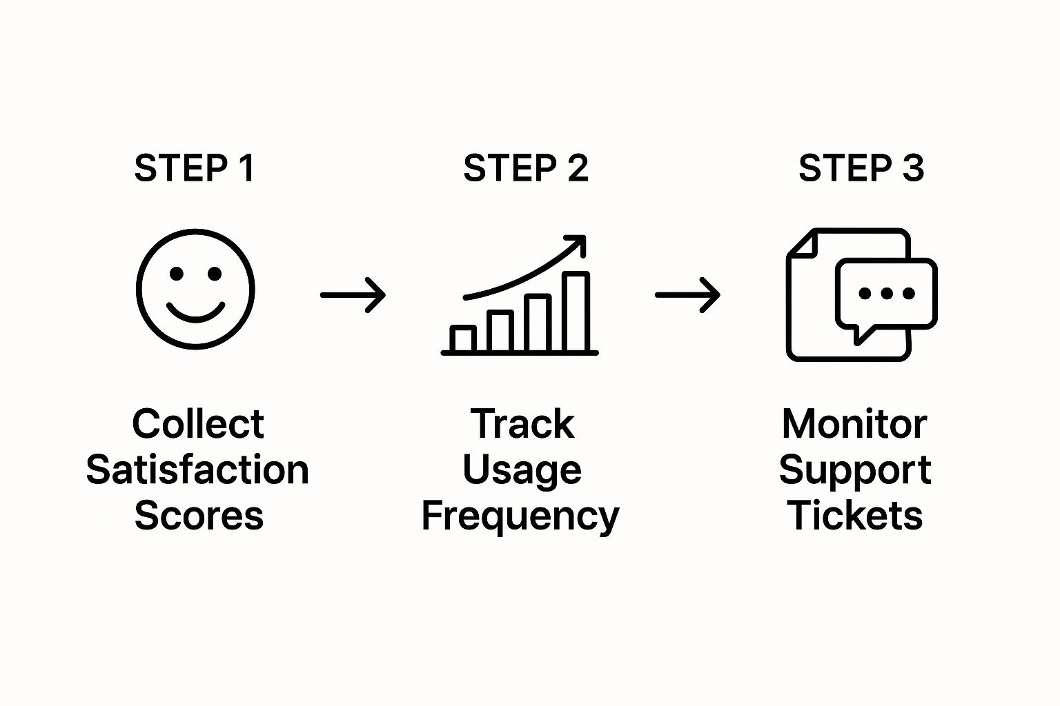
As it shows, a drop in satisfaction scores, less frequent product use, and more support tickets create a powerful signal that a customer is at risk.
Back at SyncUp, the team digs into their product analytics and strikes gold. They discover a direct correlation: Pro plan customers who didn't create a Team Dashboard within their first 14 days were four times more likely to churn within three months. This is their big insight—a concrete, measurable warning sign they can act on.
Step 4: Get the "Why" with Qualitative Feedback
Data tells you what is happening, but it rarely tells you why. For the full story, you have to talk to the people who left. Your quantitative data points you in the right direction, but it's the qualitative feedback that provides the rich, human context needed to build a solution.
Here are a few great ways to get that feedback:
- Exit Surveys: When a customer cancels, pop up a simple, one-question survey asking why they're leaving. Keep it short to get more responses.
- Churn Interviews: Reach out to a handful of recently churned customers and ask for a 15-minute call. Offering a small incentive, like a gift card, works wonders for participation.
The SyncUp team emails five recently churned Pro users and gets three on the phone. The feedback is crystal clear and consistent: they found the Team Dashboard feature "confusing to set up" and "didn't get the point of it during onboarding." This feedback directly confirms their hypothesis and explains the low adoption they saw in the data.
Now they have both the what and the why. Their analysis is complete, and they have a clear path to a targeted solution.
Predicting Churn Before It Happens
Why wait for customers to leave when you can see it coming? A truly powerful churn analysis doesn't just look in the rearview mirror; it looks ahead. The goal is to spot at-risk customers before they even think about canceling, giving you a priceless opportunity to step in and save the relationship.
This proactive approach relies on advanced analytical techniques. Instead of treating your entire customer base as a single, uniform group, these methods let you pick up on the subtle behavioral clues that a customer is slowly disengaging. It's about shifting your retention strategy from a defensive reaction to an offensive play.
Uncovering Hidden Patterns with Cohort Analysis
One of the most insightful ways to get ahead of churn is with cohort analysis. It’s a fancy term for a simple idea: grouping customers into "classes" based on when they joined. You might have a "January sign-ups" cohort, a "February sign-ups" cohort, and so on.
Tracking these specific groups over time helps you answer make-or-break questions:
- Do customers who join during a big holiday sale leave sooner than others?
- Did that major product update we rolled out in March actually improve retention for new users?
- Is there a consistent drop-off point, like month three, where we lose a lot of customers?
This method slices through the noise of your overall metrics. Instead of a single, blended churn number, you get a clear picture of how different groups behave. It shows you exactly how your marketing, product, or onboarding changes affect long-term loyalty, handing you a roadmap for what to fix and what to double down on.
Tapping Into AI and Machine Learning
The next frontier in predictive churn analysis is powered by artificial intelligence and machine learning. These systems are built to sift through massive amounts of customer data—way more than a human team ever could—to find the complex, often invisible, warning signs of churn.
An AI model can look at thousands of data points at once, connecting everything from login frequency and feature usage to the tone of a customer's support tickets. It then crunches all that information to create a highly accurate "churn risk score" for every single user.
This is where modern platforms really shine. They take all the heavy lifting of data science and turn it into simple, actionable insights you can use every day.
For example, an AI-driven platform like SigOS constantly monitors customer behavior from all corners of your business to pinpoint users who are showing signs of drifting away. The dashboard below gives you a sense of how these insights are visualized, highlighting specific problems and their direct dollar impact.

This level of detail lets you see not just who is likely to churn, but why they're unhappy and exactly how much revenue is on the line. By putting a price tag on user frustrations or ignored feature requests, these tools give your product and customer success teams the data they need to focus their energy where it counts most.
This predictive power is a complete game-changer. Forget waiting for an exit survey. Now, you can get a real-time alert when a high-value account’s product usage suddenly drops by 25%. That's your cue to launch a targeted retention campaign, offer some proactive support, or just reach out with a personal message right when it matters most. Your churn analysis transforms from a history report into a powerful guidance system for the future.
Common Churn Analysis Mistakes to Avoid
Doing a churn analysis badly can be worse than not doing one at all. It's like getting a faulty diagnosis from a doctor—the treatment won't just fail, it could actively make things worse. Bad data sends your teams down the wrong path, wasting time and money while the real problems continue to bleed customers.
Even with the best of intentions, it’s surprisingly easy to fall into a few common traps that can completely derail your strategy. Let's walk through the big ones so you can steer clear of them.
Relying on a Single Blended Churn Rate
This is probably the most common mistake in the book: looking at one company-wide churn number and stopping there. This single, blended metric averages out everyone—your brand new sign-ups, your loyal veterans, your high-ticket enterprise clients, and your low-cost SMB users—into a single number that hides more than it reveals. It tells you that the boat is leaking, but not where the hole is.
For example, you might see a 4% overall monthly churn rate and think things are okay. But what if you dug a little deeper? You might find that your enterprise clients have a rock-solid 1% churn rate, but your self-serve customers are churning at an alarming 15%. Without breaking down the numbers, you'd be completely oblivious to the fire raging in a huge segment of your business.
Key Takeaway: A single churn number is a vanity metric. Real, actionable insights only come from segmenting your data. You have to slice it by customer cohorts, pricing tiers, how they were acquired, and how they behave in your product to find the specific pockets of churn.
Confusing Correlation with Causation
Another classic trap is seeing two trends happen at the same time and assuming one caused the other. This is the age-old mix-up of correlation and causation, and it leads businesses to "fix" symptoms instead of the actual disease.
Imagine you notice that customers who don't use your "Advanced Reporting" feature have a much higher churn rate. The knee-jerk reaction is to push that feature on everyone, maybe with pop-ups and tutorials. But what if the real reason is that the users who need advanced reporting are your power users to begin with? Their deep engagement with your product is why they stick around, not their use of one specific feature.
To get to the root cause, you have to go beyond the surface-level data:
- Talk to people: Get on the phone with churned customers. Ask them about their experience and why they left.
- Run experiments: Before you overhaul your onboarding to push a feature, test your theory with an A/B test on a small group.
- Look for patterns over time: Analyze the sequence of events that lead up to churn, not just the snapshot right before it happens.
Ignoring the Impact of Customer Experience
It’s easy to get lost in product usage metrics and spreadsheets, but don't forget the human element. Time and time again, a poor customer experience turns out to be a massive driver of churn. Just look at industry benchmarks: media and professional services enjoy high retention rates of 84%, while sectors like hospitality and travel struggle at 55%.
Those numbers are closely tied to the quality of service. In fact, 59% of consumers say they'll walk away from a brand after several bad experiences. Focusing on improving that experience can slash churn by around 15%. You can dig into more stats on how customer experience impacts retention rates. If your churn analysis ignores things like support ticket response times, net promoter scores, or customer satisfaction surveys, you're missing a giant piece of the puzzle.
Common Questions About Churn Analysis
Even after you've got the basics down, a few practical questions always pop up when you're in the weeds of a churn analysis. Getting these answers straight can make the difference between a report that gathers dust and one that actually drives change.
Let's tackle some of the most common ones.
What’s a “Good” Churn Rate, Anyway?
This is the million-dollar question, and the honest answer is: it depends. There’s no universal magic number. A healthy churn rate is all about context—your industry, how mature your company is, and who you're selling to.
For a B2B SaaS company with an established product, an annual churn rate of 5-7% is a great benchmark. But if you’re an early-stage startup still figuring things out, your rate will naturally be higher. A 10% annual churn might be fantastic for a consumer subscription box but would signal a major problem for a business selling enterprise-level software. The key is to compare yourself to others in your specific niche.
How Often Should We Be Doing This?
For a full-blown, deep-dive analysis, think quarterly. This rhythm is frequent enough to catch worrying trends before they spiral out of control, yet it gives you enough time to gather a solid chunk of data so your insights are meaningful, not just statistical noise.
That said, you should absolutely keep an eye on your main churn metric every single month.
And a pro-tip: if you've just rolled out a big new feature or overhauled your pricing, don't wait for the next quarter. Run a focused analysis right away to see how customers are reacting. It’s the best way to know if your big move paid off or backfired.
Can We Actually Predict Which Customers Are Going to Leave?
Yes, absolutely. This is where churn analysis gets really exciting and moves from being a history lesson to a crystal ball. By tracking how customers behave—how often they log in, which features they use (or don't use), how many support tickets they file—you can build predictive models.
These models create a "churn risk score" for every single customer.
This is a game-changer. Instead of finding out why a customer left during an exit survey, your team can see the warning signs ahead of time. They can reach out to at-risk accounts with targeted help, turning a potentially lost customer into a loyal one. It's about getting ahead of the problem, not just reacting to it.
Ready to turn customer data into a predictable revenue engine? SigOS uses AI to analyze user behavior and pinpoint the exact issues driving churn, helping you prioritize the fixes that will have the biggest financial impact. Discover how to get ahead of churn at https://sigos.io.


Ready to find your hidden revenue leaks?
Start analyzing your customer feedback and discover insights that drive revenue.
Start Free Trial →