Data Driven Design Guide For SaaS Teams
Unlock data driven design to transform your SaaS product with proven metrics, frameworks, and a clear roadmap for higher conversion and retention.

Data driven design draws on user activity and analytics to create more focused product experiences. By treating metrics like design assets, teams confirm features quickly and map out reliable roadmaps.
Understanding Data Driven Design

Imagine your product as a car and data as the dashboard. Instead of guessing which way to turn, you follow clear indicators—like speed and fuel gauges—to stay on course. This approach unites everyone around measurable goals.
By converting raw numbers into design cues, you move beyond gut instinct. You translate customer interviews into experiments you can test, keeping risks low and confidence high.
Data Driven Design In Plain Language
Put simply, it’s letting numbers guide design rather than relying on intuition alone.
- Like a chef tasting and tweaking seasoning until the flavor is just right
- Like an athlete adjusting their training plan based on tracking performance
This shared vocabulary lets product, design, and engineering teams zero in on the metrics that matter for growth.
When Acme SaaS rolled out a revamped onboarding flow, they tracked click paths and time-to-first-action. The team spotted a drop-off at step three and refined the copy and layout. As a result, activation rates doubled within six weeks.
Key benefits include:
- Faster feature validation with real user data
- Predictable roadmaps driven by measurable goals
- Continuous improvement through ongoing experiments
Metrics are the compass that guides design and reduces guesswork.
How Data Driven Design Complements Research
By layering quantitative signals on top of qualitative insights, you see both the what and the why behind user actions.
- Qualitative feedback from interviews and surveys pinpoints pain points
- Quantitative data from analytics and tracking reveals behavior patterns
Why Metrics Matter
Metrics give teams a common language. 68% of SaaS teams report faster launches when they anchor decisions in quantitative data. Clear targets replace endless debates.
- Activation Rate tracks how many new users reach a key milestone
- Retention Curve shows how long customers stick around
- Churn Rate highlights where to double down on improvement
Preview Of The Guide
This guide moves from basic ideas to hands-on steps, with real examples you can apply immediately.
- Core concepts that define data driven design
- Essential metrics and decision frameworks for prioritization
- A step-by-step roadmap covering data sources and instrumentation
- How SigOS and other platforms automate insights and experiments
- Common pitfalls to avoid and ways to prove ROI
Ready to shift toward a metrics-led mindset? Let’s dive in.
Historical Evolution Of Data Driven Design
Picture a time when design choices came from gut feelings and guesswork. Now, imagine swapping that out for cold, hard evidence. That shift didn’t happen overnight—it started with a London physician in 1854.
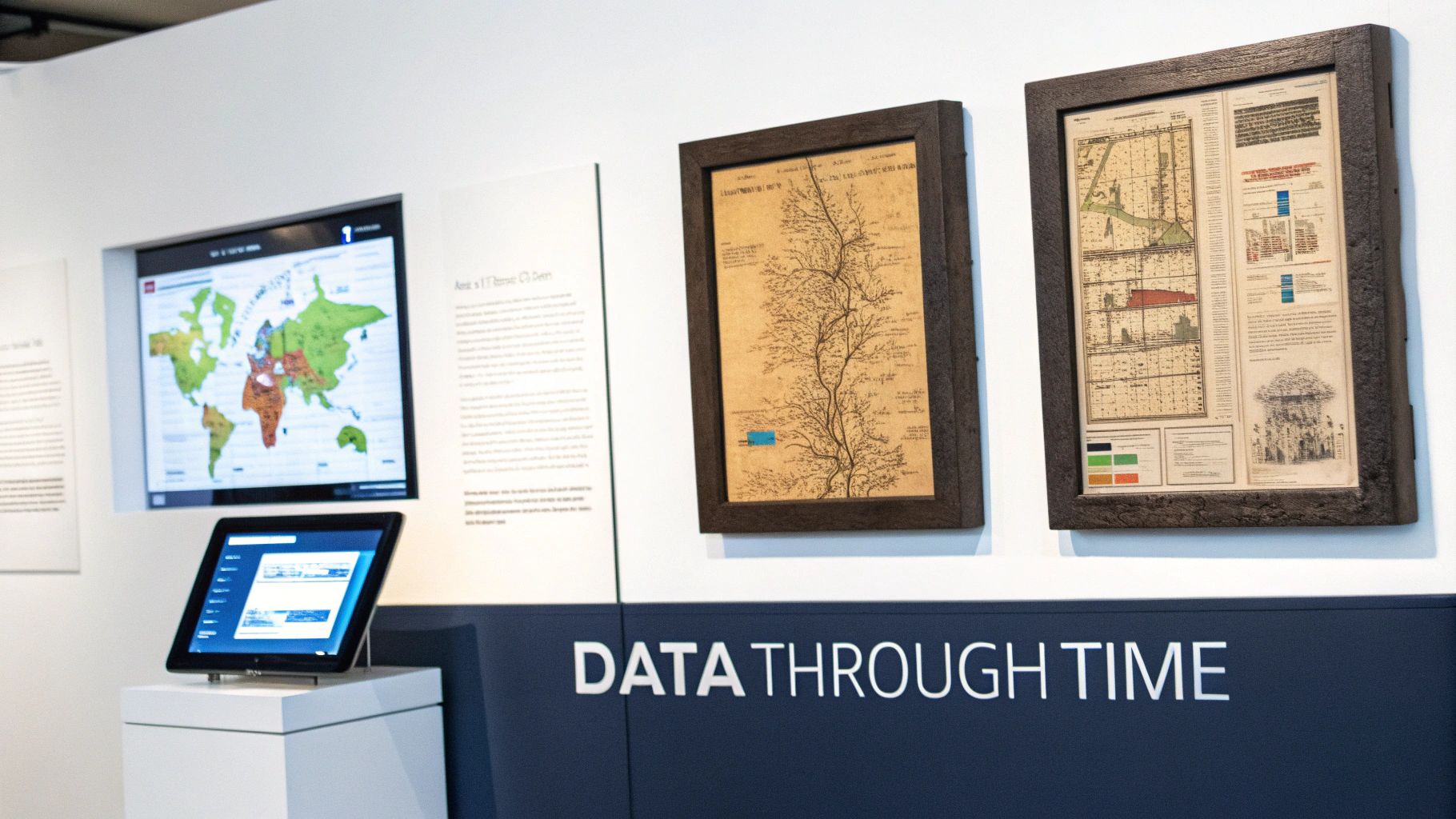
Dr. John Snow plotted cholera outbreaks on a map, spotting a deadly pattern around a single water pump. His visual analysis led to one of the earliest victories for data-driven decisions in public health.
"Design decisions anchored in maps saved lives and set a precedent for data driven design."
Relational Database Era
By the late 1970s, companies needed more structure than paper logs. Enter relational databases. Suddenly, designers and analysts could query user records on demand instead of digging through scattered notes.
- Queryable Storage of user interactions
- Oracle’s RDBMS release in the late 1970s
- Systematic Access replaced ad hoc logs
This was more than a technical milestone. Structured data became a common language for software teams. Around 90% of the world’s data was generated in the two years leading up to the mid-2010s, and IBM estimated roughly 2.5 quintillion bytes per day. That explosion set the stage for metric-driven design loops. For a closer look at how data architecture evolved, see this brief history of data architecture.
Telemetry And Cohort Analytics
Fast-forward to the mid-2010s: SaaS teams grew tired of monthly reports and started measuring continuously. Event-tracking SDKs captured every click and scroll. Dashboards broke down users into cohorts for side-by-side comparisons.
- SDK Adoption powered rapid event collection
- A/B Testing Platforms made experimentation easy
- Analytics Warehouses handled massive historical data
Designers learned to treat each feature release like a drill—tweak, measure, then tweak again. Those real-time feedback loops became the backbone of modern product development.
Setting The Stage For Experimentation
Layering structured data over design processes changed everything. Suddenly, every UI tweak had a clear performance score. Teams went from artistic leaps of faith to small, predictable steps forward.
"Continuous measurement shifts design from art to predictable, data guided iterations."
Today, platforms like SigOS stitch together tracking, analytics and experimentation into a single thread. That automated workflow is the natural evolution of John Snow’s ink-on-paper map. Next, we’ll dive into why embedding metrics into every design choice pays off—both in user delight and business results.
Why Data Driven Design Matters For SaaS Teams
In a well-oiled product team, decisions don’t hinge on hunches but on real-time signals. When raw user activity transforms into clear dashboards, every feature choice feels more like steering with confidence than shooting in the dark.
Teams that embrace this approach often cut their analysis cycles by 50% and see a 30% drop in release failures. Experimentation stops being a gamble and becomes part of the daily rhythm.
Pairing hard metrics with customer stories adds crucial context. That combo can lift conversion rates by 15% and extend user lifecycles by significant margins.
- Faster feature tuning driven by actual usage
- Reduced launch risk through validated assumptions
- Better conversion via quick iterations
- Stronger retention thanks to ongoing user feedback
Flight Deck Analogy
Think of piloting a jet with instrument delays. You’d be constantly overcorrecting, chasing outdated readings. In data driven design, dashboards update continuously, so the team knows exactly when to pivot.
Monitoring key signals—like activation and churn—in a single view turns multi-day debates into decisions made in hours.
Metrics replace guesswork and guide every product turn
- Qualitative Only leads with interviews and focus groups
- Data Driven Design blends metrics, experiments, and user narratives
Numbers And Narratives
A screenshot of a user session might show confusion, but pairing that with a 20% drop-off rate pinpoints where things go wrong. By mapping interview pain points to abandonment spikes, teams uncover the full story.
| Workflow Type | Outcome |
|---|---|
| Qualitative Only | Subjective insights |
| Metrics Enhanced | Data-backed product changes |
This table makes it clear: data driven design turns opinions into testable experiments with measurable goals.
Building A Measurement Culture
It starts with shared targets. When product, design, and engineering rally around activation and retention, everyone knows what success looks like.
Live dashboards and regular check-ins keep those objectives front and center. Small, rapid experiments stack up into double-digit growth over time.
A culture of measurement unlocks incremental gains
SaaS leaders report that embedding data driven design as a core practice aligns teams and fuels innovation. 73% of users engage more when features are tuned with real data.
Case Study
Acme Metrics integrated SigOS to unify error rates and feature requests in one view. Within weeks, they spotted a major signup friction point and revamped that flow. Activation then climbed by 40%, showcasing how metric-led tweaks pay off fast.
- Define clear success criteria before each test
- Record hypotheses and outcomes for team reference
- Feed insights into weekly planning sessions
Adopting data driven design turns uncertainty into clear opportunities. Your SaaS team gains a deeper understanding of user needs, aligns around concrete metrics, and unlocks growth that scales one release at a time.
Essential Metrics And Frameworks For Data Driven Decisions
Think of data driven design as the dashboard in a car—you need clear readouts to know whether to speed up, slow down, or take a pit stop. Metrics become those gauges, guiding every feature tweak and experiment.
Without a set of reliable indicators—Activation Rate, Retention Curve, Churn Rate, and ARPU—you’re essentially driving blind. Each metric plays a specific role, helping you decide where to invest effort and where to apply the brakes.
Key Design Metrics Comparison
Below is a quick reference to the most critical metrics in a data driven design workflow. Use it to keep your team aligned and focused on what really moves the needle.
| Metric | Definition | When To Use |
|---|---|---|
| Activation Rate | Share of users who hit a key milestone after signup | During onboarding optimization |
| Retention Curve | Percentage of users staying active over time | For post-launch health checks |
| Churn Rate | Proportion of users who cancel or stop engaging | In subscription-risk reviews |
| ARPU | Average revenue generated per user in a given period | When testing pricing and packaging |
This table turns abstract numbers into clear signposts, so you can skip endless debates and jump straight to action.
Prioritization Frameworks
• RICE scores ideas by Reach, Impact, Confidence, and Effort—ideal for weighing big bets.• ICE ranks concepts on Impact, Confidence, and Ease, perfect for rapid-fire decisions.• OKRs tie every initiative to Objectives and Key Results, keeping feature work aligned with broader goals.
For instance, one SaaS team used a simple RICE spreadsheet to shrink a three-hour debate into a ten-minute score session—and unlocked their next high-impact experiment instantly.
“A repeatable scoring model turned lengthy meetings into action items,” recalls a product lead.
Many teams blend these frameworks—ICE for sprint planning and OKRs for quarterly roadmaps—to strike a balance between speed and strategy.
Applying Metrics And Models
Start by mapping each feature idea to the metrics that matter most:
- Identify your top three metrics.
- Assign RICE or ICE scores based on historical data and team consensus.
- Align the highest-scoring ideas with your quarterly OKRs.
This step-by-step approach creates a transparent trail from concept to launch, ensuring every experiment moves you closer to measurable goals.
Large platforms that run thousands of A/B tests each year find that small lifts—often low single digits—add up into double-digit annual revenue gains. Industry forecasts estimate the analytics market topped $200 billion by 2020 and grew at about 10% CAGR into the 2020s. Learn more about big data growth and experimentation benefits on TechTarget.
For a deeper dive into how retention curves fuel growth, check out our customer retention metrics guide.
Linking your frameworks back to core metrics prevents drift and keeps teams zeroed in on the outcomes that matter.
Tips For Effective Scoring
- Validate your data sources so you’re not basing decisions on noise.
- Keep your scoring scale consistent; shifting scales breed confusion.
- Revisit your framework criteria regularly to mirror evolving priorities.
- Document the rationale behind each score to keep everyone on the same page.
These practices help your scoring models stay dependable and actionable.
By arming your team with these core metrics and decision frameworks, you pave the way for design cycles driven by real data. Swap opinions for evidence, accelerate learning loops, and roll out user experiences that drive continuous, measurable improvement.
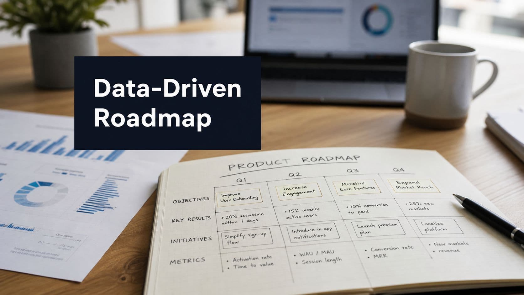
Stepwise Roadmap For Implementing Data Driven Design
Getting design decisions anchored in real data doesn’t have to be a shot in the dark. In 5 clear phases, your team can move from ad-hoc tests to a well-oiled, metrics-driven cycle. Each step builds on the last, taking you from raw event logs to real-time dashboards—and real impact.
Below is a high-level snapshot of each phase:
Roadmap Steps For Data Driven Design
| Step | Key Activities | Expected Outcome |
|---|---|---|
| 1 | Integrate event tracking and CRM mapping | Full visibility into user behavior |
| 2 | ETL and pipeline deployment | Fast, reliable metric updates |
| 3 | Cohort reports and retention analysis | Identified high-value user segments |
| 4 | Scoring models for feature prioritization | Decisive selection of experiments |
| 5 | Dashboard setup and governance rituals | Continuous feedback and alignment |
This table lays out how each stage lays the groundwork for the next. Now let’s dig into the details.
Integrate Event Tracking
First, hook into front-end and back-end code so every click, page view, and key action is recorded. Use tools like Segment, Mixpanel, or your own SDK to capture events reliably.
Mapping those events to user profiles in your CRM connects behavior back to accounts. It’s the difference between guessing and knowing which design tweak moved the needle.
- Adopt a clear naming convention for events
- Validate event fires with debugging tools before going live
- Document each event schema in a shared wiki
Build Analytics Pipelines
Once events flow in, you need to clean, enrich, and load them into an analytics store. Batch ETL jobs handle your historical backlog, while streaming pipelines keep insights fresh.
Maintain versioned schemas so changes in event structure don’t break your dashboards. A stable pipeline can cut analysis time by 50%, letting designers get feedback in hours instead of days.
- Pick a data warehouse that scales under heavy query loads
- Use change-data-capture to protect production systems
- Automate alerts for schema mismatches or job failures
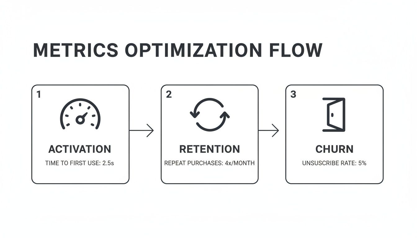
Run Cohort Analysis
Grouping users by behavior or demographics uncovers patterns that raw metrics can mask. Retention curves, for example, reveal whether a tweak drives lasting engagement or just a quick spike.
Cohort work helped one team spot a drip campaign that lifted retention by 12%. Visualizing side-by-side cohorts makes gains—and leaks—hard to ignore.
The following infographic maps activation, retention, and churn stages in a horizontal process flow.
Prioritize With Scoring Models
With all the numbers in front of you, a repeatable framework keeps debates from getting personal. Use RICE when you’re sizing up big bets months out, or ICE for quick-turn experiments.
- Score Reach by the number of users affected
- Estimate Impact from past data or similar tests
- Gauge Confidence based on data quality and team buy-in
- Track Effort in developer-hours to build and instrument
This disciplined scoring can slash meeting time and speed you straight into experiments.
Establish Feedback Loops
By now you have real-time dashboards showing experiment results as they land. Configure alerts for sudden drops in key metrics so regressions never slip by.
- Send Slack or email alerts for urgent metric shifts
- Hold a weekly chart review with designers, PMs, and engineers
- Log findings in a shared space to build collective memory
Regular governance meetings and a public roadmap keep priorities transparent. Revisit your scoring criteria quarterly as product goals shift. For a ready-to-use framework, check out our technical roadmap template on SigOS.
By following this roadmap, data-driven design becomes a repeatable habit—not a one-off project.
How Product Intelligence Platforms Drive Data Driven Design
Imagine a single workspace where analytics and design work hand in hand. Teams spend less time digging through spreadsheets, launch experiments in record time, and rally around a clear set of metrics.
At its heart, this toolkit covers every step of the data-driven design cycle:
- Unified event tracking across web and mobile to capture every user interaction
- No-code experiment setup so teams can spin up tests in minutes
- Prebuilt KPI templates for activation, retention, conversion, and more
- Customizable dashboards that blend data-warehouse feeds with BI visualizations
Streamlining Event Tracking
A unified tracking layer replaces manual tagging and tool-hopping. Engineers instrument key actions just once, and those events flow automatically into analytics and BI systems. This guarantees everyone sees the same numbers—whether in a quarterly report or a daily standup.
Common integration patterns include:
- Server-side pipelines that stream data to warehouses in near real time
- SDKs forwarding events to both analytics engines and product intelligence suites
- BI connectors that sync processed metrics into familiar reporting tools
No-Code Experimentation And Dashboards
Visual editors turn A/B test creation into a drag-and-drop exercise. As soon as a test is live, prebuilt dashboards surface results alongside your core metrics. Designers, engineers, and analysts gather in one workspace to interpret findings and chart next steps.
Teams reduced manual analysis by 70% and launched experiments in hours instead of days
One fintech startup swapped spreadsheets for live dashboards. In just one week, they tested three onboarding flows and saw a 25% lift in activation. All the while, events streamed directly into Snowflake and Tableau—no extra ETL required.
You might be interested in reading more about product intelligence platforms in our guide on SigOS product intelligence platform
Ensuring Single Source Of Truth
When data pipelines are centralized, silos vanish and version conflicts become a thing of the past. Analytics teams feed clean event streams into BI tools and SQL clients. Designers pull from the same dataset that developers rely on in their monitoring dashboards.
Over the last decade, data-driven design has gone from niche practice to organizational standard. Global data volumes jumped from 4.4 zettabytes in 2013 to a projected 175 zettabytes by 2030—a nearly 40x surge that puts empirical measurement at the core of every design debate. The big-data and analytics market swelled from about 193 billion in 2019 to forecasts of ****240–420 billion in the mid-to-late 2020s, fueling analytics teams and experimentation infrastructure.
Learn more about data driven transformation on HDR Inc insights
Aligning Teams With Data Driven Design
Product managers, designers, and analysts all tap into the same dashboards, so priorities stay aligned. Rapid feedback loops and chart reviews turn insights into immediate design tweaks that push KPIs forward. Teams report a 33% reduction in time spent aligning cross-functional goals when everyone shares a single analytics workspace.
Common Pitfalls And Measuring ROI In Data Driven Design
When teams dive headfirst into dashboards, they often end up drowning in data. It’s like staring at a map without a compass—every point seems critical and nothing feels clear.
This overload leads to analysis paralysis, where decisions grind to a halt while stakeholders debate every number. Meanwhile, some leaders chase vanity metrics such as page views or social likes, completely missing how those figures tie back to real outcomes.
To stay on track, establish clear success criteria before you look at any report. Focus on metrics that matter—think conversion rate, average order value, or revenue impact.
- Analysis Paralysis: Stops progress. Agree on a threshold that signals “time to decide.”
- Vanity Metrics: Distract from genuine goals. Zero in on revenue impact or user retention.
- Data Quality Gaps: Lead to misleading insights. Schedule routine audits to catch missing or inconsistent events.
Strategies To Overcome Pitfalls
Treat your data pipelines like a codebase: document every event schema and run regular health checks. When tracking is airtight, you avoid chasing false positives.
Opt for small, scoped experiments that are easy to interpret. Low-risk tests give you quick feedback and build confidence in your approach.
• Define success metrics before you start• Audit data flows for completeness and accuracy• Keep experiments to minimal viable changes• Celebrate and share early wins across teams
With disciplined habits like these, you’ll sidestep the usual traps and turn raw data into clear, actionable insights.
Measuring ROI With Small Gains
Even a 1–2% lift per test scales quickly on a 1,000,000 revenue base. A single experiment could produce ****10,000 to $20,000 in extra earnings.
| Metric | Base Revenue | Lift Value |
|---|---|---|
| 1% | $1,000,000 | $10,000 |
| 2% | $1,000,000 | $20,000 |
Run ten of these micro-improvements and you’re looking at up to $200,000 in additional revenue. Simple control-group comparisons and a lightweight dashboard keep these numbers visible in real time.
“Tiny wins accumulate into major impact,” recalls a product leader who achieved a 15% annual uplift through relentless, small-scale testing.
By calculating ROI for each experiment, you make a clear case for data-driven design. Share those dashboards with stakeholders, tie every metric back to a business result, and review success criteria quarterly as priorities shift.
Keep feedback loops tight by discussing outcomes in regular team rituals. Document every experiment in a shared tracker so everyone stays aligned.
Ready to prove ROI and avoid common pitfalls? Try SigOS: SigOS

Ready to find your hidden revenue leaks?
Start analyzing your customer feedback and discover insights that drive revenue.
Start Free Trial →