Build a Feature Prioritization Matrix That Drives Growth
Learn how to build a feature prioritization matrix that aligns your roadmap with real business goals. This guide covers criteria, scoring, and common pitfalls.

A feature prioritization matrix is a powerful tool for one simple reason: it forces you to stop guessing and start making strategic, data-informed decisions. It provides a clear, objective framework for weighing a feature's potential value against the effort needed to build it, ensuring you invest your limited resources where they'll make the biggest splash.
Move Beyond Guesswork in Your Product Roadmap
Let's be real. We've all been in planning meetings where the "loudest voice in the room" wins, or where a "cool idea" from an executive suddenly jumps to the top of the backlog. This kind of gut-feel prioritization is a recipe for disaster, and it's costing your company more than you think. Your product backlog becomes a chaotic junk drawer of stakeholder requests, low-impact bug fixes, and pet projects with no clear tie to your actual business goals.
The result is almost always the same predictable, painful outcome.

This subjective approach to planning directly leads to several major headaches for product teams:
- Wasted Engineering Hours: Your developers burn through entire sprints building things that barely move the needle on key metrics. This isn't just inefficient; it's a huge morale killer.
- Features Nobody Uses: The team ships a feature that a single, influential stakeholder championed, only to watch it collect dust because actual users don't care about it.
- Growing Market Disconnect: When you consistently prioritize internal opinions over genuine customer needs, a dangerous gap forms between your product and what the market actually wants.
The Shift to Objective Decision-Making
A feature prioritization matrix isn't some overly complicated process meant to bog you down in bureaucracy. Think of it as a practical tool that brings much-needed clarity, objectivity, and strategic alignment to your technical roadmap template. It forces a crucial conversation by balancing customer value against development effort, helping you spot costly mistakes before a single line of code is written.
This framework makes you ask the hard questions. Is this new feature a true "quick win" that delivers high value for low effort? Or is it a "money pit" that will suck up resources for months with little to show for it? To truly stop guessing, understanding how to prioritize product features with a structured method is essential.
While the core idea came from Six Sigma, its adoption exploded after 2010 as digital project management tools became standard. By 2025, an estimated 78% of enterprise SaaS product teams were using some form of prioritization matrix. Why? Because the old way was demonstrably failing. Studies from that time revealed that teams relying solely on executive intuition wasted around 30-40% of their development resources on features that completely missed the mark.
Gut-Feel vs Data-Informed
The move from subjective hunches to an objective framework is a fundamental shift. To see just how different the two approaches are, let's break it down.
Gut-Feel vs Data-Informed Prioritization
| Aspect | Subjective Prioritization ('The Old Way') | Matrix-Driven Prioritization ('A Better Way') |
|---|---|---|
| Decision Driver | Opinions, loudest voice, "gut feeling" | Standardized criteria, data, user feedback |
| Team Alignment | Low; decisions feel arbitrary and top-down | High; everyone understands the "why" |
| Resource Allocation | Inefficient; high risk of wasted effort | Optimized; focused on high-impact initiatives |
| Business Outcomes | Hit-or-miss; unpredictable growth | Consistent; tied directly to strategic goals |
| Stakeholder Convos | Contentious debates, defending opinions | Productive collaborations, discussing data |
Ultimately, a matrix gives you a system for making transparent, defensible decisions. It becomes your single source of truth that gets everyone, from engineering to sales, on the same page. When you can clearly show why a feature is next on the roadmap, difficult conversations with stakeholders transform into productive collaborations. That alignment is just as valuable as the priority list itself.
By putting a feature prioritization matrix in place, you empower your team to build a product that doesn't just have more features—it has the right features. The ones that solve real problems for your customers and create sustainable, long-term growth.
Choose Prioritization Criteria That Matter
A feature prioritization matrix is only as good as the criteria you feed it. Let’s be honest: if you’re scoring ideas against a vague metric like "business value," your results will be just as fuzzy. The real goal here is to build a framework on a foundation of concrete, measurable criteria that tie directly back to what your company is trying to achieve. This is where high-level strategy gets translated into an actionable scoring system.
Don't just pull a list of buzzwords out of thin air. You need to group your criteria into themes that reflect what truly moves the needle for your business. For most SaaS companies, this usually boils down to a few key areas.
Define Your Core Categories
The first step is to identify the main pillars of your product strategy. Most of the successful teams I've worked with build their matrix around three core themes:
- Revenue Growth: How, specifically, does this feature make us more money? This could mean anything from landing new deals and upselling existing customers to unlocking new markets.
- Customer Retention: How does this feature make our product stickier and keep customers from leaving? It’s all about boosting user satisfaction, solving painful problems, and making your platform indispensable.
- Strategic Fit: How does this idea align with our long-term vision? This bucket can include things like gaining a competitive edge, paying down tech debt to move faster later, or supporting a big marketing push.
Starting with these broad categories ensures you’re evaluating every feature against a balanced set of goals. A feature might not be a revenue-generator, but if it slashes your churn rate, it could be one of the most valuable things you build all year.
Translate Categories into Actionable Metrics
Once you’ve got your categories, it's time to break them down into specific, quantifiable questions. This is how you get from abstract concepts to objective scores and take the guesswork out of the process.
For example, under Revenue Growth, instead of a generic "value" score, ask pointed questions like:
- Will this feature help us close deals currently stuck in the sales pipeline?
- Does this create a clear upsell path for a specific customer segment?
- Will this feature attract a new user persona we're actively targeting?
Do the same for Customer Retention:
- How many support tickets will this feature realistically resolve each month?
- Does this address a top reason for churn we’ve seen in exit surveys?
- When selecting robust criteria for your feature prioritization matrix, consider metrics like the Customer Lifetime Value (CLTV) to focus on the long-term impact of product decisions.
A common mistake is to over-index on acquiring new customers while neglecting the ones you already have. Retention-focused criteria ensure you're shoring up your existing revenue base, which is almost always more cost-effective than acquiring new logos.
This level of detail makes prioritization meetings infinitely more productive. Instead of debating abstract ideas, your team can point to tangible evidence.
Incorporate Real-World User Data
The most powerful criteria are always the ones informed by actual user behavior and feedback. A modern approach blends qualitative feedback with quantitative signals to create a truly data-backed matrix. This is where frameworks like Jobs to be Done (JTBD) are incredibly helpful. By understanding the "job" a customer is trying to get done, you can more accurately evaluate how a feature helps them succeed. You can find out more about putting this into practice with our Jobs to be Done template.
For instance, a project management SaaS company I know discovered that "generating executive status reports" was a massive pain point for its users. In fact, a whopping 55% of their customer base reported struggling with this task.
By adding Customer Effort Score (CES) to their matrix, they could directly quantify the impact of this friction. Their analysis showed that solving this specific workflow could prevent churn for up to 8-12% of their customers annually. That data instantly transformed a vague feature request into a clear, revenue-linked priority.
When you define your criteria with this level of rigor, your matrix becomes more than just a planning tool—it becomes a strategic asset. It gives you a defensible, data-backed foundation for every product decision you make, ensuring your team is always focused on what matters most.
How to Build Your First Prioritization Matrix
You've figured out your criteria. Now it's time to roll up your sleeves and put that thinking into practice. Forget about fancy, expensive software for a minute. The best way to build your first feature prioritization matrix is with a simple spreadsheet.
Starting with a basic spreadsheet forces you to understand the mechanics of prioritization firsthand. It's a hands-on way to get a feel for the process and tweak it to fit your team's unique rhythm before you even think about dedicated tools. Let's walk through how to turn that messy backlog into a clear, actionable plan.
Setting Up Your Spreadsheet
Pop open a new Google Sheet or Excel file. The goal here is clarity, not complexity. You just need a few columns to get the ball rolling.
- Feature/Initiative: This is for your list of ideas, bug fixes, or new features. Make the names descriptive enough that a teammate can understand it at a glance without needing a full explanation.
- Description: Add a short, one-sentence summary. What is it, and what problem does it solve?
- Criteria Columns: Now, create a separate column for each of the criteria you decided on earlier. Think "Revenue Growth," "Customer Retention," "Strategic Fit," and of course, "Effort."
- Total Score: This will be your final, calculated column. It’s where the magic happens.
That's it. This simple structure is the foundation for everything that comes next.
Choosing a Scoring Scale
Okay, now for the important part: how do you actually score these things? You need a consistent scale to quantify the value and effort for each feature. Most teams I've worked with land on one of two popular methods.
First, there’s the simple 1-10 scale. It’s intuitive and easy to grasp. A 1 means minimal impact or effort, while a 10 represents the maximum. No one needs a long explanation to start using it.
The other common approach is using the Fibonacci sequence (1, 2, 3, 5, 8, 13...). If you've been around Agile development, this will feel familiar. The beauty of this scale is that the growing gaps between numbers force you to make tougher, more deliberate choices. It’s a great way to prevent everyone from just scoring every feature a 6 or 7.
My advice? Start with the Fibonacci sequence. It might feel a bit weird at first, but you'll quickly see how it creates a much clearer separation between what's truly a priority and what's just "nice to have."
This flow chart really nails down how you should be thinking about your criteria before you even get to scoring.
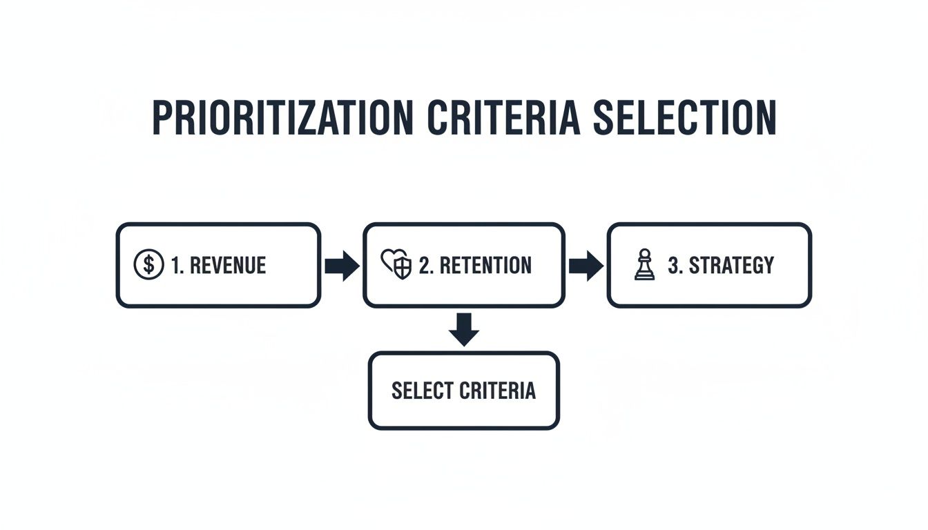
Starting with high-level business goals and breaking them down into specific criteria is what makes a matrix reliable.
The Power of Weighted Scoring
Let's be real: not all criteria are created equal. Depending on your company's quarterly goals, retaining existing customers might be far more important than acquiring new ones. This is where weighted scoring comes in—it’s a simple technique to make sure your matrix reflects what's most important right now.
Here’s how you do it:
- Assign Weights: Distribute 100% across your criteria. If customer retention is the big push this quarter, maybe you give it a weight of 50%. Revenue growth could get 30%, and strategic fit the remaining 20%.
- Calculate Weighted Scores: The math is straightforward. For each feature, you multiply its raw score by the criterion's weight. So the formula looks like this:
(Revenue Score * 30%) + (Retention Score * 50%) + (Strategic Fit Score * 20%). - Factor in the Effort: The "Effort" score is handled differently—it's the cost. You divide your total value score by the effort. The complete formula is:
Total Weighted Value Score / Effort Score.
This final calculation gives you a single, powerful number for each feature: a priority score. A higher score means a feature delivers more strategic value for less effort—the essence of effective prioritization.
Bringing It All Together: An Example Matrix
Let's see how this plays out with a quick example. Imagine a SaaS company trying to decide between three potential features.
| Feature | Revenue Growth (Score) | Retention (Score) | Effort (Score) | Final Priority Score |
|---|---|---|---|---|
| AI-Powered Reporting | 8 | 5 | 13 | 4.92 |
| New Integration | 5 | 3 | 5 | 4.20 |
| UI Refresh | 2 | 8 | 3 | 14.00 |
Weights Applied: Revenue (30%), Retention (70%)
Whoa. The "UI Refresh," which might have been dismissed as a minor tweak, shoots straight to the top of the list. Why? Because it scored an 8 on the heavily weighted 70% retention criterion and was a super low-effort task (3). This is a classic "quick win" that a non-weighted system would have totally missed. The big AI feature is still valuable, but it’s a massive project that can wait.
If you find yourself wanting more structure or different frameworks, there are some fantastic tools for product managers that can help formalize this process.
By building this simple feature prioritization matrix, you’ve done more than just rank items on a list. You’ve created a living document for communication, team alignment, and strategic decision-making. It becomes your single source of truth for answering that critical question: "What should we build next?"
A Real-World Feature Prioritization Story
Frameworks and theories are great, but nothing beats seeing a prioritization matrix in the wild. Let me tell you about a mid-sized B2B SaaS company I worked with—we’ll call them “ConnectSphere”—that was completely swamped by a bloated backlog and conflicting demands from every team. Their roadmap was less of a strategic plan and more of a chaotic wishlist.
The sales team was always pushing for one-off features to close their next big deal. The marketing lead wanted a splashy new integration to generate some buzz. And, of course, the CEO had a "visionary" project that was sucking up engineering time with no clear customer demand to back it up. The product team was stuck in the middle, trying to keep everyone happy but failing to make real progress on anything.
From Chaos to Clarity
The team finally had enough and decided to build a weighted feature prioritization matrix. They sat down and agreed on what actually mattered to the business: Revenue Impact (weighted at 40%), Customer Retention (40%), and Strategic Alignment (20%). For the very first time, every single feature, idea, and request had to pass through the same objective filter.
The results were eye-opening, almost immediately. That pet project from the CEO? The ambitious AI-powered analytics module? It scored high on "Strategic Alignment," but tanked on immediate "Revenue Impact" and "Retention." The real killer was the effort score: a whopping 13. Its overall priority plummeted.
On the other hand, a handful of small, unglamorous fixes that customers had been begging for shot straight to the top. Things like improving CSV export formatting and adding better user permission controls. Their revenue scores were modest, but they both hit a 10 for retention because they addressed the most common complaints in support tickets. Best of all, their effort scores were tiny—mostly 2s and 3s.
This is where having the right data becomes a game-changer. A platform like SigOS can connect these user pain points directly to revenue and churn risk, giving you a clear signal on what to tackle first.
Just looking at a dashboard like this, you can see how a seemingly minor issue like "Dashboard Lag" could be putting a huge chunk of your recurring revenue at risk. That makes it a much higher priority than some shiny new feature.
From Matrix to Market Impact
This matrix became so much more than just a ranked list; it transformed how the team communicated. The product manager no longer had to just say "no" to the CEO. Instead, she could walk him through the data and show why his project was being deprioritized. It immediately shifted the conversation from a battle of opinions to a collaborative discussion about shared business goals.
The team rallied around the quick wins the matrix uncovered. The impact was huge.
- They shipped a release packed with these high-impact fixes and saw a 15% drop in support tickets in just one quarter.
- By focusing engineering on low-effort, high-value tasks, they pushed the release out 25% faster.
- The sales team suddenly had solutions to problems that had been stalling several major enterprise deals for months.
This isn't just a one-off story. A major tech company I followed had the exact same experience. Their matrix revealed that executive-backed features consistently landed in the 'Low Value/High Effort' quadrant, while simple user-requested items filled the 'High Value/Low Effort' sweet spot. By trusting the data, they accelerated their time-to-market by 30-35% and cut development costs by around 25%. As you can see when exploring the Six Sigma approach to prioritization, these frameworks are designed to remove bias and politics so you can focus your limited resources on what actually moves the needle.
The greatest value of the feature prioritization matrix isn't just the final score. It's the shared understanding and strategic alignment created during the process of building it.
ConnectSphere’s experience proves that a matrix isn't a magic calculator. It’s a tool for turning difficult, opinion-driven arguments into productive, data-informed conversations. It gave them a clear, defensible roadmap that finally got the entire company pulling in the same direction and, most importantly, shipping things their customers actually wanted.
Common Mistakes to Avoid With Your Matrix
So, you’ve built a feature prioritization matrix. That’s a fantastic step toward making objective, data-informed decisions. But here's the honest truth: creating the spreadsheet is the easy part. The real challenge, and where I see so many teams stumble, is actually using it day-in and day-out.
A matrix is an incredibly powerful tool, but a few common missteps can turn it from a source of clarity into a source of chaos. It's not just about the numbers; it's about navigating the very human side of product development.

Let’s walk through the most common pitfalls I've seen over the years and, more importantly, how to sidestep them.
Treating the Matrix as a One-Time Task
This is probably the biggest mistake I see. A team will pour a ton of energy into building a beautiful, perfectly weighted matrix, use it to plan a single quarter, and then... it just sits there, gathering digital dust. This completely defeats the purpose.
Your market doesn't stand still. Customer needs evolve, and strategic goals shift. A matrix built in January is almost certainly out of date by June.
The fix is simple: make it a living document.
- Set a Cadence: Schedule a quarterly re-scoring session on the team calendar. This rhythm lines up perfectly with most business planning cycles and forces you to keep the matrix relevant.
- React to Triggers: Don't just wait for the quarterly meeting. A major competitor launch, a sudden change in company strategy, or fresh market research should all trigger an immediate review of your priorities.
Letting Personal Bias Creep Into Scoring
Even with the best criteria, we're all human. It’s natural to score our own ideas or a powerful stakeholder’s pet project a little bit higher. This kind of unconscious bias can quietly dismantle the objectivity you're trying to build, especially if one person does all the scoring.
The antidote is collaboration. Make scoring a cross-functional exercise. Pull in people from engineering, sales, customer support, and marketing.
When different departments score features independently and then you all discuss the differences, that’s where the magic happens. You start to uncover hidden blind spots and build a much richer, more accurate picture of a feature's true value.
An engineer's surprisingly low score on a feature might reveal a massive technical dependency the product manager completely missed. This turns a simple scoring exercise into a powerful tool for team alignment.
Using Vague or Poorly Defined Criteria
Your matrix is only as good as its criteria. If "Impact" can mean anything to anyone, the scores are meaningless. An "Impact" score of 7 is just a number until you define what it represents. If your team can’t agree on the definitions, you're not comparing apples to apples—you’re just putting numbers next to your opinions.
To get around this, create a simple scoring rubric before you start.
- Define Each Level: For a criterion like "Customer Retention," spell out what a score of 1, 5, and 10 actually means. A 10 might be "Solves one of the top 3 documented reasons for churn," while a 5 is "Addresses a common but non-critical support ticket theme."
- Use Concrete Data: Whenever possible, tie scores to real-world metrics. A high "Revenue Impact" score could be directly linked to unlocking a specific number of deals currently stalled in the sales pipeline.
This small bit of prep work ensures everyone is speaking the same language and makes the entire process far more credible.
Failing to Communicate the "Why"
Never, ever just share the final, ranked list with stakeholders and call it a day. When they see their pet project ranked low without any context, it feels like an arbitrary rejection. This is how you get frustration and pushback.
Remember, the matrix isn't a black box—it's a communication tool.
When you present your roadmap, walk everyone through the process. Show them the criteria you used, explain the weights, and talk about how the scores were calculated. When a stakeholder can see why their feature was deprioritized against other initiatives that deliver more value for less effort, the conversation shifts. It’s no longer a debate; it’s a strategic discussion.
That kind of transparency is the key to building trust and keeping the entire organization aligned.
Got Questions? We've Got Answers
Even the best frameworks come with questions once you start putting them into practice. A feature prioritization matrix is a game-changer, but getting it right often means navigating a few common hurdles. Here are the questions I hear most often from product teams.
How Often Should We Revisit Our Matrix?
Your matrix is a living document, not something you carve in stone. For most teams running on an agile cadence, a quarterly review and re-scoring session hits the sweet spot. It lines up nicely with typical business planning cycles and keeps your roadmap aligned with what matters now.
That said, don't be a slave to the calendar. A major event should trigger an immediate review. You'll want to pull the team together right away if:
- A competitor drops a major release that shifts the market.
- New user research completely changes your understanding of a problem.
- The company pivots or announces a new strategic direction.
The whole point is to keep your matrix reflecting your current reality, not the reality of last quarter.
What Do We Do When Stakeholders Disagree on Scores?
First off, don't panic. Disagreements are not just normal; they're incredibly valuable. When your stakeholders have wildly different scores, it means you're uncovering diverse perspectives and assumptions that were previously hidden. The goal isn't to avoid debate, but to structure it.
I've found the best way to handle this is through a focused workshop. Ask key folks from product, engineering, sales, and support to score the items on their own first. Then, get everyone in a room (or on a call) and focus the discussion only on the features where the scores are farthest apart. This forces a healthy conversation rooted in the criteria you all agreed on, pulling the focus away from gut feelings and toward a shared definition of value.
Scoring disagreements are a feature, not a bug, of this process. They force cross-functional teams to debate what ‘value’ truly means, leading to a much stronger and more defensible roadmap.
Can This Framework Be Used for Things Besides New Features?
Absolutely. This is one of the most powerful and often overlooked aspects of the matrix. The core concept is incredibly flexible—all you need to do is adapt the criteria to fit what you're prioritizing.
I've seen smart teams use this same model to manage all sorts of backlogs:
- Bug Fixes: Instead of "Revenue," you might use criteria like Severity, Number of Customers Affected, and Workaround Availability.
- Technical Debt: Prioritize based on things like System Stability Risk, Impact on Developer Velocity, and Future Scalability.
- Marketing Campaigns: Evaluate ideas using Lead Generation Potential, Brand Impact, and Resource Cost.
At the end of the day, you're just objectively weighing value against effort. That's a universal principle that brings data-driven clarity to almost any decision-making process.
Stop guessing what customers want and start building what they need. SigOS transforms messy customer feedback into clear, revenue-driving priorities. Find out how much your user feedback is really worth at sigos.io.
Keep Reading
More insights from our blog


Ready to find your hidden revenue leaks?
Start analyzing your customer feedback and discover insights that drive revenue.
Start Free Trial →