A Practical Story Mapping Example for SaaS Product Teams
Discover a complete story mapping example for a SaaS app. Learn how to build a user journey, prioritize features, and plan releases with this practical guide.
A user story map is a powerful way to visually organize your product backlog, but it's more than just a different layout. It transforms that flat list of features into the story of your customer's journey. Instead of an endless to-do list, you get a two-dimensional grid that shows exactly how users move through your product, making it an incredibly intuitive tool for planning and prioritization.
Seeing the Big Picture with Story Mapping
Let's be honest, a flat product backlog is like a shopping list without a recipe—you have all the ingredients (features), but no real narrative to connect them. User story mapping changes that completely by arranging user stories to mirror the actual user experience.
This visual approach is a game-changer. It pulls your team out of the weeds of isolated features and forces everyone to focus on delivering a cohesive, valuable product from the user's perspective. At its core, story mapping is about applying an effective storytelling structure to product development, creating a shared understanding that gets everyone, from developers to stakeholders, on the same page.
Why This Method Is So Effective
The real magic of story mapping lies in the context it provides. When your entire team can see how one small feature fits into the grander user journey, the conversation naturally shifts from "What are we building?" to "Why are we building this for our user?" That alignment is absolutely crucial for making smart, user-centric decisions.
This technique was first formalized by Jeff Patton to solve a problem that plagued early Agile teams: getting lost in long, text-heavy backlogs. These walls of text often led to misinterpretations and, ultimately, building the wrong product—a costly mistake that some surveys from that era suggested affected up to 70% of projects.
By organizing user stories horizontally (by journey steps) and vertically (by priority), teams can finally see the forest for the trees and focus on what truly matters.
A user story map is a simple idea—talk about the user’s journey through your product by building a simple model that tells the story of that journey from beginning to end. - Jeff Patton, Creator of User Story Mapping
The Core Components of a Story Map
To get started, you need to understand the fundamental building blocks of a story map. Each piece has a specific job in painting a clear and actionable picture of your product strategy.
Here's a quick look at the essential elements that make up a user story map and what they do.
| Component | Description | Purpose |
|---|---|---|
| Backbone (Activities) | The high-level, chronological steps a user takes. | Forms the main narrative and structure of the map. |
| User Stories | Specific actions or features under each activity. | Adds detail and breaks down the journey into buildable parts. |
| Release Slices | Horizontal groupings of stories across the map. | Defines what gets built in each release (e.g., MVP, V2). |
Think of the backbone as the chapter titles of your story, the user stories as the detailed paragraphs within each chapter, and the release slices as deciding which chapters to publish first. Together, they create a comprehensive and easy-to-understand plan.
Building the Backbone of Your Story Map
Alright, theory is great, but now it's time to get our hands dirty. This is where we lay the foundation—the skeleton—of the entire story map. Get this part right, and everything else falls into place. This is all about telling the story of your user's journey, from their perspective.
Let's walk through this with a real-world story mapping example. Imagine we're the product team for a new SaaS tool called 'ConnectSphere.' It's a social media scheduling platform built for busy small business owners. Our main user is a marketing manager trying to keep up an active presence across multiple platforms without it becoming their full-time job.
First, Nail Down the User's Primary Goal
Everything, and I mean everything, starts with what your user is trying to achieve. Before you even think about a single feature, you need to define that big, overarching goal.
For our 'ConnectSphere' user, that main goal is to "Efficiently Manage Social Media Presence."
This becomes our north star. It’s not about "posting to Twitter" or "uploading a video." It’s about the bigger problem they're hiring our product to solve. If you're struggling to frame this, the Jobs to be Done template is a fantastic resource for shifting your mindset from features to outcomes.
Map Out the High-Level Activities
With the goal locked in, we can start breaking down the user's journey into a sequence of high-level steps. We call these Activities, and they form the horizontal backbone of your map. Think of them as the main chapters in your user's story.
For our 'ConnectSphere' marketing manager, that story might flow like this:
- Onboard & Connect Accounts (The initial setup)
- Create & Curate Content (The day-to-day workhorse activity)
- Schedule & Publish (Getting that content out into the world)
- Analyze Performance (Figuring out what’s actually working)
- Manage Team Collaboration (Because no one works in a vacuum)
Notice how these are broad, user-focused, and in chronological order. They describe what the user needs to do, not what the system does. That distinction is absolutely critical for keeping the map user-centric.
This simple diagram shows exactly what we're doing: turning a messy, flat backlog into a structured and coherent user journey.
It’s this transformation from a simple list to a journey-based map that unlocks real context and makes strategic prioritization possible.
Break Down Activities into Specific User Tasks
Now that we have the backbone, it's time to add some meat to the bones. Under each high-level activity, we add the next layer of detail: User Tasks. These are the concrete steps the user takes to get that activity done.
Let’s take the "Create & Curate Content" activity from our 'ConnectSphere' example and flesh it out. What does our marketing manager actually do?
- Draft a post with text
- Add an image or a video
- Customize the post for each social platform
- Find relevant hashtags
- Save the post as a draft
Each of these is a smaller, tangible action. This is where the product truly starts to feel real and take shape.
By arranging user activities and tasks chronologically, you force a conversation about the complete user journey. This simple act of organization often exposes gaps and assumptions that a flat backlog would hide in plain sight.
For example, just by laying out these tasks, the team might have an "aha!" moment and realize they totally forgot a way for users to source content, like integrating with an RSS feed. The map makes these omissions glaringly obvious because they create a broken link in the user's story. Once you’ve built this backbone, you have a clear, chronological narrative of your user's experience—long before you've written a single line of code.
Adding Depth with Actionable User Stories
You’ve got the backbone of your story map built out, with the core activities and tasks laid out horizontally. This gives you a great skeleton of the user journey, but now it’s time to put some meat on those bones. This is where we drill down from broad tasks into granular, actionable user stories.
Think of these user stories as the real heart of your map. They represent the tangible value your team will actually build, translating a vague task like "Add media" into a specific, user-focused request. If you want to see this in action, we have a ton of great examples of user stories in our dedicated guide.
Ultimately, each story should be a small, testable piece of the puzzle that directly solves a user's problem.
Crafting User Stories for ConnectSphere
Let's jump back into our ‘ConnectSphere’ example. Under the "Create & Curate Content" activity, we have a task card that reads "Add an image or a video." This single task could mean a dozen different things to a dozen different people, so we need to break it down.
We'll add individual user stories as cards placed vertically beneath this parent task. This vertical stack is crucial because it immediately creates a visual hierarchy, letting you prioritize the most important stories by placing them at the top.
Here’s how we could break that one task down for our marketing manager persona:
- As a marketer, I want to upload an image from my computer so I can use our custom brand assets.
- As a marketer, I want to paste a link to a YouTube video so I can easily share existing video content.
- As a marketer, I want to choose from a library of stock photos so I can find engaging visuals quickly.
- As a marketer, I want to upload a custom thumbnail for my video so I can increase click-through rates.
See how each one follows the classic "As a [persona], I want to [action], so that [outcome]" format? This isn't just a rigid template; it’s a powerful tool that constantly forces the team to justify the work by tying it back to who they're building for and why it matters.
User stories aren’t just technical requirements; they're a promise for a conversation. They act as a shared starting point for developers, designers, and product owners to get on the same page about what needs to be built.
Keeping Stories Small and Actionable
The magic of a good user story is its size. You want each one to be small enough that it can be completed within a single sprint, maybe even in just a few days. If a story feels too big—something like "Manage all video content"—that’s a red flag. It's not a story; it's an epic, and you need to break it down further.
This is where the visual nature of the map really shines. For a video-heavy marketing team, the story about custom thumbnails might be a top priority, placed right at the top of the stack. The stock photo library, on the other hand, might be a "nice-to-have" and end up lower down. For more on this, The PM's Guide to Writing User Stories That Get Features Shipped is an excellent resource.
By fleshing out every task with these detailed stories, your high-level journey transforms into a rich, prioritized backlog. It provides incredible clarity for the development team and ensures every ounce of effort ties directly back to a real user need.
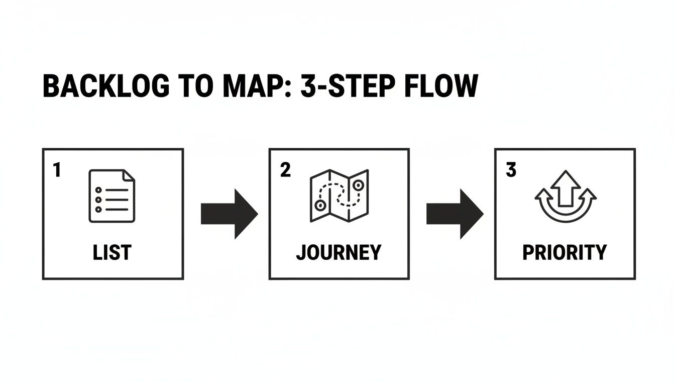
How to Slice Your Map for Release Planning
So, you've built this massive, beautiful story map. It’s a fantastic accomplishment, but staring at the whole thing can feel a bit overwhelming. That map represents everything you could build, but trying to build it all at once is a recipe for disaster. This is the moment your map transforms from a simple visualization tool into a powerful strategic weapon. It’s time to draw some lines.
Slicing your map into releases is how you turn that big vision into a tangible, step-by-step execution plan. It’s often as simple as drawing horizontal lines across your map. Everything above that first line becomes your first release—your Minimum Viable Product (MVP). The space between the next lines defines future releases, each one layering on more value for your users.

Defining the MVP for ConnectSphere
Let’s go back to our ‘ConnectSphere’ story mapping example. The goal of our MVP isn't to cram in every cool feature we can dream up. The real goal is to deliver a complete, end-to-end user journey that solves the core problem: helping someone efficiently manage their social media.
This means our first slice has to include the absolute essential stories from each activity on the backbone. A user needs to be able to sign up, connect an account, create a simple post, schedule it, and see that it went out. Anything else is just noise for now.
The MVP release for ConnectSphere might look like this:
- Onboarding: Basic email and password signup, plus the ability to connect just one social account (let’s say Twitter to start).
- Content Creation: A simple composer for text and a single image. No video, no GIFs, no fancy stuff yet.
- Scheduling: A basic calendar view where you can pick a date and time.
- Analytics: Just a simple "Published" status. We're not worrying about performance metrics yet.
See what we did there? It’s a thin slice, but it’s a complete journey. This approach gets a working product into users' hands that delivers real value from day one. That gives you a solid foundation to build on with actual user feedback, not just assumptions.
Prioritizing What Comes Next with MoSCoW
Okay, your MVP is defined. But how do you decide what goes into the second, third, and fourth releases? This is where a solid prioritization framework is your best friend. One of the most effective and straightforward methods I've used is MoSCoW.
MoSCoW is a simple acronym:
- Must-have: These are the non-negotiable features for the release. Your MVP is packed with these.
- Should-have: Important features that add a ton of value but aren't absolutely critical for this specific launch.
- Could-have: Desirable, "nice-to-have" features that you can include if time and resources allow. These are usually the first to go when deadlines loom.
- Won't-have (this time): Features you all agree are out of scope for the current release.
When you categorize stories with MoSCoW, you’re forced to have those tough but necessary conversations about what truly matters. It beautifully shifts the discussion from "Is this a good idea?" to "Is this a good idea for right now?"
Using this framework, the 'ConnectSphere' team can make some clear decisions. Maybe video scheduling is a "Should-have" for the second release, while team collaboration features are a "Could-have." This structured approach brings a ton of clarity and helps manage everyone's expectations.
This is a great way to illustrate how features get sliced across different phases.
MVP vs. Future Releases for 'ConnectSphere'
| Feature Area | MVP Release (Slice 1) | Second Release (Slice 2) |
|---|---|---|
| Onboarding | Email/password signup, connect one social account (Twitter) | Add Google/SSO login, connect multiple accounts (LinkedIn, Facebook) |
| Content Creation | Text and single image posts | Add video uploads and a simple image editor |
| Scheduling | Basic calendar date/time picker | Add a recurring post schedule and a content queue |
| Analytics | Simple "Published" status | Basic engagement metrics (likes, shares) |
This table makes it crystal clear how you can deliver a valuable core experience first, then intentionally build on it with subsequent releases.
This whole slicing process needs to be iterative. Once you release your MVP and start getting feedback, your priorities will inevitably shift. A feature you thought was a "Could-have" might suddenly become a "Must-have" based on overwhelming user demand. Your story map is a living document, and these release slices should flex and adapt as you learn.
For teams wanting to formalize this plan, translating these release slices into a more structured, timeline-based document is the next step. A good technical roadmap template can be invaluable for that process: https://www.sigos.io/blog/technical-roadmap-template
7 Common Story Mapping Pitfalls and How to Avoid Them
Even the most well-intentioned story mapping sessions can go off the rails. It happens. Knowing the common traps is the first step to sidestepping them and ensuring your map becomes a valuable asset instead of a well-organized mess.
Let’s walk through some of the most frequent stumbles I've seen and, more importantly, how to keep your team on track.
Pitfall #1: Mapping in a Silo
This is probably the biggest mistake a team can make. A product manager who builds a gorgeous, detailed map all by themselves and then "presents" it to the team has missed the entire point. The real magic of a story map comes from the shared understanding you build while creating it together.
The real value isn't the finished map itself; it's the rich conversations and debates that happen while you’re building it. Involve developers, designers, QA, and even stakeholders from the very beginning.
When everyone is in the room (virtual or physical), you surface hidden assumptions and technical constraints early, saving countless hours down the line. Plus, it ensures the whole team feels a sense of ownership over the plan.
Pitfall #2: Getting Lost in the Weeds
Another classic trap is diving into excruciating detail way too early. It's so easy to get bogged down debating every single edge case and error state for a feature that might not even get built for another year. The goal isn't to document every possible interaction on day one.
Remember, the map is a living document. It's meant to evolve.
- Stay high-level at first. Flesh out the entire user journey—the backbone of your map—before you start adding dozens of specific stories underneath.
- Detail stories just-in-time. Only add granular detail for the stories you're planning to tackle in the next one or two sprints.
- Always focus on the user's path. If a detail doesn't clarify what the user is trying to accomplish, it can probably wait.
Pitfall #3: Forgetting the Human Element
It's easy to get caught up in features and technical specs, but story mapping is fundamentally about visualizing a narrative. It's a human-centric tool.
A fascinating project from the University of New Brunswick, called 'Story Mapping Loyalists,' perfectly illustrates this by visualizing refugee narratives. One of their biggest challenges was geolocating historical sites because of how much the geography had changed—a detail crucial for building empathy that a simple biography would completely miss. You can discover more about how this spatial storytelling enhanced historical empathy.
This story mapping example is a powerful reminder to always anchor your map in the user’s real-world context and challenges.
This interactive map visually chronicles a historical journey, using geographical points to tell a compelling story. It’s a perfect demonstration of how organizing information spatially along a path—the core concept of story mapping—makes even the most complex narratives intuitive and engaging. The principle is the same, whether for historical events or a user's journey through your product.
Common Questions We Hear About Story Mapping
Even after you've built your first map, a few questions always seem to come up. Let's tackle some of the most common ones I hear from product teams who are just getting started with this technique.
Isn't a Story Map Just a Fancier Product Backlog?
Not quite, and the difference is crucial. A traditional product backlog is really just a flat, one-dimensional to-do list. It's great for seeing what's next in a linear fashion, but it's terrible for understanding the bigger picture.
A user story map, on the other hand, is two-dimensional. It lays out the user's entire journey from left to right, showing how each activity flows into the next. Then, it stacks stories vertically by priority. This structure gives you the context that a flat backlog completely misses, helping the whole team see exactly how their work contributes to a complete, valuable user experience.
What Are the Best Tools for Story Mapping?
Honestly, you don't need fancy, expensive software to start. Some of the most effective story mapping sessions I've been a part of used the simplest tools. It really depends on your team's workflow.
- The Classic Whiteboard: You can't beat sticky notes on a wall. It's a fantastic, hands-on way to get everyone collaborating in the same room. The physical act of moving notes around sparks incredible conversations.
- Digital Whiteboards: For distributed teams, tools like Miro or Mural are your best bet. They do a great job of recreating that physical whiteboard feeling on an infinite digital canvas.
- Dedicated Software: If you need something that plugs directly into your development workflow, check out platforms like Jira (with an add-on like Easy Agile), StoriesOnBoard, or FeatureMap. These are great for keeping the map and your tickets in sync.
The right tool is simply the one your team will actually use. Start simple and see what works.
A story map should be a living document, not a static artifact. Treat it as your team's single source of truth for the user journey, and it will guide you toward building a better product.
How Often Should We Update Our Story Map?
Think of your story map as a living guide, not a one-and-done artifact. It should evolve as you learn. It's not something you create and then file away.
We always revisit our map during key ceremonies like sprint planning, release planning, and backlog refinement. More importantly, you need to update it anytime you get new insights—whether that's from user feedback, a shift in the market, or a change in business goals. Keeping it current ensures it remains a true north for your product strategy.
Ready to turn user feedback into revenue-driving priorities? SigOS ingests support tickets, sales calls, and usage data to reveal the issues costing you money and the features that will unlock growth. Discover how SigOS can quantify the dollar value of your product decisions.
Keep Reading
More insights from our blog


Ready to find your hidden revenue leaks?
Start analyzing your customer feedback and discover insights that drive revenue.
Start Free Trial →