Turn Customer Data Into Revenue with a Behaviour Over Time Graph
Discover how a behaviour over time graph helps you see what customers really do. Learn to analyze behavior patterns, predict churn, and grow revenue.

So, what story is your customer data really telling you?
A behaviour over time graph is a simple but powerful tool that shows you how people are actually using your product. It plots user actions on a timeline, revealing the patterns and trends that static numbers just can't show.
Think of it this way: a single data point, like your current churn rate, is a snapshot. It’s a single photograph. A behaviour over time graph, on the other hand, is the full movie. It shows you the entire story of how users engage, adopt features, and, eventually, decide to stick around or leave.
What Story Is Your Customer Data Really Telling You?

Most dashboards give you a static view—a single number for today's active users or last month's conversion rate. While these numbers have their place, they often lack the context you need. They tell you what happened, but they leave you guessing about the how and the why.
Let's use an analogy. Imagine you're a city planner looking at a single photo of a massive traffic jam. You know there's a problem, but that's about it. Now, what if you had a year-long time-lapse video of that same intersection? You'd see the daily rush hour clogs, the quiet holiday periods, and maybe even the slow, creeping gridlock caused by a new housing development.
That time-lapse video gives you the full picture. That's exactly what a behaviour over time graph does for your product.
The Problem of Silent Churn
One of the biggest headaches for any product or growth team is "silent churn." This is when customers leave without saying a word—no support tickets, no angry emails, no negative reviews. They just… disappear. Traditional reports are completely blind to this because these users don't trigger any obvious negative signals.
And this problem is getting worse. Customer feedback channels have changed. Today, only 3 in 10 customers who leave will actually tell you why. That means a staggering 70% of your churn is happening for reasons you're completely unaware of. This is backed up by a Qualtrics report showing a 30% jump in consumers who just quietly switch to a competitor.
A behaviour over time graph is your best defense against silent churn. By tracking subtle shifts in usage—like a gradual decline in feature adoption or a drop in session frequency—you can spot at-risk customers long before they decide to leave.
This insight fundamentally changes how you operate. You can move from being reactive to proactive. Instead of scrambling to respond to a bad survey, you can spot a negative trend as it's happening, dig into the root cause, and step in to help the customer.
For example, a graph might reveal that users who hit a specific bug are 40% more likely to go inactive within two weeks. That isn't just an interesting data point; it's a direct, actionable insight you can tie straight to revenue. Once you identify these groups, you can dig deeper, which is where something like behavioral segmentation comes in handy.
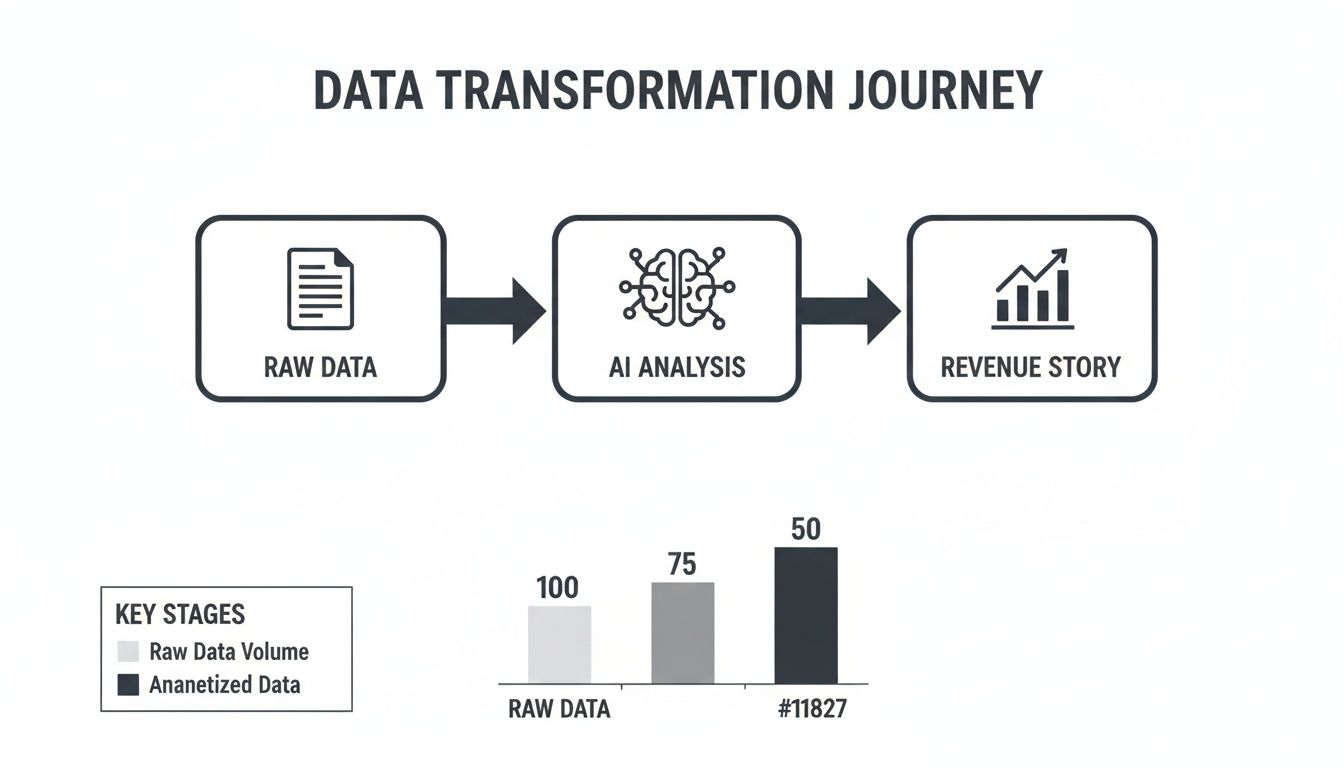
From Raw Data to a Clear Story
Any behaviour over time graph is only as good as the data you feed it. Let’s be honest, that data is usually a mess—scattered across support tickets in Zendesk, chat logs from Intercom, and raw product usage metrics. Pulling all that together into a single, coherent story is the goal.
The old way of doing this is brutal. You’d spend weeks manually exporting, cleaning, and stitching together different data sets, all while hoping you didn’t make a mistake. Garbage in, garbage out. If your initial data is flawed, your conclusions will be too. We actually have a whole guide on navigating these common data quality issues if you want to go deeper.
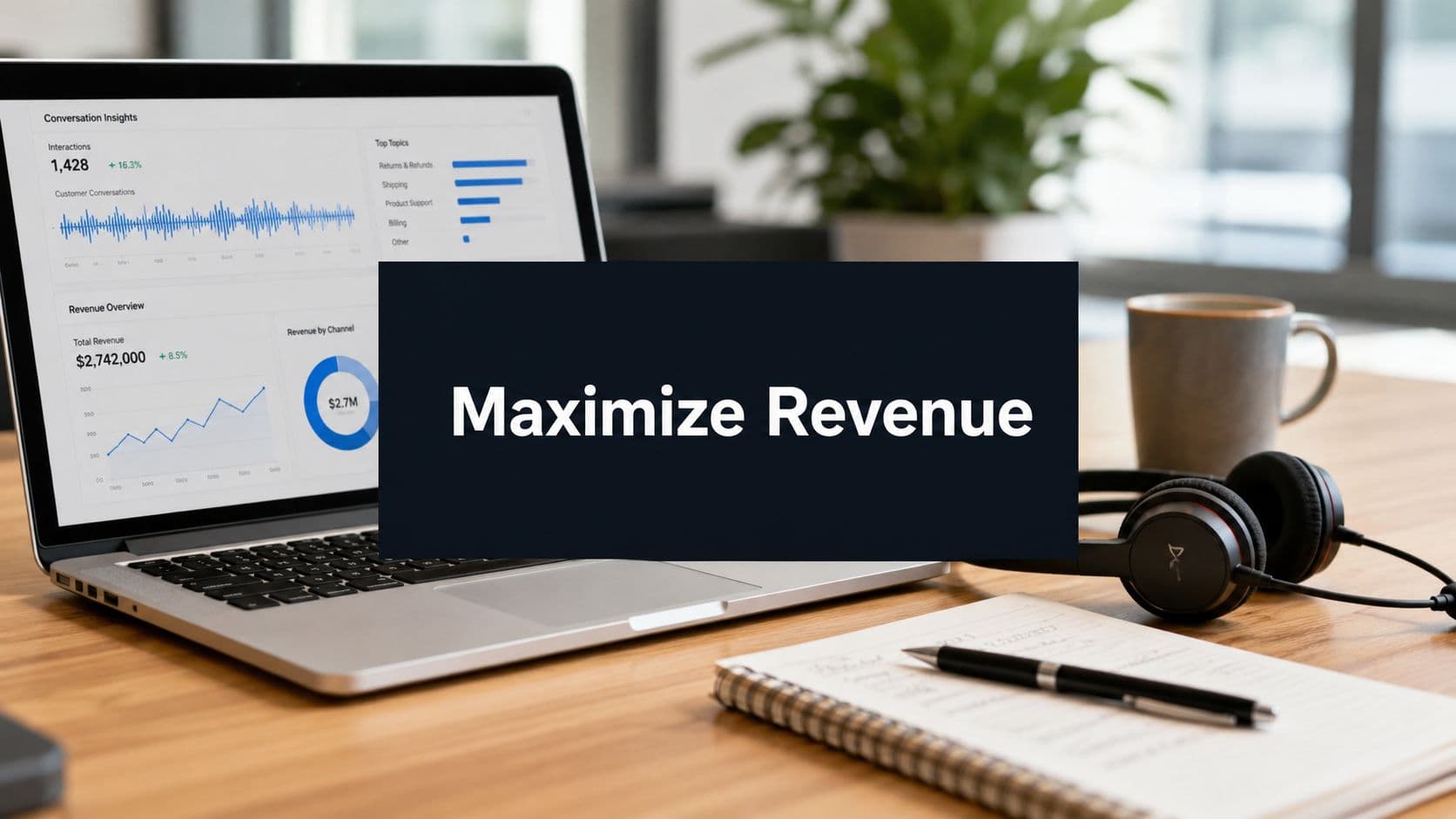
This is where a modern product intelligence platform like SigOS changes the game. Instead of a one-off, manual data pull, SigOS connects to your tools and does the heavy lifting for you. It continuously analyzes customer behavior in real-time, building the graph automatically.
Moving Beyond Simple Charts
A basic line chart can tell you that feature usage is down, but it can't tell you why. It’s just a flat line on a screen. An intelligent system adds the crucial business context that’s missing.
The AI in SigOS doesn't just plot points on a graph; it connects those behaviors to real financial outcomes. It scores every bug, friction point, or behavioral trend by its direct impact on revenue. So, you might discover that a specific API error isn't just an annoyance—it's directly tied to $30,000 in monthly churn risk. Suddenly, that simple chart becomes a powerful, prioritized to-do list.
Instead of guessing which problems matter most, you get a clear, data-backed list of priorities. The platform transforms a basic behaviour over time graph into a dynamic tool that shows you exactly where to focus your resources for the highest return.
Prioritizing by Revenue Impact
This kind of automated scoring is especially critical right now. With everyone feeling the pinch of rising costs, "good value for money" is no longer a nice-to-have; it's a primary reason people choose—or leave—a product. Deloitte’s latest research highlights this, noting that 73% of global consumers are worried about their finances, making them much quicker to ditch products that don't deliver.
This is where SigOS really shines. It draws a direct line from user friction to its financial cost. For example, the AI might sift through support tickets and usage data to find a 30% silent brand switch rate among users who hit a specific payment failure. Data analysts using the platform report seeing 87% accurate correlations between usage drops and actual dollar losses. This gives them daily dashboards that tell them exactly which fixes will deliver the highest ROI.
You stop reacting to problems and start proactively optimizing for revenue. You’re no longer just fixing bugs; you're strategically protecting and growing your business based on what your customers are actually doing.
How to Read the Patterns in Your Graph
You’ve built your behaviour over time graph. Now comes the interesting part: learning to read it. The lines and curves on that chart are more than just data points; they're the visual language of your customers. Think of it like a detective story where you're looking for clues that explain what's happening with your product.
The real goal here is to transform a mountain of raw, disconnected customer data into a coherent story that connects directly to revenue.
When you can turn scattered information into a prioritized action plan, you unlock serious business value. So let's get into the common patterns you’ll see and what they’re trying to tell you.
Decoding Common Graph Patterns
Your graph will never be a perfectly straight line. It’s going to spike, dip, and flatten out. Knowing what these shapes mean is what separates a good product team from a great one.
- The Sudden Spike: This is an unmistakable, sharp jump in a specific behaviour. If you see a spike in error messages right after pushing a new feature, that’s an obvious red flag. On the flip side, a big spike in sign-ups after a marketing campaign launch means you did something right. The critical question is always: What event happened right before this?
- The Gradual Decline: This one is sneakier. It’s a slow, steady bleed over weeks or months. Maybe you notice a gradual drop in the usage of a core feature. This could signal anything from growing user frustration or a confusing UI to a competitor slowly eating your lunch. This is often the first sign of “silent churn,” where users quietly fade away.
- The Plateau or Stagnation: This happens when a metric just flatlines after an initial growth spurt. You launch a new feature, see some exciting initial adoption, but then usage just stalls after two weeks. That's a stagnation problem. It forces you to ask: Why did growth stop, and what’s blocking further adoption?
Turning Patterns into Hypotheses
Spotting a pattern is a great start, but it isn’t enough. The next move is to turn that observation into a specific, testable hypothesis that connects the pattern to a real business outcome. This is how you go from just noticing things to actually doing something about them.
A pattern is an observation. A hypothesis is a proposed explanation for that observation that you can actually test. For example, "Usage is down" is an observation. "Usage of the reporting feature is down 15% since our Q2 pricing change, putting $50k in ARR at risk," is a powerful hypothesis.
With a clear hypothesis in hand, you know exactly where to start digging. If you believe a pricing change tanked usage, your next step is to run further analysis to prove or disprove that connection. This is often a great use case for a deeper dive, which you can learn more about in our guide on what is a cohort analysis.
Once you've plotted the historical data, you can even start looking forward. Using advanced techniques like time series forecasting methods can help you project what will happen if a current trend continues.
By learning to interpret your behaviour over time graph, you’re effectively building a strategic roadmap that guides your product and growth decisions with real evidence.
Real-World Examples of Behavioural Analysis in Action
Theory is one thing, but the real magic happens when you see a behaviour over time graph solve a genuine business problem. This is where its power truly clicks. Let's step away from the abstract and dive into a couple of real-world stories of how product and growth teams use these graphs to plug revenue leaks and find new opportunities.
Picture a B2B SaaS company known for its powerful 'Reporting' feature. On the surface, their main business metrics look healthy, but something is wrong under the hood. A behaviour over time graph, created by a product intelligence platform like SigOS, suddenly brings a hidden, costly trend into sharp focus.
The graph shows a slow but undeniable decline in the usage of their star feature, a slide that began three months ago. Even more alarming, the data connects this behavioral shift to a 15% higher churn rate among that specific group of users. This single insight immediately triggers an all-hands-on-deck investigation.
Pinpointing the Root Cause of Churn
With this new lead, the product team digs in. They layer the usage graph with qualitative feedback—pulling from support tickets and chat logs that SigOS also analyzes. The story quickly becomes crystal clear: a recent UX update, designed to simplify the reporting dashboard, had accidentally made it clunky and confusing for the power users who relied on it most.
Without the behaviour over time graph, this "silent churn" would have been a mystery, likely dismissed as a vague market shift. But with the graph, the team had a direct line of sight from a specific user behaviour (or lack thereof) to a direct hit on revenue. This led to a targeted redesign that fixed the UX issue and successfully cut churn within that cohort.
For a closer look at how businesses map these kinds of interactions, exploring customer journey analytics shows how to optimize the entire experience based on these observed patterns.
This is the core value: a behaviour over time graph doesn't just show you what is happening. It points you directly to where and why, connecting subtle user actions to concrete financial outcomes.
From Proactive Alerts to Revenue Recovery
Here's another scenario. A subscription box company sees a sudden, scary spike in cancellations over a two-week period. The panic starts to set in. Is it a new competitor? Did we mess up our pricing? Their standard dashboards offer nothing but question marks.
By analyzing patterns in support chats alongside usage data, SigOS was able to pinpoint the source. It turns out that users who experience a failed payment are 50% more likely to churn within the month, even if their payment goes through on a later attempt. The graph showed this pattern wasn't new, but it had grown much worse recently. This insight sparked a proactive dunning campaign that recovered thousands in monthly recurring revenue.
These examples aren't happening in a vacuum. Consumer behaviour is always shifting. For instance, social commerce searches have shot up 65% in the last five years, and US livestream shopping is on track to become a $70 billion market. For SaaS teams, these trends highlight the need for tools that can track user patterns across the entire journey. As you can read in more detail here, a platform like SigOS can spot when a 20% increase in social media drop-offs correlates with churn, giving teams a near real-time alert to a looming revenue risk.
Best Practices for Using Behavioural Graphs

A behaviour over time graph can be so much more than just an interesting chart. To turn it into a real driver for your business, you need a bit of discipline. By building a few key habits, your team can make sure these insights lead to meaningful action, not just a folder full of forgotten data points.
First off, always integrate multiple data sources. Product analytics data on its own only shows a sliver of the full picture. It becomes exponentially more powerful when you layer in context from support tickets, sales calls, and live chat logs. This approach connects the what with the why, giving you a complete understanding of what’s really happening.
And remember to segment your users. There’s no such thing as an "average user." When you analyze behaviour across different groups—like new sign-ups versus seasoned power users, or enterprise clients versus SMBs—you start to see the subtle, important patterns that get completely washed out in an aggregated view.
Avoiding Common Pitfalls
Even with the best intentions, it's surprisingly easy to fall into a few common traps. Just knowing what they are is half the battle.
The biggest one is analysis paralysis. This is what happens when you get so caught up exploring the data that you never actually do anything with it. A behaviour over time graph is a tool for making decisions, not for endless academic exploration. Set clear goals for your analysis and stay focused on finding insights you can act on.
The most dangerous pitfall is ignoring qualitative feedback. The numbers on your graph tell you what users are doing, but the comments in their support tickets tell you why. Without both, you're only seeing half the picture.
Another trap is obsessing over vanity metrics. Sure, a sudden spike in page views might feel great, but if it doesn't lead to lower churn or more revenue, it’s just noise. Always tie your analysis back to the core business outcomes that actually matter.
Activating Your Insights
To really put these graphs to work, you need to build a system around them. Automation is your friend here. Setting up automated alerts for significant shifts in user behaviour—a key function in platforms like SigOS—lets you jump on emerging problems and opportunities almost as they happen.
- Establish a rhythm: Don't just look at the data when you feel like it. Create a routine, whether it's a quick daily check for critical alerts or a deeper weekly dive for strategic planning.
- Prioritize ruthlessly: Use revenue impact scores to shine a light on the problems costing you the most money or the features that hold the most promise. This helps you focus your limited resources where they'll make the biggest difference.
- Close the loop: It's not enough to just find a problem. Your job isn't done until you've tracked the solution all the way to release and then measured the impact of your fix.
Answering Your Questions About Behaviour Graphs
Getting started with a behaviour over time graph raises a few common questions. Let's walk through them so you can see how powerful this approach really is.
How Is This Different From My Analytics Charts?
Think of it this way: your standard analytics charts, like those in Google Analytics, are great at taking snapshots. They tell you how many people visited a page or how long they stayed. They’re great for reporting isolated metrics.
A behaviour over time graph, on the other hand, tells a story. It connects the dots between a sequence of actions, showing you who did what, and what happened as a result. It's less about the "what" and all about the "why" and "what's next?"
What’s the First Step to Create One?
The best place to start is by focusing on your goals. Zero in on two or three critical user behaviours that you know are tied to success or failure—things like adopting a new feature or, on the flip side, the actions that often precede a cancellation.
Once you have those behaviours in mind, you can identify where the data lives, whether it's in usage logs, support tickets, or CRM notes. While you could do this manually, an automated platform is the only realistic way to get accurate, continuous insights without drowning in spreadsheets.
The goal is to move beyond static reports to a continuous, automated analysis. An intelligence platform like SigOS can connect to your data sources and build these graphs for you, scoring behaviours by revenue impact from day one.
How Often Should I Check My Graphs?
Find a rhythm that works for your team. You'll want to keep an eye on it daily for any major red flags, like a sudden spike in behaviours that signal churn risk. That's your fire alarm.
For more strategic work, a weekly review is perfect. This is where you'll spot the slower-moving trends that should inform your product roadmap or next marketing campaign. The key is to treat it as an always-on feedback loop, not just a report you pull once a quarter.
Ready to transform your customer data from noisy feedback into a clear, revenue-driven action plan? SigOS continuously analyzes user behavior to show you which issues are costing you money and which opportunities will drive growth. Start prioritizing with SigOS.


Ready to find your hidden revenue leaks?
Start analyzing your customer feedback and discover insights that drive revenue.
Start Free Trial →