What is Cohort Analysis? A Guide to Unlock Business Insights
Learn what is cohort analysis and how it helps track user behavior, boost retention, and drive growth. Discover its benefits today!

So, what exactly is cohort analysis? Think of it as a powerful lens for understanding user behavior. Instead of lumping all your users into one giant, anonymous crowd, it smartly groups them into "cohorts" based on a shared experience within a specific timeframe.
The most common way to do this is by acquisition date—for example, everyone who signed up in January becomes the "January Cohort," and everyone who signed up in June becomes the "June Cohort." This simple shift in perspective tells a rich story about how different groups of users interact with your product over time.
Understanding Cohort Analysis Beyond the Buzzwords

Imagine your entire user base is a massive, bustling train station. If you just count the total number of people passing through each day, you get a big number, but it doesn't tell you much. Are these people first-time visitors or loyal daily commuters? That's the problem with most high-level analytics—they give you a snapshot, not a narrative.
Cohort analysis, on the other hand, is like giving each group of passengers a unique travel log. It follows everyone who boarded the "January Express" (your January sign-ups) and tracks their entire journey. Then it compares them to the passengers who boarded the "February Express."
Did the January group stick around longer? Did the February group spend more in their first week? By isolating these cohorts, you can finally draw a straight line from your actions to their outcomes.
The Power of Grouping by Time and Behavior
At its heart, cohort analysis is all about grouping people who share a common starting point so you can track how their behavior evolves. A time-based cohort analysis, for instance, segments customers by the month they first signed up for your product. This lets you see if users from January are sticking around longer than those who joined in February, which might point to differences in their initial experience. You can find more detailed examples of cohort analysis to see this method in action.
This approach delivers far more meaningful insights than surface-level metrics ever could. It helps you answer the really critical questions:
- Did the new onboarding flow we launched in March actually improve retention for that month's new users?
- Are customers we acquired from our latest ad campaign more engaged than those who found us through organic search?
- How long does it really take for a brand-new user to make their first purchase?
This perspective is a complete game-changer, especially for any business that cares about long-term growth and building lasting customer relationships.
Key Cohort Analysis Concepts at a Glance
Before we dive deeper, let's break down some of the core terms you'll run into. This quick-reference table will help keep things clear.
| Concept | Simple Explanation | Why It's Important |
|---|---|---|
| Cohort | A group of users who share a common characteristic, usually a start date (e.g., all users who signed up in January). | It lets you compare apples to apples, isolating variables to see what truly impacts user behavior. |
| Cohort Size | The total number of users in a specific cohort. | This is your baseline (100%). All future retention and activity metrics are calculated against this initial number. |
| Acquisition Cohort | A cohort defined by when users were acquired (e.g., signed up, made a first purchase). | This is the most common type and is fantastic for tracking user retention and lifetime value over time. |
| Behavioral Cohort | A cohort defined by actions users took (or didn't take) within a specific timeframe. | It helps you understand the behavior of specific user segments, like power users or those who have stopped engaging. |
Having a solid grasp of these terms makes it much easier to build and interpret your own analyses, turning raw data into a clear story about your users.
Exploring Different Types of Cohorts

Choosing the right cohort is like picking the right tool for a job. The way you group your users completely changes the questions you can answer and the clarity of the results you get.
The real power comes when you move past just asking when users signed up and start asking what they did. That's how you connect specific user actions to long-term value.
Time-Based Acquisition Cohorts
The most common starting point for anyone new to cohort analysis is the time-based cohort, often called an acquisition cohort. It’s simple: you group users based on when they first signed up, installed your app, or made their first purchase.
You might group them by the day, week, or month they joined. This approach is fantastic for getting a high-level view of your business's health and seeing if retention is improving or slipping. For instance, you could compare the "January Cohort" to the "February Cohort" to see if a product update you pushed in February actually led to better long-term engagement.
But here’s the catch: time-based cohorts tell you when things are changing, not why. To get to the root cause, you have to dig deeper.
Behavioral Cohorts
This is where the real magic happens. Behavioral cohorts group users based on specific actions they took—or didn't take—within a set timeframe. This is a much more powerful way to figure out what actually drives retention and revenue.
Instead of just grouping by sign-up date, you start creating cohorts based on meaningful actions:
- Feature Adoption: Did they use a key feature (like creating a project) in their first week, or did they ignore it?
- Initial Engagement: Did they complete your onboarding tutorial, or did they skip it?
- Purchase Behavior: Did they use a discount code on their first purchase, or did they pay full price?
Imagine an e-commerce store running this analysis. They discover that users who create a "wishlist" within their first three days have a 40% higher lifetime value. That's a golden insight. It gives the product team a clear mission: get more new users to create a wishlist, because we know it leads to more revenue down the road.
Size-Based Cohorts
Finally, we have size-based cohorts, which group users by the value or scale of their first interaction. This is especially useful for SaaS and e-commerce companies trying to connect a customer's initial commitment to their long-term success.
Examples include segmenting customers by:
- Initial Purchase Value: Grouping users who spent over 100 on their first order versus those who spent under ****20.
- Subscription Tier: Comparing the retention of users who signed up for a "Pro" plan against those on the "Basic" plan.
- Team Size: For a B2B product, analyzing cohorts based on the number of seats they purchased right out of the gate.
This method helps you identify your most valuable customer profiles from day one. You might learn that larger initial deals churn less often, which would justify spending more to acquire those high-value accounts. Each cohort type gives you a different lens, and using them together helps you build a complete picture of how your users behave.
Your Step-by-Step Guide to Performing Cohort Analysis
Turning the idea of cohort analysis into something you can actually do doesn't require a data science degree. All you need is a structured approach. Let's walk through a simple four-step framework that takes the mystery out of the process and gets you from raw data to clear insights.
To make this real, we’ll follow a fictional mobile app company. Their goal is to figure out if a new onboarding flow they launched in the first week of February actually improved user engagement compared to the users who signed up in January.
Step 1: Frame a Clear Question
This is where most analyses go wrong—starting without a clear objective. A vague goal leads to a messy dataset and results that don't tell you anything useful. Before you even think about pulling data, you have to frame a specific, measurable question.
For instance, a weak question would be something like, "Are our users engaged?" It’s far too broad.
A strong question, on the other hand, is sharp and focused: "Did the new onboarding flow launched on February 1st lead to higher Day 7 retention for users acquired in February compared to those acquired in January?"
See the difference? This focused question instantly gives you three critical pieces for your analysis:
- The Cohorts: January sign-ups vs. February sign-ups.
- The Metric: User retention rate.
- The Timeline: The first seven days after a user signs up.
Step 2: Define Cohorts and Key Metrics
With your question locked in, the next job is to get specific about who is in each cohort and what you're measuring. Precision here is everything if you want an accurate comparison.
For our mobile app example, the definitions are straightforward:
- Cohort A (The Control Group): All users who installed the app for the first time between January 1st and January 31st.
- Cohort B (The Test Group): All users who installed the app for the first time between February 1st and February 28th.
The key metric is user retention. We'll calculate this by tracking the percentage of users in each group who came back to the app on specific days after they first installed it (Day 0). We'll look at Day 1, Day 3, and Day 7 to see how that initial engagement holds up.
Step 3: Organize and Visualize Your Data
Okay, time to get the data. The goal is to organize it into a cohort chart (often just called a cohort table). This grid is the classic way to visualize cohort data because it makes complex retention patterns easy to grasp at a glance.
This is the basic flow from raw numbers to an actionable chart.
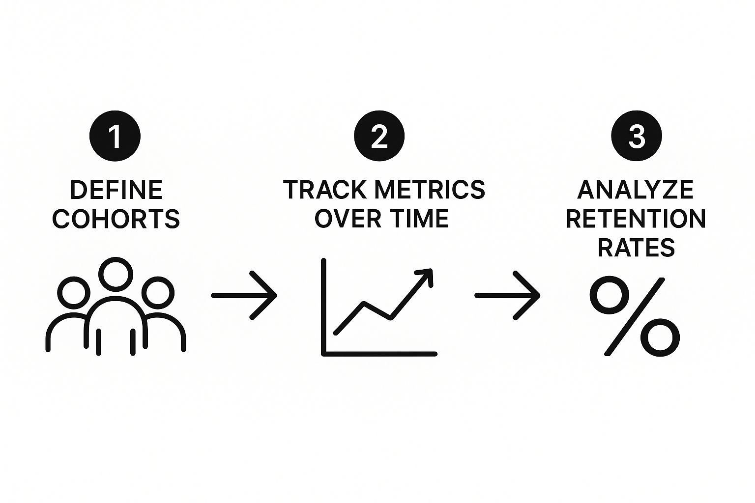
As the infographic shows, you start with clear definitions, track your metrics over time, and end up with patterns you can actually analyze.
The structure of a cohort chart is pretty simple:
- Rows: Each row represents one of your cohorts (e.g., "January 2024 Signups").
- Columns: Each column represents a period of time after that cohort was created (e.g., Day 1, Day 7, Month 1).
- Cells: Each cell shows the percentage of the original cohort that was still active during that specific time period.
Most tools use a heat map—a color scale from dark to light—to make trends jump off the page. Darker cells mean higher retention, and lighter cells show you exactly where people are dropping off.
Step 4: Interpret the Story Your Data Tells
This is the last—and most important—step. A chart full of percentages is just noise until you interpret it. You need to hunt for trends, spot any oddities, and find the patterns that finally answer the question you asked back in Step 1.
Back to our mobile app example. You'd lay the February cohort’s retention numbers next to the January cohort's. If the percentages for Day 1, Day 3, and Day 7 are consistently higher for the February group, you have strong evidence that the new onboarding flow worked.
But what if the numbers are lower? That’s just as valuable. It tells you the new flow might have created some unexpected friction that needs to be investigated and fixed. Either way, you have your answer.
Let's See Cohort Analysis in Action with Real-World Examples
It’s one thing to talk about cohort analysis in theory, but its real value clicks when you see it solve actual business problems. We're moving past basic retention charts here. Let’s look at how smart companies use this data to make confident decisions that actually grow revenue.
Think of it this way: for each example, we'll look at the problem, the analysis they ran, the "aha!" moment they had, and the action they took. This simple framework turns cohort analysis from a dusty report into a strategic playbook, connecting the dots between how users behave and how the business performs.
The SaaS Company and the High-Value Webinar
A B2B SaaS company was staring at a flatline. Their overall customer lifetime value (LTV) just wasn't growing. They were pouring money into multiple acquisition channels—paid ads, organic search, a monthly webinar series—but had no clue which ones were actually bringing in the customers who stuck around and paid.
- The Problem: Stagnant LTV and no clear idea which acquisition channels were worth the investment.
- The Analysis: They decided to create behavioral cohorts based on a user's very first interaction with the company. They grouped all users who signed up after attending a webinar into one cohort and users who came from paid search ads into another.
- The Insight: The results were a game-changer. The webinar cohort had a 40% higher LTV over a six-month period. Not only that, but their churn rate was dramatically lower than customers from any other channel.
- The Action: With this data in hand, the marketing team went all-in on their webinar strategy. They started hosting them more often and made them a central part of their lead generation efforts.
This wasn't just a minor tweak; it was a fundamental shift that improved the quality of every new customer walking through the digital door. It was definitive proof that not all leads are created equal.
The Gaming App and the Holiday Churn Problem
Imagine this: a popular mobile gaming app launched a massive holiday event. New downloads went through the roof, and on paper, everything looked incredible. But the product team had a gut feeling that something wasn't right. Were all these new players actually playing the game, or just stopping by for the party?
To get to the bottom of it, they created two separate acquisition cohorts: one for players who joined during the big December holiday event and a control group of players who had signed up back in November.
- The Problem: The huge spike in holiday sign-ups could be hiding terrible long-term retention.
- The Analysis: They tracked and compared the 30-day and 60-day retention rates of the "Holiday Cohort" versus the "November Cohort."
- The Insight: The data told a worrying story. The holiday cohort's retention fell off a cliff after 30 days. These users were super engaged during the event but disappeared as soon as the special content was gone.
- The Action: The team got to work. They designed a brand-new onboarding experience just for players who joined during seasonal events. This flow guided them toward the core game mechanics, helping them find value beyond the temporary promotion and successfully turning them into long-term fans.
In both of these stories, cohort analysis revealed a clear, actionable narrative that high-level metrics completely obscured, leading directly to smarter, more profitable decisions.
Common Mistakes That Can Invalidate Your Results

Cohort analysis is an incredibly powerful tool, but it's not foolproof. The insights you get are only as good as the data and methods you put in. A few common mistakes can easily send you down the wrong path, turning a potentially valuable analysis into a source of costly bad decisions.
Knowing what these pitfalls are is the first step to making sure your data actually helps you.
Mismatching Your Cohort Size and Timeframe
One of the easiest ways to get confusing results is by choosing the wrong cohort size or timeframe. Imagine you have a product with a six-week sales cycle. If you try to analyze retention using daily cohorts, you’re just creating noise. The window is far too short to see how users are actually behaving.
The reverse is also true. If you're looking at a mobile game where most users drop off in the first 72 hours, grouping them into monthly cohorts will completely hide that critical early churn. You have to match the cohort’s timeline to the natural rhythm of your customer's journey.
Ignoring Important User Segments
Another huge mistake is treating all users in a cohort like they're the same. When you lump everyone together, you risk averaging out the very trends you’re trying to find. This oversight can completely undermine your analysis by hiding crucial differences between distinct user groups.
Failing to segment your users can lead to some wildly incorrect assumptions. For example, think about the differences between:
- Mobile vs. Desktop Users: People on different devices almost always have different needs and engagement patterns.
- Geographic Location: How someone in Japan uses your product might be completely different from someone in Brazil due to cultural or market factors.
- Acquisition Channel: A user who signed up after a detailed webinar is likely to behave differently than someone who clicked a general social media ad.
By not segmenting your cohorts, you might incorrectly conclude a new feature is a total flop. But in reality, it could be a massive hit with desktop power users and just performing poorly on mobile—a problem you can actually fix.
Tracking Vanity Metrics Over Actionable Insights
Finally, even a perfectly segmented, time-aligned analysis can be worthless if you're tracking the wrong things. It's tempting to focus on vanity metrics—numbers like total sign-ups or page views. They look impressive on a chart but don't tell you much about the health of your business.
Instead, you need to focus on actionable metrics that tie directly to real business outcomes. These are the numbers that tell a story about whether users are getting value and sticking around.
| Metric Type | Example | Why It Matters |
|---|---|---|
| Vanity Metric | Total App Downloads | This number is often inflated by one-time users who churn immediately. |
| Actionable Metric | Day 7 Retention Rate | This shows if new users actually find lasting value in your app. |
| Vanity Metric | Total Registered Users | This doesn't separate your active champions from the accounts that have gone cold. |
| Actionable Metric | Activation Rate | This measures how many users reach that key "aha!" moment where your product clicks for them. |
Dodging these common traps is key. It’s what ensures your cohort analysis gives you clear, accurate, and genuinely useful insights that can point your product and growth strategies in the right direction.
A Few Common Questions About Cohort Analysis
https://www.youtube.com/embed/-p2-23Hzdbg
As you start to dip your toes into cohort analysis, a few questions almost always pop up. Let's walk through some of the most common ones to clear up any confusion and help you get started on the right foot.
Getting these fundamentals down will give you the confidence to start digging into your own data and uncovering what's really going on with your users.
What’s the Main Difference Between Cohort Analysis and Segmentation?
This is a great question because they sound similar on the surface. Both methods involve grouping users, but the key difference boils down to one thing: time.
Segmentation is usually a static snapshot. It groups people based on attributes that are true right now—things like their geographic location, their subscription tier, or the industry they're in. It's fantastic for telling you who your users are at this moment.
Cohort analysis, on the other hand, is all about tracking behavior over time. It groups users by a shared starting point, like the month they signed up, and then follows that specific group's journey forward.
Think of it like this: segmentation is like taking a single group photo of everyone at a party. Cohort analysis is like taking a photo of the "Class of June" on their first day, then another a month later, and another a year later, to see how they've changed.
This time-lapse view is what makes cohort analysis so powerful for understanding the long-term impact of your work. It doesn't just show you a moment; it tells you a story about how different groups evolve.
What Tools Can I Use to Perform Cohort Analysis?
You've got plenty of options here, and what you choose really depends on your team's technical skills and how deep you need to go.
Here's a quick breakdown of the common tools people use:
- Spreadsheets: Good old Google Sheets or Microsoft Excel are perfect when you're just starting out or doing a quick, one-off analysis. You have total control, but it's a very manual process.
- Product Analytics Platforms: This is where things get much easier. Tools like Mixpanel, Amplitude, or Heap have cohort analysis built right in. They automate most of the data crunching for you.
- Business Intelligence (BI) Tools: If your goal is to create beautiful, shareable dashboards for the whole company, BI tools like Tableau or Looker are the way to go. They're great for custom visualizations.
- Programming Languages: For the most complex and customized analysis, data scientists will often turn to Python (using libraries like Pandas) or R. This approach offers unlimited flexibility but requires coding skills.
How Often Should I Run a Cohort Analysis?
There’s no magic number here—the right cadence really depends on your business. A good rule of thumb is to match the frequency of your analysis to the speed at which you make decisions.
For a fast-moving e-commerce site or a mobile app, running a weekly analysis makes sense. You can quickly see how a new promotion or app update affects user retention in those critical first few weeks.
But for a B2B SaaS product with a much longer customer journey, monthly cohorts are usually the sweet spot. It gives user behavior enough time to play out in a meaningful way.
The most important thing? Always run a fresh cohort analysis after any big change. This could be a major product launch, a new pricing structure, or a big marketing push. It’s the only way to truly measure the long-term impact of that event on user behavior.
Ready to stop guessing and start knowing what your customers truly want? SigOS uses AI-driven intelligence to analyze customer feedback and behavioral data, showing you exactly which issues are costing you money and which features will drive revenue. Discover the signal in the noise with SigOS.
Keep Reading
More insights from our blog


Ready to find your hidden revenue leaks?
Start analyzing your customer feedback and discover insights that drive revenue.
Start Free Trial →