Unlocking User Loyalty with Cohort Analysis Retention
Our guide to cohort analysis retention breaks down how to track user behavior, reduce churn, and build loyalty. Learn to turn data into growth strategies.

Cohort analysis is a powerful way to understand user retention by grouping them based on a shared starting point—most often, the month they signed up. Think of it like a graduating class. Instead of looking at all your users as one giant, jumbled group, this technique lets you see how loyalty develops for each specific "class" of users over their lifecycle.
Why Cohort Analysis Is Your Clearest Lens for Retention

Imagine trying to figure out why a university's alumni are successful by tossing every graduate from every single year into one big spreadsheet. It would be a mess. The class of 1985 had a completely different experience than the class of 2023. Cohort analysis for retention applies that same common-sense logic to your users.
Relying on a single, blended retention rate can be dangerously misleading because it averages out everyone. Cohort analysis avoids this trap by segmenting users, allowing you to see the real story behind your numbers.
Uncovering Hidden Patterns in User Behavior
By grouping users into cohorts, you can finally answer critical questions that get lost in the noise of aggregate data. It helps you connect the dots between your actions and their long-term impact on user loyalty.
For example, a SaaS company might find that a cohort acquired during a Q2 promotion retained 40% of users after three months. That sounds great, but when compared to a Q1 cohort that only retained 22% over the same period, it’s a huge win. This is where the magic happens.
This kind of segmentation reveals powerful truths about your business:
- Impact of Product Changes: Did that new onboarding flow you launched in March actually make new users stick around longer than the ones who signed up in February?
- Quality of Acquisition Channels: Are users coming from your paid ad campaigns churning faster than those who found you through organic search?
- Long-Term Engagement Trends: Is your product actually getting "stickier" over time, or is a slow decline being hidden by a constant influx of new sign-ups?
By isolating variables, cohort analysis moves you from guessing to knowing. It transforms a blurry, company-wide retention metric into a high-definition picture of individual group behaviors, laying the groundwork for truly actionable insights.
Ultimately, understanding these patterns is the first step toward improving the crucial customer retention metrics that fuel sustainable growth.
Reading the Story Your Retention Data Is Telling
Numbers on a spreadsheet don't tell you much. But when you visualize that data, it starts to tell a powerful story about how much your users actually like your product. This is where cohort analysis goes from a buzzword to a genuinely useful tool. By focusing on a few key metrics, you can get a gut check on your user experience at the moments that matter most.
Think of these metrics as your product's vital signs. They're the quick, scannable numbers that tell you if you're making a good first impression and if new users are sticking around.
Key Retention Metrics to Watch
Not all retention days are created equal. While your product's specific lifecycle matters, a few timeframes are almost universally important for understanding user stickiness.
- Day 1 Retention: This is your first-impression metric. How many people came back the very next day after signing up? A low number here is a major red flag, often pointing to a confusing onboarding flow or a failure to show users the "aha!" moment right away.
- Day 7 Retention: A week in, are users starting to form a habit? This metric tells you if your product is becoming part of their routine. If you see a massive drop-off between Day 1 and Day 7, it's a sign that the initial novelty wore off and didn't translate into real value.
- Day 30 Retention: This is where you start to see signs of long-term value. If someone is still using your product after a full month, they’ve found a solid reason to stay. These are the users most likely to become your power users, advocates, and paying customers.
To help you keep these straight, here's a quick breakdown of the essential metrics you'll be looking at.
Essential Cohort Retention Metrics Explained
This table breaks down the most important retention metrics used in cohort analysis, explaining what each one measures and why it's valuable for product and growth teams.
| Metric | What It Measures | Why It Matters |
|---|---|---|
| Day 1 Retention | The percentage of users who return 1 day after their first session. | It's the ultimate test of your first-time user experience and onboarding. |
| Day 7 Retention | The percentage of users who return 7 days after their first session. | It indicates early habit formation and whether your product has short-term value. |
| Day 30 Retention | The percentage of users who return 30 days after their first session. | It's a strong signal of long-term engagement and product-market fit. |
| Cohort Size | The total number of users who joined in a specific time period. | Provides context for retention percentages. A 50% retention rate on a cohort of 10 users is very different from a cohort of 10,000. |
| Retention Curve | A line graph plotting retention percentage over time for a specific cohort. | Visualizes the rate of user drop-off and helps identify when churn is highest. |
Keeping these core metrics in mind makes it much easier to diagnose problems and spot opportunities when you're looking at your own cohort data.
A cohort chart—that classic heatmap of percentages—is the canvas where these stories come to life. It’s not just a grid of numbers; it’s a visual narrative of how well you’re keeping users engaged over time.
How to Interpret a Cohort Chart
At first glance, a cohort chart can look like a spreadsheet that threw up a rainbow. But once you know what to look for, the patterns are surprisingly simple to read.
Each row is a cohort—a group of users who signed up during the same period (like "January 2024"). The columns track that group's activity over time, showing the percentage of them who came back on Day 1, Day 7, Day 30, and so on.
Usually, darker colors mean higher retention, and lighter colors show where you're losing people. A healthy chart has dark colors at the beginning of each row that fade slowly and gracefully over time. An unhealthy one shows a sudden cliff—a sharp drop from dark to light, signaling a "leaky bucket" where you're churning through users almost as fast as you acquire them.
That big, early drop-off is incredibly common. In fact, a 2023 analysis of consumer apps found that, on average, only about 25% of users are still active after just 30 days. By comparing different cohorts side-by-side, you can finally see if that new feature or redesigned onboarding flow actually moved the needle on these critical early retention numbers. If you want to dive deeper, you can find more great cohort retention analysis insights on SarasAnalytics.com.
How to Perform Your First Cohort Analysis
Jumping into your first cohort analysis for retention can feel a bit intimidating, but it's really a logical process. Think of it less like complex data science and more like telling a story about your users, one chapter at a time. I'll walk you through a simple framework, complete with a practical example to show you exactly how the numbers work.
The whole thing starts with a clear question. Without one, you’re just adrift in a sea of data. Are you trying to figure out if that new onboarding flow actually boosted Day 7 retention? Or maybe you want to know which marketing channel delivers users who stick around the longest? Your goal shapes every single step that follows.
Step 1: Define Your Cohorts and a Key Action
First things first, you need to decide how to group your users. The most common approach is using acquisition cohorts, which is just a fancy way of saying you group users by when they signed up—for example, everyone who joined in January, everyone who joined in February, and so on.
Next, you have to pinpoint the key action that tells you a user is genuinely active and retained. This is crucial. A simple login isn't enough; you need an action that proves they're getting real value out of your product.
- For a social media tool, it might be scheduling a post.
- For a project management app, it could be creating or completing a task.
- For an e-commerce site, the obvious one is making a purchase.
This action becomes the yardstick for measuring whether someone "came back" in a given week or month.
Step 2: Gather Your Data and Build the Table
Now that you have your definitions, it’s time to pull the data. You only need two pieces of information for every user: their sign-up date (so you can put them in the right cohort) and a timestamp for every time they performed that key action you just defined.
The cohort table is where the magic really happens. It’s structured like this:
- Rows: Each row represents one of your cohorts (e.g., "January 2024," "February 2024").
- Columns: The columns track the time that has passed since that cohort was formed (e.g., Month 0, Month 1, Month 2).
- Values: The cells show the percentage of users from a specific cohort who came back and performed the key action during that time period.
For example, if you wanted to calculate the Month 1 retention for your January cohort, the formula is straightforward:
(Number of January users who took action in February / Total number of users in January cohort) * 100
You just repeat this calculation for every cell, and suddenly your raw data starts telling a clear story about retention.
This process flow gives you a visual for the key milestones you'd typically track for any user cohort.
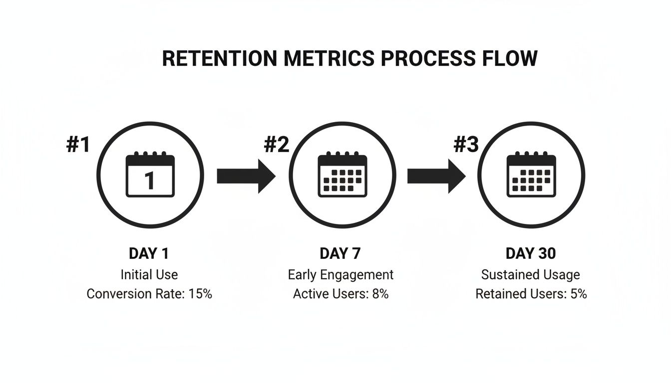
These Day 1, Day 7, and Day 30 check-ins are standard for a reason—they're fantastic early indicators of your product's health and stickiness.
Step 3: Visualize and Interpret the Results
Once your table is built, don't just stare at a wall of numbers. Use a heatmap or simple conditional formatting to make it come alive. A gradient of dark colors for high retention to light colors for low retention will make patterns practically leap off the page.
Do you see a massive drop-off after the first month across all cohorts? That’s a huge red flag. Are your newest cohorts sticking around longer than the older ones? That’s a sign that your recent product changes are working.
This final step is all about translating those numbers into a narrative. By following this simple process, you create a powerful, repeatable way to truly understand—and improve—user loyalty.
Finding Meaning in the Numbers and Avoiding Common Traps
So you’ve built your cohort chart. Now what? The heavy lifting of calculation is done, but the real work—the interpretation—is just getting started. This is the moment you turn that grid of percentages into a story about your users and a roadmap for your product. You're hunting for patterns that reveal what's really happening in your user experience.
The first thing to look for is often the most painful: a steep, early drop-off. If you see retention numbers plummet within the first few days or the first month for cohort after cohort, that’s a huge red flag. It’s telling you that your initial user experience is falling flat. People just aren't finding that "aha!" moment fast enough to stick around.
Interpreting Critical Retention Patterns
On the flip side, you might spot a much more positive trend called the “smiling curve.” This is where retention drops, as it always does, but then starts to flatten out or even creep back up in later months. This is a fantastic sign. It often means that users who lapsed are now returning, having realized the value of your product over time. That’s a powerful indicator of long-term product-market fit.
The most potent insights, however, come from comparing cohorts side-by-side. Did the May cohort suddenly perform better than April's? Think back: what did you change in May? Maybe you shipped a new feature or redesigned the onboarding process.
By isolating the group of users who experienced a specific change, cohort analysis lets you directly measure its impact on their loyalty. You’re moving beyond simple correlation and getting much closer to understanding causation.
Common Pitfalls That Derail Analysis
But be careful. This is also where it’s easy to jump to the wrong conclusions. It's tempting to see a retention spike after a feature launch and immediately call it a win, but you have to be sure that change was actually responsible. Before you pop the champagne, it's a good idea to understand how to determine statistical significance to make sure your findings are solid.
Another classic mistake is mixing up correlation with causation. Perhaps your March cohort retained better not because of a product tweak, but because a new marketing campaign brought in a different, more committed type of user. Always look for outside factors that could be influencing the numbers.
Finally, don't get distracted by vanity metrics. A growing total user count is great, but it can easily hide a leaky bucket. Cohort analysis for retention keeps you honest by focusing on the health and loyalty of your user base, not just its size.
Here are a few common mistakes to keep an eye on:
- Ignoring Cohort Size: A 90% retention rate from a tiny cohort of ten users means very little. A 40% rate from a cohort of ten thousand is far more telling. Always keep the sample size in mind.
- Choosing the Wrong Key Action: If you define retention as a simple login, you might see impressive numbers that don't reflect real engagement. Pick an action that proves users are getting value.
- Failing to Segment Further: Acquisition date is just the start. The real gold is often found when you slice cohorts by behavior, device, or marketing channel to get a much richer picture.
By learning to spot these patterns and sidestep the common errors, you turn raw data into actionable wisdom. That’s how you empower your team to make smarter decisions that actually move the needle on long-term retention.
Using Advanced Cohorts to Find Your Best Users

Once you get the hang of grouping users by their sign-up date, you've got the basics down. But the real magic in cohort analysis retention begins when you stop focusing on when users joined and start digging into what they actually do. This is where behavioral cohorts come in, a powerful way to segment users based on the actions they take inside your product.
Think about it. If you run a project management tool, an acquisition cohort lumps everyone who signed up in January into one big, generic group. A behavioral cohort, on the other hand, lets you ask much smarter questions. You could create one cohort of users who invited a teammate in their first week and another of those who didn't.
Comparing the retention curves of these two groups is where you’ll strike gold. If you find the "teammate inviters" have a 30% higher retention rate after three months, you’ve just uncovered a key activation event—a genuine "aha!" moment for your product.
Identifying Your Power User Personas
This whole approach lets you build data-backed personas of your most valuable users. Instead of just guessing what an ideal customer looks like, you can define them by the specific actions that actually predict long-term loyalty and higher lifetime value.
For example, you might start to see distinct patterns emerge:
- The Collaborators: Users who create and assign three or more tasks during their first session.
- The Integrators: Users who connect your app to another tool, like a calendar or cloud storage, within the first 48 hours.
- The Organizers: Users who create their own custom project templates rather than just sticking with the defaults.
By tracking the retention of each of these behavioral cohorts, you can pinpoint the exact in-product milestones that turn a casual visitor into a deeply engaged power user.
Shifting from acquisition to behavioral analysis is like upgrading from a blurry photograph to a high-resolution image. You suddenly see the fine details that separate users who churn from those who stick around for the long haul, giving you a clear roadmap for what to build next.
Leveraging Survival Analysis for Deeper Insights
Another powerful tool in your belt is survival analysis. A standard cohort chart shows you retention at fixed points in time—Day 7, Day 30, and so on. A survival curve, however, gives you a continuous view, plotting the probability of a user "surviving" (not churning) over their entire lifecycle.
This method is especially handy for comparing different behavioral cohorts head-to-head. You can plot the survival curves for your "Collaborators" and "Integrators" on the same graph. This shows you not just if one group retains better, but also reveals how much longer they typically stay active. It’s a simple, visual way to see which user journeys create the most lasting engagement.
At the end of the day, these advanced techniques are all about getting to the why behind your retention metrics. They help you find the specific actions and features that forge loyal customers, so you can redesign your user experience to guide more people toward those behaviors and, ultimately, create more of your best users.
Turning Your Retention Insights into Growth Strategies
Discovering a powerful insight is just the start. The real magic happens when you turn that knowledge into action. A beautifully crafted cohort analysis retention chart is just a pretty picture if it's left to gather dust in a dashboard. The final, and most critical, step is to translate your findings into real-world initiatives that make your product better and keep users coming back.
This is where data science meets product strategy. Let’s say your analysis uncovers a gem: users who invite a teammate within their first 48 hours show double the long-term retention. That isn't just an interesting statistic—it's a clear signal telling you exactly what to do next.
From Data Point to Strategic Priority
Your job is to get more new users to perform that one, high-value action. This single insight can spark a whole range of experiments to test.
- Redesigning Onboarding: You could tweak your onboarding flow, making the "invite a colleague" step a prominent part of the initial setup.
- Creating In-App Nudges: Maybe you could implement a smart tooltip that pops up during a user's second session, highlighting the perks of collaborating with their team.
- Testing Incentives: What if you offered a small reward? Perhaps unlocking a cool, minor feature for anyone who successfully invites a teammate.
Once you've used cohort analysis to really understand what makes users stick around, it's time to put those lessons to work by exploring various customer retention strategies. Each new initiative you launch becomes its own experiment, creating a brand new cohort of users whose behavior you can track and measure.
This creates a continuous feedback loop: analyze behavior, act on an insight, measure the results with the next cohort, and repeat the whole cycle. It's an engine for making small, data-backed improvements that add up in a big way over time.
This disciplined approach is what turns cohort data from a passive report into an active driver of growth. It ensures you’re focusing your team's precious time and energy on the changes that actually move the needle on loyalty and, in turn, the lifetime value of a customer in SaaS.
Struggling to connect user behavior to revenue impact? SigOS uses AI to analyze your customer data, automatically identifying the patterns that predict churn and highlighting the product improvements that will drive growth. Stop guessing and start prioritizing with SigOS.
Keep Reading
More insights from our blog


Ready to find your hidden revenue leaks?
Start analyzing your customer feedback and discover insights that drive revenue.
Start Free Trial →