Mastering Cohort Retention Analysis for Growth
A practical guide to cohort retention analysis. Learn how to track user behavior, reduce churn, and drive sustainable growth with real-world examples.

Cohort retention analysis is one of those things that sounds more complicated than it is. At its core, it’s about grouping users together based on something they have in common—usually when they signed up—and then tracking how many of them stick around over time.
This approach gives you a much clearer picture than just looking at your overall churn rate. It's the difference between knowing your bucket has a leak and knowing exactly which hole is losing the most water.
What Cohort Retention Analysis Actually Reveals

Think of it this way: cohort analysis tells your product's story over time. It helps answer the most important question for any SaaS business: "Are we actually getting better at keeping our users?"
A single churn number is just a snapshot. Cohort analysis is more like a time-lapse video, showing you trends that you'd otherwise completely miss. This makes it an absolutely essential tool if you're serious about sustainable growth. The magic happens when you start segmenting users into these specific groups, or cohorts, which opens up a much more detailed view of their behavior.
Uncovering Deeper User Insights
The real power here comes from how you group your users. The two most common ways I see this done are:
- Time-Based Cohorts: This is the classic approach. You group users by when they started using your product, like "January 2024 Signups" or "Week 3 Users." This is perfect for seeing if your product experience is improving. For example, is your Day 30 retention for new users this month better than it was six months ago? If it is, your recent changes are working.
- Behavioral Cohorts: This method is more advanced and groups users by actions they took (or didn't take). Think "Users Who Used Feature X" or "Users Who Completed Onboarding." This helps you connect the dots between specific actions and long-term value.
This kind of detailed segmentation gives you a clear lens into your product's health. For example, cohort retention analysis is critical for understanding user engagement, which you can calculate by dividing the number of active users in a period by the total cohort size.
In a real-world example from October 2023, a new user cohort of 47 people had a Day 1 retention rate of 51.1%, meaning 24 of them came back the next day. This is the kind of specific, actionable data you get. You can find more practical examples on how to calculate retention on Userpilot.com.
Before we go deeper, let's get a few key terms straight. Understanding this vocabulary is crucial for making sense of your data and communicating your findings effectively.
Table: Core Cohort Analysis Concepts
This table is a quick reference for the essential terms you'll encounter and why they are vital for your analysis.
| Concept | What It Means for Your Product | Why It Matters for SaaS |
|---|---|---|
| Cohort | A group of users who share a common characteristic, most often their sign-up date. | Allows you to compare "apples to apples" when analyzing user behavior over time. |
| Cohort Size | The total number of users in a specific cohort. | This is your baseline (100%) for all future retention calculations for that group. |
| Retention Rate | The percentage of users from a cohort who are still active after a specific period (e.g., Day 7, Month 3). | The ultimate measure of product stickiness and long-term value. |
| Time Period (N) | The interval you're measuring, such as Day N, Week N, or Month N. | Defines the granularity of your analysis, from short-term engagement to long-term loyalty. |
Having these concepts down will make the following steps much clearer as we dive into the actual analysis.
How to Gather and Segment Your Cohort Data

Any powerful cohort retention analysis lives and dies by the quality of its data. Your insights will only be as sharp as the information you feed them, so getting your hands on clean, well-organized data is the first real step on the ground.
The idea isn't to boil the ocean and collect every scrap of data. It's about being strategic. Think about the most important moments in your customer's journey. This information is usually scattered across a few places—your product analytics tool, the company CRM, or maybe a central data warehouse.
Pinpointing the Right Data to Collect
Before you can start grouping users into cohorts, you need the right raw ingredients. I always tell teams to start with a core set of data points that will form the backbone of almost any analysis you'll want to run later.
At a minimum, you'll need these:
- User ID: A unique way to identify every single user.
- Sign-up Date: The exact moment a user created their account. This is the foundation of your acquisition cohorts.
- Key Action Timestamps: The specific dates and times of critical events, like when a user finished onboarding, used a "sticky" feature for the first time, or upgraded their plan.
- Last Seen Date: The most recent timestamp of any user activity. This is essential for knowing if a user is still considered "active."
A reliable data pipeline makes all the difference. I've seen many companies get stuck trying to merge behavioral data from their app with subscription data from their payment processor, and it completely muddies the water. To make this process less painful, our guide on customer data integration best practices is a great place to start.
Turning Raw Data Into Meaningful Segments
With your data in hand, the real fun begins: segmentation. This is where you group users into the cohorts you defined earlier, and it’s how you start to uncover the story hidden in the numbers. How you slice and dice the data depends entirely on the questions you need to answer.
For subscription services, timing can be incredibly revealing. I worked with a streaming company that found users who signed up during a holiday promotion had dramatically higher long-term retention than those who joined at full price. That single insight, pulled from their monthly acquisition cohorts, completely changed how they planned their marketing calendar. You can read more about how cohort analysis reduces churn on Prosperstack.com.
Here are a few powerful ways to start segmenting your users:
- By Acquisition Channel: Are users from organic search stickier than those from paid ads? Grouping users by how they found you helps pinpoint which channels deliver true long-term value, not just a spike in sign-ups.
- By First Action Taken: What a user does in their first 24 hours is often a huge predictor of future behavior. Did they invite a teammate? Import their data? Segmenting by that first critical action ties early engagement directly to retention.
- By Subscription Plan: This one seems obvious, but it’s amazing how different the retention curves can look. Grouping users by their plan (e.g., Free, Pro, Enterprise) almost always reveals significant differences in both behavior and loyalty.
Building Your First Cohort Retention Chart
Alright, you’ve gathered and segmented your user data. Now for the fun part: turning those raw numbers into a story. A cohort chart isn't just another table in a spreadsheet; it's a visual account of how well your product holds onto different groups of users over time. This is where abstract data points come to life and paint a clear picture of user loyalty.
The basic setup of a cohort retention table is straightforward. Each row represents an acquisition cohort (e.g., users who signed up in January), and the columns track the time that has passed since they joined. The cells of the table show the percentage of each cohort that came back during that specific time period.
For example, if you had 1,200 new sign-ups in the first week of January, your chart would show what percentage of that specific group was still active in week one, week two, and so on. This format is brilliant for spotting patterns you’d otherwise miss, like how retention changes over time and how different cohorts compare against each other.
From Calculation to Visualization
Let's walk through a concrete example. Say a cohort of 1,000 users signed up for your SaaS product in the first week of March. Here’s how you’d track their retention:
- Week 0: By definition, all 1,000 users are present. This is your baseline, or 100% retention.
- Week 1: You check your analytics and see that 450 of those original users came back. That’s a 45% retention rate (450 / 1000).
- Week 2: The number of active users from that March cohort dips to 320. Your retention rate is now 32% (320 / 1000).
- Week 3: Only 250 users from the original group are still active, bringing the retention rate to 25% (250 / 1000).
You’d then repeat this exact process for every single cohort—the second week of March, the third, and so on—filling out your table row by row. This methodical approach is what reveals the true stickiness of your product. If you want to dig deeper into the specific numbers you should be tracking, we've put together a guide on essential user retention metrics.
Here's a quick visual of this simple three-step process:
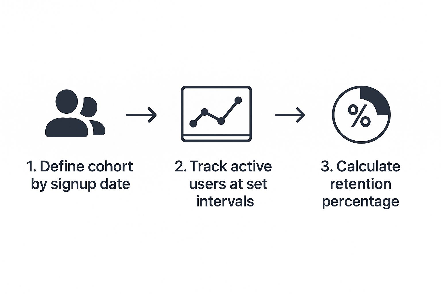
As you can see, the core of cohort analysis is just a systematic loop: define a group, track their activity, and calculate the results. Simple, yet incredibly powerful.
Putting It All Together in a Table
Here’s what a finished, simplified retention table might look like. We’re tracking monthly cohorts to see how users stick around over a four-month period.
Example Cohort Retention Table
| Acquisition Month | Total Users | Month 1 | Month 2 | Month 3 | Month 4 |
|---|---|---|---|---|---|
| January 2024 | 1,500 | 45% | 35% | 28% | 22% |
| February 2024 | 1,750 | 42% | 31% | 25% | 20% |
| March 2024 | 1,600 | 51% | 42% | 36% | 31% |
| April 2024 | 1,820 | 55% | 48% | 41% | 35% |
Tables like this are the backbone of retention analysis. They lay out the hard numbers and let you compare cohort performance at a glance. Notice how the March and April cohorts are performing better than the earlier ones? That’s exactly the kind of insight we’re looking for.
Interpreting the Visual Patterns
Once your table is built, the real analysis begins. A great trick is to apply conditional formatting—like a heat map—to make the patterns pop. You can set it up so darker colors represent higher retention. This quickly visualizes trends and draws your eye to what matters.
These questions are where strategy is born. You start connecting your actions to user outcomes. The typical "triangle" shape of the chart shows that retention naturally decays over time, but the subtle (or not-so-subtle) differences between the rows are where the gold is hidden. Your ultimate goal is to flatten that curve as much as possible and make each new cohort perform better than the last.
Turning Your Analysis into Actionable Insights
A good-looking cohort chart is nice, but that's not the point. Its real power is in the questions it makes you ask and the changes it inspires. Think of the data as the starting point, not the finish line. Your job is to look at those colorful cells and figure out the story they're telling about your users and your product.
When you see a steep drop-off in retention after week one, that's more than just a number. It's a huge red flag. It's screaming that your onboarding might not be showing people the "aha!" moment fast enough. The chart is your guide, pointing you away from just staring at data and toward forming a solid hypothesis you can actually test.
Connecting Data Points to Real-World Events
The best insights happen when you start layering your company's own history on top of the cohort data. Did retention suddenly jump for the March cohort? Don't just pat yourself on the back—figure out why.
What was going on that month? Maybe you finally shipped that feature everyone was begging for. Or perhaps the marketing team launched a new campaign that brought in a much better-fit customer. If that "February cohort" is your star performer, pull up your development logs, marketing calendar, and even support tickets from that time.
You'll probably find the cause hiding in plain sight:
- A critical bug fix that solved a major headache for new users.
- The release of new tutorials that finally made a confusing feature click.
- A pricing adjustment that attracted customers who were more serious about using your tool.
This is how your cohort retention analysis goes from being a boring historical report to a powerful diagnostic tool. You start drawing direct lines between your team's work and how users behave, which is where real product improvement begins.
From Observation to Hypothesis-Driven Action
Spotting a pattern is the easy part. Doing something about it is what matters. The goal here is to come up with hypotheses you can actually test. For instance, you notice retention takes a nosedive right after a specific feature release. Your observation is simple: retention dropped. But your hypothesis gets to the why: "The new UI for Feature X is confusing new users, causing them to bail."
Let's walk through a real-world example. A SaaS company noticed that users who invited a teammate within their first 24 hours had a 50% higher retention rate after three months.
- Observation: Users who work together, stick around.
- Hypothesis: If we encourage all new users to invite a teammate during onboarding, we can lift our overall retention.
- Action: A/B test a new onboarding flow that makes inviting a colleague the clear, easy next step.
This is how you turn a passive piece of data into an active growth experiment. You create a feedback loop of observing, hypothesizing, and testing that drives constant improvement. For more ideas on improving stickiness, our guide on customer retention best practices covers a ton of other strategies. Your cohort analysis will be the key to figuring out which of those tactics will give you the biggest bang for your buck.
Common Mistakes In Cohort Analysis To Avoid
Even seasoned teams can stumble when interpreting cohort data. The numbers themselves are solid, but a skewed perspective can lead you down the wrong path. Here’s what I watch out for in my own work—and what you should too.
Comparing Incompatible Cohorts
It’s tempting to lump every user group together and call it a day. In reality, a high-intent paid search cohort rarely mirrors behavior from a broad social media audience. When you merge those two without context, you erase the very signals you’re trying to uncover.
- Check if each group shares a similar starting point and motivation
- Make sure the acquisition channels you compare have aligned goals
- Remember: apples-to-oranges comparisons hide the true story
Relying on Surface-Level Segments
Monthly acquisition buckets give you a bird’s-eye view, but they often gloss over critical details. Within that one cohort sit multiple pricing tiers, channels, and user objectives—all mixed together.
- Go Beyond Acquisition Date: Break down users by first key action, plan type, or device at signup
- Isolate Key Behaviors: Build cohorts for those who completed onboarding versus those who didn’t, or for users who tried a “sticky” feature in session one
This extra layer helps you move from seeing a retention shift to pinpointing its cause.
Overlooking External Factors And Seasonality
Your product lives in a wider ecosystem. A dip in engagement might have nothing to do with your codebase—it could be the day a competitor dropped a big update or the start of a major holiday.
Seasonal swings matter too. A B2B SaaS platform in December behaves far differently than it does in March. Without accounting for these patterns, you’ll chase ghosts instead of genuine insights.
Frequently Asked Questions About Cohort Analysis

Let’s tackle some of the common questions I hear when teams start digging into cohort retention analysis. We'll cover which tools to start with, how often you should be running these reports, and why this is so much more powerful than just keeping an eye on your overall churn rate.
What Tools Are Best for Performing Cohort Analysis?
The right tool really comes down to your team's technical comfort level and how deep you need to go. You can find everything from ready-to-go platforms to completely custom-built solutions.
If you’re just getting your feet wet, product analytics platforms are a fantastic starting point. They have great built-in cohort tools that let you dive in without having to write a single line of code. But if you need to pull in data from multiple sources or ask really specific questions, you’ll get the most flexibility by using SQL and a dedicated BI tool.
Here's how I typically see it break down:
- Product Analytics Platforms: Tools like Mixpanel, Amplitude, or Heap are my go-to recommendation for beginners. They handle all the heavy lifting of data collection and visualization, so you can jump straight to finding insights.
- Business Intelligence (BI) Tools: When you need a bigger picture, platforms like Tableau or Looker are perfect. They let you blend your product data with information from your CRM, payment systems, or marketing platforms for a more complete view.
The best tool is simply the one that gets you from question to answer the fastest. Start simple. You can always add more powerful tools later when your questions get more complex.
How Often Should I Run a Cohort Analysis?
There’s no magic number here; the right cadence depends entirely on your business rhythm and how long it takes for a customer to see value.
For a fast-paced consumer app, you might be looking at daily or weekly cohorts to catch trends as they happen. For most B2B SaaS companies I've worked with, a monthly review is the sweet spot. It's often enough to spot meaningful changes but not so frequent that you're reacting to random noise in the data.
My advice? Start with a monthly analysis. As you get a feel for your customer lifecycle, you can adjust the frequency to match what’s most impactful for your decisions.
How Is Cohort Analysis Different From Measuring Churn?
This is a really important distinction. Your overall churn rate is a blended, top-level metric. It’s a vital sign, for sure, but it tells you what happened, not why.
Think of your churn rate like a fever—it tells you that something is wrong. Cohort analysis is the diagnostic work—the blood tests and X-rays—that uncovers the root cause.
For instance, your overall churn rate might be holding steady at 5%, which doesn't seem too alarming. But a cohort analysis could uncover a serious problem hiding beneath the surface: maybe churn for users who signed up after a confusing product update is a whopping 20%, while your older, loyal cohorts are only churning at 1%. The blended average completely masks that critical insight.
Cohort analysis isolates variables, turning a vague problem like "our churn is too high" into a specific, actionable one.
Stop guessing what customers want and start knowing. SigOS connects customer behavior to revenue, helping you prioritize the features and fixes that truly matter. Discover how SigOS can transform your product intelligence.
Keep Reading
More insights from our blog


Ready to find your hidden revenue leaks?
Start analyzing your customer feedback and discover insights that drive revenue.
Start Free Trial →