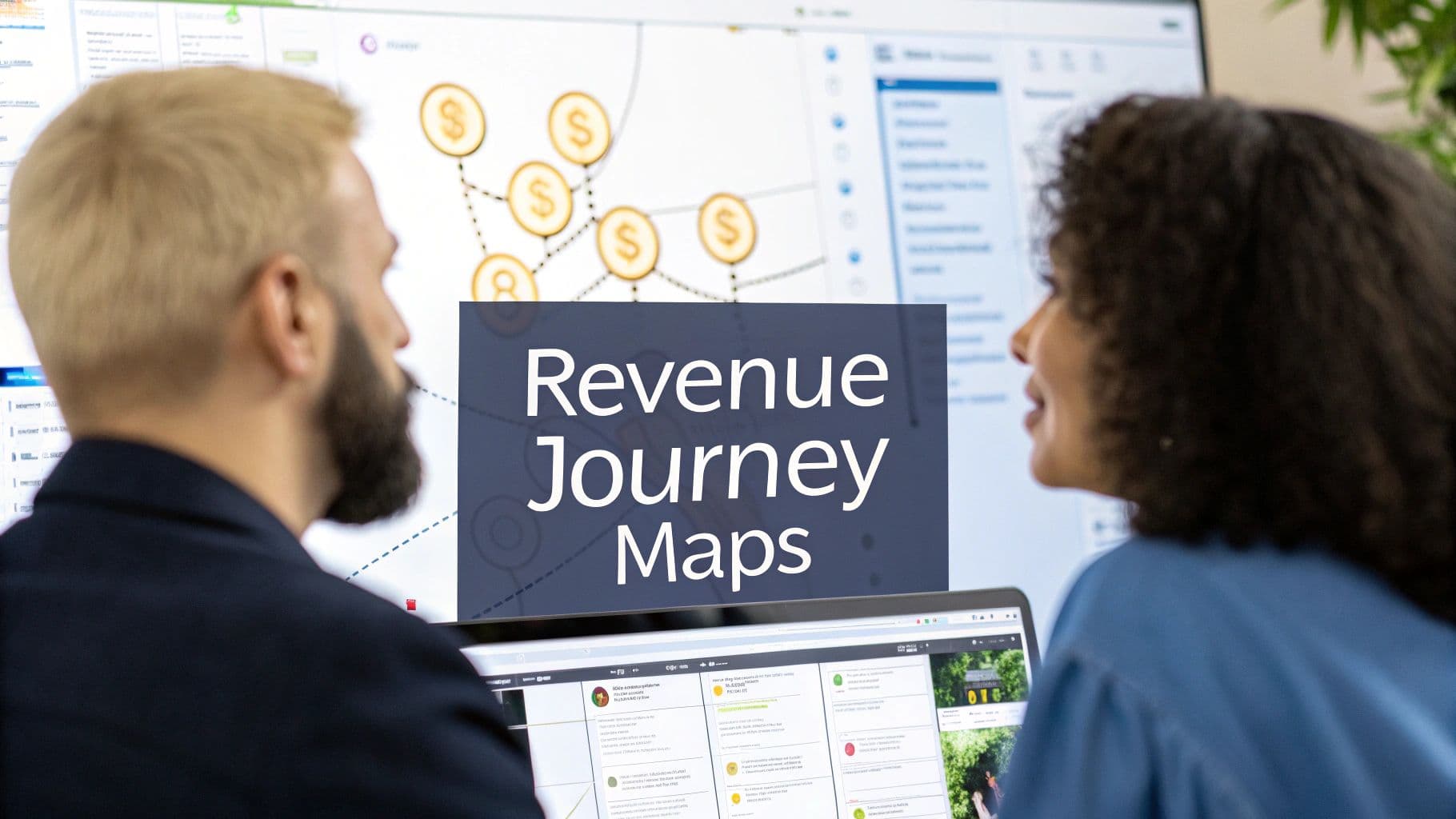
Build User Journey Maps That Drive Real Revenue
Stop making static diagrams. Learn how to build dynamic user journey maps that integrate real data, uncover revenue opportunities, and guide your CX strategy.
Let's be real for a moment. Most user journey maps are beautiful lies. They hang on a wall, looking impressive, but they become outdated artifacts the second the ink dries. We've all seen them—neat, linear diagrams that show a perfect customer path that almost no real customer ever follows.
Why Your Current User Journey Map Is Broken

The biggest problem with traditional user journey maps is that they're static. They’re a snapshot in time, a hypothesis built in a workshop, not a living reflection of what’s happening right now. This creates a massive, dangerous gap between how you think your customers behave and how they actually do.
In a world where customer expectations change by the week, a map you made last quarter is basically a history lesson. It can't possibly show you the subtle new friction points or the real "why" behind what your users are doing today.
The Disconnect Between Static Maps and Dynamic Customers
What you're left with is a tool that looks great in a slide deck but does very little to move the needle on business goals. These maps are completely disconnected from live behavioral data, which means they miss the most important parts of the story.
Think about where these old-school maps consistently fail:
- They Ignore the Chaos: Real customers are messy. They bounce from your app to a review site, get distracted, and come back a week later. A straight line on a diagram just can’t capture that reality.
- They Lack Emotional Truth: A static map might have a sticky note that says "pain point," but it can't show you the rage-clicking in a session replay or the frustration boiling over in a support chat.
- They're Divorced from Revenue: They almost never connect a specific frustrating action—like a bug in the checkout flow or a confusing onboarding step—to the actual revenue you're losing because of it.
The data backs this up. It turns out only 34% of companies even have a well-defined mapping strategy. That’s a shocking number when you consider that 80% of customers now demand a seamless experience across every single touchpoint. You can find more insights on this from the team at SuperAGI.
This isn't just a small gap; it's a huge opportunity. It’s time to stop making wall art and start building a living tool that genuinely helps you improve retention and grow your business.
Gathering the Right Intelligence for Your Map
A powerful user journey map isn’t built on assumptions; it’s built on a foundation of rich, multi-layered data. Before you can even think about drawing a single box or arrow, you have to do the legwork of gathering in-depth intelligence, and that starts with understanding your ideal customer through buyer personas. This moves you away from a generic "user" and toward a real, human-centered perspective.
But personas are just the entry point. The real magic happens when you blend different types of data to get a complete, 360-degree view of the user experience. Your map needs to be fueled by both qualitative and quantitative insights. This dual approach is non-negotiable because it ensures you understand not just what users are doing, but why they're doing it.
Combining Quantitative and Qualitative Data
First, let's talk about the numbers. Quantitative data is the hard evidence of user behavior—it tells a story with data, giving you an objective look at where people succeed and where they struggle at scale.
- Analytics Platforms: Dive into metrics like bounce rates, time on page, conversion funnels, and feature adoption. Where are the glaring drop-offs?
- Heatmaps and Scroll Maps: These tools are fantastic for visualizing where users are clicking, moving their cursors, and how far they scroll. It’s a quick way to spot areas of high engagement or total confusion.
- Session Recordings: I can't recommend these enough. Watching anonymized recordings of real user sessions is one of the most direct ways to see exactly where users get stuck, hesitate, or hit a frustrating bug.
But numbers alone can be misleading. This is where qualitative insights become your superpower in building an effective user journey map. Qualitative data provides the emotional context, the why behind the what.
Defining Your Map’s Objective
With this mix of data in hand, you need to define a sharp, business-focused objective for your map. A journey map without a clear goal is just a pretty picture. Get your team in a room and ask: what specific problem are we trying to solve with this?
- Are we trying to slash churn in the first 30 days?
- Is our primary goal to boost free-to-paid trial conversions?
- Do we need to figure out why the new user onboarding flow isn't leading to activation?
Defining a clear objective from the start ties your mapping efforts directly to tangible business outcomes. It also helps narrow your focus to a specific user segment and their "job to be done." For a much deeper dive on this, our Jobs to be Done template offers a great framework. This approach fundamentally shifts the focus from who the user is to what they are trying to accomplish—a far more powerful lens for this kind of work.
By blending these different data streams and setting a clear goal, you create a rock-solid foundation. Your user journey map stops being a static diagram and becomes a living, breathing strategic tool that can confidently guide product decisions and prioritize work based on real-world evidence.
How to Build a Modern User Journey Map
This is where the magic happens—turning all that raw data you've gathered into a clear, visual story. A modern user journey map isn't just a pretty, linear diagram. It's a reflection of reality, capturing the messy, roundabout paths your customers actually take. The goal is to honestly map out their entire experience, from their first interaction to their last, including their actions, touchpoints, and emotional state.
A great way to start is by sketching out the key phases of the journey. For a B2B SaaS product, you'll typically see stages like Awareness, Consideration, Onboarding, Adoption, and Advocacy. But don't just guess what these look like. Dig into your data—both the hard numbers and the customer interviews—to define what each phase really means for your users. What specific behavior tells you a customer has moved from just "Considering" your tool to actively "Onboarding"?
You're essentially blending different streams of information into one cohesive narrative. The process looks a lot like this:

As you can see, a successful map is a true synthesis of analytics and human stories, all pointing toward what the business needs to accomplish.
Mapping the B2B SaaS Journey
Let's walk through a real-world scenario. Imagine a marketing manager named "Maria" who's on the hunt for a new social media scheduling tool.
- Awareness: Maria first spots your tool in a LinkedIn post. That's her initial touchpoint. Her first action? Clicking the link to your blog.
- Consideration: After reading a couple of articles, she heads over to your pricing page. Now she’s feeling a mix of interest but also some confusion about the different feature tiers. That emotional shift is a golden nugget of insight.
- Onboarding: Maria decides to give the free trial a go. Her immediate goal is to connect one social account and schedule five posts. This stage is really a sequence of smaller tasks, which you can dive deeper into by looking at different user flow examples that break down these kinds of specific paths.
By mapping these details, Maria's journey comes to life. You're not just seeing what she did; you're getting a clear picture of what she was likely thinking and feeling every step of the way.
Key Stages of a B2B SaaS User Journey
To make your map digestible and avoid an overwhelming wall of sticky notes, structuring it with clear swimlanes is crucial. The table below breaks down the typical stages, what the user is trying to accomplish, their feelings, and where things can go wrong (or right!).
| Stage | User Goal | Actions & Touchpoints | User Emotions | Pain Points & Opportunities |
|---|---|---|---|---|
| Awareness | "I have a problem that needs a solution." | Sees an ad, reads a blog post, gets a recommendation. | Curious, overwhelmed, hopeful. | Pain: Information overload. Opportunity: Offer a clear, concise value proposition. |
| Consideration | "Is this the right tool for me?" | Compares features, checks pricing, reads reviews, signs up for a demo. | Interested, skeptical, confused. | Pain: Unclear pricing or feature tiers. Opportunity: Provide transparent comparisons and case studies. |
| Onboarding | "How do I get this thing set up and working?" | Creates account, connects integrations, follows setup wizard. | Excited, anxious, frustrated. | Pain: A complicated setup process. Opportunity: Offer an intuitive wizard and helpful tooltips. |
| Adoption | "How can I get the most value out of this?" | Explores advanced features, invites team members, builds workflows. | Confident, engaged, empowered. | Pain: Hidden or complex features. Opportunity: Use in-app guides and email campaigns to highlight value. |
| Advocacy | "I love this tool and want to tell others." | Leaves a positive review, refers a colleague, participates in a case study. | Loyal, satisfied, proud. | Pain: No easy way to share feedback. Opportunity: Create a simple referral or review program. |
Using a structure like this ensures you're capturing the complete picture, not just a series of clicks. This approach is quickly becoming a core business strategy, not just a niche UX exercise. The global customer journey mapping software market is projected to hit USD 16.8 billion by 2025, with the United States alone set to grow at a CAGR of 16.1%.
When you build a map that's detailed, empathetic, and rooted in cross-functional collaboration, you create an incredibly powerful tool that aligns your entire organization on what matters most: delivering better outcomes for your customers.
Connecting User Actions to Revenue Impact
So, you’ve built a map that tells a pretty compelling story about what your users are going through. That's a huge step. But if you want to turn that empathetic diagram into a tool that actually drives profit, you need to connect the dots between what people do in your product and how it affects your bottom line.
This is where you pinpoint the make-or-break moments in the journey. We're looking for the specific actions that separate your most valuable, long-term customers from the ones who eventually churn.
These aren't just random clicks. They're high-impact behavioral signals—the "aha moments" that have a strong correlation with someone sticking around and paying you. For a project management tool, maybe it’s a user inviting three teammates in their first week. For an analytics platform, it could be the moment they create and share their first custom dashboard.
When a user takes one of these actions, they're not just kicking the tires anymore. They're actively embedding your product into their daily work and starting to get real, tangible value from it. Finding these signals is the secret to understanding where value is truly created, both for them and for your business.
Finding Your High-Value Signals
To unearth these critical behaviors, you need to get your hands dirty in the data. Start with one simple question: what do our best customers do that our churned customers don't?
- Analyze Your Power Users: Dive into the behavioral patterns of your most loyal, high-LTV customers. What features did they jump on in their first seven days? How fast did they blow through key onboarding steps?
- Segment by Outcome: Run a side-by-side comparison of the journeys of users who converted from a trial versus those who didn’t. What specific actions did the successful group take that the other group skipped?
- Talk to Sales and Success: Your customer-facing teams are sitting on a goldmine of information. They know which feature demo gets the contract signed and which onboarding step is a non-negotiable for long-term adoption.
This process shines a bright light on the exact moments where your best customers succeed and others fall off a cliff. When you layer this data directly onto your user journey maps, you suddenly have an incredibly powerful new lens to work with.
Prioritizing Fixes by Revenue Impact
Once you’ve identified these high-value signals and the roadblocks keeping users from hitting them, prioritization becomes a whole lot easier. You can finally start quantifying the potential ROI of fixing a specific problem.
The conversation completely shifts. Instead of the team debating which bug to tackle next, you’re discussing which fix will have the biggest impact on retaining customers and growing revenue.
If you want to take this even further, you can tie these insights directly to customer lifetime value (LTV). Understanding how these key actions influence long-term value is a game-changer for making smarter, data-backed decisions. For a deeper dive, check out our guide on calculating customer lifetime value for SaaS.
With this revenue-focused approach, your roadmap is no longer built on gut feelings or who shouts the loudest in a meeting. It’s built on a clear, data-driven understanding of what actions actually grow the business, turning your journey map into a strategic weapon for sustainable success.
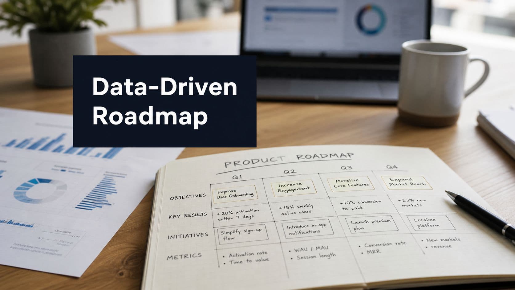
Turning Your Journey Map Into Action

A data-rich user journey map is an incredible diagnostic tool, but its real value only shines when it actually sparks change. An insight sitting on a slide deck is just an observation. Now, it's time to turn that detailed visual into a concrete plan for improvement.
The first move is to get the right people in a room with the map. This isn’t a siloed product team task. It needs to be a cross-functional workshop. Pull in stakeholders from product, engineering, marketing, sales, and especially customer support. Each person brings a different lens to the problem, which not only enriches the analysis but also creates a sense of shared ownership over the solutions.
Running an Effective Workshop
The goal here is simple: analyze the map, pinpoint the most critical friction points, and brainstorm high-impact solutions.
You'll want to walk the team through the entire journey, stage by stage, with the map as your guide. Zero in on the moments where you see user frustration spike or when people are abandoning high-value actions.
Encourage a "no bad ideas" brainstorming session around these pain points. Let’s say the map reveals that users are constantly getting stuck during the initial setup of a key integration. The team might come up with ideas like:
- Creating a quick, step-by-step video tutorial.
- Building in-app guidance with interactive tooltips.
- Simplifying the UI to slash the number of required steps.
Your journey map helps you find exactly where things are breaking. For a great real-world example of this in practice, check out this case study on bottleneck removal in onboarding. It really helps frame how these findings translate into tangible fixes.
A Simple Model for Prioritization
After a good brainstorm, you’ll probably have a long list of potential fixes and new features. You can't tackle everything at once, so ruthless prioritization is your best friend.
A simple but surprisingly effective way to do this is to score each idea against three core criteria:
- User Impact: How many users does this problem affect, and how severe is the pain? (Score 1-5)
- Revenue Potential: How directly is this friction point tied to churn, lost deals, or missed expansion revenue? (Score 1-5)
- Engineering Effort: How complex and time-consuming will this be to build? (Score 1-5, where 1 is a ton of effort and 5 is a quick fix)
This scoring system helps you get past gut feelings and make objective, data-informed decisions about where to spend your resources first. The ideas with the highest scores are your quick wins and most strategic bets.
This action-oriented approach is precisely why companies are investing so heavily in this space. The customer journey analytics market is projected to grow from USD 20.87 billion in 2025 to USD 48.40 billion by 2030, and mapping applications are a huge part of that.
This proves there's a direct line from mapping insights to measurable ROI, turning your map from a static document into a dynamic playbook for business success.
Got Questions About User Journey Mapping?
It's one thing to talk about building a user journey map, but it's another to actually do it. When teams roll up their sleeves, a few practical questions almost always come up.
Let's clear up some of the most common hurdles right now.
How Often Should We Update Our Journey Map?
Your user journey map should be a living, breathing document, not something you create once and then frame on the wall. A good rule of thumb is to set aside time for a formal review and update every quarter.
That said, you should also treat certain events as triggers for a refresh. Did you just launch a major new feature? Overhaul your marketing strategy? Get a sudden surge of feedback (good or bad) from a new user segment? Those are all perfect moments to revisit the map.
Integrating continuous behavioral data is the real secret here. It keeps your map grounded in reality day-to-day, so those quarterly check-ins are about refining, not starting from scratch.
Is This a User Journey Map or a User Flow?
Ah, the classic question. It's easy to mix these two up, but they serve very different purposes. The difference really boils down to scope.
- A user flow is super specific and tactical. Think of it as a mini-map for a single task, like the exact clicks a user makes to reset their password or add a new team member.
- A user journey map is the big picture. It's strategic, capturing the entire experience a person has with your company over time—from the moment they first hear about you, through their sign-up process, and well into their life as a long-term customer. It includes their goals, feelings, and pain points along the way.
I like to think of it this way: a user flow is a single chapter, but the user journey map is the whole book. It gives you the high-level story that makes each individual flow make sense.
Can We Do This on a Shoestring Budget?
You absolutely can. Don't let a tight budget stop you from getting started. The trick is to be scrappy and prove the value with a smaller, focused effort first.
Instead of trying to map everything at once, pick one critical journey to start with. The path from a new trial sign-up to becoming a paid customer is always a great candidate.
For tools, you can use the free tiers of collaborative whiteboards like Miro or FigJam to build your map. For the data, you just need to get creative with what you already have. Comb through your support tickets, read your G2 and Capterra reviews, and just talk to a few customers. Five focused interviews will give you more insight than you'd think.
Transform your customer feedback from noise into revenue-driving signals. SigOS uses AI to analyze behavioral data and prioritize the fixes and features that have the biggest impact on your bottom line. Learn how SigOS can connect your user journey to real revenue outcomes.


Ready to find your hidden revenue leaks?
Start analyzing your customer feedback and discover insights that drive revenue.
Start Free Trial →