Build a Dashboard for Metrics That Drives Revenue
Learn to build a dashboard for metrics that connects SaaS data to revenue. Go beyond vanity metrics with actionable KPIs, visuals, and automation.

A truly great metrics dashboard does one thing exceptionally well: it answers your most pressing business questions in a single glance. It's not just a gallery of charts. It's the connective tissue between your team's daily grind and the big-picture goals—like growing revenue and keeping customers happy.
The whole point is to move beyond impressive-sounding but ultimately hollow vanity metrics and zero in on the Key Performance Indicators (KPIs) that actually drive the business forward.
Build Your Foundation Beyond Vanity Metrics
First things first, you have to decide what’s truly worth measuring. This is where many teams get sidetracked by the allure of vanity metrics. Sure, a huge number of total sign-ups or a spike in social media followers feels good, but do those numbers actually mean the business is healthy? Not usually.
A dashboard that provides real value is built on a solid foundation of KPIs tied directly to revenue, user retention, and churn.
This means starting with your core business objectives. For a SaaS company, that might be increasing annual recurring revenue by 20% or cutting customer churn in half. Once you know what you're aiming for, you can work backward to identify the metrics that tell you if you're on the right track. This isn't just a nice-to-have anymore; it's becoming standard practice. The global dashboard software market was valued at USD 4.5 billion in 2023 and is projected to more than double to USD 9.8 billion by 2032, according to a recent market analysis. That explosion is happening because everyone is trying to get a simpler, more actionable handle on their data.
Differentiating Leading from Lagging Indicators
One of the most common traps I see teams fall into is building a dashboard that only looks in the rearview mirror. They pack it with lagging indicators—metrics that tell you what already happened. Monthly Recurring Revenue (MRR) is the classic example. It’s critical to know, but it’s a result of past actions. It doesn’t tell you what’s coming next.
A forward-looking dashboard needs a healthy mix of lagging indicators and leading indicators. Leading indicators are the predictive metrics; they give you an early warning if things are heading in the right or wrong direction.
- Leading Indicator Example: Think about the adoption rate of a new, "sticky" feature. If that rate is climbing, it’s a great sign that users are getting value, which often predicts better retention and lower churn down the road.
- Lagging Indicator Example: Your Customer Churn Rate, on the other hand, is a lagging indicator. It tells you, definitively, how many customers you lost last month or last quarter.
Before we go further, let's map this out. Tying specific metrics to your overarching goals is the most crucial step. Without this connection, you're just tracking numbers for the sake of tracking numbers.
Connecting Metrics to Business Goals
| Business Goal | Leading Indicator (KPI) | Lagging Indicator (KPI) | Why It Matters |
|---|---|---|---|
| Increase User Engagement | Weekly Active Users (WAU), Avg. Session Duration, Key Feature Adoption Rate | Monthly Active Users (MAU), Customer Satisfaction (CSAT) Score | Leading indicators show if users are forming habits now, which will eventually be reflected in broader MAU and satisfaction scores. |
| Reduce Customer Churn | # of Support Tickets per Account, Product Usage Frequency, Health Score | Customer Churn Rate, Net Revenue Retention | Tracking support tickets or a drop in usage can signal a customer is at risk before they actually cancel their subscription. |
| Improve Product Adoption | New User Onboarding Completion Rate, Free-to-Paid Conversion Rate | Time-to-Value (TTV), Customer Lifetime Value (CLV) | A smooth onboarding experience (leading) is a strong predictor that a user will find value quickly and stick around long-term (lagging). |
| Drive Expansion Revenue | % of Accounts Nearing Usage Limits, Upsell/Cross-sell Qualified Leads | Average Revenue Per Account (ARPA), Expansion MRR | These leading indicators identify customers who are outgrowing their current plan and are ripe for an upgrade, directly impacting revenue. |
This table is just a starting point. The key is to have a clear line of sight from the metrics you track every day to the high-level results the business cares about.
Brainstorming Metrics That Matter
So, how do you come up with the right mix of KPIs for your dashboard? Get the right people in a room. Pull in stakeholders from product, sales, customer success, and marketing and facilitate a brainstorming session.
The trick is to frame the conversation around questions, not metrics.
Instead of starting with, "What should we track?" kick things off with questions like these:
- What specific actions do users take right before they upgrade their plan?
- Which features are our happiest, long-term customers using the most?
- What are the absolute earliest warning signs that a healthy account is starting to go south?
This question-first approach forces everyone to think about purpose. It ensures every single chart on your dashboard has a job to do, turning it from a passive report into an active, strategic guide.
Unify Your Data to See the Full Picture
Your dashboard is only as good as the data feeding it. Think of it less as an isolated island of information and more as a central hub, pulling in intel from all your different territories—product usage, customer support, sales, you name it. This is how you create a single, unified view of the entire customer journey.
Without this holistic view, you’re just catching fragmented scenes instead of watching the whole movie.
Imagine your product team notices a sudden drop in a key feature's usage inside Mixpanel. At the same time, the support team is getting slammed with tickets in Zendesk about that exact same feature being buggy. If those two data streams aren't connected, both teams could spin their wheels for weeks, completely unaware they're chasing the same root problem.
The goal is to tear down these data silos and get all your information talking to each other automatically.
Identify and Map Your Key Data Sources
First things first, you need to figure out where your most valuable customer data actually lives. For most SaaS companies, it’s usually scattered across a few core systems.
You'll typically find critical insights in places like these:
- Product Analytics Platforms: Tools like Mixpanel or Amplitude are fantastic for tracking what users are doing in your product. This is where you'll find your engagement, feature adoption, and retention metrics.
- Customer Support Systems: Platforms like Zendesk or Intercom capture the why behind user actions. This is the raw, unfiltered voice of your customer—their frustrations, their questions, and their feature requests.
- CRM and Sales Software: Your Salesforce instance holds all the commercial context. It tells you about account health, contract values, and the journey from lead to loyal customer.
Now, pulling all this together isn't always a walk in the park. You’ll likely hit some bumps, especially with data cleaning and standardization. A common headache? A customer might be identified by their email in Zendesk but a numeric user ID in your product analytics. You have to find a consistent way to link them. For a deeper look at navigating these challenges, our guide on data integration best practices lays out a solid framework.
This diagram helps visualize how to connect your high-level goals to the specific metrics you’ll be tracking.
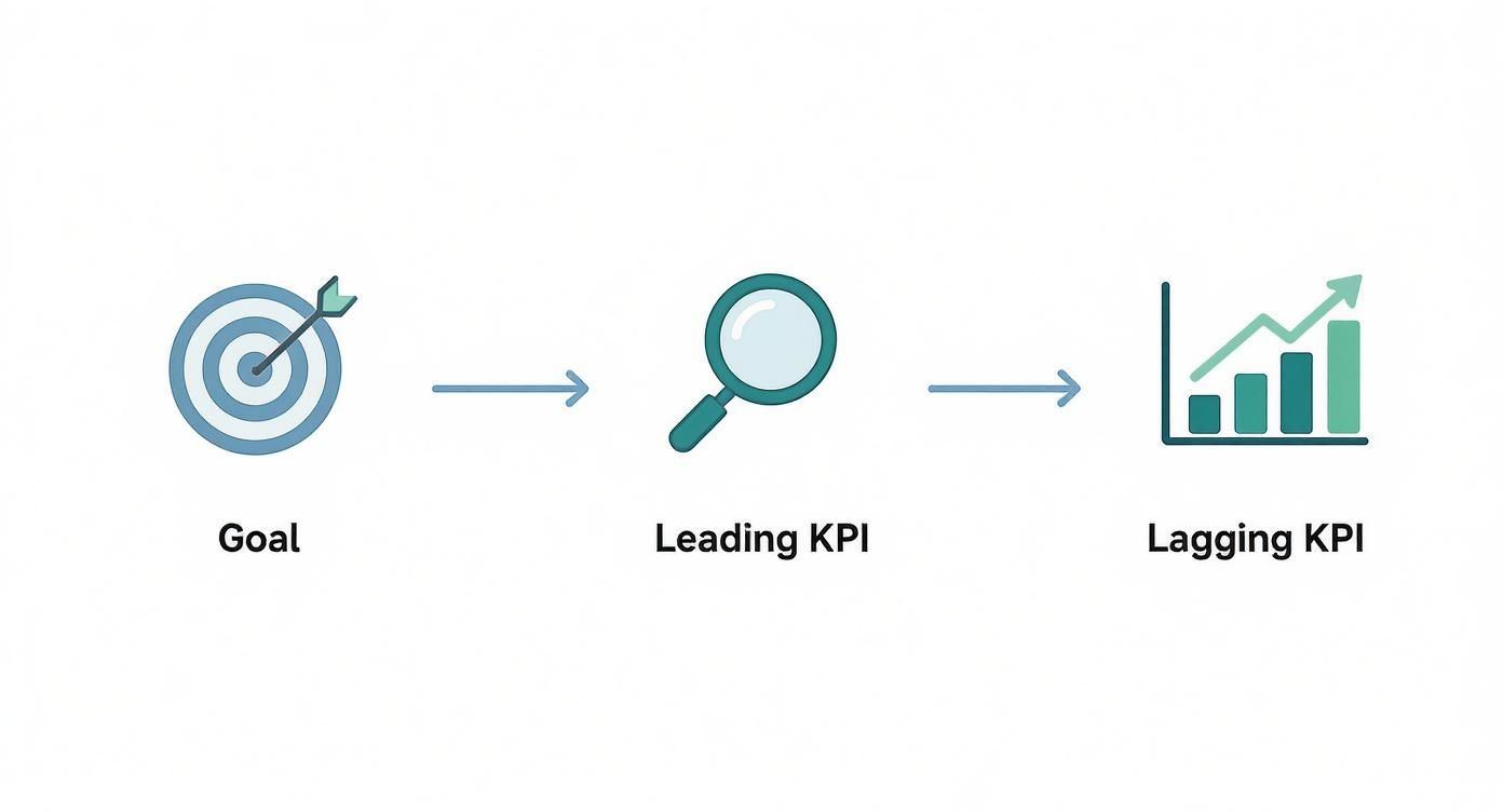
It’s all about creating a clear line of sight from your big-picture strategy down to the daily leading and lagging indicators that show if you're on the right track.
Design Dashboards for Clarity and Action
You can have the best data in the world, but if you present it poorly, it's useless. I’ve seen it happen time and again: teams spend months on data infrastructure only to build a cluttered, confusing dashboard that everyone ignores. The best dashboards tell a clear story at a glance, guiding your eye to the most important information and making the key takeaways obvious.

This isn't just about making things look pretty; it's a massive adoption issue. For all the talk about being "data-driven," the reality is that most people don't use the tools they're given. In fact, research shows that only about 25% of employees actively use their company's BI or analytics platforms. A well-designed dashboard is your best shot at bridging that gap.
Guiding the User’s Eye
A great dashboard has a natural flow, a visual hierarchy that makes sense immediately. Think of it like the front page of a newspaper. The biggest, boldest headline is right at the top, and you can drill down from there.
My advice is to always use a top-down approach:
- Top Level: Start with the big numbers—the 3-5 high-level KPIs that tell you if you're winning or losing. These are your headline metrics like Monthly Recurring Revenue (MRR), Customer Churn Rate, and Net Revenue Retention.
- Mid Level: Right below those, you need context. This is where trend charts come in. Is that MRR number good or bad compared to the last six months? Is that recent spike in churn a blip, or is it the start of a scary trend?
- Granular Level: At the bottom, you can get into the operational weeds. This is where you might find a breakdown of new sign-ups by channel or the top 5 most reported bugs from last week.
This structure means a CEO can get a 30-second health check, while a product manager can dig into the specifics, all from the same screen. If you're looking for some solid visual inspiration, checking out real-world Power BI dashboard examples is a great way to see this in practice.
Choosing the Right Visualization for the Job
Please, step away from the default pie chart. The type of chart you pick can make the difference between instant understanding and total confusion. Each visualization has a specific job to do.
Here’s a quick-and-dirty guide I use:
- Trend Lines: The only choice for showing performance over time. Perfect for tracking user engagement, revenue growth, or ticket volume.
- Bar Charts: Use these when you're comparing distinct categories. Think feature usage across different customer plans or support tickets by product area.
- Heat Maps: These are fantastic for quickly showing "hot spots" in complex data, like where users are clicking most on a webpage.
- Funnel Visualizations: Absolutely essential for tracking conversion. If you have an onboarding flow or a sales pipeline, you need a funnel.
Ultimately, every single element on your dashboard has to earn its place. To get a much deeper dive on this, our guide on the best practices for data visualization will help you make sure your charts are both beautiful and brutally effective.
Turn Your Dashboard into a Proactive Watchtower with AI and Automation
A great metrics dashboard isn't just a passive screen of charts you check once a day. It should be an active, intelligent member of your team. The real magic happens when you stop just looking at data and start making the dashboard work for you, 24/7.
This is about turning your dashboard into a smart monitoring system. One that alerts you to problems and opportunities the second they pop up, fundamentally shifting your team from a reactive "what just happened?" mindset to a proactive one.
Set Up Intelligent, Automated Alerts
The first move is to build a system of smart alerts that plug directly into your team's existing workflows. Instead of relying on someone to notice a dip in a key metric, the dashboard should spot the trend, flag it, and immediately kick off a response. It becomes the central nervous system for your product.
Think about it this way: you can set up a rule that a sudden 15% drop in your user activation rate over a 24-hour period does more than just turn a number red. It could instantly:
- Ping a high-priority notification into a dedicated Slack channel like
#product-fire-alerts. - Create a Jira ticket and automatically assign it to the product manager who owns onboarding.
- Tag the customer success team in Intercom or Zendesk to start digging into recent support tickets from new users.
This kind of automated workflow collapses the time from insight to action from days down to minutes. It makes sure critical signals are never missed and that the right people are looped in without anyone having to lift a finger.
Go Deeper with Anomaly Detection and Predictive Analytics
Simple threshold alerts are great, but AI integration is making dashboards so much smarter. AI-powered features can learn from your historical data to figure out what "normal" looks like for your key metrics. Then, they can flag deviations a human would likely miss.
This is anomaly detection in action. It’s far more nuanced than a simple "if this, then that" rule. For example, it might pick up on a subtle, steady decline in user engagement from a specific country over three days—a quiet trend that wouldn’t trigger a big alarm but could point to a localized bug or performance issue.
The global push for AI makes this kind of capability more important than ever. With 78% of organizations now using AI in at least one business function, the pressure to measure its impact is immense. This is where a modern dashboard for metrics is no longer a nice-to-have; it's essential for proving value.
This forecasting power helps you get ahead of problems before they ever hit your bottom line. To dig deeper into how AI is becoming a must-have, check out this article on Why Every Sales Team Needs an AI Sales Assistant. By automating alerts and adding predictive capabilities, your dashboard evolves from a simple reporting tool into an indispensable strategic partner.
Turn Your Dashboard Insights Into Action
A dashboard full of beautiful charts is useless if it doesn't inspire action. Let's be honest, an insight that isn't acted upon is just trivia. The final, and arguably most critical, step is bridging the gap between seeing a change in your data and knowing exactly what to do about it. This is where you graduate from passive monitoring to an active, coordinated response.
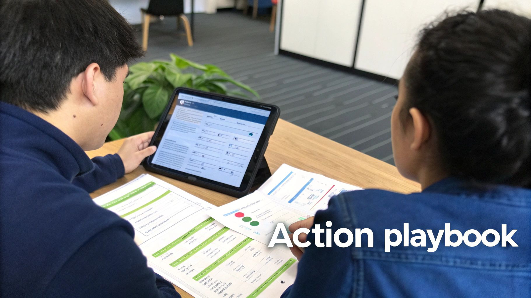
This is where action playbooks come in. Think of them as predefined, documented battle plans for specific data scenarios—basically, standard operating procedures for your metrics. When an alert fires, there should be zero ambiguity about what happens next.
Creating Your First Action Playbook
A playbook doesn't need to be some hundred-page document. It just needs to clearly answer three simple questions: What happened? Who owns it? What are the immediate next steps?
Imagine your dashboard for metrics flags a sudden 20% spike in customer churn for users on your Pro plan. Without a playbook, that alert can trigger panic, finger-pointing, and scattered, inefficient efforts. But with a playbook, the response is immediate and organized.
Here’s how a simple playbook for that exact scenario might look:
- Trigger: Churn rate for Pro plan customers increases by >15% week-over-week.
- Owner: Head of Customer Success.
- Immediate Action (First 60 Minutes): The CS lead pulls a list of all recently churned Pro accounts. They immediately cross-reference that list against recent support tickets in Zendesk to find a common complaint or theme.
- Communication: A summary of initial findings is posted in the
#retention-squadSlack channel, tagging the relevant Product Manager.
This simple structure transforms a vague, scary problem into a clear, actionable task with a designated owner. It gets the right information to the right people, instantly.
Expanding Playbooks Across the Business
The churn example is just one scenario. A robust set of playbooks will cover both negative trends and positive opportunities your dashboard uncovers. It's crucial to understand the financial impact of these movements. For instance, a rise in churn directly erodes your bottom line by reducing the potential lifetime value of a customer for your SaaS business.
Here’s a quick look at what a simple action playbook table can look like. This provides a clear, at-a-glance reference for the entire team, eliminating any confusion when an alert goes off.
Sample Dashboard Action Playbook
| Triggering Metric | Threshold | Immediate Action (First 60 Mins) | Responsible Team | Communication Channel |
|---|---|---|---|---|
| New User Activation Rate | Drops below 50% for 48 hours | Product team reviews the last 24 hours of sign-up session recordings. | Product | Jira Ticket & Slack |
| P95 API Response Time | Exceeds 800ms for 1 hour | Engineering team analyzes logs for performance bottlenecks. | Engineering | PagerDuty Alert & Slack |
| Upsell Qualified Leads | Increases by 25% week-over-week | Sales team initiates outreach sequence to all qualified accounts. | Sales | Salesforce Task & Slack |
By creating and maintaining these playbooks, your dashboard becomes so much more than a reporting tool. It evolves into the command center for a well-oiled machine, ensuring every important data point is met with a swift, intelligent, and coordinated response.
Have More Questions? We've Got Answers
Even with a solid plan in hand, diving into your first metrics dashboard can bring up a lot of questions. Let's walk through some of the most common ones we hear from product and SaaS teams as they start building.
What's the Single Biggest Mistake Teams Make?
Without a doubt, it’s focusing on quantity over quality. I've seen it time and again: teams get excited and try to track absolutely everything. The result is always the same—a cluttered, overwhelming dashboard where the truly critical signals are completely lost in the noise.
The best way to avoid this is to start small. Seriously. Pick just 5-7 core KPIs that tie directly to your most important business goals. You can always add more later. Starting with a focused, curated set ensures your dashboard is actually actionable and easy for everyone to rally around.
How Often Should We Be Looking at This Thing?
A dashboard isn't a "set it and forget it" report that collects digital dust. It's a living, breathing tool, and how often you check it really depends on what you're measuring.
- Day-to-day operational metrics like new sign-ups or incoming support ticket volume? You’ll want to keep an eye on those daily or at least weekly.
- Bigger-picture strategic KPIs like Customer Lifetime Value (CLV) or your overall churn rate are better reviewed on a monthly or quarterly basis.
A non-negotiable rule: formally review the entire dashboard every single quarter. Your business goals will shift, and if your dashboard doesn't shift with them, it quickly becomes irrelevant.
What Are the Best Tools for Building a Metrics Dashboard?
This one comes down to your specific needs, where your data lives, and how technical your team is. The good news is there are fantastic options for every stage.
If you're just starting out, tools like Geckoboard or Databox are brilliant. They’re known for being user-friendly and have a ton of pre-built integrations that get you up and running fast.
For teams needing to do more complex data deep-dives and custom visualizations, the industry heavyweights are Tableau, Looker (now part of Google Cloud), and Power BI. These are incredibly powerful and flexible. And if you're laser-focused on product analytics, platforms like Amplitude or Mixpanel have fantastic, purpose-built dashboarding features baked right in.
The right tool gives you the charts and graphs, but the real magic happens when you turn raw customer feedback into insights that grow your revenue. SigOS plugs directly into your support tickets, sales calls, and usage data to automatically find and quantify the exact issues costing you money. It helps you build a dashboard that doesn't just report numbers—it drives action. Learn how SigOS can pinpoint your most impactful metrics.


Ready to find your hidden revenue leaks?
Start analyzing your customer feedback and discover insights that drive revenue.
Start Free Trial →