How to Create a Data Architecture Diagram That Actually Works
A practical guide to creating a data architecture diagram that aligns teams and prevents costly errors. Learn components, tools, and real-world patterns.

A data architecture diagram is the blueprint for your entire data ecosystem. It’s a visual map that shows exactly how data flows—from collection and storage to processing and finally, how it’s put to work inside your organization. Far from being just a technical flowchart, it’s a strategic business asset. It translates incredibly complex data systems into a clear, shared language that everyone from an engineer to a CEO can understand.
Why Your Diagram Is a Strategic Blueprint
It's easy to see a data architecture diagram as just another piece of technical documentation—something you create once, file away, and forget about. But that's a huge mistake. Its real power lies in its role as a strategic blueprint that directly connects your technology stack to your business goals. Without this visual guide, teams drift into silos, which almost always leads to redundant data pipelines, inconsistent analytics, and painful integration failures down the line.
Think of it like the architectural plan for a skyscraper. You wouldn't dream of pouring the foundation without a detailed blueprint showing how the electrical, plumbing, and structural supports all fit together. A data architecture diagram does the same for your data, giving you a complete picture and making sure every component works in harmony.
A solid diagram serves several key purposes, each delivering value to different parts of the business. It’s not just for engineers; it’s a communication tool for the entire organization.
Core Objectives of a Data Architecture Diagram
| Objective | Primary Beneficiary | Business Impact |
|---|---|---|
| Align Technology & Business | Executive Leadership, Product Managers | Ensures data initiatives directly support key business outcomes and KPIs. |
| Clarify Data Flows | Data Engineers, Analysts | Reduces ambiguity and errors by visually mapping data sources, transformations, and destinations. |
| Accelerate Onboarding | New Hires (All Roles) | Drastically shortens the time it takes for new team members to understand the data landscape. |
| Identify System Bottlenecks | Engineering, DevOps | Makes it easier to spot and resolve performance issues before they cause system-wide failures. |
| Streamline Governance | Security, Compliance Teams | Provides a clear audit trail for data lineage, access controls, and regulatory compliance. |
Ultimately, a well-maintained diagram fosters a shared understanding that prevents miscommunication and ensures everyone is pulling in the same direction.
Unifying Teams with a Common Language
One of the toughest hurdles in any data-driven company is the communication gap between engineers, product managers, and business leaders. Engineers talk about APIs, ETL jobs, and database schemas. Meanwhile, stakeholders are focused on KPIs, revenue, and customer churn. A good diagram acts as a Rosetta Stone, bridging this gap with a shared visual language.
For example, a product manager can pull up the diagram in a meeting and walk executives through the exact path customer feedback from Zendesk takes. They can point to how it’s ingested, processed by a platform like SigOS, and where it lands in the data warehouse to influence the next product release. That kind of visual storytelling is infinitely more effective than a dense technical spec sheet.
A data architecture diagram transforms abstract technical processes into a tangible map that everyone can follow. It removes ambiguity, clarifies dependencies, and ensures that when a business leader asks "Where does this data come from?" there’s a clear, immediate answer.
Preventing Costly Mistakes and Technical Debt
Trying to manage a data system without a clear diagram is like trying to navigate a new city without a map. You might get where you’re going eventually, but you'll probably take a few wrong turns, hit dead ends, and burn through time and resources. When new engineers join, a diagram cuts their onboarding time from weeks to days, because they can see the data flows and dependencies right away.
This clarity is more important than ever. By 2028, we're on track to generate a mind-boggling 394 zettabytes of data globally. As you can read in these data architecture trends on Dataversity, this explosion makes visual guides essential for taming complexity. With only 20% of companies feeling confident they can even analyze the data they have, a diagram becomes a non-negotiable tool for spotting bottlenecks and optimizing performance before they become full-blown disasters.
Putting in the effort to create and maintain a data architecture diagram pays off in very real ways:
- It cuts down on redundancy. You can quickly see if another team is already building a pipeline for the same data source.
- It helps you scale. It’s much easier to pinpoint and fix performance issues when you can see the whole system.
- It simplifies compliance. A clear map of data flows is invaluable for security audits and data governance.
- It speeds up development. Teams can build new features faster when they have a clear understanding of the existing data landscape.
Mapping the Core Components of Your Data Ecosystem
A data architecture diagram is more than just boxes and arrows; it’s the story of your data’s journey. To tell that story well, you have to map out every single stage, from its raw, messy origin to its final, polished destination as a critical business insight. When you break the ecosystem down into its core components, the entire system suddenly becomes clear, even for people who don't live and breathe data.
This isn't just an academic exercise. It's about turning abstract concepts into a tangible, working map. This is what it looks like to go from chaos to clarity.
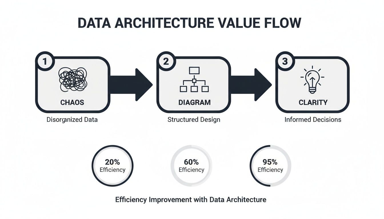
A well-designed diagram is the bridge connecting disorganized data inputs with the actionable intelligence that actually drives smart decisions.
Charting the Data Ingestion Layer
Everything kicks off with ingestion—how data gets into your ecosystem in the first place. This layer is usually the most diverse, pulling information from all sorts of places. Your diagram has to show these entry points with absolute clarity. Don't just draw a box labeled "Data Sources"; get specific.
Common sources you'll want to map out include:
- APIs: Essential for pulling data from third-party services like Salesforce or Zendesk, or even your own internal microservices. Be sure to label the specific API and what it's giving you (e.g., "Zendesk API - Support Tickets").
- Event Streams: Perfect for capturing real-time user actions or system events. This is where tools like Apache Kafka or Amazon Kinesis come in. Show the event producer, the stream itself, and the type of events flowing through it (e.g., "User Clickstream Data").
- Batch Loads: For the less urgent stuff, like daily transaction summaries from a relational database or logs from a file system. Represent these with clear icons for databases or files and note the frequency (e.g., "Nightly Batch from RDS").
A pro tip is to visually distinguish these methods. Use different symbols or colors to separate your real-time streams from scheduled batch jobs. This small detail tells the viewer about the freshness and velocity of your data at a single glance.
Clarifying Data Storage Solutions
Once the data is in, it needs a place to live. The storage layer can be a real point of confusion, especially with terms like "data lake" and "data warehouse" being thrown around. Your diagram is the perfect opportunity to demystify all of it.
A data lake, like Amazon S3 or Google Cloud Storage, is usually the first stop for raw, unstructured, or semi-structured data. Think of it as a cost-effective holding pen for massive amounts of information in its original format. On your diagram, this should look like a large, flexible repository.
A data warehouse, on the other hand, is a more refined environment. Tools like Amazon Redshift, Snowflake, or BigQuery store structured, processed data that's ready for analytics. This data has been cleaned, modeled, and optimized for fast querying—it's the single source of truth for your dashboards and reports.
The most important thing to illustrate is the transformation that happens between the lake and the warehouse. Show the raw data flowing into the lake, and then a clean, structured version moving into the warehouse. This visual distinction is one of the hallmarks of a great data architecture diagram.
Visualizing Data Processing and Transformation
This is the engine room of your entire operation. The processing layer is where raw data gets turned into something genuinely useful. You're typically looking at one of two patterns here: ETL (Extract, Transform, Load) or ELT (Extract, Load, Transform). Your diagram must make it obvious which approach you’re taking.
With ETL, data is transformed before it lands in the data warehouse, often in a dedicated processing engine like Apache Spark.
With ELT, the raw data is loaded directly into the data warehouse first. Then, the transformation logic is applied using the warehouse’s own compute power. This pattern has exploded in popularity, thanks to tools like dbt.
Visually, an ETL flow will show a transformation step sitting between the data source and the warehouse. An ELT flow will show raw data going straight into the warehouse, with a transformation layer depicted inside or on top of the warehouse itself. Getting these data pipelines right is absolutely critical for understanding how your whole system works.
Defining the Data Consumption Layer
Finally, we get to consumption—the part where the business actually gets value from all this work. This is what your stakeholders care about the most, so make it crystal clear. This layer shows exactly how end-users interact with the processed data.
Common consumption tools you'll want to show include:
- BI and Analytics Dashboards: Tools like Tableau, Looker, or Power BI that hit the data warehouse to build reports.
- APIs for Applications: Custom APIs that serve curated data back to your user-facing apps or internal tools. For example, a product intelligence platform like SigOS would tap into this layer to power its own analytics features.
- Machine Learning Models: Data scientists and ML models accessing the warehouse or lake to train algorithms for things like prediction or classification.
The rise of AI is making this layer more complex than ever. In a recent survey of 259 data professionals, generative AI was a top research area, but teams are hitting some serious roadblocks. Key challenges include 36.7% battling AI hallucination risks, 35.5% dealing with high costs, and 35.1% struggling with data silos that kill effective model training. A solid data architecture diagram is your best weapon for identifying and breaking down those silos, which is fundamental for any successful AI project.
Choosing the Right Tools and Visual Language
Once you’ve mapped out the bones of your data ecosystem, it's time to bring that structure to life in a diagram. This is where the rubber meets the road. The tools you pick and the visual language you settle on are just as critical as the architecture itself. I’ve seen it happen too many times: a brilliant architecture gets lost in a confusing, inconsistent diagram that creates more questions than answers.
The right toolkit can make diagramming a smooth, collaborative process instead of a chore. Likewise, a shared visual language ensures that everyone—from a new engineer to a product manager—can glance at your data architecture diagram and get the gist immediately. That consistency is everything.
Selecting Your Diagramming Toolkit
When you're picking a tool, you're usually trading off between flexibility, collaboration features, and how specialized it is. There’s a whole spectrum of options out there, each with its own sweet spot.
For most teams, general-purpose diagramming tools are the best place to start. They’re like a Swiss Army knife.
- Lucidchart** and Miro:** These are the collaboration kings. Their real-time, multi-user editing is a game-changer for remote workshops and brainstorming sessions. With massive shape libraries and templates, you can pretty much build any diagram you can dream up.
- draw.io** (now diagrams.net):** This is a shockingly powerful free option that plays nicely with tools like Google Drive and Confluence. The interface isn't as slick as its paid rivals, but for teams watching their budget, it's an incredible workhorse.
Then you have the specialized tools, which offer much deeper functionality for specific jobs.
- Data Modeling Software: Tools like ERDPlus or SqlDBM are built specifically for creating detailed entity-relationship diagrams (ERDs) and database schemas. The killer feature? They can often generate SQL code right from your visual model, which saves database architects a ton of time.
- Cloud Architecture Diagrammers: When you're building on a major cloud platform, using their official icon sets is a must. Tools from the providers themselves, like AWS Architecture Icons or Azure's diagramming tools, make your diagrams instantly readable to anyone familiar with that ecosystem.
When you're making a choice, think collaboration and integration first. A diagram that's stuck on someone's local machine is a diagram that’s already out of date. The best tool is the one your team will actually use and that plugs right into your daily workflow.
Establishing a Consistent Visual Language
After you've got your tool, the next make-or-break step is standardizing your visual language. This means getting everyone to agree on a single set of symbols, colors, and notations. If you skip this, your diagrams will quickly become a chaotic mess of personal styles.
You don't have to reinvent the wheel. Borrowing from established frameworks is a great shortcut. The C4 model, for instance, is fantastic for showing software architecture at different zoom levels—from the 10,000-foot system view down to the nitty-gritty code components. It's designed for software, but the principles adapt perfectly to data architecture. For a real-world look at how this can be applied, check out this Open API Architecture Diagram example.
Here’s a simple "cheat sheet" you can adapt to create your own team's standards:
| Component | Recommended Symbol | Why It Works |
|---|---|---|
| Data Source | Cylinder (Database Icon) | Universally recognized for data storage, clearly indicating an origin point. |
| API | Plug or Cloud Icon | Represents an external connection or service endpoint. |
| Message Queue | Series of Connected Boxes | Visually implies a sequential flow or queue of events, like in Kafka or Kinesis. |
| Processing Job | Gear or Cog Icon | Denotes a transformation or computation step (e.g., a Spark job). |
| Data Warehouse | Large Cylinder/Warehouse Icon | A larger version of the database icon, indicating a central, massive repository. |
| BI Tool | Bar Chart or Graph Icon | Directly represents the end-user output—analytics and visualization. |
Adopting clear symbols is a huge win, but don't stop there. Good visual design can guide the viewer and tell a story about your data's journey. For a deeper dive into making your charts and diagrams both beautiful and useful, take a look at our guide on the best practices for data visualization.
Weaving in Security, Governance, and Monitoring
If your data architecture diagram only shows how data moves from A to B, it’s telling you half the story. A truly useful diagram goes deeper, mapping out the critical, non-functional layers that keep your data safe and your systems running smoothly. Security, governance, and monitoring aren't just features you tack on at the end; they’re the foundation of a resilient architecture.
When you visualize these elements, you elevate your diagram from a simple flowchart to a powerful operational and compliance tool. It becomes the definitive guide during security audits, instantly demonstrating the controls you have in place to protect sensitive information and ensure data integrity.

This means you need to clearly draw your security boundaries and show precisely how policies are enforced across the entire data ecosystem.
Defining Security Boundaries and Access Controls
First things first: you have to visually define your security perimeters. Think of these as fences you're building around your data assets.
I find it helps to use visual cues like colored boxes or dashed lines to group components that live in the same security context. A production environment, for instance, should be clearly walled off from a development sandbox. Once those boundaries are drawn, you have to show how access is actually controlled.
Role-Based Access Control (RBAC) is the standard here for a reason. Don't just draw a generic user icon pointing to a database. Instead, illustrate the roles that have permission. For example, your diagram should show a "Data Analyst" role with read-only access to specific tables in your data warehouse, while an "ETL Service Account" has write permissions.
Make sure your access control diagram includes these key elements:
- Authentication Services: Show where an identity provider like Okta fits in, authenticating users before they can even touch a data system.
- Privilege Boundaries: Clearly mark the handoffs where permissions change. A data pipeline might run with elevated privileges in its own environment, but the data it produces lands in a warehouse with much tighter user access rules.
- Data Masking and Encryption: Use distinct icons or callouts to pinpoint where Personally Identifiable Information (PII) is masked or where data is encrypted—both in transit (TLS/SSL) and at rest (like S3 bucket encryption).
Your data architecture diagram should make it immediately obvious who can access what data, and under what conditions. If a security auditor can't understand your access model from the diagram alone, it’s not doing its job.
This level of detail is a lifesaver, not just for compliance but for getting new engineers up to speed on the security posture of the systems they'll be working on.
Integrating Monitoring and Observability
A secure system is one you're actually watching. Your diagram also needs to show the tools and processes that keep an eye on pipeline health, data quality, and system performance. Without this layer, you're flying blind, leaving yourself vulnerable to silent failures or security breaches. If you want to dive deeper, our guide on what is continuous monitoring breaks down the importance of this ongoing visibility.
Start by adding icons for your monitoring stack. Whether you’re using Prometheus for metrics, Datadog for end-to-end observability, or a specialized data quality tool, these components deserve a spot on the map.
Show how these tools are wired into your infrastructure:
- Log Aggregators: Depict how logs from your applications and services are piped into a central system like Splunk or an ELK stack.
- Metrics Collectors: Illustrate how agents or exporters scrape performance metrics from databases, servers, and processing jobs.
- Alerting Systems: Draw the connection from your monitoring tools to an alerting platform like PagerDuty, showing how teams get notified when things go sideways.
By including these components, your data architecture diagram becomes a complete operational blueprint. It doesn't just show how the system is supposed to work; it shows how you ensure it keeps working, day in and day out.
Common Data Architecture Patterns You Can Steal
Why reinvent the wheel? Decades of data engineering have given us a handful of battle-tested architectural patterns. Honestly, picking the right pattern is probably the biggest decision you'll make when sketching out your data architecture diagram. It sets the foundation for everything that follows.
Let’s walk through the four main patterns I see in the wild. We'll break down where they shine, where they fall short, and the specific problems they’re built to solve. This isn't just theory—it's about finding a proven blueprint you can adapt for your own system.

Each of these has a fundamentally different philosophy. Getting a feel for that core philosophy is the key to choosing well.
H3: The Traditional Data Warehouse
The Data Warehouse is the OG, the classic centralized model. Picture a meticulously organized library where every book is cleaned, categorized, and placed on a specific shelf before anyone can check it out. This approach is fantastic for business intelligence (BI) because the data is already prepped and optimized for quick, dependable queries.
- It’s perfect for: Organizations that desperately need a single source of truth for structured reporting. Think historical analysis, financial dashboards, and tracking KPIs.
- The main headache: That rigid structure is also its biggest weakness. Adding a new data source is a heavy lift, requiring a lot of upfront work to define schemas and build ETL pipelines. It’s not very agile when you're dealing with messy, unstructured, or fast-changing data.
In a diagram, this pattern is clean and linear. You'll see structured sources like your CRM and ERP systems feeding into an ETL process, which then loads that polished data into the central warehouse. From there, BI tools have everything they need.
H3: The Flexible Data Lake
As data volumes exploded and we started caring about unstructured stuff like server logs and social media feeds, the Data Lake came along. Instead of a pristine library, a data lake is more like a massive reservoir. It's built to hold enormous amounts of raw data, just as it is, in its native format.
The flexibility here is incredible. You load the data first (ELT), and only apply structure later on when you actually need it for a specific analysis. This "schema-on-read" approach is a game-changer for data science and machine learning, where researchers need to get their hands on the original, untransformed bits and bytes.
The big trade-off with a data lake is governance. If you're not careful, it can quickly turn into a "data swamp"—a messy, undocumented mess where finding trustworthy data is nearly impossible.
When you're looking for ideas, checking out different data pipeline architecture examples can show you how others have managed to keep their lakes clean.
H3: The Modern Data Lakehouse
What if you could get the best of both worlds? That's exactly what the Data Lakehouse pattern tries to deliver. It combines the cheap, flexible storage of a data lake with the powerful data management features of a warehouse.
The magic happens with open table formats like Apache Iceberg, Hudi, or Delta Lake. These technologies bring ACID transactions, data versioning, and governance right to the data sitting in your lake. Suddenly, you can run both traditional BI queries and complex machine learning jobs on the very same data, which means you don't have to manage and pay for two separate systems.
- It's great for: Companies that want to unify their business intelligence and AI/ML work on one platform. It's a really practical, cost-effective choice for teams that need both structure and flexibility.
- The challenge: This is newer tech, so it can be more complex to set up than the older patterns. You need people with the right skills and you have to be deliberate about your tool choices to pull it off.
H3: The Decentralized Data Mesh
For massive, complex companies, a single central data team often becomes a bottleneck that slows everyone down. The Data Mesh pattern flips the entire model on its head by treating data as a product. It pushes the ownership of data out to the individual business domains that create it.
Under this model, each domain—like Marketing, Sales, or Product—is responsible for creating and maintaining its own clean, accessible data products. A central platform team provides the self-service tools and infrastructure, but the domains own their data, end-to-end.
This decentralized approach can unlock incredible agility and scale in big enterprises, letting teams move much faster. But be warned: it demands a massive cultural shift and a relentless focus on shared governance standards to avoid total chaos. A data mesh isn't just a technical solution; it's an organizational one.
H3: Comparison of Data Architecture Patterns
Picking the right pattern really comes down to your company's scale, the kind of data you work with, and what you're trying to achieve. There's no single "best" answer, only the best fit for your specific context.
This table gives a quick, high-level breakdown to help you compare your options.
| Pattern | Best For | Key Challenge | Primary Data Type |
|---|---|---|---|
| Data Warehouse | Structured BI & Reporting | Rigidity and Slow to Adapt | Structured |
| Data Lake | ML & Data Exploration | Governance and "Data Swamp" Risk | Unstructured, Semi-structured |
| Data Lakehouse | Unified BI & AI/ML | Technology Complexity | Mixed (Structured & Unstructured) |
| Data Mesh | Large, Decentralized Organizations | Organizational Change, Governance | Domain-Specific (Varied) |
Ultimately, your data architecture diagram needs to clearly show which of these patterns you've chosen. That single decision says a ton about your data strategy, your priorities, and how your teams are going to work together to turn data into something valuable.
Tackling Your Toughest Diagramming Questions
Once you move from theory to actually building your diagrams, you're going to hit some tricky spots. The standard guides don't always cover the messy, real-world situations that pop up. Creating a data architecture diagram is a continuous process, and a few common questions always seem to surface once teams start using these diagrams in their day-to-day work.
Let’s get into some of the toughest questions I hear from teams in the trenches and tackle the practical hurdles of keeping diagrams relevant and accurate for today's complex systems.
How Often Should I Update My Diagram?
Think of your diagram as a living document, not a static artifact you create once and frame on the wall. A good rule of thumb is to give it a thorough review and update quarterly. But honestly, the real answer is: update it the moment a significant architectural change happens.
Are you adding a new data source? Adopting a new ETL tool? Decommissioning a legacy database? That’s your trigger to open up the diagram and make the changes.
For teams running agile, the best habit you can build is to integrate documentation directly into your development cycle. Make diagram updates part of your "definition of done" for any epic or major story that touches the architecture. This simple practice keeps your documentation from going stale and ensures the diagram remains a reliable source of truth for everyone.
What’s the Right Level of Detail?
This is a classic question, and the answer is always: it depends entirely on who you're talking to. A one-size-fits-all diagram is a recipe for confusion. What I’ve found works best is to maintain multiple views of the same architecture, each tailored to a specific audience.
- For Business Stakeholders: Keep it high-level. Show them a context diagram that highlights the major systems, key data flows, and critical integrations. Don't bog them down with technical jargon they don't need.
- For Engineering Teams: This is where you get granular. Your fellow engineers need the nitty-gritty details—specific technologies, database schemas, API endpoints, and data formats.
The C4 model is a fantastic framework for handling this. It gives you a structured way to create a hierarchy of diagrams, letting you "zoom in" from a bird's-eye system context all the way down to a specific component. Everyone gets the right amount of information.
How Do I Diagram a Serverless Architecture?
When you're dealing with event-driven and serverless systems, you have to shift your thinking. Traditional diagrams tend to focus on static data stores and servers. But in a serverless world, the events themselves are the stars of the show. Your diagram needs to reflect this dynamic flow.
I recommend using distinct symbols to represent the main players in a serverless setup:
- Event Producers: These are the services or apps that kick things off (e.g., your microservices).
- Event Brokers: This is the central message bus routing everything, like Apache Kafka or Amazon Kinesis.
- Event Consumers: These are the functions or services that react to the events, like your AWS Lambda functions.
Use directed arrows to trace the path of each type of event, and make sure you label the events clearly (e.g., "OrderPlaced," "UserLoggedIn"). Your main goal here is to visually communicate the asynchronous, decoupled nature of the architecture. That’s its most powerful and defining characteristic, and your diagram should make that immediately obvious.
Ready to turn scattered customer feedback into a clear product roadmap? SigOS ingests support tickets, chat logs, and usage data to reveal the issues costing you money and the features that will drive expansion. Prioritize with confidence and build what matters.
Keep Reading
More insights from our blog


Ready to find your hidden revenue leaks?
Start analyzing your customer feedback and discover insights that drive revenue.
Start Free Trial →