SaaS Sample KPI Report Template
Download our free sample KPI report template for SaaS. Learn how to track metrics, find insights, and build reports that drive product growth.

Tired of wrestling with generic spreadsheets that just don't cut it? For SaaS product teams, the right sample KPI report template is more than just a document. It’s a strategic compass that translates raw numbers into a clear story about user behavior, product health, and ultimately, your impact on the business. This guide offers a purpose-built, downloadable template designed to turn your reporting from a routine chore into a powerhouse of actionable insights.
Moving Beyond Basic Spreadsheets

If your current KPI reporting feels like you're just going through the motions, you're not alone. So many SaaS teams are stuck with generic templates that present metrics in a vacuum, completely missing the context needed to make smart decisions. The result? A report that gets a quick glance but is rarely understood, let alone acted upon.
That's the exact problem this guide solves. We're providing a downloadable sample KPI report template built specifically for the fast-paced world of product and growth teams. Its entire structure is designed to connect the dots between what your users are doing, how the product is performing, and how it all ties back to revenue.
Why Traditional Reporting Falls Short
Most traditional reports are like looking in the rearview mirror—they tell you what happened last month but offer zero explanation as to why. This backward-looking view forces you into a reactive mode, constantly playing catch-up instead of proactively shaping what comes next. A genuinely useful report should help you see what’s coming around the corner.
Our approach is built around a more dynamic, insight-driven process that helps you:
- Tell a Compelling Story: Don't just show charts. Frame your data in a narrative that highlights important trends, connects seemingly unrelated metrics, and points to obvious next steps.
- Focus on Actionable Insights: Move past vanity metrics and pinpoint the specific levers you can pull to cut churn, spark expansion, and boost feature adoption.
- Align Stakeholders: Present your findings in a clear, straightforward way so everyone—from the C-suite to individual contributors—can grasp the priorities and make well-informed decisions.
What to Expect from This Guide
We’ll walk you through exactly how to populate the template, make sense of the results, and present your findings in a way that gets people to listen. Of course, the data for these reports comes from all over the place, and knowing how to organize that flow is key. For teams just starting to build out their infrastructure, learning how to build data pipelines is a crucial first step to ensure your reporting is both accurate and automated. By the end, you'll have the tools to transform your KPI reporting into a powerful engine for growth.
Anatomy of an Effective SaaS KPI Report

Let's be honest, a great KPI report is much more than a data dump. It tells a story. It should guide your stakeholders from a bird's-eye view right down to the nitty-gritty details, all without losing sight of what really moves the needle for your product. Think of it less like a spreadsheet and more like a strategic briefing.
That’s exactly the philosophy behind our downloadable sample KPI report template. Every single section is there for a reason, designed to work together to give you a complete, actionable snapshot of your product's health. It’s built to answer not just "what happened?" but the more important questions: "so what?" and "what are we doing next?"
Our template is structured around a few core components that we’ve found essential for creating a report that people actually read and use.
Core Components of the SaaS KPI Report Template
This table breaks down the key sections you'll find in our downloadable template. Each part plays a specific role in telling a complete and compelling story about your product's performance.
| Section Name | Objective | Key Metrics Example |
|---|---|---|
| Executive Summary | Provide a 60-second, high-level overview for busy stakeholders. | Overall Product Health (Up/Down), Key Wins, Critical Risks |
| Leading Indicators | Offer a forward-looking view to predict future outcomes. | Feature Adoption Rate, User Engagement Score, Support Ticket Volume |
| Lagging Indicators | Report on past performance to confirm trends and results. | Monthly Recurring Revenue (MRR), Customer Churn Rate, LTV |
| Detailed Metric Breakdown | Dive deep into specific performance areas using the AARRR framework. | New Trial Signups, Activation Rate, Net Revenue Retention |
| Qualitative Insights | Add context, customer feedback, and human stories behind the numbers. | Direct quotes from user interviews, top themes from support tickets |
| Action Plan | Outline concrete next steps and assign ownership. | "Launch A/B test for new onboarding flow by EOW" |
By combining these elements, you move from simply reporting data to driving informed, strategic decisions for your product.
The Executive Summary
This is your headline section. It’s the first—and sometimes only—part busy executives will read, so it has to pack a punch. You have about 60 seconds to convey the most important takeaways. This isn’t just a list of numbers; it’s your analysis of what they mean.
A solid executive summary needs to state three things clearly:
- The overall health of the product: Are we trending in the right direction?
- Major wins from this period: What big achievements should we celebrate, like a killer feature launch or a significant drop in churn?
- Critical risks or challenges: What red flags need immediate attention?
Balancing Leading and Lagging Indicators
A common trap is focusing only on lagging indicators—metrics like churn or MRR that tell you what already happened. They’re absolutely vital, but they're like driving by looking in the rearview mirror. You can't see what's coming.
A powerful report balances these with leading indicators. These are the forward-looking metrics that give you clues about the future. For instance, a dip in daily active users or a spike in support tickets for a specific feature could be an early warning sign of future churn. Our template is designed to track both, giving you a much richer, more predictive view.
This shift toward more predictive tracking is happening across the industry. Thanks to better data infrastructure, real-time KPI tracking has exploded by 150%, jumping from 12% to 42% in adoption. Today, an incredible 78% of companies are even using AI-driven predictive KPIs to get ahead of the curve.
Detailed Metric Breakdowns
Here's where you get into the weeds and show your work. To keep this section from becoming a chaotic mess of numbers, we structure it around the classic AARRR (Acquisition, Activation, Retention, Referral, Revenue) framework. This is a battle-tested way to ensure you’re analyzing the entire customer journey, not just a few isolated metrics.
If you're looking for a deep dive on how to bring these numbers to life visually, this guide on How to Create a KPI Dashboard is an excellent resource.
Finally, we always include dedicated space for qualitative insights and a forward-looking action plan. This is what connects the cold, hard data to real-world context and makes your report a true catalyst for decision-making.
Getting Your KPI Template Filled Out
https://www.youtube.com/embed/AuDneVhY33I
Alright, let's get down to brass tacks. An empty template is just a good intention; the real value comes from plugging in the right data from the right places. This is where the magic happens, turning that blank sample kpi report template into a real-time dashboard for your business.
So, where do you find all this information? It's not about guessing. The data is already there, but it’s probably spread across a few different systems. Your first task is to round it all up.
For most product and SaaS teams, the data lives in three main places:
- Your Product Analytics Tool: This is your window into user behavior. Think platforms like Mixpanel, Amplitude, or Heap. They'll give you the hard numbers on feature usage, session times, and user engagement.
- Your CRM: This is where customer-level data lives. Your Salesforce or HubSpot instance holds the keys to understanding acquisition channels, account health, and sales cycles.
- Your Billing System: When it comes to the money, this is your single source of truth. Systems like Stripe or Chargebee are crucial for accurately calculating MRR, LTV, and churn.
Nailing the Core SaaS Metrics
Once you know where to look, it’s time to start crunching the numbers. Let's walk through how to calculate some of the most important metrics for your report and avoid some common pitfalls.
Monthly Recurring Revenue (MRR) This is the pulse of your SaaS business. To calculate it, simply add up all the subscription revenue you expect to bring in from your customers in a given month.
Customer Acquisition Cost (CAC) In simple terms, how much are you spending to get a new customer? If this number starts creeping up, it can be a red flag that your go-to-market strategy needs a tune-up.
To get your CAC, just divide your total sales and marketing spend for a period by the number of new customers you signed up during that same time.
Customer Lifetime Value (LTV) LTV is your best guess at the total revenue you'll earn from a customer over their entire time with you. A sustainable business model absolutely depends on your LTV being much higher than your CAC.
A solid rule of thumb is to aim for an LTV:CAC ratio of 3:1 or higher.
Churn Rate This is the one that keeps founders up at night: the percentage of customers who leave each month. Churn is a direct reflection of customer satisfaction and product-market fit. No matter how great your acquisition engine is, high churn will eventually sink the ship.
Tracking these numbers isn't optional; it's essential. For a much deeper dive, check out our guide on the most important customer retention metrics every team should be watching.
Making Feature Adoption Data Tell a Story
Financial metrics are only half the picture. Your report also needs to show how people are actually using your product. This is where feature adoption rates come in, and they can be incredibly insightful.
To figure this out, you just need two data points from your product analytics platform:
- The number of unique users who engaged with a specific feature.
- The total number of unique active users in that same period.
The math is easy: (Users of Feature / Total Active Users) * 100.
Let's say you had 5,000 active users last month. If 1,500 of them tried out your new dashboard filtering feature, the adoption rate for that feature is a healthy 30%. Plugging this kind of granular data into your template is what elevates it from a simple financial report to a strategic tool that drives smart product decisions.
Finding the Story in Your Data
A report packed with numbers is just noise. It's not until you start connecting the dots that a story begins to take shape. Raw data can tell you what's happening—your MRR dipped, for example—but the real gold is in understanding why. This is where a good sample kpi report template goes from being a simple tracking doc to a powerful tool that drives real strategy.
The trick is to stop looking at metrics in a vacuum. A dip in Monthly Recurring Revenue (MRR) isn't just a number; it's a symptom. The story comes alive when you see that number next to a rising churn rate and a sudden spike in support tickets all pointing to a new feature. Suddenly, you've got a narrative: our latest release is causing friction, and it’s pushing customers away.
Let's walk through a few real-world examples to show you how to pull these stories from the data. Each one tackles a critical scenario that SaaS product teams run into all the time.
Scenario 1: Identifying Churn Risk
Picture this: your report flags a 12% increase in support ticket volume over the last month. By itself, you might just think it was a busy month for the support crew. But when you layer on your product analytics, you notice that engagement with a core, high-value feature has dropped by 8% among the exact same group of users.
- Key Data Points: Support tickets are up, usage of a key feature is down, and you see a small but noticeable increase in downgrades from premium tiers.
- The Story: Something is broken or confusing in a critical workflow, and it's frustrating your most active users. This friction is a massive leading indicator of churn. Your report is waving a red flag long before the cancellation numbers actually spike, giving you a window to get ahead of the problem.
This kind of proactive analysis is becoming essential. A recent survey from APQC found that many companies are great at collecting data but struggle to actually apply the insights. As detailed in their 2025 operational KPI report, the businesses that get ahead are the ones that can analyze data in real-time to make faster, smarter decisions.
Scenario 2: Spotting Expansion Opportunities
Now for a more positive story. Your KPI report shows that a small but growing segment of users on your mid-tier plan are constantly bumping up against their API call limits. At the same time, you see a 25% month-over-month jump in traffic to your pricing page, and it's coming almost exclusively from that same user group.
- Key Data Points: Users are maxing out a specific plan limit, they're visiting the enterprise pricing page, and their recent NPS comments are overwhelmingly positive.
- The Story: You've got a specific cohort of customers who are primed for an upsell. The data gives your sales and success teams a crystal-clear directive: reach out to these power users with a targeted upgrade offer.
Scenario 3: Measuring New Feature Adoption
You just rolled out a big, new project management feature. The launch numbers look great—40% of daily active users gave it a try within the first week. But as you dig deeper into the report, you see the repeat usage rate is a dismal 5%.
- Key Data Points: The initial trial rate was high, but repeat engagement is incredibly low. Support tickets are starting to come in, with users mentioning they're confused about how to set the feature up.
- The Story: Your launch marketing worked perfectly and got people in the door, but the feature itself is failing the "is this actually useful?" test. Users are curious, but they aren't finding enough value—or are finding it too complicated—to work it into their routine. The insight is obvious: the next move isn't more promotion, but a focused effort on improving the feature's onboarding and overall user experience.
Presenting Your KPIs for Maximum Impact
You've put in the hard work and built a data-rich report. That's a great start, but it's only half the battle. The real magic happens when you share those insights in a way that actually gets people to listen, understand, and act. Honestly, how you present your findings is just as crucial as the data itself.
One of the biggest mistakes I see teams make is taking a one-size-fits-all approach to reporting. It just doesn't work. The nitty-gritty details your engineering team craves will put your C-suite to sleep. To make any real impact, you have to tailor the story to your audience.
For example, when you're in front of the executive team, stick to the big picture. They care about top-line trends and bottom-line impact. Zero in on metrics like MRR growth, LTV to CAC ratio, and overall churn rates. But when you're huddling with your product team, that's the time to dive deep into feature adoption rates, user engagement scores, and specific trends you're seeing in customer feedback.
Tailor Your Reporting Cadence
There’s no magic formula for how often you should report on KPIs; it really depends on the rhythm of your business. A startup in the middle of a big launch might need a weekly check-in to stay on top of things. For more established products, a monthly or bi-weekly report is often plenty to monitor long-term trends. The most important thing is to be consistent.
- Weekly: This is perfect for high-velocity metrics that change fast, like new trial sign-ups or how a new feature is being adopted right after launch. It keeps the team nimble.
- Bi-Weekly: A solid middle ground. This cadence helps you monitor trends and track progress toward quarterly goals without getting bogged down in daily fluctuations.
- Monthly: This is your go-to for strategic overviews with leadership. It’s best for lagging indicators that tell a bigger story, like churn, LTV, and revenue growth.
The infographic below really drives home how different SaaS scenarios—like Churn Risk, Expansion, and Feature Adoption—are all tied together in a good KPI report.
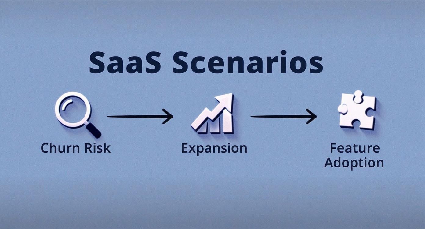
It’s a great reminder that a powerful presentation connects the dots between data points and these core business outcomes, telling a clear story about the health of your product.
Automate and Visualize Your Data
Let’s be real: manually pulling data every week is a surefire way to burn out and make mistakes. Setting up automated data collection that feeds into a central dashboard will save you countless hours and make your data far more accurate. Going beyond static reports, an interactive dashboard can make your presentations much more engaging. For a great look at how these tools work in the real world, check out MetricMosaic's Your Guide to the Shopify Analytics Dashboard.
We’re also seeing a shift in what we measure. By 2025, it’s expected that KPIs will more frequently include strategic goals around customer experience and tech adoption, with AI helping teams make adjustments in real time. This change means we need to think more holistically about the entire customer journey, making thoughtful KPI design more critical than ever.
In the end, it all comes down to clarity. If your charts are confusing, your message will be lost. For some practical tips on turning dense data into a compelling story, check out our guide on the best practices for data visualization.
Answering Your Top KPI Reporting Questions
Getting started with KPI reporting, even with a solid sample kpi report template, always brings up a few questions. It's a common experience for product teams transitioning to a more data-informed approach, so let's walk through some of the most frequent hurdles.
One of the first things teams ask is which KPIs they should even be tracking. The answer really depends on where your company is in its journey. The metrics that matter for a scrappy startup are completely different from those for an established, scaled-up product.
What's the Difference Between Startup vs. Mature Product KPIs?
Early on, your entire world revolves around proving your concept and finding product-market fit. Your KPIs need to reflect that intense focus on validation. Think less about long-term financial metrics and more about immediate user behavior.
- For Startups, focus on: Daily/Weekly Active Users (DAU/WAU), Activation Rate (the percentage of users who complete that crucial first action), and the sheer volume of qualitative feedback you're getting.
Once your product has found its footing in the market, the game changes. Your attention naturally shifts toward optimizing what works, improving efficiency, and expanding your footprint. The KPIs here become much more about financial health and long-term, sustainable growth.
- For Mature Products, focus on: Net Revenue Retention (NRR), Customer Lifetime Value (LTV), and your Customer Acquisition Cost (CAC) Payback Period.
What Should I Do When a Metric Is Trending Down?
Sooner or later, it's going to happen—a key metric will dip. The most important thing is not to panic. A downward trend is a symptom, not the root cause. Your job is to play detective.
The first step is always to see how that metric relates to other data points. Did your Net Promoter Score (NPS) suddenly drop? Don't just stare at the number. Go look at your recent support ticket trends or check the adoption rates of your newest features. More often than not, a recent, buggy release is the culprit. This is where the magic happens when you blend quantitative data with qualitative feedback. The numbers tell you what is happening; real user conversations tell you why.
Don't just see your KPI report as a report card. Treat it like a diagnostic tool. A metric in the red isn't a sign of failure—it's a bright, flashing light showing you exactly where you need to direct your team's energy.
Another common question is about cadence. How often should you be pulling these reports? There isn't a one-size-fits-all answer, but a good rule of thumb is to check your leading indicators (like user activity) weekly, while lagging indicators (like LTV) can be reviewed monthly or even quarterly. Remember, your KPIs aren't set in stone. They should adapt and change right alongside your product and your company's goals.
SigOS helps you find the "why" behind your KPIs by turning raw customer feedback into revenue-driving insights. Discover how to prioritize your roadmap with confidence.
Keep Reading
More insights from our blog


Ready to find your hidden revenue leaks?
Start analyzing your customer feedback and discover insights that drive revenue.
Start Free Trial →