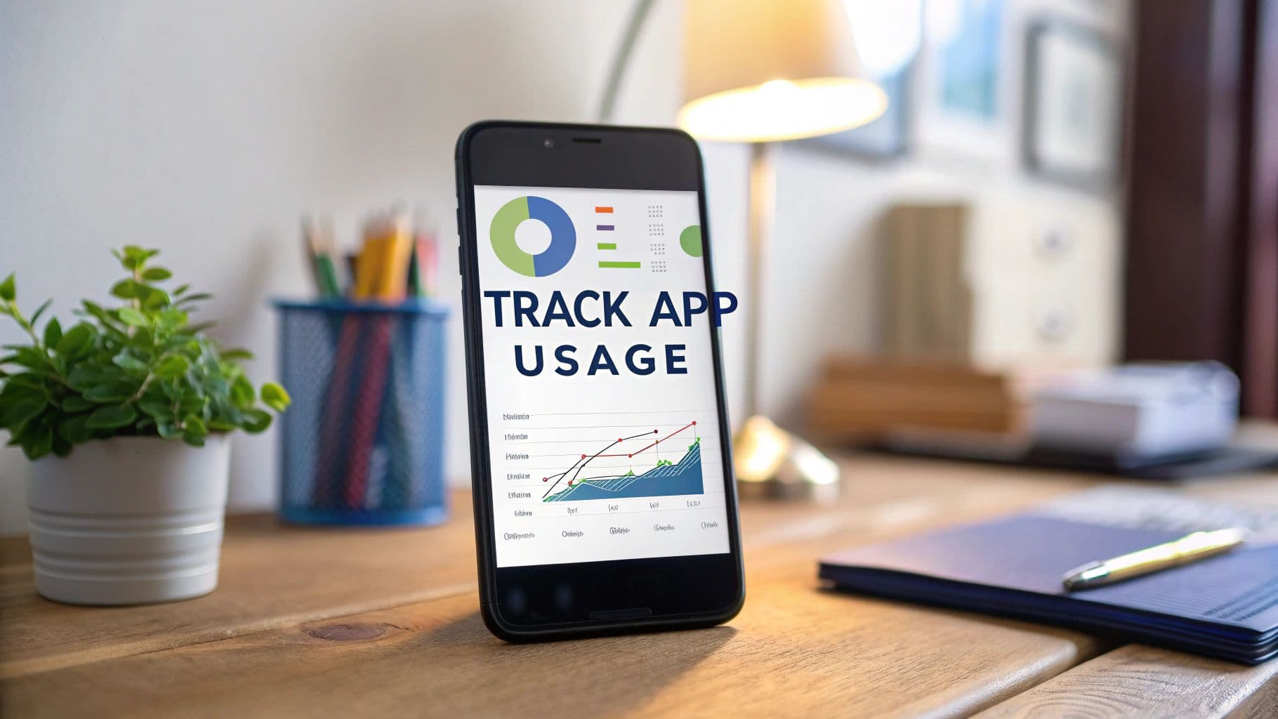
A Guide to Track App Usage for Growth
Learn how to track app usage with this complete guide. Discover the right tools, key metrics, and analysis techniques to boost user engagement and retention.
To really get a handle on how your app is performing, you have to look past vanity metrics like download numbers. The real story is in how people behave inside your app. This means digging into key user actions, tracking feature adoption rates, and truly understanding session engagement to see what makes your users tick.
Why Tracking App Usage Is a Business Imperative

Too many product teams treat app tracking like a technical chore—something you just check off the list after launch. That’s a huge mistake. Detailed usage data is the fuel for real, sustainable growth. It’s the difference between guessing what your users want and knowing what they actually need.
Without solid data, your product roadmap is just a collection of assumptions. But when you learn to translate raw numbers into a clear story about user behavior, you can make confident, data-backed decisions that show up on the bottom line.
Uncover Your Most-Loved Features
Can you confidently name the parts of your app your users can't live without? Usage data gives you the answer, no guesswork involved. By keeping a close eye on feature adoption, you can pinpoint which tools are central to the user experience and which ones are just gathering digital dust.
Imagine a SaaS company discovers that 90% of its power users rely on a specific reporting feature every single day. That's gold. It tells them to double down on that functionality, maybe market it more aggressively, or build out related features. More importantly, it stops them from pouring development dollars into something nobody wants.
Identify Hidden Friction Points
Think of usage analytics as an X-ray for your user experience. It uncovers the hidden friction points that cause frustration and, ultimately, churn. Are users constantly bailing during the last step of your onboarding flow? Are they abandoning carts on one particular screen?
Finding these pain points lets you fix problems before they start costing you users and damaging your brand. This is why you should be constantly monitoring your key customer retention metrics—it’s how you spot these trends early. For a deeper dive, check out our guide on the customer retention metrics that matter most.
Let's be real, the app marketplace is brutal. As of 2025, there are roughly 8.93 million mobile apps out there, all competing for attention. Yet the average person only uses about 9 or 10 apps daily. In a world with that much competition, you simply can't afford to be in the dark about how people are using your product.
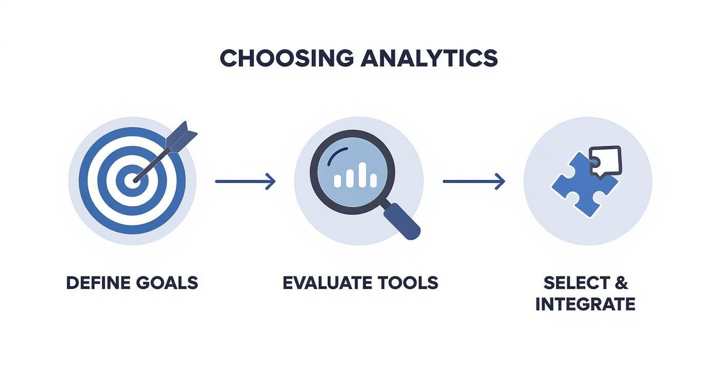
Choosing Your App Analytics Toolkit
Picking the right tool to track app usage isn't just a technical task; it's a strategic decision that will define how well you understand your users. The wrong choice can leave you drowning in messy data or, even worse, with insights that don't actually help your business. So, instead of just rattling off a list of popular platforms, let’s walk through how to choose a toolkit that genuinely fits what you need.
The analytics market is crowded, with each tool serving a slightly different purpose. The key is to match a tool's strengths with your most important goals.
Aligning Tools with Your Strategic Goals
Before you even glance at a feature list or a pricing page, you have to know what you're trying to achieve. What questions are keeping you up at night? Are you trying to figure out why users are dropping off after the first week? Or maybe you need to optimize your checkout funnel. Your core objective is the single most important factor in this decision.
Let’s break down the main categories of analytics platforms you'll encounter:
- Event-Based Platforms: Tools like Amplitude are the go-to for deep, granular analysis of user journeys. They’re fantastic for answering complex questions, like "What specific actions do our most valuable users take right before they subscribe?"
- All-in-One Solutions: Think of platforms like Firebase Analytics as your app’s mission control. They give you a comprehensive, high-level overview of everything from daily active users and crash reports to basic engagement, all in one dashboard.
- Session Replay Tools: When you need to see the why behind the data, nothing beats a tool like LogRocket. These platforms let you watch anonymized recordings of user sessions, so you can see exactly where people get stuck, confused, or frustrated. It’s like looking over their shoulder.
For example, this dashboard from Google Analytics for Firebase shows how an all-in-one tool gives you a quick snapshot of key metrics, like user activity over time and engagement by country.
This kind of big-picture view is perfect for assessing your app's overall health and spotting broad trends without having to be a data scientist.
A Practical Decision-Making Framework
With these categories in mind, it's time to get practical. The best tool isn't just about the flashiest features; it's about what your team can realistically implement and use to make better decisions.
Run through these key questions:
- App Platform and Integration: Is your app native iOS, Android, or built with a cross-platform framework like React Native or Flutter? Make sure any tool you consider has a well-documented, easy-to-use SDK for your tech stack. A painful integration is often the first red flag.
- Your Team's Technical Skills: Be honest here. A powerful tool that requires complex queries is useless if no one on your team has the skills or time to use it. A simpler platform might offer less depth but deliver far more value if it gets used daily.
- Budget and Scalability: Most tools price their plans based on Monthly Tracked Users (MTUs). It’s crucial to project your user growth over the next 6-12 months so you don't get hit with a surprise bill. If you're planning for that growth, looking into the best predictive analytics software can give you a serious competitive edge.
- Your Core Objective: Are you trying to reduce churn? Increase conversions? Your primary goal should dictate the kind of data you need to collect. For a deeper dive, you can explore tools like Mixpanel and see how they stack up for different use cases.
To help visualize your options, here’s a quick comparison of the main tool categories.
Comparison of App Analytics Tool Categories
This table compares the primary categories of app usage tracking tools based on their ideal use case, complexity, and typical cost structure to help you choose the right solution.
| Tool Category | Primary Use Case | Technical Complexity | Common Pricing Model |
|---|---|---|---|
| Event-Based | Deep behavioral analysis, cohort analysis, funnels | High | Based on event volume or MTUs |
| All-in-One | High-level app health, core metrics, crash reporting | Low to Medium | Often bundled with a larger platform |
| Session Replay | Understanding user friction, UI/UX bug identification | Medium | Based on number of recorded sessions |
Ultimately, picking the right tool is less about finding the "best" one on the market and more about finding the best one for your team and your goals.
Getting Your App Ready for Meaningful Data Collection
Once you've picked your analytics tools, the real work begins. This is the instrumentation phase—the part where you strategically embed trackers into your app's code to capture how people are actually using it. When you get this right, your app stops being a black box and starts giving you clear, reliable data.
Most platforms will grab some basic info for you right away, like device type, operating system, and session starts. That's a decent starting point, but it barely scratches the surface. The real magic happens with custom events, which are the specific, deliberate actions you decide to track because they matter to your business goals.
Beyond the Basics: What to Track Manually
To genuinely understand your users, you have to look past the default metrics. Custom events are how you measure what’s truly driving your product's success. Are people finishing the onboarding? Are they even finding that killer new feature you just shipped? You can't answer these questions without tracking specific user actions.
This means pinpointing key moments in the user journey and giving them a clear, descriptive event name.
- User Registration: This is a huge milestone. An event like
registration_completedtells you exactly how well your signup flow is working. - E-commerce Actions: For a retail app, you’ll want to track
item_added_to_cart,checkout_initiated, andpurchase_completed. These are the building blocks of your sales funnel. - Gaming Milestones: If you're building a game, you might track events like
level_achieved,tutorial_skipped, orin_app_purchase_madeto see how players are progressing and where they're spending money.
This whole process really starts with your goals, not your code. You have to know what you want to learn before you can decide what to measure.
As you can see, successful data collection begins long before you write a single line of code. It starts with a clear definition of what you need to find out.
Why You Absolutely Need a Tracking Plan
Before anyone on your team even thinks about coding, you need a tracking plan. This is usually just a simple document, like a spreadsheet, that acts as the single source of truth for your analytics. It’s your best defense against the chaos that comes from inconsistent or poorly defined data.
A solid tracking plan connects your business objectives to specific user actions. It defines the exact event name and any associated properties for each one. This gets product managers, engineers, and marketers all on the same page about what’s being collected and why.
For instance, a consistent naming convention is non-negotiable. I’ve always found that using snake_case (like feature_used or item_added) for event names and properties works best. If you don't stick to a convention, you’ll inevitably end up with itemAdded, item_added, and Item_Added all tracking the same action. That's how you get a messy, unreliable dataset that's a nightmare to analyze.
Implementing Events That Tell a Coherent Story
With a clear tracking plan in hand, implementation becomes so much smoother. Your engineers aren't guessing anymore; they have a precise blueprint of what to track and exactly how to name it.
Let's imagine you're working on a subscription-based app. A simple tracking setup might look like this:
**viewed_pricing_page**: The user is showing interest in buying.**selected_plan**: They’ve picked a specific tier. You'd want to include a property here, maybeplan_type: 'premium'.**subscription_completed**: Success! They've paid and are now a subscriber.
When you look at this sequence of events later, it forms a funnel that tells a story. You can see how many users expressed interest, how many chose a plan, and how many actually converted. If you see a huge drop-off between selected_plan and subscription_completed, you know right away that something is probably wrong with your payment screen. This is how you track app usage to get insights you can act on.
As you start collecting more and more data, managing that information flow becomes a new challenge. If you're curious about the technical side of scaling your analytics, our guide on how to build data pipelines dives deeper into structuring these systems.
Ultimately, setting your app up for data collection is an investment in clarity. By defining what matters, sticking to a plan, and implementing events with purpose, you lay the foundation for making smarter product decisions based on what your users are actually doing.
The Core Metrics That Signal App Health
Collecting data is one thing, but knowing what to do with it is what separates the apps that thrive from those that just fade away. It’s incredibly easy to get sidetracked by vanity metrics like total downloads. While those numbers might look good on a slide deck, they don’t tell you if you’re actually building a sustainable business.
To really track app usage for growth, you need to zero in on the metrics that reflect genuine user engagement and the overall health of your product.
A fantastic way to frame this is the AARRR model, famously known as "Pirate Metrics." It breaks down the user journey into five clear stages, giving you a powerful lens to analyze your data and spot your biggest opportunities for improvement.
Acquisition: Where Your Best Users Come From
Acquisition metrics show you how people are discovering your app and taking that first step. The goal here isn't just to count installs, but to figure out which channels are delivering your most valuable, long-term users. Are they finding you through organic search, paid ads, or a viral social media post?
A great place to start is by digging into your Cost Per Install (CPI) for each channel. For example, you might see that Instagram ads have a low CPI of 2.00, but those users churn within a week. Meanwhile, users from organic search cost you ****3.50 to acquire, but they stick around and subscribe. That tells you exactly where your marketing budget is best spent. It’s not about finding the cheapest users; it’s about finding the most profitable ones.
Activation: The "Aha!" Moment
Activation is that crucial moment when a new user truly experiences your app's core value for the first time. This isn’t just about them opening the app—it's about them completing a key action that makes them think, "I get it."
What that action is will be completely unique to your app:
- For a music app: Creating their first playlist.
- For a social media app: Adding their first five friends.
- For a productivity tool: Creating their first to-do item.
Your Onboarding Completion Rate is a vital metric to watch here. If you discover that 60% of new users are dropping off before they even finish your tutorial, that’s a major red flag. It’s a strong signal that your initial user experience is either too confusing or simply fails to communicate the app's value quickly enough.
Retention: Keeping Users Coming Back
Honestly, retention might be the single most important metric for the long-term health of your app. It measures how many users return over time. Without solid retention, your app is just a leaky bucket—you're constantly spending money to acquire new users just to replace the ones who are leaving.
The standard retention metrics to watch are:
- Day 1 Retention: How many users return the day after they install?
- Day 7 Retention: Are they still active after a week?
- Day 30 Retention: How many have formed a genuine habit with your app?
A poor Day 1 retention rate often points to a fundamental problem with your core value or the initial user experience. Beyond just tracking who's active, it's essential to understand why users churn and to implement effective mobile app retention strategies based on what your usage data is telling you.
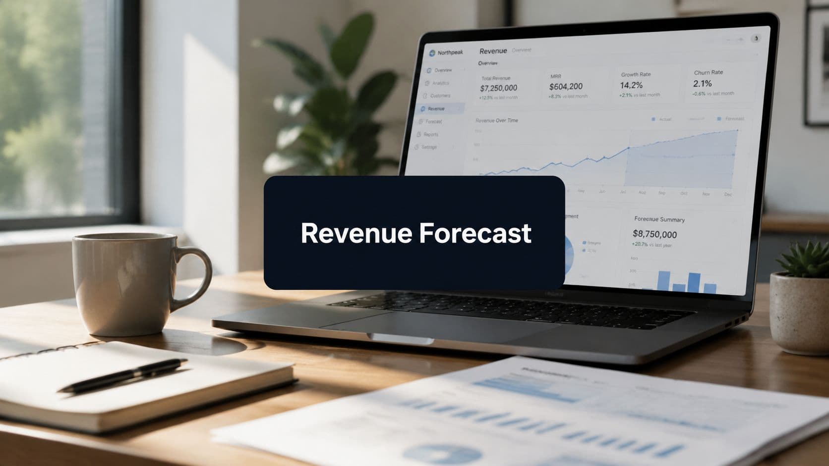
Revenue: How You Make Money
Revenue metrics are the scorecard for your app's financial health. These are the numbers that directly connect user behavior to your bottom line. Two of the most critical metrics to live by are Average Revenue Per User (ARPU) and Customer Lifetime Value (LTV).
ARPU tells you how much revenue a single user generates over a set period. LTV takes it a step further, projecting the total revenue a user will bring in during their entire relationship with your app.
The math here is simple: your LTV needs to be significantly higher than your Customer Acquisition Cost (CAC). If it costs you 5 to acquire a user who only generates ****3 in lifetime revenue, you don't have a sustainable business model.
Referral: Turning Users into Advocates
The final stage, referral, is all about measuring how many of your users are actively promoting your app to others. This is the holy grail—the ultimate sign of a healthy, beloved product. The key metric to watch here is your invite acceptance rate or the app's virality coefficient (often called the K-factor).
This number tells you how many new users each existing user brings in. A K-factor greater than 1 means your app is growing exponentially through word-of-mouth alone. Even a small bump in this metric can dramatically lower your reliance on paid acquisition and fuel incredible growth.
How to Turn Usage Data Into Actionable Insights
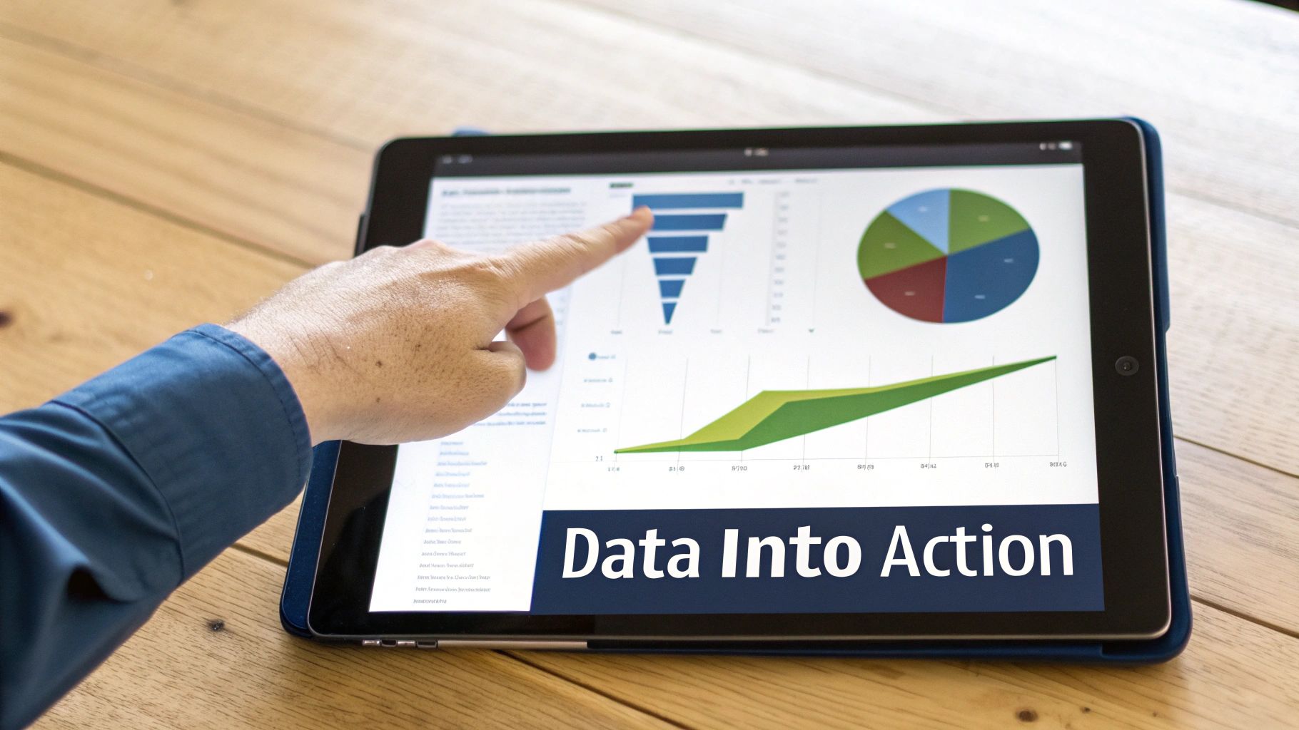
Raw data is just a pile of numbers. The real magic happens when you start asking the right questions. Learning to track app usage is one thing, but the true value comes from turning those numbers into smart business decisions. It’s the difference between staring at a dashboard and actually interrogating your data to uncover the stories your users are telling you.
This is where you'll find your biggest growth opportunities. Instead of just knowing what's happening in your app, you can finally start to understand why. With the right approach, you can pinpoint exactly where your user experience is breaking down and, just as importantly, what your most loyal users absolutely love.
Uncovering Drop-Offs with Funnel Analysis
For diagnosing problems in critical user flows, funnel analysis is your best friend. Think about the most important journeys in your app—the signup process, the checkout sequence, or a multi-step tutorial. A funnel shows you exactly how many users move from one step to the next, instantly flagging where people are bailing.
Let's say you run an e-commerce app. You could set up a simple four-step funnel:
- User adds an item to their cart.
- User proceeds to checkout.
- User enters payment information.
- User completes the purchase.
If you suddenly see a massive 70% drop-off between entering payment details and hitting "buy," you’ve just struck gold. That isn't just a data point; it's a flashing red light telling you that something in your payment step is causing friction, frustration, or a lack of trust. It's costing you real money.
Understanding User Behavior Over Time with Cohort Analysis
While funnels are fantastic for specific workflows, cohort analysis tells you how user behavior changes over time. A cohort is just a group of users who share a common trait, usually the date they signed up. For instance, you could compare everyone who joined in January against everyone who joined in March.
This technique is incredibly powerful for measuring the real impact of product changes. Imagine you launched a major app redesign in March. By comparing the March cohort's retention rate to the January cohort's, you can see if the new design actually made your app "stickier."
If the March cohort has a 20% higher Day 30 retention rate, you have hard evidence that your redesign was a success. Cohort analysis gets you out of the realm of opinion and into the world of cold, hard proof.
This is more critical now than ever. With global mobile app downloads projected to hit a staggering 299 billion by 2025 and the average person juggling 10 apps a day, holding onto users is the name of the game. Retention analysis isn't a "nice to have"; it's a top priority. For more on this, you can find additional insights about mobile app download statistics.
Finding Your Power Users with Segmentation
Segmentation is all about dividing your users into distinct groups based on their behavior or attributes. This is how you move beyond vague averages and start to understand the nuances of who uses your product. Instead of treating everyone as one giant monolith, you can compare different segments to find powerful insights.
You can segment users in all kinds of ways:
- By Engagement Level: Compare your "power users" (who log in daily) to your "casual users" (who pop in once a month).
- By Feature Adoption: Look at users who’ve embraced a new feature versus those who haven't touched it.
- By Acquisition Source: Analyze the behavior of users who came from an Instagram ad versus those who found you through organic search.
Let's revisit our e-commerce app with the payment funnel problem. After using funnel analysis to spot the drop-off, the team could use segmentation to dig deeper. They might segment the users who abandoned their carts by device type, payment method, or geographic location.
What if they discovered that 90% of the drop-offs were from users trying to pay with a specific digital wallet on Android devices? Suddenly, the problem isn't a universal failure. It's a highly specific bug. That insight allows them to deploy a targeted fix fast, boosting their conversion rate without needing to overhaul the entire checkout flow. That’s the power of turning data into precise, actionable intelligence.
Common Questions About Tracking App Usage
As you start digging into app analytics, a few key questions almost always pop up. Getting these sorted out early is the difference between a clear, effective tracking strategy and a confusing mess. Let's walk through the most common ones so you can move forward with confidence.
Getting these fundamentals right from the beginning prevents a lot of headaches down the road and ensures your whole team is on the same page.
What’s the Difference Between App Tracking and App Analytics?
It's easy to use these terms interchangeably, but they're two sides of the same coin. I like to think of it this way: tracking is gathering the raw ingredients, while analytics is actually cooking the meal.
App tracking is the pure technical work. It’s all about implementing code snippets—usually through an SDK—to log specific things a user does in your app. When someone finishes onboarding, buys a subscription, or uses a new feature, the tracking code sends that event record.
App analytics, on the other hand, is what you do with all that raw data. This is the strategic part—building dashboards, analyzing user cohorts, and mapping out conversion funnels to figure out why users behave the way they do. You can’t have analytics without tracking, but tracking by itself doesn't tell you anything useful.
How Much Does It Cost to Track App Usage?
This is the big one, and the answer is: it depends. The cost can range from completely free to thousands of dollars a month, but the good news is that you can get started for very little.
Many excellent platforms, like Google Analytics for Firebase, have generous free plans that are perfect for new apps. Once you scale up, more specialized tools like Mixpanel or Amplitude usually have pricing based on your usage.
Typically, their costs are tied to two main things:
- Monthly Tracked Users (MTUs): How many unique users you're tracking each month.
- Data Volume: The sheer number of events your app is sending.
My best advice for keeping costs down? Start lean. Create a tight tracking plan that only captures the events directly tied to your most important business questions. This way, you're not paying to store a bunch of data that just adds noise.
How Do I Track App Usage While Respecting User Privacy?
In this day and age, user privacy isn't just a good idea—it's non-negotiable. Trust is everything. The great thing is, you don't have to choose between respecting privacy and getting powerful insights.
Ethical tracking really comes down to a few core practices. First, be crystal clear in your privacy policy about what you collect and why. Then, you absolutely must get explicit user consent where regulations like GDPR in Europe or Apple's App Tracking Transparency (ATT) framework require it.
Most importantly, focus on collecting anonymized, aggregate data, not Personally Identifiable Information (PII). Your goal is to understand broad patterns—like which features get the most love—not to follow individual users around. Make sure any analytics platform you choose is fully compliant with major privacy laws. It protects your users and, ultimately, protects your business.
Ready to turn user feedback and usage data into insights that actually drive revenue? SigOS is an AI-driven intelligence platform that connects customer behavior to business impact. Prioritize your roadmap with confidence.
Keep Reading
More insights from our blog


Ready to find your hidden revenue leaks?
Start analyzing your customer feedback and discover insights that drive revenue.
Start Free Trial →