Mastering Your Data Analytics Dashboard
Unlock powerful business insights with this complete guide to the data analytics dashboard. Learn key features, best practices, and real-world examples.
Think of a data analytics dashboard as the mission control for your business. It’s a single screen that pulls together all your most important data—your key performance indicators (KPIs) and critical metrics—and presents them in a way you can understand instantly. Instead of drowning in spreadsheets, you get clear, interactive visuals.
It’s the fastest way to check the health of your business, see what’s working (and what’s not), and make smart decisions on the fly.
Your Business Cockpit for Smarter Decisions
Imagine trying to fly a modern jet with nothing but a paper map and a compass. It sounds absurd, right? Stressful, inefficient, and incredibly risky. Yet, many businesses are still navigating today's complex market with disconnected information scattered across dozens of spreadsheets. That's essentially flying blind.
A dashboard acts as your business’s cockpit. It connects to all your different systems—your sales software, marketing tools, customer support logs, you name it—and pipes that information into one unified command center. You stop looking at raw, confusing numbers and start seeing the story they tell.
This concept map shows exactly how a dashboard brings together critical data from different parts of the business, like sales, marketing, and operations.
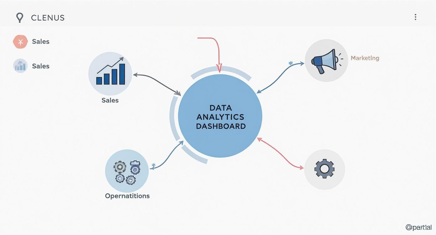
As you can see, it’s not just another report. It’s the central hub that creates a single, shared view of what's happening across the entire company.
To put it simply, a dashboard connects the dots between different business functions. Here's a quick breakdown of what these tools are designed to do.
Dashboard Core Functions at a Glance
| Core Function | Primary Goal | Business Benefit |
|---|---|---|
| Data Aggregation | Collect and centralize data from multiple sources. | Creates a "single source of truth" for consistent decision-making. |
| Data Visualization | Convert raw numbers into charts, graphs, and maps. | Makes complex information easy to understand at a glance. |
| Real-Time Monitoring | Display the most current data available. | Enables proactive problem-solving and immediate opportunity-spotting. |
| Interactive Exploration | Allow users to drill down, filter, and segment data. | Uncovers deeper insights and answers specific business questions. |
Ultimately, these core functions work together to turn messy data into a clear, actionable picture of your business performance.
From Raw Data to Actionable Insights
The real magic of a dashboard is its ability to transform overwhelming raw data into genuine, actionable insights. It does this by turning rows of numbers into intuitive charts and graphs that your brain can process in seconds. This move from clunky, manual reporting to live, dynamic visualization lets you:
- Spot trends instantly: See if sales are trending up, if customer churn is spiking, or if your marketing campaigns are hitting the mark—as it happens.
- Fix problems proactively: Notice a sudden dip in a key metric? A dashboard alerts you to small issues before they snowball into full-blown crises.
- Seize opportunities faster: Discover which strategies are really paying off and double down on them, giving you a serious leg up on the competition.
The Growing Demand for Real-Time Analytics
Making decisions based on data isn't just a trendy idea anymore; it’s how modern, successful businesses operate. The proof is in the numbers. The global market for real-time dashboards was valued at 12 billion in 2023 and is expected to rocket to ****32 billion by 2032, growing at a compound annual rate of 11.5%.
This explosive growth makes one thing clear: companies across every industry are hungry for instant, visual access to their data. You can learn more about the growth of the real-time dashboard market to understand its widespread impact.
What Makes a Great Dashboard? The 6 Must-Have Features

A powerful data analytics dashboard is so much more than a pretty picture of your metrics. The best ones are dynamic command centers that let you not just see the data, but question it, explore it, and act on it. These essential features are what separate a simple, static report from a true strategic tool.
Think of it like this: a basic report is a photograph of a car's engine. A great dashboard lets you pop the hood, tinker with the parts, and see how everything works together in real time. To get that kind of value, your dashboard needs to turn data from a passive display into an active partner in your decision-making.
1. Interactive and Dynamic Visualizations
The real magic of a modern dashboard is its interactivity. Static charts are a relic of the past; today’s tools invite you to get your hands dirty and really engage with the numbers. This is how you uncover the "why" behind the "what."
Here are the interactive elements that truly make a difference:
- Drill-Downs: This is probably the most powerful feature of all. Imagine you're looking at a high-level national sales number. Instead of just taking it at face value, you click on it. Instantly, it breaks down by state. You click on a specific state, and now you see the numbers by city, and then by individual store. Each click peels back another layer of the story.
- Dynamic Filtering: Users need the ability to slice and dice the data on the fly. Whether it's filtering by a specific date range, a sales region, or a product line, this lets everyone from marketing to finance tailor the view to their own questions without needing dozens of different reports.
- Hover-Over Details: Sometimes it's the little things. A simple hover effect can pop up with an exact value, a comparison to the previous period, or a quick definition, giving you crucial context without cluttering the main screen.
2. Customization and Real-Time Alerts
Let's be honest, every person on your team cares about something different. The CEO wants that 30,000-foot view of business health, while the social media manager is obsessed with campaign-specific engagement rates. A one-size-fits-all dashboard just won't cut it.
That’s where customization is key. The ability for users to drag and drop widgets, add new metrics, or remove what isn’t relevant to them is critical. It allows each person to build a personal command center focused on what matters to their role, which is a game-changer for getting people to actually use the tool.
Beyond that, a great dashboard should work for you even when you're not looking at it. Automated alerts are a non-negotiable feature. You should be able to set thresholds for your most important metrics—for example, getting an email if customer churn spikes by 5% in a day, or a Slack message when a sales quota is hit. This kind of proactive monitoring means you can jump on opportunities or threats right away, not find out about them in a report next week.
What Are the Real Benefits of Using a Dashboard?
Think of a data analytics dashboard as upgrading your business's navigation system. You're swapping out an old, folded paper map for a live GPS. Instead of making decisions based on where you were last month, you're steering your company with up-to-the-second information. This isn't just a minor tweak; it fundamentally changes how you operate and strategize.
The most obvious win is speed. Forget waiting around for someone to pull a weekly report. With a dashboard, your team gets instant access to the numbers that matter. This means you can be proactive, spotting and fixing a small issue before it becomes a major fire. That kind of agility is a massive competitive advantage.
Driving Day-to-Day Efficiency
A great dashboard is like the central nervous system of your operations. Imagine you're a logistics manager. On one screen, you can see every truck's location, its fuel level, and its estimated arrival time. If a major traffic jam pops up, you see it immediately and can reroute a driver instantly, saving the delivery and keeping a customer happy.
This kind of real-time visibility has a direct impact on the bottom line by cutting waste and improving service. When you can pinpoint inefficiencies the moment they arise, you can manage your resources much more effectively. It’s exactly this kind of power that's driving the data analytics market's incredible expansion, which is on track to hit over $658.64 billion by 2034. If you're curious, you can explore the full data analytics market research to see the trends pushing this growth.
Establishing One Source of Truth
Let’s be honest: one of the biggest headaches in any company is getting everyone to agree on the facts. Different departments often have their own spreadsheets with conflicting numbers, leading to endless debates and stalled projects. A centralized dashboard cuts through all that noise. It creates a single, reliable source of information for the entire organization.
When the marketing, sales, and product teams are all looking at the same key performance indicators (KPIs), the conversation changes completely. You stop arguing about whose numbers are right and start collaborating on how to improve them. This is the first step toward building a truly data-driven culture.
This shared view of reality delivers some powerful perks:
- Clearer Accountability: With performance metrics out in the open, everyone knows exactly what they're responsible for.
- Better Teamwork: When different teams can see how their work affects others, they start solving problems together instead of in silos.
- Quicker Onboarding: New hires can get a clear picture of the business's health and priorities on day one, without having to hunt down a dozen different reports.
By bringing all your data together in one accessible place, a dashboard helps turn isolated departments into a single, cohesive team all pulling in the same direction.
Dashboard Design Principles for Total Clarity
A powerful data analytics dashboard is completely useless if it’s confusing or overwhelming. The best ones don't just show data; they communicate insights clearly and quickly. Think of great design as the bridge that turns a complex dataset into an intuitive, actionable story.
Imagine your dashboard is the front page of a newspaper. The most important headlines are big and bold, right at the top, grabbing your attention instantly. The less critical details are tucked away further down. This core principle, known as visual hierarchy, is essential for guiding your user's eye straight to what matters most.
Start with Your Audience in Mind
Before you even think about picking a chart or a color palette, you have to ask one critical question: who is this dashboard for?
The high-level metrics a CEO needs to see for a quarterly business review are worlds apart from the granular, real-time data a marketing manager needs to optimize a live campaign. Tailoring the dashboard to the user's specific goals is the first step toward true clarity. This focus keeps you from creating a cluttered "data dump" that tries to be everything to everyone but ends up being useful to no one.
Choosing the Right Visualization for Your Data
Picking the right chart for your data is non-negotiable. A mismatched visual doesn't just look bad—it can actively mislead people and lead to bad decisions. The trick is to match the chart type to the specific insight you're trying to communicate.
To help you out, here’s a quick guide on matching your goal to the right visualization.
| Data Goal | Recommended Chart Type | When to Use It |
|---|---|---|
| Tracking change over time | Line Chart | Perfect for showing trends, like website traffic over the last 30 days or monthly revenue. |
| Comparing different categories | Bar Chart | Excellent for comparing distinct groups, such as sales performance across different regions. |
| Showing parts of a whole | Pie Chart or Donut Chart | Use sparingly, but effective for illustrating proportions, like market share percentages. |
| Visualizing density or hotspots | Heat Map | Great for identifying areas of high concentration, like where users click most on a webpage. |
Choosing the right chart is half the battle. The other half is making sure it's easy to understand at a glance.
For a deeper dive into making your data tell a compelling story, check out our guide on the best practices for data visualization. To ensure your dashboards offer total clarity and effectiveness, delve into these valuable top dashboard design best practices. By mastering these principles, you build a data analytics dashboard that doesn't just present numbers but drives intelligent action.
Real-World Dashboard Examples
It’s one thing to talk about dashboards in theory, but seeing them in the wild is where their power really clicks. These aren’t just fancy tools for Silicon Valley giants; they’re adaptable command centers that help businesses of all stripes make smarter decisions, faster. Every industry tailors its dashboards to keep an eye on what truly matters to them.
From the sales floor to a hospital ward, a good data analytics dashboard turns raw numbers into a clear, actionable story. Let's look at a couple of concrete examples to see how different sectors put these visual tools to work.
Retail Operations Dashboard
Picture a busy retail store manager starting their day. Instead of sifting through stacks of yesterday’s sales reports, they pull up a live dashboard on their tablet. At a glance, they get the full picture:
- Hourly Sales Volume: A line chart clearly shows sales spiking between 12 PM and 2 PM. This isn't just a guess anymore; it's a data-backed reason to schedule extra cashiers for the lunch rush.
- Inventory Turnover Rate: A simple gauge is flashing yellow for a popular item, signaling that it's running low. This triggers an immediate reorder, preventing a stockout and lost sales.
- Store Foot Traffic vs. Sales: By comparing foot traffic data with actual conversion rates, the manager can see if the new store layout is working or if staff need to be repositioned for better engagement.
This dashboard empowers the manager to react to the day's rhythm as it happens, not a day late. You can see more powerful https://www.sigos.io/blog/business-intelligence-dashboard-examples that drive these kinds of results.
SaaS Marketing Funnel Dashboard
In the world of Software-as-a-Service (SaaS), the customer journey is everything. A marketing dashboard acts like a GPS for the entire acquisition process, tracking a lead from their first click on an ad to the moment they become a paying customer.
It visualizes the complete marketing and sales funnel, highlighting the key performance indicators (KPIs) that directly tie into revenue. To get a better sense of how different metrics can be presented, it’s worth checking out these compelling financial dashboard examples.
This real-time visibility is becoming more crucial every day. The explosion of data from the Internet of Things (IoT) is a major driver here. The big data and analytics services market is on a steep climb, projected to grow from 169.01 billion in 2025 to a massive ****365.42 billion by 2029. This growth is fueled by billions of connected devices, all pumping out data that needs to be understood.
How to Choose the Right Dashboard Tool
Trying to pick the right data analytics dashboard tool can feel overwhelming. The market is packed with options, from standalone giants like Tableau to the built-in dashboards you find in platforms like HubSpot. The secret isn't to chase the tool with the most features; it's about finding the one that solves your specific problems.
The best way to start is by looking inward. Don't get sidetracked by a slick demo showing what a tool could do. Instead, focus entirely on what your team needs it to do right now. That simple change in perspective cuts through the hype and points you toward a solution that will actually get used.
Define Your Core Requirements
Before you schedule a single sales call, it's time to ask some tough questions. Getting clear on your internal needs is the single most important step in finding a tool your team will embrace.
Think about these key areas:
- Team Skill Level: Are you equipping a team of seasoned data analysts, or do you need something with a simple drag-and-drop interface for folks who aren't data experts?
- Data Integrations: What data sources are absolute must-haves? Make a list of the platforms you can't live without, like Salesforce, Google Analytics, or your customer support system.
- Scalability: Can this tool handle your data volume a year from now? Or five? Think about where your business is headed, not just where it is today.
- Budget: Be honest about what you can spend. Factor in not just the license fee but also the cost of implementation and any training your team might need.
Self-Service BI vs. Integrated Platforms
Once you've mapped out your needs, you'll probably find yourself leaning in one of two directions.
On one hand, you have the powerful self-service BI platforms like Microsoft Power BI or Tableau. These offer incredible flexibility and deep analytical muscle, which makes them perfect for companies with dedicated data teams who can really dig in.
On the other hand, many businesses get exactly what they need from the dashboards already built into the software they use every day. An integrated data analytics dashboard inside your CRM, for example, gives you immediate insights without a complicated setup. And for more forward-looking analysis, some of the best predictive analytics software also comes equipped with its own powerful dashboarding capabilities.
Common Dashboard Questions Answered
Even after you’re sold on the benefits, jumping into dashboards for the first time can feel a little intimidating. A few key questions always seem to pop up. Let's walk through them so you can get a solid feel for how these tools really work and where they fit into your business.
What Is the Difference Between a Dashboard and a Report?
This is probably the most common question, and there's a simple analogy for it.
Think of your data analytics dashboard as the live scoreboard at a basketball game. It’s dynamic, constantly updating, and gives you a snapshot of what’s happening right now. You glance at it to understand the current situation and make quick decisions.
A report, on the other hand, is the post-game analysis you read the next day. It’s a static, detailed breakdown of what happened over a set period—a quarter, a season, or a specific campaign. Dashboards help you monitor the present; reports help you analyze the past.
How Do I Decide Which KPIs to Include?
This is a crucial step, and the secret is to keep it simple. Start by identifying the single most important goal for that particular area of your business.
Once you have that goal, ask yourself: "What are the 3-5 critical metrics that tell me if I'm winning or losing?" Resisting the urge to track everything is key. A good Key Performance Indicator (KPI) is always tied directly to a business outcome and gives you information you can actually act on. Stay away from "vanity metrics"—numbers that look good but don't help you make any real decisions.
A clean dashboard with a handful of powerful KPIs will always beat a cluttered one filled with dozens of meaningless numbers. Simplicity is what drives clarity and, ultimately, action.
Can Small Businesses Benefit from a Dashboard?
Absolutely. In fact, dashboards can be a game-changer for smaller companies.
Years ago, this kind of data analysis was only accessible to huge corporations with big budgets. Today, with so many affordable and easy-to-use tools on the market, small businesses can tap into the same data-driven insights.
A simple dashboard can help a small business:
- Track daily sales numbers against weekly targets.
- See how a new social media ad campaign is performing in real-time.
- Keep an eye on inventory to avoid running out of popular items.
At the end of the day, a dashboard gives you the clarity to make smarter, faster decisions. It helps you navigate challenges and pounce on opportunities, which is essential for competing and growing in any market.
At SigOS, we transform your customer feedback into actionable, revenue-driving insights. Our AI-driven platform analyzes support tickets, calls, and usage metrics to show you exactly which issues are costing you money and which features will unlock major growth. Prioritize your product roadmap with confidence.


Ready to find your hidden revenue leaks?
Start analyzing your customer feedback and discover insights that drive revenue.
Start Free Trial →