A Guide to High-Impact Web Analytics Dashboards
Transform raw data into revenue. This guide explores how web analytics dashboards drive smarter product decisions with real-world examples and expert tips.

A web analytics dashboard is your one-stop shop for understanding how your website is performing. It pulls together all the critical numbers—your Key Performance Indicators (KPIs)—from your website and marketing channels into a single, visual interface. Think of it as the mission control for your entire digital strategy, turning messy data into insights you can actually use.

Why Web Analytics Dashboards Are Your Command Center
Could you imagine trying to fly a plane without a cockpit? You’d feel the plane moving, sure, but you'd have no clue about your speed, altitude, or how much fuel is left in the tank. Running a business online without a good web analytics dashboard is pretty much the same thing—you're just flying blind, making decisions based on gut feelings instead of solid data.
A dashboard is so much more than just a bunch of charts. It’s a storytelling tool. It takes abstract numbers and weaves them into a clear story about your users: where they’re coming from, what they do on your site, and what convinces them to convert (or what makes them leave). For product managers, growth teams, and founders, this centralized view is absolutely essential. It helps you tune out the noise and focus on the signals that actually matter for everything from user retention to revenue growth.
From Data Overload to Strategic Clarity
In most companies, data is scattered everywhere. Your Google Analytics data doesn't automatically sync with your CRM, which has no connection to your paid ad platforms. This kind of fragmentation makes getting a straight answer about performance a real headache.
This is where web analytics dashboards really shine. They break down those data silos by pulling information from different sources into one place. Suddenly, everyone is looking at the same numbers and working from a single source of truth, which is critical for getting the whole organization aligned.
And this alignment is becoming more important than ever. The global web analytics market is on track to hit USD 7.98 billion in 2025 and is expected to skyrocket to USD 16.36 billion by 2030. With cloud-based platforms making up over 78% of the market, it’s clear that real-time, unified insights are no longer a "nice-to-have"—they're a necessity.
The Core Functions of a Dashboard
A truly effective dashboard does more than just display data; it actively helps you answer crucial business questions. Its real value is in connecting the dots between raw numbers and strategic outcomes, turning it into a tool that drives growth.
Here’s a quick breakdown of the main jobs a dashboard handles.
Core Functions of a Web Analytics Dashboard
| Core Function | What It Means for Your Business | Key Business Question Answered |
|---|---|---|
| Performance Monitoring | Gives you a real-time pulse check on vital metrics like traffic, conversions, and user activity. | "How are we tracking against our goals right now?" |
| Strategic Decision-Making | Uncovers long-term trends and patterns, guiding data-driven planning and resource allocation. | "Where should we invest our time and budget for the next quarter?" |
| Problem Identification | Flags anomalies and negative trends, like a sudden drop in conversions or a spike in bounce rates. | "Why did our user sign-ups suddenly tank last week?" |
These functions work together to move analytics from a passive reporting tool to an active engine for business growth.
Ultimately, a dashboard helps you identify website visitors and convert them into customers by giving you the clarity needed to make smarter, faster decisions. It's about turning observation into action.
Decoding the Metrics That Actually Matter
A dashboard crammed with data is just noise. It's useless if the numbers don't tell you a compelling story about what people are actually doing on your site. Think of individual metrics as words; they only start to mean something when you string them together into sentences that describe user behavior.
Focusing on the right Key Performance Indicators (KPIs) is what turns a cluttered spreadsheet into a clear narrative about your business's health. The best dashboards organize these metrics into logical chapters that follow the user's journey from start to finish, helping you answer the most fundamental questions about your audience.

Acquisition: How Do Users Find You?
This is where the story begins. Acquisition metrics answer one simple question: "Where did they come from?" This data is absolutely essential for figuring out which marketing channels are actually driving valuable traffic and where you should be putting your money for the best return.
A few key metrics to watch here include:
- Traffic by Source/Medium: This shows you exactly where visitors are coming from—Organic Search, Paid Social, Direct, etc. It immediately highlights your top-performing channels.
- New Users: This is your pulse check on audience growth and brand reach. How many first-time visitors are you bringing in?
- Cost Per Acquisition (CPA): For any paid campaigns, this is your bottom line. It tells you precisely how much you're spending to land a new customer, making it a critical measure of marketing efficiency.
Keeping an eye on these numbers helps you spot trouble early. A sudden plunge in organic traffic might point to an SEO problem, while a skyrocketing CPA could mean your ad creative just isn't connecting anymore. For a deeper dive into this, check out this guide on decoding the metrics that actually matter.
Engagement: What Are They Doing on Your Site?
Once someone lands on your site, the story shifts. Now the question is, "Are they finding what they came for?" High engagement is a fantastic sign of a healthy product and a great user experience. Low engagement, on the other hand, is a red flag that there's a disconnect between what users expected and what you delivered.
A classic mistake is getting excited about high traffic without checking engagement. 10,000 visitors who leave in five seconds are far less valuable than 1,000 visitors who click around, explore multiple pages, and interact with key features.
The big three engagement metrics you need to track are:
- Bounce Rate: The percentage of people who view just one page and then leave. A high bounce rate is often a clear signal that your landing page content doesn't live up to the promise of your ad or search result.
- Average Session Duration: How long are people actually sticking around? Longer sessions usually mean users are genuinely interested and engaged with your content.
- Pages Per Session: This tells you how deep visitors are going. Are they just scratching the surface, or are they exploring different parts of your site?
When you look at these metrics together, they paint a very clear picture. For example, if you see high traffic from a paid ad but also a sky-high bounce rate and a super short session duration, you've got a classic marketing-to-product mismatch. The ad is working, but the landing page isn't sealing the deal.
Retention: Do They Bother Coming Back?
This is the final—and arguably most important—chapter of the user story. Retention metrics answer the most critical question for long-term, sustainable growth: "Do they come back for more?"
It’s always more expensive to acquire a new customer than to keep an existing one, which is why retention should be a top priority for any serious business.
The key retention metrics for your dashboard should include:
- Returning Visitors: This simple metric shows the percentage of your audience that has been to your site before. It’s a direct indicator of loyalty and sustained interest.
- Customer Lifetime Value (CLV): This forecasts the total revenue you can expect from a single customer over their entire relationship with you. It’s a powerhouse metric for making strategic calls on marketing spend and support investments.
- Cohort Analysis: This is a powerful way to group users by their sign-up date and track their behavior over time. It reveals exactly how long different groups of users stay active and helps you identify what keeps them around.
Here's a quick reference table breaking down these core metrics and why they're so important for growth teams.
Essential Web Analytics Metrics and Their Business Impact
| Metric Category | Key Metric | What It Measures | Why It's Critical for Growth |
|---|---|---|---|
| Acquisition | Traffic by Source/Medium | The origin of your website visitors (e.g., Organic Search, Social, Paid). | Identifies which marketing channels deliver the highest ROI and deserve more investment. |
| Acquisition | New Users | The number of unique visitors who are interacting with your site for the first time. | Acts as a primary indicator of brand reach and the success of top-of-funnel campaigns. |
| Engagement | Bounce Rate | The percentage of single-page sessions where the user left without any interaction. | A high bounce rate signals a mismatch between user expectation and landing page content. |
| Engagement | Pages Per Session | The average number of pages viewed during a single session. | Reveals how deeply users are exploring your site, indicating interest and content value. |
| Retention | Returning Visitors | The percentage of your audience that has visited your site more than once. | Measures audience loyalty and the effectiveness of your content in bringing people back. |
| Retention | Customer Lifetime Value (CLV) | The total predicted revenue a customer will generate throughout their relationship. | Informs strategic decisions on acquisition costs, marketing budgets, and feature development. |
Ultimately, these three categories—Acquisition, Engagement, and Retention—are the building blocks of a great story. When tracked together in your web analytics dashboards, they transform raw data into a narrative that empowers you to make smarter, more informed decisions that actually drive growth.
Designing Dashboards That Drive Action
A great dashboard isn't a firehose of data; it's a tool that gives you clear answers, fast. Too many teams fall into the "data dumping" trap, cramming every possible metric onto one screen. The result? A cluttered mess that creates more confusion than clarity.
The real goal is to design a dashboard that tells a story at a glance, guiding anyone who looks at it toward a specific conclusion or action.
Think of it like the front page of a newspaper. The most important headlines are always "above the fold" where they grab your attention immediately. Your dashboard should work the same way. Place your most critical KPIs—like conversion rates or customer acquisition cost—right at the top where they can't be missed.
This simple principle ensures even a busy executive can absorb the key takeaways in seconds, without having to scroll or hunt for the important numbers. It’s all about matching the information hierarchy to your business priorities.
Master the Five-Second Rule
Here's a simple test for any dashboard: can someone look at it for five seconds and get the big picture? If they can't immediately tell whether things are going well, poorly, or holding steady, the design isn't working.
The Five-Second Rule forces you to be ruthless with simplification. It pushes you to use obvious visual cues, minimal text, and a layout that naturally draws the eye to what's most important. Getting to that level of clarity means making tough calls about what to include and, just as crucially, what to leave out.
Choosing the Right Chart for the Right Story
The type of chart you pick has a massive impact on how easily your data is understood. The wrong visual can hide important insights or, even worse, mislead people. Every chart type is built to tell a specific kind of story.
Here are a few of the most common ones and what they're good for:
- Line Charts for Trends: When you need to show how a metric changes over time, a line chart is your go-to. It’s perfect for tracking things like monthly recurring revenue (MRR) or daily active users to spot patterns and momentum.
- Bar Charts for Comparisons: Need to compare values across different groups? A bar chart is your best friend. It’s fantastic for showing which traffic source drove the most sign-ups or comparing feature adoption rates.
- Pie Charts for Composition: Use these with care, but they are effective for showing parts of a whole. A classic example is breaking down traffic by device type (e.g., 65% mobile, 35% desktop).
Making smart visualization choices is a skill in itself. If you're looking to level up, digging into the best practices for data visualization will give you a much deeper understanding of how to make your data compelling and clear.
Build Dashboards for Your Audience
A one-size-fits-all dashboard is a myth. The metrics your CEO cares about are completely different from the granular data your product team needs to do their job. The most effective dashboards are always tailored to a specific audience.
An executive doesn't need to see the click-through rate on a new button. They need to know the overall customer acquisition cost and how it’s trending. A product manager, on the other hand, lives and breathes that button-level data to know if a UX change worked.
By creating role-specific dashboards, you make sure everyone gets the insights they need without having to wade through irrelevant noise.
- C-Suite Dashboard: This should be a high-level, strategic snapshot. Focus on big-picture metrics like Customer Lifetime Value (CLV), overall marketing ROI, and high-level conversion funnels. Keep it visual and tied directly to business outcomes.
- Product Team Dashboard: This needs to be much more granular. Think user engagement metrics, feature adoption funnels, retention cohorts, and user session data. This is the dashboard that helps the team understand how people are actually using the product.
- Marketing Team Dashboard: This one is all about performance and efficiency. It should be packed with metrics like traffic by channel, cost per acquisition (CPA), conversion rates from specific campaigns, and return on ad spend (ROAS).
When you tailor your dashboards this way, you turn them from generic reports into essential tools that help each team make better, faster decisions.
Connecting Data to Dollars with Product Intelligence
Your web analytics dashboard is fantastic at telling you what is happening. It'll show you that 30% of users abandoned their carts last Tuesday or that engagement with a new feature dropped 15% this week. But it almost never tells you why. That’s where the numbers stop and the real detective work begins.
To get to the bottom of it, you have to connect the dots between the quantitative data on your dashboard and the qualitative insights coming directly from your users. This is the whole point of product intelligence: digging into customer feedback—from support tickets, sales calls, chat logs, and surveys—to find the root cause of the trends you’re seeing.
When you do this, your dashboard transforms from a simple reporting tool into a strategic command center. A sudden spike in bounce rate is no longer just a random metric; it's a clue. Pair that with product intelligence, and you might discover the spike lines up perfectly with a flood of support tickets about a broken "Add to Cart" button on Safari. Boom. You’ve just tied a data point to a real, revenue-draining problem.
From Vague Observations to Quantified Problems
The real magic of this approach is its ability to put a price tag on user friction. Instead of a backlog cluttered with subjective feature requests and vague bug reports, you can start prioritizing work based on its actual financial impact. This is often done using revenue-impact scoring.
Let's say two bugs get reported in the same week:
- Bug A: The company logo looks a little off on certain mobile devices.
- Bug B: A payment gateway is failing for customers trying to upgrade their subscriptions.
Without context, they're just two more tickets for the dev team. But with product intelligence, you can see the true impact. Bug A has generated zero support tickets and isn't affecting conversions at all. Bug B, on the other hand, is tied to $15,000 in failed transactions and a dozen angry customer emails. The priority becomes crystal clear.
This data-backed process turns your development roadmap from a subjective wish list into a calculated, revenue-focused plan. The most important tasks are no longer the ones shouted loudest in a meeting but the ones proven to be costing the most money. To see how this works in practice, you can explore how a dedicated product intelligence platform can drive your strategy.
Of course, the design of your dashboard is what makes spotting these initial clues possible in the first place.
This simple flowchart breaks down the foundational steps to designing a dashboard that brings critical insights to the surface, fast.
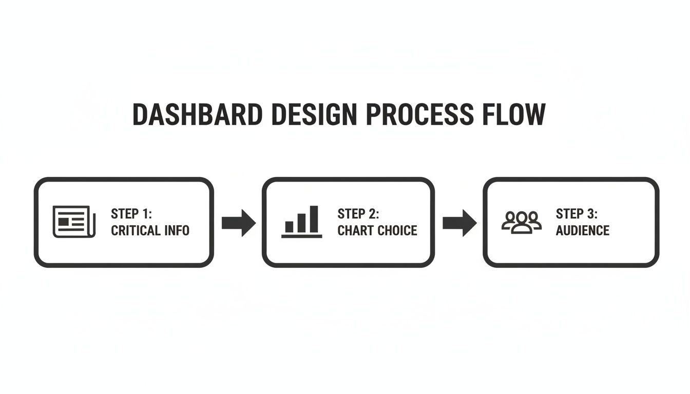
Starting with the most critical information ensures that you’ll immediately see high-impact changes, like a sudden drop in conversions.
Unifying Qualitative and Quantitative Signals
This integrated approach is becoming more and more essential. The global web analytics market was valued at USD 4.5 billion in 2023 and is projected to hit USD 13.2 billion by 2032. Small and medium-sized businesses make up over 35% of this market, and they're looking for dashboards that do more than just report traffic—they need tools that help them make smarter decisions and improve customer service. This trend underscores the growing demand for platforms that can analyze qualitative customer feedback right alongside quantitative data.
The ultimate goal is to create a powerful feedback loop. Your web analytics dashboard flags a potential issue, your product intelligence tools dig into the 'why' by analyzing user feedback, and the combined insight lets you create a development ticket with a clear, quantified revenue impact.
This is exactly how top-tier product teams operate. They don't just stare at charts; they hunt for the stories hidden behind the data points. They know that a 2% dip in retention isn't just a number—it represents a collection of individual user frustrations that, once solved, can unlock serious growth. By connecting data directly to dollars, you ensure your team is always focused on what truly matters most.
Real-World Dashboards for Key Business Roles
Theory is great, but it’s in the real world where a good dashboard proves its worth. A truly powerful web analytics dashboard isn't a one-size-fits-all report; it's a tool built with a specific person and their specific questions in mind. When you tailor the data to the user, you’re not just sharing information—you're building a decision-making engine.
Let's get practical and move past the abstract. Here are three examples of dashboards designed for key roles you’d find in any tech company: the Product Manager, the Customer Success Manager, and the Growth Marketer. Each one is designed for clarity and action, zeroing in on the metrics that actually matter for their job.
Product Manager Health Dashboard
A product manager lives and breathes one central question: "Are we building something people actually want and use?" Their dashboard has to cut through the noise of vanity metrics like total sign-ups and get straight to the health of the product itself. The real goal is to measure how much value the product delivers and whether users are sticking around.
This kind of dashboard tells a clear, data-driven story about what users do after they sign up, helping the PM make smarter roadmap decisions and spot friction points.
Key metrics and widgets would include:
- Feature Adoption Rate: A simple bar chart showing what percentage of users tried a new feature within its first 30 days. It’s a fast way to see what's a hit and what's a miss.
- User Retention by Cohort: This is the ultimate health metric. A cohort chart groups users by their sign-up month, showing if product improvements are actually making new users stick around longer than the old ones.
- Active Users (DAU/MAU Ratio): A line chart tracking the ratio of Daily Active Users to Monthly Active Users. If this number is high or climbing, you've got strong, habitual engagement.
- Top User Paths: A flow diagram that shows the most common steps users take in the product. It’s perfect for spotting both the "golden path" you want users on and the unexpected places where they get stuck and drop off.
Customer Success Command Center
The Customer Success team is on the front lines, fighting churn every single day. Their dashboard needs to be an early-warning system that flags at-risk accounts long before a customer decides to cancel. It's all about moving from reactive problem-solving to proactive health monitoring.
This dashboard focuses on the leading indicators of customer health and potential frustration, giving the team a chance to step in at exactly the right moment.
Here’s what’s essential for this dashboard:
- Account Health Score: A color-coded list of key accounts (Green, Yellow, Red) based on a combined score from usage metrics, support ticket volume, and recent activity.
- Usage Drop-Off Alerts: A running list of accounts where the number of weekly active users has dropped by more than 20%. This is a massive red flag for churn.
- Overdue Onboarding Tasks: A simple number showing how many customers haven't finished key setup steps within their first 14 days.
- Recent "Sad" Support Tickets: A widget that uses sentiment analysis to pull in support tickets from frustrated users who need a personal touch, fast.
Growth Team Performance Dashboard
For the growth team, everything comes down to ROI. Their dashboard must draw a straight line from marketing spend to business results like new customers and revenue. Every single metric should help answer the question: "Is this campaign actually making us money?"
Think of this as the financial command center for marketing, giving a real-time pulse on campaign efficiency and the economics of customer acquisition.
The push for role-specific web analytics dashboards is growing because they are becoming true revenue engines. North America currently holds 34.7% of the global market share, a trend fueled by AI integrations and a staggering USD 100 billion projected for U.S. AI investments by 2025. As the total web analytics market surges toward USD 24.79 billion by 2033, dashboards that connect marketing efforts directly to the bottom line will become non-negotiable. You can read the full research about the web analytics market to see where things are headed.
Key widgets for a growth dashboard include:
- Customer Acquisition Cost (CAC) by Channel: A bar chart that directly compares how much it costs to get a new customer from different sources like Google Ads, Organic Search, or LinkedIn.
- CAC Payback Period: A critical metric showing the number of months it takes for a customer's revenue to pay back the cost of acquiring them.
- Lead-to-Customer Conversion Rate: A funnel visualization that tracks the journey from lead to paying customer, showing you exactly where people drop off.
- Return on Ad Spend (ROAS): The bottom-line metric. It shows the gross revenue you make for every dollar you spend on ads, broken down by individual campaigns.
These focused templates show just how valuable a well-designed dashboard can be. For even more ideas, check out our other business intelligence dashboard examples and see how different industries visualize success.
Frequently Asked Questions About Web Analytics Dashboards
Jumping into web analytics can feel like trying to drink from a firehose. You know there's gold in that data, but the practical questions that pop up can be a real roadblock. This section tackles the most common questions head-on, giving you straightforward answers to help you avoid the usual pitfalls and build a smarter data strategy.
We’ll cover everything from the classic rookie mistakes and choosing the right tools to the ultimate goal: connecting your data directly to your bottom line.
What Is the Biggest Mistake Teams Make with Their First Dashboard?
Without a doubt, the single biggest mistake is data dumping. It’s the classic "more is more" fallacy, where teams cram every metric they can think of onto one screen, hoping that sheer volume will magically produce insights. In reality, it does the exact opposite—it creates a cluttered, overwhelming mess that leads to analysis paralysis, not clear action.
Think of it like trying to have five conversations at once. You can't really focus on any of them, and you end up just hearing noise. That's what a dashboard with dozens of charts and numbers becomes: visual noise.
The best way to start is with a single, critical business question. For example, "Which user actions actually lead to long-term retention?" Then, build your first dashboard with only the data needed to answer that one question. A focused dashboard that gives you a clear answer is infinitely more valuable than a sprawling one that offers no direction.
How Often Should I Check My Web Analytics Dashboard?
There's no magic number here. The right cadence depends entirely on your role and what you're trying to accomplish at the moment. What's more important than frequency is consistency. The goal is to get into a rhythm that aligns with your decision-making cycle, not just checking stats for the sake of it.
Here’s a rough guide for different roles:
- Executives (CEO/CMO): A high-level dashboard review once a week is usually enough to keep a pulse on overall business health and track progress against quarterly goals.
- Product Managers: If you've just launched a new feature or are watching a critical user flow, checking key metrics daily is essential to spot bugs or see if your launch is a hit.
- Growth Marketers: During a big campaign, you might be monitoring performance in real-time to optimize ad spend and shift your budget to what's actually working.
But an even smarter approach is to let the dashboard tell you when to pay attention. Set up automated alerts for major changes, like a sudden 20% drop in conversion rates or a weird spike in your bounce rate. This turns your dashboard from a passive report you have to remember to check into an active watchdog for your business.
How Can I Connect Dashboard Insights to Real Revenue Impact?
This is the million-dollar question, and it's what separates basic reporting from real strategy. You bridge this gap by pairing your quantitative web analytics (the what) with qualitative product intelligence (the why). Your dashboard gives you the signal; your user feedback gives you the story behind it.
Let's say your dashboard shows a 15% drop in checkout conversions over the last 48 hours. On its own, that's just a number. But when your product intelligence tool flags a 300% spike in support tickets complaining about a broken payment processor, you've just found the smoking gun.
Now you can actually quantify the financial damage. By connecting those two dots, you can go to your engineering team with a ticket that says, "This checkout bug is costing us an estimated $5,000 per day." That instantly clarifies the priority and shows the direct revenue impact of a single data point on your dashboard.
Which Tools Are Best for Building Web Analytics Dashboards?
The "best" tool really depends on your company's stage and what you need to measure. It's rare for one platform to do everything perfectly, so a smart setup usually involves a "stack" of a few specialized tools working together.
Here’s a look at the typical layers in a modern analytics stack:
- Web & Traffic Analytics (The Foundation): Google Analytics is the universal starting point. It’s the industry standard for understanding where your traffic comes from and what people do on your site. It’s powerful, and you can’t beat the price (free).
- Product Analytics (In-App Behavior): To understand how users really interact with your product or app, you need a dedicated tool. Mixpanel and Amplitude are the leaders here, great for tracking user flows, feature adoption, and retention.
- Data Visualization (Unified Views): To pull data from all your different sources—analytics, CRM, ad platforms—into one central dashboard, you'll want a visualization tool. Platforms like Tableau or Looker are absolute powerhouses for this.
- Product Intelligence (The 'Why'): This is the layer that connects the dots between user behavior and user feedback. A product intelligence platform pulls in qualitative data from support tickets, sales calls, and surveys to explain the trends you're seeing in your other dashboards.
When you combine these layers, your web analytics dashboards transform from simple reporting tools into a true engine for making strategic, revenue-driven decisions.
Stop guessing what users want and start building what they need. SigOS is an AI-driven product intelligence platform that analyzes customer feedback to pinpoint the issues costing you money and the features that will drive growth. Prioritize your roadmap with revenue-impact data today.
Keep Reading
More insights from our blog


Ready to find your hidden revenue leaks?
Start analyzing your customer feedback and discover insights that drive revenue.
Start Free Trial →