Mastering Client Churn Analysis to Boost Retention
A practical guide to client churn analysis. Learn to identify at-risk customers, predict churn, and implement proven retention strategies that work.

Before you can ever hope to fix churn, you have to understand it. Client churn analysis is simply the process of digging into why customers are leaving so you can get ahead of it and stop the bleeding. It’s about figuring out the root causes—whether it's something as simple as a failed credit card or as complex as a poor user experience—and then doing something about it.
Laying the Groundwork for Your Churn Analysis
Let's be clear: without a rock-solid, universally understood definition of "churn" at your company, any analysis you do is just noise. Your predictive models will be flawed, your retention campaigns will miss the mark, and you'll waste a ton of time and resources. Getting this foundation right isn't about fancy algorithms; it's about absolute clarity from the start.
The whole process really boils down to three core steps: you define what churn actually is, you calculate it consistently, and then you start analyzing the results.
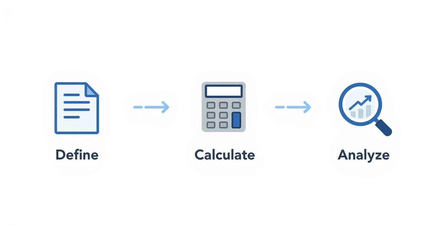
This simple workflow is your guide. It shows that you can't jump to the analysis part until you’ve nailed down the definitions and calculations first.
What Does Churn Actually Mean to Your Business?
The word "churn" gets thrown around a lot, but what does it mean for you? Is it a customer actively canceling their subscription? What about someone who just fails to renew? Or a client who downgrades to a free plan? You need to hammer out a single, unambiguous definition that everyone from sales to product agrees on.
From there, you need to break it down further into two critical metrics:
- Client Churn: This is the most straightforward number. It's the percentage of customers who walk out the door in a given period. It answers the simple question, "How many clients did we lose?"
- Revenue Churn: This tracks the percentage of monthly recurring revenue (MRR) lost from those customers. This one answers the much more impactful question, "How much money did we lose?"
Honestly, tracking both is non-negotiable. Losing ten tiny clients might look alarming on a client churn report, but losing one massive enterprise account could cripple your quarterly revenue. Revenue churn adds the financial weight that client churn often misses.
Voluntary vs. Involuntary Churn: The "Why" Matters
Another crucial split is understanding why a customer churned. This immediately divides your problem into two very different, and very actionable, buckets.
Voluntary churn is when a customer makes a conscious choice to leave. Maybe your service was buggy, a competitor made them a better offer, or they just didn't see the value anymore. This is a direct signal about your customer satisfaction and product-market fit.
On the flip side, involuntary churn is usually an accident. It’s the stuff like an expired credit card, a failed transaction, or some other billing hiccup. This is the lowest-hanging fruit in the retention world because it's often fixable with a simple dunning email or an in-app prompt to update payment details.
How to Calculate Your Churn Rate
Once you've got your definitions locked down, the calculation itself is pretty simple. The standard formula is the number of customers you lost during a period divided by the total number of customers you had at the start of that period.
For example, if you start the month with 4,000 customers and lose 200, your monthly churn rate is 5%. This single number is your baseline, allowing you to track performance over time and see if your retention efforts are actually working. If you want to dive deeper, HubSpot's guide on calculating churn rates is a great resource.
It's also important to pick the right time frame. A fast-moving startup will probably want to look at churn monthly for quick feedback. A more established enterprise might prefer a quarterly or annual view to smooth out the noise. The key isn't which one you choose, but that you stick with it for consistent, reliable trend analysis.
Gathering the Right Data for Accurate Insights
Your client churn analysis is only as good as the data you feed it. Garbage in, garbage out, as they say. If your data is messy or incomplete, you'll end up with flawed conclusions, wasting a ton of time and money on retention strategies that just don't work.
To get this right, you need to build a complete picture of your customer—one that combines the hard numbers with the human story behind them. Think of it as creating a detailed case file for every client. The mission is to get a single, unified view that captures every meaningful interaction they've had with your company, from their very first click to their most recent support ticket.

Unifying Quantitative Data Sources
Let's start with the quantitative stuff. This data gives you the objective, measurable facts about how clients actually use your product and engage with your business. It's the "what" and the "when" of their behavior. Without clean, reliable quantitative inputs, any predictive model you try to build later is basically a shot in the dark.
Your focus should be on pulling data from these core systems:
- Product Usage Logs: This is gold. It’s your richest source of behavioral data. You need to be tracking metrics like login frequency, how often specific features get used, session duration, and whether customers are completing key workflows. A sudden nosedive in activity here is often the very first sign a client is checking out.
- Billing and Subscription Information: Your CRM or billing platform holds a ton of vital context. Look at the subscription plan, contract length, payment history, and any past-due invoices. You'd be surprised how much involuntary churn is just hiding in this data.
- Customer Support Tickets: The volume, frequency, and sentiment of support tickets are incredibly strong indicators of customer health. Are they constantly hitting bugs? Is their resolution time getting longer and longer? These are major red flags.
Capturing the 'Why' with Qualitative Data
Numbers tell you what happened, but they almost never explain why. This is where qualitative data becomes so critical. It adds the human context, the emotion, and the reasoning behind all those quantitative trends, helping you understand the real-world frustrations and problems your customers are facing.
A great starting point is to weave in customer satisfaction metrics like CSAT and NPS scores. These give you a direct pulse on how customers are feeling over time.
But don't stop at scores. You need to seek out direct feedback, too.
- Exit Surveys: The second a customer cancels, ask them why. Keep the survey short and sweet, focusing on their primary reason for leaving. Was it price? A missing feature? Poor service? Did they jump ship to a competitor?
- Customer Interviews: For high-value accounts that have churned, nothing beats a real conversation. This is your chance to really dig into their experience, figure out what needs you weren't meeting, and learn what might have changed the outcome.
- Feedback from Customer-Facing Teams: Your sales, success, and support teams are on the front lines, hearing unfiltered feedback every single day. You need a system to capture and log these insights, because they often contain the early warnings that surveys and data logs completely miss.
Building a Clean and Integrated Dataset
Once you’ve identified all your data sources, the real work begins: pulling it all together into one clean, usable dataset. You're going to run into disparate systems, inconsistent formatting, and missing values—all of which can easily derail your analysis before you even start. This is why a well-structured data pipeline is absolutely essential.
For example, you'll need a way to link a user's support ticket history from a platform like Zendesk with their usage data from your product database and their subscription details from Stripe. This requires a common key, like a customer ID or email, to stitch everything together.
Honestly, creating this unified view is often the most time-consuming part of the whole process, but it's also the most important. You can learn more about tackling this technical side of things by reading up on how to build data pipelines that can reliably merge these different sources.
Uncovering Patterns with Exploratory Analysis
Once your data is clean and in one place, it's time to put on your detective hat. This is where the real work begins—rolling up your sleeves and digging into customer behavior to find the stories hidden just beneath the surface. The goal here isn't just to look at top-line metrics but to slice and dice your data to spot correlations, trends, and the faint whispers of a customer about to walk away.
This initial phase of your client churn analysis is more about asking the right questions than building complex models. Where are we seeing the most drop-off? Is there a specific point in the customer journey that’s a common exit ramp? This exploration is the foundation for everything that comes next.

Segmenting Customers to Find High-Risk Groups
Relying on averages is a great way to miss the real story. A company-wide churn rate of 3% might look pretty healthy on a slide deck, but it could be masking a serious problem. What if that 3% is actually 1% churn among your enterprise clients but a disastrous 10% churn among the small businesses you acquired through paid ads? Without segmentation, you’d never catch it.
Start by breaking down your customer base by different attributes to see if churn is concentrated somewhere. From my experience, these are often the most revealing segments:
- Acquisition Channel: Are customers from organic search sticking around longer than those from a recent social media campaign? This tells you a lot about the intent and quality of the leads your marketing team is bringing in.
- Subscription Plan: Is your cheapest plan a revolving door for customers? That could signal a value problem or that it’s attracting users who were never a great fit. On the flip side, high churn on a premium plan is a five-alarm fire.
- Company Size or Industry: For B2B businesses, this is crucial. You might discover you’re an absolute powerhouse for tech startups but can’t seem to retain clients in the healthcare space. This kind of insight helps you understand your true product-market fit.
- Onboarding Experience: Did the customer actually finish the setup tour? Did they get a call from an onboarding specialist? A rocky start is one of the biggest predictors of an early exit.
Visualizing these segment-specific churn rates is how you go from a vague goal like "reduce churn" to a tangible problem like "fix the leaky bucket of mid-market customers on our Pro plan." Making these trends pop is key; our guide on the best practices for data visualization has some great tips on this.
Using Cohort Analysis to Understand Lifecycle Trends
Segmentation tells you who is churning. Cohort analysis tells you when. Honestly, this might be the most powerful tool you have for exploratory analysis. A cohort is just a group of people who started at the same time—usually grouped by their sign-up month or quarter.
By tracking each cohort's retention over their lifecycle, you see exactly how engagement and loyalty change over time. It helps answer the questions that a simple churn rate just can’t touch.
For instance, a cohort chart can instantly tell you if that big product update you shipped in May actually improved long-term retention for every customer who signed up after. The impact is right there in the data, clear as day.
This type of chart lets you compare the retention of different user groups as they mature.

Here, you can see how newer cohorts (the lower rows) are performing against older ones. Are your onboarding improvements actually helping customers stick around longer? This visualization will tell you.
From Raw Data to Actionable Understanding
Think of exploratory analysis as the hypothesis-building stage. You’re not looking for definitive proof yet—you’re just looking for smoke. Is there a connection between customers who never touch a certain key feature and those who cancel? Do clients who file more than three support tickets in their first 30 days have a higher chance of leaving?
These patterns are the raw materials for the more advanced predictive models you'll build later. By first figuring out who is leaving and when, you can focus your retention campaigns and deeper analysis where they’ll make the biggest difference. This foundational work ensures you’re not just guessing; you’re building a strategy to keep the right customers, for the right reasons.
Building a Predictive Churn Model That Works
Your exploratory analysis told you what happened. Predictive modeling is all about seeing what's going to happen. This is where you move from reacting to churn to getting ahead of it, giving you a real chance to step in and save at-risk accounts. Honestly, the most effective retention strategies are always built on this kind of forward-looking insight.
Building a predictive churn model can sound like a massive data science project, but the concept is pretty straightforward. You're essentially teaching a machine learning algorithm to recognize the patterns of a customer who is about to churn, based on all your historical data. Once it learns those patterns, it can scan your current customer base for those same warning signs and flag accounts that need your attention now.
Choosing the Right Machine Learning Model
You don't need a team of PhDs to get started. A few well-established models can provide a powerful foundation for predicting churn. While they all work differently under the hood, their goal is the same: to assign a "churn probability" score to every single one of your customers.
Here are the most common models I see teams start with, moving from simplest to most powerful:
- Logistic Regression: This is almost always the best place to begin. It's easy to build, the results are simple to interpret, and it's perfect for a binary outcome like "churn" vs. "no churn." It essentially calculates how different factors—like product usage or recent support tickets—affect the odds of a customer leaving.
- Decision Trees: Think of this model as a big flowchart. It works by asking a series of simple questions about your data (e.g., "Is login frequency less than once per week?") to arrive at a prediction. They're incredibly visual, which makes them great for explaining the "why" behind a churn risk to non-technical stakeholders.
- Random Forest: This is a serious upgrade to the basic decision tree. Instead of building one tree, it builds hundreds of them and then aggregates their predictions. This approach makes it far more accurate and robust. It's a real workhorse for many prediction problems, including churn.
There are more complex models out there, but starting with one of these three will give you a solid, reliable foundation. The most important thing is to just pick one and start experimenting.
The Art and Science of Feature Engineering
A model is only as good as the data you feed it. That's where feature engineering comes in. This is the process—part art, part science—of selecting and transforming raw data points into meaningful predictive signals, or "features," for the model to learn from. I can't overstate this: this is the most critical step for building an accurate model.
You're hunting for the specific behaviors and attributes that separate happy customers from those on their way out. Your exploratory analysis should have already given you some strong clues.
I've found that the best features almost always measure change over time. These dynamic signals are often the strongest predictors of future behavior.
- Usage Velocity: How has their adoption of key features changed in the last 30 days compared to the previous 90? A sudden drop-off is a classic red flag.
- Support Ticket Trends: Is the volume of high-priority support tickets creeping up? Has the sentiment of their messages turned more negative?
- Engagement Momentum: Are they logging in less often than they did a month ago? Are their sessions getting shorter?
This is where platforms like SigOS can be a huge help by automating much of this discovery process. By continuously analyzing behavioral data from sources like support tickets, product usage logs, and even sales calls, SigOS can automatically identify and surface the features most correlated with churn, which can save a data team hundreds of hours.
Training, Testing, and Tuning Your Model
Once you have your features ready, it's time to train the model. This involves feeding it a large, historical dataset where you already know who churned and who stayed. The standard practice is to split this data into two parts:
- Training Set (around 70-80%): The model studies this data to learn the patterns and relationships associated with churn.
- Testing Set (around 20-30%): This data is kept separate. After the model is trained, you use this "unseen" data to test how accurately it can predict outcomes.
This testing phase is non-negotiable. It’s how you validate that your model will actually work in the real world. You’ll be looking at key metrics like precision (of all the customers we predicted would churn, how many actually did?) and recall (of all the customers who actually churned, how many did our model successfully catch?).
Getting it right is an iterative process. You'll likely go back and add new features, maybe try a different algorithm, or tweak the model's parameters to squeeze out more accuracy. The end result is a reliable early-warning system that empowers your success teams to act on data, not just gut feelings. This is how you transform churn analysis from a backward-looking report into a proactive, revenue-saving engine.
Turning Predictions into Profitable Actions
A predictive model that flags an at-risk account is powerful, but it's only half the story. Knowing a customer might churn is one thing; knowing which one to save first is where the real strategy comes in. Not all at-risk customers are created equal, and if you spread your retention efforts too thin, you’ll just burn out your team and your budget.

The real goal is to turn predictions into profitable actions. This means looking beyond simple churn probability and adding a layer of financial context. By combining your model's output with key business metrics, you can prioritize your efforts with ruthless efficiency, focusing only on the accounts that truly move the needle.
Prioritizing Churn Risk by Revenue Impact
The single most effective way to focus your retention strategy is to give every at-risk customer a priority score. This simple step transforms a daunting list of potential churners into a clear, actionable roadmap for your customer success team.
The logic is straightforward: a high-value customer with a moderate churn risk is often a much bigger priority than a low-value customer who is almost certain to leave.
To get this score, you just need to combine two key data points:
- Churn Probability Score: This is the direct output from your predictive model, usually a score from 0 to 1 indicating the likelihood of churn.
- Customer Financial Value: You can represent this with their Customer Lifetime Value (CLV) or, more simply, their current Monthly Recurring Revenue (MRR).
Multiplying these two figures gives you an Expected Revenue Loss score. This single number tells you, in clear dollar terms, which accounts represent the biggest financial threat. Suddenly, your team isn't just fighting churn—they're protecting revenue.
Segmenting for Actionable Retention Plays
With a prioritized list in hand, you can now segment at-risk customers into actionable tiers. This allows you to match the intensity of your retention effort to the value of the account, because a one-size-fits-all approach just doesn't work here.
For example, your tiers might look something like this:
- Tier 1 (High-Value, High-Risk): These are your "all hands on deck" accounts. They need immediate, high-touch intervention from a senior customer success manager. This could mean a strategic business review, outreach from an executive, or a custom solution to their specific problems.
- Tier 2 (Moderate-Value, High-Risk): This group is perfect for a more scaled approach. Think one-to-many actions like targeted email campaigns highlighting underused features, invitations to educational webinars, or proactive check-ins from a pooled success team.
- Tier 3 (Low-Value, High-Risk): For these accounts, efficiency is key. Fully automated interventions are your best bet—things like in-app guides, automated emails with helpful resources, or special offers designed to encourage re-engagement.
This tiered framework ensures your most expensive resource—your team’s time—is dedicated to the accounts with the highest potential revenue impact. It transforms retention from a reactive cost center into a focused, profit-driving function.
From Prediction to Proactive Intervention
Once you know who to focus on, the next step is implementing strategies that actually boost retention. A great resource for digging deeper is Mastering Customer Retention: The Ultimate Guide. Effective intervention is all about timing and context. It’s not just about what you do, but why you're doing it.
This is where all the context from your client churn analysis becomes so vital. Is the risk driven by low product usage? Then your intervention should be an educational campaign. Is it because of a recent string of support tickets? A direct call from a support lead is probably the right move. You can learn more about specific tactics in our guide on how to reduce customer churn: https://www.sigos.io/blog/how-to-reduce-customer-churn
Industry churn rates vary wildly, from 22% in online retail to over 25% in financial services. These numbers have a brutal compounding effect; a seemingly moderate monthly churn of 5% means you lose nearly half your customers within a year. This financial reality is exactly why a revenue-first prioritization strategy isn't just smart—it's essential for survival.
Common Questions About Client Churn Analysis
As teams start digging into client churn analysis, the same practical questions tend to pop up. Getting ahead of these common hurdles can save you a ton of headaches and prevent your retention efforts from stalling out before they even begin.
One of the first things people ask is, "Where do we even start looking for churn signals?" You can get lost in complex behavioral data, but honestly, some of the most powerful signals are staring you right in the face. A perfect example is how fast you respond to customer support tickets.
How Important Is Customer Service Speed?
Let's be clear: speed in customer service isn't a bonus feature; it's a core part of the product experience and a massive retention lever. The data is pretty stark here. A whopping 68% of customer cancellations are tied directly to slow or just plain bad responses from support.
Think about it from the customer's perspective. If they have to wait more than two hours for a reply, they're four times more likely to walk away. On the flip side, companies with an average first response time under a single minute see 42% lower churn rates. Yet, a staggering 82% of companies admit they don't even track response time as a key churn metric. That's a huge blind spot. If you want to dive deeper, there are some great customer churn statistics that really highlight the impact of service quality.
The takeaway is simple: tracking metrics like First Response Time (FRT) and Average Handle Time (AHT) is non-negotiable. It's one of the easiest and most impactful places to start your analysis.
Can We Predict Churn for New Customers?
Another big question is about timing: "How soon can we tell if a new client is going to churn?" It’s a tricky one because you need enough data to figure out what "normal" even looks like for them. Trying to call it in the first week is mostly just guessing.
As a rule of thumb, you'll want at least 30 to 60 days of activity before you can make any kind of reliable prediction. This window gives you enough time to see how they handle the critical early stages:
- Onboarding: Did they actually complete the setup process, or did they bail halfway through?
- Feature Adoption: Are they using the "sticky" features that you know lead to long-term success?
- Support Tickets: Did they immediately run into problems or bugs that soured their experience?
A bumpy start is one of the most reliable predictors of an early breakup.
The goal isn't to predict churn on day one. It's about making sure the onboarding experience is smooth. A customer who gets set up properly and finds value in that first month is far more likely to stick around for the long haul.
What If We Don't Have a Data Science Team?
This is a big one. A lot of companies think they can't do meaningful churn analysis because they don't have a dedicated data science team. While data scientists can definitely build some sophisticated models, you absolutely don't need one to get started.
Many modern CRMs and customer success platforms have health scoring and basic churn prediction tools built right in. Even if you don't have those, you can uncover incredibly powerful patterns with a simple spreadsheet tracking things like login frequency, key feature usage, and the number of support tickets. The secret is to start small, focus on the most obvious signals, and add complexity as you go.
At SigOS, we automate this entire process. Our platform plugs directly into your customer data—from support tickets to product usage logs—to find and score churn signals in real-time. We then tell you which issues are costing you the most money, so your team knows exactly where to focus. See how you can turn your customer feedback into a revenue-driving machine.


Ready to find your hidden revenue leaks?
Start analyzing your customer feedback and discover insights that drive revenue.
Start Free Trial →