A Practical Guide to Customer Churn Analysis
Discover how to perform a complete customer churn analysis. This guide covers everything from data gathering to building predictive models and taking action.

Customer churn analysis is all about digging into your data to figure out why customers are leaving. It’s a process of connecting the dots between customer behavior, their interactions with your support team, and how they use (or don't use) your product.
When you get this right, you can build smart, effective strategies to keep customers happy and sticking around for the long haul.
Why Customer Churn Analysis Is Critical for Growth

Let’s be honest: churn isn't just another KPI. It's a silent killer of growth. High churn puts you on a hamster wheel, forcing you to sprint just to replace the customers you're losing, let alone grow. It’s an exhausting and expensive way to run a business.
The real magic of churn analysis is that it flips your mindset from reactive to proactive. You stop asking, "Why did that customer leave?" and start asking, "Who is at risk of leaving, and what can we do right now to keep them?" This shift is a game-changer for building a sustainable company.
The Financial Drain of Attrition
The financial hit from churn is easy to underestimate because it’s a slow bleed that compounds over time. What looks like a small monthly percentage can quickly spiral into a massive annual revenue hole, making it incredibly difficult to scale.
For any business with a subscription model, the numbers are sobering. Take a look at how seemingly minor monthly churn rates can devastate your bottom line over a year.
The Compounding Impact of Monthly Churn on Annual Revenue
This table illustrates how seemingly small monthly churn rates can lead to massive annual revenue and customer loss, highlighting the urgency of effective churn analysis.
| Monthly Churn Rate | Annual Customer Loss | Annual Recurring Revenue (ARR) Lost (from $1M initial ARR) |
|---|---|---|
| 1% | 11.4% | $113,616 |
| 3% | 30.6% | $306,019 |
| 5% | 46.0% | $459,692 |
| 10% | 70.0% | $699,578 |
A seemingly manageable 5% monthly churn wipes out nearly half (46%) of your customers within a year. And a 10% monthly rate? That's a catastrophic 70% annual loss. The flip side is just as powerful: reducing churn by a mere 5% can boost profits by 25-95%. This data, backed by research on customer retention rates, shows why proactive analysis is non-negotiable.
This is exactly why the best product and revenue teams don't see churn analysis as a chore. They see it as a primary growth lever. They know that every customer you keep adds to predictable revenue and a much healthier customer lifetime value (CLV).
Connecting Qualitative Clues to Hard Numbers
Great churn analysis is about more than just crunching numbers; it's about building a story. It connects what your customers say with what they actually do.
Think about all the clues scattered across your business:
- Frustrated Support Tickets: Is one account suddenly lighting up your support queue with bug reports?
- Sales Call Notes: Did a CSM mention a key stakeholder is worried about budget or is "looking at other tools"?
- Product Usage Metrics: Has a team that used to live in your app suddenly gone quiet?
By pulling these qualitative and quantitative signals together, you can spot the early warning signs before it's too late. A solid churn analysis process helps you understand the why behind the risk, empowering your teams to step in with the right message at the right time. This guide will show you exactly how to build that process.
Finding the Right Data for Your Churn Analysis
Any good churn analysis is only as strong as the data it’s built on. I’ve seen incredibly sophisticated models fall flat because they were fed incomplete or siloed information. The real story of why customers leave is rarely in one place; it's scattered across a half-dozen different tools and teams. Your first job is to play detective and bring it all together.
To get this right, you have to look at both the what and the why. You need the hard numbers—what are people actually doing inside your product?—but you also need the human context from their conversations with your team. The magic happens when you can connect the dots, like linking a specific complaint in a support ticket to a measurable drop in that user's activity.
Uncovering the "Why" in Qualitative Data
Qualitative data is where you find the emotion. It's the frustration, the unmet expectations, and the subtle hints that a customer is becoming a churn risk long before their usage metrics start to dip. The best place to start is where your customers are already talking.
- Support Tickets (Zendesk, Intercom): Look past just closing tickets and start mining them for themes. Are you seeing a dozen different customers complain about the same confusing workflow? Or maybe a bug that seems minor to engineering is actually a major point of friction.
- Live Chat Transcripts: Chats are often raw and unfiltered. Phrases like "I'm so confused," "this is taking forever," or the dreaded "your competitor does this better" are pure gold. They show you exactly where the user experience is breaking down in real-time.
- Sales and CSM Call Notes: Don't sleep on the notes your teams are logging in the CRM. A CSM mentioning a customer is "concerned about ROI" or a sales rep hearing whispers of budget cuts are huge, forward-looking indicators of potential churn.
By pulling these sources together, you’re not just collecting a list of complaints. You're building a complete narrative of the customer journey, warts and all. That narrative is what helps you find the root cause of churn, not just the symptoms.
Of course, manually sifting through thousands of conversations is a non-starter. This is where modern AI platforms like SigOS come in, automatically turning all that unstructured text from different tools into clear, quantifiable signals.
Tracking the "What" with Quantitative Metrics
While qualitative data gives you the story, quantitative data gives you the hard evidence. These are the objective, measurable signals that tell you what users are doing and when. Without this, you’re flying blind.
You really need to track behavior at both the individual user and the overall account level. A great starting point includes:
- Product Usage Frequency: How often are people actually logging in? A shift from daily to weekly logins is one of the oldest and most reliable red flags in the book.
- Feature Adoption Rate: Are customers using the sticky features that you know lead to long-term value? If they aren't adopting key functionality, they're not getting their money's worth.
- Session Duration and Depth: When they do log in, are they actually getting work done or just poking around for a minute? Short, shallow sessions often mean they can't find what they're looking for.
- User Engagement Scores: Many teams roll up several key metrics into a single "health score." This can be a fantastic at-a-glance indicator, but you have to make sure the inputs are meaningful.
The goal is to focus on behaviors that actually correlate with retention, not just vanity metrics. To get a richer picture, you can use data enrichment tools to add more context to your customer profiles.
Bringing all this data together is a huge first step, but it often uncovers another problem: messy data. We've all been there. For a deep dive on navigating that, check out our guide to fixing common data quality issues.
Turning Raw Data Into Predictive Churn Signals
Raw data on its own is mostly just noise. A long list of user clicks or a transcript from a support call doesn't really tell you much about whether a customer is happy or about to walk out the door. The real magic in churn analysis happens when you transform that raw material into predictive signals. This process, often called feature engineering, is where you translate abstract behaviors into concrete metrics that actually correlate with a customer's likelihood to stay or leave.
This isn't as simple as just counting logins or support tickets. You have to add a layer of intelligence. For instance, knowing a customer submitted ten support tickets last month is interesting, but it's not a clear signal. What if you dug deeper? If sentiment analysis showed that eight of those tickets contained phrases like "frustrated," "not working," and "unacceptable," you've just engineered a powerful "Customer Frustration Score." That new signal is far more predictive than the raw ticket count ever could be.
The key is to blend both the numbers (quantitative) and the conversations (qualitative) to build a complete picture of customer health.
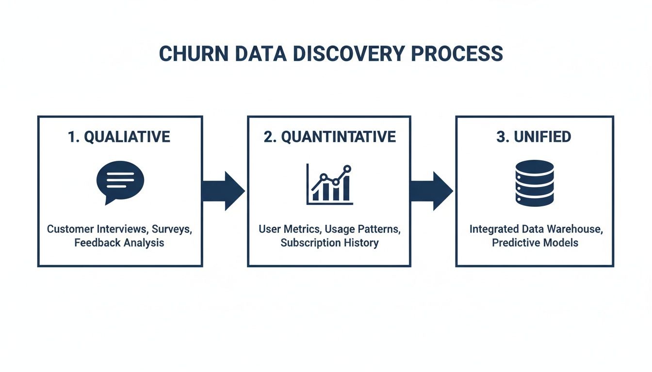
This diagram shows the ideal workflow. You start with separate streams of qualitative and quantitative data, then merge them into a unified source. It's this unified view that gives you the foundation to build an accurate, comprehensive churn model.
Crafting Signals from Quantitative Data
Your product usage data is an absolute goldmine for creating these kinds of time-sensitive signals. The trick is to stop looking at static snapshots of activity and start tracking changes over time. This is where you'll find the subtle behavioral shifts that almost always happen before a customer churns.
Here are a few practical examples of signals I've seen work wonders:
- Login Velocity Change: Don't just check if a user is active. Compare their average login frequency over the last 30 days to their average over the last 90 days. A significant drop-off creates a powerful "Engagement Momentum" signal that flags slowing activity long before it becomes a problem.
- Core Feature Adoption Ratio: Pinpoint your three most "sticky" features—the ones your best customers can't live without. Then, create a signal that measures what percentage of a customer’s active users have adopted at least two of them. A low ratio is a dead giveaway that they aren't getting the full value from your product.
- Time-to-Value (TTV) Benchmark: Figure out how long it typically takes a successful new customer to complete a key workflow for the first time. You can then flag any new accounts that exceed this benchmark by 50%, immediately highlighting a rocky onboarding experience that needs intervention.
Creating these dynamic, time-series features gives you a moving picture of customer engagement, not just a single, static photo. It helps you understand how their engagement is trending, which is far more important than just knowing if they're engaged today. If you want to go deeper, understanding how to properly use behavior analytics is a great next step.
Deriving Signals from Qualitative Feedback
While usage data tells you what users are doing, qualitative data from support tickets, chats, and calls provides the crucial "why." Engineering signals from this unstructured text is how you uncover the frustration and negative sentiment that usage logs simply can't see.
Here, the focus shifts to thematic analysis and sentiment scoring. You can turn all that messy conversational data into hard metrics by:
- Categorizing Ticket Themes: Use natural language processing (NLP) to automatically tag conversations with themes like "Bug Report," "Billing Issue," or "Feature Confusion." A sudden spike in "Bug Report" tickets from a single account is a massive red flag.
- Tracking Sentiment Shifts: Analyze the sentiment of every single customer interaction over time. A customer who has always been positive but suddenly turns negative over their last few conversations is a much higher churn risk than a customer who is consistently neutral.
- Identifying Key Risk Phrases: Build a library of keywords and phrases that are highly indicative of churn risk. Think "considering alternatives," "too expensive," or "disappointed." A simple count of these phrases per account can be a surprisingly effective predictor.
The most powerful signals often come from combining both data types. For instance, an account with declining usage metrics (quantitative) that also has a recent spike in tickets tagged with "Billing Issue" (qualitative) is a five-alarm fire.
For more advanced analysis, especially when dealing with massive amounts of unstructured text, technologies like vector databases can be a game-changer for turning raw information into predictive signals. Of course, platforms like SigOS are designed to automate this entire process, continuously analyzing both data streams to surface these combined signals before they turn into churned customers.
Choosing the Right Churn Modeling Approach
Once your signals are clean and predictive, it’s time to pick your weapon. This is where you decide how you’re going to model customer churn, and it’s definitely not a one-size-fits-all scenario. The right approach for a scrappy startup is worlds away from what a data-rich enterprise needs. The goal is to strike the right balance between complexity, accuracy, and whether you can actually do something with the results.
I’ve seen teams burn months building a hyper-complex machine learning model, only to realize a few simple rules would have delivered 80% of the value in a tiny fraction of the time. Don't make that mistake. Let’s walk through the four most common approaches so you can figure out what makes sense for your business right now.
Simple Heuristics and Rule-Based Triggers
The quickest way to get started is with heuristics. Think of them as simple “if-then” rules you create based on what you already know about your customers. No fancy stats or machine learning required—just your team's domain expertise setting thresholds for risky behavior.
For example, you could set up a rule that flags an account if:
- Logins have plummeted by more than 50% in the last 30 days.
- Fewer than 10% of their users have touched a critical new feature after 60 days.
- They’ve sent in more than three support tickets with negative sentiment in a single week.
The beauty of this method is its sheer speed and simplicity. You can have these rules up and running in an afternoon and start flagging at-risk customers immediately. It’s not the most precise method, but it's a fantastic first step for any team just dipping their toes into churn analysis.
Survival Analysis: Predicting When Churn Happens
Heuristics tell you if a customer might be in trouble, but survival analysis tries to predict when they’re most likely to leave. Borrowed from medical research, this statistical method is perfect for understanding the timeline of customer attrition. It helps you answer critical questions like, "What's the probability a customer will churn in their third month?" or "How does completing onboarding impact a customer's 'survival' rate after six months?"
This is especially powerful for subscription-based businesses because it models time-to-event data so well. You can clearly see how specific events—like a pricing change or a major product update—bend the churn curve over time.
This approach moves beyond a generic "at-risk" flag and gives your customer success team a real window of opportunity. Knowing a high-value account has a 70% probability of churning in the next 45 days is a far more actionable insight than just knowing they seem unhappy.
Classification Models: Predicting Who Will Churn
When you’ve got a good bit of historical data to work with, classification models are the logical next step up. These are the machine learning models you’ve heard about—like Logistic Regression, Random Forest, or Gradient Boosting—trained to predict a simple binary outcome: churn or no churn.
The model crunches all your historical data, learning the complex patterns that separate customers who left from those who stayed. It can analyze hundreds of signals at once, picking up on connections a human could never spot. For instance, a model might find that users who consistently ignore a specific in-app notification are 3x more likely to churn, even if their overall usage looks fine.
The catch? Complexity. Building, validating, and maintaining these models requires data science expertise. But for mature organizations, the jump in predictive accuracy is often well worth the investment. For those without a dedicated data science team, platforms like SigOS can automate this entire workflow, making advanced classification much more accessible.
Behavioral Cohorting for Group-Level Insights
This last approach isn't about predicting individual churn so much as understanding group dynamics. With behavioral cohorting, you group customers based on what they do in your product, not just when they signed up. It’s a powerful way to see how different usage patterns correlate with long-term loyalty.
You could define cohorts like:
- Power Users: Customers who use your top five features daily.
- Specialists: Customers who live in one specific feature but use it intensively.
- Explorers: New users who try a bunch of features once but don't form a habit.
By tracking the churn rate of each cohort, you get incredible insight into what makes your product sticky. You might discover your "Specialists" almost never churn, telling you to double down on that one feature. Or maybe the "Explorers" churn at an alarming rate, shining a spotlight on a broken onboarding experience.
Comparison of Customer Churn Analysis Models
To help you decide, it’s useful to see these four approaches side-by-side. This table breaks down each method by its primary goal, complexity, and ideal use case.
| Modeling Approach | Primary Goal | Complexity | Best For |
|---|---|---|---|
| Heuristics | Flagging obviously at-risk accounts quickly | Low | Teams just starting out or needing immediate, simple triggers. |
| Survival Analysis | Predicting when a customer is likely to churn | Medium | Subscription businesses needing to understand churn timing. |
| Classification | Predicting if a customer is likely to churn with high accuracy | High | Data-rich organizations looking for the most precise predictions. |
| Behavioral Cohorting | Understanding how specific usage patterns impact churn | Medium | Product teams trying to identify sticky features and user journeys. |
Ultimately, there's no single "best" model. The right choice depends entirely on your team's resources, data maturity, and what you plan to do with the insights you uncover. Many companies start with simple heuristics and gradually work their way toward more sophisticated models as they grow.
Putting Your Churn Insights Into Action

Let's be honest: a perfect churn prediction model is completely useless if its insights just sit in a dashboard. The real magic of customer churn analysis happens when you operationalize your findings—turning those predictive scores into real, proactive interventions that actually save accounts.
This is where you bridge the gap between data science and customer success. The objective is to bake churn intelligence right into the daily routines of your customer-facing teams.
When your model flags a customer as high-risk, it shouldn't just be another data point on a chart. It needs to trigger an immediate, automated, and context-rich alert that empowers someone to jump in and help. It’s about building a proactive retention engine, not just a reactive support queue.
Building an Automated Alerting System
First things first, you need to set up real-time notifications that go off the second a customer's risk score crosses a certain threshold. You can't afford to have your team stumble upon a problem a week later during a report review. You need them on it within minutes.
These alerts have to land where your teams already live and work. A buried email is a lost opportunity. The most effective systems plug directly into your team’s most-used tools:
- Slack/Microsoft Teams: A notification in a dedicated
#churn-alertschannel can bring the right people together in an instant. - Zendesk/Intercom: Automatically spin up a high-priority support ticket and assign it to the right Customer Success Manager (CSM).
- Jira/Linear: If the churn risk is tied to a specific bug or a missing feature, an alert can generate a task directly for the product team.
The alert itself needs more than just a customer's name. It has to include the "why." For example, an alert might say: "Account XYZ risk score just hit 85%. Reason: Key feature usage dropped 60% and their last two support tickets were flagged for negative sentiment." This context is everything; it’s what enables a meaningful, targeted intervention.
Prioritizing Interventions Based on Revenue Impact
Not all at-risk accounts are created equal. A small, low-spend account showing churn signals is a concern, for sure. But a high-value enterprise client at risk? That’s a code-red situation.
Without a clear way to prioritize, your team will burn out chasing down low-impact issues. This is where you have to tie churn risk directly to your financial data. Every alert should be enriched with revenue information to create an instant hierarchy.
The best way I've seen this done is with a simple risk matrix. On one axis, you have the churn probability score. On the other, the account's Annual Recurring Revenue (ARR). This instantly isolates the high-risk, high-value accounts that need immediate, white-glove attention from the lower-priority risks you can handle with an automated email sequence.
This kind of ruthless prioritization ensures your most experienced people are always focused on protecting your most critical revenue. It's how churn analysis stops being an interesting academic exercise and becomes a core driver of financial health. By focusing on the right accounts, you can start proactively reducing your churn rate and protecting your bottom line.
Turning Insights Into Customer Conversations
Once a prioritized alert is in hand, the final piece is helping your team intervene effectively. The reasons customers leave are often emotional and complex. Research shows a shocking 68% of churn happens because customers simply feel unappreciated. Other reports pinpoint support speed as the #1 retention factor.
Globally, companies lose an estimated $1.6 trillion a year to churn, and well over half of that can be traced back to poor onboarding, weak relationships, or bad service. You can dig into more of these state of retention findings yourself.
This data tells us one thing loud and clear: your intervention has to be human. The automated alert gets the ball rolling, but the solution is almost always a thoughtful conversation. Your CSMs need a playbook that guides them on how to handle different risk drivers.
- Risk Driver: Low feature adoption.
- Action: Proactively schedule a one-on-one training session focused specifically on the features they aren't using.
- Risk Driver: Negative support sentiment.
- Action: Have a senior support manager personally call the customer, acknowledge their frustration, and own the solution.
This entire flow—from signal to alert to prioritized, human action—is what it means to truly operationalize churn analysis. It's a continuous, automated loop that turns raw data into saved customers and protected revenue.
Common Mistakes in Churn Analysis to Avoid
Getting started with churn analysis is a big step, but I've seen a lot of promising projects go sideways by falling into a few common traps. It's easy to get excited by the data, but you have to be careful about the conclusions you draw.
One of the biggest mistakes is confusing correlation with causation. You might see that customers who use Feature X churn less often. The immediate, and usually wrong, conclusion is to force every new user into that feature. The reality is often more complex; perhaps only your most engaged, high-value customers were using that advanced feature in the first place.
Another classic pitfall is focusing on vanity metrics. Sure, tracking daily active users is fine, but it’s a lagging indicator—by the time it drops, the customer is already gone. A much better early warning sign is a dip in the number of key actions a user performs each time they log in. That subtle change in behavior is where the real story is.
Misinterpreting Your Model and Data
I see this all the time: teams build incredibly complex, "black box" machine learning models. The problem? If your product managers or customer success team can't understand why a customer is flagged as high-risk, they won't trust the model. And if they don't trust it, they won't act on its predictions.
A model that is 85% accurate and fully explainable is infinitely more useful than one that is 90% accurate but impossible to interpret. Actionability always trumps raw accuracy.
You also need to be precise about what kind of churn you're looking at. The approach for preventing involuntary churn (think a failed credit card payment) is totally different from stopping voluntary churn (a customer actively deciding to cancel). When you lump them together in your analysis, you muddy the waters and your retention strategies become ineffective.
Finally, and this is a critical one, don't analyze churn in a vacuum. Disconnecting your analysis from revenue is a huge oversight. If you don't factor in customer lifetime value (LTV) or expansion potential, you might waste a ton of effort saving low-value customers while your biggest accounts are quietly heading for the door. Always tie your churn risk directly to financial impact; it ensures you're fighting the fires that matter most.
Answering Your Top Churn Analysis Questions
When you first dive into a formal churn analysis program, a lot of questions pop up. It's a common experience. Let's tackle some of the most frequent ones we hear from teams just getting started.
What’s a Good Churn Rate for a SaaS Company?
Honestly, there's no single magic number. A "good" churn rate really depends on who you are—your industry, how long you've been around, and who you're selling to. For big, established enterprises, a 5-7% annual churn rate is often seen as a solid benchmark. But if you're an early-stage startup, your rate will naturally be higher as you find your footing.
The real goal isn't to hit some universal metric. It's to consistently drive your own rate down. Focus on figuring out what's causing customers to leave your specific product and then demonstrate steady, month-over-month improvement. That’s a win.
How Often Should We Retrain Our Churn Prediction Model?
This really hinges on how fast your business is changing. A good rule of thumb to start with is quarterly. If you're constantly shipping new features, onboarding different types of users, or changing your pricing, you might need to retrain monthly to keep the model from going stale.
For more stable businesses where things don't change quite so dramatically, twice a year might be perfectly fine.
The key is to keep an eye on your model's accuracy. When you see its predictive power start to slip, that's your cue. Retraining with fresh data ensures it's picking up on new customer behaviors and market dynamics, keeping your insights sharp and reliable.
Should We Focus on Preventing Churn or Finding New Customers?
While you obviously need both, the data overwhelmingly points to retention as the more profitable play. It's not even close.
- Acquisition is expensive: It can cost five times more to land a new customer than to keep an existing one.
- Retention is profitable: Just a 5% drop in customer churn can increase profits anywhere from 25% to a whopping 95%.
Think of it this way: use your churn analysis to build a stickier product that customers love. That creates a loyal base that not only stays but also makes your new customer acquisition efforts more sustainable and impactful down the road.
Ready to turn customer feedback into revenue? SigOS uses AI to analyze support tickets, calls, and usage data, identifying the top issues costing you money and the features that will drive expansion. Discover how to prioritize your roadmap with revenue-backed insights at sigos.io.


Ready to find your hidden revenue leaks?
Start analyzing your customer feedback and discover insights that drive revenue.
Start Free Trial →