A Guide to Dashboard Data Analytics for SaaS Teams
Master dashboard data analytics to transform raw data into revenue. Learn to build strategic SaaS dashboards that reduce churn and align product teams.
At its core, dashboard data analytics is all about turning mountains of raw data into a clear, visual story. Instead of getting lost in endless spreadsheets, your teams get a command center—a live view of what’s happening in the business, why it’s important, and what steps to take next.
From Data Overload to Actionable Clarity
Let’s be honest: for most SaaS teams, data is everywhere, but real clarity is nowhere to be found. Product managers are often drowning in a sea of disconnected information—endless support tickets, confusing usage logs, scattered sales notes, and random user feedback. The truly valuable insights get buried in all that noise, making it almost impossible to see how daily work actually impacts the bottom line.
This is where a smart approach to dashboard data analytics can turn that chaos into a serious competitive edge. It's about building a single source of truth that does more than just track vanity metrics. A great dashboard tells a story, connecting every data point to a real-world outcome, whether that's customer churn, a new upsell opportunity, or a jump in product adoption.
Turning Qualitative Feedback into Revenue Signals
The real magic happens when you start blending numbers with human feedback. Modern dashboards don’t just show you what happened (like a sudden drop in user activity). They can pull in qualitative data from tools like SigOS to show you why it happened—for instance, a huge spike in support tickets all complaining about the same bug.
Suddenly, that vague customer feedback becomes a critical signal tied directly to revenue.
This move toward dashboard-driven decisions is only getting bigger. The global data analytics market is on track to blow past $480 billion by 2033. And get this: customer analytics already accounts for nearly 20% of all data applications used around the world. Dashboards aren't just for reporting anymore; they're where the most important business decisions get made.
A great dashboard doesn’t just present data; it provokes a question and points toward an answer. It’s the starting point of a conversation, not the end of a report.
To truly make the leap from data overload to actionable clarity, you need solid systems for organizing all this information. Digging into some actionable best practices for knowledge management can help you build the right foundation. When your dashboards are built on reliable, accessible information, every insight you uncover becomes that much more powerful.
Choosing the Right Dashboard for Your Mission
Not all dashboards are created equal. Trying to use one for the wrong purpose is like trying to turn a screw with a hammer—it’s clunky, frustrating, and ultimately, you won't get the job done. The first step to getting real value from your data is picking the right type of dashboard for the mission at hand.
Think of your business as a large ship. Different crew members need different information to do their jobs effectively. The engineer in the engine room needs a completely different set of dials and gauges than the captain on the bridge. This is the perfect way to think about the three main types of dashboards.
The whole point is to turn a tangled mess of raw data into something clear and actionable, which is exactly what this process map shows.
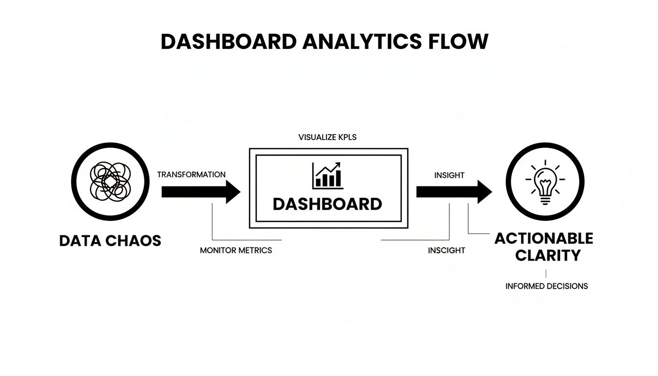
This journey from chaos to clarity is only possible when you’re looking at the right information, organized in the right way. Let's break down the three core types.
Operational Dashboards: The Engine Room
First up are operational dashboards. These are the live gauges and monitors deep in the ship’s engine room, telling you what’s happening right now. They’re built for your front-line teams—the people in the trenches who need real-time data to do their jobs and put out fires.
An operational view is all about speed and immediacy. The data has to be fresh, often updated every few minutes, or it's useless.
- Who uses it? Think customer support agents, DevOps engineers, or sales reps.
- What does it answer? How many new support tickets just came in? Is our server uptime still at 99.9%? How many sales calls have I made this morning?
- Key Focus: Monitoring live activity and flagging immediate problems that need attention now.
Tactical Dashboards: The Navigation Chart
Next, we have tactical dashboards. These are like the ship's navigation chart, used by managers and department heads to see if they're on course to hit their goals for the month or quarter. It’s less about the real-time blips and more about analyzing trends.
Unlike their operational cousins, tactical dashboards help you spot patterns over time. The data is usually refreshed daily or weekly, giving managers enough information to analyze performance and make smart adjustments to their team's strategy.
A great tactical dashboard helps a manager connect the dots between daily activities and bigger goals, guiding mid-term decisions on where to focus the team's effort.
Strategic Dashboards: The Captain’s Telescope
Finally, there are strategic dashboards. This is the high-level, long-term view from the captain's telescope. These are for the C-suite and senior leadership, designed to track the overall health and direction of the entire company.
Here, you're only looking at a handful of critical KPIs that tie directly to major business objectives. The data might only be updated monthly or quarterly because the goal isn't to react to daily noise but to assess long-term performance and make big, course-correcting decisions.
- Who uses it? C-suite executives, board members, and senior leaders.
- What does it answer? How does our Customer Lifetime Value (LTV) compare to our Customer Acquisition Cost (CAC)? Are we growing our market share? What's our year-over-year revenue growth?
- Key Focus: Monitoring high-level KPIs and tracking progress toward long-term organizational goals.
To make the differences even clearer, here's a side-by-side comparison.
Comparing Operational, Tactical, and Strategic Dashboards
This table breaks down how each dashboard type serves a unique purpose, from the front lines to the boardroom.
| Dashboard Type | Primary User | Key Focus | Example Metrics | Data Freshness |
|---|---|---|---|---|
| Operational | Front-line Teams | Real-time monitoring & alerting | Open support tickets, server status, calls per hour | Seconds to minutes |
| Tactical | Department Managers | Trend analysis & goal tracking | Churn rate by segment, feature adoption trends, MQL to SQL conversion | Daily to weekly |
| Strategic | Executives & Leadership | High-level business health | LTV:CAC ratio, market share, quarterly revenue growth | Monthly to quarterly |
As you can see, the user, their goals, and the data they need are all tightly connected. Matching the dashboard to the person and their mission is the first—and most important—step.
Designing Dashboards That Inspire Action
A great dashboard does more than just throw numbers on a screen; it tells a clear story that practically begs for a response. Think of a bad dashboard as a messy, cluttered room. The information might be in there somewhere, but good luck finding what you actually need. The real goal is to create something that’s intuitive, trustworthy, and impossible for your team to ignore.
This is where thoughtful design in dashboard data analytics makes all the difference. A well-crafted dashboard naturally guides the user's eye to what matters most, letting them get the pulse of the business in a matter of seconds.

Prioritize with the Inverted Pyramid
Take a cue from journalism and use the "inverted pyramid" method. It's simple: put your most critical, big-picture KPIs right at the top. The dashboard should pass a five-second test—can a busy executive glance at it and immediately understand the overall health of the business?
From that high-level summary, the dashboard should then invite users to dig deeper into the more granular details. This structure respects everyone's time by giving them the headline news first, with the full story just a click away for those who need to explore further.
A well-designed dashboard anticipates the next question. It presents a key metric, then offers the underlying data that explains the why behind the number.
This layered approach is what turns a static report into a dynamic analytical tool. To see what this looks like in practice, it’s worth checking out some effective business intelligence dashboard examples that nail these principles.
Use Visuals with a Purpose
Every single chart, graph, and number on your dashboard has to earn its spot. Clutter is the number one enemy of clarity, so being deliberate with your design is the only way to create a truly actionable view.
- Color with Intention: Don't just make it pretty; use color to communicate. Save bright, jarring colors like red for critical alerts or negative trends that need immediate attention. A consistent, more muted palette for everything else makes those important alerts impossible to miss.
- Choose the Right Chart: You wouldn't use a hammer to turn a screw. Don’t force your data into the wrong type of visualization. Stick to line charts for tracking trends over time, bar charts for comparing distinct categories, and use pie charts sparingly (only when showing parts of a whole).
- Establish a Single Source of Truth: If your team doesn't trust the data, the dashboard is worthless. Make sure it pulls from a centralized, clean, and reliable data source. When you integrate data directly from platforms like Zendesk and Jira, everyone is on the same page, which kills confusion and conflicting reports before they start.
Dashboards aren't just static wall displays anymore. With global spending on big data and analytics projected to hit around $420 billion in 2026, they've become the central nervous system for how people interact with data. In fact, research shows that over 60% of companies now embed analytics directly into their daily business applications. The focus has shifted to dynamic, in-workflow views that mix real-time data with predictive insights, making clear, purposeful design more critical than ever.
Connecting Disparate Data for Deeper Insights
The magic of modern dashboard data analytics isn't just about making one dataset look good; it's about connecting data points that have never spoken to each other before. Sure, a dashboard showing only product usage is useful. But a dashboard that overlays that usage data with customer support tickets and notes from sales calls? That's a different beast entirely. It weaves together a unified view, revealing the hidden stories behind the numbers.
At its core, this process involves blending two very different kinds of information. You have your quantitative data—the hard numbers like daily active users, feature adoption rates, or churn percentages. Then you have the qualitative data, which is all the rich, messy, unstructured context locked away in support chats, ticket descriptions, and CRM notes.

From Bug Reports to Revenue Impact
The whole point isn't just to mash data together. It’s to find powerful connections that actually drive business decisions.
Picture this: your dashboard flags a sudden 7% drop in the usage of a key feature. That's alarming on its own, but you have no idea why it’s happening. Is it a new competitor? A seasonal dip?
Now, imagine that same dashboard also pulls in and analyzes your support tickets. It could instantly show you a 40% spike in tickets from your highest-value accounts, all complaining about the same frustrating bug in that exact feature. Suddenly, the picture is perfectly clear. The "why" behind your usage drop is a critical bug that’s actively hurting your best customers.
You’ve just transformed a simple bug report into a clear, revenue-focused problem that screams for immediate attention. By connecting a qualitative complaint to a quantitative business metric, you've turned raw feedback into a properly prioritized action item.
A unified dashboard doesn't just show you metrics; it reveals the cause-and-effect relationships between user feedback and business performance. This is where insights become truly actionable.
Automating the Connection
Let's be realistic—manually digging through thousands of tickets to connect them with usage patterns is impossible to do at scale. This is where AI-driven platforms like SigOS come into play. These systems act as the connective tissue for your entire data ecosystem, automating the heavy lifting of pulling in and making sense of all those different data streams.
An AI-powered platform can:
- Ingest and Analyze Unstructured Data: It reads and understands the sentiment, topics, and urgency within support tickets, chat logs, and sales call transcripts.
- Correlate Across Sources: The system automatically spots patterns, like connecting a rise in complaints about "slow loading times" to a drop in engagement from a specific user segment.
- Quantify the Business Impact: It can assign a potential revenue impact to each issue, helping teams prioritize what to fix based on financial risk, not just ticket volume.
Pulling this off requires a solid technical foundation. Building the right infrastructure is key, and it helps to understand how to build data pipelines that can bring these disparate sources together effectively. By creating this unified view, you finally close the loop between customer feedback, product performance, and the bottom line.
From Reactive Reports to Proactive Intelligence
Top-tier SaaS teams have a secret: they don’t just react to red lines on a chart; they get ahead of them. The real magic of modern dashboard data analytics isn't just about showing what happened last quarter. It’s about turning a passive reporting tool into an active intelligence engine.
Think of it this way: your dashboard stops being a rearview mirror and becomes more like a GPS, showing you the road ahead and warning you about traffic jams before you hit them.
This journey starts with something simple but powerful: smart alerts. Instead of having your team compulsively refresh their dashboards, you can automate the process. Set up alerts that trigger when a key metric crosses a certain threshold.
These alerts are your early-warning system. For instance, you could set an alert to fire if billing-related support tickets jump by more than 20% in a single hour. Your support team gets a heads-up instantly, letting them tackle a potential payment processor issue before it snowballs into a full-blown crisis.
The Next Frontier: Predictive Alerting
Threshold alerts are great, but predictive alerting is where things get really interesting. This is where you bring in AI models that don't just look at what's happening now, but forecast what's likely to happen next. By digging through all your connected data—from usage logs to support chats—these systems spot faint patterns that a human would almost certainly miss.
Imagine an AI model flagging a subtle trend: a specific group of users is logging in slightly less often, and at the same time, their support chats show a tiny uptick in frustrated language.
On their own, neither of those signals would set off alarms. But combined, they can be a powerful predictor that this customer segment is at high risk of churning in the next 30 days. That's proactive intelligence in action.
This kind of foresight is a massive advantage. It lets you move from defense to offense. Instead of getting a notification that a customer has already churned, your success team gets an alert to engage a high-risk account before they even start thinking about leaving. If you're serious about this, checking out the best predictive analytics software is the logical next step to building a forward-looking strategy.
Ultimately, this changes what a dashboard is for. It evolves from a historical archive into a live, forward-looking guide. By using both simple alerts and sophisticated predictions, you equip your teams to stop putting out fires and start preventing them entirely.
How Dashboards Drive Real-World Revenue Growth
It's easy to see a dashboard as just a collection of charts and graphs. But how do you actually draw a straight line from those visuals to your company's bank account? The answer is that effective dashboard data analytics isn't just about passively tracking metrics; it’s about actively generating revenue and stopping churn before it starts.
The real magic happens when a dashboard takes scattered, seemingly random data points and weaves them into a clear story. When your teams can finally see the why behind the numbers, they're empowered to make smarter, faster decisions that have a direct impact on the bottom line.

Uncovering the Silent Churn Driver
Let’s look at a real-world example. A SaaS company spotted a slight but steady drop in usage for a key feature, mostly among their biggest enterprise clients. By itself, that data point was worrying, but it didn't tell them what to do.
This is where the integrated dashboard changed the game. By pulling in support tickets and user feedback, the product team connected the dots. They found a pattern of seemingly minor complaints about that feature's performance. The dashboard showed a direct correlation between these complaints and the drop in usage, exposing a "silent" bug that was slowly pushing valuable customers away.
By catching this early, the team could prioritize a fix that stopped the bleeding. This single insight prevented an estimated $250,000 in annual recurring revenue from walking out the door. That’s how you turn qualitative feedback into a quantifiable win.
Identifying the Six-Figure Feature Request
In another case, a growth team was trying to figure out what to build next. Their dashboard was set up to pull in and analyze qualitative data from every corner of the business—sales calls, support chats, and notes in their CRM.
This unified view allowed an AI-powered system to detect an important trend. A specific feature kept coming up in conversations with high-value prospects, and the data showed that deals stalled or were lost whenever that feature was mentioned.
The dashboard didn't just highlight the request; it quantified the opportunity cost. Armed with concrete data showing how much revenue was being blocked, the team knew exactly what to do.
- The Insight: High-potential prospects kept asking for the same integration.
- The Correlation: Deals that mentioned this request had a significantly lower close rate.
- The Action: The feature was fast-tracked and built in the very next sprint.
- The Result: Launching it unlocked over $500,000 in new pipeline in a single quarter.
These examples make it clear: a well-designed dashboard isn’t just for looking at data. It’s for finding the financial story hidden inside it.
A Few Common Questions About Dashboard Analytics
Even with the best strategy in place, you’re bound to have questions as you start putting dashboard analytics into practice. Let's tackle some of the most common ones to clear up any confusion and help your teams get started on the right foot.
What’s the Real Difference Between Dashboard Analytics and BI?
It's easy to get these two mixed up because they're so closely related, but they play different roles. Think of Business Intelligence (BI) as the entire kitchen—it’s the raw ingredients in the pantry, the appliances, and all the complex recipes you could possibly use to analyze your business.
A dashboard, on the other hand, is the final dish, perfectly plated and ready to eat. It’s designed for quick, easy understanding. Dashboard data analytics is the art of arranging that dish—visualizing specific data on a dashboard to tell a clear story. The line is getting blurrier, though, as modern platforms embed AI right into the dashboard, turning what was a static report into an active, intelligent tool.
How Do I Choose the Right KPIs for My Product Dashboard?
This is a big one. The key is to start with your most important business goal, not just the data you happen to have lying around.
If your main objective is to reduce churn, your Key Performance Indicators (KPIs) should be things that measure how engaged and happy your users are. You'd want to track metrics like the DAU/MAU ratio, feature adoption rates, or maybe even the volume of support tickets coming from each customer. The goal is to avoid "vanity metrics" like total sign-ups, which look nice but don't tell you if people are actually getting value from your product.
A great approach is to rally your team around a North Star Metric (NSM). This is the one metric that best captures the core value your product delivers to customers. A truly effective dashboard will then display all the supporting KPIs that directly push that North Star forward.
For anyone looking for hands-on guidance, learning how to create dashboards in Salesforce provides a solid foundation for putting these data analytics principles into action.
Can I Build a Good Dashboard Without a Data Scientist?
Yes, you absolutely can. The old days of needing a data expert for every little query are over. The rise of self-service analytics and AI-powered tools has opened up data analysis to everyone.
Modern platforms are built for product, growth, and support teams—not just data scientists. They handle the heavy lifting of data integration and correlation behind the scenes, serving up insights on a dashboard that anyone can understand and act on. While a data scientist is still invaluable for building complex predictive models, you no longer need to write a single line of code to answer your most important business questions.
Turn your customer feedback into your biggest competitive advantage. SigOS uses AI to connect support tickets, user behavior, and sales calls to the metrics that matter most—revenue and churn. Discover your revenue-critical signals with SigOS.
Keep Reading
More insights from our blog


Ready to find your hidden revenue leaks?
Start analyzing your customer feedback and discover insights that drive revenue.
Start Free Trial →