Product Data Science: Unlock User Insights & Revenue
Product data science converts user insights into revenue. Explore methods, data sources, and a roadmap to reduce churn and fuel growth.

Your sprint planning doc is open. Slack is full of screenshots from sales calls, support has tagged another cluster of urgent tickets, and the dashboard says activation is flat. Every input feels important. None of them line up cleanly.
That’s the moment product data science becomes useful.
Not as a reporting function. Not as a team that drops charts into a deck after decisions are already made. Product data science exists to reduce uncertainty in product decisions that affect revenue, retention, and expansion. It helps teams answer the hard questions: which friction drives churn, which request is just noise, and which fix is worth delaying something shiny on the roadmap.
At high-growth SaaS companies, the biggest gains rarely come from one more dashboard. They come from connecting messy customer signals to business outcomes with enough rigor that product, engineering, and go-to-market teams can act with confidence.
What Is Product Data Science Really
A product team reviews the same week of evidence and reaches three different conclusions. Sales says a missing feature is blocking expansion. Support says onboarding friction is driving ticket volume. Product sees an activation dip in the dashboard but cannot tell whether the cause is poor UX, shaky implementation, or low-fit accounts entering the funnel.
Product data science turns that mess into a decision.
Product data science is the discipline of connecting product behavior and customer feedback to business outcomes, then using that link to prioritize what the team should build, fix, or stop doing. It sits between analytics, product judgment, and commercial context. The work is not finished when a dashboard explains usage. It is finished when the team can quantify which problem is worth solving first and what that decision is likely to do to retention, expansion, or churn.
That distinction matters because event data alone rarely explains intent. A drop at activation can signal confusing setup, a broken handoff from sales, weak onboarding copy, or a segment of users who were never likely to succeed. Support tickets, call transcripts, implementation notes, and win-loss feedback often contain the missing context. On their own, those sources are noisy. Paired with behavioral data, they become measurable.
A good product data science practice does not stop at funnel reporting or A/B tests. It joins quantitative patterns with unstructured qualitative evidence so teams can estimate the dollar value of product decisions. If enterprise admins mention permissions in sales calls, and those same accounts stall during team setup and show weaker expansion later, that is no longer a vague request. It is a revenue issue with a product root cause.
Product data science starts once a team can translate messy signals into a ranked set of product bets with clear business consequences.
In early-stage companies, this work often overlaps with product design and research. Founders who need tighter feedback loops before they have a large data team can benefit from a practical guide to product design for founders.
The simplest definition is still the most useful: product data science connects how customers behave, what they say, and what the business earns or loses as a result.
The True Mission Driving Business Impact
Product data science is often still treated as a smarter analytics function. That undersells the work.
The mission is to quantify the business impact of product decisions. That means translating user actions, failure patterns, and feedback themes into a ranked set of product moves. Which bug is subtly pushing good-fit users away. Which feature gap keeps expansion conversations from closing. Which workflow creates support load without generating customer value.

The financial translator for user behavior
A strong product data scientist acts like a financial translator for user behavior.
Users don’t say, “this bug is reducing our expected retention curve.” They say, “your export keeps failing,” or “setup took too long,” or “we need role permissions before we can roll this out.” Raw feedback like that matters, but it isn’t decision-ready. A product data scientist links that signal to account health, usage depth, expansion likelihood, and friction inside the product.
That’s why the hardest and most valuable questions are usually financial, not descriptive:
- Which issue affects high-value accounts most often
- Which request appears in deals with real expansion potential
- Which workflow problem creates both support cost and churn risk
- Which improvement is likely to change behavior, not just satisfaction
The gap here is bigger than many teams realize. The monetization of data science insights through predictive prioritization is still poorly documented. The specific ROI question, namely how to quantify the dollar impact of fixing bugs versus building features, lacks standardized methodologies, which creates a real decision-making gap for product teams, as noted by InData Labs on data science challenges.
Dashboards are not the deliverable
A dashboard is a tool. It is not the end product.
The deliverable is a recommendation with trade-offs attached. Sometimes that recommendation says, “don’t build the feature sales wants yet.” Sometimes it says, “ship the smaller fix because it removes a blocker across multiple segments.” Sometimes it says, “we need better instrumentation before we make this decision.”
That’s where many teams miss. They produce elegant reporting and still struggle to prioritize because the reporting isn’t tied to money, churn, or expansion.
Practical rule: If an analysis ends with “interesting trend” instead of “recommended action,” the team hasn’t finished the job.
The product teams that do this well usually combine behavioral analysis with qualitative context. Design teams working toward that model often find useful patterns in Uxia's guide to data-driven product design, especially around turning evidence into product choices rather than design theater.
What strong product data science actually produces
The best output is often a short operating list, not a long research memo.
| Output | What it means in practice |
|---|---|
| Prioritized friction points | Problems ranked by likely impact on churn, adoption, or revenue |
| Opportunity sizing | A reasoned estimate of which requests deserve roadmap space |
| Experiment decisions | Clear guidance on what to test, what to roll out, and what to stop |
| Segment-specific actions | Different moves for new users, power users, at-risk accounts, and expansion candidates |
When product data science works, roadmap debates get sharper. Not easier. Sharper. The team still makes trade-offs, but they stop confusing the loudest request with the most valuable one.
Essential Data Sources for a Complete Picture
Most product teams are rich in data and poor in signal.
They collect events, page views, conversion steps, NPS responses, CRM notes, support transcripts, and recordings from sales calls. Yet when a roadmap discussion starts, they fall back to intuition because the data lives in separate systems and tells different partial truths.
Product data science only works when it combines quantitative and qualitative sources. One tells you what users did. The other helps explain why they did it.
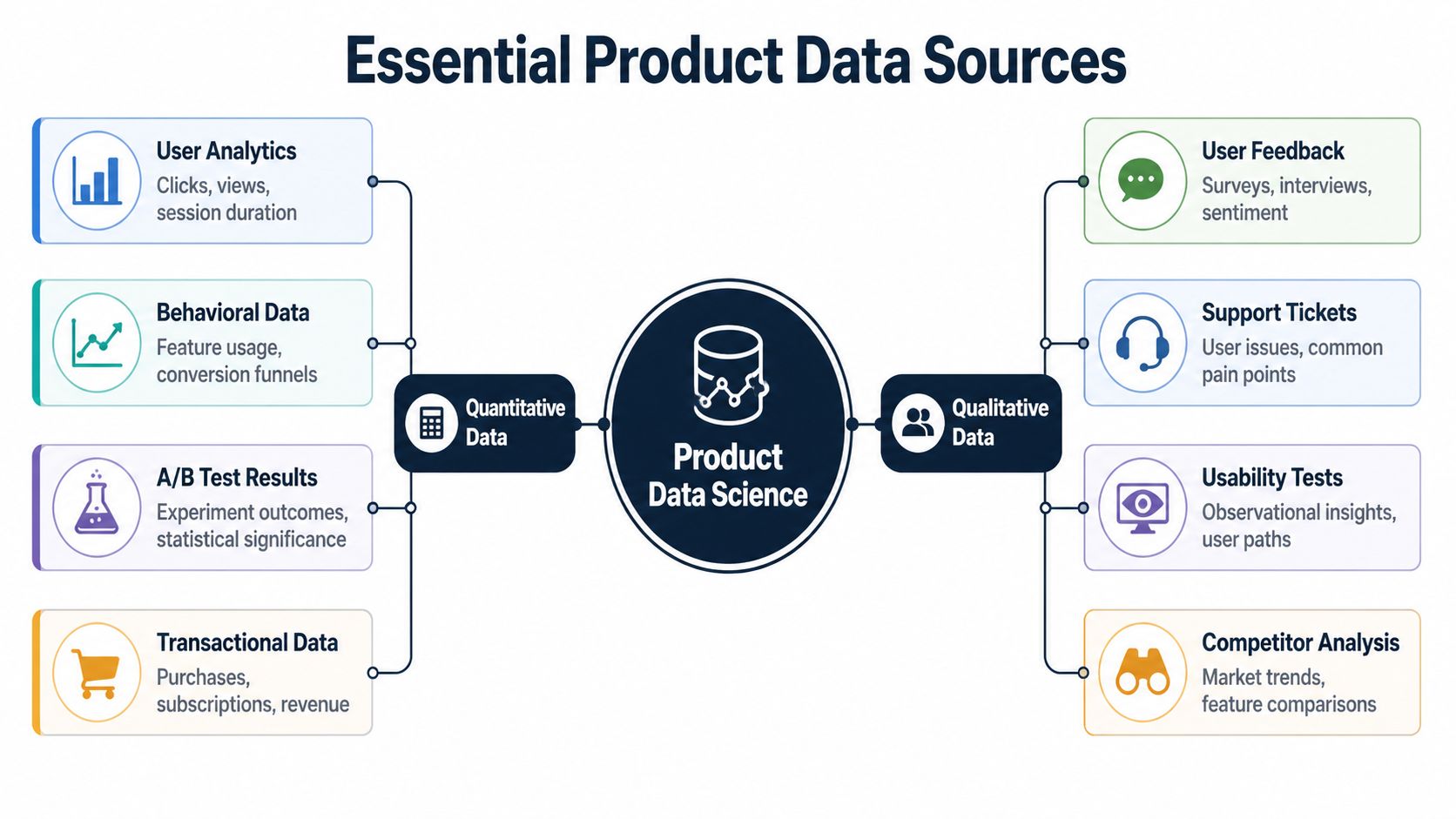
Quantitative data shows patterns of behavior
Start with the familiar layer. Product teams usually have some version of this already.
These data sources include event logs, feature usage, conversion funnels, billing records, account metadata, and experiment results. They tell you where users drop, which paths correlate with retention, and which segments behave differently.
Common examples include:
- User analytics: Clicks, screens, session paths, onboarding completion
- Behavioral data: Feature adoption, repeat usage, team invites, export volume
- Experiment results: A/B tests, holdouts, pre-post comparisons
- Transactional records: Plan changes, renewals, add-ons, seat expansion
Teams trying to improve collection quality often need to tighten instrumentation before they do anything advanced. A practical starting point is to review how to track app usage so events map cleanly to user intent and business milestones.
Quantitative data is what lets you ask hard operational questions. Which user paths are common among retained accounts. Which actions happen before expansion. Which bugs appear before churn risk increases. Which feature launch changed behavior rather than just creating novelty.
Qualitative data explains the why behind the pattern
This is the underused layer.
Support tickets, chat logs, sales calls, implementation notes, survey comments, and interview transcripts are messy. They’re also where teams hear the clearest expressions of pain, urgency, and willingness to pay. The problem isn’t value. The problem is operationalizing them at scale.
That gap matters because 80-90% of the world’s data is unstructured, while only 18% of organizations can effectively utilize it, according to MIT Sloan’s summary of Deloitte survey findings on unstructured data. For product teams, that means a large competitive opening still exists in turning support and sales conversations into product intelligence.
If your roadmap uses event data but ignores the language customers use when they get blocked, you know where the fire is but not what’s burning.
Qualitative sources usually include:
- Support tickets: Repeated breakpoints, environment-specific bugs, workflow confusion
- Sales call transcripts: Missing capabilities that stall deals or expansions
- Customer success notes: Adoption blockers after purchase
- Open-text survey responses: Friction that metrics alone flatten into averages
- Usability sessions: Points where users hesitate, backtrack, or misinterpret controls
Product Data Sources At a Glance
| Data Type | What It Tells You | Common Examples | Primary Challenge |
|---|---|---|---|
| Quantitative | What users did | Event logs, funnels, subscriptions, experiment results | Strong pattern detection, weaker explanation |
| Qualitative | Why users behaved that way | Tickets, call transcripts, interviews, comments | Rich context, harder to standardize |
| Financial and account context | Which behaviors matter commercially | Plan tier, renewal stage, account value, expansion history | Often siloed across systems |
| Operational data | Where product issues create internal cost | Support volume, escalation patterns, implementation delays | Hard to tie back to product changes |
What works and what fails
What works is a joined view. Support themes linked to affected accounts. Sales objections connected to product usage. Feature requests weighted by account context rather than raw count.
What fails is treating every source as equal and isolated. A ticket theme that appears often in low-value, low-fit accounts may matter less than a rarer issue showing up repeatedly in healthy accounts with expansion potential. Likewise, a behavior drop in analytics may look severe until you learn it was caused by an instrumentation bug or a documentation change.
A complete picture needs both lenses at once. Product data science becomes strategic when teams stop asking whether quantitative or qualitative data is better and start asking how the two validate, contradict, or sharpen each other.
Core Methods and Predictive Models Explained
A product team rarely struggles because it has no data. It struggles because it has too many signals and no reliable way to connect them to revenue, churn, or expansion. The methods below matter because they help teams separate noise from patterns they can act on, then tie those patterns back to what customers say in tickets, calls, and renewal conversations.
Segmentation groups users in ways the roadmap can use
Segmentation starts with a practical question: which users need a different product decision?
Basic segments such as plan tier, company size, or region help with reporting. They rarely explain why one group adopts quickly while another stalls. Stronger segmentation combines account context, product behavior, and qualitative signals. That means looking at who reached value fast, who uses one workflow heavily but avoids adjacent features, and which accounts generate repeated support themes before downgrade or churn.
Clustering helps when those groups are not obvious in advance. Instead of forcing users into labels the team chose upfront, clustering finds patterns in the data first. In practice, that can reveal a segment of accounts that appears healthy in top-line usage but repeatedly hits the same setup issue, or a group of power users asking for advanced controls that map to expansion potential.
If you want a plain-language explanation of how pattern grouping differs from outcome prediction, Cleffex Digital ltd insights offer a useful distinction between clustering and classification.
Cohort analysis shows when a problem starts, not just that it exists
Average retention hides timing. Cohort analysis fixes that.
The method is simple. Group users by a shared starting point, then compare how they behave over time. The starting point might be signup month, acquisition source, assisted onboarding versus self-serve, first-week feature use, or whether an account raised a support ticket during implementation.
The value of qualitative data becomes clear. A cohort with weak month-two retention becomes more useful when ticket themes show repeated confusion around permissions, billing setup, or data import. Sales call notes can add another layer. If prospects from a specific segment keep asking for the same capability, and that same segment under-adopts after purchase, the team has more than a retention problem. It has a packaging, expectation, or workflow problem with commercial consequences.
Cohort analysis turns one retention curve into a timeline of failure points and revenue opportunities.
A/B testing works only when the metric matches the business question
Experimentation is still part of product data science. It just should not end at click-through rate or a short-term engagement bump.
A useful experiment starts with a decision the business cares about. Will this onboarding change increase activation for accounts likely to convert? Will this pricing page message improve trial quality, not just trial volume? Will a new workflow reduce support burden for high-value customers, even if it adds one extra step?
Teams that run strong experiments define guardrails before launch, check sample quality, and look at effects by segment rather than only at the average. They also read the messy text. Session replays, support tickets, and sales feedback often explain why a variant won, why it failed, or why the impact differed between SMB and enterprise accounts.
The point is discipline. A test result is useful only if it changes a roadmap choice, a go-to-market motion, or a retention outcome.
Predictive models estimate risk and opportunity early enough to act
Predictive models help teams rank what is likely to happen next. Common targets include churn risk, expansion likelihood, onboarding completion, and feature adoption.
The mistake is treating modeling as a separate analytics exercise. In product data science, the stronger approach is to build features from both behavior and feedback. Product events show what happened. Support themes, call transcripts, NPS comments, and implementation notes often explain why the pattern matters. A churn model built only on login frequency may flag risk late. A model that also includes failed setup steps, repeated ticket categories, and account maturity can surface the accounts worth saving earlier.
Teams usually follow a workflow like this:
- Define the outcome in business terms: renewal risk, add-on adoption, time to first value, or downgrade probability.
- Build features from usage, account context, and feedback: event history, plan data, lifecycle stage, ticket themes, call topics, and operational friction.
- Test on unseen data: check whether the model still performs outside the training sample.
- Use the score in a real operating process: prioritize fixes, trigger outreach, or rank roadmap bets by expected commercial impact.
A useful adjacent read is this guide to a predictive churn model for identifying at-risk customers, especially if your team needs a practical starting point.
These methods matter because they turn scattered product activity into decisions with a dollar value attached. That is the difference between reporting on usage and building products customers will keep paying for.
Product Data Science in Action Case Studies
A roadmap debate gets sharper when two issues compete for the same sprint. One looks noisy but small. The other looks strategic but hard to prove. Product data science earns its keep by turning both into economic decisions.

The silent churn driver
A B2B SaaS team saw activation rates holding steady, but downstream value was slipping. New accounts were starting trials and completing the early checklist, yet fewer reached the point where expansion or renewal became likely.
The clue came from support. Ticket volume was not exploding, but the same setup complaint kept appearing in slightly different language. New admins were getting stuck in a permissions step. Some thought changes had saved when they had not. In a dashboard, those users could still look active for a week or two. In reality, they were failing before the product became part of their workflow.
The product data scientist tied three signals together: event logs from the setup flow, cohort behavior after the failure point, and ticket themes pulled from support conversations. That combination mattered. Event data showed where users dropped. Ticket text explained why they dropped and which part was true product friction versus simple confusion.
The result was a narrow, high-return fix. The team cleaned up the confirmation state, rewrote the setup guidance, and added instrumentation around failed permission changes. They also gave PMs and support leads a shared view of the issue through a self-serve analytics setup for cross-functional teams, so the pattern stopped living in one analyst’s notebook.
That work prevented a common mistake. Teams often treat onboarding friction as a UX issue until renewal rates force attention. In practice, small setup failures can become churn months later. The better approach is to connect the early friction to retained revenue before the customer churns unnoticed.
The feature request that kept showing up in revenue conversations
Another team kept hearing the same request in sales calls. It was not coming from every prospect. It was coming from larger accounts evaluating a broader rollout.
Pure usage data made the request easy to dismiss. Very few current customers were using related workflows, so the feature looked narrow. Sales transcripts told a different story. Prospects in the highest-value segment raised the issue during security reviews, procurement, or expansion planning. Some existing customers had already built awkward workarounds, which showed up in product logs as repeated export steps, admin overrides, and support-assisted configurations.
The data science team matched those transcript themes to account segment, deal stage, and observed workaround behavior. Then they looked at which opportunities stalled after the request surfaced and which customer profiles were most likely to expand if the friction disappeared.
That changed the roadmap conversation. The feature was not broadly requested. It was concentrated in accounts with higher contract value and clearer expansion paths. Building it would not lift every KPI. It could improve win rate in a specific segment and reduce the manual cost of supporting those customers after close.
Good product data science asks a harder question than “how many users asked for this?” The better question is “what revenue, retention, or support cost changes if we build it for this segment?”
That is the difference between a loud request and an investable case.
Your Roadmap to Building a PDS Capability
Teams don’t need a massive data organization to start doing product data science well. They need the right first moves.
Start with the first hire
The first product data science hire shouldn’t be a narrow specialist who only builds models or only writes dashboards.
Look for someone who can move across four modes:
- Instrumentation thinking: They know how event design affects decision quality.
- Analytical judgment: They can move from raw logs to product insight without getting lost in novelty.
- Business fluency: They understand churn, expansion, pricing context, and support cost.
- Cross-functional communication: They can challenge PMs, partner with engineering, and make output useful to revenue teams.
The best early hire is usually a strong generalist with product instinct. They can write SQL, reason statistically, and listen carefully to the language customers use in tickets and calls.
Build the stack around decision speed
Tool choices matter less than consistency, but some stack categories are essential.
You need a warehouse or central data layer, reliable event instrumentation, a BI layer, and a way to ingest unstructured customer feedback. Many teams also need workflow integrations so insights don’t die in a slide deck. If the output of analysis doesn’t become a Jira ticket, a Linear issue, a roadmap discussion, or a go-to-market play, the stack is incomplete.
A healthy setup usually supports these motions:
| Capability | Why it matters |
|---|---|
| Event collection | Captures behavioral truth inside the product |
| Warehouse modeling | Makes metrics reusable and consistent |
| BI and dashboarding | Gives PMs and leaders self-serve visibility |
| Feedback ingestion | Brings support, success, and sales language into the analysis |
| Workflow integration | Pushes findings into actual product execution |
For teams trying to reduce dependency on analysts for every question, self-service matters a lot. A practical reference is this guide to self-serve analytics, especially for product organizations that need PMs to explore behavior without breaking metric consistency.
Use the first 90 days to earn trust
The first project should be narrow, urgent, and commercially relevant.
Don’t start with a grand platform vision. Start with one painful question the business already feels. A churn driver analysis is often the best entry point because it forces the team to combine usage data, account context, and customer language.
A solid first sequence looks like this:
- Audit instrumentation: Confirm the product events support the questions you need to answer.
- Pick one business-critical problem: Churn risk, failed activation, or expansion blockers.
- Join quantitative and qualitative sources: Tickets, transcripts, behavior, and account data.
- Produce a ranked action list: Not a research archive. A set of recommended fixes with rationale.
- Close the loop after shipping: Check whether behavior changed in the target segment.
Scale by embedding, not centralizing
A common mistake is building product data science as a remote service desk. Requests go in. Charts come out. Product teams stay dependent and slow.
A better model embeds the capability into product planning and review cycles. The product data scientist helps define success metrics before development, reviews instrumented events before launch, monitors experiments after release, and feeds customer feedback patterns back into roadmap conversations.
Operator’s test: If data science only appears after a launch, the team is measuring work, not shaping it.
At scale, the function works best when product, support, customer success, and revenue teams all contribute signal into one prioritization loop. That’s when product data science stops being an analytics add-on and becomes part of how the company builds.
Common Pitfalls and Best Practices
Most failures in product data science are not technical failures. They’re operating failures.
The vanity metric trap
Teams often choose metrics that are easy to see and easy to celebrate. Signups, page views, feature clicks, and raw ticket counts can all be directionally useful. They’re also easy to misread.
A feature can increase clicks and still create no durable value. A campaign can drive top-of-funnel growth while worsening fit. A support topic can dominate volume without affecting retention or revenue in meaningful segments.
Best practice: tie every analysis to a business decision and a business metric. If the work won’t influence retention, activation quality, expansion, monetization, or support cost, question why it’s being prioritized.
The silo effect
Data science teams fail when they operate as detached experts.
If analysts only talk to PMs, they miss the texture of customer pain from support and success. If they only talk to support, they may overweight anecdotal pain. If they never speak with sales, they miss what buyers are willing to pay for. Product data science needs all three.
A stronger operating model usually includes:
- Shared review loops: Product, support, and revenue teams review patterns together.
- Common definitions: Churn risk, activation, healthy adoption, and expansion mean the same thing across teams.
- Execution pathways: High-confidence findings become tickets, tests, or roadmap decisions quickly.
Ignoring the why
A lot of teams still believe behavior data is enough.
It isn’t. Event streams show action, but they often hide motive. A drop in feature use could reflect bad UX, weak onboarding, missing documentation, poor fit, or even a successful workaround. Without qualitative context, teams build stories that fit the chart instead of the customer.
That’s why support tickets, sales calls, and implementation notes matter so much in product data science. They bring language, urgency, and situational detail that events can’t express on their own.
The chart tells you where users stopped. The ticket often tells you why they gave up.
Analysis paralysis
This one shows up in mature organizations. The team has strong tools, a clean warehouse, and advanced methods. Decisions still stall because every question becomes a multi-week project.
The fix is not lower rigor. It’s tighter framing.
Best practice: every analysis should end with one of four outcomes:
- Ship the change
- Run an experiment
- Collect better data
- Do nothing for now
Anything else is usually a disguised refusal to decide.
Overfitting the roadmap to loud customers
Listening to customers matters. Obeying the loudest customer is different.
Product teams can get pulled into bespoke requests that feel strategic because they come from high-attention conversations. Product data science helps by checking whether those requests appear across the right segments, whether they connect to retained behavior, and whether the opportunity is concentrated or superficial.
The right response isn’t always yes or no. It’s often, “yes for this segment, no for that one,” or “yes, but only after we fix the workflow making the request necessary in the first place.”
Treating data products as one-off artifacts
A churn model, dashboard, or prioritization report is not done when it ships. Product data changes. Instrumentation drifts. Customer language evolves. Teams launch new features that change the meaning of old metrics.
Best practice: treat metrics, datasets, dashboards, and models like maintained product assets. Give them owners. Review them. Retire them when they stop supporting decisions.
The companies that get the most from product data science don’t just analyze better. They build a repeatable system for learning which product decisions change the business and which ones only feel important.
SigOS helps product teams operationalize exactly this kind of work. If you want a way to connect support tickets, chat transcripts, sales calls, and usage metrics to churn and revenue impact, take a look at SigOS. It’s built for teams that need to prioritize customer feedback with more rigor and move from noisy inputs to clear product decisions.
Keep Reading
More insights from our blog


Ready to find your hidden revenue leaks?
Start analyzing your customer feedback and discover insights that drive revenue.
Start Free Trial →