Dashboard Web Analytics A Guide for Product and Growth Teams
Transform your data into revenue with this guide to dashboard web analytics. Learn to build, interpret, and act on dashboards that drive real growth.
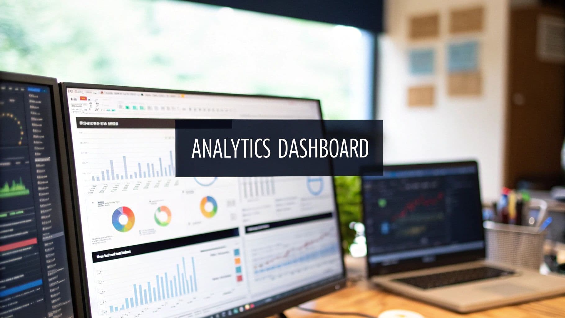
Let's be blunt: a web analytics dashboard should be your team's command center, not a data graveyard. Most of them are just that—a sprawling collection of charts that look busy but don’t actually help anyone make a smart decision. Teams end up feeling overwhelmed, staring at graphs without a clear idea of what to do next.
Why Most Web Analytics Dashboards Fail

The reality is, the average web analytics dashboard is completely broken. It's a chaotic mess of vanity metrics that provides plenty of data but zero real insight. Your team is drowning in numbers but starved for answers.
Think of your dashboard like a pilot's cockpit. A good one shows just the vital information needed to fly the plane safely—altitude, speed, fuel—so the pilot can make split-second decisions. A bad one is a blinding mess of flashing lights and confusing dials that just creates anxiety. Right now, most dashboards are the bad kind.
This failure comes from a deep misunderstanding of what a dashboard is for. Its job isn't to be a library of every single metric you can track. It’s meant to be an intelligence hub, built to answer your most urgent business questions.
Adopting a Decision-First Approach
The fix is to flip the script and adopt a "decision-first" mindset. Stop asking, "What data can we cram onto the screen?" Start asking, "What decisions do we absolutely need to make today?" This simple shift changes everything.
A decision-driven dashboard is engineered to give you clear answers to high-stakes questions that directly hit your bottom line:
- What is the #1 reason our users churned this week?
- Which new feature is causing the most user frustration?
- Which specific bug is losing us the most revenue right now?
This approach turns your dashboard web analytics from a passive, backward-looking report into an active, strategic weapon. Every single element on the dashboard has to earn its spot by helping someone make a faster, better decision. It's about connecting what users do with what your business earns.
A great dashboard doesn't just show you what happened; it tells you what matters and why. It prioritizes signals over noise, guiding your team toward the actions that will actually move the needle on growth.
From Data Overload to Actionable Insight
This shift from cluttered, confusing dashboards to clean, decision-focused ones is happening across the industry. The old way of just dumping data on a screen is being replaced by a smarter, more targeted approach.
| Attribute | Traditional Web Analytics Dashboard | Decision-Driven Intelligence Dashboard |
|---|---|---|
| Primary Goal | Display as much data as possible | Answer critical business questions |
| Key Question | "What happened?" | "What should we do next?" |
| User Experience | Overwhelming, complex, requires manual digging | Focused, intuitive, highlights priorities |
| Focus | Vanity metrics (e.g., page views, sessions) | Actionable metrics (e.g., churn drivers, friction scores) |
| Outcome | Data paralysis, wasted time | Faster decisions, improved retention and revenue |
| Design Philosophy | Data-first (show everything) | Decision-first (show what's important) |
Ultimately, a decision-driven dashboard isn't just a nicer-looking version of the old model—it’s a fundamentally different tool built for a different purpose: driving action.
The Growing Demand for Clarity
This need for clear, actionable insights has never been more critical. As companies fight to understand user behavior, the web analytics market is exploding. Valued at USD 7.98 billion in 2025, it's on track to hit USD 16.36 billion by 2030. You can find more details on these web analytics market projections on Mordor Intelligence.
This growth isn't just about more data; it's about a fundamental shift in how product and growth teams work. They're moving away from stale, static reports and toward dynamic intelligence hubs that guide daily strategy.
This guide will walk you through building a dashboard for this new reality. We’ll cover how to select the right metrics, design for action, and connect your data to build a true command center that drives real business results.
Choosing Core Metrics That Actually Drive Growth
Once you've committed to a decision-first mindset, the next move is to pick metrics that actually answer your most burning business questions. A truly powerful dashboard web analytics setup isn't about tracking every click and scroll; it's about focusing on the numbers that tell a clear story about your business's health.
The best way to structure this is to mirror the customer's journey. We can break our metrics down into three core groups: Acquisition, Engagement & Retention, and Monetization. Each metric we choose should directly tackle a critical question and point us toward a specific, actionable step.
Tracking User Acquisition
Acquisition metrics are all about how you attract new users. They get to the heart of the matter: "Where are our best customers coming from, and how much are we paying to get them?" Nailing this is the first real step in building a growth engine that can last.
These KPIs go way beyond just counting website visitors. They measure the real efficiency of your marketing dollars.
- Customer Acquisition Cost (CAC): This is your total sales and marketing spend divided by the number of new customers you brought in. If your CAC is creeping up, it’s a clear signal to rethink which channels are getting your budget.
- Traffic by Source/Medium: This shows you exactly where your visitors are coming from—be it organic search, paid ads, or social media. Getting a handle on sources like organic traffic in Google Analytics is crucial for understanding your audience.
- Lead-to-Customer Conversion Rate: This percentage reveals how many of your leads actually turn into paying customers. It's the ultimate test of your traffic quality.
Measuring Engagement and Retention
Getting users in the door is just the beginning. The real question is, are they finding value and sticking around? Engagement and retention metrics are the pulse of your product.
Think of these as your leading indicators. They’re the early warning signs that can predict churn long before a customer actually cancels. A dip in the usage of a key feature, for instance, is a much earlier red flag than a lost subscription.
A great dashboard works like an early warning system. It helps you spot a group of users slipping away because of a frustrating bug or confusing feature—long before their silence turns into lost revenue.
To keep a finger on this pulse, you need to track:
- Daily/Monthly Active Users (DAU/MAU): This ratio is your "stickiness" score. It shows how often people are coming back. If that ratio starts to drop, engagement is taking a hit.
- Key Feature Adoption Rate: Are people using the features that deliver the most value? If not, it could point to a problem with your onboarding or a need for better in-app guidance.
- Churn Rate: This is the percentage of customers who leave over a specific period. For any subscription business, this is a non-negotiable health metric.
- Cohort Retention Analysis: This is a game-changer. It groups users by when they signed up and tracks how well you keep them over time. You can learn more in our guide on how to perform a cohort retention analysis.
Analyzing Monetization and Revenue
Finally, monetization metrics are what connect all that user behavior to the bottom line. They answer the million-dollar question: "Are we actually building a profitable business?" This is where your dashboard web analytics truly pays for itself.
These numbers give you a crystal-clear view of your financial health. It’s no surprise that by 2026, the web analytics market is projected to grow to USD 5.2 billion, driven by a need to connect user actions directly to revenue.
Here are the essential monetization KPIs:
- Monthly Recurring Revenue (MRR): The predictable income your business can count on every month. For any SaaS company, tracking MRR growth is everything.
- Customer Lifetime Value (LTV): This is a forecast of the total profit you'll make from a customer over their entire relationship with you. A healthy business model demands an LTV that's way higher than your CAC.
- Average Revenue Per User (ARPU): This metric helps you understand what an average customer is worth. You can also segment it to pinpoint which user groups are your most valuable.
By organizing your dashboard around these three pillars, you’re not just looking at data. You're telling a complete story—from how you find customers, to how you keep them happy, and ultimately, how you grow a thriving business.
Designing a Dashboard for Clarity and Action

A great web analytics dashboard isn't just a collection of charts and numbers; it's a masterclass in information design. The real goal isn't just to show data, but to tell a clear, compelling story about the health of your product. When a product manager glances at the screen, they need to know what's working, what's broken, and where to focus their energy—instantly.
This kind of clarity doesn't happen by accident. It's the result of a deliberate structure and a deep commitment to visual storytelling. The best dashboards guide your eye, making critical insights easy to spot and impossible to ignore.
The Inverted Pyramid Layout
One of the most effective structures I've seen is the inverted pyramid. Think of it like a well-written news article: the headline and most critical facts are right at the top, with supporting details following for those who want to dig deeper. This approach respects your team's time and prevents them from getting bogged down in the weeds.
This layout is powerful because it ensures even a quick, five-second scan delivers the essential takeaways. Here’s how it works in practice:
- Top Level (The "What"): This is the prime real estate at the very top of the dashboard. It should feature just a handful of your most critical KPIs—the vital signs of your business. We're talking about numbers like MRR, Customer Churn Rate, and New Trial Signups. These are the metrics the CEO will ask about.
- Mid Level (The "Why"): Directly below your headline metrics, you start providing context. This section breaks down the KPIs, showing trends and comparisons that begin to explain why the numbers are what they are. For example, you could show MRR broken down by customer segment or a trendline of your churn rate over the past six months.
- Bottom Level (The "Where"): At the bottom, you offer the most granular data. This is where your team can drill down into specific reports, tables, and logs to investigate anomalies or find the root cause of a problem. It might include a list of at-risk accounts or a table of recent user feedback submissions.
A well-designed dashboard follows the principle of progressive disclosure. It presents a high-level summary first and reveals complexity only as the user actively seeks it, preventing overwhelm and promoting focused analysis.
Choosing the Right Visualizations
How you visualize data is just as important as the data itself. Every chart type tells a different story, and using the right one can be the difference between a head-scratching moment and an immediate "aha!" moment. Picking the right format is a cornerstone of effective dashboard web analytics.
- Line Charts for Trends: Nothing beats a line chart for showing how a metric changes over time. They are perfect for tracking daily active users, website sessions, or feature adoption over a quarter.
- Bar Charts for Comparisons: When you need to compare distinct categories, bar charts are your best friend. They work beautifully for comparing traffic from different marketing channels or stacking up feature usage rates.
- Heatmaps for User Behavior: Heatmaps give you a powerful, at-a-glance view of where users are clicking and scrolling on a page. They instantly highlight areas of high engagement or frustrating user friction.
If you need to show the spread and outliers in your data, you can even visualize data distributions with box and whisker plots. The key is to always match the visualization to the question you're trying to answer.
Smart Design for Actionable Insights
Beyond structure and chart selection, a few key design principles can elevate your dashboard from a simple report to an indispensable tool. These small details make a huge difference in usability and help insights pop right off the screen.
First, use color with purpose. Don't just make your charts pretty. Assign meaning to your color palette—green for positive trends, red for alerts or negative changes. This simple visual shorthand helps people process information much faster. For some great ideas on effective layouts, check out these business intelligence dashboard examples for inspiration.
Next, ruthlessly cut out "chart junk." This term, coined by data visualization pioneer Edward Tufte, refers to any visual element that isn't essential for understanding the data. Get rid of 3D effects, busy gridlines, and any decorative fluff that just adds noise.
Finally, think in terms of role-based views. Your CEO, product managers, and support leads all care about different metrics. A great analytics platform will let you create customized dashboards tailored to the specific needs of each stakeholder, ensuring everyone sees the most relevant data for their role without distraction.
Connecting Qualitative and Quantitative Data
A great web analytics dashboard does more than just spit out numbers; it tells you the story behind them. Your quantitative data—all those beautiful charts showing traffic spikes, conversion rates, and user flows—is brilliant at telling you what is happening. But it’s often silent on the most important question: why?
This is where things get interesting. The most effective dashboards don’t just live in a world of numbers. They connect the cold, hard data to the real, human experiences happening on the other side of the screen. This means pairing your quantitative analytics with the rich, qualitative feedback coming directly from your users.
Think of your dashboard as your product's central command center. One part tracks the vitals, like user activity and feature adoption. The other part is listening—to support tickets, sales call notes, live chats, and survey responses. When you bring those two streams together, you unlock a whole new dimension of understanding.
From Vague Metrics to Specific Problems
Let's walk through a common scenario. Your dashboard flags a sudden 30% drop-off at the final stage of your checkout process. The quantitative data is crystal clear: you're losing a ton of customers right before they give you their money. But the numbers alone can't explain it. Is the shipping cost a surprise? Is the page slow to load? Is a button broken?
Without that context, your team is flying blind. They could waste weeks A/B testing button colors or tweaking copy, all while that revenue leak continues. This is where an integrated system completely changes the game.
A modern product intelligence platform like SigOS doesn't just show you the drop-off. It’s smart enough to automatically scan and analyze all the qualitative feedback related to that specific part of your product. In this case, it would instantly surface a clear pattern in support tickets and live chats, with users all saying the same thing: "Hey, your payment button is broken for Safari users!"
This screenshot shows exactly how a platform like SigOS can surface high-impact issues by tying user feedback directly to business metrics. Instead of just a long list of complaints, the dashboard prioritizes problems based on their real, quantifiable impact on your users and your bottom line.
Just like that, you’ve gone from a vague metric ("30% drop-off") to a specific, actionable, and high-priority bug report ("Fix the broken payment button for Safari users to recover lost sales"). You went from data to diagnosis in minutes, not weeks.
The Power of an Integrated View
This fusion of qualitative and quantitative data is quickly becoming the new standard. The market for dashboard web analytics is expected to climb from USD 21.84 billion in 2025 to a massive USD 99.66 billion in the coming years, largely driven by this demand for deeper, connected insights. You can read more about these web analytics market projections on OpenPR.
While tools like Google Analytics are great for traffic analysis, enterprise platforms are now using AI to connect dips in usage with churn risk—a process that absolutely requires both types of data.
By connecting what users do with what users say, you create a single source of truth. This allows your team to stop debating opinions and start making decisions based on unified, evidence-based insights.
This unified approach makes entirely new, automated workflows possible. Suddenly, you can:
- Automate Prioritization: New feature requests or bug reports can be automatically enriched with data showing exactly how many users are affected or how much potential revenue is at stake.
- Prevent Churn Proactively: The system can spot when negative feedback from a high-value customer lines up with a drop in their product usage, automatically triggering an alert for your customer success team to step in.
- Build Data-Driven Roadmaps: Product managers can build their roadmaps with confidence, focusing on the features and fixes that have the largest proven impact on customer happiness and revenue.
Ultimately, weaving the "what" and the "why" together transforms your dashboard. It stops being a passive reporting tool and becomes a true engine for growth, guiding every decision with a complete, 360-degree view of the customer experience.
From Insight to Impact: Building Your Action Workflow
Let's be honest: an insight buried in a dashboard is completely useless. A truly effective web analytics setup doesn't just show you data; it forces you to act. It's about turning those raw numbers into a clear, prioritized workflow that connects a problem directly to a solution. This is where you stop being a metric-watcher and start driving real business impact.
The trick is to make your insights operational. You need intelligent systems that bridge that frustrating gap between discovering a problem and getting your team to fix it. This means setting up smart alerts, creating a prioritization framework based on revenue, and automating the handoff to your product and engineering teams.
Think of it as a simple, three-step journey from raw data to real business decisions.
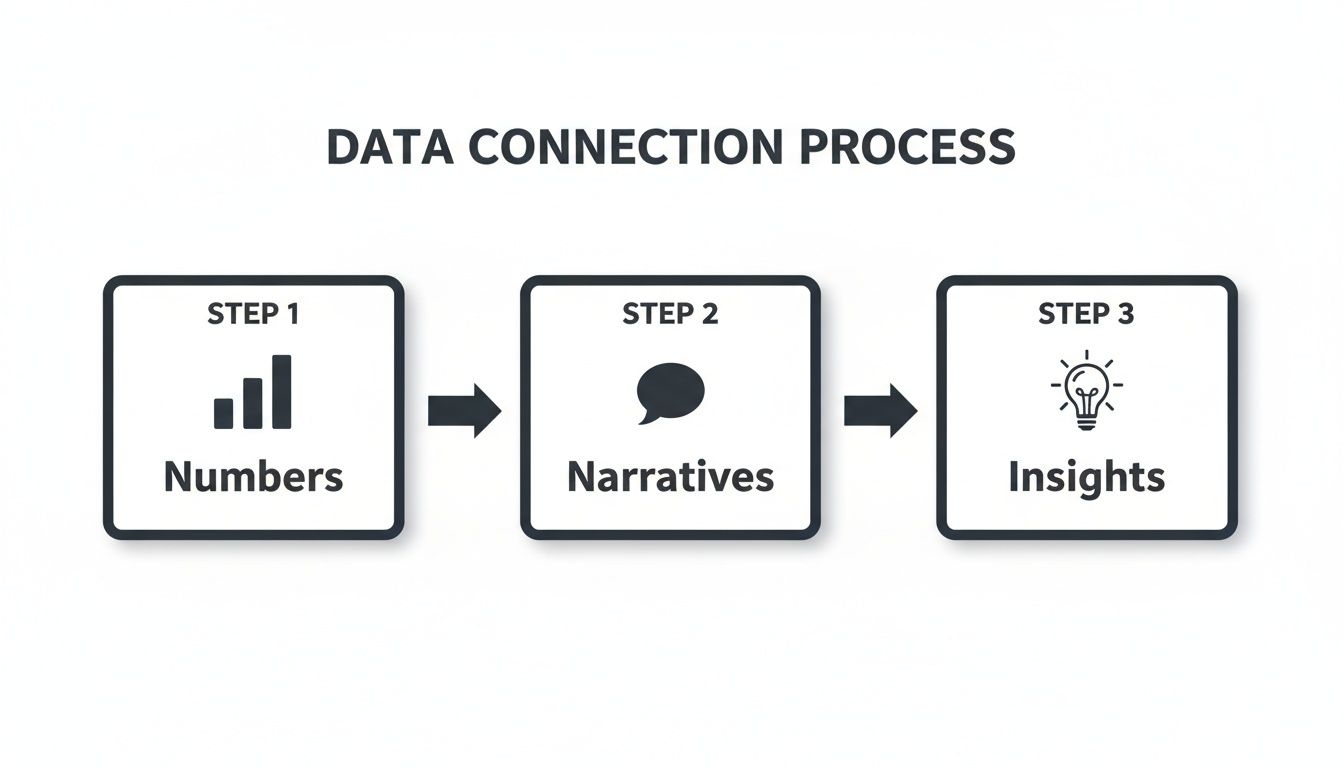
This flow shows exactly how quantitative numbers need qualitative stories to become true, actionable intelligence.
Creating Intelligent, Real-Time Alerts
Generic alerts like "traffic is down 10%" are just noise. They get ignored and create alert fatigue, not focus. The modern approach is to set up sophisticated, hyper-specific triggers that notify the right person with the exact context they need to jump on a problem.
These alerts shouldn't be tied to vanity metrics. Instead, they should monitor the leading indicators of customer health and revenue risk—the subtle behavioral shifts that signal trouble on the horizon.
Here are a few examples of alerts that actually get things done:
- Churn Risk Alert: "Churn risk has shot up by 15% for enterprise accounts that just adopted the new invoicing feature." This notification goes straight to the Customer Success Manager responsible for that segment.
- Friction Alert: "Mobile users are abandoning the checkout page at a 40% higher rate since the last app update." This pings the Product Manager and the mobile engineering lead immediately.
- Expansion Opportunity Alert: "API usage has tripled among mid-market customers this week, and three of them have searched the pricing page for 'API'." Now, the sales team knows exactly who to call about an upsell.
An intelligent alert system is like your product's nervous system. It feels pain or opportunity in real-time and sends a precise signal to the part of the company that can actually do something about it.
Prioritizing Based on Revenue Impact
As soon as an alert fires, the next question is always, "So what? How important is this?" Too often, that question is answered by a subjective battle of opinions. A data-driven workflow kills that subjectivity by tying a clear dollar value to every bug, feature request, and point of user friction.
How? By connecting the issue directly to the affected user base and the revenue they represent. A product intelligence platform like SigOS can do this automatically, calculating a "revenue-at-risk" score for each problem.
This simple framework completely changes the conversation. It goes from "This one user is yelling really loudly about this bug" to "This bug is currently impacting $5,000 in MRR and is the #1 driver of churn in our highest-value customer segment." All of a sudden, the priority is crystal clear. You can stack-rank everything on the roadmap by its direct financial impact, making sure your engineers are always working on what truly matters to the bottom line.
Automating the Insight-to-Action Pipeline
The final, crucial step is closing the loop with automation. A manual handoff from the product team to engineering is slow, and critical context always gets lost in translation. An integrated workflow automates this entire process, guaranteeing speed and clarity. If you're looking to build these kinds of robust systems from the ground up, we’ve put together a separate guide on how to build data pipelines.
Here’s what that complete, automated workflow looks like in the real world:
- Alert Fires: An intelligent alert is triggered (e.g., "Checkout failure rate spikes for users on Chrome").
- PM Reviews Insight: The Product Manager gets a notification that includes the number of affected users and the estimated revenue at risk.
- Ticket Is Created: With a single click, a ticket is automatically generated in a tool like Jira.
- Ticket Is Enriched: The ticket comes pre-loaded with all the necessary context: a revenue impact score, links to relevant user feedback, and even session replays showing the error.
- Engineering Prioritizes: The engineering team sees the ticket in their backlog, instantly grasps its financial importance, and can tackle it with full confidence they're working on a top-priority issue.
This seamless process transforms your dashboard web analytics from a passive reporting tool into the very engine of your development cycle, ensuring every insight leads directly to a valuable, revenue-protecting action.
Putting It All Together: Your Dashboard as a Growth Engine
So, where do we go from here? We’ve spent this guide breaking down the old way of doing things—those static, confusing data dumps—and replacing it with something far more powerful: a living, breathing command center for your product. Your dashboard web analytics setup shouldn't just be a place to check numbers; it needs to be the engine driving your entire growth strategy.
We’ve covered a lot of ground, from picking the metrics that actually matter to designing a layout that gives you answers at a glance. We’ve talked about how to connect the what (the numbers) with the why (the user feedback), turning abstract data into a clear, prioritized to-do list. That’s really the essence of modern product intelligence.
The final, crucial step is turning all that intelligence into real momentum. When you build automated workflows that are tied directly to revenue, you close the loop between finding an insight and actually doing something about it.
Getting Your Team to Act on the Data
Ultimately, this is about changing how your team operates. The goal is to get them to stop just looking at data and start using it to make faster, smarter calls every single day. A great dashboard is what makes this shift possible, giving everyone from product managers to marketers the context they need to act confidently.
The real worth of a web analytics dashboard isn't found in the data it displays, but in the decisions it sparks. It's about creating a system that consistently points your team toward the changes that cut churn, drive expansion, and build a product people can't live without.
This is how you get ahead and stay ahead. While your competitors are stuck in meetings debating opinions or lost in spreadsheet hell, your team will be shipping updates based on clear, data-backed priorities that you know will move the needle on revenue.
The Blueprint for Sustainable Growth
At the end of the day, overhauling your dashboard is about building a system for sustainable growth. By focusing on the right metrics, designing for action, and making insights operational, you create a powerful feedback loop that gets smarter over time.
Think of it as your new workflow:
- Find Problems Faster: Pinpoint the real source of user friction in minutes by seeing all your data in one place. No more waiting weeks for answers.
- Prioritize with Clarity: Let potential revenue impact, not just loud opinions, decide what gets built next.
- Build What Matters: Ship features and fixes you can prove will make customers happier and directly contribute to the bottom line.
This isn't just about building a better dashboard. It's about building a smarter, more agile, and more profitable company.
Frequently Asked Questions
Even with a solid game plan, getting a new web analytics dashboard off the ground is bound to bring up some questions. Let's tackle a few of the most common ones we hear from product and growth teams as they shift from basic reporting to building a real decision-making engine.
How Do I Choose the Right Web Analytics Tool?
It's tempting to get caught up in a side-by-side comparison of standard reporting features, but that's a trap. The real power players are the tools that go deeper.
Your first priority should be finding a platform that integrates with your qualitative feedback channels—think support tickets, user interviews, and sales call notes. This connection is the secret to understanding the why behind the numbers. Without it, you're just guessing.
Also, think about the future. Does the tool scale? Does it use AI to do the heavy lifting for you? A great platform doesn't just give you more charts to stare at; it actively points out important patterns and helps you prioritize what to fix or build next, saving you from hours of manual data-sifting.
What's the Biggest Mistake Teams Make With Dashboards?
The most common pitfall, by far, is what I call the "data vomit" dashboard. This is when a team crams every possible metric onto a single screen, hoping that insight will magically appear. Most of these are vanity metrics with no real tie to business goals, and the result is just a lot of noise.
This problem gets even worse when there's no qualitative context. A chart showing a dip in user engagement is just an observation. But a dashboard that connects that same dip to a surge in support tickets about a specific bug? Now that's an insight you can actually do something with.
A dashboard should answer questions, not just display metrics. If a chart or number doesn't help you make a specific decision about your product or growth strategy, it doesn't belong on your primary view.
How Do I Justify Investing in a Better Analytics Platform?
You need to frame the discussion entirely around return on investment (ROI). Your leadership team thinks in terms of dollars and cents, so you need to move the conversation away from "better data" and toward concrete financial wins.
The best way to do this is to put a price tag on the problems your current setup can't solve. Calculate:
- The Cost of Churn: Show exactly how much monthly recurring revenue is slipping away due to user issues that a smarter platform could have helped you catch and fix earlier.
- The Revenue Lost to Bugs: Pinpoint a critical bug, calculate how many users it impacts, and show the total revenue tied to those accounts.
- The Value of Prioritization: Explain how the platform will help your team focus on features requested by high-value prospects, making a direct case for unlocking new revenue.
Stop guessing and start prioritizing with confidence. SigOS connects your user feedback directly to your revenue metrics, transforming your web analytics into a powerful growth engine. See how you can turn insights into impact at sigos.io.
Keep Reading
More insights from our blog


Ready to find your hidden revenue leaks?
Start analyzing your customer feedback and discover insights that drive revenue.
Start Free Trial →