Metrics and Reporting That Drive Business Growth
A complete guide to metrics and reporting. Learn to track the right KPIs, build actionable dashboards, and make data-driven decisions that fuel growth.

Trying to run a business without solid data is like trying to sail a ship through a storm without a compass. You’re essentially flying blind. Put simply, metrics and reporting are the tools that translate your daily grind into a language you can act on, showing you precisely where you are, where you're going, and how to steer around the icebergs.
Why Metrics and Reporting Are Your Business Compass

Imagine you're piloting a sophisticated aircraft. The cockpit is covered in dials, gauges, and screens—each one is a critical metric. Fuel level, altitude, speed, engine temperature... these aren't just abstract numbers. They're vital signs that guide every single decision you make. For your business, effective metrics and reporting do the exact same job.
They give you an objective, real-time picture of performance, cutting straight through gut feelings and assumptions. So, instead of guessing why sales dipped last quarter, you can actually pinpoint the cause. Instead of just hoping a new feature will land well with users, you can measure its adoption rate and see the reality for yourself.
Turning Data Into Direction
This whole process isn't just about hoarding endless streams of data; that's just noise. The real magic is in turning that raw information into a clear story that guides your strategy. Good reporting uncovers hidden growth opportunities you might have otherwise missed and flags potential risks long before they become full-blown crises. To truly navigate your business with data, a solid grasp of concepts like B2B marketing analytics is crucial for reading the signals correctly.
The Power of Objective Insights
When you build a consistent system for tracking metrics and reporting on them, you create a single source of truth that gets your entire team on the same page. Every department, from sales and marketing to product development, can work from the same playbook, making decisions based on shared, accurate information.
This data-informed approach is now fundamental to any modern business strategy. It's about digging into the right numbers to find opportunities, head off risks, and really drive growth.
Ultimately, getting a handle on your metrics means you can:
- Steer with confidence: Make strategic calls backed by hard evidence, not just a hunch.
- Adjust your course: Respond quickly to what the market and your internal data are telling you.
- Reach your destination: Navigate with certainty toward your biggest business goals.
Tracking the SaaS Metrics That Truly Matter
In the world of Software as a Service (SaaS), it’s easy to get buried in data. But not all numbers are created equal. A handful of core metrics act as the true vital signs of your business, and focusing on them is the key to separating a meaningful signal from all the noise.
Think of your business like a patient at a check-up. Each key metric tells a different part of the story, and when you look at them together, you get a complete picture of its health. This is about more than just tracking numbers; it’s about understanding the story they tell about your company's stability and future.
Monthly Recurring Revenue: The Heartbeat
Monthly Recurring Revenue (MRR) is the predictable, stable income your business brings in every single month from active subscriptions. It's the rhythmic heartbeat of your company, giving you a clear look at its baseline financial health and growth trajectory.
MRR smooths out the peaks and valleys of one-time payments, offering a reliable measure of your company’s momentum. A steadily climbing MRR tells you you're adding new customers, upselling existing ones, or both—all fantastic signs of a healthy, growing business.
Customer Acquisition Cost: The Investment
Customer Acquisition Cost (CAC) is the total amount you spend on sales and marketing to land a single new customer. This isn't just your ad spend—it includes everything from marketing team salaries to sales commissions.
Think of CAC as the price tag for winning a new customer. A high CAC isn't automatically bad, especially if those customers are highly valuable. But if it costs you 500 to acquire someone who only pays you ****50 a month, you have a serious problem. Good reporting will shine a spotlight on this kind of imbalance before it drains your budget.
Customer Lifetime Value: The Return
This brings us directly to Customer Lifetime Value (LTV), which is the total revenue you can expect from a single customer over their entire relationship with your company. LTV is the long-term payoff for your initial investment (CAC).
A high LTV is a great sign. It points to happy customers, low churn, and solid upselling or cross-selling strategies. It’s the ultimate measure of the value you provide and the loyalty you've earned in return.
This metric is so powerful because it pulls your focus away from short-term wins and toward long-term health. The real secret to a successful SaaS business isn't just getting customers; it's keeping them and growing their value over time. For a deeper analysis, exploring detailed customer retention metrics can reveal exactly what drives your LTV higher.
Churn Rate: The Leaky Bucket
Churn Rate is the percentage of customers who cancel their subscriptions in a given period. It’s the single biggest threat to a SaaS business, acting like a leak in your revenue bucket. It doesn't matter how much new revenue you pour in if high churn is constantly draining it away.
You’ll want to keep an eye on two different types of churn:
- Customer Churn: The percentage of customers you've lost.
- Revenue Churn: The percentage of MRR you've lost. This can be far more painful if your highest-paying customers are the ones heading for the door.
Keeping churn low is absolutely critical. Even a small drop in your monthly churn rate can have a massive compounding effect on your revenue down the road.
The LTV to CAC Ratio: The Ultimate Health Score
Finally, the LTV to CAC ratio is the metric that ties it all together. It compares the lifetime value of a customer to what it cost to acquire them, giving you a crystal-clear indicator of your business model's profitability and sustainability.
A common benchmark is to aim for an LTV that is at least 3x your CAC.
- A ratio of 1:1 means you're losing money with every new customer.
- A ratio of 3:1 suggests a healthy, profitable business model.
- A ratio of 5:1 or higher might mean you're underinvesting in marketing and could be growing even faster.
This ratio is your overall fitness score. It tells you if your growth engine is efficient or if you're just burning cash on customers who don't stick around. By focusing on these essential metrics, your reporting becomes a roadmap to sustainable success.
How to Build Reports That Inspire Action
Let's be honest: a report that just sits in an inbox, unread, is a failure. It doesn't matter how precise your data is. If it doesn't spark a conversation, drive a decision, or push for a change in direction, it's nothing more than a collection of numbers. The real goal of effective metrics and reporting isn't just to inform people; it's to get them to do something.
To make that happen, you have to stop thinking like a data-dumper and start thinking like a storyteller. Imagine your report is a news story. You need a killer headline (the main insight), some solid evidence to back it up (the data), and a clear call to action (the recommended next steps). Just throwing every data point you have at your audience is the fastest way to get them to tune out completely.
This is all about connecting the dots. For example, core SaaS metrics like MRR, LTV, and Churn aren't isolated figures; they're all tangled together, telling the story of your company's overall health.
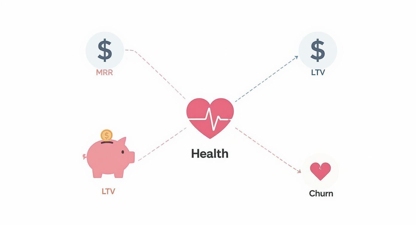
As you can see, a healthy SaaS business is a balancing act. It’s all about growing that recurring revenue and customer value while fighting back against the constant pull of churn.
Know Your Audience and Their Needs
The golden rule of creating a report people will actually use? Know who you're talking to. Different people care about different things, so a one-size-fits-all report is almost always a miss. The dashboard you build for your CEO should look nothing like the one you send to the marketing team.
- For Executives: They need the 30,000-foot view, and they need it fast. Lead with the big-picture summary, highlight the most important KPIs, and show clear trend lines. It's all about progress toward major business goals and the bottom-line financial impact.
- For Product Managers: They live in the details. Their reports need to dig into feature adoption rates, user engagement patterns, conversion funnels, and what customers are actually saying.
- For Marketers: This team needs the nitty-gritty on campaign performance. They’re looking at channel effectiveness, Customer Acquisition Cost (CAC), and lead conversion rates to see what’s working and what’s not.
When you customize the report, you're making sure the information is immediately relevant. It goes from being "just another report" to "the answer to my question."
Choose Visualizations That Tell a Clear Story
The way you present your data is every bit as important as the data itself. The right chart can make a complex idea click in an instant, but the wrong one just adds to the confusion. Always aim for clarity, not complexity.
A great gut check is the 5-second rule. If someone can't understand the main point of your chart within five seconds, it’s too complicated. You either need to simplify it, add better labels, or pick a different kind of visual altogether. If you want to get really good at this, it's worth exploring some best practices for data visualization that can take your reports to the next level.
This means being intentional with your choices:
- Line charts are your go-to for showing trends over time, like MRR growth.
- Bar charts are perfect for comparing different groups, like signups by marketing channel.
- Pie charts should be used sparingly. They only really work for showing parts of a whole when you have just a few distinct categories.
- Scorecards (those big single numbers) are fantastic for putting your most important KPIs front and center.
Structure Your Report for Maximum Impact
A truly effective report has a natural flow. It builds a narrative that guides the reader from one point to the next, ultimately leading them to a conclusion. Don't just list a bunch of metrics. A simple but powerful structure is to move from the "what" to the "why" and, finally, to the "so what."
- Start with the Summary (The What): Kick things off with a quick executive summary or a dashboard of your top-line KPIs. This gives everyone the most critical information right away. What were the headline results for this period?
- Provide Supporting Detail (The Why): Now, you dig in. If signups jumped by 20%, this is where you show which channels were responsible. If churn spiked, you pinpoint the user segments that were most affected. You're providing the crucial context behind the numbers.
- Conclude with Actionable Insights (The So What): This is the most important part of the entire report. Based on everything you've shown, what should the team do next? Offer specific recommendations backed by the data. For instance, "Given the high conversion rate from our last webinar, we recommend doubling our investment in that channel next quarter."
Following this structure turns your reporting from a passive, backward-looking task into a strategic tool that actively pushes the business forward.
Moving from Manual Spreadsheets to Automated Dashboards

If your team is still wrestling with spreadsheets for your core metrics and reporting, you know the feeling. The endless cycle of exporting data, copying and pasting numbers, and double-checking formulas isn't just a headache—it’s a surefire way to get bogged down by mistakes and stale insights. By the time you’ve built a report, the data is already out of date.
It's a bit like trying to develop photos in a darkroom while everyone else is snapping pictures on their phone. The process is painfully slow, the results aren't immediate, and you can't make adjustments on the fly. It’s time to step into the light and get the instant clarity that automated dashboards provide.
The True Cost of Manual Reporting
Sticking with manual spreadsheets comes with a hidden price tag that goes far beyond just wasted hours. A single misplaced decimal or a broken formula can snowball into disastrous strategic decisions. On top of that, this old-school process creates data silos, locking away critical information in scattered files across different computers.
This fragmented approach makes getting a clear, unified view of your business nearly impossible. Instead of analyzing trends and shaping strategy, your most valuable people are stuck playing the role of data-entry clerks. It's not just inefficient; it’s a major drain on your team's potential and morale.
Embracing Automation for Real-Time Insights
Automated dashboards and modern business intelligence (BI) tools are a complete game-changer. They plug directly into all your data sources—your CRM, payment processor, analytics platforms, you name it—to create a single, trustworthy source of truth. Data is pulled, cleaned, and visualized automatically, giving you real-time insights at your fingertips.
Understanding the principles of workflow automation is key to appreciating just how significant this transition is. It empowers your team to finally stop gathering data and start interpreting it.
This drive for efficiency is on every leader's mind. In fact, a recent survey found that half of all business leaders are planning to invest more in automation and better data analytics to fuel growth.
The Benefits of a Modernized Reporting Stack
Switching to an automated system for your metrics and reporting delivers powerful benefits that you’ll feel across the entire organization, almost immediately.
- Improved Accuracy and Consistency: Automation wipes out the human errors that plague spreadsheets. Everyone in the company is looking at the same verified numbers, which builds trust and keeps everyone aligned.
- Real-Time Data Access: Forget making decisions based on last week's or last month's data. You can now monitor performance as it happens, letting you jump on new opportunities or tackle emerging problems before they get out of hand.
- Increased Efficiency and Focus: By automating the mind-numbing tasks of data collection, you free up your team. They can finally dedicate their brainpower to what actually matters—analyzing trends, uncovering insights, and figuring out how to grow the business.
This new approach gives you a living, breathing view of your business health. You can drill down into specific metrics, filter by customer segments, and explore your data in ways a static spreadsheet could never allow. It's the difference between looking at a single photograph and watching a live video feed of your business in action.
How Your Metrics Actually Affect Business Performance
A dashboard full of numbers is just that—numbers. They only become meaningful when you tie them directly to what keeps the lights on: real, tangible business results. This is where tracking metrics stops being a passive chore and starts being a strategic weapon. It’s about drawing a clear, undeniable line from a percentage point on a chart to the dollars and cents in your bank account.
This connection closes the loop between raw data and what your leadership team actually cares about. Once you get this right, you can walk into any meeting and confidently explain why a 1% drop in customer churn is a massive win, or how a tiny bump in your conversion rate directly fattens the bottom line. You're no longer just reporting data; you're telling the story behind it.
From Metrics to Money: The Profitability Link
Every single metric you track, whether you realize it or not, has a ripple effect on your profitability. The trick is making that connection crystal clear for everyone in the company, not just the finance department. Let's look at how a couple of core metrics translate directly into financial health.
Picture this: your Customer Acquisition Cost (CAC) is 400, and the average Lifetime Value (LTV) of a customer is ****1,200. That’s a pretty healthy 3:1 ratio. Now, let’s play out two different scenarios:
- Scenario A: Your marketing team launches a brilliant new campaign that improves conversion rates, knocking your CAC down to $300. Suddenly, your LTV/CAC ratio is 4:1. Every new customer you bring in is now significantly more profitable.
- Scenario B: Your product team rolls out an update that fixes a few common frustrations, causing your monthly churn rate to drop from 3% to 2%. This seemingly small tweak could push your LTV up to $1,600, boosting your overall profitability without spending a dime on acquiring new customers.
This is how abstract data points become powerful levers for financial growth. A centralized view of your metrics and reporting shows you which levers have the biggest impact, helping you decide where to put your time and money.
Fueling Growth and Making Your Teams More Productive
Beyond the bottom line, your metrics are the key to unlocking sustainable growth and making your teams more effective. For example, if you're tracking product engagement, you might discover that a certain feature is barely being used but is still sucking up development resources. By sunsetting that feature, you can free up your engineers to work on projects that customers are actually begging for.
It's the same on the support side. By analyzing support ticket trends, you can spot the same problems popping up over and over. If you fix the root cause behind the top 10% of tickets, you can slash the workload for your support team, making them more efficient and your customers much happier. This is the point where data stops being about observation and starts actively driving operational improvements.
According to the Global Business Services Index (GBSI), the industries experiencing the most growth are the ones that are best at linking their performance data to their operational strategy. They're capitalizing on things like better billing rates and high demand because they let the data guide them. You can dive deeper into these findings in PwC's comprehensive analysis.
Creating a Single, Unified View of Business Health
The real magic happens when you connect all these metrics together and tear down the walls between departments. Too often, sales, marketing, product, and customer success teams are all staring at their own dashboards, working with different KPIs and seeing only a small slice of the overall picture.
A unified approach to metrics and reporting changes all that. It creates a single source of truth that gets the entire company on the same page. When the marketing team sees how the quality of their leads affects the sales team's close rate, they can fine-tune their campaigns. When the product team sees how a new feature impacts customer retention, they get immediate validation for their roadmap.
This big-picture view shows how everything is interconnected. You start to see your business not as a collection of separate departments, but as a single, complex engine. Your reporting dashboard becomes the control panel for that engine, showing you how tweaking one part affects the whole system and ensuring every team is pulling in the same direction.
How SigOS Delivers Automated Insights on Demand
Understanding the theory behind great metrics and reporting is one thing. Actually putting it into practice without the right tools is another beast entirely. We’ve all been there—stuck in the manual grind of exporting data from platforms like Stripe, HubSpot, and Google Analytics. It’s a frustrating cycle that almost guarantees your insights are stale by the time you get them.
Instead of spending hours wrestling with spreadsheets, SigOS automates the whole process. It pulls your data from all those scattered sources and unifies it into one clean, cohesive dashboard. The best part? It takes minutes, not days. This means you can go from looking at raw numbers to understanding what they mean for your business, well, almost instantly.
Picture this: a SaaS founder starts their day. Instead of diving into three different platforms to pull reports, they just glance at their SigOS dashboard. Right there, in real-time, is their LTV/CAC ratio, giving them an immediate health check on their entire business model.
From Data Overload to Decisive Action
With just a few clicks, that founder can dig deeper. The dashboard clearly shows that a recent blog post series is bringing in the highest-quality leads. This isn't just a hunch; it’s a direct line connecting a specific marketing effort to new revenue. Now they know exactly where to double down on their content strategy.
Then, an automated alert pops up.
SigOS has detected an unusual spike in churn among users who recently tried a new feature. This real-time warning gives the product team a heads-up to investigate before the problem snowballs, turning a potential crisis into a proactive fix.
This little story gets to the heart of what an automated intelligence platform does. It’s not just about seeing your metrics. It's about having a system that’s constantly watching your data, connecting the dots for you, and helping you make smart moves, right now.
Unlocking Your Team's Strategic Potential
This shift completely changes how your team works. When the tedious, mind-numbing work of data collection and report building is off their plate, your people are free to do what they do best: think strategically. They can finally spend their time analyzing trends, talking to customers, and making decisions that actually move the needle.
Think of SigOS as a tireless data analyst working around the clock. It ensures your reporting is always current, accurate, and focused on what really impacts your bottom line. It’s about getting the right insights to the right people at exactly the right moment.
By connecting what users do directly to its impact on revenue, you can:
- Prioritize with confidence: Know exactly which bugs are costing you the most money and which feature requests are tied to high-value customers.
- Reduce churn proactively: Get ahead of customer frustrations with alerts that flag friction points before they lead to cancellations.
- Accelerate growth: Pinpoint the channels and features that are genuinely driving expansion and keeping users happy.
This is what modern, effective reporting looks like. It's a system that doesn't just throw numbers at you but tells you the story behind them. To see how these kinds of insights can reshape your own product strategy, you can learn more about how to analyze your data with SigOS and turn customer feedback into revenue.
Common Questions on Metrics and Reporting
Diving into the world of data can feel a bit overwhelming, and it's natural to have a few questions. Let's clear up some of the most common ones. Getting these core concepts straight is the foundation for building a solid strategy around your metrics and reporting.
How Often Should I Be Looking at My Business Metrics?
There's no magic number here. The right frequency really depends on the metric itself—what it's telling you and how quickly it changes. It's a lot like the gauges in your car. You're constantly glancing at the speedometer, but you probably only check the oil every few thousand miles.
A good way to think about it is to group your metrics by timeframe:
- Daily Check-ins: These are for your fast-moving, operational numbers. Things like daily active users, new sign-ups, or the number of support tickets coming in. A quick look each day helps you catch fires before they spread or jump on a sudden opportunity.
- Weekly Reviews: This is where you track your tactical progress. Think metrics like leads from a new marketing campaign, trial-to-paid conversion rates, or how many people are using that new feature you just shipped.
- Monthly Sit-Downs: Save this for your big-picture, strategic KPIs. Metrics like Customer Lifetime Value (LTV), Customer Acquisition Cost (CAC), and your overall churn rate need a longer view to spot the trends that actually matter.
What’s the Real Difference Between a KPI and a Metric?
This question comes up all the time, but the distinction is actually pretty simple once it clicks.
Think of it this way: every single quantifiable piece of data in your business is a metric. Website visits, time on page, number of downloads—they're all just data points. Now, imagine all those metrics are stars in the night sky.
A Key Performance Indicator (KPI) is like the North Star. You're not looking at every star to navigate; you're focused on the one that reliably guides you to your destination.
A KPI is a special type of metric you've chosen because it directly measures your progress toward a critical business goal. So, while every KPI is a metric, very few of your metrics will ever be important enough to be called a KPI.
For example, total website visitors is a useful metric. But the percentage of those visitors who become paying customers? That’s a KPI, because it’s tied directly to the core business objective of generating revenue.
How Do I Pick the Right Metrics for My Business?
It’s easy to get analysis paralysis when you see just how much you can track. The best way to cut through all that noise, especially early on, is to use a simple framework like the One Metric That Matters (OMTM).
This approach forces you and your team to get laser-focused on the single most important metric that shows you're delivering value to your customers. For a social media app, that OMTM might be daily active users. For a project management tool, it could be the number of new projects created each week.
Starting with an OMTM brings incredible clarity and gets everyone pulling in the same direction. As your business matures, you'll naturally expand your view to a small set of core KPIs that cover everything from acquisition and engagement to retention and profitability. The trick is to always make sure every metric you track has a clear "why" behind it—a direct link to a strategic goal.
Ready to turn qualitative feedback into insights that actually drive revenue? SigOS connects what your customers do to your bottom line, so you can stop guessing and start building what matters. Learn how SigOS can help you prioritize with confidence.
Keep Reading
More insights from our blog


Ready to find your hidden revenue leaks?
Start analyzing your customer feedback and discover insights that drive revenue.
Start Free Trial →