Data Analytics Dashboards: The Ultimate Guide
Discover data analytics dashboards that cut churn and boost revenue. Learn KPI selection, UX-friendly design, and actionable insights.

A data analytics dashboard is your mission control. It's a visual tool that pulls together all your most important metrics and key performance indicators (KPIs), translating raw, messy data into something you can actually understand at a glance. Think of it as a centralized command center for your business, helping your team track goals and make smart decisions without getting lost in spreadsheets.
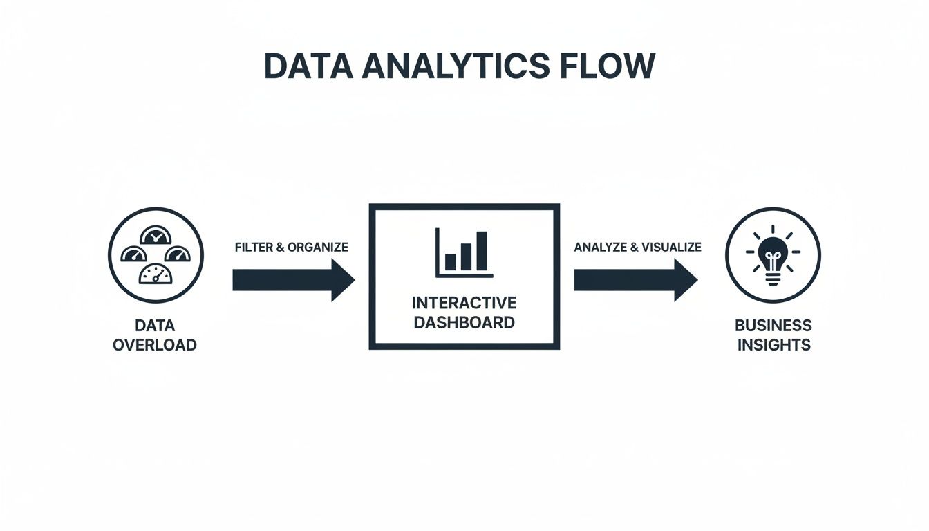
Moving From Data Overload To Actionable Insight
Ever felt like you're trying to fly a jumbo jet by looking at hundreds of separate, blinking dials? It's a dizzying experience. Each dial gives you a piece of information, but together, it's just noise. That's exactly what most SaaS and product teams face every day—drowning in a sea of disconnected data from support tickets, product usage logs, sales calls, and CRM updates. Finding a clear signal in all that chaos is next to impossible.
This guide is here to help you build that mission control center. We're talking about a powerful data analytics dashboard that cuts right through the complexity. It’s about getting beyond basic charts to create a strategic asset that turns raw numbers into a clear, compelling story about your business. A great dashboard doesn't just show you what's happening; it tells you why it matters.
Why Every SaaS Team Needs a Mission Control
In a crowded market, making the right call quickly is everything. Gut feelings and one-off customer stories just don't cut it anymore for guiding product strategy or deciding where to invest your resources. A centralized dashboard creates a single source of truth that gets the entire organization on the same page. It helps you answer tough, urgent questions with real confidence:
- Which bugs are actively costing us revenue? By linking support data with customer value, you can prioritize the fixes that directly protect your bottom line.
- What features are driving upgrades and retention? Usage analytics show you exactly which parts of your product create the most value, lighting the way for your roadmap.
- Which high-value customers are silently slipping away? By tracking customer health and engagement, you can spot churn risks early and step in before it's too late.
This is the big shift: moving from reactively pulling data to proactively spotting opportunities. It’s what separates the leaders from everyone else. The explosive growth of the global data analytics market—projected to hit USD 785.62 billion by 2035—is proof of this trend. Businesses are ditching static spreadsheets for real-time dashboards because they need to make data-driven decisions to survive and thrive. You can dig into the numbers on this market expansion on Precedence Research to see the full picture.
A dashboard is more than a reporting tool; it’s a conversation starter. It equips your teams to stop debating opinions and start making collaborative decisions based on shared, undeniable evidence. It’s your first and most important step toward building a data-informed culture.
Choosing The Right Dashboard For The Job
Not all dashboards are created equal. Trying to track daily bug reports with a high-level strategic dashboard is like using a telescope to find your car keys—you’ve got a powerful tool, but it's completely wrong for the task at hand. Picking the right type of dashboard is the crucial first step in turning a mountain of raw data into something you can actually act on.
The entire point of a dashboard dictates its design, the metrics it shows, and who it's for. Before you even think about building a chart, you have to ask the hard questions: “What specific decision will this dashboard drive?” or “What question does this absolutely need to answer?” Getting this clear from the start is how you avoid building a "data graveyard"—a dashboard that looks impressive but is ultimately useless because no one ever looks at it.
The whole idea is to filter the signal from the noise, turning data overload into a clear path forward for your team.
A well-designed dashboard isn't just a collection of charts; it's a finely-tuned instrument for making smarter, faster decisions.
The Operational Dashboard: What’s Happening Right Now?
Think of an operational dashboard as the cockpit of a plane. It gives you real-time, at-a-glance information about what’s happening this very second. Its sole purpose is to monitor immediate performance and flag urgent issues that need someone to jump on them, fast.
These dashboards are the lifeblood of teams on the front lines—think customer support, DevOps, or sales. They aren't trying to spot long-term trends. They need to know if a server just went down, if support ticket volume is suddenly spiking, or if a critical payment process is failing. The data here is constantly refreshed, sometimes every minute or even every few seconds.
- Primary Goal: Monitor live activities and alert teams to immediate problems.
- Time Horizon: Now. Data is as close to real-time as you can get.
- Audience: Front-line staff like support agents, engineers, and operations managers.
- Example KPIs: Server uptime, active users online, new support tickets, failed transactions.
The Strategic Dashboard: Are We Hitting Our Long-Term Goals?
If the operational dashboard is the cockpit, the strategic dashboard is the flight plan. It doesn't show your current airspeed, but it does show if you're on course to reach your destination. This is the dashboard for executives and leadership, helping them track progress against big-picture business goals.
Strategic dashboards are updated far less frequently—maybe daily, weekly, or even monthly. They zero in on KPIs that reflect the overall health of the business, designed for deep analysis and planning, not knee-jerk reactions.
A strategic dashboard is all about the "what" and the "why." It helps leaders see performance over time, spot market trends, and make informed calls on where to steer the ship next, cutting through the noise of day-to-day operations.
Comparing Key Data Analytics Dashboard Types
To make it even clearer, let's break down the fundamental differences between the most common dashboard types. Understanding these distinctions is key to building a tool that actually helps your team, rather than just adding to the noise.
| Dashboard Type | Primary Goal | Typical Audience | Time Horizon | Example KPIs |
|---|---|---|---|---|
| Operational | Monitor real-time operations, detect issues | Front-line Staff, Ops Managers | Now (real-time) | Server Uptime, Active Users, Support Ticket Volume |
| Strategic | Track progress against long-term business goals | Executives, Leadership | Monthly, Quarterly | Year-over-Year Growth, Market Share, Profit Margin |
| Product | Understand user engagement and feature adoption | Product Managers, UX Teams | Daily, Weekly | Daily Active Users (DAU), Retention Rate, Feature Clicks |
| Growth | Analyze customer acquisition and conversion funnels | Marketing Teams, Growth Leads | Weekly, Monthly | Customer Acquisition Cost (CAC), LTV, Conversion Rate |
Choosing the right format from this table ensures that the information presented is relevant, timely, and actionable for its intended audience.
Specialized Dashboards For SaaS Teams
Beyond these two main categories, SaaS and product teams lean heavily on specialized dashboards that blend operational and strategic views to answer very specific questions.
- Product Dashboards: These are all about user behavior. They help product managers see how people are really using the product, which features they love, and where they're getting stuck. Key metrics here are things like Daily Active Users (DAU), feature adoption rates, and user retention cohorts.
- Growth Dashboards: These focus squarely on the customer journey, from first touch to conversion. Growth and marketing teams live in these dashboards to track campaign performance, conversion funnels, Customer Acquisition Cost (CAC), and Lifetime Value (LTV).
Making the right choice here is fundamental. If your team is just starting out, it’s a great idea to look at a variety of business intelligence dashboard examples to get a feel for what works. And when you're ready to pick a tool, a solid Tableau and Power BI comparison can help you figure out which platform has the right features for your specific needs.
Building Your Dashboard Blueprint With The Right Data
A dashboard without the right data is just an expensive collection of pretty, but useless, charts. It's like having a beautiful car with no engine. The real power comes from connecting specific user actions directly to tangible business outcomes, drawing a clear line of sight from a button click all the way to revenue.
This means you have to get past the temptation of reporting on misleading vanity metrics. Things like total sign-ups or page views might look great in a presentation, but they often hide the real story about your business's health. A truly effective dashboard is built on a foundation of actionable KPIs that measure real value and engagement.
Selecting KPIs That Truly Matter
To build a dashboard that actually drives decisions, you need to focus on metrics that tell the story behind user behavior. These KPIs don't just show you what happened; they give you clues as to why it happened and what you should do next. It’s a mindset shift—from tracking superficial activity to measuring a genuine exchange of value.
Here are a few essential, action-oriented KPIs that SaaS product teams live by:
- Time-to-Value (TTV): How long does it take a brand-new user to hit their first "aha!" moment? This is the point where they truly get the core value of your product. A short TTV is one of the strongest predictors of long-term retention.
- Feature Adoption Rate: Don't just track feature usage. This KPI tells you what percentage of your active users are engaging with key features, helping you understand if your roadmap is actually delivering what they need.
- Customer Health Score: This is a composite metric. It combines several data points—like how often a customer uses the product, their support ticket volume, and recent survey feedback—into a single score that helps predict loyalty and churn risk.
- Revenue-at-Risk: This is where things get really powerful. By connecting bug reports or negative feedback from specific customer segments to their subscription value, you can quantify the financial impact of problems. Bug prioritization suddenly shifts from an opinion-based debate to a data-driven business decision.
A dashboard's primary job is to answer critical business questions. If your KPIs don't directly help answer questions like "Are we building the right features?" or "Which customers are about to leave?", they are likely the wrong KPIs.
Unifying Disparate Data Streams
The most powerful insights are almost always found at the intersection of different data sources. A user’s product activity tells one part of the story, but when you combine it with their support history from Zendesk, their subscription level from Stripe, and sales interactions, a much richer picture emerges.
For example, connecting support tickets to product usage logs might reveal that users who encounter a specific bug are 30% more likely to churn within the next 90 days. Tying in revenue data might show that your highest-paying customers are the ones most frequently requesting a particular feature. This unified view is what creates a reliable source of truth. If you want to dive deeper, our guide on data integration best practices is a great place to start.
The rapid growth of the embedded analytics market, which is projected to hit USD 182.7 billion by 2033, highlights this industry-wide shift. Companies are ditching siloed tools and embedding analytics directly into their workflows to get predictive and prescriptive insights right where decisions are made.
This foundational work of connecting data streams is what turns a simple dashboard into an intelligent system. It’s the difference between merely reporting on the past and actively shaping the future of your product. For a hands-on look at bringing your data together and visualizing it, check out this guide on How to Create a Power BI Dashboard.
Designing Dashboards People Will Actually Use

Here's a hard truth: even the most powerful data analytics dashboards are useless if they're confusing or difficult to scan. If a dashboard isn't being used, it's just a digital paperweight, regardless of how valuable the data behind it is. The goal isn't just to display numbers; it's to craft an intuitive experience that delivers insights at a glance.
Good design is all about reducing cognitive load. When a stakeholder opens your dashboard, they should grasp the key takeaways in seconds, not minutes. This takes a deliberate approach to layout, chart selection, and overall clarity.
Start With The Most Critical Information
The best dashboards borrow a principle from journalism: the "inverted pyramid." Lead with the most critical, high-level information right at the top. This is the first thing people see, so it needs to immediately answer their biggest questions.
Think of it as an information hierarchy. The top of the dashboard is the executive summary. As you scroll down, you can offer more granular details for those who want to dig deeper. This structure respects everyone's time and makes the main points impossible to miss.
A great dashboard tells a story in seconds. It provides an immediate answer to "How are we doing?" and then offers clear paths for users to explore "Why is that happening?" without getting lost.
With this approach, even a quick glance is valuable. Don't make your team hunt for the bottom line—put it front and center.
Create Clarity Through Visual Hierarchy
A cluttered dashboard is an unusable one. The secret to avoiding this all-too-common problem is a strong visual hierarchy that guides the user's eye naturally through the data. It's amazing what a little whitespace, thoughtful color, and smart positioning can do.
Here are a few principles I always stick to:
- Leverage Whitespace: Don’t try to fill every pixel. Whitespace (or negative space) is your best friend for cutting through the clutter and making individual elements pop. It gives the viewer's brain some breathing room to process what they’re seeing.
- Use Color Purposefully: Color shouldn't be decorative; it should be informative. Stick to a limited, consistent palette. For example, use green for positive trends and red for negative ones, but avoid a rainbow of bright colors that all compete for attention.
- Group Related Metrics: Place related KPIs and charts next to each other. This creates logical sections, making it far easier for users to connect the dots between different data points.
Applying these simple rules can transform a chaotic wall of charts into a clean, scannable, and genuinely useful tool.
Choose The Right Chart For The Story
Not all charts are created equal. The visualization you pick has a massive impact on how easily your data is understood. The wrong chart can hide important insights or, even worse, mislead your audience.
Here’s a quick guide to matching the chart to the data’s story:
- Line Charts: These are your go-to for showing trends over time. Use them to track things like Monthly Recurring Revenue (MRR) or daily active users to easily spot patterns, growth, or seasonality.
- Bar Charts: Perfect for comparing values across different categories. A bar chart is great for comparing feature adoption across customer segments or seeing which marketing channels are bringing in the most leads.
- Pie Charts: Use these sparingly. They only work when showing parts of a whole that add up to 100%, and they get messy with more than a few categories (five is pushing it).
Choosing the right visualization is a skill. For anyone looking to level up, exploring the best practices for data visualization is a fantastic way to get a deeper understanding of how to tell a clear, compelling story with data. When you select your charts carefully, your dashboard will communicate its message with maximum impact.
Connecting Your Dashboard to Real Business Impact

Let's be honest. A well-designed dashboard is great at telling you what happened. It can throw up a beautiful chart showing a sudden spike in customer churn or a worrying dip in feature engagement. But for most traditional data analytics dashboards, that's where the story ends. They show you the symptom but leave you completely in the dark about the disease, forcing your team to start a painful, manual hunt for the root cause.
This frantic, reactive scramble is a huge time sink. Instead of making informed decisions, your best people are stuck playing detective, digging through endless data silos. The next leap forward in analytics isn't just about prettier charts that load faster; it’s about finally closing the gap between seeing a problem and actually understanding what to do about it. The goal is a system that doesn't just show you the numbers, but explains the "why" behind them.
Moving Beyond Charts to Product Intelligence
This is where a new class of tools—product intelligence platforms like SigOS—is changing the game. Think of them as an intelligence layer that sits on top of your existing data stack. They turn your dashboard from a passive, historical report into an active, forward-looking guide for your business. The central idea is to automatically connect the dots between your quantitative usage data and the qualitative feedback your users are giving you every day.
Picture this: your dashboard flags a 15% increase in churn from your highest-paying customer segment. Instead of a fire drill, an intelligent system kicks in. It instantly starts analyzing recent support tickets, in-app chat logs, and even sales call transcripts—all from that specific group of customers.
Within minutes, it uncovers the real issue. A critical bug in last week's release is corrupting data, but only for users with massive accounts. The system doesn't just stop there. It quantifies the damage by telling you exactly how much monthly recurring revenue is at risk if you don't act.
The true power of a modern dashboard isn’t in the charts themselves, but in its ability to connect user behavior directly to business outcomes. It should automatically quantify qualitative feedback, putting a precise dollar value on fixing a bug or building a requested feature.
Suddenly, your dashboard is no longer a rearview mirror. It's a command center for what's ahead.
Aligning Every Action With Revenue
This deep integration of numbers and narratives is quickly becoming non-negotiable. The data analytics market in the United States alone is a testament to this, projected to rocket from USD 29.7 billion in 2025 to USD 232.9 billion by 2034. That explosive growth is being fueled by companies that are learning to tie every single action back to a strategic, revenue-driven outcome. You can dive deeper into these market dynamics and projections at IMARC Group.
Platforms like SigOS make this alignment possible by giving teams a clear, revenue-based framework for prioritization.
- From Noise to Signal: AI-powered analysis cuts through thousands of feedback snippets to find the critical patterns that correlate with churn risk or point to big expansion opportunities.
- Actionable Alerts: Forget simple metric alerts. The system sends you context. For instance: "The top three feature requests from enterprise accounts in your expansion pipeline are worth a combined $250,000 in ARR."
- Automated Workflows: Once a high-impact issue is flagged, it can be automatically sent to Jira or Linear with its revenue-impact score already attached, completely streamlining the handoff to development.
This approach ensures your product and engineering teams are always focused on the initiatives that will make the biggest, most measurable difference to your bottom line.
Your Dashboard Is a Conversation, Not a Conclusion
If there’s one thing to take away from all this, it’s that a data analytics dashboard isn't a final report card. Think of it as the opening line in a much smarter, data-informed conversation. It’s the tool that gets your teams to stop debating opinions and start making confident moves based on shared, undeniable facts.
We've walked through the entire blueprint for building dashboards people actually want to use. We covered setting a clear mission, picking KPIs that genuinely matter to the business, and using smart design to make complex data feel simple. We also looked at how adding product intelligence turns a basic reporting tool into a proactive system that tells you why things are happening, not just what.
Now, it’s your turn to put it all into practice.
From Static Report to Living Asset
The best dashboards are treated like living, breathing assets. They need to evolve as your business questions get more sophisticated and your strategy sharpens. The real measure of a dashboard’s success isn’t how many charts you can cram onto it, but how many intelligent actions it sparks.
An effective dashboard doesn't just show you data; it makes you ask questions. It should be the thing that sparks curiosity, encourages digging deeper, and ultimately drives your whole organization to get better every day. It’s a tool for asking better questions, not just seeing old answers.
To get started, just focus on answering one critical business question with one clean, simple visual. Build from there and constantly get feedback from the people using it. Ask them straight up:
- Does this help you make a decision faster?
- What new question does this chart make you ask?
- Is there anything on here that you can't take action on?
That feedback loop is what separates a dashboard that becomes an indispensable strategic tool from one that just becomes digital wallpaper. By encouraging this kind of back-and-forth, you make sure your data analytics dashboards become the engine for real growth, getting every team focused on the numbers that truly move the needle.
A Few Common Questions
Diving into the world of data analytics dashboards always brings up a few questions. Let's tackle some of the most common ones that product and data teams grapple with when they're building or using these tools.
What’s the Main Point of a Data Analytics Dashboard, Anyway?
At its core, a data analytics dashboard is all about turning a mountain of raw, messy data into a clear, visual story. It acts as a single source of truth, pulling together your most important key performance indicators (KPIs) and other critical metrics into one easy-to-understand view.
Think of it as your business’s command center. It gives you a real-time pulse on the health of your product, helps you track progress toward your big-picture goals, and lets you spot trends or problems before they get out of hand. By making data visual, dashboards help you move from staring at spreadsheets to actually making faster, smarter decisions.
How Do I Pick the Right KPIs for My Dashboard?
Choosing the right KPIs is everything. If you get this wrong, you'll end up with a dashboard that’s full of flashy charts but tells you absolutely nothing useful. The best way to start is by asking two simple questions: who is this for, and what do they need to achieve?
A dashboard for the C-suite focused on quarterly growth will look completely different from one used by the customer support team to monitor daily ticket volume. Once you know your audience and their mission, you can pick metrics that directly measure progress toward that specific goal.
A solid KPI should be:
- Specific: It measures one clear, defined outcome.
- Measurable: You have a reliable way to actually track it.
- Relevant: It connects directly to a critical business objective.
- Actionable: It gives you insights that your team can actually act on.
The golden rule here is to steer clear of vanity metrics. These are the numbers that look great on paper—like total app downloads—but don't really tell you anything about the health of your business or what you should do next.
What’s the Biggest Mistake People Make When Designing a Dashboard?
The most common pitfall, by a long shot, is data clutter. It’s the temptation to cram every single metric you can think of onto one screen. But instead of being helpful, this just creates a dashboard that’s overwhelming, confusing, and eventually, completely ignored.
When a screen is overloaded with clashing colors, endless numbers, and a mishmash of charts, it becomes impossible to see what matters. The whole point of a dashboard—to get quick, clear insights—is lost.
Good design is about restraint. It’s about using whitespace to let the data breathe, grouping related metrics together logically, and having the discipline to show only what’s absolutely essential. The goal isn't to show everything; it's to show the right things.
Ready to move beyond dashboards that just show what happened and start understanding why? SigOS uses AI to connect your product data with customer feedback, automatically surfacing the revenue-impacting signals hidden in the noise. Prioritize with confidence.
Keep Reading
More insights from our blog


Ready to find your hidden revenue leaks?
Start analyzing your customer feedback and discover insights that drive revenue.
Start Free Trial →