Master data architecture diagrams: A Clear Guide to Visualizing Your Data Flows
Explore data architecture diagrams with practical steps, real-world examples, and best practices to visualize data flows clearly.

A data architecture diagram is really the master blueprint for your organization's entire data world. Think of it as a strategic map that shows exactly how data moves—from all the different places it comes from, through all the steps of processing and storage, and finally to where it gets used for analytics or inside an application. This visual guide is absolutely essential for keeping teams on the same page, making sure your data is reliable, and planning for what comes next.
The Strategic Value of Data Architecture Diagrams

I like to think of a data architecture diagram as a city planner’s map. A city map shows you the roads, neighborhoods, and power lines, right? A data diagram does the same thing for your most valuable asset: your data. It lays out the pathways and systems that move, store, and shape it. Without this map, you’ve got teams working in silos, which leads to duplicated work, inconsistent data, and systems that just can't grow with the business.
A clear diagram becomes your single source of truth. It creates a common language that everyone—from the deeply technical engineers to the business-focused stakeholders—can actually understand. It brings the entire data lifecycle out of the shadows, from the moment raw data comes in to the polished insights that drive big decisions. This kind of visibility isn't just a nice-to-have; it's a critical business function.
Unifying Teams and Preventing Miscommunication
One of the biggest wins you get from a well-maintained diagram is how it aligns different teams. When your engineers, product managers, and data analysts are all looking at the same visual reference, conversations just get more productive. There’s less ambiguity, and everyone can see how their piece of the puzzle affects the bigger picture.
This shared understanding helps you sidestep costly mistakes. For instance, the marketing team might ask to plug in a new data source, not realizing the heavy engineering lift required to fit it into the existing pipeline. A quick glance at the architecture diagram can instantly clarify the scope and dependencies, leading to much smarter planning and resource allocation.
Building a Foundation for Scalable Growth
As your company grows, so does the complexity of your data systems. What starts as a simple database and a couple of apps can quickly spiral into a tangled mess of integrations and hidden dependencies. Data architecture diagrams bring order to that chaos. They give you a clear framework for making changes and adding new pieces without accidentally breaking something else.
A well-documented architecture acts as a safeguard against "technical debt," ensuring that today's solutions don't become tomorrow's problems. It allows you to anticipate bottlenecks, plan for increased data volume, and make informed decisions about technology investments.
And the pressure to manage this growth is real. Industry analysts are projecting that global data creation will blow past 394 zettabytes by 2028. At the same time, research shows that only about 20% of professionals feel truly confident in their ability to handle the data volumes they need to. This gap underscores why having clear diagrams that show data lineage, processing, and ownership isn't optional anymore.
These diagrams don't exist in a vacuum, either. To understand how they fit into the bigger development picture and keep them from becoming outdated relics, it's worth exploring a resource like A Practical Guide to Designing System Architecture.
Clear diagrams are valuable to nearly everyone in a data-driven organization, but what they get out of them can be quite different.
How Data Architecture Diagrams Empower Different Roles
| Role | Primary Benefit | Example Use Case |
|---|---|---|
| Data Engineer | Clarity on Data Flow | Identifying the best point in a pipeline to add a new data transformation step. |
| Product Manager | Understanding Dependencies | Assessing the technical effort required to build a new data-driven feature for users. |
| Data Analyst | Data Lineage & Trust | Tracing a metric in a BI dashboard back to its original source to verify its accuracy. |
| Business Stakeholder | High-Level Overview | Grasping how customer data from various touchpoints is used to create a 360-degree view. |
| IT/Security | Identifying Risks | Auditing the architecture to ensure sensitive PII data is properly secured at rest and in transit. |
Ultimately, these diagrams act as a universal translator, turning complex technical systems into a shared, understandable picture that drives better decisions across the board.
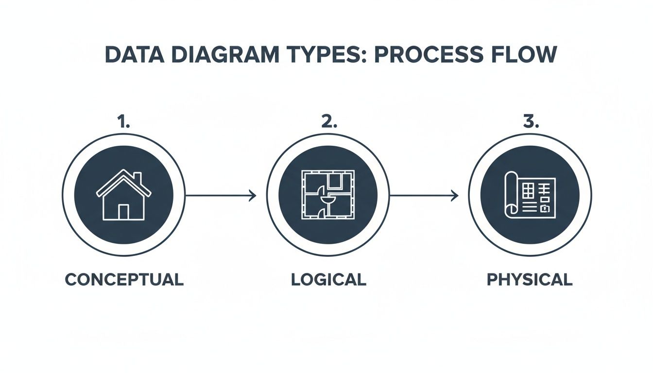
Think of data architecture diagrams like the blueprints for a house. You wouldn't just hand a construction crew a single napkin sketch and expect a mansion, right? You need different levels of detail for different stages of the project, and it's the same with your data infrastructure.
There are three main "layers" to these blueprints, each serving a different purpose and audience.
The Big Picture: Conceptual Diagrams
The conceptual diagram is your initial high-level sketch. It’s what you draw on a whiteboard to get everyone—from the CEO to the product manager—nodding in agreement. This diagram shows the major pieces of your data world and how they relate, but it deliberately leaves out the nitty-gritty technical details.
It answers questions like:
- Where does our data come from (e.g., user apps, third-party APIs)?
- What are the major systems involved (e.g., a central data warehouse, a CRM)?
- What are the key business concepts we're dealing with (e.g., "Customers," "Orders," "Events")?
You're not talking about specific databases or data formats here. You’re just mapping out the territory so everyone shares the same mental model of what you're trying to build.
The Floor Plan: Logical Diagrams
Once everyone agrees on the big picture, you move to the logical diagram. This is like the detailed floor plan of your house, showing how data actually flows between the rooms. It maps out the "plumbing" of your data ecosystem without getting hung up on which brand of pipes you're going to use.
Here, you define the data entities, their attributes, and the relationships between them. You’ll see data pipelines, processing steps, and how different systems interact. For example, it might show that user event data is processed through a streaming pipeline before landing in an analytics database.
The key here is that it's vendor-agnostic. You’re describing what needs to happen to the data, not how a specific tool like Snowflake or dbt will do it. This is where architects and senior engineers spend a lot of their time, designing the system's logic before committing to specific technologies.
The Contractor's Blueprint: Physical Diagrams
Finally, you have the physical diagram. This is the highly detailed, "for construction" blueprint that you hand to the builders—your data and platform engineers. It gets incredibly specific.
This diagram spells out the exact technologies, server specifications, database schemas, and network configurations. It answers questions like:
- Are we using a PostgreSQL database or a Redshift cluster? What version?
- What’s the exact table schema, including column names and data types (e.g.,
user_idis aVARCHAR(255))? - Where is this running? Which AWS region? What EC2 instance size?
Nothing is left to interpretation. The physical diagram is the ground truth for implementation, ensuring that what gets built perfectly matches the architectural design.
An accurate set of diagrams is the single best way to keep your builders, architects, and stakeholders in sync. A good blueprint is the foundation of a strong data architecture.
When to Use Each Type
So, how do you put this into practice? It's a natural progression.
- Conceptual: Use this at the very beginning of a project. It’s perfect for kickoff meetings to align business stakeholders and product teams on the overall goals and scope.
- Logical: Develop this during the design phase. It’s the primary tool for architects and engineers to hash out data flows, transformation logic, and system interactions.
- Physical: Create this right before implementation. It’s the final, actionable document that guides engineers as they write code and provision infrastructure.
I saw a SaaS startup building an event analytics platform use this process perfectly. They started with a conceptual diagram to show investors and product leads where data would come from (app, CRM, marketing tools). Then, they built logical diagrams to define the streaming pipelines and transformation models.
Finally, their physical diagram detailed the exact Amazon Kinesis streams, S3 storage tiers, and Redshift cluster configurations. This iterative approach cut their new engineer onboarding time by 40% because the "why," "what," and "how" were all clearly documented.
Why This Matters for Your Team
Getting this right has a ripple effect across the entire organization.
- Data Engineers can see dependencies and pipeline requirements clearly, long before they write a single line of code.
- Product Managers can align their feature roadmap with what’s actually possible from a data perspective.
- Analysts can trace metrics all the way from a dashboard back to the source, building trust and confidence in the data.
- Operations teams know exactly what infrastructure to provision and monitor.
In my experience, solid data architecture diagrams act as a shared language for the whole company, reducing cross-team misunderstandings by up to 50%.
By mastering these three types of diagrams, you're not just drawing pictures; you're creating a clear, progressive, and shared understanding of your most valuable asset: your data. Your data ecosystem will start to feel less like a confusing maze and more like a well-planned city.
Breaking Down the Core Components of a Modern Diagram
At first glance, a modern data architecture diagram can look like the cockpit of a 747—a dizzying array of boxes and lines. But it's not as scary as it seems. Once you know what the core building blocks are, you can make sense of any diagram that comes your way. It helps to think of it less as a static schematic and more as a story about your data's journey, with a clear beginning, middle, and end.
Each component you see represents a critical stage in that journey. By breaking it down into these fundamental parts, we can trace the flow of information and understand what every single element is doing.
Let's walk through these essential pieces one by one.
Data Sources: The Starting Point
Every data story has an origin. These are your data sources—the wells from which all information is drawn. On a typical diagram, you'll find them sitting on the far left, marking the official entry point into your data ecosystem.
Data sources can be incredibly diverse. You'll often see a mix of systems like these:
- Application Databases: Think of the relational databases (like PostgreSQL or MySQL) that run your actual product. They hold all the critical stuff: user accounts, product info, and transaction histories.
- Third-Party APIs: This is data you pull from other services. It could be CRM data from Salesforce, payment logs from Stripe, or website traffic from Google Analytics.
- Event Streams: This is the real-time data that flows from user interactions in your app—every click, page view, and form submission.
- File Storage: This covers all the unstructured or semi-structured data, like application logs sitting in Amazon S3 or files users have uploaded.
The diagram below shows how different types of diagrams—conceptual, logical, and physical—model these components at various levels of detail.
You can see a clear progression here, moving from a high-level sketch to a detailed blueprint. Each view is essential for different phases of planning and building.
Data Ingestion and Storage: Moving and Holding Data
Once data is born at the source, you have to get it somewhere and give it a place to live. This is where the ingestion and storage layers come into play. Ingestion is simply the process of moving data from all those sources into a centralized repository.
Think of ingestion as the fleet of delivery trucks for your data. These are the data pipelines that reliably haul raw materials from the quarries (your sources) to the warehouses (your storage). On a diagram, this is usually represented by arrows connecting sources to storage systems. If you're curious about what goes into making these, you can dig into how to build data pipelines.
The storage layer is where all that data comes to rest. You'll typically see two main types of storage:
- Data Lake: A massive repository that holds raw, unstructured data in its original format. It’s like a giant reservoir—incredibly flexible, but the water needs to be treated before you can drink it.
- Data Warehouse: A highly structured repository built for one thing: fast analytics. Here, data has already been cleaned, transformed, and organized neatly into tables, ready for querying.
You’ll often see a "Lakehouse" in modern diagrams. This is a hybrid approach that tries to give you the best of both worlds—the raw flexibility of a data lake with the structure and performance of a data warehouse. It's becoming a very common pattern.
Data Processing and Transformation: Shaping the Raw Material
Let's be honest, raw data is messy and rarely useful on its own. The processing and transformation layer is where the real work gets done. This stage is all about taking that raw data from storage and refining it into something clean, consistent, and actually usable.
This is the factory floor of your data operation. Raw materials get cleaned, molded, and assembled into something valuable. On a diagram, this layer usually sits right between your storage systems and your final analytics tools. Common tools you'll see here include:
- Apache Spark: The go-to heavy-lifter for large-scale data processing.
- dbt (Data Build Tool): An incredibly popular tool for transforming data that's already inside your warehouse, using simple SQL.
- Streaming Processors: Tools like Apache Flink or Amazon Kinesis that transform data on the fly, in real-time, as it streams through.
If you skip or skimp on this step, you end up trying to build analytics on a foundation of quicksand. It's often the most complex and critical part of the entire architecture.
Analytics and Integrations: The Final Destination
Finally, the polished data is ready to be put to work. The analytics and integrations layer is the last stop on the journey, and it's where all that effort pays off in business value. This is where data becomes insight.
This layer represents the "storefronts" of your data city, where end-users come to interact with the finished product. Key components here include:
- Business Intelligence (BI) Tools: Platforms like Tableau, Looker, or Power BI that people use to build dashboards and reports for business leaders.
- Machine Learning (ML) Models: Algorithms that use the clean data for predictive work, like forecasting sales or flagging customers who are at risk of churning.
- Reverse ETL: A newer category of tools that do something cool: they pipe the enriched, valuable data from the warehouse back into the tools your teams use every day, like your CRM. This puts the insights directly into the hands of sales and marketing.
By understanding these core components—Sources, Ingestion, Storage, Processing, and Analytics—you'll be able to confidently read just about any data architecture diagram and follow the story from raw data to real business impact.
Best Practices for Creating Diagrams That Actually Get Used
It’s one thing to create a data architecture diagram. It's another thing entirely to create one that your team actually uses. Let's be honest—an unused diagram isn't just a waste of time. It becomes a source of confusion and can send teams down the wrong path.
To avoid creating these digital dust collectors, we need to think beyond just drawing boxes and arrows. The real goal is to build for clarity, purpose, and easy maintenance. The secret is to treat your diagrams as living documents, not static, one-and-done artifacts. They're communication tools first, technical blueprints second. This simple shift in mindset changes everything.
Choose Clarity Over Complexity
First rule: know your audience. An executive doesn't need a dissertation on database replication settings; they need the big-picture conceptual view. On the other hand, an engineer building the system needs those precise technical details. Trying to cram everything into a single, complex diagram is a surefire way to make it useless for everyone.
Think about using different notations for different needs:
- Simple Box-and-Arrow: This is your go-to for high-level conceptual diagrams. It’s universally understood and perfect for explaining the grand vision to non-technical stakeholders without getting bogged down in the weeds.
- The C4 Model: This brilliant framework gives you four levels of zoom—Context, Containers, Components, and Code. It lets you create tailored views for different audiences, from business users all the way down to the developers writing the code.
The aim is to provide just enough information to be useful, not to overwhelm the viewer. Remember, the visual design is just as important as the data it represents. For a deeper look at making visual information stick, check out our guide on the best practices for data visualization.
Maintain Consistency and Use Visual Cues
A consistent visual language is your best friend for readability. Use the same shapes for the same types of components—cylinders for databases, clouds for external services, you get the idea. A smart color scheme can also work wonders, helping to distinguish between different data domains or environments (like green for production and blue for analytics).
This consistency creates mental shortcuts. It helps viewers instantly grasp what they're looking at without constantly checking a legend. It guides their eyes and makes the whole diagram feel more intuitive and professional.
Treat your diagram like a user interface. A good layout, clear labels, and a logical flow are non-negotiable for a good user experience. If it’s hard to read, people simply won't use it.
Treat Diagrams as Code
The most effective data architecture diagrams are the ones that evolve right alongside the systems they describe. How do you make that happen? By adopting a "diagrams as code" philosophy. Instead of relying on drag-and-drop tools that spit out static image files, use tools that let you define the diagram in a simple text format.
This approach unlocks some powerful advantages:
- Version Control: You can store your diagrams in Git right next to your application code. This means you can track every change, review updates in pull requests, and see a clear history of how your architecture has evolved over time.
- Automation: Imagine automatically generating diagrams directly from your code or infrastructure definitions. This ensures they are always accurate and up-to-date, eliminating manual effort.
- Collaboration: Teams can work on diagrams the same way they collaborate on code—suggesting changes, leaving comments, and providing feedback in a structured way.
This practice is becoming more important as companies invest more in the tools that produce these artifacts. The market for diagramming and visualization software was valued at around USD 843.9 million in 2024 and is expected to nearly double by 2031. Much of this spending is happening in regions like North America, a leader in data catalog adoption where regulatory needs demand meticulous documentation. This investment pays off, too—teams with well-maintained diagrams often report 20%-40% faster troubleshooting times. You can read more about these market trends in data catalog adoption to see how the industry is moving.
Choosing the Right Diagramming Notation
Selecting the right notation isn't just a technical choice; it's about finding the right language to communicate your architecture's story. From high-level business flows to granular component interactions, the notation you pick sets the tone and clarity of your diagram. Below is a quick comparison to help you choose the best fit for your specific needs.
| Notation/Framework | Best For | Key Strengths | Potential Drawbacks |
|---|---|---|---|
| UML (Unified Modeling Language) | Detailed software engineering and object-oriented systems. | Standardized, comprehensive, and well-supported by tools. Excellent for technical deep-dives. | Can be overly complex and rigid for high-level or agile architectural views. |
| C4 Model | Communicating software architecture to diverse audiences (technical and non-technical). | Hierarchical (4 levels of zoom), focuses on communication, easy to learn and apply. | Less standardized than UML; requires discipline to maintain consistency across levels. |
| ArchiMate | Enterprise architecture modeling across business, application, and technology layers. | Provides a rich, standardized vocabulary for describing complex enterprise systems. | Steeper learning curve; can be too heavyweight for smaller projects or team-level diagrams. |
| SysML (Systems Modeling Language) | Complex systems engineering, including hardware, software, and data. | Extends UML for a broader range of systems, good for cyber-physical systems. | Niche and highly technical; overkill for typical data or software architecture. |
| Simple Box-and-Arrow | High-level conceptual diagrams, initial brainstorming, and non-technical presentations. | Extremely simple, flexible, and universally understood. No training required. | Lacks formal structure, can become ambiguous or inconsistent without clear conventions. |
Ultimately, the best notation is the one your team understands and will actually use. Don't be afraid to start simple with boxes and arrows and introduce more formal notations like the C4 Model as your system and documentation needs grow more complex. The goal is always effective communication, not rigid adherence to a standard.
Looking at Data Architecture in the Real World

Theory is great, but it only gets you so far. To really get a feel for how data architecture diagrams work, you have to see them in the wild. Looking at real-world scenarios helps connect the dots between abstract boxes and arrows and the actual business value they create.
These examples bring the conceptual, logical, and physical models we've talked about to life. They show how different tools and technologies are stitched together to solve real problems, first for a modern SaaS company and then for a large-scale enterprise analytics platform.
SaaS Company User Event Tracking
Picture a SaaS product, much like our own SigOS platform, that needs to track what users are doing in real time. The goal is twofold: first, to power a live, in-app dashboard showing user activity, and second, to send all that data to a warehouse for deeper, long-term analysis of user behavior.
The data's journey starts with user events—every click, page view, and feature interaction—generated from the web and mobile apps.
- Ingestion: An event streaming platform like Apache Kafka or Amazon Kinesis acts as the central nervous system. It reliably takes in this firehose of events, creating a buffer that keeps the main application separate from the analytics systems.
- Dual Processing Paths: From Kafka, the data splits and flows down two parallel paths. One stream feeds a real-time analytics database (think Apache Druid or ClickHouse) that powers the live dashboard with near-instant results. The other stream gets picked up by an ETL/ELT process, which loads the raw event data into a cloud data warehouse like Amazon Redshift or Snowflake.
- Transformation and Analysis: Once inside the warehouse, a tool like dbt (Data Build Tool) gets to work transforming the raw logs. It cleans up the data, connects it with user account info from the production database, and rolls it up into useful models that track things like user engagement and retention. From there, the product and growth teams can explore this polished data in their BI tool.
This dual-path architecture is a really common and effective pattern. It handles the need for both immediate operational insights and deep strategic analysis, without trying to force one system to do a job it wasn't built for.
Enterprise BI and Analytics Platform
Now, let's zoom out to a larger enterprise that needs to pull together data from several core business systems. The mission is to give executives a single, unified view of performance by integrating data from their CRM (like Salesforce), ERP (like SAP), and various marketing automation platforms.
Here, the diagram starts with a bunch of different, often siloed, data sources. The biggest challenge isn't speed, but unification and governance.
A well-designed enterprise data architecture brings order to chaos. It transforms a tangled web of disparate systems into a single, trusted source of truth for decision-making across the entire organization.
The flow for this kind of setup usually follows a few key stages:
- Centralized Ingestion: Data from all these different systems is first pulled into a central data lake, which is often built on cloud storage like Amazon S3. This gives the company a cheap and flexible place to dump all the raw data in its original format.
- Transformation into a Star Schema: From the data lake, a powerful processing engine like Apache Spark runs jobs to transform the data. These jobs clean, validate, and reshape the data into a star schema inside a data warehouse. This classic structure organizes data into "fact" tables (like sales transactions) and "dimension" tables (like customer details or product info), which is perfect for BI queries. To see how this works in practice, you can check out these real-world data pipeline architecture examples.
- Serving Business Intelligence: With the data now clean and structured in the warehouse, it’s ready for the business. A BI platform like Tableau or Power BI connects directly to it, letting leaders build interactive dashboards, drill down into reports, and ask new questions of the data. Of course, following solid data integration best practices is what makes sure the final numbers are accurate and trustworthy.
These two examples really show how data architecture diagrams are not one-size-fits-all. They are custom blueprints designed to solve specific business needs, providing a clear roadmap for building data systems that actually work.
The Future of Data Architecture Visualization
Data architecture diagrams are undergoing a massive shift. We're moving away from static, hand-drawn blueprints that become obsolete almost as soon as they’re finished. The future isn't about creating a snapshot; it's about building a living, intelligent dashboard that shows you what’s happening with your data right now.
A couple of big trends are driving this change. First, Generative AI is starting to automate the whole process. Think about tools that can read your infrastructure-as-code files and metadata, then instantly generate a perfect diagram of your system. It would automatically highlight recent changes or flag potential risks, all without you lifting a finger.
The Rise of Dynamic and Intelligent Diagrams
At the same time, we're seeing a big move toward decentralized models like the data mesh. In a data mesh, data is treated like a product, with different teams owning their specific domains. This means future diagrams have to do more than just show technical connections. They'll need to map out ownership, data contracts, and the agreements between teams, acting less like a single blueprint and more like a federated map of an entire data ecosystem.
A few key technologies are making all of this possible:
- Automated Discovery Tools: These tools are constantly scanning your data environment, automatically mapping out dependencies and data flows to ensure your diagrams are always up-to-date.
- Data Contracts: These are machine-readable agreements that lock in the schema, quality, and meaning of a dataset. Diagrams will start to visually represent these contracts, showing you where data promises are being kept—or broken.
- Interactive Visualization: The diagrams of tomorrow will be fully explorable. You’ll be able to click on a database to trace its lineage, pull up its metadata, or check its health status, all from within the visualization itself.
The ultimate goal is to transform diagrams from a historical record into a predictive, interactive control panel for your entire data landscape.
This isn't just a niche idea; there's serious money behind it. The market for these kinds of visualization tools was valued at USD 844 million in 2024 and is expected to hit USD 1.783 billion by 2031. This growth shows that companies are finally getting serious about investing in the documentation and discoverability that good diagrams provide. You can dive deeper into the trends in data architecture modernization to see the financial drivers for yourself.
Getting ready for this next generation means adopting tools built for automation. It means treating your diagrams like code—something that is versioned, collaborative, and woven directly into how you work.
Got Questions? We've Got Answers.
As you start rolling up your sleeves and working with data architecture diagrams, you're bound to have a few questions. Let's tackle some of the most common ones that pop up.
What's the Best Tool for Making These Diagrams?
Honestly, the "best" tool really depends on what you're trying to do and who you're doing it with. For just getting ideas out of your head and onto a canvas, you can't go wrong with collaborative whiteboarding tools like Miro or Lucidchart. They're fantastic for quick, high-level sketches and brainstorming sessions with the team.
But when you need to get serious with logical or physical diagrams, that's where "diagrams as code" tools shine. Platforms like Mermaid.js or PlantUML let you write your diagrams in simple text. The huge advantage here is that you can check them into Git right alongside your application code, making sure your documentation always matches reality.
How Often Should I Update My Diagrams?
The simple answer? As soon as your architecture changes. A diagram that's out of date is worse than having no diagram at all—it breeds confusion and leads people to make bad decisions based on old information.
Think of your data architecture diagram as a living document, not a one-and-done artifact. It needs to grow and change right along with your systems to stay trustworthy.
A great habit to get into is making diagram updates part of your development workflow. If a new feature or service touches a data flow, updating the diagram should be part of the pull request. For systems that don't change as often, setting a reminder for a quarterly review is a solid plan to keep everything accurate.
What's the Difference Between a Data Architecture Diagram and a Data Flow Diagram?
This is a really common question, and it's easy to get them mixed up. Here’s a simple way to think about it.
A data architecture diagram is the static blueprint. It shows you the structure of your data world—all the major components like databases, storage systems, and processing engines. It answers the "what" and "where" of your data infrastructure.
A Data Flow Diagram (DFD), on the other hand, is all about movement. It traces the journey of a piece of data as it moves through the system. A DFD shows how information gets from point A to point B, what happens to it along the way, and where it ends up. It’s focused on the "how" and "when." The architecture diagram provides the stage, and the DFD shows the action happening on it.
At SigOS, we turn complex customer data flows into clear, revenue-driving insights. Our AI-driven platform analyzes your qualitative feedback from support, sales, and usage metrics to pinpoint the bugs costing you money and the features your best customers are asking for. Transform your product strategy with data, not guesswork. Discover how at sigos.io.


Ready to find your hidden revenue leaks?
Start analyzing your customer feedback and discover insights that drive revenue.
Start Free Trial →