Design of Experiment Template: Build Your Best DOE
Master the design of experiment template. This guide empowers product & growth teams to create, analyze, & integrate powerful DOEs for optimal results.

Most advice about experimentation in SaaS is too narrow. It tells teams to pick one variable, run an A/B test, declare a winner, and move on. That sounds disciplined, but in practice it often gives you a clean answer to the wrong question.
Product teams rarely change one thing in isolation. A pricing page headline interacts with proof points. An onboarding email interacts with in-app prompts. A feature flag behaves differently across segments, account sizes, and support burden. If your testing method ignores those interactions, your “winner” can disappear the moment you scale it.
That’s why a solid design of experiment template matters. It gives teams a reusable structure for choosing factors, defining levels, randomizing runs, and analyzing what moved the response variable. For product and growth leaders, that’s the difference between ad-hoc testing and a repeatable experimentation system that surfaces revenue-relevant insight.
Why Your A/B Tests Are Probably Lying to You
A/B tests fail most often when teams ask them to do a job they were never designed to do.
A simple A/B test is good at comparing one treatment against one control under stable conditions. It’s weak when multiple inputs are changing, when behavior shifts over time, or when your real business question is “which combination of factors should we launch?” instead of “which variant won this week?”

False wins happen when interactions stay hidden
A product team changes CTA copy and sees a lift. They ship it. Two sprints later, retention is flat and expansion revenue didn’t budge. The likely problem isn’t that the team failed to test. It’s that they tested too narrowly.
One-factor-at-a-time testing tends to miss interaction effects. A message that works for high-intent users may fail for low-intent users. A support workflow change may reduce ticket volume for one segment while increasing churn risk in another. The test still returns a result. It just doesn’t return the one you needed.
This is the same trap teams fall into when they rely on oversimplified measurement models. If you’ve worked through the problems with last click attribution, the pattern is familiar. A narrow lens can produce a very confident story while hiding the actual drivers.
Practical rule: If the change touches behavior, timing, segment, and channel at the same time, a basic A/B test is usually too blunt.
Most SaaS teams still underuse structured experimentation
The bigger issue is operational. Existing DOE templates have mostly been built for technical and manufacturing use cases, not modern product and growth teams. That gap matters because SaaS teams need templates that connect behavioral data, support signals, and delivery systems.
A 2025 Gartner report noted that 68% of SaaS teams underutilize structured experimentation on behavioral data, leading to 25% higher churn, and highlighted the need for templates that integrate with systems such as Zendesk or Jira instead of forcing manual analysis (reference).
That finding matches what happens inside many growth orgs. The testing itself isn’t the bottleneck. The bottleneck is turning messy customer behavior into a structured experiment design that people can trust.
DOE is the upgrade
A Design of Experiments, or DOE, gives you a way to test several factors together in a controlled design. Instead of asking whether one variant beat another, you ask a more useful question: which inputs matter most, which combinations create lift, and which variables can you stop arguing about.
For SaaS teams, that’s a better fit for pricing tests, onboarding design, retention interventions, rollout thresholds, support triage rules, and messaging experiments where several controllable factors move together.
A/B testing isn’t wrong. It’s just incomplete. DOE is what teams adopt when they get tired of local wins that never turn into business outcomes.
From Vague Goals to Testable Hypotheses
Teams do not fail at DOE because the template is hard to fill out. They fail because the brief starts with a goal that belongs in a board deck, not an experiment.
“Reduce churn” is a company objective. “Improve activation” is a planning theme. Neither gives a product manager, analyst, or engineer enough precision to build a valid test. A design of experiment template starts paying off only when the team converts that broad goal into one measurable response, a short list of controllable factors, and levels that can be shipped.

Start with one business question
The first useful question is usually narrower than stakeholders want.
Instead of “improve onboarding,” write the test around a claim the team can prove or reject: changing onboarding sequence timing, checklist visibility, and trial guidance level should improve activation quality for new accounts. That wording forces decisions. What counts as activation quality? Which inputs are under team control? What ranges are realistic during the test window?
Pick one primary response variable and protect it. In SaaS, that might be activation score, retained usage after onboarding, upgrade-qualified product usage, or revenue-weighted support load. Secondary metrics still matter, but they do a different job. They explain side effects, risk, and implementation trade-offs.
I have seen good experiments collapse because the brief tried to optimize activation, retention, expansion, NPS, and support volume at the same time. That is not rigor. It is indecision. If your team needs help separating a KPI from a diagnostic metric, use this guide to track the right business indicators.
Define factors and levels the way operators do
Once the response is clear, list the inputs the team can control during the experiment. In product and growth work, those factors usually sit across multiple systems, not one spreadsheet. Message structure may live in a lifecycle tool. Prompt timing may be triggered in-app. Support intervention may depend on CRM routing or a playbook in Zendesk. Rollout thresholds may be controlled through feature flags.
That operating reality matters because vague factor definitions create execution drift fast.
Use factors like these:
- Checklist visibility. Shown on first session or hidden until first key action.
- Prompt timing. Immediate nudge or delayed nudge after inactivity.
- Trial guidance level. Product-led walkthrough or human-assisted onboarding.
- Rollout threshold. Enable at signup or enable after qualification event.
Each factor needs explicit levels that engineering, lifecycle, and support can implement the same way every time. Many teams code levels as -1 and +1 in the template because it keeps the design matrix readable and makes analysis cleaner. The coding matters less than the operational clarity behind it.
“Better onboarding” is not a factor. “Checklist shown in session one” is a factor. “More aggressive rollout” is not a level. “Feature enabled after workspace invite” is a level.
Write hypotheses that survive contact with real data
A useful hypothesis connects business intent to observable behavior. It also names the conditions under which the effect should appear.
For a SaaS team, a stronger hypothesis often looks like this:
For newly created workspaces under 10 seats, showing the checklist on first session, delaying upgrade prompts until after first value event, and adding guided trial tips will increase activation score without increasing support burden.
That version is better for three reasons. It identifies the audience. It specifies the factors. It makes the trade-off visible. Product leaders rarely care about lift in isolation. They care whether lift comes with more tickets, lower conversion quality, or higher implementation cost.
Modern DOE templates must improve upon the old spreadsheet model in this regard. The template should not just store factor names and levels. It should map each factor to the system of record, the event definitions in analytics, the audience logic in the warehouse or CDP, and the downstream metrics in a product intelligence tool such as SigOS. Teams that do this well spend less time debating definitions after launch because the hypothesis and instrumentation were connected before the first run. For teams tightening that logic, this guide to hypothesis testing in product analysis is a useful reference.
Keep the first design small enough to run cleanly
Early DOE work usually fails from ambition, not from lack of sophistication.
A practical starting point is a small set of factors, usually two to five, with levels the team can implement without custom analysis every day. The point of the first template is not to model the whole business. The point is to create a repeatable structure that product, growth, data, and engineering all trust.
A good conversion process looks like this:
- Choose one outcomeName the single response variable that decides whether the test worked.
- Limit the inputsInclude only factors the team can change and monitor during the experiment window.
- Specify the levelsWrite levels in operational language, not strategy language.
- State the expected effectDescribe how the factors should change the response, and note the trade-offs you will watch.
- Tie the template to instrumentationMap each factor and response to events, properties, flags, and dashboards before launch.
That last step is the SaaS adaptation many teams miss. In manufacturing, the worksheet can sit apart from execution for a while. In product growth work, it cannot. If the experiment template is disconnected from analytics events, support data, and rollout controls, the team ends up rebuilding the experiment by hand after the fact.
A short walkthrough helps teams see the planning logic in motion:
What good looks like
Good DOE planning is plainspoken and strict. One business question. One primary response. A limited factor set. Levels that are easy to implement without interpretation. Instrumentation that already exists or can be added before launch.
Bad DOE planning looks busy. The template gets filled with every idea from product, growth, CS, and engineering, then nobody can tell which input caused the result.
The payoff for doing this well is large. Teams stop arguing in broad terms and start learning which combinations effectively change revenue, retention, and cost to serve.
Choosing Your Weapon Full Factorial vs Fractional vs RSM
Teams often treat experiment design like a maturity badge. They pick the most advanced-sounding method, then wonder why the test stalls in engineering, burns traffic, or produces results nobody trusts. The better move is simpler. Match the design to the decision.
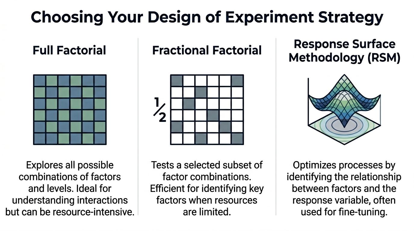
Full factorial, fractional factorial, and Response Surface Methodology each solve a different problem. Product and growth teams get into trouble when they use one method for every stage of learning. Early screening, interaction analysis, and optimization are separate jobs. The template should reflect that, especially if it feeds an analytics stack instead of sitting in a spreadsheet no one revisits.
Full factorial gives the cleanest read, at a price
A full factorial design tests every combination of factor levels. Add factors and the run count climbs fast. In SaaS, that cost shows up in more than math. It means more feature-flag states to configure, more QA paths, more segmented traffic, more dashboards to validate, and more chances for implementation drift.
That overhead is worth paying when the factor count is small and interaction effects could change the business decision.
I use full factorial for bounded problems. A short list of onboarding changes. A pricing page flow with a few controllable elements. A support escalation experiment where one combination could improve conversion but also increase ticket load. In cases like that, ambiguity is expensive, so running the full set is often cheaper than debating partial answers for two weeks.
Model fit still matters. Teams should not stop at “one coefficient looks significant.” Check whether the model explains enough of the response to support a decision, as noted earlier. A design can be executed correctly and still produce a weak model if the response is noisy or the factors were poorly chosen.
Comparison of common DOE designs
| Design Type | Best For... | Number of Runs | Key Benefit | Main Drawback |
|---|---|---|---|---|
| Full Factorial | Small experiments where you need to understand main effects and interactions across all factors | Grows quickly as factors increase | Most complete view of interactions | Becomes impractical quickly as factors increase |
| Fractional Factorial | Screening many possible inputs when time, traffic, or engineering effort is limited | Smaller subset of the full design | Efficient way to identify the few factors worth deeper work | Some effects are aliased and need follow-up testing |
| Response Surface Methodology | Fine-tuning and optimization after key factors are known | Structured around optimization runs rather than simple high/low screening | Captures curvature and helps find better settings, not just winner/loser comparisons | More complex to plan and analyze |
Fractional factorial is usually the right starting point for SaaS teams
For modern product teams, fractional factorial is often the practical default.
Growth teams rarely have the luxury of pausing roadmaps, reserving large clean traffic pools, and implementing every possible variant state at once. They need a disciplined first pass that screens multiple candidates without creating an operational mess. Fractional designs do that well. They trade completeness for speed and focus, which is usually the right trade in subscription businesses where the question is which levers deserve another sprint.
That trade-off needs to be explicit. With a fractional design, some effects are aliased. You may learn that a combination matters without isolating every interaction perfectly on day one. That is acceptable if the goal is prioritization. It is a poor choice if leadership expects a final operating rule from the first experiment.
This is also where SaaS teams should adapt the template itself. Do not just list factors and runs. Include the feature flags, audience definitions, event names, and metric owners tied to each run. If the design lives inside your product intelligence workflow, in a platform such as SigOS, the team can trace every planned combination to actual user behavior without rebuilding the experiment after launch. That is a major step up from the usual spreadsheet-first process, where the design matrix and the analytics reality drift apart by week two.
RSM belongs later, once the important levers are known
RSM is not a discovery tool for a messy factor list. It is an optimization method for teams that already know where to focus.
That distinction matters. First ask which parts of the retention flow matter. Then ask what timing, message intensity, or incentive level produces the best outcome across conversion, retention, and support cost. RSM helps with the second question because product behavior is often non-linear. The best setting is not always at the highest or lowest level. Sometimes there is a middle range that maximizes revenue while limiting downstream friction.
Teams usually reach for RSM too early because it sounds advanced. In practice, it pays off only after the screening work is done and the instrumentation is stable enough to support tighter modeling.
A practical filter for choosing the design
Use full factorial when you have a small factor set, care strongly about interactions, and can support the execution load.
Use fractional factorial when you need to screen several plausible inputs across limited traffic, engineering capacity, or launch windows.
Use RSM when the important factors are already known and the job is tuning the operating point, not figuring out what matters in the first place.
Good DOE teams do not ask which method is best in theory. They ask which method will survive contact with product constraints, analytics reality, and decision deadlines. That is the standard that turns experiment design from an academic exercise into a repeatable revenue tool.
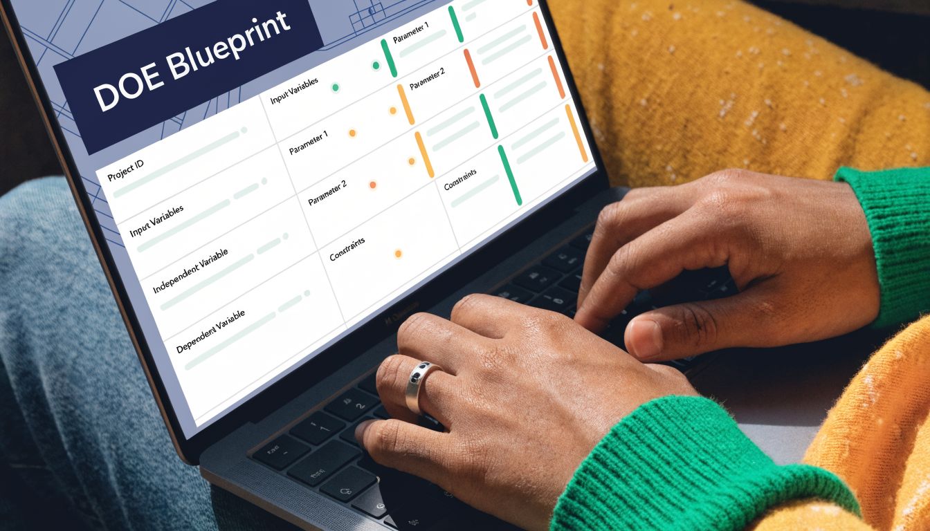
Constructing Your Reusable Experiment Template
A good design of experiment template should work the same way every time, whether the team is testing onboarding prompts, support escalation logic, or expansion messaging. If the template changes shape for every experiment, adoption falls apart.
The simplest reliable version lives in Google Sheets or Excel. ASQ provides free Excel-based DOE templates and a standard three-step approach that starts with understanding inputs and outputs, choosing measures, and then building the design matrix. That structure became standard because it gives teams a practical path to controlled testing without requiring advanced statistical expertise up front.
The top section of the template
The first block should describe the experiment itself, not the individual runs. I keep this at the top of the sheet so anyone opening the file can understand the purpose in a minute.
Include these fields:
- Experiment IDUse a consistent naming format. For example, retention-doe-q3-01.
- OwnerOne accountable person. Not a committee.
- Date opened and date closedThis matters later when you review changes in context.
- Business objectiveShort statement of the decision the experiment supports.
- Primary response variableOne metric only. Secondary metrics can sit in a separate note field.
- HypothesisPlain language statement connecting the factors to the expected response.
- Systems touchedList product areas, automations, or teams involved.
This metadata block is boring. It’s also where most future confusion gets prevented.
The run table is the real engine
Below the metadata, build the run matrix. Each row is one run. Each column has one job.
A reusable structure looks like this:
| Column | What it stores | Why it matters |
|---|---|---|
| Run ID | Permanent identifier for the designed run | Keeps analysis stable even after randomization |
| Randomized Run Order | The order in which the run should be executed | Reduces time-based bias |
| Factor A coded | -1 or +1 | Standardized level coding |
| Factor B coded | -1 or +1 | Easier model analysis |
| Factor C coded | -1 or +1 | Consistent across experiments |
| Actual Factor A value | Human-readable implementation detail | Lets operators execute the run correctly |
| Actual Factor B value | Human-readable implementation detail | Avoids coding confusion |
| Actual Factor C value | Human-readable implementation detail | Important for handoffs |
| Response variable | Observed result for the run | Core analysis field |
| Notes | Exceptions, outages, anomalies | Useful during interpretation |
The key principle is separating coded values from actual values. Analysts need the clean -1/+1 structure. Operators need to know what those codes mean in production.
Randomized order is not optional
Teams skip randomization because it feels annoying. That’s a mistake.
If you run every “low” condition first and every “high” condition later, time enters the experiment as an uncontrolled influence. In SaaS, time effects show up everywhere: campaign timing, weekday behavior, release timing, support load, and traffic quality. Once order is confounded with treatment, your results get muddy fast.
Run order should be randomized before launch and preserved in the template. Don’t let the team improvise the sequence during execution.
In a spreadsheet, create a helper column with random values, sort by that column, then assign the resulting sequence as Randomized Run Order. After that, freeze the order. Don’t keep recalculating random values once execution starts.
Add a factor dictionary tab
The best templates don’t stop at one sheet. Add a second tab called Factor Dictionary.
Use it to document:
- Factor nameKeep labels short and unambiguous.
- Low level definitionWhat exactly does -1 mean in practice?
- High level definitionWhat exactly does +1 mean?
- Owner for implementationWhich team member sets or verifies the condition?
- ConstraintsAny engineering, legal, or segmentation limits.
This tab is what keeps “we thought that meant X” from derailing the run.
Add a capture discipline for the response variable
The response field needs explicit rules. Define what gets entered, when it gets entered, and how exceptions are handled.
For example:
- Specify the source systemIf the response comes from product analytics, note the exact dashboard or export source.
- Set the observation windowDecide when each run is considered complete.
- Clarify exclusionsInternal users, duplicate records, or broken sessions should be handled consistently.
- Track anomalies in notesDeployment issues and unusual traffic should never live only in Slack messages.
Spreadsheet DOE often breaks down. The matrix is fine. The data collection discipline is not.
Build for repeat use, not one-off heroics
A mature template should be copyable. One tab for experiment metadata. One tab for run design. One tab for factor definitions. Optional tabs for raw exports and summary analysis.
What works is standard naming, locked formulas, and clear ownership. What doesn’t work is a one-time worksheet built by the only analyst who understands it.
If you want the process to survive team growth, the template has to be boring in the best possible way. Clean columns. Visible assumptions. Stable coding. No mystery formulas hidden in random cells.
That’s what turns DOE from a clever exercise into operating infrastructure.
Executing the Experiment and Analyzing the Results
DOE does not break in the analysis tab. It breaks during execution, when a team changes rollout timing, lets tracking drift, or treats one noisy run as a reason to rewrite the plan.
That is why disciplined teams get more value from the same traffic.
A SaaS product or growth team running a designed experiment needs to protect consistency run by run. The payoff is not academic rigor for its own sake. The payoff is being able to say, with confidence, which factor changed activation, expansion revenue, trial conversion, or support load, and which one only looked promising in a dashboard snapshot.
Start with execution control, not excitement
Before launch, confirm the operating conditions around the test are stable. In practice, I want four things locked down:
- Tracking works the same way in every runIf one condition is measured from Mixpanel and another from a warehouse backfill, the comparison is already weaker.
- Factor levels stay fixedA pricing test, onboarding prompt, or lifecycle sequence cannot drift midway because someone wants to “improve” a treatment.
- The run calendar is visible to every team involvedProduct, growth, engineering, support, and data all need the same sequence and timing.
- Exceptions get logged in the experiment recordRelease delays, CRM sync issues, paid campaign spikes, and outage windows need to be captured where the analysis will happen.
This is the unglamorous part. It is also where DOE starts outperforming ad hoc testing. A/B programs often hide execution problems inside a single topline number. DOE makes those problems visible, provided the team records them.
Analyze effects in the order they affect decisions
Start simple. For a two-level design, review main effects first, then interactions that are large enough to change a product or growth decision.
That order matters. Teams lose time when they jump straight to complicated modeling before confirming whether one factor has a clear directional effect. In SaaS work, the first useful question is usually practical: did pricing copy, onboarding friction, message timing, or sales assist level move the response enough to justify a rollout or another round?
A good DOE template makes that review faster because the structure is already clean. Each run has coded factor levels, a defined response window, and notes on anomalies. Analysts can sort, model, and segment without rebuilding the dataset from scratch.
If the team needs to package the findings for leadership or cross-functional review, this example of a data analysis report structure helps turn results into a documented decision instead of another chart dropped in Slack.
Use AI where it helps
AI is useful for pattern review, anomaly detection, summarizing run notes, and drafting a first pass at effect interpretation. It is also useful for connecting experiment output to adjacent product signals such as support tickets, NPS comments, and sales-call tags.
It is less useful when the underlying DOE file is messy.
That is the key constraint for modern SaaS teams. Classic DOE assumed a relatively tidy dataset and a slower operating cadence. Product and growth teams now run tests across feature flags, lifecycle systems, CRM workflows, and billing events. If the template only works as a static spreadsheet, analysis slows down the moment someone asks for segment cuts by plan tier, acquisition source, or expansion propensity.
Teams benefit from designing the template for system-to-system use. SigOS-style product intelligence workflows are a good example of the shift. The DOE file should behave like structured operational data, not a one-off worksheet that an analyst has to clean up manually every time.
For teams that want outside help automating those handoffs, an AI automation agency can help connect experiment records, analytics pipelines, and reporting workflows.
Use RSM after screening, not before
RSM earns its place once the team has evidence about which factors matter and needs to optimize within a narrower range. That is common in SaaS work where the best setting is rarely the extreme. Onboarding length, discount depth, notification frequency, usage limits, and rollout thresholds often have a middle ground that beats both endpoints.
At that stage, the question changes. The team is no longer picking a winner from a small set of variants. The team is estimating a better operating region with clearer trade-offs between conversion, retention, margin, and customer experience.
That is a higher-value conversation than “which version won.”
Finish with a decision list
The final output should be brief and operational:
- Factors with a meaningful effect on the response
- Interactions that change the recommended setting
- Factors that did not matter enough to prioritize
- The next configuration to ship, validate, or optimize
- Execution caveats that limit confidence
That list is what product, growth, and engineering need. The template, run logs, and model outputs support the decision. They are not the decision itself.
Integrating Your DOE Template with Your Tech Stack
A spreadsheet is a useful starting point. It’s a poor endpoint.
If the DOE file lives in a folder and nowhere else, the insight dies too early. Product teams need experiment outputs to flow into analytics, planning, and delivery systems so the result becomes operational rather than archival.
Treat the DOE file as structured input
The easiest pattern is to export the run table and results as a clean CSV, then route it into your analytics layer. Looker, Tableau, and warehouse-based reporting workflows can all work if the fields are standardized.
That’s why column naming matters so much. If every experiment uses the same schema for run ID, factors, levels, response, and notes, downstream reporting gets easier. If every team invents its own format, integration becomes manual work again.
A shared architecture reference helps here. This guide to a data architecture diagram is a useful way to map where experiment data should enter, where enrichment happens, and where decisions should be surfaced.
Close the loop into execution systems
Value comes when significant findings trigger action.
Examples include:
- Jira epics created when a factor combination shows a repeatable impact on activation or retention.
- GitHub issues opened when a defect pattern appears in a specific condition.
- Support playbooks updated when a treatment reduces burden for one segment but raises risk in another.
- BI alerts routed to stakeholders when a tested setting should become the new default.
At this point, experimentation stops being an analyst-side function and becomes part of the operating rhythm.
Automation is what makes DOE sustainable
Teams often don’t abandon DOE because the method is weak. They abandon it because the process feels manual.
If your organization needs help wiring experiments into issue creation, reporting pipelines, or workflow orchestration, working with a specialist in applied automation can help. A partner like an AI automation agency can be useful when the problem is less about experiment design and more about connecting the design outputs to the systems where teams work.
The mature version of DOE isn’t a better spreadsheet. It’s a feedback loop that turns structured experiments into backlog, analytics, and product decisions without waiting for a meeting.
The best design of experiment template does more than document tests. It creates a clean, reusable format that other tools can read, enrich, and act on. That’s how experimentation starts driving product prioritization instead of sitting beside it.
SigOS helps product and growth teams turn noisy customer signals into clear, revenue-linked priorities. If you want a faster way to connect feedback, behavioral patterns, and prioritization decisions, explore SigOS.
Keep Reading
More insights from our blog


Ready to find your hidden revenue leaks?
Start analyzing your customer feedback and discover insights that drive revenue.
Start Free Trial →