Master Data Driven Product Management for Success
Master data driven product management. Translate customer data into ROI using key metrics & tools. Build better products with effective frameworks.

You’re probably dealing with a familiar mess right now. Sales wants a feature for a deal that feels urgent. Support wants a bug fixed because tickets keep piling up. Design wants to revisit onboarding. Engineering wants to pay down technical debt. Leadership wants growth, retention, and clearer ROI. Every request sounds reasonable, and taken together they create a backlog shaped more by pressure than evidence.
That’s where data driven product management starts to matter. Not as a reporting exercise, and not as a way to replace judgment, but as a way to stop mistaking noise for signal. The job is to connect what users do inside the product, what they say outside it, and what the business needs next. Teams that learn to do that consistently make better roadmap calls, defend trade-offs with confidence, and waste less time building things that sounded important but weren’t.
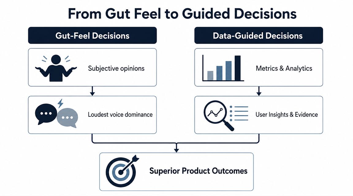
From Gut Feel to Guided Decisions
Most product teams aren’t choosing between intuition and data. They’re choosing between unguarded intuition and judgment informed by evidence.
When decisions come from gut feel alone, a roadmap usually reflects whoever is loudest, closest to revenue, or most persuasive in a meeting. That doesn’t mean those people are wrong. It means the team has no reliable way to separate a broad customer pattern from one memorable conversation.
What data driven product management actually means
At its core, data driven product management means every meaningful product decision answers three questions:
- What is happening
- Why it’s happening
- What we’ll do next to change the outcome
The first question comes from quantitative data. Usage patterns, retention behavior, conversion drop-offs, churn signals, feature adoption, DAU, MAU, and revenue metrics show the shape of reality. They tell you what users did, where they stalled, and which behaviors correlate with value.
The second question comes from qualitative data. Support tickets, sales calls, onboarding interviews, NPS comments, and bug reports explain the human context behind the pattern. They reveal friction, confusion, unmet expectations, and language customers use.
The third question is where good product teams earn their keep. They don’t just admire dashboards. They turn evidence into prioritization.
Practical rule: Behavioral data tells you where to look. Customer feedback tells you what to ask next.
Data aware isn’t the same as data driven
A lot of teams are data aware. They have dashboards. They review KPIs. They can quote MAU or trial conversion in planning meetings. But the actual roadmap still moves on instinct.
A data driven team works differently:
- They define the decision first. They don’t pull reports just because data exists.
- They challenge anecdotes with patterns. A single customer request can matter, but only after it’s placed in context.
- They connect outcomes to business impact. Better onboarding matters because it changes retention or conversion, not because it “feels smoother.”
- They build learning loops. Every shipped change becomes a testable bet.
For teams trying to mature this muscle, a practical primer on predictive analytics is useful because it shows how historical patterns can support forward-looking product decisions without turning PMs into data scientists.
The better analogy
Running product by instinct alone is like navigating a ship by the stars when GPS, radar, and weather data are sitting on the bridge. A skilled captain still matters. Judgment still matters. But refusing better instruments isn’t craftsmanship. It’s avoidable risk.
That’s the shift. Data driven product management doesn’t remove experience from the process. It gives experience something solid to stand on.
The Undeniable Business Case for Data
The strongest argument for data isn’t that it makes product teams look smarter. It’s that it improves business outcomes the rest of the company already cares about.
When product leaders tie decisions to retention, churn, CAC, LTV, MRR, and NRR, the conversation changes. Roadmap debates stop sounding like taste and start sounding like capital allocation. That matters because executives rarely struggle to approve work that has a visible link to revenue, customer health, or expansion.

Why the ROI case is hard to ignore
The clearest proof is financial. Organizations adopting data-driven product management strategies achieved substantial financial and operational advantages, with a Splunk survey showing an 83% increase in revenue and a 66% rise in other business value metrics in the year prior to the study among high-performing firms, according to Kandasoft’s review of data-driven product management.
That kind of result doesn’t come from dashboards alone. It comes from a repeatable operating model:
- Product teams measure behavior early
- They spot friction before churn becomes obvious
- They prioritize work with commercial consequences
- They learn which changes move customers toward value
- They reinvest based on evidence rather than internal opinion
Metrics that connect product to the boardroom
Some product metrics matter because they reflect user value. Others matter because they translate directly into financial language. Good PMs need both.
A few examples make this concrete:
| Metric | Why leadership cares |
|---|---|
| Retention rate | Shows whether the product keeps earning repeat usage and ongoing value |
| Churn rate | Reveals where revenue leakage or account risk is building |
| CAC | Frames how expensive growth is |
| LTV | Shows how much long-term value the product creates per customer |
| MRR | Connects product improvements to recurring revenue trends |
| NRR | Shows whether existing accounts are shrinking, holding, or expanding |
The mistake many teams make is reporting these numbers after the fact without changing how they prioritize. Data only becomes strategic when it changes what gets built, fixed, delayed, or removed.
If product work can’t be connected to customer behavior and business outcomes, leadership will treat it as discretionary.
The flywheel most teams want but few build
The business case compounds. Better evidence leads to better product bets. Better bets improve adoption, retention, and customer satisfaction. Those gains strengthen revenue quality and create room for more investment. The team then gets better tools, sharper focus, and more confidence to run disciplined experiments.
That’s the flywheel.
It also changes cross-functional trust. Sales gets clearer explanations for roadmap decisions. Support can prove which issues affect valuable accounts. Engineering can argue for reliability work with stronger evidence. Finance sees a tighter link between delivery and return.
Data driven product management works because it isn’t just a product practice. It becomes a business system.
Building Your Data-Driven Product Framework
Teams usually fail at data driven product management for one of two reasons. They either track too much and can’t decide, or they track too little and keep falling back on opinion. A useful framework avoids both.
The practical model has three parts. First, choose metrics that reflect real product value. Second, treat roadmap items as hypotheses, not promises. Third, build a feedback loop that combines behavioral evidence with customer language.
Start with a North Star and supporting metrics
A product team needs one core measure of delivered value. Not traffic. Not activity for its own sake. A North Star metric should reflect meaningful customer progress inside the product.
Slack is the classic example. It has famously tracked teams sending 2000+ messages as a North Star signal for engagement, as noted in Statsig’s overview of core PM metrics. That works because it ties usage to real adoption rather than shallow clicks.
The same source emphasizes that retention rate and churn rate are central measures in data driven product management, and that teams often benchmark return behavior at Day 1, Day 7, and Day 30 to see whether users are reaching the product’s “wow moment.”
That gives you a simple but strong lens. If users don’t come back after initial exposure, the product either failed to deliver value quickly enough or failed to make that value obvious.
Essential metrics for data-driven product management
| Metric | Category | What It Measures | Why It Matters |
|---|---|---|---|
| Retention rate | Customer | How many users keep returning over time | Shows whether users continue finding value |
| Churn rate | Customer | The share of users who stop using the product | Highlights loss of product value or fit |
| NPS | Customer | Customer willingness to recommend the product | Adds sentiment and loyalty context |
| MAU | Product | Monthly active usage | Helps track overall engagement trend |
| DAU | Product | Daily active usage | Useful for products where frequent return matters |
| Feature adoption | Product | Usage of a specific feature or workflow | Helps validate whether shipped work matters |
| CAC | Business | Cost to acquire a customer | Keeps growth economics visible |
| LTV | Business | Customer value over time | Helps prioritize durable value over shallow wins |
| MRR | Business | Recurring revenue trend | Connects product changes to commercial health |
| NRR | Business | Expansion and retention within existing accounts | Ties product value to account growth |
A good metric stack has a hierarchy. One North Star. A handful of supporting metrics. A short list of guardrails. That’s enough to guide decisions without drowning the team.
Avoid vanity metrics early
Vanity metrics make teams feel informed while keeping them blind. Total signups, page views, and raw event counts can look encouraging while retention stays weak and customers leave.
Use a filter before adding any metric to your weekly review:
- Can the team influence it directly
- Does it reflect user value, not just exposure
- Would a change in this metric alter roadmap priority
- Can we segment it by cohort, plan, or customer type
If the answer is no, it probably belongs in a background dashboard, not in the decision loop.
For PMs tightening their measurement discipline, this guide to Top 10 Data Integrity Best Practices is useful because metric debates often start with instrumentation problems, inconsistent event naming, or broken tracking rather than genuine strategy differences.
Turn roadmap items into hypotheses
Strong PMs don’t say, “Customers asked for this, so we should build it.” They say, “We believe this change will move this behavior for this segment, and we’ll know it worked if this metric changes.”
That’s the difference between shipping work and running product discovery inside delivery.
A practical hypothesis format looks like this:
- If we simplify onboarding for trial users,
- then more users will reach first value,
- because current drop-off suggests setup friction is blocking activation.
This style forces clarity. It also makes post-launch review less political. The discussion becomes whether the hypothesis held up, not whether someone was persuasive in planning.
For teams wanting a deeper view of instrumentation and KPI selection, SigOS has a practical post on analytics for product managers that maps product questions to measurable signals.
The fastest way to improve prioritization is to stop treating feature ideas as conclusions and start treating them as tests.
Build the what and the why into one loop
Quantitative data rarely explains itself. A drop in retention tells you something broke or weakened. It doesn’t tell you whether users were confused, disappointed, blocked by bugs, or never understood the setup process in the first place.
That’s why the best teams operationalize qualitative feedback instead of treating it as anecdotal overflow.
Sources worth feeding into the same review rhythm include:
- Support tickets that reveal repeated friction in real customer words
- Sales call notes that surface objections, missing capabilities, and deal blockers
- Onboarding interviews that show where expectations diverge from reality
- NPS comments that add context to sentiment shifts
- Bug reports from engineering and QA that explain hidden technical causes
The hard part isn’t collecting this information. Most companies already have too much of it. The hard part is connecting it back to behavior and business outcomes.
Tooling plays an important role. Teams often use combinations of Amplitude, Mixpanel, Google Analytics, Zendesk, Intercom, Jira, Linear, and spreadsheets. In environments with heavy feedback volume, some teams also use SigOS to ingest support conversations, sales calls, and usage signals, then connect recurring themes to churn or revenue impact so product decisions aren’t driven by whichever ticket thread got the most internal attention.
Build a weekly operating cadence
Frameworks fail when they stay conceptual. Put the system on the calendar.
A practical weekly cadence looks like this:
- Review one core outcome metricStart with retention, churn, activation, or the North Star. Don’t begin with dozens of charts.
- Inspect segment changesCheck whether the movement is concentrated in a cohort, plan tier, customer size, or acquisition source.
- Match the pattern to customer evidencePull in support, sales, and interview themes from the same time window.
- Form one decisionChoose whether to investigate, fix, test, or deprioritize.
- Define the expected resultState which metric should move if the team is right.
That’s enough to turn data from reporting into product management.
Operationalizing Insights Across Your Organization
A product team can become data literate and still fail if the rest of the company treats data as someone else’s job. The shift only sticks when support, engineering, design, growth, and leadership all work from the same evidence base.
Most organizations don’t have a data shortage. They have a coordination problem. Product sees feature usage in one tool. Support sees ticket volume in another. Sales keeps objections in call notes. Finance tracks revenue in a separate system. Everyone has part of the picture, and no one fully trusts the whole.
Build a single decision language
The fix isn’t making everyone stare at the same dashboard all day. It’s creating shared definitions and a common decision language.
That means agreeing on questions like:
- What counts as activation
- How do we define churn risk
- Which metrics are leading indicators versus lagging confirmation
- What evidence is enough to change roadmap priority
- Who owns the follow-up when patterns appear
Without those definitions, teams argue about interpretation instead of action.
A useful model comes from operational analytics outside product. In fields where workflows depend on fast interpretation of changing signals, teams often standardize shared views before they automate decisions. The same principle shows up in this article on enhancing logistics with Python data analytics, where the value comes from making data usable inside day-to-day operations, not solely collecting more of it.
Remove friction from access
If teams need an analyst every time they want to answer a basic question, adoption stays shallow. Self-serve access matters because waiting kills curiosity.
That doesn’t mean everyone should build their own logic from scratch. It means product leaders should invest in curated dashboards, clear metric definitions, and workflows that let teams explore without corrupting the source of truth. A strong reference point is self-serve analytics, especially for organizations trying to balance governance with speed.
Data maturity shows up when teams can answer routine product questions without opening a ticket or starting a debate over which report is “correct.”
Get buy-in through visible wins
Culture doesn’t change because leadership declares a new principle. It changes when teams see better outcomes.
The most effective rollout pattern is small and concrete:
- Pick one painful problem that multiple teams already feel
- Use shared data to diagnose it
- Ship one response with a clear owner
- Review the outcome openly
- Document the decision path so others can repeat it
That creates credibility. Once support sees that recurring complaints affect roadmap priority, they contribute better evidence. Once engineering sees that reliability work can be tied to customer risk, technical investment gets easier to defend. Once executives see fewer opinion-only debates, they ask for more of the same approach.
Operationalizing insights is less about analytics sophistication and more about making evidence part of normal work.
Data-Driven Wins in the Real World
Theory gets much easier to trust when you can see how teams use it. The pattern is rarely dramatic in the moment. A team notices a behavior change, combines it with customer evidence, tests a response, and then learns faster than competitors who are still debating the problem.

Story one: fixing onboarding with cohorts and feedback
A B2C app team saw a familiar pattern. New users were signing up, trying the product once, and fading quickly. The initial temptation was to redesign the interface because stakeholders assumed the experience felt dated.
The smarter move was narrower. The team looked at return behavior by cohort and compared Day 1, Day 7, and Day 30 retention windows. That showed an early drop rather than a later engagement problem. They then paired that pattern with interview notes and app feedback, which pointed to the same issue: users didn’t understand how to reach first value during setup.
That changed the work. Instead of a broad redesign, the team simplified onboarding steps, clarified what success looked like, and removed setup choices that were creating hesitation. The insight didn’t come from one dashboard or one interview. It came from joining the “what” and the “why.”
Story two: using hypotheses to prioritize better bets
Another team had a roadmap packed with feature requests. Sales wanted expansion-friendly capabilities. Existing customers wanted improvements to current workflows. Engineering pushed for reliability work. Everyone had a case.
So the PM group shifted the roadmap discussion into formal hypotheses. Each candidate initiative had to state an expected behavior change, the metric that would validate it, and the customer segment most likely to benefit. Product hypothesis testing through structured if-then thinking and A/B experimentation forms the core of data-driven prioritization, and ProdPad’s review of this approach notes that hypothesis-driven roadmaps lift feature success rates from 30% with gut-feel approaches to 65%.
That kind of discipline changes roadmap politics. A request can still be important, but it has to survive contact with evidence. In practice, this team stopped approving broad “improvement” projects and started funding testable bets with clear success criteria. Some ideas held up. Others fell apart quickly. That was a win, because invalidating a weak idea early is cheaper than defending it after launch.
A short demo helps make that operating model more tangible:
Story three: turning support noise into product signal
The most overlooked product data often lives in support and success channels. Teams collect thousands of tickets, chats, and call notes, but they rarely turn that volume into structured prioritization.
A B2B SaaS team had this exact problem. Support kept escalating complaints that looked small in isolation. Product kept delaying them because no single ticket sounded strategic. Then the team grouped feedback themes against account behavior and discovered a more serious pattern. The complaints were clustering among high-value customers using a particular workflow, and those same accounts showed weakening engagement.
That insight changed the roadmap immediately. What looked like “support noise” turned out to be an early warning tied to customer risk. Once the issue was fixed, support had a stronger escalation path, product had better evidence, and leadership had a cleaner explanation for why the work mattered.
Good data driven product management doesn’t treat qualitative feedback as soft evidence. It treats it as missing context for hard evidence.
These examples all point to the same lesson. The teams that win aren’t the ones with the most charts. They’re the ones that can connect behavior, feedback, and business impact fast enough to act with confidence.
Common Pitfalls and How to Avoid Them
Bad data practice doesn’t usually look reckless. It looks responsible. More dashboards. More review meetings. More analysis. More tools. Then the roadmap still slips back to politics because nobody trusts the system enough to decide.
That’s why the biggest risks in data driven product management are usually operational and cultural, not technical.

Analysis paralysis
Some teams respond to uncertainty by asking for one more cut of the data. Then another. Then a deeper breakdown. Weeks pass and nothing ships.
The fix is to set a decision threshold before analysis starts. Decide which metric matters, what change would count as meaningful, and when the team has enough evidence to test. Data should reduce ambiguity, not become an excuse to avoid accountability.
Regression can help here when the problem has multiple moving parts. In data-driven PM, regression analysis helps product managers forecast outcomes like revenue by quantifying the causal impact of several variables, and teams using regression achieve 20-30% more accurate roadmap predictions than intuition-based approaches according to Chisel’s explanation of regression in product management. Used well, that sharpens decisions. Used poorly, it becomes another reason to postpone them.
Vanity metrics dressed up as insight
A metric is dangerous when it creates confidence without changing action. Many product dashboards are full of these.
Watch for symptoms like:
- Celebrating growth in top-line activity while retention stays flat
- Reporting feature usage totals without knowing which segments matter
- Treating survey averages as decisive without reading customer comments
- Reviewing aggregate numbers that hide what high-value accounts are doing
The solution is blunt. Any metric reviewed regularly should have an owner, a decision attached to it, and a known relationship to customer value or business impact.
Tool sprawl without data quality
Buying more analytics software won’t fix broken event definitions, duplicate records, or inconsistent naming. It usually makes the confusion easier to scale.
If teams are arguing over which dashboard is correct, don’t add another dashboard. Audit the inputs. Reconcile definitions. Fix instrumentation. This is exactly why product teams should pay attention to data quality issues before expanding their stack.
When teams don’t trust the data, they always return to opinion.
Ignoring the human story
The opposite failure also happens. A team becomes so metric-focused that it stops listening to users. It sees a drop-off and assumes the pattern explains itself.
That rarely holds up. Quantitative data tells you where friction exists. Qualitative evidence explains whether the cause is confusion, missing capability, broken performance, or a promise the product didn’t keep. The best PMs don’t choose between them. They build a process that requires both before major prioritization calls.
The practical standard is simple. Never approve a meaningful product decision based only on anecdotes. Never approve one based only on dashboards either.
Your First Step Toward Data Maturity
Organizations often make this harder than it needs to be. They try to become fully data driven in one motion, with new dashboards, new tools, new meeting cadences, and a rewritten roadmap process. That usually collapses under its own weight.
Start smaller.
Pick one user behavior that matters. It might be completing onboarding, adopting a core workflow, returning after the first session, or using a feature tied to account expansion. Then pick one metric that shows whether that behavior is improving. Then write one hypothesis about what change should move it.
That’s enough to begin.
A simple starting point looks like this:
- Choose one problem your team already agrees is important
- Define one metric that reflects the outcome, not just activity
- Gather both kinds of evidence by checking usage patterns and customer feedback together
- Form one testable hypothesis
- Review the result and decide what changed
This is how data maturity develops. Not through a declaration, but through repeated cycles of better questions, cleaner evidence, and more disciplined decisions.
If your team is still operating on instinct, don’t try to fix everything at once. Build one reliable loop. Once people see that evidence leads to better trade-offs, the culture shift becomes much easier to sustain.
If your team is trying to connect support tickets, sales conversations, and usage data to roadmap decisions, SigOS is worth a look. It helps product and growth teams identify recurring feedback patterns, connect them to churn or revenue impact, and turn scattered qualitative input into something they can prioritize against.
Keep Reading
More insights from our blog


Ready to find your hidden revenue leaks?
Start analyzing your customer feedback and discover insights that drive revenue.
Start Free Trial →