How Do You Calculate Retention Factor
Learn how do you calculate retention factor for SaaS teams. This practical guide covers key metrics, formulas, and tips to improve customer retention in 2026.

You've got the dashboard open, the board deck is due, and someone just asked why product says retention looks healthy while finance says the same cohort is slipping. That's the moment when retention factor stops being a textbook term and turns into a practical question you need to answer with clean math and defensible definitions.
The answer depends on what you're measuring. In SaaS, retention factor can mean plain user retention, cohort retention, or revenue-weighted retention, and those versions do not tell the same story. If you don't define the numerator, the denominator, and the time window up front, you end up with numbers that sound precise but don't survive scrutiny.
Why Your Retention Numbers Might Be Lying to You
A product team once walked into an exec review proud of a 70% retention rate. The dashboard looked strong, the adoption charts were up and to the right, and the team had already started planning a launch celebration. Then finance asked why a chunk of customers who downgraded before canceling never appeared in the retention report. The answer was uncomfortable, because the calculation had excluded the accounts that mattered most.
That kind of mismatch is common when teams use the same word for different metrics. Logo retention counts accounts, user retention counts people, and net revenue retention folds in expansion and contraction. Each one can be valid, but they answer different questions, so a product roadmap based on the wrong metric can drift fast. The core issue is not math, it's definition.

Start with the business question, not the spreadsheet
If the question is “Are customers staying?”, logo retention may be enough. If the question is “Are active users finding value?”, user retention is better. If leadership cares about growth from existing accounts, revenue retention is the metric that should sit next to churn.
Practical rule: Never let a dashboard label decide the calculation. Write the definition in plain English first, then build the formula around that definition.
That discipline matters because retention metrics shape action. A team that thinks it has a usage problem may overhaul onboarding, when the actual issue is pricing pressure or contract structure. A team that thinks it has a revenue problem may raise prices, when the actual issue is that a subset of users never activated. If you want the number to guide decisions, it has to reflect the business model accurately.
For teams cleaning up the data layer itself, the operational side matters too. The kind of mismatches that distort retention usually live in event tracking, account mapping, and status logic, which is why many teams pair retention reviews with broader data quality issue patterns. That's not busywork. It's the difference between a metric that informs and a metric that misleads.
The Core Retention Factor Formula Explained
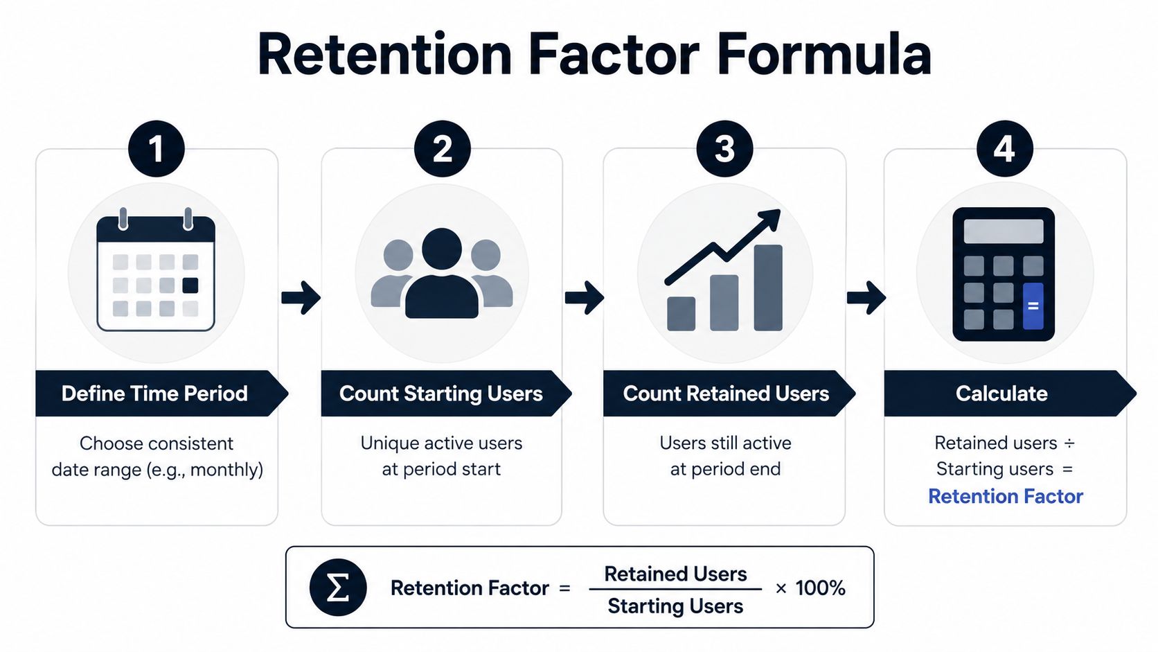
At the simplest level, retention factor is the share of a starting population that's still present at the end of a defined period. In product work, that usually means retained users divided by starting users. The period can be monthly, quarterly, or annual, but the key is consistency. If the time window changes, the number changes too, even when the product experience hasn't.
A clean single-period calculation looks like this. Start with 1,200 active customers at the beginning of the month. By month-end, 960 of those same customers are still active, 140 have churned, 60 expanded into higher plans, and 40 downgraded before later canceling. If you define retention as “starting customers still active at period end,” the retention factor is 960 divided by 1,200, which gives 0.8, or 80%.
Define the denominator carefully
The denominator is not “everyone who touched the product.” It's the population you want to evaluate, usually active users or active accounts at period start. If you include brand-new signups, you blur retention with acquisition. If you exclude dormant accounts without a written rule, you inflate the number.
For SaaS teams, the simplest usable formula is:
Retention factor = retained starting users ÷ starting users
If you need the inverse view, churn is the complement of that measure. Don't mix the two in the same report without labeling them clearly, because stakeholders often read one as if it were the other.
Choose one period and stick to it
Monthly retention is useful when usage patterns are fast and the product has frequent touchpoints. Quarterly retention works better when customer behavior changes more slowly or when billing is less frequent. Annual retention is better for executive reporting, but it hides a lot of motion inside the year.
The period you choose also changes how stakeholders react to the number. A month-to-month dip can look alarming in isolation, but the same pattern may be normal seasonal variance. A longer window smooths that out, but it can also delay action. The right answer is usually not one metric, it's one stable calculation reported on a cadence that matches the business rhythm.
The best retention formula is the one your finance lead, PM, and CS leader would all use the same way without arguing about edge cases.
That's the bar. If you can't explain the formula in one sentence, the spreadsheet probably has too many hidden assumptions.
Cohort-Based and Rolling Retention Calculations
Single-period retention tells you whether the base held up. Cohort retention tells you which users stayed, and that's where the useful diagnosis starts. A cohort groups customers by a shared starting point, usually signup date, but it can also be plan tier, acquisition channel, or onboarding path. That lets you compare like with like instead of averaging together people who joined at different times and had different first experiences.
A cohort table usually tracks the same group across several checkpoints. If a January cohort has strong Month 1 retention but weak Month 12 retention, the product may be good at creating early value but weak at sustaining it. If another cohort starts weaker but flattens later, onboarding may be failing while habit formation eventually recovers. For a deeper framework on building those groups, see the guide on cohort analysis.
A simple cohort table
| Cohort | Month 1 | Month 3 | Month 6 | Month 12 |
|---|---|---|---|---|
| Q1 signup cohort | 82% | 68% | 55% | 41% |
| Q2 signup cohort | 84% | 70% | 58% | 44% |
| Q3 signup cohort | 79% | 66% | 53% | 39% |
The table doesn't just show decline. It shows shape. That shape is what product teams use to decide whether activation, feature depth, or ongoing value delivery needs work.
Rolling retention smooths the noise
Rolling retention looks at whether users come back within a moving window rather than only on a fixed checkpoint. That's useful when product usage is irregular, because a customer can look inactive on a strict monthly cut even though they still return often enough to matter. Rolling windows reduce the chance that a holiday, billing date, or reporting boundary creates a fake drop.
It's especially useful for products where customers dip in and out, like workflow tools, collaboration apps, or analytics platforms. Fixed cohorts are better for comparing lifecycle stages. Rolling retention is better for spotting whether engagement is holding up in the practical world.
If fixed retention is a snapshot, rolling retention is the video clip.
Both have value. The mistake is treating them as interchangeable. One tells you about structured progression. The other tells you about actual usage continuity.
Interpreting Retention Factor for Product Decisions
A retention number only matters if it changes what the team does next. The first mistake leaders make is comparing their number to the wrong benchmark. A self-serve SMB product and an enterprise contract platform won't share the same retention pattern, because usage, switching friction, and renewal dynamics are different. If you compare them anyway, you create false urgency in one place and dangerous comfort in another.
The second mistake is stopping at the overall number. Overall retention can hide two different realities. One segment may be stable and expanding while another is slipping. If you only report the blended average, you'll miss the part of the product that needs intervention.
What the number usually means
When retention falls early in the lifecycle, onboarding is often the first place to look. If users activate but don't stick, the problem may be that the product solved the first task but not the second or third one. If retention stays flat while revenue falls, the issue may be contraction rather than total loss. If retention improves only for feature-adopting users, the feature may be acting as a stickiness lever worth expanding.
A retention trend is not a verdict. It's a clue pointing at the stage of the journey where value breaks down.
That's why revenue-weighted retention often tells a different story than logo retention. A small set of high-value accounts can keep revenue healthy even while low-value accounts churn quickly. The reverse can happen too, where the customer count looks fine but expansion stalls. Execs care about both, but they should not be presented as if they were the same thing.
When you present retention to leadership, anchor it to a decision. Product wants to know where activation is failing. Customer success wants to know which accounts need intervention. Engineering wants to know whether the friction is technical, behavioral, or workflow-related. Retention math is useful only when it helps each group allocate time and resources differently.
Common Retention Calculation Mistakes to Avoid
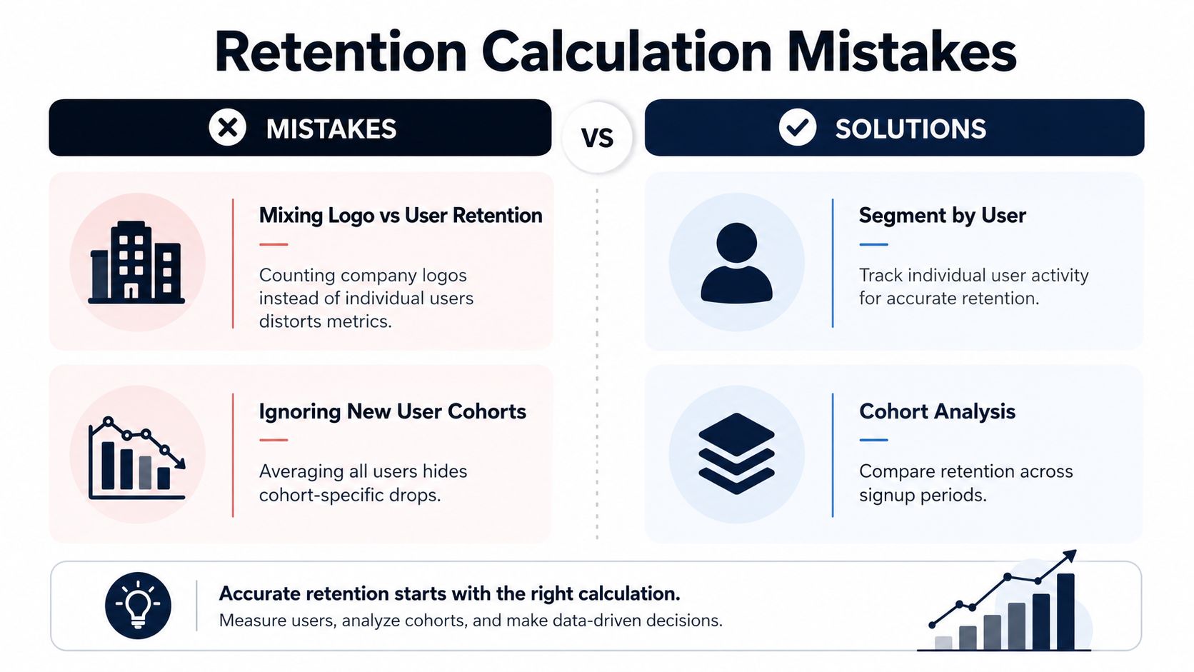
The biggest retention errors are rarely arithmetic. They're definition errors. Teams often mix logo retention with user retention, exclude paused accounts, or count only the accounts that survived long enough to be visible in a later report. That creates an artificially flattering number that can hold up in a slide deck and fall apart in a working session with finance.
A common distortion shows up when billing cycles don't line up with calendar months. If customers start mid-month, then calendar-based reporting can misclassify behavior that really belongs to the next cycle. The same problem appears with annual contracts that span multiple review periods. If the reporting window doesn't match the business event, the metric becomes hard to interpret.
The mistakes that hurt most
- Mixing logos and users: Counting the company as retained while individual users churn gives you two different stories in one metric.
- Dropping dormant accounts: If paused or inactive accounts remain customers in your system, excluding them from the denominator inflates retention.
- Using calendar boundaries blindly: A customer who renews on the 18th shouldn't be forced into a report that treats the 1st as the truth.
- Counting reactivated customers as continuous retention: A customer who left and came back may be valuable, but they're not continuously retained.
- Averaging across uneven cohorts: Old, mature customers can hide a sharp drop in new-user retention.
Those errors are especially dangerous because they're hard to spot in aggregate. The top-line number can look stable while the underlying customer base gets more fragile. That's why retention audits should trace the logic from raw events to the final metric, not just inspect the last dashboard tile.
Practical rule: If a customer can leave, return, downgrade, or pause, write the rule for each state before you calculate anything.
That one habit removes a lot of dashboard drama. It also makes your calculations defensible when someone asks why the retention rate moved after a product change or billing migration.
Tools and Visualizations for Tracking Retention
Spreadsheets are fine for the first pass, but they break down fast when your business has multiple cohorts, billing cycles, and product lines. At that point, the job is not just calculating retention once. It's building a repeatable system that keeps the definition stable and surfaces changes early. That usually means a mix of spreadsheets, analytics tools, and a shared dashboard layer that product, CS, and finance can all read.
For teams that want a broader reporting setup, a good starting point is the guidance on data analytics dashboards. Cohort heatmaps work well for product teams because they make drop-off patterns obvious at a glance. Trend lines are better for executives who want a quick directional view. Survival curves help analysts understand how long users remain active before churn risk rises.
What to track on a regular cadence
- Cohort retention by signup period: Use this to compare onboarding quality across launch windows.
- Rolling retention: Use this to smooth noisy usage patterns and spot continuous engagement.
- Revenue-weighted retention: Use this when finance and growth need the same picture.
- Segmented retention: Break it out by plan tier, channel, or feature adoption to avoid averages that hide risk.
Cadence matters as much as visualization. Weekly checks are often too noisy to support good decisions, especially for longer sales cycles. Quarterly-only reviews can miss the moment when a cohort starts to drift. Teams need a cadence that sits between those extremes and matches how often customers engage.
SigOS fits naturally into that kind of workflow as one option for connecting usage signals with support tickets, chat transcripts, and churn risk patterns in a single view. That matters because retention is rarely one metric in isolation. The teams that act fastest are the ones that can see behavior, feedback, and revenue impact together instead of in separate tools.
If you want retention math that holds up in board meetings and product reviews, use a system that ties the formula to real customer behavior. SigOS helps teams connect usage signals, support noise, and revenue impact so retention work isn't just reporting, it's prioritization. Visit the product if you want a clearer way to spot where retention is leaking and what to fix first.
Keep Reading
More insights from our blog



Ready to find your hidden revenue leaks?
Start analyzing your customer feedback and discover insights that drive revenue.
Start Free Trial →