User Experience Metrics: A 2026 Guide to Growth
Discover the user experience metrics that matter most—measure behaviors & attitudes to reduce churn and increase revenue.

**Every ****1 invested in user experience can return up to **100, a benchmark that implies a 9,900% ROI and turns UX measurement into a finance conversation, not a design one. That's why the right user experience metrics aren't the prettiest charts in your dashboard, they're the signals that explain retention, expansion, support burden, and churn before those outcomes hit revenue. One 2026 industry summary says 55% of companies are already conducting UX testing, which is a strong sign that measurement has moved from research theater into product operations (DesignRush UX statistics).
A second number should make any SaaS leader uncomfortable. 52% of customers have stopped buying from a brand after a bad experience, and another industry summary says 70% of customers abandon purchases because of bad user experience (Maze UX statistics roundup). If half your buyers will walk after friction, then measuring surface-level sentiment without behavior, or behavior without business impact, is just a slower way to miss the same leak.
The useful way to think about user experience metrics is simple. They sit between what users do, what users say, and what the business earns or loses. If a metric doesn't help you explain a change in task success, retention, conversion, or support load, it's probably vanity dressed up as insight.
For a concise framework on translating design work into business language, how to quantify design ROI is worth keeping nearby. And if your team already has reporting in place, the discipline only works when those signals are visible in one place, which is why many teams pair UX measurement with an internal reporting layer like metrics and reporting.
Why User Experience Metrics Are a Revenue Question
UX teams once justified measurement as a usability exercise. That framing breaks down in a SaaS funnel, where a small amount of friction can affect churn, support volume, and expansion behavior at the same time. The commercial case is already clear from the benchmark above, **1 in UX can return up to **100, so the key question is not whether measurement matters, but which measurement helps you make a better revenue decision.
Revenue is the outcome, UX is the lever
The strongest product organizations do not ask whether a screen is “good.” They ask whether the experience helps people complete the job fast enough to stay, buy more, or recommend the product later. A task success dashboard belongs in the same room as churn reviews and pipeline discussions, because poor experience has direct commercial fallout.
A useful operating rule is to group every UX metric into three lenses, behavioral, attitudinal, or outcome-linked. Behavioral measures show where friction appears, attitudinal measures show how people interpret it, and outcome-linked measures show whether the friction affects revenue, retention, or cost. If those three do not line up, the safest assumption is that you are looking at an incomplete signal, not a clean result.
Practical rule: if a metric cannot be tied back to retention, support cost, conversion, or expansion, it deserves less dashboard space.
That framing is why modern teams treat UX measurement as an operating discipline. The point is not to collect more data, it is to rank the experience issues most likely to move revenue in the next planning cycle. Teams that use metrics and reporting well keep those signals in one place, then connect them to the economics of the funnel. That same discipline is what makes how to quantify design ROI useful, because it forces design work into the language of business impact.
If a CEO asks why a checkout issue matters, the right answer is not that users dislike it. The right answer is that friction changes abandonment, and abandonment changes revenue. AI-driven behavioral analysis closes that loop faster by separating cosmetic complaints from friction that carries dollar impact.
The Behavioral vs Attitudinal Split
Behavioral and attitudinal metrics answer different questions, and teams get into trouble when they let one stand in for the other. Behavioral metrics show what users do in the product. Attitudinal metrics capture what they think about doing it. A clean-looking survey score can hide a broken flow, and a smooth-looking flow can still leave people irritated enough to churn later (Userlytics UX metrics glossary).
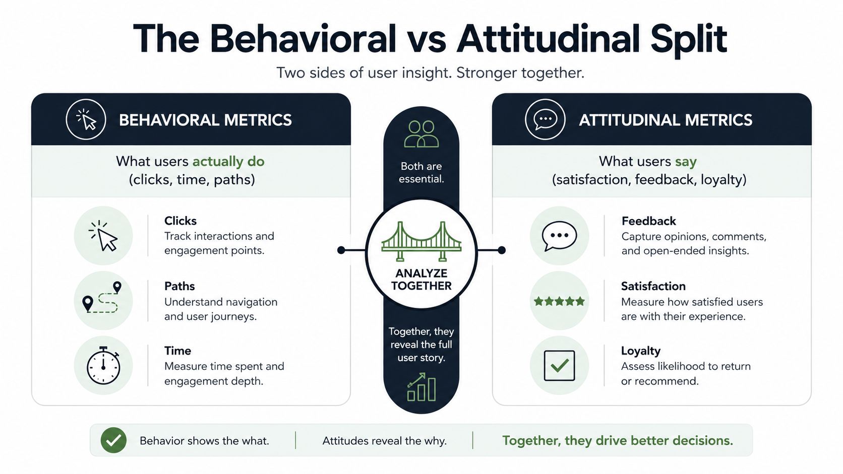
Why checkout data can lie if you only read one side
Take a checkout flow. Behavioral data might show repeated backtracking, a long pause on shipping selection, or a spike in form errors. Attitudinal data might show a decent CSAT because the customer eventually got through and doesn't want to relive the pain in a survey. Those aren't conflicting truths, they're different levels of the same problem.
The right sequence is to use behavior to diagnose and attitude to validate. If task success is weak but CSAT is fine, the experience may be bad enough to waste team time without yet triggering visible complaints. If CSAT is weak but task success is strong, the interface may be usable but still exhausting, confusing, or trust-damaging. That distinction matters because teams often protect a pleasant-looking score long after it stops predicting healthy product usage.
A practical way to read the two together is to ask one question at the end of each flow. Did the user complete the task efficiently, and how did they feel about doing it? That single split keeps a team from mistaking silence for satisfaction.
For teams building AI-assisted feedback loops, MyMentions' guide to AI sentiment for marketers is a useful reminder that attitude analysis needs context, not just scorecards. The same logic applies in product work, sentiment is informative, but it doesn't replace observed behavior.
Use behavior analytics only works when you treat the clickstream as evidence, not as the whole story.
The Core UX Metrics Every Product Team Should Track
A dashboard gets useful only after you stop putting everything on it. The core user experience metrics are the ones that survive scrutiny because they tell you whether users can complete work, how hard that work is, and whether they like the result enough to come back. Anything else is usually a supporting metric, a diagnostic overlay, or a vanity number pretending to be strategic.
The metrics worth keeping
Task success rate is the cleanest measure of whether people can finish the job. It's the first metric to inspect when a core flow breaks because it separates successful completion from partial completion or workarounds. The common misuse is to treat completion as success even when users needed help, guessed, or recovered from errors along the way.
Time on task shows speed, but only when compared against a baseline and the same context. Slow is not always bad, and fast is not always good. The trap is reading raw time as efficiency without asking whether the user was thinking carefully, stuck, or navigating a needlessly long path.
Error rate tracks slips, mistakes, and system-driven confusion. It matters most when users recover, because recovery can hide a real design flaw. A flow with frequent near-misses is often more dangerous than one with obvious failures, since the team may assume the problem is solved.
Abandonment or drop-off is the early warning signal for hidden friction. The misuse is to celebrate a completed journey without checking how many users exited before the finish line. If a path is leaking at one step, the fix is usually more specific than the headline metric suggests.
CSAT tells you how people felt about a specific interaction, usually right after it happened. It's useful, but it's narrow. The trap is using it as proof that the experience worked, when it really just says the user was willing to answer a survey.
NPS is a relationship metric, not a product flow metric. It captures loyalty and advocacy across the broader customer relationship, which makes it valuable for stakeholder conversations and poor for pinpointing a broken screen. The misuse is to expect NPS to tell you which step to redesign.
CES is best when you want to understand perceived effort at a key moment. It's especially useful when the question is not “did they like it?” but “did this feel like work?” That makes it a strong complement to behavioral signals.
SUS still earns its place in deeper studies. It's useful when you need a standardized usability read on a product or a major flow, especially in quarterly research where comparability matters more than speed. The misuse is to treat it as a replacement for task-level evidence.
A high satisfaction score does not excuse a broken flow, and a smooth flow does not prove the experience feels good. Keep both in view.
| Metric | Category | What It Measures | Common Misuse |
|---|---|---|---|
| Task success rate | Behavioral | Whether users complete a task correctly | Counting partial completion as success |
| Time on task | Behavioral | How long the task takes | Reading speed as quality without a baseline |
| Error rate | Behavioral | Mistakes, slips, and failed inputs | Ignoring recoveries and near-misses |
| Abandonment | Behavioral | Where users leave a journey | Judging the full funnel from the finish only |
| CSAT | Attitudinal | Satisfaction with a specific interaction | Treating a local score as proof of usability |
| NPS | Attitudinal | Loyalty and recommendation intent | Using it to diagnose a broken screen |
| CES | Attitudinal | Perceived effort | Ignoring whether effort came from product design |
| SUS | Attitudinal | Standardized usability perception | Rewriting the survey and breaking comparability |
Instrumenting UX Metrics Across Web, Mobile, and AI Surfaces
The metric is only as good as the instrumentation behind it. If the event model is sloppy, if identities do not reconcile, or if surveys land at the wrong moment, the cleanest dashboard in the world will still mislead you. Product teams need product analytics, session replay, heatmaps, in-app surveys, support signals, and a way to connect them across surfaces before they can trust the numbers.
Start with the minimum event grammar
At the event level, the core taxonomy is straightforward, task start, step, success, failure, and error. That structure lets teams measure completion without forcing the data model to fit one interface pattern. It also makes web, mobile, and chat journeys comparable without inventing a new schema for each one.
Surveys should sit close to the moment of truth. Trigger them after a task, after support contact, or after a meaningful feature interaction, not days later when memory has faded. In-app responses matter because they capture the experience while users still know exactly what they just did.
Qualitative signals matter just as much. Support tickets, chat transcripts, and sales calls often reveal the friction in the user's own language, which is more actionable than a generic score. When those sources repeat the same complaint, analysts are not looking at isolated noise, they are looking at a pattern.
Reconcile identity before you draw conclusions
Cross-surface measurement fails when teams treat each channel as its own truth. A user may start on web, continue on mobile, and finish through an assistant or support channel, but the analytics system may split that into three unrelated sessions. Without identity reconciliation, task completion gets undercounted and frustration gets misattributed.
AI-assisted interfaces complicate the picture. They can reduce visible clicks without improving the underlying outcome, which means a metric may look cleaner while the journey gets less reliable. The only defense is to keep behavioral events, survey signals, and support evidence linked to the same user journey, then compare that journey to the revenue impact it creates or destroys.
For a practical view of how AI changes customer experience measurement, AI driven customer experience guide 2026 is a useful reference point. A measurement stack still has to follow the journey, not the channel.
Reporting only works when the system can connect signals instead of flattening them into separate tables. A clear ROI template for UX and product analytics helps teams turn those linked signals into a dollar view of friction, instead of treating metrics as a scorecard with no business context.
The False-Positive Problem in Cross-Surface UX Measurement
Classic user experience metrics were designed for discrete interactions. In 2026, users don't behave that neatly. They move from web to mobile to chat, sometimes with an AI assistant in the middle, and that creates a measurement problem that most dashboards still hide.
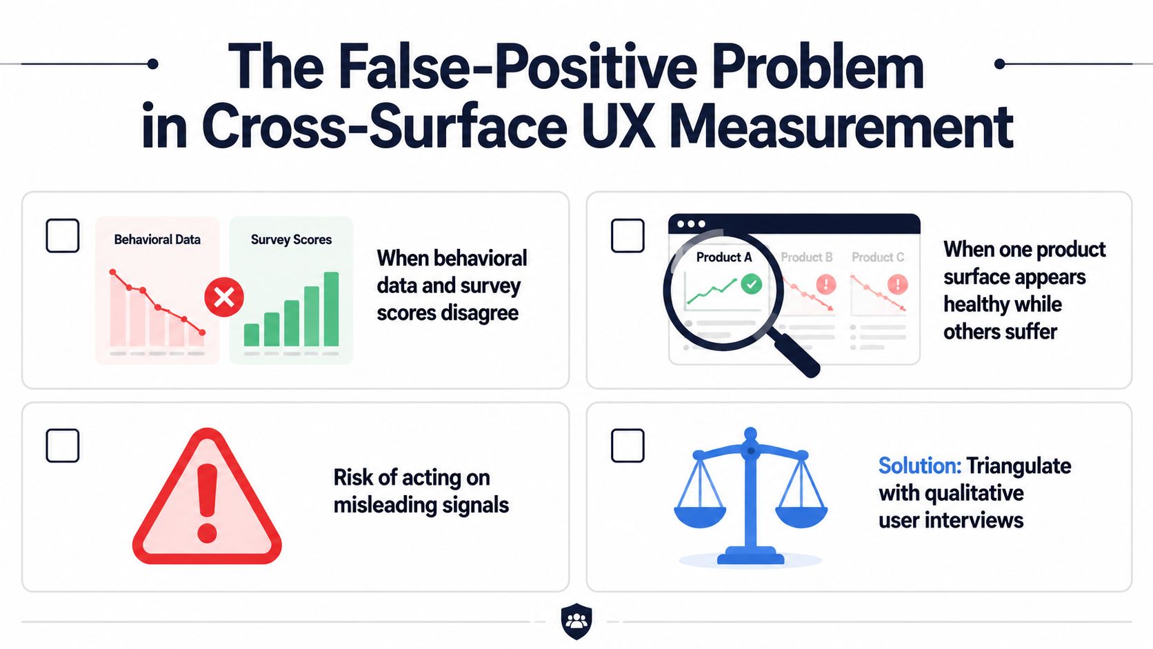
When one surface looks healthy and the journey still fails
A mobile team may celebrate a faster task time while the web channel starts generating more support tickets. An AI assistant may lower click counts while users still fail to reach the right outcome. Both situations produce a false positive if you only inspect the metric that improved.
The fix is not to abandon measurement. It's to insist on cross-channel reconciliation before anyone ships a conclusion. Behavioral metrics need to be read against the end-to-end journey, not the isolated surface, and outcome-linked KPIs have to be the final judge of whether the change mattered.
A useful checklist looks like this.
- Conflicting signals: If behavioral data and survey scores disagree, don't average them away, investigate the mismatch.
- Surface drift: If one product surface improves while others degrade, treat the improvement as incomplete.
- Misleading wins: If a metric improves but support, churn, or escalation patterns worsen, the metric is not the full story.
- Qualitative confirmation: If the numbers look suspicious, interview users before you move roadmap priority.
Balanced view: the fastest metric movement is not always the most meaningful one.
Minimum sample thresholds matter too, even when the data looks dramatic. Small movements can be noise, especially when the change only appears on one surface or one cohort. The safest operating habit is to wait for multiple signals to point in the same direction before you label anything a win.
From Friction Signals to Dollar Impact
A friction signal becomes valuable only after you connect it to a cost center. Support load, churn risk, and expansion potential are the three places UX problems usually show up in SaaS, and they don't show up equally. A confusing flow can create tickets, a broken workflow can increase churn, and a smooth upgrade path can open expansion.
Convert symptoms into a prioritization logic
The workflow I trust starts with behavior. Session replay shows where users hesitate, repeat actions, or backtrack. Support transcripts show what they complained about in plain language. Sales and success calls show whether the same issue is blocking a higher-value deal or renewal conversation.
Once those signals line up, the question changes from “is this a problem?” to “how much is it worth fixing?” That's where a product-intelligence layer changes the cadence. A platform like SigOS is built to continuously analyze support tickets, chat transcripts, sales calls, and usage metrics, then turn those patterns into issue creation with revenue impact scores and churn-risk alerts.
The point isn't to automate judgment out of the process. It's to give product and growth teams a daily triage mechanism so they stop waiting for quarterly research cycles to surface the obvious. When a friction cluster maps to support volume and churn risk, that combination is much easier to defend in roadmap review than a lone sentiment score.
If you want a framework for making the business case visible, the earlier section on return on investment template logic pairs naturally with this kind of prioritization. Finance usually doesn't fund “better usability.” Finance funds lower churn, lower support cost, and improved expansion odds.
The deeper insight is that user experience metrics should not end at diagnosis. They should feed a decision system that assigns a dollar-shaped priority to the problem, so the team can act on friction that moves the business.
A Quarterly Playbook for Prioritizing UX Improvements
The cleanest UX program is not the one with the most metrics. It's the one with the fewest metrics that still force a real decision. For most SaaS teams, that means cutting the dashboard, reviewing signals on a weekly cadence, and only shipping fixes when the movement is big enough to matter financially.
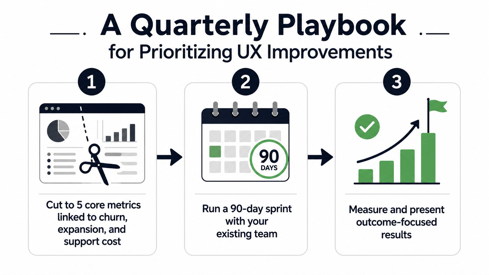
Step 1 Cut the dashboard hard
Keep the metrics that map directly to churn, expansion, and support cost. Everything else should either support those signals or stay out of the main review. A dashboard with too many metrics creates a political problem, because every team can find one number to defend and none of them have to agree on action.
Step 2 Run a 90-day sprint with the team you already have
Weekly triage is enough for most product organizations. Review behavioral data, attitudinal signals, and qualitative evidence together, then rank the issues by revenue impact instead of by noise or hierarchy. If you already have a tool that scores issues by customer value or risk, use it to reduce debate time and make the queue more consistent.
A practical weekly review can look like this.
- Behavioral signals: task success, time on task, errors, and abandonment.
- Attitudinal signals: CSAT, NPS, CES, and SUS where appropriate.
- Qualitative signals: support language, chat themes, and sales objections.
- Outcome signals: churn risk, ticket volume, and expansion indicators.
Step 3 Decide with both movement and money in view
Don't ship every improvement just because a metric twitched. Act when the movement crosses your threshold and the dollar impact clears a defined floor. If the movement is small, log it and revisit. If the movement is large but the business impact is unclear, investigate before you commit roadmap time.
Five traps keep teams stuck.
- Vanity metrics: numbers that rise nicely but change nothing.
- Single-surface thinking: treating one channel as the whole journey.
- Survey fatigue: asking so often that responses stop reflecting reality.
- Ignoring qualitative signals: discounting the user's own words.
- No after-state measurement: shipping a fix and never checking whether it worked.
The best quarterly UX review ends with fewer charts, clearer ownership, and a shorter list of problems that actually deserve engineering time.
If your team wants a tighter way to connect friction to revenue, SigOS gives product and growth leaders a way to prioritize customer feedback using continuous behavioral analysis, revenue impact scoring, and churn-risk alerts. Visit SigOS and use it to turn UX measurement into a daily decision process instead of a quarterly guessing game.



Ready to find your hidden revenue leaks?
Start analyzing your customer feedback and discover insights that drive revenue.
Start Free Trial →