Your SaaS Key Performance Indicator Report Template
Download our free key performance indicator report template. A practical guide to help your SaaS team customize, automate, and interpret KPIs that drive growth.

Tired of hunting for the right key performance indicator report template? I’ve been there. That's why we built one from the ground up, specifically for SaaS teams. It’s pre-loaded with the metrics that actually matter and designed to get your product, support, and growth teams speaking the same language. Think of it less as a spreadsheet and more as a framework for turning scattered data points into a coherent story about your performance.
Your All-In-One SaaS KPI Report Template
A good KPI report does more than just track numbers—it’s a powerful communication tool. In a SaaS business, product, support, and growth are deeply intertwined. When reporting is disconnected, you get silos, duplicated effort, and a ton of missed opportunities. Our downloadable template is designed to tear down those walls by creating a single source of truth that everyone can rally around.

Unifying Teams With A Shared Framework
I've structured this template with separate tabs for each key function—Product, Support, and Growth—but the magic happens when they roll up into an automated summary dashboard. This setup gives each team the space to focus on their specific metrics while making sure the big-picture insights are visible to all. A real-world example? The support team’s data on rising ticket volume for a specific feature can directly inform the product team's next sprint planning, and everyone sees that connection on the main dashboard.
This integrated view helps you finally answer those critical cross-functional questions:
- How did our latest feature release (Product) affect customer satisfaction scores (Support)?
- Are our new marketing-qualified leads (Growth) submitting more high-priority support tickets (Support)?
- Which churn drivers identified in exit surveys (Product) are hitting our monthly recurring revenue the hardest (Growth)?
Connecting these dots is how you shift from constantly putting out fires to building a proactive, data-informed strategy. It’s no surprise that KPI reporting has become standard practice; it provides these kinds of actionable insights by pulling together different data sources, which ultimately sharpens decision-making across the entire business. You can explore how SigOS helps analyze and connect this data to see the broader impact.
To give you a clearer idea, here’s a quick breakdown of some of the essential KPIs included in the template for each team.
Essential KPIs For SaaS Teams At A Glance
This table offers a quick reference for the most critical KPIs that product, support, and growth teams should be tracking. These are the metrics we’ve baked into the downloadable template.
| Team | Key Performance Indicator (KPI) | What It Measures |
|---|---|---|
| Product | Feature Adoption Rate | The percentage of active users who engage with a specific feature. |
| Product | Customer Churn Rate | The percentage of customers who cancel their subscription over a period. |
| Support | First Response Time (FRT) | The average time it takes for support to provide an initial response to a ticket. |
| Support | Ticket Resolution Rate | The percentage of support tickets solved by the team. |
| Growth | Monthly Recurring Revenue (MRR) | The predictable total revenue generated by all active subscriptions in a month. |
| Growth | Customer Acquisition Cost (CAC) | The total cost of sales and marketing to acquire a new customer. |
These metrics provide a solid foundation, but the real insights come from combining them with qualitative analysis.
Beyond The Numbers: Adding The "Why"
One of the biggest traps in KPI reporting is getting lost in the quantitative. Numbers tell you what is happening, but they rarely explain why. That’s why our template has dedicated sections for qualitative analysis and an executive summary.
These narrative elements are absolutely essential when you're presenting to leadership or other stakeholders who don't have time to wade through raw data. The goal isn't just to show charts; it's to deliver a complete picture that blends hard numbers with human insight. That's how a report becomes a genuine tool for strategic alignment.
Making the Template Your Own
Think of a downloadable KPI report template as a great starting point, not the finished product. Its true power isn't unlocked until you shape it to fit the unique challenges and goals of your own business. A generic report gives you generic insights. A report you've tailored yourself becomes a compass, pointing you directly toward what matters most.
The whole process starts with one simple question: "What are we actually trying to accomplish this quarter?" The answer is going to be different for every team. For a product team rolling out a new module, feature adoption rate and user engagement time are probably everything. Their version of this template will have those KPIs front and center, maybe even broken down by user cohort or subscription plan.
Now, contrast that with a support team laser-focused on improving the customer experience. Their main obsession might be slashing the First Response Time (FRT) from two hours down to under 60 minutes. Their report will highlight ticket volume trends, agent performance, and CSAT scores, while pushing other, less relevant metrics into the background.
Aligning Metrics With What You're Actually Trying to Do
The point isn't just to track data; it's to track the right data. Before you touch a single cell in the template, make sure every metric you keep is tied directly to a specific business outcome. This is the single best way to keep your report from becoming a "data graveyard"—a cluttered dashboard full of numbers nobody looks at.
Here’s a practical way I've seen teams approach this:
- Goal: Reduce Churn. Your go-to metrics should be churn rate, customer health scores, and maybe something more granular like the number of support tickets from at-risk accounts.
- Goal: Increase Expansion Revenue. You'll want to prioritize upsell/cross-sell rates, feature adoption by high-value customers, and, of course, Net Revenue Retention (NRR).
- Goal: Improve Product-Market Fit. Here, you should be looking closely at Net Promoter Score (NPS), feature request volume, and user retention by cohort.
When every KPI is linked to a strategic priority, the report starts telling a coherent story. It stops being a list of numbers and becomes a narrative about your team's progress.
Setting Targets That Are Both Realistic and Ambitious
Once you've picked your metrics, you need to give them targets. A metric without a target is just a number floating in space. A good target stretches the team but doesn't feel impossible. A common mistake I see is teams picking arbitrary numbers out of thin air, like "let's increase engagement by 20%."
Dig into your performance over the last six months. What was your best month? What was the average? This context gives you a solid foundation for setting future targets that will actually motivate your team instead of demoralizing them.
Customizing the Look and Feel
The final touch is making the report look like it came from your company. This isn't just about making things pretty; it's about professionalism and ownership. A report that carries your brand's identity automatically has more authority and gets taken more seriously in meetings.
Start with these simple but high-impact changes:
- Pop in Your Logo: Swap out the placeholder logo for your own. Stick it in the header on every page for consistency.
- Use Your Brand Colors: Change the colors in the charts, graphs, and headers to match your company's palette. Most spreadsheet tools let you save a custom color theme to make this easy.
- Switch to Your Brand Fonts: Change the default fonts to your company's standard typography. It's a subtle tweak that makes a big difference in creating a cohesive feel.
This level of polish sends a clear message: this report is an official, important document. When you present data that's not only insightful but also professionally designed, you boost the credibility of both the numbers and the team behind them. This is how you turn a simple template into a powerful tool that helps drive your business forward.
Automating Your KPI Data and Reporting Flow
A customized KPI report is a fantastic starting point, but its power fizzles out fast if you're stuck manually updating it every week. Let's be honest, the real goal is to spend your time digging for insights, not just copying and pasting numbers from one platform to another. This is where automation comes in, transforming your report from a static document into a living, breathing dashboard that actually works for you.
Think about it: manually punching in data isn't just a time sink; it's a huge risk for human error. One misplaced decimal or a copy-paste slip-up can send your team on a wild goose chase, either fixing problems that don't exist or celebrating wins that aren't real. Automation is your safety net. It ensures your data is accurate and consistent, freeing up your team to focus on making smart decisions instead of doing mindless data entry.
The whole process really boils down to three key stages: download the template, customize it with your specific KPIs, and then analyze the results.
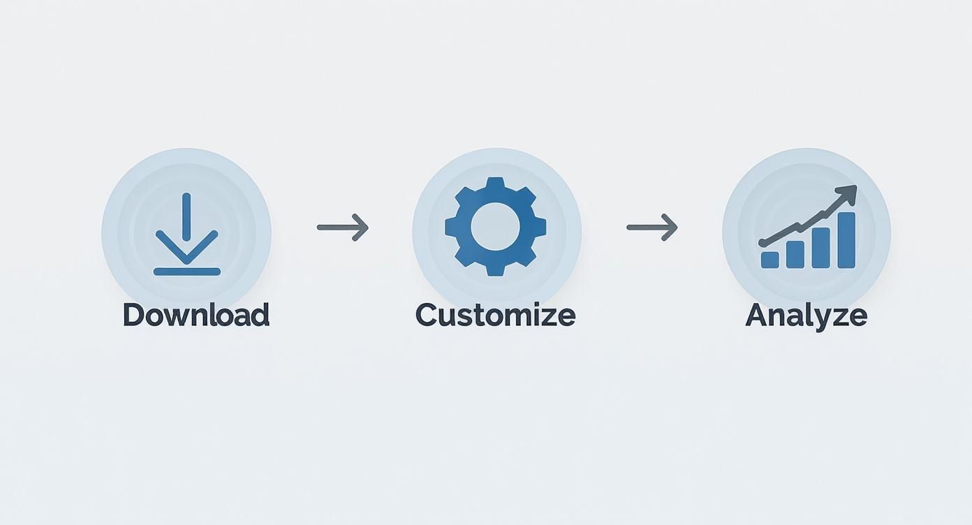
This workflow shows how you move from a generic starting point to a genuinely powerful analytical tool. The real magic happens after that initial setup.
Connecting Your Data Sources
First things first, you need to build a bridge from your report template to wherever your data actually lives. For most SaaS companies, this means pulling information from a handful of different, essential platforms.
Your most critical data sources probably include:
- Analytics Platforms: Something like Google Analytics is a staple, giving you the lowdown on user behavior, session times, and conversion funnels.
- Support Desks: Tools like Zendesk or Intercom are goldmines for support ticket volume, first response times, and CSAT scores.
- CRMs: Your Customer Relationship Management system is where you'll find everything about lead conversion, customer lifetime value (CLV), and the health of your sales pipeline.
The main challenge is getting these separate systems to talk to your central KPI report. The good news is, you don't need a degree in software engineering to make it happen. There are several ways to get this done, from simple connections to more sophisticated setups. For those dealing with a lot of complex data streams, it's worth understanding how to structure these connections properly. You can dive deeper into that topic by checking out our guide on how to build data pipelines.
Choosing Your Automation Method
Once you've mapped out your data sources, it's time to pick the right tool for the job. There's no single best answer here; the ideal method depends entirely on your data's complexity, your team's technical skills, and the tools you already have in your stack.
If your team lives and breathes in Google Sheets, Google Apps Script is an incredibly powerful option. You can write custom functions that automatically fetch data from APIs. For example, a simple script could pull the daily ticket count from your Zendesk API and drop it into the right cell of your report every morning at 9 AM. This route requires a bit of coding know-how but gives you a ton of flexibility.
But what if coding isn't your jam? No problem. No-code automation platforms are a complete game-changer here.
You can get a sense of how powerful these connections can be by looking at examples like automating video creation with Zapier integration, which shows how different platforms can be wired together to create slick, automated workflows.
Building a Real-Time Dashboard
While an automated spreadsheet is a massive leap forward, the ultimate prize for many teams is a real-time, visual dashboard. This is where dedicated business intelligence (BI) and KPI tracking tools really shine.
These dashboards pull data from multiple sources to create a single, interactive view of your business's health. You're not just looking at numbers in a spreadsheet; you're seeing trends and patterns come to life.
This approach is quickly becoming the norm. In fact, roughly 41% of enterprises are now using dedicated KPI tracking software to get away from the old-school spreadsheet grind. These platforms offer live updates, beautiful custom visuals, and even predictive analytics to help you spot what's coming around the corner.
Tools like Google Data Studio, for example, let you build stunning, personalized dashboards that can pull in data from over 800 different sources. That gives you a truly complete picture of your entire operation. By investing in automation, you're not just building an efficient report; you're creating a single source of truth that your whole organization can rely on.
Choosing Metrics That Actually Matter
Look, a slick, automated report template is great, but it’s just the container. The real power comes from what you put inside it. The metrics you choose to track are the engine that actually moves your business forward. Without the right key performance indicators, even the most beautiful report is just noise.
The goal here is to get past the vanity metrics and zero in on the numbers that have a real, tangible impact on your company's health. For any SaaS business, that means thinking about KPIs in terms of function—Product, Support, and Growth—and then understanding how they all connect.
This isn’t a new concept. Take the hospitality and tourism industry, for example. They live and die by their KPIs. They've mastered using metrics like Revenue per Available Seat Hour (RevPASH) to figure out exactly how much income each seat generates, every hour. That single data point helps them optimize everything from staffing schedules to happy hour pricing.
Core Metrics for Your Product Team
Your product team is building the very thing you sell, so their KPIs need to reflect more than just shipping new stuff. It’s not about how many features you release; it's about releasing the right features that people actually use and get value from. Good metrics tell you what's working and, more critically, what isn't.
Two of the most telling product metrics I always look at are:
- Feature Adoption Rate: This is simply the percentage of your active users who are engaging with a specific feature. If that number is low, it’s a huge red flag. It could mean the feature is hard to find, poorly designed, or just doesn't solve the problem you thought it did.
- User Engagement Score: This is usually a blend of a few different data points, like how often someone logs in, how long their sessions are, and how many key actions they take. It gives you a much richer story about user behavior than a simple daily active user count ever could.
Of course, for any SaaS business, customer churn is the big one. If you want a masterclass on tackling this, check out this B2B SaaS playbook on how to reduce customer churn. You have to get to the "why" behind your churn—is it missing features, clunky UX, or pricing? That’s where the real insights are.
Essential KPIs for Your Support Team
Your support team is sitting on a goldmine of customer feedback and product friction points. Their KPIs shouldn't just be about efficiency; they're a direct line to customer health and satisfaction. A great support experience can be one of your strongest retention tools.
Don't get bogged down in basic ticket counts. Instead, focus on the metrics that reveal the quality and speed of your service.
Another crucial one is First Response Time (FRT). We live in an on-demand world, and customers expect fast answers. A low FRT shows you respect their time, and that alone can dramatically improve their perception of your entire company.
Growth Metrics That Drive Revenue
For your growth team, the mission is crystal clear: bring in money. This means they need to look past top-of-funnel fluff like website visits and focus on what truly hits the bottom line. Every single KPI should help answer the question, "How is this making us money?"
Your most important growth metrics will almost always be these three:
- Customer Acquisition Cost (CAC): This is the total you spend on sales and marketing divided by the number of new customers you brought in. If your CAC is climbing, it's a sign your acquisition channels are getting less effective or more expensive.
- Customer Lifetime Value (CLV): This number predicts the total revenue you can expect from a single customer over their entire relationship with you. The magic happens when you compare it to your CAC. A healthy SaaS business should have a CLV that is at least 3x its CAC.
- Lead-to-Customer Conversion Rate: This shows you what percentage of your qualified leads actually turn into paying customers. It's a direct reflection of how well your sales process and product messaging are working.
Ultimately, building a powerful KPI report is an act of deliberate choice. Every metric needs to earn its spot by giving your teams an insight they can act on. By focusing on these core indicators across product, support, and growth, you build a reporting framework that gets everyone pulling in the same direction.
Turning Data Into A Compelling Performance Story
So, you've automated your KPI report and the data is flowing in. That's a huge win, but it's only half the battle. Raw numbers on a spreadsheet are just noise. The real magic happens when you start interpreting that data—weaving it into a story that explains what’s happening in the business, why it matters, and what to do next.
This is the step that elevates a simple data file into a tool that drives smart decisions.

The trick is to look beyond individual metrics. No KPI lives in a silo. Your job is to connect the dots and uncover the cause-and-effect relationships that paint a complete picture of performance.
From Correlation To Causation
Start by looking for patterns across different teams. Did a spike in support tickets directly follow last month's big feature release? If you see that, you've just found a crucial link between a product decision and a support outcome. That connection is where your story begins.
Here’s a classic scenario I’ve seen play out:
- The Data: The report flags a 15% drop in the Feature Adoption Rate for a new tool. At the same time, the support team’s data from Zendesk shows a 30% jump in tickets tagged "UI confusion."
- The Story: The new feature isn't failing because it lacks value. It's failing because the interface is confusing, which sends users straight to the support team instead of exploring the tool.
- The Action: The product team now has a clear mandate. They don't need to scrap the feature; they need to prioritize a UX redesign for the next sprint.
This approach flips the script from reactive fire-fighting to proactive, data-informed strategy. You're no longer just reporting numbers; you're explaining what they mean for the business.
Your report’s executive summary is where this storytelling really counts. Never expect your audience to connect the dots for you. State the key insight upfront, explain the contributing factors you've uncovered, and propose a clear, actionable next step.
Visualizing The Narrative
How you present your data is just as important as what it says. Good data visualization guides your audience through the story you’re telling, making complex information digestible and highlighting what's most important. The goal isn't just to make pretty charts; it's to focus the conversation.
Effective visual storytelling boils down to a few key principles:
- Pick the Right Chart: A line chart is perfect for showing trends over time, like Monthly Recurring Revenue (MRR). A bar chart works better for comparing distinct categories, like ticket volume by product area.
- Keep It Clean: Get rid of the clutter. Ditch the extra gridlines, labels, and colors that don't add value. The data should be the hero, not the decoration.
- Highlight What Matters: Use a pop of color or a callout box to draw the eye to a critical data point—like a sudden drop in user engagement or a new all-time high in conversions.
Choosing the right visuals makes your narrative stick and your conclusions much harder to ignore. To build reports that really land with stakeholders, check out these expert tips on the best practices for data visualization that can help you turn data into a persuasive story.
Adding Qualitative Context
Finally, remember that numbers only tell part of the story. The "why" behind the data often lives in qualitative feedback—comments from support tickets, notes from sales calls on Intercom, or customer exit surveys. This is the context that gives your quantitative data real meaning.
Don't be afraid to pull this qualitative feedback directly into your report. If you're showing a rise in customer churn, pair that chart with a few anonymized quotes from exit surveys explaining why those customers left.
This blend of hard numbers and human experience is incredibly powerful. It transforms your key performance indicator report from a simple tracker into an engine for genuine strategic change.
Common Questions About KPI Reporting
Even with the best KPI report template, questions are going to come up. As your teams lean more into data to make decisions, you'll naturally run into new challenges. Here are a few of the most common roadblocks I've seen and how to work through them.
Don't sweat it if these questions sound familiar. It’s actually a great sign. It means your team is genuinely digging into the data and thinking critically about what the numbers are telling them.
How Often Should We Update And Review Our Report?
There’s no magic number here. The right frequency really depends on the metrics themselves and the natural pace of your business. Some KPIs are fast-moving and need a close eye, while others tell their story over a much longer period.
I find it helpful to group metrics into different review cycles:
- Daily or Weekly: This is for your operational, "pulse check" metrics. Things like support ticket volume, server uptime, or daily active users (DAU) change fast and can be early warning signs of bigger issues.
- Monthly: This is the sweet spot for most tactical metrics that track progress toward your quarterly goals. Think Monthly Recurring Revenue (MRR), Customer Acquisition Cost (CAC), and lead-to-customer conversion rates.
- Quarterly: Save this review for the big, strategic KPIs. This is where you zoom out to look at things like Customer Lifetime Value (CLV), Net Revenue Retention (NRR), and overall market share. These don't change overnight, but they dictate your long-term strategy.
My best advice? Set a clear reporting schedule and treat it like any other important meeting. Consistency is what turns reporting from a chore into a powerful strategic habit.
What If We Miss A Target?
First off, don't panic. Missing a target isn't a failure—it's a data point. It's an opportunity to learn something you didn't know before. The absolute worst thing you can do is ignore it or try to spin the numbers. A missed KPI is simply a flare gun, signaling that part of your strategy or execution needs a closer look.
When a metric turns red, the report has done its job. It flagged the problem. Now your team’s job is to figure out the "why" behind it.
The immediate question shouldn't be "Who is to blame?" It should be "What assumption was wrong?" Did we misjudge the market's need for a feature? Did a competitor’s new campaign hit harder than we expected? Is the new user onboarding flow more confusing than we thought?
A missed target should be the beginning of a productive conversation, not the end of one. It’s an invitation to analyze what happened, adjust your approach, and try again. That’s how data-driven teams get better.
How Do We Handle Conflicting Data?
It happens all the time. You’ll pull up a report and see two KPIs that seem to be telling opposite stories. For example, your lead conversion rate is soaring, but your customer churn rate is also creeping up. That's not a contradiction; it's a puzzle waiting to be solved.
More often than not, this kind of situation points to a gap between what you're promising and what the product is delivering. Maybe your marketing is so good that it's pulling in customers who aren't actually the right fit for the product. They sign up, get disappointed, and leave.
When you see conflicting numbers, get the right people in a room. The growth team needs to understand the retention data, and the product team needs to see which new customers are churning the fastest. A great key performance indicator report template doesn't just show numbers; it sparks these crucial cross-functional conversations that uncover the real story.
Ready to turn scattered feedback into a clear, revenue-driven roadmap? SigOS is an AI-driven intelligence platform that analyzes customer interactions to show you exactly which issues are costing you money and which features will drive growth. Learn how SigOS can help you build a better product.
Keep Reading
More insights from our blog


Ready to find your hidden revenue leaks?
Start analyzing your customer feedback and discover insights that drive revenue.
Start Free Trial →