Unlock the Meaning of Robust in Statistics
Understand the meaning of robust in statistics. Discover why non-robust metrics fail and how to apply robust methods for clearer insights in noisy data.

You're probably looking at a dashboard that says engagement jumped, retention dipped, or a launch “worked,” and you need to decide what to do next. The problem is that many product metrics are built on estimators that react badly to messy data.
In SaaS, messy data is normal. A bot can flood events. One enterprise admin can generate more activity than an entire segment. A support escalation can dump duplicate logs into your warehouse. If your default answer to all of that is “take the average,” your dashboard can look precise while being directionally wrong.
When looking for reliable patterns, understanding the concept of resilience in statistics becomes practical instead of academic. Resilient methods help teams separate broad user behavior from noise, edge cases, and whale users. For PMs, analysts, and product intelligence teams, that usually means fewer false alarms and better prioritization.
Your Dashboard is Lying About That Engagement Spike
Monday morning. A PM opens Amplitude, Mixpanel, or a Looker dashboard and sees average session duration spike. Slack lights up. Someone credits the onboarding redesign. Someone else thinks lifecycle email finally landed. Growth wants to scale spend.
By lunch, the analyst finds the actual cause. One customer account ran a long admin workflow all weekend, or a bot hit the same endpoint over and over. The metric moved. User behavior didn't.

That scenario shows why simple averages can be dangerous in product analytics. They give every data point a way to pull the result, but some points pull far harder than they should. A single whale user can make “average engagement” look healthy even while most users are flat. A handful of extreme support scores can make CSAT look broken even when the median experience is stable.
Where PMs get trapped
Three patterns show up all the time:
- Launch overreaction: A feature release coincides with a metric spike, and the team attributes causality too quickly.
- Segment blindness: Enterprise admins or internal QA traffic behave nothing like regular users, but their events still reshape top-line averages.
- Channel confusion: Marketing teams often see the same problem when channel performance is dominated by a few unusual posts or campaigns. If you're working through that side of measurement too, this guide on how to boost social media ROI is useful because it focuses on measuring signal rather than celebrating noisy top-line movement.
A dashboard isn't valuable because it updates fast. It's valuable because it keeps you from making the wrong decision fast.
Resilience matters because product data is almost never clean enough for fragile metrics. If your team treats every spike as a story, you'll keep shipping responses to artifacts instead of responses to users.
What Does Robust Mean in Statistics
In product analytics, a method is useful if it still gives a trustworthy answer after the data gets messy. That usually means it can handle outliers, mixed user populations, tracking errors, and skewed distributions without letting a few strange records rewrite the story.
That matters more in SaaS than many intro stats guides admit. PMs are rarely working with clean lab data. They are working with event logs from free users, admins, QA traffic, power accounts, and the occasional whale customer who can distort a dashboard by themselves. A good definition from a more credible source than Wikipedia is Statistics by Jim's explanation of robust statistics, which frames the idea around methods that keep performing well when assumptions are violated.
Mean versus median in product terms
Take a common question: what is typical time spent in app?
The mean looks convenient. Sum session time, divide by users, report the result. But that number breaks quickly when one customer runs a migration, one user leaves a tab open for eight hours, or a bot hits the same flow all afternoon. In a PM review, that can turn into a bad call fast. The team celebrates “higher engagement” when regular users did not change at all.
The median is often closer to the question PMs care about. It answers, “What does the middle user look like?” That makes it far less sensitive to extreme values. In practice, if you are reviewing weekly product health in SigOS or comparing experiment results with tools like Otter A/B for analyzing test data, this distinction changes the decision, not just the chart.
A stable method protects the signal from a handful of unusual observations. It does not require perfect data to stay useful.
Why this matters for decisions
For product teams, this is about decision quality.
Use an outlier-resistant metric when you need answers to questions like these:
- Typical behavior: What does a normal self-serve user do in a week?
- Trend quality: Did activation improve across the user base, or did a small segment move a lot?
- Prioritization: Are support issues spreading broadly, or is a small set of accounts driving the spike?
This is the gap between academic definitions and day-to-day product work. In theory, the issue is sensitivity to assumption violations. In practice, it is whether a PM ships a follow-up based on broad user behavior or chases noise from a few edge cases.
What it does not mean
Using a more resilient method does not mean outliers are irrelevant. Sometimes the outliers are the business. A single enterprise account might represent a large share of revenue, and hiding that behavior inside a median would be a mistake.
The better pattern is to measure both layers. Report the stable center for top-line product decisions, then inspect the extremes separately through segmentation. That gives analysts and PMs a cleaner read on overall user behavior without losing sight of high-value edge cases.
The Three Pillars of a Robust Statistical Method
A metric can look stable on a dashboard and still fall apart the first time one whale account, one replay bug, or one internal admin does something unusual. For SaaS teams, three checks separate a dependable metric from one that sends PMs chasing noise. Breakdown point, influence, and efficiency.
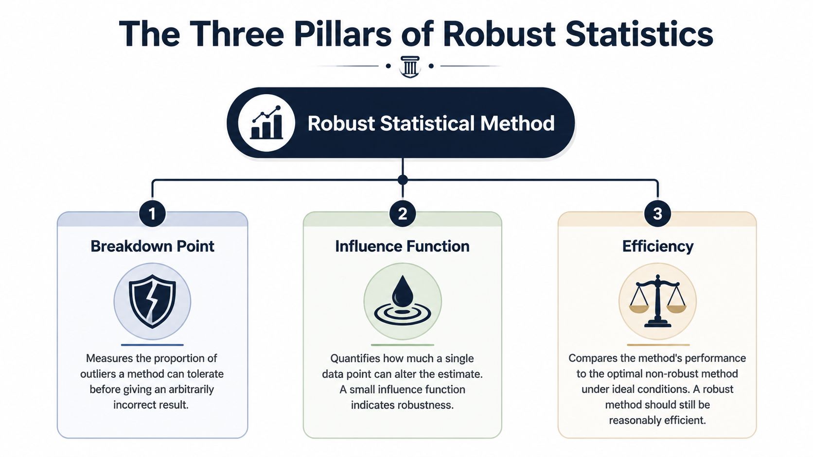
Breakdown point
Start here. Breakdown point asks how much bad data a method can absorb before the answer becomes useless.
In product analytics, that translates to a simple question. How many broken or extreme records can hit this metric before a PM would stop trusting it?
That matters because SaaS event data gets messy in predictable ways:
- Tracking failures: duplicate events, late arrivals, malformed properties
- Extreme behavior: one automation script, one enterprise admin, one customer success teammate testing a workflow all day
- Mixed user types: free accounts, trial users, paying teams, internal employees
A metric with a low tolerance for contamination is a bad steering wheel. It can turn a minor logging issue into a fake trend.
Influence
Breakdown point is about how much bad data it takes to break a method. Influence is about how much damage one single record can do.
This is the pillar PMs usually feel first. If one giant customer can swing average seats invited, average time in app, or average tickets created, the metric is giving that account too much say in the story. Product teams see this all the time in SigOS-style dashboards. The chart says engagement jumped, but the movement came from a tiny set of accounts behaving nothing like the rest of the base.
That same problem shows up in experiments. Before arguing about p-values or Bayesian intervals, check whether one unusual account can materially move the input metric. If your team is sorting out test frameworks, Otter A/B for analyzing test data is useful background. The testing philosophy matters less when the underlying metric is overly sensitive to a few records. For teams building experiment workflows, this guide on how to do hypothesis testing for product metrics fits well here.
A practical standard works well. If removing a handful of accounts changes the conclusion, treat the result as fragile.
Efficiency
Efficiency is the trade-off. Methods that hold up better under messy conditions often give up some precision when the data are perfectly clean.
That sounds like a downside, and sometimes it is. If you are analyzing a tightly controlled system metric with clean instrumentation and low skew, a simpler estimator can be the right call. But that is not how most product data looks in a SaaS company. Usage distributions are lopsided. Account sizes vary wildly. Logging quality drifts over time. In that setting, giving up a little ideal-case precision often buys a much better decision process.
I use a simple filter:
- Roadmap metrics: favor methods that stay stable when odd accounts appear
- Operational alerts: favor methods that do not overreact to one-off spikes
- Controlled analyses: use simpler estimators only when the data quality and population shape actually support them
The point is not to hide unusual behavior. The point is to stop a few unusual records from making product-wide decisions for everyone else.
Comparing Robust vs Non-Robust Estimators
Estimator choice changes product decisions faster than expected. In SaaS data, one whale account, one logging bug, or one burst of internal traffic can turn a clean-looking average into a bad roadmap call.
Resilient vs. Non-Resilient Estimator Cheat Sheet
| Metric Type | Non-Resilient Method (Vulnerable to Outliers) | Resilient Alternative (Resistant to Outliers) | When to Use the Resilient Version |
|---|---|---|---|
| Central Tendency | Mean | Median or trimmed mean | When a few users can generate unusually large values, such as session duration, event counts, or tickets per account |
| Dispersion | Standard deviation | IQR or median absolute deviation | When you want spread without letting a few extreme values define “normal variation” |
| Trend or Modeling | Ordinary least squares regression | Resistant regression such as Theil-Sen style approaches | When relationships are distorted by unusual accounts, logging bugs, or mixed customer populations |
Central tendency for engagement metrics
For engagement, the mean answers a narrow question: what is the arithmetic average? PMs usually need a different answer. They need to know what a typical user or account experienced.
That distinction matters on real dashboards. If one enterprise customer runs a heavy workflow all day, average session time can spike while self-serve users behave exactly the same. The median holds up better in that situation. A trimmed mean is also useful when you still want an average-like metric for reporting in SigOS or a notebook, but you do not want the top edge of the distribution to dominate it.
Dispersion for operational monitoring
Spread metrics shape alerting, forecasting, and incident review. Standard deviation works fine when the distribution is well-behaved. Product and support data usually are not.
IQR is often a better fit for operational dashboards because it tracks the middle range instead of letting a few extreme records define normal behavior. Median absolute deviation serves the same purpose when analysts need a stable spread measure for comparisons over time. If support resolution time looks noisy, these measures help teams tell the difference between a broad process problem and a couple of broken tickets.
Modeling when weird accounts pull the line
Ordinary least squares regression can let a small number of unusual records set the slope. In practice, those records are often large customers, backfilled imports, duplicate events, or QA traffic that slipped into production data.
That is a product analytics problem, not just a statistics problem. If a model says feature usage predicts retention, PMs may prioritize the wrong workflow if the line was mostly pulled by a handful of oversized accounts. Resistant regression methods reduce that risk and give teams a read that better matches the customer base they serve.
Teams running experiments should make metric choice and test design part of the same review. A polished testing workflow still produces weak conclusions if the estimator is too easy to distort. This guide on hypothesis testing for product metrics is a useful companion for that reason.
Use the resilient version when the cost of being fooled is higher than the cost of a little extra conservatism.
Resilient Methods in Action for Product Analytics
A PM walks into the weekly review and points to a sharp jump in average session time. The chart looks great. Then you break it down and find the spike came from one enterprise account that left a tab open all weekend, plus a batch of automated traffic from a misconfigured integration. The product did not suddenly get more engaging. The dashboard just made a noisy number look like a win.

Measuring true user engagement
This shows up constantly in SaaS product analytics. Session duration, events per user, seats invited, projects created. All of them can be pulled around by a small set of whale accounts, internal users, bots, imports, or broken instrumentation.
For operating decisions, I rarely want the raw mean by itself. I want a view of typical behavior and a view of tail behavior. In practice, that usually means putting median and trimmed mean next to the average so PMs can see whether the story holds up.
A simple pandas pattern looks like this:
import pandas as pd

# df has one row per user-day
# columns: user_id, session_minutes

mean_session = df["session_minutes"].mean()
median_session = df["session_minutes"].median()

lower = df["session_minutes"].quantile(0.05)
upper = df["session_minutes"].quantile(0.95)
trimmed = df[df["session_minutes"].between(lower, upper)]["session_minutes"].mean()

summary = {
    "mean": mean_session,
    "median": median_session,
    "trimmed_mean": trimmed
}
That comparison is more useful than arguing about one perfect metric.
If mean, median, and trimmed mean all move together, the engagement change is probably broad. If the mean jumps while the other two stay flat, a small tail is driving the headline. That is the moment to stop celebrating and start segmenting.
A good dashboard should make that easy. SigOS has a practical guide to dashboard data analytics for product teams that fits this kind of review workflow well.
What to check before you call it a trend
When I review engagement charts with PMs and analysts, I usually ask:
- Did the middle move, or just the average: If median is flat, the typical user likely did not change much.
- Does the trimmed mean sit closer to the median or the mean: That tells you how much influence the tail has.
- Who owns the tail: Enterprise admins, test accounts, power users, imports, and bots all create different product actions.
- Is the metric aligned to the decision: A roadmap decision needs a typical-user view. Capacity planning may need the tail too.
That last point matters. There is no prize for using the most statistically pure summary if it answers the wrong product question.
Finding real churn signals in customer feedback
Feedback metrics create a different trap. Teams average CSAT, sentiment, or issue severity and assume they have a clean read on retention risk. Usually they do not. A handful of escalations can drag the average down even when the broader customer base is steady. The reverse happens too. A few very happy champions can cover up a worsening experience for smaller accounts.
A better workflow is to summarize the center, inspect the spread, and then split by segment before making a churn call.
# df columns: account_id, csat_score, segment, ticket_type

median_csat = df["csat_score"].median()
csat_by_segment = df.groupby("segment")["csat_score"].median()

distribution = (
    df.groupby(["segment", "ticket_type"])["csat_score"]
      .agg(["median", "count"])
      .reset_index()
)
That code pattern is simple, but the decision impact is real. If median CSAT is stable overall and one ticket type is deteriorating inside a high-value segment, the problem is concentrated. You do not need a product-wide fire drill. You need the PM, support lead, and success team looking at the same account group.
This video gives a clear visual explanation of how outliers distort analysis and why median-based summaries often hold up better in messy product data:
The same principle shows up in data strategy. More rows do not automatically produce better decisions. TrainsetAI's guide on smart data strategy makes the right point for product teams. Better inputs and sharper summaries beat noisy volume.
A better operating habit
Strong analysis in product teams usually follows the same pattern:
- Use outlier-resistant summaries on executive dashboards.
- Review tails on purpose instead of letting them define the main KPI.
- Segment before telling a story so enterprise and self-serve behavior do not get blended into one misleading average.
- Match the metric to the decision because pricing, onboarding, support staffing, and retention work each need a different lens.
This keeps teams from chasing a fake engagement spike, rolling back a feature that only upset one corner of the customer base, or overinvesting in a workflow that only whale users touch. In product analytics, that discipline matters more than sounding statistically advanced.
How to Build a More Robust Data Culture
A resilient metric helps. A strong culture is better. Teams get into trouble when they treat any number on a dashboard as self-explanatory.
What changes this is not just code. It's the routine questions people ask before acting on a spike, dip, or experiment result. If your PM, analyst, and support lead all know how to challenge a fragile metric, your decisions improve fast.
Questions every team should ask
Use this as a standing checklist in product review:
- What estimator are we using: Mean, median, trimmed mean, ratio, rate, model coefficient?
- Who can dominate this metric: Whale users, internal traffic, enterprise admins, bots, imported records?
- What does the distribution look like: Tight and stable, or long-tailed and messy?
- Did we compare a resilient alternative: If the mean moved, what happened to the median?
- Are we mixing populations: Self-serve and enterprise users rarely belong in one undifferentiated number.
- Is this metric good enough for decision-making: Not “can we compute it,” but “should we use it to steer roadmap and spend?”
One practical habit is to treat data quality review as part of analysis, not a separate cleanup task. This guide on common data quality issues in analytics is worth sharing internally because many “insights” are just broken instrumentation wearing a chart.
Build dashboards that resist drama
Most dashboard drama comes from defaults. If the BI layer defaults to average, leaders get average. If it defaults to median plus spread plus segment filters, conversations change.
A stronger setup usually includes:
- Outlier-resistant default tiles: median engagement, IQR-based variability views, segment-level comparisons
- Tail monitors: separate views for extreme accounts, unusual traffic, or exceptional revenue customers
- Metric annotations: a note in the dashboard that says what estimator is being used and why
- Decision review norms: no roadmap decision from one metric without a distribution check
Teams don't need more charts. They need fewer fragile charts.
If you're trying to shift internal thinking from collecting massive amounts of noisy data toward using the right signals, TrainsetAI's guide on smart data strategy fits well with this mindset.
Translate robustness into stakeholder language
Don't tell executives “the estimator is not resistant to unusual data points.” Tell them the dashboard average is being pulled by a small number of unusual accounts, and the typical customer behavior is flatter. That language lands.
The best product teams I've seen don't frame methods resistant to outliers as a statistical preference. They frame them as decision hygiene. If one outlier can redirect roadmap, trigger incident review, or reallocate budget, then resistance to outliers isn't optional. It's part of operating the product responsibly.
If your team wants help finding real product signals in noisy behavioral and feedback data, SigOS is built for that job. It helps product, growth, and support teams identify patterns that correlate with churn, expansion, and revenue impact so you can prioritize what matters instead of reacting to noisy averages.
Keep Reading
More insights from our blog


Ready to find your hidden revenue leaks?
Start analyzing your customer feedback and discover insights that drive revenue.
Start Free Trial →