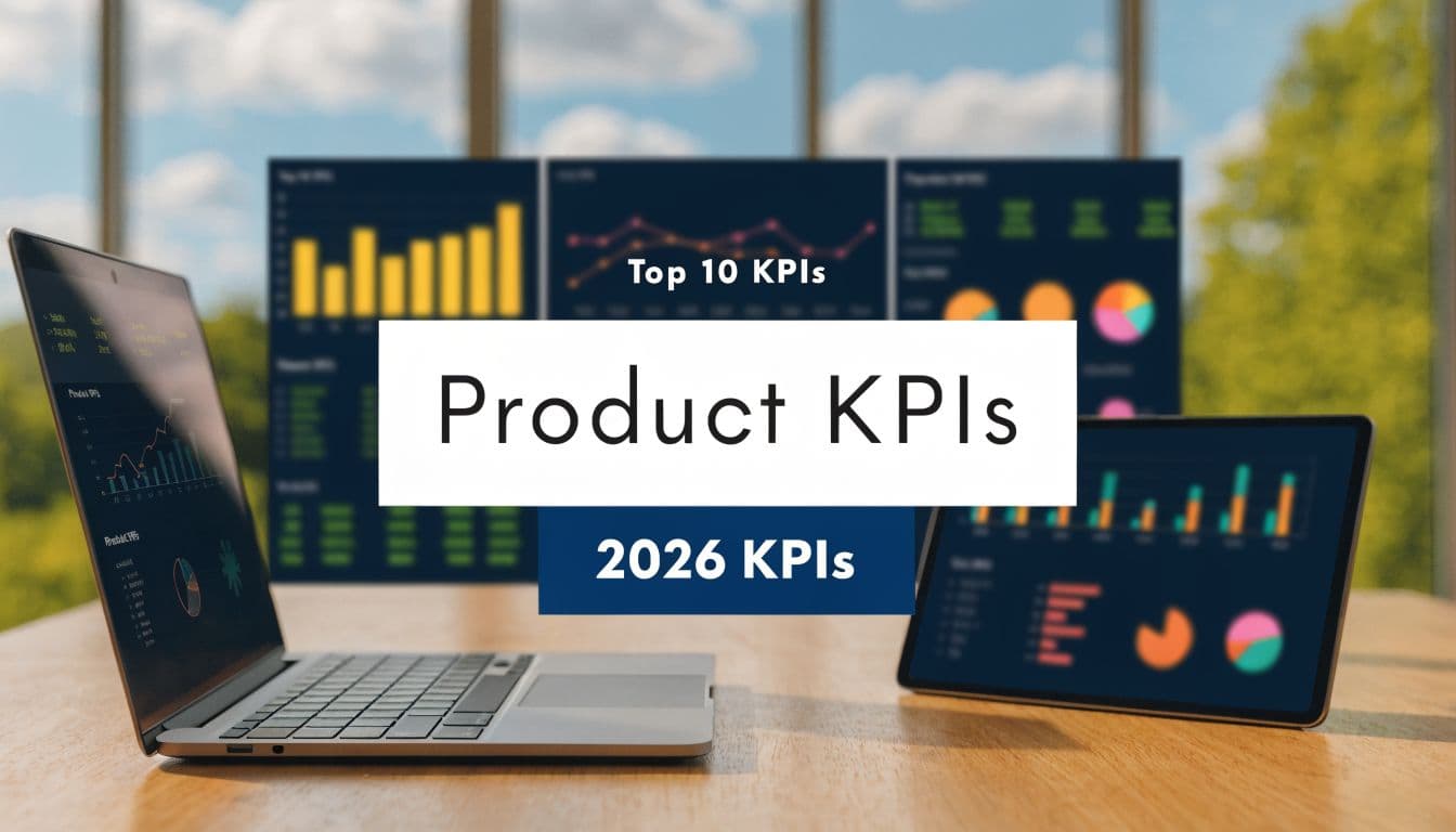
Top 10 Product Management KPIs for 2026
Discover the 10 essential product management KPIs for 2026. Learn to measure churn, NRR, and adoption to drive revenue-focused product decisions.
A long KPI list does not produce better product decisions. A smaller set of metrics tied directly to retention, expansion, and delivery quality usually produces clearer tradeoffs and faster prioritization.
The problem is not dashboard volume alone. Product teams often track activity metrics that describe motion without showing economic effect. A rise in page views, session count, or feature clicks can look positive while churn stays flat, payback stretches, or expansion revenue stalls. Product management KPIs matter when they connect product behavior to financial outcomes.
A useful KPI system covers three questions. Is the product retaining revenue. Are customers adopting the behaviors that predict expansion. Is the team shipping improvements fast enough to change those outcomes. That lens is more practical than a generic scorecard because it links every metric to a decision a product leader can make, such as reprioritizing onboarding, fixing a failed feature launch, or reducing friction in high-value workflows.
That revenue link is where many KPI programs break down. Teams can see that adoption is weak or support demand is rising, but they cannot quantify the cost of that pattern or rank it against other roadmap work. AI analysis helps close that gap by connecting usage signals, support themes, and account data to measurable risk and upside. For teams working on predicting customer churn from behavioral and account signals, that means less manual triage and a clearer view of which product changes are most likely to protect or grow recurring revenue.
The ten product management KPIs below were selected for that standard. Each one has a clear formula, a diagnostic role, and a direct path to revenue impact. Together, they form a practical operating model for turning product metrics into prioritization decisions that improve retention, expansion, and payback.
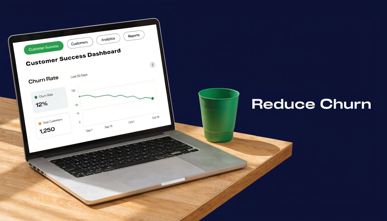
1. Customer Churn Rate
Churn is the fastest way product decisions show up on the income statement. A customer who cancels stops future recurring revenue, lowers lifetime value, and raises the acquisition burden required to replace that revenue.
Benchmarks vary by market, contract model, and customer segment, so the useful question is narrower. Is churn concentrated in the accounts, plans, or behaviors that matter most to revenue. Product teams get more value from that view than from a single blended rate, because a logo loss in a low-value cohort and a contraction in a strategic segment point to different product problems.
Formula and diagnostic use
Use both customer churn and revenue churn.
- Customer churn rate: customers lost during a period / customers at the start of the period × 100
- Revenue churn: recurring revenue lost during a period / recurring revenue at the start of the period × 100
Revenue churn usually carries more decision value for product leaders. It weights the outcome by dollars, not logos, which makes prioritization sharper. If ten small accounts leave after a weak onboarding flow, that is one kind of product issue. If one enterprise account contracts because a key workflow never became part of weekly operations, the revenue risk is larger and the fix may belong in adoption, reliability, or feature depth.
The diagnostic work starts after the formula. Break churn by segment, plan tier, tenure, acquisition channel, and feature usage pattern. Teams often find that cancellation is preceded by a drop in activation milestones, fewer multi-user workflows, slower time to first value, or a spike in support contacts tied to one part of the product.
SigOS helps product teams operationalize that analysis by connecting behavioral signals, account context, and support data into a ranked view of churn risk. For a practical model, see this guide to predicting customer churn from behavioral and account signals. The point is not to produce a cleaner dashboard. The point is to identify which product changes are most likely to protect recurring revenue before the renewal is lost.
Churn also needs to be read alongside retention metrics. Teams that want a finance-grade view should pair logo and revenue churn with comparing gross and net retention, since churn alone cannot show whether expansion offsets losses.
A common pattern in collaboration and CRM products is straightforward. Accounts that never reach a meaningful usage threshold leave sooner than accounts that embed the product into a repeat workflow. That makes churn a lagging KPI with leading indicators. The product manager's job is to trace those indicators back to specific friction points, then prioritize the fixes with the highest expected revenue impact.
2. Net Revenue Retention and Gross Revenue Retention
If churn tells you what leaked out, retention tells you whether the base business is strengthening. Gross Revenue Retention measures how much recurring revenue you kept from existing customers before expansion. Net Revenue Retention adds expansion back in. Together, they answer a blunt question: are existing customers becoming more valuable over time?
These are among the most executive-facing product management kpis because they compress product quality, pricing power, onboarding, and account expansion into one view. Product teams can't own NRR alone, but they absolutely influence it through adoption and delivered value.
How to calculate each one
Use these formulas:
- GRR: (Beginning recurring revenue - churned recurring revenue - contraction recurring revenue) / beginning recurring revenue × 100
- NRR: (Beginning recurring revenue + expansion recurring revenue - churned recurring revenue - contraction recurring revenue) / beginning recurring revenue × 100
A result above 100% on NRR means expansion outweighed losses. That's the retention shape investors and operators both look for because it signals customers are not just staying. They're growing.
One practical way to sharpen this metric is to map product behavior to revenue expansion. If a customer starts using integrations, advanced analytics, or multi-team workflows, they're often showing purchase readiness before they ever contact sales.
- Segment by cohort: Separate new cohorts from mature ones so you don't mistake onboarding friction for account weakness.
- Tie expansion to behavior: Look for usage patterns that consistently precede upgrades.
- Review both metrics together: Strong NRR can mask weak GRR if a few expansions cover broad underlying loss.
For a finance-side explanation of the difference, this reference on comparing gross and net retention is useful. In practice, GRR tells you whether the core product is durable. NRR tells you whether product value compounds after the initial sale.
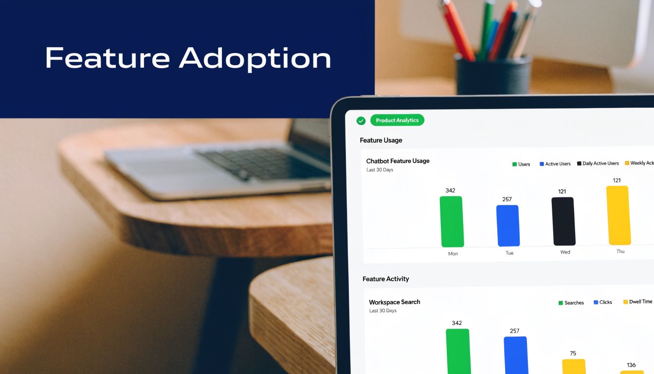
3. Feature Adoption Rate
Feature adoption rate is the fastest reality check on whether roadmap output is creating economic value. Shipping adds cost immediately. Revenue impact shows up only when the right users incorporate a feature into recurring behavior, renew because of it, or expand because it solved a higher-value job.
The formula is straightforward: feature adoption rate = active users of the feature / eligible users × 100. The numerator should include meaningful use, not a single click. The denominator should include only users or accounts that could reasonably adopt the feature based on plan, role, setup state, or use case. Product Fruits uses this standard framing for product adoption metrics, and the eligibility filter is the part many teams mis-specify.
A weak denominator can distort prioritization. If a workflow feature is relevant to 20% of accounts but measured against the full customer base, the result will look mediocre even when adoption is healthy inside the target segment. The opposite error is just as costly. Counting every exposure as adoption can make a feature look successful while it contributes little to retention or expansion.
A stronger operating model measures adoption on three levels:
- Reach: What share of eligible users tried the feature at least once?
- Depth: How many completed the key workflow, not just opened the UI?
- Frequency: How often did they return within a defined period such as 7, 30, or 90 days?
That breakdown separates discovery from habit formation. It also connects more cleanly to revenue. Features that improve retention usually show repeat usage within a real workflow. Features that support expansion often show concentrated adoption in higher-value accounts, power users, or multi-team deployments.
Cohort analysis matters more than the top-line average. Compare adoption by launch month, segment, plan tier, and acquisition path. A feature with modest aggregate adoption can still justify continued investment if usage is concentrated in accounts with strong renewal or upgrade potential. A feature with broad trial but low repeat use usually points to poor onboarding, unclear value communication, or weak workflow fit. Teams that want cleaner event data can use a structured product analytics setup such as this guide on tracking app usage behavior.
The practical question is not whether adoption is high. It is whether adoption changes business outcomes. Tie the metric to renewal rate, expansion rate, support ticket volume, or time saved on a high-frequency task. That turns feature adoption from a release scorecard into a capital allocation tool. AI analysis layers such as SigOS can help rank which adoption gaps matter financially by connecting usage patterns to churn risk, expansion signals, and the likely revenue return from fixing discovery or onboarding friction.
4. Customer Acquisition Cost and CAC Payback Period
CAC sits at the border between product, growth, and finance. Product leaders should still care because product experience changes both the cost to acquire customers and the speed at which those customers pay back acquisition spend. A weak onboarding flow can make every marketing channel look more expensive than it really is.
The basic CAC formula is simple: total sales and marketing spend divided by the number of new customers acquired in the same period. CAC payback period asks how long it takes the gross profit from a customer to recover that acquisition cost.
Why product teams should own part of it
Product work influences CAC in indirect but material ways. Strong self-serve onboarding reduces human sales effort. Better activation improves trial-to-paid conversion. Faster time to value shortens the distance between first payment and meaningful account expansion.
This KPI becomes more useful when it's cut into slices:
- By acquisition channel: Product-qualified signups often behave differently from sales-led accounts.
- By segment: Enterprise CAC can be justified differently from SMB CAC.
- By product path: Freemium, trial, demo-led, and partner-led motions create different payback shapes.
A collaboration tool like Slack typically benefits when users find value without heavy hand-holding. A larger enterprise platform may tolerate a longer payback period because long-term contract value is higher. Product teams should avoid treating CAC as a marketing-only number. If a release improves activation and retention, it can improve payback even if ad spend never changes.
The revenue link is straightforward. Lower churn, stronger adoption, and faster value realization all make customer acquisition more efficient. That's why CAC shouldn't be reviewed in isolation. It belongs beside TTV, retention, and NRR.
5. Customer Health Score
Customer health score decides where retention revenue is won or lost before renewal data makes the answer obvious. The metric matters because it converts scattered product, support, and commercial signals into a ranked list of accounts that need intervention, education, or expansion.
A useful health score is not a generic red-yellow-green label. It is a weighted model built from variables that have shown a measurable relationship to renewal, contraction, or upsell in your own customer base. Product teams should treat it like a forecasting system. If the score does not predict commercial outcomes, it is only reporting activity.
Building a score that predicts revenue risk
The strongest models combine level and direction. Current usage matters, but trend often matters more. An account with steady moderate adoption may be lower risk than an account with historically strong adoption that has declined for two consecutive periods. That distinction is often where churn signals first appear.
A practical formula looks like this:
Customer Health Score = (Usage depth × weight) + (Breadth of adoption × weight) + (Support risk × weight) + (Sentiment × weight) + (Commercial momentum × weight)
The exact weights should come from observed outcomes, not intuition. If support escalations precede churn more reliably than low login frequency, support risk should carry more weight. If multi-team adoption strongly precedes expansion, breadth should have a larger share of the score.
Useful inputs often include:
- Usage depth: Frequency, duration, or completion of high-value actions
- Breadth of adoption: Number of active users, teams, or product modules in use
- Support risk: Ticket volume, severity, reopen rate, and repeated issue themes
- Sentiment: NPS, CSAT, survey text, and meeting notes
- Commercial momentum: Seat growth, downgrade signals, renewal status, and expansion history
The weighting logic is the difference between a dashboard metric and an operating KPI.
SigOS fits here as an analysis layer for the inputs that are hardest to standardize, especially unstructured feedback and support text. If product teams can classify complaint themes, detect worsening sentiment, and connect those patterns to churn or expansion by segment, the health score becomes revenue-weighted instead of generic. A declining score for a high-ARR account with expansion potential should trigger faster action than the same score for a low-value account with limited product fit.
That revenue framing also improves prioritization inside the roadmap. If a recurring onboarding issue appears disproportionately in accounts whose health scores later deteriorate, fixing it has a clearer financial case. The KPI then stops being a customer success artifact and becomes a product investment signal.
6. Time to Value and Time to First Value
Slow value realization destroys revenue faster than many roadmap teams model. A product can win the evaluation, close the deal, and still underperform commercially if customers wait too long to reach a useful outcome. Time to First Value tracks the elapsed time from signup, purchase, or implementation start to the first meaningful success event. Time to Value extends that lens to the point where the customer reaches repeatable, material benefit.
The difference matters because the two metrics answer different business questions. TTFV measures whether onboarding creates enough momentum to prevent early abandonment. TTV measures whether the product reaches the level of utility that supports retention, expansion, or both.
Use formulas that teams can instrument consistently:
- Time to First Value (TTFV) = Date and time of first value event minus date and time of signup, purchase, or implementation kickoff
- Time to Value (TTV) = Date and time of sustained value milestone minus date and time of signup, purchase, or implementation kickoff
- Pre-value drop-off rate = Users or accounts that churn, go inactive, or stall before first value divided by total new users or accounts in the cohort
The hard part is choosing the right events. "Account created" is not value. "Setup completed" is often not value either. A better definition ties the milestone to an observable customer outcome: first report generated, first workflow automated, first file shared with collaborators, first lead routed correctly, first support trend identified and acted on.
For Figma, a reasonable first-value event might be creating and sharing a design file. For a support analytics product, it could be importing historical ticket data and surfacing the first actionable pattern. For Salesforce or other enterprise systems, the first-value milestone may arrive later because integration and process design are part of the product experience, not implementation noise.
What matters is predictive power. If the milestone does not correlate with activation, retention, expansion, or lower support cost, it is not the right milestone.
A practical operating model has three parts:
- Define value events by segment. SMB self-serve users and enterprise admins often reach value through different paths.
- Measure stage-by-stage latency. Separate signup-to-setup, setup-to-first-value, and first-value-to-repeat-value so teams can find the exact bottleneck.
- Quantify revenue exposure. Compare renewal rates, expansion rates, and payback periods across fast-value and slow-value cohorts.
This KPI becomes more useful when product teams stop treating onboarding as a UX issue and start treating it as a revenue system. If accounts that reach first value in 3 days retain at a meaningfully higher rate than accounts that take 14 days, reducing that gap has direct financial impact. It raises conversion from trial to paid, shortens CAC payback, and lowers churn risk before the account ever reaches maturity.
SigOS can help at this stage by analyzing onboarding friction across event data, support logs, and feedback text. That matters because the blockers behind slow TTFV are often scattered across systems. A missing integration, a confusing setup sequence, and repeated support complaints may all point to the same lost revenue path. Automating that analysis helps teams prioritize the onboarding fixes most likely to increase activated accounts and protect ARR.
7. Product Engagement Score
Active users can hide revenue risk. A product engagement score is more useful because it estimates whether the product has become part of the customer's operating routine, which is far more relevant to retention and expansion than a simple login count.
The metric works best when it is modeled, not guessed. Product teams usually build it from weighted behaviors tied to durable value creation, then test whether the score predicts outcomes such as renewal, seat growth, upsell conversion, or support load. If the score does not correlate with commercial results, it is only an activity index.
Build the score from behaviors that map to account value
A practical formula looks like this:
Product Engagement Score = (Frequency x wf) + (Breadth x wb) + (Depth x wd) + (Trend x wt)
The weights should reflect observed business impact. In a collaboration product, sharing, admin setup, and repeated workflow completion may deserve more weight than passive viewing. In an analytics product, dashboard creation, saved reports, scheduled exports, and multi-user adoption often matter more than raw query volume.
That distinction matters. A user who logs in every day but repeats one low-value action can inflate DAU without increasing switching costs or expansion potential. An account that adopts multiple workflows across teams usually becomes harder to replace and more likely to renew.
A strong scoring model usually includes:
- Frequency: Return rate over a fixed period, such as active days per week or sessions per account per month
- Breadth: Number of meaningful features or modules used
- Depth: Completion of advanced or repeatable workflows, not just entry-level actions
- Trend: Direction of usage over time, measured by change versus the prior 30, 60, or 90 days
Benchmarks are product-specific, so the better approach is cohort comparison. Compare high-score and low-score accounts on churn, expansion, and support intensity. If high-engagement accounts renew at materially higher rates or expand faster, the score has operating value. If not, revise the event set and weighting logic.
This KPI becomes more actionable when finance and product use the same frame. Teams can translate engagement deterioration into expected revenue exposure, then estimate whether a workflow fix, feature improvement, or lifecycle campaign is likely to pay back. A simple ROI template for product investments helps connect score changes to retained ARR or expansion potential.
SigOS can help by analyzing event streams, support conversations, and feedback text to identify which behavior changes precede churn or upsell. That reduces a common failure mode in engagement scoring. Teams often overweight easy-to-measure clicks and underweight the actions that predict revenue. Automated pattern detection improves the model and helps prioritize the interventions most likely to turn engagement into money.
8. Revenue Impact Score and Cost of Inaction
Revenue impact score is one of the few product KPIs that can change roadmap decisions immediately. It converts backlog items from opinion-driven requests into financial bets with explicit upside, downside, and timing.
The core question is simple. If the team fixes a problem or ships a capability, how much revenue is protected, accelerated, or created? The companion question matters just as much. If nothing happens this quarter, what revenue remains at risk?
A practical revenue impact score uses a weighted formula such as:
Revenue Impact Score = Affected Revenue × Probability of Outcome × Time Sensitivity
Each input needs evidence, not intuition:
- Affected revenue: ARR, pipeline, renewals, or expansion tied to the accounts experiencing the issue
- Probability of outcome: Estimated likelihood that the issue contributes to churn, stalled expansion, delayed purchase, or discount pressure
- Time sensitivity: A multiplier for urgency based on contract dates, active renewals, open deals, or seasonal dependency
This framing produces better prioritization than request volume alone. A reporting defect that affects enterprise renewals can justify immediate work even if only a small number of customers mention it. A popular request with weak commercial impact can wait.
Cost of inaction makes the model sharper. A simple version is:
Cost of Inaction = Revenue at Risk × Delay Period × Probability of Loss
That estimate changes the economics of delay. If a missing admin control is blocking late-stage deals, every month of deferral carries an opportunity cost. If a reliability issue increases support burden and renewal risk in a high-value segment, the team can quantify the tradeoff instead of labeling it a technical concern.
A useful operating pattern is to score work across three buckets. Revenue protection, revenue expansion, and revenue acceleration. Protection covers churn and contraction risk. Expansion covers upsell, seat growth, and cross-sell potential. Acceleration covers shorter sales cycles, faster onboarding, or fewer approval blockers.
SigOS can help by linking support tickets, sales call themes, CRM notes, and usage patterns to likely commercial outcomes. That matters because revenue impact often hides in unstructured data long before it appears in a dashboard. Teams that want a finance-ready model can use this ROI template for product investments to translate product choices into expected payback.
The same discipline applies to delivery decisions. If an initiative depends on release reliability, deployment practices affect the realized value of the work. For teams managing infrastructure-heavy products, GitOps for Kubernetes deployments is relevant because delayed or inconsistent releases can extend the cost of inaction even when prioritization was correct.
Revenue lens: Prioritize by expected financial effect per unit of delay, not by the loudest request or the largest ticket count.
Used well, this KPI does more than rank features. It reveals which backlog items function as hidden revenue leaks, which requests deserve enterprise-level attention, and which projects create activity without changing business outcomes.
9. Monthly or Quarterly Product Velocity and Deployment Frequency
Shipping faster increases revenue only when releases reach production reliably and produce measurable customer behavior change. That makes velocity a business KPI, not just an engineering one.
For product leaders, the useful unit is not story points or tickets closed. It is the rate at which validated improvements move from idea to production, then into adoption, retention, or support-cost reduction. A team can post high internal throughput and still miss revenue targets if releases stall in QA, fail in production, or ship features customers ignore.
A practical scorecard ties delivery speed to four observable measures:
- Deployment frequency: number of production deployments per week, month, or quarter
- Cycle time: median time from work start to production release
- Change quality: post-release incident rate, rollback rate, or customer-reported defect rate
- Business effect: feature adoption, expansion activity, churn reduction, or support ticket change after launch
The formulas are simple:
- Deployment frequency = Total production deployments in period / length of period
- Cycle time = Release date minus work start date, tracked at median to reduce distortion from outliers
- Change failure rate = Failed deployments or releases requiring hotfix, rollback, or incident response / total deployments
- Release impact rate = Releases that hit a predefined KPI target / total releases
That last metric is where product management gets sharper. If a team deploys 20 times in a month but only 3 releases move an adoption or retention KPI, the constraint is not speed alone. It is prioritization quality, release quality, or both.
Deployment frequency also changes the economics of learning. Smaller, more frequent releases shorten the time between hypothesis and evidence. That reduces the cost of carrying low-value work and lets teams stop weak bets earlier. Monthly or quarterly reviews should therefore examine whether faster shipping is producing faster decision cycles, not just more change volume.
Infrastructure discipline matters here. Teams using controlled release workflows often find it easier to separate deployment count from release risk, especially in infrastructure-heavy environments. This overview of GitOps for Kubernetes deployments is relevant for products where unreliable redeploys delay feature availability and push expected revenue impact into a later quarter.
SigOS fits this KPI at the interpretation layer. It can connect release timing, support themes, sales feedback, and usage changes so teams can identify which deployments generated commercial movement and which consumed capacity without changing outcomes.
Use this KPI to answer a harder question than "how fast are we shipping?" Ask, "How much revenue-producing learning are we generating per release window?" That framing turns velocity from an activity metric into a capital-allocation metric.
10. Daily and Monthly Active Users and Stickiness
DAU and MAU only become decision-grade KPIs when they are tied to product frequency, cohort quality, and revenue outcomes. A growing user base can still hide weak habit formation. The ratio between daily active users and monthly active users exposes that gap faster than top-line MAU.
Use the formulas directly:
- DAU = number of unique users active on a given day
- MAU = number of unique users active in a rolling 30-day period
- Stickiness = DAU / MAU × 100
If 12,000 users were active in the last 30 days and 2,400 were active today, stickiness is 20 percent. That means one in five monthly users returned on a typical day. For a workflow product, that can indicate routine use. For a product used only during weekly approvals or monthly reporting, the same ratio may be unrealistic as a target and misleading as a management signal.
The operating question is not whether stickiness is high in absolute terms. It is whether the observed usage cadence matches the job the product was hired to do. Messaging, collaboration, and incident-response products usually need frequent return behavior to defend retention and expansion. Reporting, procurement, and governance products may generate strong account value with lower daily recurrence if they are tightly embedded in a critical periodic workflow.
Segmentation determines whether this KPI explains revenue or just traffic:
- Free vs. paid: If paid users return more often, conversion is associated with deeper workflow integration and lower revenue risk.
- New vs. mature cohorts: Early increases in recurrence often precede stronger retention, while flat usage after signup usually points to weak activation.
- Role-based usage: Admins, operators, managers, and executives should not be expected to show the same usage pattern. Healthy recurrence varies by role.
- Account segment: Enterprise accounts can produce lower user-level stickiness but higher contract value if a smaller set of users performs business-critical work regularly.
Interpret directional changes with care. If MAU rises while DAU/MAU falls, acquisition is outpacing habit formation. That usually means the product is attracting trial demand faster than it is creating repeated value. The commercial result is predictable. More top-of-funnel activity enters the business, but fewer users become durable, expansion-ready customers.
This KPI is also useful for roadmap control. A release that lifts signups but leaves stickiness unchanged often creates attention without changing behavior. A smaller release that improves repeat usage among paid accounts can have more revenue impact because it increases the odds of renewal, seat growth, or cross-functional adoption.
Slack and Notion illustrate the point without needing the same target. Slack is built around frequent communication, so recurrence is close to the product promise itself. Notion can support daily operating workflows or occasional documentation use. Product leaders should set recurrence expectations from actual workflow frequency, not from generic benchmark copying.
SigOS can help teams connect changes in stickiness to account expansion, support patterns, and feature usage, so DAU and MAU stop functioning as dashboard decoration and start informing prioritization. That turns a familiar activity metric into a financial signal. The practical question is simple: which usage patterns correlate with retained and expanding revenue, and which only inflate MAU?
Top 10 Product Management KPIs Comparison
A KPI table is only useful if it changes allocation decisions. The comparison below frames each metric by implementation cost, decision value, and revenue relevance so product teams can distinguish dashboard activity from signals that justify investment, intervention, or reprioritization.
| Metric | Implementation Complexity 🔄 | Resource Requirements ⚡ | Expected Outcomes 📊 | Ideal Use Cases 💡 | Key Advantages ⭐ | Key Limitations |
|---|---|---|---|---|---|---|
| Customer Churn Rate | Low to medium. Requires cancellation tracking, cohort logic, and clear customer status definitions | CRM, billing data, product analytics, consistent customer records | Retention trend visibility and direct measurement of recurring revenue loss | Renewal monitoring, cohort retention analysis, account risk review | Direct link to lost revenue, simple formula, useful across business models | Lagging if measured only at cancellation point. Root-cause analysis needs usage, support, and onboarding context |
| Net Revenue Retention (NRR) / Gross Revenue Retention (GRR) | Medium to high. Depends on revenue attribution, cohort consistency, and finance alignment | Billing integration, historical revenue data, finance and ops support | Overall revenue health, separation of retention from expansion, clearer view of account quality | Board reporting, pricing strategy, expansion planning, segment performance analysis | Connects product outcomes to revenue durability and growth quality | Complex across plans and contract structures. Expansion can hide underlying logo churn if reviewed in isolation |
| Feature Adoption Rate | Medium. Requires event design, instrumentation, and feature-level segmentation | Product analytics, event taxonomy, analyst or product ops support | Evidence of whether shipped work changes customer behavior | Launch evaluation, roadmap review, feature sunset decisions, experiment analysis | Fast feedback on product investments and clearer prioritization signals | Usage alone does not prove value. High adoption can still come from low-impact or mandatory workflows |
| CAC & CAC Payback Period | Medium. Needs reliable cost attribution and revenue timing | Marketing data, sales cost inputs, finance models, attribution tooling | Better unit-economics visibility and faster detection of inefficient growth | Channel budgeting, go-to-market planning, hiring plans, fundraising preparation | Forces discipline on acquisition spend and ties growth to cash efficiency | Attribution disputes are common. Results can look stronger than reality during subsidized growth periods |
| Customer Health Score | High. Requires model design, weighting logic, and cross-system integration | CS platform, product usage data, support signals, data engineering support | Earlier risk detection, smarter account prioritization, better renewal and expansion targeting | Success interventions, account segmentation, renewal forecasting | Converts scattered signals into an operational score teams can act on | Score quality depends on calibration. Models often drift by segment, contract type, or product maturity |
| Time to Value (TTV/TTFV) | Medium. Requires explicit milestone definitions and event tracking | Onboarding analytics, implementation data, UX research, support inputs | Faster activation, lower early churn risk, stronger onboarding economics | Onboarding redesign, implementation planning, enterprise rollout analysis | Strong indicator of whether customers reach a monetizable outcome fast enough | Value milestones vary by product and persona. Long implementation cycles can blur the metric |
| Product Engagement Score | High. Requires a weighted model of frequency, depth, breadth, and user role | Advanced analytics, reliable instrumentation, segmentation by persona or account type | Better prediction of retention and expansion than single activity metrics | Power-user identification, churn modeling, account prioritization | Captures quality of usage better than raw activity counts | Complex to compute. High engagement does not always translate into commercial value |
| Revenue Impact Score / Cost of Inaction | High. Needs causal modeling that connects product issues to churn, expansion, or sales friction | Product data, support data, revenue data, analyst time, strong prioritization process | Roadmap ranking by expected financial effect and delay cost | Bug triage, technical debt decisions, enterprise request prioritization | Reduces opinion-driven prioritization and links roadmap choices to money | Estimation error is a real risk. Long-term strategic bets can be underweighted if the model is too narrow |
| Product Velocity & Deployment Frequency | Low to medium for measurement. Higher for interpretation | CI/CD tooling, engineering metrics, release logs, quality signals | Faster learning loops and shorter delivery cycles when quality holds | Delivery management, experimentation cadence, engineering process review | Shows whether the team can ship and learn at a useful pace | More releases do not guarantee better outcomes. Teams can optimize for output instead of impact |
| DAU/MAU Ratio & Stickiness | Low. Formula is simple if active-use definitions are consistent | Activity logging, analytics platform, account or user segmentation | Clear read on repeat usage patterns and habit strength | Usage monitoring for daily-workflow products, freemium analysis, retention diagnostics | Easy to calculate and easy to explain across teams | Weak on value discrimination. Frequent low-intent usage can inflate the ratio |
The comparison matters because these metrics do not carry equal financial weight at every stage. Early-stage teams often need fast feedback from adoption, TTV, and velocity. Later-stage teams usually get more decision value from NRR, churn, health score quality, and cost-of-inaction modeling because the revenue base is larger and prioritization mistakes are more expensive.
The non-obvious point is that implementation complexity can be a feature, not just a cost. Metrics like Product Engagement Score or Revenue Impact Score require more work, but they can improve capital allocation because they connect behavior patterns to renewal, expansion, or delayed revenue. Tools like SigOS can automate parts of that analysis by linking usage, account risk, and revenue signals, helping teams rank product work by likely commercial return instead of volume of requests.
From Measurement to Action A Unified KPI Strategy
The strongest product teams don't review these KPIs as separate dashboard tiles. They read them as a system. Churn is rarely just churn. It usually traces back to weak time to value, poor feature adoption, shallow engagement, or deteriorating customer health. NRR isn't just a finance metric. It often reflects whether the product keeps creating new value after the first sale.
That connected reading matters more as products grow. Early on, teams can get away with intuition because customer volume is small and pain is obvious. Later, intuition breaks down. Too many accounts, too many features, and too many feedback channels make it hard to see which product problems deserve engineering time. That's where disciplined product management kpis enable greater impact.
A practical operating model starts with a compact KPI set, not an exhaustive one. The verified benchmark that many product managers use only 5 to 7 core metrics is important because focus beats dashboard sprawl. Pick the metrics that map directly to your business model, then define how each one influences decisions. If feature adoption falls, what changes? If TTV rises, who gets alerted? If engagement drops in a high-value cohort, what intervention happens next?
The next step is causal linking. NPS, adoption, churn, and expansion shouldn't be reviewed in separate meetings with separate owners. If your NPS weakens in the same cohort where feature drop-off rises, that combination is more useful than either metric alone. If deployment frequency increases but defect density also climbs, you'll often see the commercial cost later through support volume and retention pressure.
That is where AI-assisted analysis can change the operating cadence. In business context from Chameleon's KPI trend analysis, AI KPI users are projected to reduce churn compared with static dashboards, and the larger point is credible even beyond the projection: real-time behavioral interpretation is more actionable than retrospective reporting. SigOS is one relevant option because it combines support, chat, sales, and usage signals, then ties patterns back to churn, expansion, and revenue impact.
A mature KPI strategy also changes roadmap conversations with executives. Instead of defending a release because customers asked for it often, product leaders can defend it because adoption patterns, retention risk, and revenue exposure justify it. Instead of reporting that support volume increased, they can identify which issue cluster threatens renewals. Instead of saying onboarding feels confusing, they can show that delayed first value is suppressing activation.
Customer satisfaction still matters, but the most useful satisfaction work is tied to operational and financial outcomes. For teams trying to tighten that loop, Monito's proven strategies offer a broader service lens that complements product metrics.
The end goal isn't better reporting. It's better allocation of attention, budget, and development time. When these 10 KPIs are unified, product teams stop reacting to noise and start managing a revenue system.
If you want to connect product management kpis to actual revenue decisions, SigOS is built for that workflow. It analyzes support tickets, chat transcripts, sales calls, and usage data to surface patterns tied to churn, expansion, and revenue impact, then helps teams prioritize the issues and feature requests that matter most.
Keep Reading
More insights from our blog


Ready to find your hidden revenue leaks?
Start analyzing your customer feedback and discover insights that drive revenue.
Start Free Trial →