Mastering Retention Cohort Analysis
Unlock business growth with our guide to retention cohort analysis. Learn to decode user behavior, reduce churn, and make data-driven decisions that work.

If you've ever looked at your overall user retention rate and felt like you were missing the full story, you're not alone. That single number can hide a lot. That’s where retention cohort analysis comes in—it’s a way to group your users by when they joined and then watch how they behave over time.
Instead of just knowing that you lose customers, this method shows you when you lose them and which groups are churning. It's the difference between a blurry snapshot and a high-definition movie of your customer lifecycle.
What Is Retention Cohort Analysis

Think of your new users like a series of graduating classes. You wouldn't lump every graduate from every year into one massive group to measure their success, right? You'd look at the "Class of January," the "Class of February," and so on, to see how each group fares over time.
That's exactly what retention cohort analysis does for your business. It groups users into distinct cohorts, allowing you to track the loyalty and behavior of each "class" as they move through their journey with your product. This lets you answer much deeper questions than a simple, aggregate retention metric ever could.
The Two Core Components
At its core, this analysis breaks down into two straightforward parts:
- Cohorts (The 'Who'): These are the specific groups of users you're tracking. Most often, you'll be looking at acquisition cohorts—everyone who signed up or made their first purchase in the same time frame (like a specific week or month).
- Time Periods (The 'When'): This is the timeline for tracking each cohort's activity after they join. You might check in on them on Day 1, Day 7, and Day 30, or you could track them over several months or even years.
Putting these two pieces together gives you a cohort table, which is basically a detailed story of user engagement over time. It’s an essential tool for any subscription business that wants to understand customer loyalty. If you want a deeper dive into the basics, check out this guide on What is Cohort Analysis.
For example, a SaaS company might track its monthly sign-up cohorts to see what percentage are still active after one month, three months, and six months. Seeing a significant drop-off in month two for the "January Cohort" but not for the "February Cohort" gives you a massive clue—what changed between those two months?
Key Concepts in Cohort Analysis
Before we go any further, let's get a handle on a few foundational terms. This table breaks down the key concepts you'll see throughout this guide.
| Term | Simple Explanation | Why It Matters |
|---|---|---|
| Cohort | A group of users who share a common characteristic, usually the date they signed up. | It allows you to compare "apples to apples" and isolate the impact of your actions over time. |
| Cohort Size | The total number of users in a specific cohort. | This is your starting point (100%) for calculating retention rates for that group. |
| Retention Rate | The percentage of users from a cohort who are still active after a certain period. | This is the ultimate measure of how well you're keeping your users engaged and happy. |
| Churn Rate | The percentage of users from a cohort who have stopped using your product. | It's the opposite of retention and highlights when and where you're losing customers. |
Getting these terms straight is the first step to confidently reading and acting on a cohort chart. They form the language of retention.
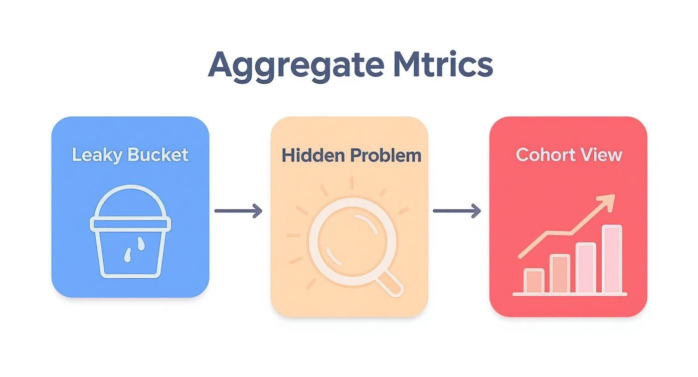
Why Big-Picture Numbers Hide the Real Story
Relying on big-picture metrics like total users or overall monthly retention can be incredibly misleading. Imagine your company’s main dashboard shows steady user growth. On the surface, things look great—signups are up, and the top-line numbers are climbing. This is a classic trap where aggregate data paints a deceptively rosy picture.
But this growth can easily mask a serious, underlying problem. While you’re busy celebrating new acquisitions, you could be losing existing customers faster than you realize. It's the classic "leaky bucket" problem. You keep pouring new users in the top, but older, loyal users are quietly slipping out through holes in the bottom.
The Leaky Bucket in Action
Let’s walk through a common scenario. Say your company signs up 1,000 new users in January and then doubles that to 2,000 new users in February. A simple, aggregate view would just show a net gain in total users, pointing to healthy growth.
But what if the January cohort had a 50% retention rate after one month, while the February cohort only had a 25% retention rate?
- January Cohort: Of the 1,000 users who signed up, 500 are still active a month later.
- February Cohort: Of the 2,000 new users, only 500 are still active a month later.
Even though you doubled your signups in February, something you did—a product change, a new marketing campaign—made that group far less sticky. An aggregate metric wouldn't catch this alarming drop-off; it would just see the total user count. This is precisely why retention cohort analysis isn’t just a nice-to-have; it's an essential diagnostic tool.
Without breaking down your users into cohorts, you're flying blind. You have no idea if a recent product update delighted new users or frustrated them into leaving. You can't tell if a new marketing channel is bringing in high-value customers or just low-engagement traffic.
Uncovering the Truth with Cohorts
This is where a retention cohort analysis becomes your magnifying glass. It gets you past a single, blended retention rate and isolates the performance of each group. By comparing the "Class of January" to the "Class of February," the problem becomes crystal clear. You can pinpoint exactly when the drop in loyalty occurred and start digging into the why.
Was it a buggy feature release? A confusing change to the UI? A poorly targeted acquisition campaign? Cohort analysis gives you the clues you need to ask the right questions and find real answers, turning vague problems into specific, solvable challenges. It’s the only way to truly understand the health of your user base over time.
How to Build Your First Cohort Table
Diving into your first retention cohort analysis can feel like a big undertaking, but it’s really just a logical process. Think of it less like complex data science and more like telling a story with your user data. We can break it down into a few straightforward steps to get from raw numbers to powerful insights, even if you're just starting with a simple spreadsheet.
The goal is to move past the vague feeling of a "leaky bucket" and get a crystal-clear view of where the holes really are. It's about finding the why behind your churn.
This shift from a single, blended metric to a granular, cohort-based view is what uncovers the real story of user engagement—or lack thereof.
Step 1: Define Your User Groups
First things first: you need to decide how to group your users. These groups are your cohorts. The most common and useful way to do this is by creating acquisition cohorts, which simply means grouping users by the date they signed up or made their first purchase.
The timeframe you choose depends entirely on your business model:
- Daily Cohorts: Perfect for mobile games or social apps where daily interaction is everything. You need to know if users are coming back on day one.
- Weekly Cohorts: A solid middle-of-the-road option for many businesses. It provides enough detail without getting overwhelming.
- Monthly Cohorts: The go-to for most SaaS or subscription companies. Here, the user journey is longer, and monthly activity is the name of the game.
For our walk-through, we'll stick with monthly signups, creating cohorts like "January 2024," "February 2024," and so on.
Step 2: Choose a Key Retention Action
Next up, you have to define what it actually means for a user to be "retained." This isn't a philosophical question—it's about picking a specific, meaningful action that shows a user is still engaged and finding value. A fuzzy definition here will give you fuzzy, unreliable data.
So, what makes a good retention action? It needs to be a clear signal of active use.
Some classic examples include:
- Logging into the app
- Using a core feature (like sending an invoice or publishing a post)
- Making another purchase
- Renewing a subscription payment
Picking the right action is crucial. If it's too flimsy (like opening a marketing email), your retention will look artificially high. If it's too strict (like using an obscure advanced feature), you'll think everyone is churning. Find the sweet spot.
Step 3: Construct the Cohort Table
Now it's time to build the actual table. The structure is pretty standard because it’s designed to be easily read and understood at a glance. Each row will represent one of your cohorts, and the columns will track their activity over time.
To get started, create a simple table that looks like this:
Example Retention Cohort Table (Monthly Signups)
| Signup Month | Users | Month 1 | Month 2 | Month 3 | Month 4 |
|---|---|---|---|---|---|
| Jan 2024 | 1,000 | 45% | 38% | 32% | 28% |
| Feb 2024 | 1,250 | 48% | 41% | 35% | 30% |
| Mar 2024 | 1,100 | 52% | 46% | 41% | 37% |
| Apr 2024 | 1,300 | 50% | 44% | 39% | - |
The layout is simple:
- Rows: Each row is a cohort. The first column is the cohort name (e.g., "Jan 2024"), and the second shows the cohort size—the total number of users who signed up that month.
- Columns: These represent the time elapsed since the cohort signed up (Month 1, Month 2, etc.). You'll notice there's no "Month 0," because that's the signup month itself, when retention is always 100%.
Each cell in this grid tells a part of your product's story, showing you how a specific group of users behaved at a specific point in their journey.
Step 4: Calculate Retention Rates
The final step is to fill in the table with your retention percentages. Don't worry, the math is simple.
For each cell, the formula is:
(Number of Users from a Cohort Who Performed the Key Action) / (Total Users in That Cohort) * 100
Let's use our table as an example. The January cohort had 1,000 users. If 450 of them logged in during their first month (February), the Month 1 retention for that cohort is 45%. You just repeat that calculation for every cohort across every time period.
Of course, getting all this data organized is where the real work happens. It often depends on having a clean, reliable data infrastructure in place. To get a better sense of what that involves, you can read up on how to build data pipelines. Once the data is flowing, filling out the table gives you that complete, time-lapsed picture of user loyalty you’ve been looking for.
Turning Cohort Data Into Actionable Insights
Once you've built your cohort table, you're not just looking at a grid of numbers. You’re looking at a treasure map. Every row and column holds clues about your users' journey, showing you what’s working, what isn’t, and where your biggest growth opportunities are hiding. The real skill is knowing which patterns to look for.
Reading your cohort chart isn't about getting lost in every single cell. It's about seeing the bigger story the data is telling. When you understand how different groups of users behave over time, you can develop targeted strategies for increasing customer lifetime value.
Spotting Critical Retention Patterns
When you first glance at your cohort table, a few key patterns will probably jump out. Each one is a signal, a vital sign that tells you something specific about your user experience and product health.
Here are the common patterns you should look for:
- The Initial Drop-Off: Look closely at the retention rate between the sign-up month and Month 1. A steep nosedive here is a classic red flag. It often means your onboarding is confusing or that your marketing promises don't quite match the reality of the product.
- The Stabilization Point: At some point, you'll see the retention curve for a cohort start to flatten out. This is where you find your loyal, core user base—the people who truly "get" your product. The higher this stabilization point, the stickier your product is for the long haul.
- The 'Smile' Curve: This one is less common but incredibly powerful. It's when retention drops off but then starts to tick back up in later months. This often means your reactivation campaigns are working and dormant users are coming back to rediscover your product.
Turning Patterns into Business Decisions
Identifying a pattern is just the first step. The real magic happens when you connect that data to a concrete business decision.
This is where cohort analysis really proves its worth, linking what users do directly to your product and marketing choices. For example, a social media automation platform had a hunch that users who connected at least one social account during setup would stick around longer. They used cohort analysis to test it. The data was crystal clear: the ‘connected’ cohort had a 65% retention rate after 30 days, while the ‘not connected’ group was only at 35%. This insight immediately prompted them to make that connection step a priority in their onboarding flow.
By comparing the performance of different cohorts, you can directly measure the impact of your work. Did the group of users acquired after you launched that big new feature have better Month 3 retention? If they did, you have solid evidence that the change was a success.
Cohort Analysis in Different Industries

While retention cohort analysis feels like it was tailor-made for SaaS, its real power lies in its versatility. This approach isn't just for software companies; it's a valuable tool for almost any business wanting to understand customer behavior and loyalty over time.
The core idea is always the same: group customers by when they started and watch what they do next. The specific questions you ask and the actions you track are what change from one industry to the next. By breaking down your user base into these smaller, more manageable groups, you start to see trends that would otherwise be completely invisible in your top-line metrics.
E-commerce Customer Loyalty
For any online retailer, one of the biggest challenges is figuring out who your real customers are. Are they the one-time deal-seekers who show up for a holiday sale, or are they the loyal fans who come back again and again? Cohort analysis helps you tell the difference.
Let's say you run a huge Black Friday promotion. You get a massive influx of new customers that month, creating your "November Cohort." How do they stack up against the customers who found you during a quiet "September Cohort"? Now you can ask the important questions:
- Lifetime Value: Do the discount-hungry November buyers spend less over their lifetime compared to the September customers who bought at full price?
- Purchase Frequency: How many people from that holiday group actually come back to make a second purchase within the next three months?
- Product Stickiness: Did customers who bought a specific product first come back more often than others?
Answering these questions helps e-commerce brands move beyond chasing short-term sales spikes and start building marketing strategies that attract profitable, long-term customers.
Mobile App Engagement
The mobile app world is brutally competitive. User retention is the name of the game, and a single product update can make or break an app's success. Cohort analysis is the perfect tool for measuring the real impact of these changes.
Imagine a fitness app rolls out a new social challenges feature in March. To know if it's a hit, the team can compare the "March Cohort" (people who signed up after the feature launched) with the "February Cohort" (those who signed up before). By looking at metrics like Day 7 and Day 30 retention, they can see if the new feature actually made the app stickier.
SaaS and Subscription Insights
For any SaaS business, cohort analysis is non-negotiable—it's the vital sign monitor for product health. It's how you pinpoint the exact features or onboarding moments that turn a new trial user into a long-term, paying customer.
A B2B software company, for instance, might analyze its data and discover that users who invite a teammate in their first week have a 30% higher retention rate after six months. That's pure gold. It gives the product team a clear, actionable mission: redesign the onboarding to push for early collaboration.
By tracking the next few cohorts, they can see if that change actually moved the needle on retention. While benchmarks vary—customers buying high-value e-commerce products might show 60% retention at six months—the method for diagnosing what works is the same. You can find more e-commerce cohort analysis insights on peelinsights.com.
Common Mistakes to Avoid in Your Analysis
A retention cohort analysis can feel like a superpower, giving you a clear window into user behavior. But like any powerful tool, its insights are only as good as the way you use it. Simple mistakes can easily warp your conclusions and send your product strategy down the wrong path.
Let's look at some of the most common traps and how you can sidestep them to make sure your analysis is rock-solid.
Inconsistent Cohort Definitions
This one trips up a lot of people. Imagine you define your January cohort by "first-time app open" but then define your February cohort by "account creation." You're no longer comparing apples to apples. Any change you see in retention might be from the definition shift itself, not from actual user behavior.
Lumping All Your Users Together
Another classic mistake is analyzing your entire user base as one giant, uniform group. When you lump everyone together—from free trial users to your high-paying enterprise customers—you completely miss the real story.
Your overall retention rate might look perfectly fine, but that average could be hiding a serious churn problem in one segment while another group is showing incredible loyalty.
It’s like a doctor taking a patient's temperature and calling it a full check-up. That single number doesn't tell you what's really going on under the surface. Segmenting your cohorts is like running a full diagnostic—it uncovers the critical details you need to make an accurate assessment.
So, how do you keep your analysis clean and insightful? Start with a clear, consistent game plan.
- Standardize Your Definitions: Pick one specific action—like sign-up date or first purchase—and use it to define all your cohorts. This creates a level playing field for comparison.
- Segment Your Users: Don't stop at the high-level view. Break your cohorts down by meaningful attributes like their acquisition channel, pricing plan, or key first actions. This is where the gold is hidden, showing you who your best customers are and which groups are struggling.
- Beware of Small Sample Sizes: If a cohort only has a handful of users, its retention rate can swing wildly from one period to the next. A 50% drop might look alarming, but it could just be one or two people leaving. To know if your results are truly meaningful, it's worth learning how to determine statistical significance for your data.
By dodging these common pitfalls, your retention analysis will go from being just another report to a reliable compass guiding your product and marketing decisions.
Got Questions? We've Got Answers
Let's tackle some of the most common questions that pop up when you're ready to dive into retention cohort analysis. Think of this as your practical cheat sheet to get started.
What's the Best Tool for the Job?
Honestly, you can get your feet wet with a simple spreadsheet. Tools like Excel or Google Sheets are perfect for running your first few analyses and really understanding the mechanics of how cohorts work.
But once you're serious about tracking user behavior, you'll want something more powerful. Dedicated product analytics platforms are built for this stuff. Tools like Mixpanel, Amplitude, and Heap make cohort analysis a breeze. And if your company already uses a business intelligence (BI) tool like Tableau or Looker, chances are it has robust features for cohort analysis built right in.
How Often Should I Be Looking at This Data?
For most SaaS and e-commerce companies, running a monthly cohort analysis is the sweet spot. It gives you a consistent pulse on how you're doing without getting bogged down by tiny, day-to-day fluctuations.
That said, if you've just rolled out a major new feature or launched a big marketing campaign, switch to a weekly view. This gives you much faster feedback on whether your big push is actually making a difference in user retention.
Your overall retention rate tells you what happened (e.g., "we kept 80% of our users"). Cohort analysis tells you who you kept and when others left, revealing the story behind that single number.
Ready to turn customer feedback into a revenue-generating machine? SigOS helps you put a dollar value on what your users are saying so you can prioritize the features that truly move the needle. Find out how SigOS can help you build a better product.
Keep Reading
More insights from our blog