Customer Success Dashboard: KPIs, Design, and Revenue Impact
Build a customer success dashboard that drives retention and growth. Learn core KPIs, design best practices, integrations, and how

Many teams start a customer success dashboard by asking, “Which metrics should we add?” That's the wrong first question. More metrics rarely create more control. They usually create a polished reporting surface where executives scan, CSMs hunt through filters, and analysts reconcile definitions after the meeting.
The useful question is narrower: which five to ten signals does each role need, and what action should each signal trigger? A dashboard earns its place when it connects customer behavior to retention, expansion, support efficiency, or renewal execution. If a metric doesn't change a decision, it's decoration.
Why Most Customer Success Dashboards Fail
A dashboard can contain every familiar customer signal and still fail operationally. Usage, adoption, NPS, CSAT, support volume, response times, stakeholder engagement, milestones, renewals, churn, expansion, and health each have a place. The breakdown starts when no role owns the response.
A customer success dashboard should support operating decisions, not preserve a museum of KPIs. SaaS teams commonly track Net Revenue Retention, Gross Revenue Retention, churn, expansion revenue, and health scores. One practical framework starts with health score, NRR, churn rate, renewal pipeline, and at-risk accounts (GitLab's customer success monthly metrics dashboard). The point is not to copy a standard set. It is to assign each metric to a role, connect it to commercial exposure, and define what happens when it changes.
The leading and lagging indicator problem
Lagging indicators record outcomes after they occur. Churn, GRR, and NRR show the financial result once customer behavior has become a commercial event. Leading indicators, including feature adoption, usage frequency, support patterns, sentiment, and payment history, expose conditions that may precede that result (technical guidance on customer health scoring).
A leading signal has value only when someone can act on it. A CSM cannot reverse last quarter's churn, and a usage decline does not deserve priority merely because it is visible. Pair behavioral signals with revenue and renewal context. Then convert qualitative evidence, such as repeated executive concern or deteriorating sentiment, into a documented risk estimate tied to the account's recurring revenue.
Without decision rules, placing both categories on one screen makes every change appear urgent. Teams respond with alert fatigue, inconsistent prioritization, and meetings that explain numbers without assigning work.
Practical rule: Every metric needs an owner, a review cadence, a threshold or change condition, and a documented next action.
Design for the decision, not the audience
Executives need a compact view of retention, revenue exposure, and movement over time. CSMs need account context, recent changes, and intervention queues. Analysts need definitions, cohorts, data lineage, and enough history to test predictive signals.
Build separate views from one governed metric dictionary. A role should see only the five to ten signals it can use, while analysts maintain the definitions and validation logic. When a health change creates a task, a renewal risk raises an account's dollar-weighted priority, or a support pattern reaches product leadership with commercial context, the dashboard is doing operational work rather than producing attractive reporting.
The Core KPIs Every Dashboard Must Include
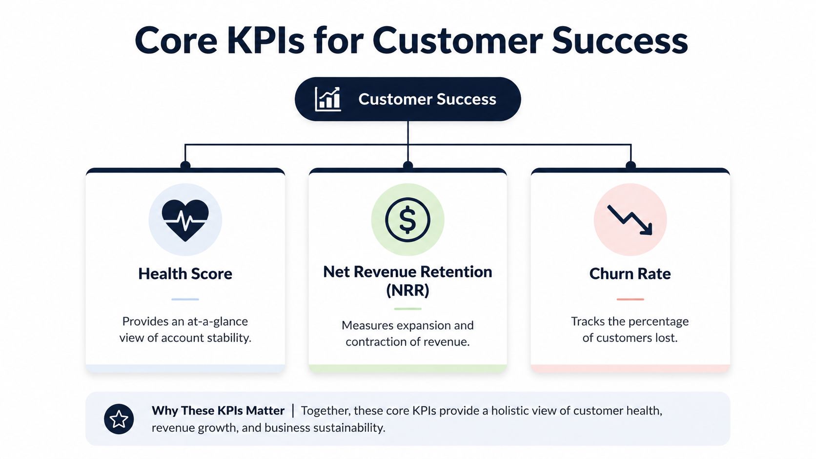
A dashboard can display every available metric and still fail at its main job: deciding where the team should act. Start with a compact foundation of health score, NRR, churn rate, renewal pipeline, and at-risk accounts, then assign each signal to the role that can use it. The executive view may need five metrics, while a CSM or analyst may need a different set within the five-to-ten metric range. The metric list matters less than its owner, threshold, review cadence, and next action.
Health score
A health score combines behavioral, service, relationship, and commercial signals at the account level. The score matters only when it starts a useful conversation: what changed, why did it change, and what should the account team do next?
One implementation uses a 0 to 100 scale, weighting engagement at 30%, support at 20%, and business health at 25%, then checking the result against actual churn to assess predictive value (MetricGen's health score dashboard guidance). Treat those weights as a starting model, not a benchmark. Workflow completion, stakeholder participation, or outcome achievement may predict retention better than login activity for a particular product.
Net Revenue Retention
NRR measures how recurring revenue from an existing customer base changes after expansion, contraction, and churn:
(Starting recurring revenue + expansion revenue - contraction revenue - churned revenue) / starting recurring revenue
NRR exposes account-value movement that logo retention can hide. Show logo churn and revenue churn beside it. Logo churn describes customer loss, while revenue churn shows the financial effect and helps determine which risks deserve immediate attention.
Churn rate
Churn rate tracks lost customers or lost recurring revenue over a defined period. Keep logo churn and revenue churn separate, with clear time boundaries and consistent account definitions. Customer-level churn supports coverage and retention planning. Revenue churn helps leaders assess financial exposure.
Churn is a lagging measure, so pair it with the conditions that precede it, such as falling adoption, unresolved support friction, or missing renewal engagement.
Renewal pipeline
The renewal pipeline shows whether upcoming renewals have a credible path to completion. Include renewal stage, account owner, commercial value, decision-maker engagement, open risks, and next action. Dates alone do not establish forecast quality. Evidence that the customer is achieving value does.
At-risk accounts
An at-risk view should function as a prioritized work queue. Show why the account is flagged, the recurring revenue exposed, the intervention owner, and the next review date. Convert qualitative signals, such as repeated executive concern or deteriorating sentiment, into a documented risk estimate and combine it with revenue exposure. That rule prevents a low-value noisy account from outranking a high-value renewal with weaker but more consequential warning signs.
Use the customer outcome metrics for dashboards as a reference when defining signals, then align them with your operating model. A KPI report template for customer success teams can help standardize ownership, definitions, and review fields. Keep the underlying metric dictionary governed so executives, CSMs, and analysts work from the same definitions while seeing only the measures relevant to their decisions.
Designing Role-Specific Views and Health Scores
A customer success dashboard fails when every role receives the same screen. Assign each role a limited set of metrics, then attach every metric to a decision rule. Executives need commercial direction, CSMs need an ordered work queue, and analysts need evidence that the scoring model deserves trust.
Executive view
Executives need a control panel for retention and commercial exposure. Put NRR, GRR, logo churn, revenue churn, renewal pipeline, and revenue-at-risk trends in the primary view. Show movement over time rather than a single current value, because a point-in-time result can conceal seasonality and account movement.
The executive view should answer four questions quickly:
- Is recurring revenue being retained?
- Where is contraction or churn concentrated?
- Which renewals require leadership attention?
- Are expansion opportunities emerging from healthy adoption?
Keep health-score components out of the primary executive view unless they explain a material commercial movement. Leadership needs the implication, direction, and required decision, not a data dump.
CSM view
CSMs need an account queue, not a board report. Show current health, recent health movement, product adoption, unresolved support patterns, stakeholder engagement, renewal timing, and the next recommended action. A “yellow” status without context forces the CSM to investigate manually.
Each row should state the trigger, the commercial importance, and the intervention owner. Convert qualitative evidence, such as executive concern or repeated workflow friction, into a documented priority. Weight that priority by recurring revenue and renewal proximity so a noisy low-value account does not outrank a quieter account with greater exposure.
Analyst view
Analysts need cohort analysis, metric definitions, source fields, missing-data indicators, and trailing-12-month views. They should test whether health-score changes precede churn, expansion, or renewal outcomes instead of treating correlation as proof. A data-driven dashboard design approach helps connect each displayed measure to the decision it supports.
| Role | Primary Metrics | Refresh Cadence | Key Decision |
|---|---|---|---|
| Executive | NRR, GRR, churn, renewal pipeline, revenue-at-risk | Monthly or quarterly | Where should leadership intervene? |
| CSM | Health movement, adoption, support risk, renewal status, next action | Daily or near real time | Which account needs action now? |
| Analyst | Cohorts, metric lineage, trailing trends, score validation | Bi-weekly or monthly | Which signals predict outcomes? |
Build the score as a model
Start with dimensions that represent engagement, support experience, product value, and commercial health. Assign weights, document the rationale, and record how missing data affects the result. Then compare score movement with actual churn and expansion outcomes. If accounts remain green before contracting, the model is misweighted or its underlying data is incomplete.
A health score should produce an action, not merely a color. Define thresholds for review, escalation, and intervention, and specify who owns each response. Review the rules as the product, customer base, and retention motion change. The score earns credibility when its changes consistently improve prioritization and its assumptions remain visible to the people who use it.
Integrations and Revenue-Impact Automation
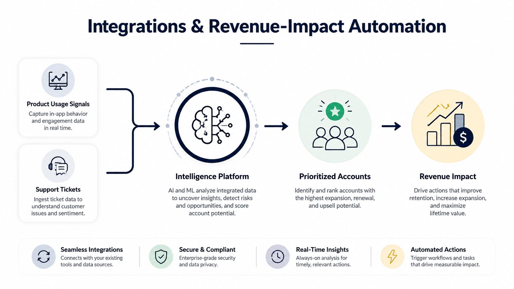
A dashboard can't prioritize customer risk if its inputs are trapped in separate systems. Product usage may sit in an analytics platform, support context in Zendesk or Intercom, account value in a CRM, and product issues in Linear, Jira, or GitHub. Manual exports create delays and often strip away the relationships that make a signal meaningful.
The integration layer should preserve three things: the customer attached to the signal, the behavior or issue detected, and the commercial context surrounding it. A support ticket matters differently when it belongs to a low-engagement account approaching renewal than when it comes from a highly adopted account requesting an expansion feature.
From qualitative feedback to prioritization
Customer feedback often arrives as unstructured language. A chat transcript may describe a confusing workflow. A sales call may reveal an expansion requirement. A support ticket may indicate repeated friction with a feature. The dashboard becomes more valuable when it groups these signals, connects them to usage and account records, and surfaces their likely relationship to churn or expansion.
SigOS ingests support tickets, chat transcripts, sales calls, and usage metrics to reveal patterns correlated with churn, expansion, and revenue impact. Its automated integrations with Zendesk, Intercom, Linear, Jira, and GitHub can create issues with revenue impact scores, helping product and success teams move from detection to ownership without manually translating every customer conversation.
That workflow changes the question from “How many requests mention this feature?” to “Which recurring issue affects accounts with meaningful renewal or expansion exposure?” It doesn't replace human judgment. It gives that judgment a better evidence base.
A practical overview of this operating model is available in revenue intelligence for customer-focused teams.
Governance still matters
Automation can create bad priorities faster if account identifiers, revenue fields, or sentiment classifications are inconsistent. Establish shared definitions for customer, account, subscription, issue, and revenue impact before building alerts. Assign an owner to investigate false positives and review whether automated actions are producing useful work.
Security also belongs in the design conversation. Data access should follow least-privilege principles, sensitive information should be encrypted, and teams should understand how vendors handle customer data. The dashboard is part of the operating system for customer decisions, so data governance can't be an afterthought.
Dashboard Templates and Intervention Workflows

A dashboard template earns its place by assigning decisions to people, not by filling a screen with charts. Build connected views with shared definitions, then limit each role to the metrics it can act on.
Start with an executive retention view covering NRR, GRR, logo churn, revenue churn, renewal pipeline, and at-risk revenue over time. The executive question is exposure and trend. CSMs need a ranked account-risk view with reasons and next actions. Analysts need the segment, product, support, and adoption detail required to test whether those signals predict commercial outcomes.
A monthly view that reveals movement
A monthly metrics dashboard with 12-month trending can expose seasonality and year-over-year performance that a single current-period value hides. The review should focus on movement: which segment changed, which accounts explain the change, and which owner has a response.
If revenue churn rises while logo churn stays stable, leadership should examine account concentration and contraction rather than assume broad dissatisfaction. If health declines among accounts using one workflow, product and success leaders should review adoption friction, support themes, and outcome delivery before renewal risk becomes a commercial event.
BI dashboard examples for 2025 can help teams compare visual patterns. The design matters less than the decision rule attached to each panel.
The intervention queue
The CSM workflow should rank accounts instead of displaying every warning. Each flagged account needs a reason code, an owner, and an action path:
- Detect the change. Identify a material movement in health, adoption, sentiment, support friction, or payment behavior.
- Weight the exposure. Connect the signal to renewal timing, recurring revenue, expansion potential, and strategic importance.
- Assign the response. Create a customer conversation, executive alignment plan, enablement session, support escalation, or product investigation.
- Record the outcome. Capture whether the intervention changed adoption, sentiment, risk status, or renewal confidence.
- Review the rule. If the alert produced no useful action, adjust its threshold, input, or ownership.
Qualitative signals need the same discipline. Tag a support theme or stakeholder concern, link it to affected accounts, then rank it by recurring revenue and renewal proximity. This converts “customers dislike the workflow” into a prioritised investigation with commercial context.
Show expansion readiness too. A healthy account with deeper adoption, positive stakeholder engagement, and unmet use cases belongs in a growth queue, not only a green segment.
Here's a short visual reference for how analytics dashboards can support operational review:
Common Pitfalls and How to Fix Them
Most dashboard problems are governance problems disguised as data problems. The underlying information may be available, but teams haven't agreed on definitions, owners, or response rules.
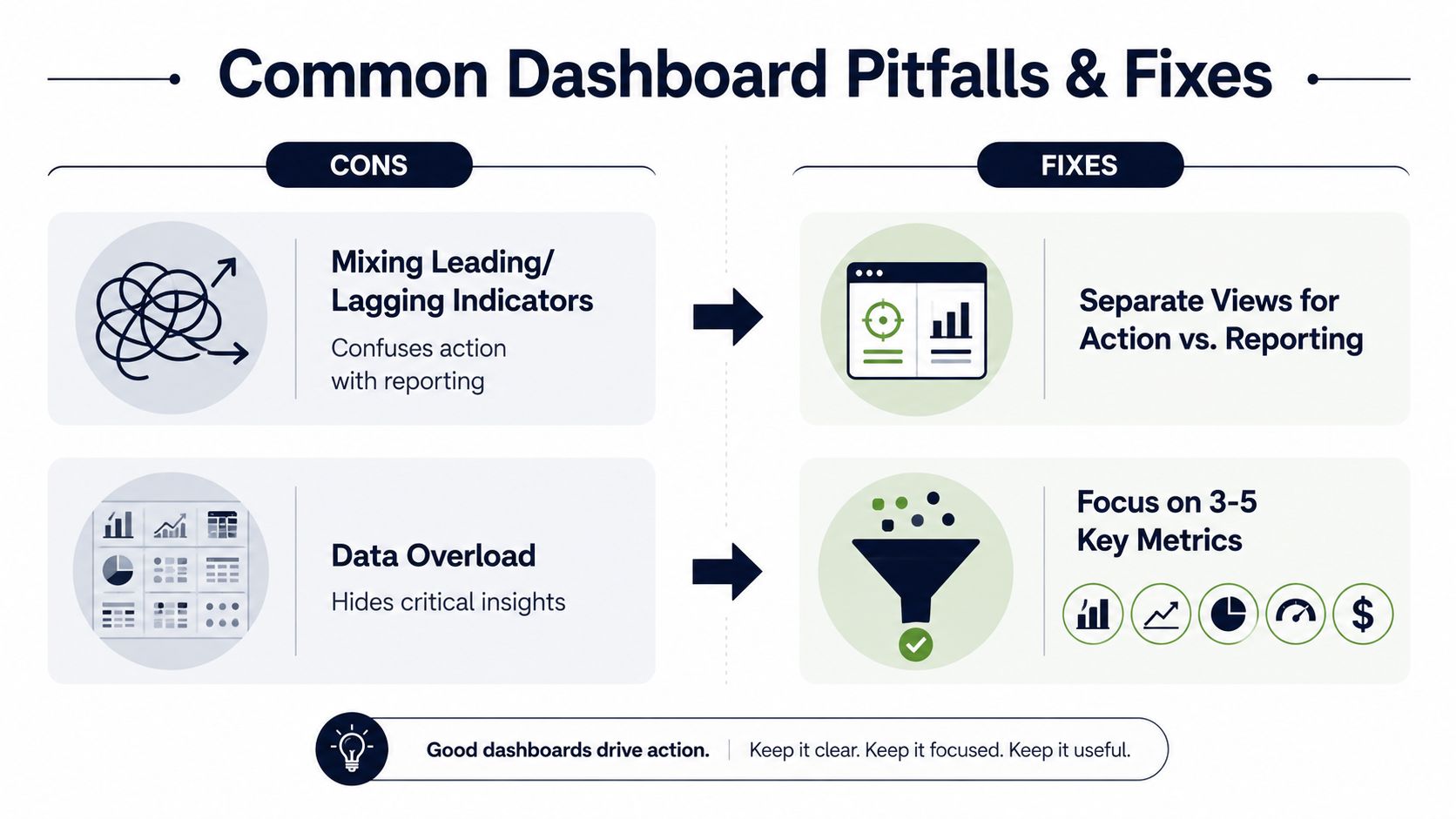
Mixing leading and lagging indicators
Symptom: A dashboard places churn beside product usage and treats every movement as equally urgent.
Why it fails: Churn describes an outcome. Usage and support behavior may provide an opportunity to intervene. Without labels and rules, CSMs can't tell whether they're reviewing history or choosing today's work.
Fix: Separate outcome reporting from action queues. Label each metric as leading, lagging, or diagnostic. Define the condition that creates an alert and the person responsible for responding.
Data overload
Symptom: The dashboard contains a long list of KPIs, filters, charts, and account attributes.
Why it fails: Important signals disappear among low-value context. Users compensate by exporting data, maintaining private spreadsheets, or ignoring the dashboard.
Fix: Start with the five core metrics recommended in modern customer success reporting, then add a metric only when it supports a recurring decision. Keep executive, CSM, and analyst views distinct. Industry guidance also describes operational frameworks with 10 to 15 metrics split across health, risk, growth, and execution (Successifier's dashboard guidance), but that range should inform governance, not justify filling every screen.
Satisfaction without commercial context
NPS and CSAT can reveal sentiment, but they don't explain revenue exposure on their own. A detractor response from a small account and a similar response from a major renewal should not automatically receive identical treatment.
Fix: Join feedback to account value, renewal timing, usage, support history, and product area. Use sentiment to enrich prioritization, not replace behavioral and financial signals. TSIA's 2025 analysis describes a move toward changing metrics, with adoption and Voice of the Customer becoming more central (HubSpot's customer success metrics overview). That direction supports a broader signal model, not a simple swap from one survey score to another.
Treating the dashboard as finished
A health model can decay as customer behavior changes, product workflows evolve, or commercial strategy shifts. Review false positives, missed risks, stale fields, and unresolved alerts. Retire metrics that no longer change decisions, and add new signals only after defining their owner and response.
Optimizing Your Dashboard for Continuous Impact
Treat dashboard design as a recurring governance practice. A quarterly review should examine whether the metric definitions still match the business, whether each role sees the right level of detail, and whether alerts create useful work rather than noise.
Use this review checklist:
- Validate prediction: Compare health-score movement with later renewal, contraction, expansion, and churn outcomes.
- Audit action rules: Check whether every alert has an owner, service-level expectation, and documented next step.
- Review data quality: Find missing customer identifiers, stale revenue fields, duplicate accounts, and inconsistent product events.
- Retire weak metrics: Remove measures that don't change prioritization, coverage, or investment decisions.
- Test role fit: Ask executives, CSMs, and analysts to identify their next action from their own view without opening another report.
- Measure operating impact: Track whether the dashboard reduces time-to-insight and time-to-action, not merely whether users open it.
The strongest customer success dashboard isn't the one with the most information. It's the one that helps a team recognize a meaningful change, assign the right response, and learn whether that response protected or expanded customer value.
SigOS connects support tickets, chat transcripts, sales calls, and usage metrics so customer success and product teams can prioritize issues by revenue impact. Visit SigOS to see how an intelligence-driven dashboard can turn customer signals into clearer renewal and expansion decisions.
Keep Reading
More insights from our blog



Ready to find your hidden revenue leaks?
Start analyzing your customer feedback and discover insights that drive revenue.
Start Free Trial →