Master SaaS Growth with These ROI Templates Excel
Unlock strategic insights with our guide to ROI templates Excel. Learn to build a dynamic model for CAC, LTV, and revenue that drives real business decisions.
Ready-made ROI templates for Excel are everywhere, and it’s tempting to grab one for a quick win. But for a modern SaaS business, most of these generic templates are a trap. They're built on a simple "investment vs. return" formula that completely misses the point of a recurring revenue model.
Why Your SaaS Team Needs a Better ROI Template
Let's be real—that standard ROI template you downloaded from a random business blog wasn't built for a subscription company. It was probably designed to measure a one-off marketing campaign or a physical product launch. While those simple calculators can give you a rough first look, they lack the nuance needed to guide serious strategic decisions in SaaS.
A basic (Net Profit / Total Investment) x 100 formula is a fine start, but it leaves product and growth teams flying blind. It won't tell you a thing about the long-term value of your customers or how tiny tweaks in retention can completely reshape your financial future.
The Problem with Generic Models
The fundamental flaw in generic templates is that they treat every dollar of revenue as equal. For any of us in the SaaS world, we know that's just not true. We don't just "make a sale"; we acquire a customer relationship that, hopefully, lasts for years and grows in value through upgrades and expanded use.
This is exactly why you need a specialized ROI template for Excel—one that’s built around the entire customer lifecycle, not just a single transaction.
I once saw a product team get excited about a major feature overhaul. The initial ROI projection looked great, showing a healthy return based on development costs and a spike in new sign-ups. The problem? Their model completely ignored the potential impact on customer churn.
Without factoring in churn reduction or expansion revenue, the team was making a decision with only half the data. This highlights a critical blind spot: focusing solely on acquisition-based ROI can lead you to prioritize the wrong initiatives, potentially at the expense of your existing customer base.
That experience taught me that the goal isn't to build a static spreadsheet but a dynamic decision-making engine. We need to connect our product choices to real financial outcomes. Even basic tracking can pay off handsomely; one SaaS company's prospecting campaign netted a 300% ROI from a simple Excel template, turning a 5,000 investment into ****15,000 in new sales. On a larger scale, firms that use proper ROI modeling have been shown to cut misallocated budgets by as much as 25%. You can explore more insights on how ROI is calculated over at CaptivateIQ.
Building a Model That Truly Understands SaaS
To build a more powerful model, you have to think beyond simple costs and profits. Your template needs to be anchored to the metrics that actually drive a subscription business. These are the non-negotiables that turn a simple calculator into a strategic weapon for your product and growth teams.
Here’s a quick-reference table of the core inputs we'll be using.
Essential SaaS Metrics for Your ROI Template
| Metric | What It Measures | Why It Matters for ROI |
|---|---|---|
| Customer Acquisition Cost (CAC) | The total sales and marketing cost to acquire one new customer. | Helps you understand the immediate "cost" part of the ROI equation and sets the baseline for profitability. |
| Customer Lifetime Value (LTV) | The total revenue you expect to generate from a single customer over their entire relationship with you. | This is the ultimate "return" metric in SaaS. A high LTV:CAC ratio is the hallmark of a healthy business. |
| Churn Rate | The percentage of customers who cancel their subscriptions within a specific period (e.g., monthly or annually). | Churn is the silent killer of ROI. Lowering churn directly increases LTV and overall profitability. |
| Expansion MRR | Additional recurring revenue from existing customers through upgrades, add-ons, or cross-sells. | This is your fastest path to profitable growth. Factoring it in shows the ROI of features that drive up-sells. |
By weaving these metrics into your Excel template, it stops being a backward-looking report and becomes a forward-looking strategic tool. Suddenly, you can model how different product decisions—like fixing a critical bug to lower churn or building a new module to drive expansion—will truly impact the financial health of your business.
Building Your Dynamic SaaS ROI Model in Excel
Alright, let's move past the generic ROI calculators and roll up our sleeves in Excel. This is where you build a truly powerful, reusable tool that understands the unique pulse of a subscription business. We're not just doing simple math here; we're creating a dynamic, multi-sheet model that gives you a real, data-backed view of your company's financial health.
This isn't just about building a spreadsheet. It's about turning a static document into a core part of your decision-making process.
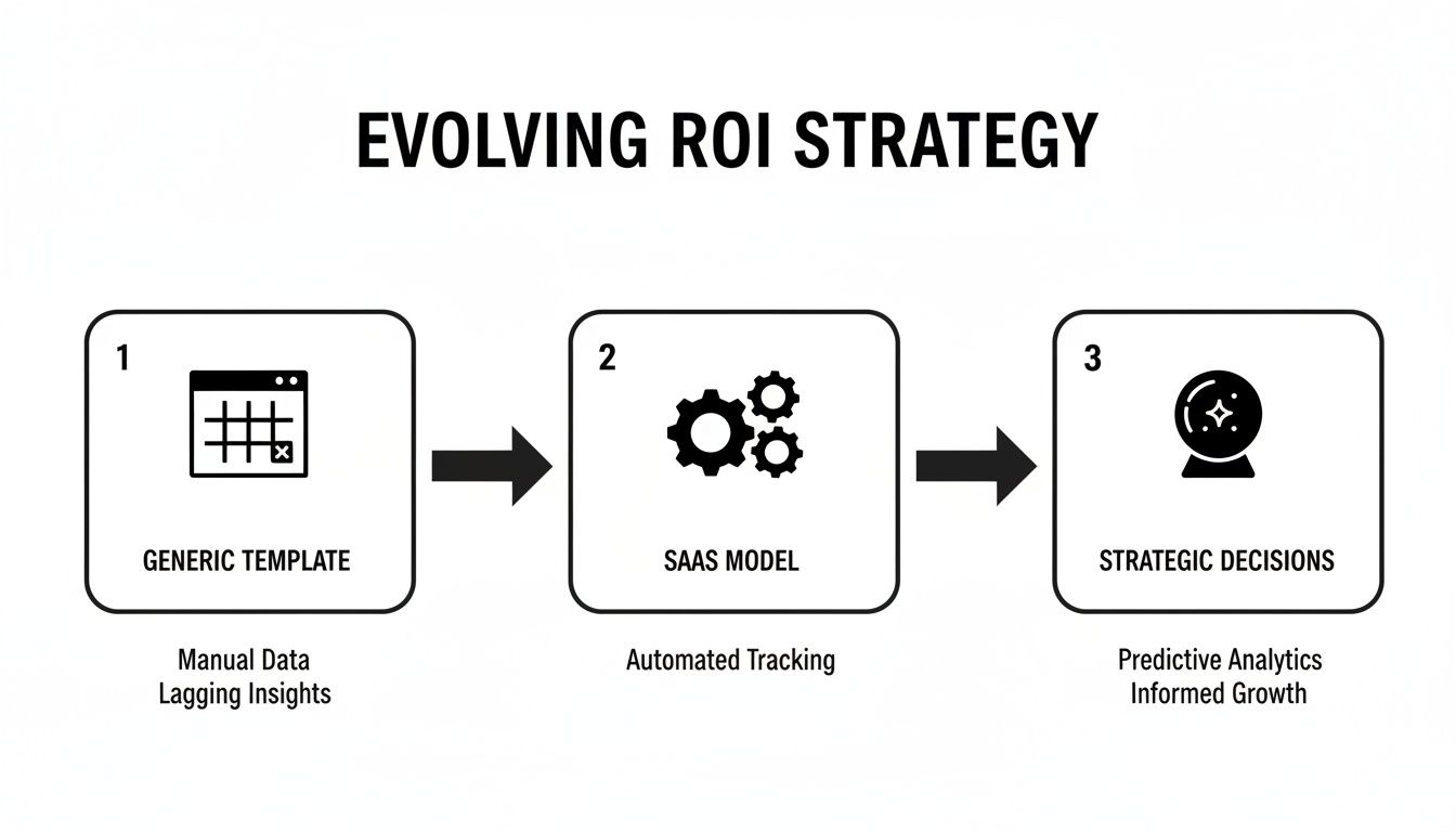
Think of it like this: you start with basic data, plug it into a smart model, and get predictive insights that guide your next move. That’s exactly what we're about to build.
Structuring Your Multi-Sheet Model
The secret to a clean, scalable ROI template in Excel is good organization. I've found the best approach is a simple two-sheet structure: one sheet for all your inputs and a separate one for all the calculations. This setup is a lifesaver—it prevents you from accidentally breaking formulas and makes the whole model incredibly easy to update.
- Sheet 1: Inputs & Assumptions: This is your control panel. All your key SaaS metrics—think CAC, churn rate, expansion MRR—will live right here. Whenever you want to test a new scenario or update a number, this is the only sheet you'll touch.
- Sheet 2: Calculation Engine: This is where the real work happens. It pulls all the data from your 'Inputs' sheet and runs it through a series of formulas to spit out crucial outputs like your LTV:CAC ratio, payback period, and Net Income ROI. Once it's set up, you’ll rarely need to edit this sheet directly.
If you want to get a feel for the fundamentals, looking at how others approach building a powerful Excel template can offer some great structural ideas you can adapt for your own ROI model.
The Inputs and Assumptions Sheet
Let’s start by setting up your 'Inputs' sheet. This is the foundation for the entire model, so clarity is everything. Give each metric a clear, descriptive label.
For a typical SaaS product team, here’s a good starting list:
- Average Monthly Recurring Revenue (MRR) per Customer: Your average subscription price.
- Customer Acquisition Cost (CAC): The total cost to bring in one new paying customer.
- Monthly Churn Rate (%): The percentage of customers you lose each month.
- Monthly Expansion MRR Rate (%): Revenue growth from your existing customers through upgrades or add-ons.
With this structure, your model becomes incredibly flexible. Curious what a 10% reduction in CAC does to your bottom line? Just change that one cell on the 'Inputs' sheet, and the entire model instantly recalculates.
Crafting the Calculation Engine
Now for the engine room. On your second sheet, we'll use formulas to project customer value and profitability over time. The main goal here is to calculate the all-important LTV:CAC ratio, which is the ultimate health check for any SaaS business. A ratio of 3:1 or better is what you're aiming for.
Here are the essential formulas you'll want to include:
- Customer Lifetime (in months): This tells you how long a customer sticks around, on average.
=1 / 'Inputs'!B4(assuming B4 is your Monthly Churn Rate) - Gross Margin-Adjusted LTV: This calculates the true lifetime value by factoring in your cost to serve the customer.
=('Inputs'!B2 * (1 + 'Inputs'!B5)) / ('Inputs'!B4 - 'Inputs'!B5) * Gross_Margin_Percentage - LTV:CAC Ratio: This is your north star metric. It’s the direct comparison of lifetime value to acquisition cost.
=LTV_Cell / 'Inputs'!B3(where B3 is your CAC)
The real beauty of this model is how everything is connected. If you adjust the churn rate on the 'Inputs' sheet, it automatically changes the customer lifetime, which then recalculates your LTV and, ultimately, your LTV:CAC ratio. This dynamic feedback loop is what makes Excel such a powerful tool for strategic planning.
And this isn't just theoretical. A 2026 Deloitte global survey found that 68% of companies using Excel ROI templates boosted their capital efficiency by an average of 19%. In one case, a healthcare SaaS company used a similar model to link support ticket trends to a 12% drop in operational costs, saving them $2.8M.
For a deeper look into putting these templates together, check out our own guide to crafting a comprehensive return on investment template. It’s all about making sure your big decisions are grounded in financial reality, not just gut feelings.
Using Your ROI Template for Strategic Decisions
Once you've built a solid, dynamic model, your ROI template for Excel stops being a rearview mirror. It becomes a tool for peering into the future, letting you game out different scenarios and make genuinely data-backed decisions. This is the leap from simply tracking metrics to using them to drive strategy.
Instead of asking, "What was our ROI last quarter?" you can finally start asking, "What will our ROI be if we do X?" That simple shift in perspective is what separates high-performing product teams from everyone else. You're moving from being reactive to proactive.
Answering Critical Business Questions with Scenario Analysis
This is where your template really starts to shine. The true power lies in Excel's built-in 'What-If Analysis' tools, which you'll find hiding under the Data tab. These features are designed to let you plug in different assumptions and see the ripple effect on your bottom line almost instantly. Now you can get real answers to those tough questions that always pop up in strategy meetings.
Let’s say you’re debating where to put your engineering resources for the next quarter. Instead of a debate based on gut feelings, you can use the Scenario Manager in Excel to model the financial outcome of each path.
- Scenario A: Reduce Churn. You've got a project focused on fixing key bugs that you believe could cut monthly churn from 2.5% down to 2.0%. You plug that new churn rate into your model.
- Scenario B: Increase Expansion. A different project involves adding a new feature tier, and your hypothesis is that it could boost monthly expansion MRR from 1.0% to 1.5%. You model that change.
By running both scenarios, you can compare the projected LTV and overall ROI side-by-side. The conversation completely changes. It’s no longer about opinions; it's about which initiative delivers a quantifiably better return for the business.
Identifying Your Most Influential Levers
Beyond just comparing A vs. B, it’s crucial to understand which of your core metrics has the biggest impact on profitability. Is your business more sensitive to a change in churn, or a change in CAC? This is a job for Sensitivity Analysis.
You can do a simple version of this manually or use Excel's Data Tables. A Data Table is perfect for this—it lets you see how changing one or two variables (like churn rate and CAC) affects a single key result (like your LTV:CAC ratio).
The real eye-opener for many teams is discovering just how sensitive their LTV:CAC ratio is to even small changes in churn. A 1% decrease in churn often has a much larger impact on long-term ROI than a 1% decrease in customer acquisition cost, yet many teams remain hyper-focused on acquisition.
This kind of analysis helps you pinpoint your highest-leverage opportunities. If your model clearly shows that a small drop in churn dramatically boosts ROI, you suddenly have a powerful, data-driven case for prioritizing retention-focused projects. This is exactly how you justify shifting resources from top-of-funnel marketing to, say, improving the post-onboarding experience.
From Product Decisions to Broader Strategy
A well-built ROI template isn't just for prioritizing features. It can inform larger, cross-functional business strategies. When you model different growth, pricing, and operational assumptions, you’re providing the finance and leadership teams with the data they need to set realistic targets and allocate budgets effectively.
This extends beyond just product, too. These models can provide a financial backbone for broader initiatives like Sales and Operations Planning, helping to align sales forecasts with your operational capacity and ensuring the entire organization is working from the same financial playbook.
To put this into practice, try creating "Best Case" and "Worst Case" versions of your forecast using the Scenario Manager.
- Best Case: Churn is a little lower, expansion is higher, and a new channel brings your CAC down.
- Worst Case: A new competitor causes a spike in churn, expansion revenue stagnates, and ad costs go up.
Presenting this range of outcomes to stakeholders is incredibly valuable. It frames the entire strategic conversation around risk and reward, allowing you to build contingency plans with a clear-eyed view of the financial implications. Your simple Excel file becomes the centerpiece for these critical discussions.
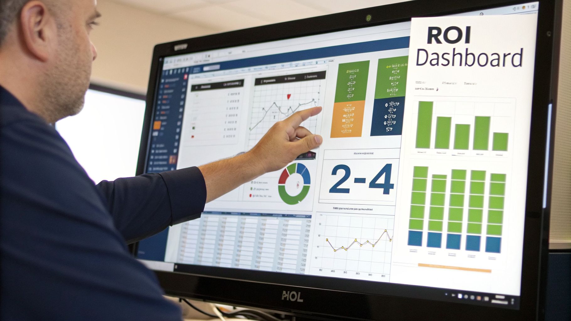
Creating a Visual ROI Dashboard That Drives Action
Let’s be honest: a spreadsheet full of raw numbers, even from the most robust ROI templates for Excel, can make anyone's eyes glaze over. The calculations are your foundation, but a visual dashboard is how you make those numbers talk. This is where you translate complex data into a clear, compelling story that a busy executive can absorb in a glance.
Think of it as the difference between showing someone a blueprint and showing them a 3D model of the finished house. A dedicated "Dashboard" sheet in your Excel file isn't just a nice-to-have; it's what gets your findings understood and acted upon.
Choosing the Right Chart for the Right Metric
The fastest way to kill a good dashboard is to use the wrong chart. The entire point is clarity, and a poorly chosen visual can create more confusion than it solves.
For example, if you're tracking your LTV:CAC ratio over the last 12 months, a pie chart would be a nonsensical mess. A simple line chart, on the other hand, immediately shows you the trend—is your business model getting more or less efficient? It’s all about picking the right tool for the job.
Matching your data to the right visualization is a skill. Here’s a quick-reference table I use to guide my choices for common SaaS metrics.
Choosing the Right Chart for Your SaaS Metrics
| Data to Visualize | Recommended Chart Type | Reasoning |
|---|---|---|
| MRR Growth vs. CAC | Combo Chart (Column + Line) | This chart perfectly illustrates the relationship between your investment (CAC) and your revenue growth (MRR). You can instantly see if your acquisition costs are rising faster than the revenue they generate. |
| ROI Breakdown by Component | Waterfall Chart | Ideal for showing how a starting value (like initial investment) is affected by a series of positive and negative values (revenue, costs, churn impact) to reach a final net ROI. It tells a clear story of what contributed to the result. |
| Scenario Comparison | Clustered Column Chart | When you've run a "Best Case" vs. "Worst Case" analysis, this chart lets you place the potential outcomes side-by-side for an easy comparison of key metrics like LTV or payback period. |
| Key Metric Performance | KPI Cards (Text Boxes) | For your most important numbers like the LTV:CAC ratio or Net Income ROI, sometimes the most powerful visual is the number itself, displayed prominently in a "card" format. |
Getting this right ensures every part of your dashboard has a purpose. If you're new to building dashboards from the ground up, our guide on the core principles of effective data analytics dashboards is a great place to start.
Making Key Trends Impossible to Ignore
With your charts in place, the real magic begins. You can use visual cues to guide your audience's attention exactly where you want it. This is where you stop just reporting data and start presenting insights. Excel's Conditional Formatting is your secret weapon here.
Instead of making people hunt for the important stuff, make it jump off the screen.
- Color-code your LTV:CAC ratio. In your KPI card, apply a simple green-to-red color scale. If the ratio is healthy (above 3:1), it’s green. If it’s sinking toward an unsustainable level (below 2:1), it turns red. It’s an instant health check.
- Flag churn spikes. In the data table behind your charts, create a rule that turns any monthly churn figure above your acceptable threshold—say, 3%—a bright, impossible-to-miss color.
- Visualize with Data Bars. Have a table comparing the projected ROI of several new features? Use data bars to create mini bar charts right inside the cells. This makes it incredibly easy to spot the winners.
The most effective dashboards are designed for the "three-second test." Can a stakeholder glance at it and grasp the main takeaway in three seconds? Visual tools like combo charts and conditional formatting are what make this possible.
By combining the right charts with smart, attention-grabbing formatting, your ROI template for Excel transforms. It's no longer just a spreadsheet; it’s a dynamic, persuasive tool that frames the conversation and rallies your team around a clear path forward.
Taking Your ROI Model to the Next Level with Product Intelligence
You've built a solid, dynamic SaaS ROI model. It's a great tool for forecasting the impact of big-picture strategic moves. But its real power is still capped by the quality of your inputs. This is where we go from good to great by connecting your ROI templates for Excel directly to the voice of your customer—quantified and translated into dollars and cents.
What if you could calculate the precise ROI of fixing one specific bug? Or building a single, highly-requested feature? This isn’t just a thought experiment. It’s what happens when you start feeding real product intelligence into your financial models.

From Educated Guesses to Granular ROI
Most ROI analysis focuses on broad goals like "reduce churn" or "increase expansion." That's useful for high-level planning, but it doesn't help a product manager decide what the engineering team should work on this week.
This is the gap that product intelligence tools like SigOS were built to fill. They sift through mountains of unstructured customer feedback—support tickets, sales call transcripts, user surveys, chat logs—and connect the dots back to your revenue.
This process essentially turns qualitative feedback into hard, quantifiable data points you can plug straight into your Excel model.
For example, your intelligence platform might flag that a nagging API bug is mentioned over and over again by customers who eventually churn. It can then assign a "revenue-at-risk" score to that specific issue.
Instead of a PM arguing, "I think this bug is important," they can now state with confidence, "This bug is directly correlated with $50,000 in monthly churn risk." This one data point completely changes the prioritization meeting from a battle of opinions to a clear-headed business decision.
With that number in hand, the "cost of inaction" becomes a tangible input for your ROI template. The "Return" is the $50,000 in monthly revenue you stand to save by dedicating a few engineering sprints to the fix. Suddenly, your Excel model isn't just for the C-suite; it’s a killer tool for managing the development backlog.
For SaaS growth teams, this gets even more powerful. Imagine analyzing post-demo chat logs and discovering that a few specific feature requests are accelerating the pipeline by 35%, a potential $4M annual gain. Combine that with churn predictions that are 87% accurate, and you can turn everyday product decisions into revenue-generating moves. Some teams even map UX fixes on a 2x2 matrix against their dollar impact—one team I know saw a 210% ROI just by reducing support tickets 40%. You can find more examples of these calculation templates on Smartsheet.com.
How to Pipe Intelligence into Your Template
The good news is you don't need to rebuild your spreadsheet from scratch. It's really about adding a new layer of data to your existing "Inputs & Assumptions" sheet.
Here’s a simple, practical way I’ve seen this work well:
- Add a New Section: On your 'Inputs' sheet, create a new area called something like "Product Intelligence Scenarios."
- Define the Initiative: Give each row a clear label for the specific item you're evaluating (e.g., "Fix API Timeout Bug-123").
- Input the Financial Impact: Create dedicated cells for the metrics your intelligence platform gives you. This usually includes:
- Monthly Revenue at Risk (Churn): The amount of MRR you're likely to lose if you do nothing.
- Potential Expansion Revenue: The new MRR you could unlock by building a requested feature.
- Associated Engineering Cost: Your best estimate of what it will cost to build or fix the item.
- Link to Your Calculations: Over in your 'Calculation Engine' sheet, set up a new ROI formula that pulls from these cells. The "Return" is simply the sum of saved churn and potential expansion, while the "Investment" is your engineering cost.
This approach gives you a clean, isolated ROI figure for even the smallest development tasks. To get a better sense of how this data is often processed and presented, take a look at our guide on building a sample of data analysis report.
Prioritizing Your Backlog by Dollar Impact
Once this system is up and running, you can create a simple but incredibly powerful table that ranks your entire backlog by financial impact.
| Initiative | Estimated Cost | Projected Annual ROI |
|---|---|---|
| Fix Bug-123 | $15,000 | $600,000 (from churn reduction) |
| Build Feature-X | $40,000 | $120,000 (from new expansion) |
| Improve Onboarding | $25,000 | $80,000 (from better retention) |
This table, fed by real-world data from your product intelligence platform and calculated within your Excel template, becomes the ultimate source of truth for your roadmap. It takes emotion, ego, and politics out of the equation. It allows you to confidently point your most valuable resource—engineering time—at the initiatives guaranteed to have the biggest, most predictable impact on the bottom line.
Common Questions About Using Excel for ROI
Once you've built your ROI model, the theoretical part is over, and the practical questions begin. I've seen countless product and growth teams build fantastic spreadsheets, only to wonder how to actually weave them into their daily and monthly rhythms.
Let's walk through some of the most common questions that pop up. Getting these right is the difference between a template that gathers digital dust and one that becomes a core part of your strategic toolkit.
How Often Should I Update My SaaS ROI Template?
For most SaaS companies, a monthly update hits the sweet spot. This lines up perfectly with how you track MRR and gives you a clear signal on key metrics like CAC, churn, and LTV. It’s frequent enough to spot trends but not so frequent that you get bogged down in statistical noise.
Of course, there are times when you need to speed things up.
- During a big launch: If you’re in the middle of a major product release or a high-stakes marketing campaign, you’ll want faster feedback. Shifting to weekly updates can tell you if your investment is paying off in near-real-time.
- Testing a new channel: When you're experimenting with a new acquisition source, you can't afford to wait a month to see if it's working. Check the numbers weekly to decide whether to double down or cut your losses quickly.
The goal is to find a rhythm that delivers real insights without creating a reporting nightmare. For big-picture strategy, monthly is great. For a tactical blitz, go weekly.
Can This Excel ROI Template Scale as My Company Grows?
Yes, but its role will change. This kind of dynamic Excel model is a powerhouse for early and growth-stage companies—it's everything you need when you have a few hundred or even a few thousand customers.
The problem with Excel at massive scale isn't the formulas; it’s the data logistics. When you're juggling multiple product lines, complex datasets, and thousands of customers, a spreadsheet can get slow, clunky, and become a version-control headache.
When you hit that point, you’re not throwing the model away. Instead, you’re graduating. Most companies migrate the proven logic from their spreadsheet into dedicated Financial Planning & Analysis (FP&A) software or a BI platform.
Think of your Excel template as the perfect blueprint for that migration. You’ve already done the hard work of defining and validating all the metrics, formulas, and reports you'll need.
What Is the Biggest Mistake People Make with ROI Templates?
By far, the biggest mistake is treating the template like a history book. It’s not just for looking backward at last month’s performance. Its real power is as a crystal ball.
You should be using it to run scenarios before you spend a dollar or a sprint. What’s the potential ROI of that new feature? How would a 10% price increase impact LTV and payback period? That’s where the magic happens.
A close second is relying only on the quantitative numbers you can easily pull. The most advanced teams enrich their models by connecting them to qualitative feedback. For example, knowing a specific bug is putting $20,000 in monthly revenue at risk of churn is a game-changer. That's how you go from just reporting numbers to making truly informed strategic decisions.
Ready to stop guessing and start quantifying the real dollar impact of your product decisions? SigOS is the AI-driven intelligence platform that connects customer feedback directly to your bottom line. Learn how SigOS can supercharge your ROI analysis today.
Keep Reading
More insights from our blog


Ready to find your hidden revenue leaks?
Start analyzing your customer feedback and discover insights that drive revenue.
Start Free Trial →