Scroll Heat Map: Uncover User Behavior Patterns
Use a scroll heat map to understand user behavior. Interpret patterns, find growth insights, and prioritize changes to boost your revenue in 2026.

You launch the page on Tuesday. The design is clean, the copy got approval from product and sales, and traffic starts landing within hours. By Friday, the page has plenty of visits and almost no movement in the metric that matters. Trial starts stay flat. Demo requests barely move. The team starts blaming the offer, the channel, or the headline.
A lot of the time, the problem is simpler. People never saw the part of the page that was supposed to do the selling.
That's why a scroll heat map is one of the first things I check when a page looks polished but underperforms. It helps you stop arguing about whether the message is strong “in theory” and start looking at whether users reached the proof, pricing detail, objection handling, or CTA that was meant to convert them.
The important shift is this. A scroll map isn't a design vanity tool. It's a visibility tool. And visibility is tied directly to revenue. If the section that explains why your product is worth buying lives below the point where attention dies, you don't have a persuasion problem first. You have a page structure problem.
Your Beautiful Page Is Live But No One Is Converting
A common failure pattern looks like this. The hero section wins internal praise. The product screenshots look sharp. The copy team adds testimonials, comparison points, FAQs, and a strong CTA lower on the page. Analytics shows people are arriving. Conversion barely changes.
The team often responds by adding more content. More proof. More feature detail. Another testimonial block. A second pricing explainer. That usually makes the problem worse if the underlying issue is that users stop scrolling before they reach any of it.
I've seen this most often on pricing pages and feature launch pages. The business assumes the page underperformed because the message wasn't convincing enough. But once you inspect behavior, the pattern is usually more basic. Key information sits too low, the opening screen creates friction, or mobile users lose the thread long before the page makes its case.
That's where scroll data becomes more useful than opinion. It shows whether your page earns enough attention to expose the content that drives action. If you're already reviewing broader Sitecore conversion strategies, add scroll behavior to that process because conversion work is really about connecting layout decisions to business outcomes, not just button color debates.
A smart companion mindset is data-driven design. Good pages don't just look coherent. They sequence information in the order users are likely to consume it.
Practical rule: If your most important section sits below the point where users stop exploring, the page is under-monetizing the traffic you already paid for.
The reason scroll maps matter here is that they expose the hidden gap between what your team published and what visitors experienced. That gap is where a lot of lost revenue lives.
What Is a Scroll Heat Map Really Showing You
A scroll heat map is best understood as a digital dye test for attention. You pour traffic into a page and watch how far that attention flows before it thins out.
Heat maps are part of a broader visualization family, and the website-specific form became common as product analytics and UX tooling expanded in the 2010s and later. In this use case, the map shows the percentage of visitors who reach each vertical depth on a page, which makes it useful for pages built for conversion or content consumption because it reveals where attention falls off rather than just where clicks occur, as described in Wikipedia's overview of heat maps.

What the colors mean
The color gradient doesn't measure excitement. It measures reach.
A warmer area means more visitors made it that far down the page. A colder area means fewer did. That's why scroll maps are different from click maps and cursor maps. Click maps show interaction. Scroll maps show visibility.
This distinction matters because a section can't influence conversion if users never reached it. Teams sometimes obsess over low clicks on a CTA when the simpler explanation is that the CTA sat in a low-visibility zone.
Here's the quick comparison:
| Map type | What it tells you | Best use |
|---|---|---|
| Scroll heat map | How far users reach on the page | Visibility, content placement, drop-off diagnosis |
| Click map | Where users click or tap | CTA performance, false affordances, interaction patterns |
| Movement map | Where cursors move on desktop | Supplemental attention clues, not a reading proxy |
Why aggregated behavior matters
A useful scroll map is not a single-session artifact. It's aggregated behavioral data. That aggregation helps you see page-level patterns instead of reacting to one user's odd browsing path.
That's also why scroll maps work well alongside broader analytics workflows. If you're trying to connect page behavior with real-time decision making, resources like Live View Pro's analytics explained are helpful because they reinforce the same operating principle. Raw activity is only valuable when you can interpret what users are doing and what that means for revenue.
For teams moving from page metrics to behavior analysis, behavior analytics workflows are the right next step. The scroll map gives you the visual. The rest of your stack helps explain whether that visual points to friction, intent mismatch, or a content sequencing problem.
A scroll heat map doesn't tell you whether users liked your page. It tells you how much of your page they had a chance to evaluate.
How to Read Scroll Map Patterns Like an Expert
Most beginners read a scroll map like weather. Warm colors feel good. Cool colors feel bad. That's not how experienced teams use it.
The core value is pattern recognition. You're looking for shape, not just shade.

Contentsquare describes a scroll heat map as a depth-distribution visualization that shows the percentage of visitors who reach each vertical point on a page. In practice, the most useful signal is the drop-off curve, the point where visibility sharply decays, because that identifies the effective fold and helps teams decide whether critical content needs to move higher on the page, as explained in Contentsquare's heatmap guide.
Sharp drop versus gradual fade
A sharp drop usually means the page hits friction. That friction might be a weak first screen, a confusing transition, an oversized visual block, or content that doesn't match the visitor's intent.
A gradual fade is different. It often means the page is behaving normally, with attention naturally thinning as users move deeper. That pattern can still justify change, but it's less likely to indicate one obvious UX break.
When I review a page, I ask one basic question first. Did the page lose people because attention naturally tapered, or did the design create a cliff?
False bottoms and broken flow
One of the more expensive mistakes is the false bottom. That happens when users think the page has ended even though more content exists below. Large empty gaps, abrupt background changes, oversized dividers, or a footer-like block can all create that illusion.
Watch for a map where users consistently stop around a section that visually feels terminal. If the page still has high-value proof, pricing logic, or a CTA below that point, the design is hiding revenue behind a mistaken endpoint.
A useful way to operationalize this is to form a testable hypothesis, not just a visual opinion. Teams that already run structured experiments should fold this into hypothesis testing discipline, because the map identifies where to test, not what result the test will produce.
This walkthrough is worth a quick watch before you start diagnosing patterns on your own:
Desktop and mobile rarely tell the same story
A page can look healthy on desktop and broken on mobile. That's normal.
On a larger screen, users may reach pricing details, comparison rows, or product proof without much effort. On mobile, those same sections can fall too far down the experience, especially if the page opens with a tall hero, stacked navigation, or repeated trust badges.
Use this review lens:
- Check the effective fold: Where does meaningful visibility fall off by device?
- Inspect key sections separately: Did mobile users reach the primary message, not just the top of the page?
- Look for density problems: A layout that scans well on desktop can feel endless on mobile.
- Review CTA position: A button that feels present on desktop may be buried on smaller screens.
If mobile users stop before your core value proposition, the issue usually isn't “mobile traffic quality.” It's page geometry.
Turning Scroll Data into Actionable Growth Insights
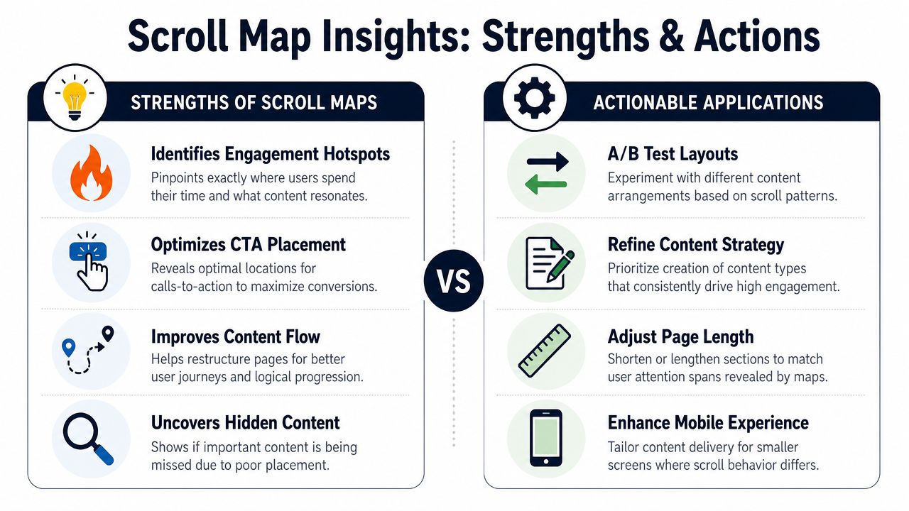
A scroll heat map becomes useful when it changes what your team does next. Not when it produces a screenshot for a slide deck.
Microsoft Clarity describes scroll maps as a way to quantify engagement depth by showing what percentage of users reach different parts of a page, often alongside an average fold score. That lets teams judge depth-of-view and identify when a key CTA is placed below the fold where only a minority of visitors scroll. Clarity explicitly states that this helps determine ideal page length for maximum conversions in its scroll maps documentation.
The pages that usually produce value fastest
The strongest starting point is almost always a page close to money. Pricing. Demo request. Trial signup. Product detail. Renewal education. Upgrade flow.
On those pages, scroll behavior can immediately sharpen prioritization because the business outcome is clear. If users don't reach the section that resolves a buying objection, that's not just a UX issue. It's a revenue leak.
Here are a few patterns I see repeatedly.
Problem, insight, action
The CTA was too lowA team put the primary signup CTA after feature details, social proof, and FAQ content. The scroll map showed the page was asking users to stay patient longer than they were willing to. The right move wasn't adding another CTA at the bottom. It was moving a strong action point above the major visibility decay.
The headline earned the click but not the scrollTraffic arrived from a campaign with a clear promise. The hero copy shifted into generic product language instead of matching that promise. The map showed users abandoning early. The page needed a tighter opening message and a faster path to proof, not more content lower down.
A buried differentiator never got seen A product team had a strong point of differentiation, but it lived deep in a comparison section. The map made the issue obvious. The value wasn't weak. The placement was weak.
The form introduced commitment too earlyOn a lead-gen page, users encountered a long form before they had enough confidence. Scroll patterns paired with form behavior often reveal this mismatch. The fix is often sequencing. Let users absorb a few confidence-building blocks before asking for effort.
What works and what doesn't
What works:
- Moving proof higher: Put testimonials, product evidence, or a pricing explainer before the first major drop.
- Tightening the first screen: Remove decorative bulk that delays clarity.
- Repeating the right CTA: Not everywhere. At the moments where intent is likely to peak.
- Restructuring mobile layouts: A desktop-first page often needs a different order on smaller screens.
What doesn't:
- Treating every cold zone as failure: Some content is meant for committed users deeper in the funnel.
- Adding more sections after a drop-off point: That just buries content in an area users already ignore.
- Redesigning the whole page at once: You lose the ability to learn what changed.
- Using scroll data alone: Visibility is necessary, not sufficient.
Field note: The highest-value change is rarely the most obvious visual change. It's the change that improves what users see before they decide whether to continue.
Implementing Scroll Maps Tools and Data Best Practices
Many teams don't fail because they picked the wrong heatmap tool. They fail because they read one blended map, draw a confident conclusion, and optimize for an imaginary average user.
Scroll maps are most actionable when you treat them as an aggregated dataset across device classes. Sources note that these maps combine desktop, mobile, and tablet behavior, which makes them useful for diagnosing cross-device content loss. The same page can look effective on desktop while underperforming on mobile if the scroll-depth decay happens before the primary message. That's why segmentation matters, as discussed in Arcalea's explanation of scroll heat maps.
Tool options and what to care about
There are several ways to get scroll data. Hotjar, Microsoft Clarity, and Contentsquare are common starting points. Chartbeat is useful for editorial environments. SigOS can also fit into this workflow when teams want scroll behavior alongside broader product intelligence, especially when they need to connect behavioral patterns with customer feedback and business signals in one operating view.
If you're still evaluating software, a practical guide to selecting heatmap tools can help narrow the field. But don't overcomplicate selection. The question isn't “Which dashboard looks nicest?” It's “Can this setup help us isolate revenue-relevant behavior by audience and device?”
The setup checklist that avoids vanity analysis
Use this checklist before you trust any readout:
- Segment by device: Always split desktop, mobile, and tablet. Merged views hide layout-specific failure.
- Filter by traffic source: Paid visitors, organic visitors, and social visitors often arrive with different intent.
- Separate new and returning users: Returning users may scroll with purpose. New users often need more reassurance.
- Freeze major page changes during collection: Mixed layouts create misleading maps.
- Review page intent first: A pricing page and a help article should not be judged by the same definition of success.
What to ignore at first
Don't start by debating exact shades or tiny visual transitions. Start with the structural questions:
| Question | Why it matters |
|---|---|
| Did users reach the primary message? | If not, copy quality lower on the page doesn't matter yet |
| Did mobile lose visibility earlier than desktop? | That usually points to layout and density issues |
| Did traffic cohorts behave differently? | A blended map can hide high-intent user patterns |
| Did the page goal match the reading pattern? | Informational pages need a different interpretation than conversion pages |
Good scroll analysis is mostly disciplined filtering. The teams that get value from it don't stare at one colorful overlay and guess. They compare cohorts, connect the patterns to page goals, and only then decide what deserves a test.
Beyond Scroll Depth Prioritizing for Revenue Impact
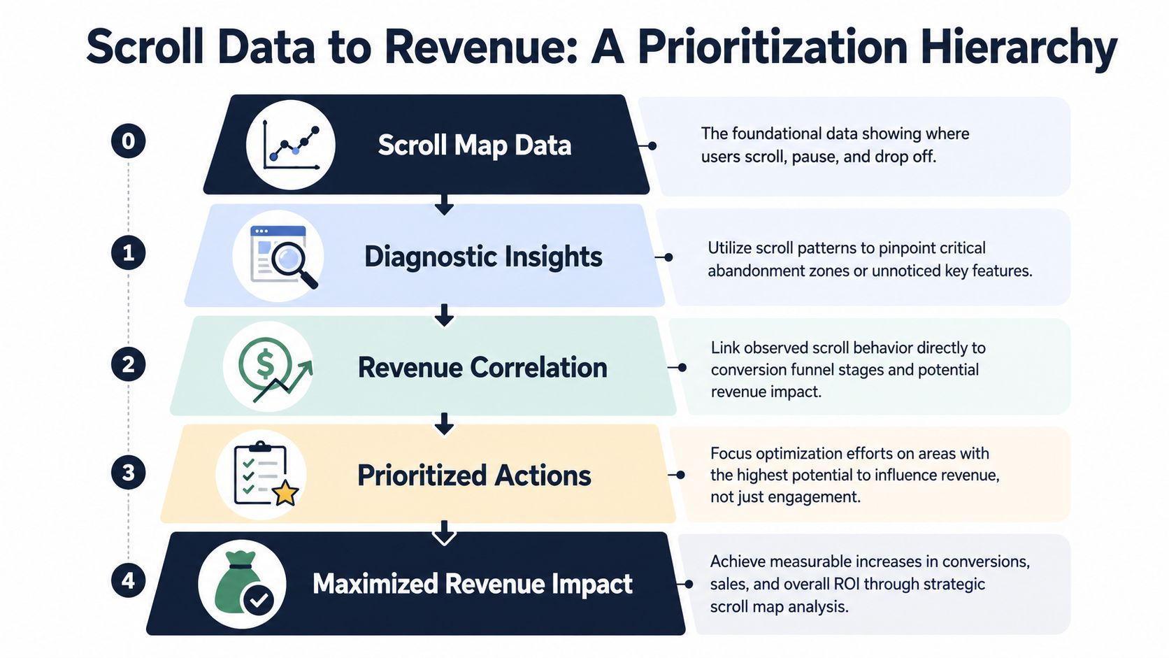
Most articles end too early. They show you how to spot a drop-off. They don't show you how to decide whether that drop-off deserves engineering time, design time, or no action at all.
A scroll heat map tells you what users saw. It does not tell you why they stopped, which segment mattered most, or how much money the issue is costing you.
Draft Nu makes an important point here. Scroll heat maps are only actionable when tied to a success metric. For long-form content, a short scroll can mean the user got what they needed quickly, not that the page failed. Coverage often fails to distinguish commercial and informational page goals, which means a drop-off can be a false alarm without context, as noted in Draft Nu's guide to heat maps.
The wrong way to prioritize
A lot of teams rank issues like this:
- Biggest visible drop-off
- Most surprising pattern
- Loudest internal reaction
That approach creates motion, not outcomes. A dramatic drop before a blog FAQ may matter far less than a moderate visibility loss on a pricing explanation that sales prospects need before they book.
The better operating model
Use scroll maps as the smoke alarm. Then connect them to other evidence.
Look at:
- Support tickets: Are users asking questions answered in a section they never reach?
- Sales calls: Do prospects repeatedly miss a capability that sits deep on the page?
- Chat transcripts: Do buyers ask for reassurance that exists but is poorly placed?
- Usage and retention data: Are users misunderstanding onboarding content that affects activation?
- Expansion signals: Are high-value accounts failing to discover upgrade messaging hidden too low in the flow?
When those signals line up, prioritization gets sharper. A drop-off before a generic content block is one thing. A drop-off before the section that addresses a common enterprise objection is another.
Commercial pages and informational pages need different judgment
This distinction saves teams from wasted work.
On a commercial page, lower scroll depth often means users missed content required for conversion. That can justify layout changes quickly.
On an informational page, short scroll depth isn't automatically failure. A help-center article can succeed if users find the answer near the top and leave satisfied. A thought-leadership article may earn partial reading and still build trust. Context defines the interpretation.
Don't optimize for scroll depth in isolation. Optimize for the business outcome the page exists to produce.
A practical prioritization filter
When deciding whether to act on a scroll pattern, ask:
- Is this page tied to revenue, retention, or expansion?
- Did the missed section contain information users needed to progress?
- Do qualitative channels confirm confusion or missed value?
- Is the issue concentrated in a high-value segment, such as mobile trial traffic or enterprise prospects?
- Can we test a small structural change before committing to a redesign?
If the answer is mostly yes, the pattern deserves action. If not, it may just be interesting.
The biggest mindset shift is this. A scroll heat map helps you find visibility problems. It does not tell you which problem is costing you the most. That second question requires connecting behavior to customer language and business impact.
If your team can already see where users drop off but still struggles to decide what deserves action first, SigOS is built for that next layer. It helps product, growth, and support teams connect behavioral signals with support tickets, chat transcripts, sales calls, and revenue impact so the work queue reflects what's affecting churn, expansion, and conversion.
Keep Reading
More insights from our blog



Ready to find your hidden revenue leaks?
Start analyzing your customer feedback and discover insights that drive revenue.
Start Free Trial →