How to Build a SaaS Analytics Dashboard
Build a SaaS analytics dashboard that turns KPIs, customer signals, alerts, and workflows into clear revenue and retention actions.

You've got a dashboard that looks busy, but the team still asks the same question in Slack every Monday: what changed, why did it change, and who's doing something about it? That gap is where most SaaS reporting breaks down. The fix isn't another row of charts, it's building a SaaS analytics dashboard around decisions, causes, and accountable follow-through.
Start With Decisions Rather Than Charts
A product team sees activation drop on Friday afternoon. The dashboard is open, the charts are polished, and nobody can agree on the cause. One person blames onboarding friction, another points to a broken workflow, a third thinks the customer mix changed, and customer success says support volume jumped.
That's the moment to stop thinking in terms of visuals and start with a decision question. A useful SaaS analytics dashboard answers something like, “Which issue do we investigate first, and who owns the next action?” If the dashboard can't support that decision, it's just decoration.
Build the dashboard around a recurring decision
Start by writing a short purpose statement. For example, “This dashboard helps the product and customer teams identify why activation, retention, or expansion moved, then route the right issue to the right owner.” That statement forces a primary audience, a business outcome, and a response pattern before anyone picks a chart.
Practical rule: If a metric moves and nobody can name the next owner, the dashboard isn't operational yet.
The best dashboards distinguish operating metrics from diagnostic context. Operating metrics tell you what changed, such as activation, churn, or expansion. Diagnostic context explains why it changed, such as feature usage, support themes, customer segment, or contract profile.
A good decision map is simple. Signal. Interpretation. Action. Owner. Expected business outcome. That sequence keeps the dashboard from turning into a reporting wall, which is a common failure when teams try to cram product usage, support, growth, and revenue into one first screen.
The strongest dashboards often support only a few recurring decisions, not every question in the business. If product leadership needs to investigate activation, customer success needs to triage churn risk, and revenue wants expansion signals, those are related but not identical workflows. A single view can connect them, but it shouldn't flatten them into one undifferentiated pile of metrics.
Define the KPIs and Metric Contracts
A good dashboard starts with trust, and trust starts with definitions. SaaS teams talk about MRR, ARR, churn, CAC, LTV, LTV:CAC, ARPU, and retention as if everyone means the same thing, but they often don't. Until the team agrees on those definitions, putting the metrics on a dashboard just creates faster confusion.
Industry guidance consistently treats MRR and ARR as the core revenue measures, with churn, CAC, LTV, LTV:CAC, ARPU, and retention as the supporting economics around them, and common benchmark thinking often treats a healthy LTV:CAC ratio as 3:1, with strong net revenue retention often considered 110% or higher. More advanced benchmark guides describe top-quartile NRR as above 130%, but those thresholds only help if everyone has the same formula and grain behind the number. Klipfolio's SaaS dashboard examples is a useful reference point for the metric set, while the thresholds themselves should be used as directional operating context, not as a substitute for internal definition.
Write a metric contract before the dashboard goes live
A metric contract is the simplest way to prevent drift. For each KPI, record the owner, exact formula, grain, time window, segment rules, exclusions, and expected refresh cadence. That sounds tedious, but it saves hours later when a PM and an analyst disagree about whether a cancellation should count as churn or whether a refunded invoice should remain in revenue.
A practical pattern is to split metrics by business stage. Acquisition can track qualified signups or traffic quality. Activation can track the first meaningful success event. Engagement can track core feature use. Retention can track account survival or usage persistence. Expansion can track upgrade movement. Revenue efficiency can track CAC and payback economics.
Each of those needs a stable definition.
- Separate new MRR from expansion MRR. Mixing them hides whether growth is coming from new customers or existing accounts.
- Choose account-level or user-level retention explicitly. A customer success team often needs account-level retention, while product teams may care more about user-level persistence.
- Define refunds, trials, upgrades, and cancellations once. If finance and product handle those differently, every dashboard refresh becomes a debate.
- Pick one time window for each KPI. A churn rate that shifts windows every quarter stops being comparable.
If you want a practical reference for structuring KPI reporting, the KPI report template from SigOS is a useful internal-style model for turning definitions into a shared operating view. For teams working through churn specifically, Creem's practical churn analysis guide is a solid companion because churn only becomes actionable when definitions, cohorts, and segments line up.
A metric contract isn't a data team artifact. It's the agreement that keeps product, revenue, and support looking at the same business.
Validation should happen before the dashboard reaches leadership. Check for denominator changes, unexpected nulls, missing segments, and sudden jumps caused by a tracking change rather than by customer behavior. If the number changed but the definition didn't, the data pipeline probably did.
Instrument and Model Reliable SaaS Data
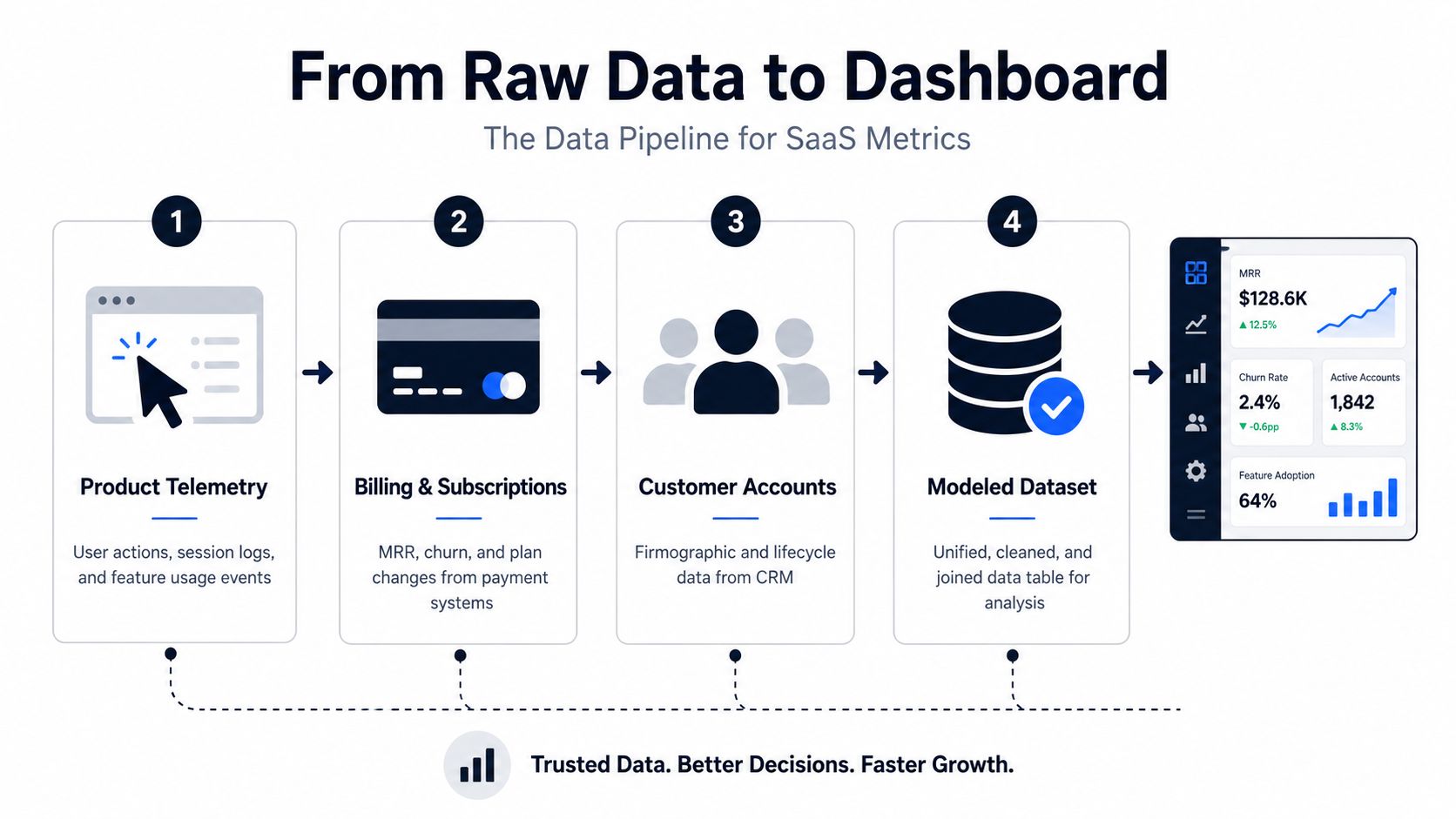
A dashboard is only as useful as the join between source systems. SaaS teams usually need product telemetry, billing and subscription data, customer account records, support interactions, and campaign attribution to sit in the same model. If those sources don't share stable identifiers and timestamp conventions, the dashboard will look precise while still being wrong.
Get the model right before you think about speed
Start with event naming and identity resolution. A single action should have one name, one meaning, and one owner. If “workspace_created,” “org_created,” and “team_created” all mean roughly the same thing, decide which one is canonical and map the others into it. The same discipline applies to customer and account IDs, which need to survive merges, plan changes, and product migrations.
Then standardize the basics. Use consistent timestamp logic, currency handling, and timezone rules. Keep test data out of production dashboards. Treat late-arriving events carefully so yesterday's metric doesn't change after the executive review has already happened. Access controls matter too, especially when support notes or conversation transcripts are joined with product and revenue data.
A clean transformation flow usually looks like this:
- Raw events arrive from product, billing, CRM, and support tools.
- The data is cleaned, deduplicated, and normalized.
- Records are mapped into a stable business model.
- Common time grains and segments are pre-aggregated for reuse.
- Validation checks compare dashboard outputs to trusted systems.
That pre-aggregation step matters because dashboards get slow when every refresh recalculates the same heavy metrics from scratch. NetSuite's dashboard guidance emphasizes that heavy recalculation hurts speed, and that combining disparate sources while controlling access is a recurring challenge, which matches what many SaaS teams see in practice. The fix is to do repeated work upstream, not inside the visualization layer. Schoenbaum's dashboard anatomy guide covers the same practical point from the data-engineering side.
Validate the model like a product surface
Validation should be boring and systematic. Check row counts after each load. Compare joins for duplication. Watch null rates on IDs and timestamps. Reconcile key totals with finance, CRM, or support systems before users start relying on the numbers.
Batch processing is enough for many weekly and monthly business reviews. Near-real-time updates make sense when the dashboard is tied to live onboarding, churn prevention, or active customer support routing. The more the view is used for intervention instead of retrospective analysis, the more useful near-real-time ingestion becomes.
For teams that need a practical reminder of how bad data shows up in real dashboards, SigOS's data quality issues guidance is a helpful pattern library. It's worth reading alongside your own model because the biggest mistakes are usually not dramatic, they're quiet mismatches in definition, freshness, or joins.
Design the join around the business question
Many teams overbuild. They connect every system to everything, then hope the dashboard will become self-explanatory. It won't. The model should be shaped by the decision the dashboard has to support, not by the maximum amount of data available.
If a customer renews but stops using the product, the dashboard should make that tension obvious. If support volume spikes after a release, the model should connect the release cohort to the ticket theme. If a feature drives expansion in one segment but not another, the data model should preserve the segment boundary, not flatten it away.
Design a Dashboard People Can Act On
A lot of SaaS dashboards fail because they try to impress executives instead of helping operators act. A dense first screen with twelve metrics and six filters can look rigorous, but it's hard to scan and harder to trust. On the other side, a dashboard with buried filters and no context turns every question into a scavenger hunt.
The better pattern is a tight hierarchy. Lead with three to five priority metric cards, one primary trend view, and supporting breakdowns that keep date range, segment, and filter controls visible. UX guidance from SaaS dashboard design work consistently favors that structure because it reduces cognitive load and keeps the view scannable for product and growth teams. SaaS UI's analytics dashboard patterns makes the same point in practical terms.
Pair every metric with interpretation
A metric card should never stand alone. It needs comparison context, a short interpretation, and a next step. A churn spike without segment context is just noise. A retention dip with an account segment breakdown and a linked workflow for the owner is useful.
Use chart types by job, not by taste. A line chart works for trend. A bar chart works for rank and comparison. A funnel works for staged conversion. A cohort table works when time matters. A simple table works when the user needs account-level detail. Progressive disclosure lets the dashboard stay clean at the top level while still exposing feature-level or account-level depth when someone clicks in.
Practical rule: The first view should answer “what changed?” in seconds. The drill-down should answer “why?” without sending the user to another tool.
Design also has to respect the rest of the workflow. Empty states should say what's missing, not just that nothing is there. Loading states should reassure users that the data is refreshing. Definitions should be accessible from the view itself. If someone has to open another document to understand the card, the dashboard is too detached from the work.
A dense executive report usually fails because it tries to summarize every function at once. A filter-heavy workspace fails for the opposite reason, the controls dominate the experience and the question disappears. Good dashboards are opinionated. They say which decisions matter, then make the path to action obvious.
For teams that want a reference on translating layout into workflow, data-driven design guidance is useful because it treats the dashboard as a decision surface, not just a chart canvas. That's also where tools like the embedded dashboard layer from Refport's real-time dashboards for affiliate KPIs fit conceptually, since the useful part is not the chart itself but the connection to the operating choice behind it.
The embedded video below is worth watching if your team tends to overpack the first screen.
Add Alerts and Cause-Level Insights
A dashboard becomes operational the moment it starts pointing people to likely causes, not just metric changes. A basic alert says churn rose. A better alert says churn rose in a specific segment, tied to a usage drop and a recurring support theme, and it should go to the person who can act on it.
That distinction matters because not every alert deserves the same response. Fixed thresholds are useful for obvious conditions. Trend alerts catch gradual deterioration. Anomaly alerts catch unexpected movement. Composite alerts combine weaker signals into a more meaningful pattern.
Use evidence to route the alert
A churn-risk example works well here. If activation is slipping, support contacts are repeated, issue themes remain unresolved, and the account is a meaningful revenue opportunity, the right owner may be customer success, support, or product depending on what the evidence shows. If the same account is healthy in usage but showing an expansion pattern, the route changes completely.
SigOS is built around that kind of workflow. It uses continuous behavioral analysis across support tickets, chat transcripts, sales calls, and usage metrics to identify patterns associated with churn, expansion, and revenue impact, and the product notes report 87% correlation accuracy with sub-minute analysis times. Those numbers matter because they show how fast multi-source signals can be turned into an actionable queue, not just a retrospective report.
The practical requirements for a good alert are straightforward:
- Trigger condition, define exactly what movement or pattern fires it.
- Evaluation window, make the time frame explicit.
- Affected segment, show which customers or accounts are included.
- Evidence, surface the supporting signals.
- Confidence, indicate how strong the pattern is.
- Severity, rank how urgent the response should be.
- Recipient, route it to the right owner.
- Deduplication, avoid sending the same issue repeatedly.
That's also where tools like Flaex.ai's AI agent for data analysis guide are relevant, since automated analysis is only useful when the output can be trusted, reviewed, and routed cleanly into the team's existing workflow.
A key warning here is not to confuse prioritization with proof. A model can flag a likely cause without proving causation. Teams should still validate the signal before customer outreach or escalation. If the dashboard claims an issue is urgent, someone should confirm that the underlying evidence matches the conclusion.
Route the issue to the owner, not the inbox
The strongest operating setups push alerting into the systems teams already use. Zendesk and Intercom fit support workflows. Linear, Jira, and GitHub fit product and engineering workflows. The point isn't to create more notifications. It's to move from “something changed” to “someone owns the fix.”
SigOS's product logic fits this pattern by combining behavioral, support, and commercial signals to classify likely churn or expansion issues and route them into the appropriate team. That's not the same as saying the model knows the truth. It means the dashboard helps the organization spend attention where it's most likely to matter.
Use Dashboard Templates for Core SaaS Jobs
One dashboard rarely serves every job well. Activation, engagement, retention, expansion, and executive review all need the same governed data layer, but they need different questions and different default views. A template keeps the structure consistent while still letting each team work from what they need.
| Template | Primary Question | Example Views | Likely Action |
|---|---|---|---|
| Activation | Where are eligible users or accounts stalling before the first value moment? | Signup progression, time to first success, segment falloff | Fix onboarding friction, messaging, or workflow breaks |
| Engagement | Which users are building real product depth before renewal? | Feature adoption, active usage trend, behavior change by cohort | Improve adoption flows, educate users, remove dead ends |
| Retention | Which accounts show early signs of risk? | Product activity, support burden, account status | Escalate to customer success or product review |
| Expansion | Where is healthy usage meeting unmet needs? | Growth patterns, requests, account context | Route to sales, CS, or product for expansion review |
| Executive | What moved materially across growth, efficiency, and retention? | Topline trend, retention view, efficiency summary | Review priorities and assign follow-up |
The activation view should focus on eligibility, the critical event chain, and where users fall out. The engagement view should care more about depth than raw volume. A feature can be used often and still not be driving durable value. The retention view needs to combine product usage with support burden and account status, because cancellations rarely arrive without earlier signals.
Expansion is the one where teams most often overstate intent. A healthy account is not automatically ready to buy more. What you want is evidence of fit, repeated usage, and an unmet need that appears valuable enough to justify outreach. Keep that view conservative and route it to someone who can verify the opportunity before treating it as revenue.
The executive template should be the lightest of the group. It summarizes movement and links out to the underlying decision views. If the leadership dashboard becomes the only dashboard, operating teams will lose the detail they need to act.
SigOS fits as one option for the template pattern because its dashboard is built around feedback, support, and behavior signals tied to revenue impact. That makes it useful in the same operating stack as the template set above, especially when teams need a shared daily view of what matters most.
Operationalize Trust and Continuous Improvement
A dashboard doesn't stay useful because it launches well. It stays useful because teams keep testing it against reality. Every view should expose its data source, last refresh time, metric definition, owner, and status for any automated insight. If users can't see freshness and lineage, they'll hesitate the moment a number surprises them.
Governance belongs in the product experience, not hidden in an analyst note. Access should be audited, customer-level information should be protected, and any qualitative conversation data combined with product and revenue records should follow security-first handling. The best operating teams also reconcile totals with trusted systems and review false-positive alerts regularly, because trust erodes quickly when the dashboard is right most of the time but wrong at the wrong moment.
A dashboard earns trust the same way a product does, through visible reliability over repeated use.
A good operating cadence is simple. Product and data teams review metric changes. Support and revenue teams confirm likely causes. Owners record the intervention and follow-up. That closes the loop between signal and action, which is the whole point of the dashboard in the first place.
Rollout works best in phases. Start with purpose. Lock metric contracts. Instrument and model the data. Pilot the dashboard with one team. Add alerts. Connect integrations. Review what happened. Then tighten the loop again. A SaaS analytics dashboard isn't a finished artifact, it's a decision system that gets better when every metric change leads to a visible owner and a verified response.
If you want a dashboard that does more than report, SigOS is built to turn support tickets, chat transcripts, sales calls, and usage data into prioritized issues with revenue context. Visit SigOS to see how it can help your team connect metric movement to the next accountable action.
Keep Reading
More insights from our blog

Ready to find your hidden revenue leaks?
Start analyzing your customer feedback and discover insights that drive revenue.
Start Free Trial →