How to Create Dashboards That Drive Real Decisions
Learn how to create dashboards that drive decisions, not just display data. Step-by-step guide with BI tool tips, KPIs, and product team examples.
You're in the Monday meeting, the dashboard is open on a big screen, and nobody in the room trusts the numbers enough to make a call. Product wants to ship, growth wants to wait, support says the issue is “probably noise,” and the analyst is stuck reconciling three definitions of the same metric. That's the core problem with a lot of how to create dashboards advice, it treats the dashboard as a charting exercise when the failure is usually governance, ownership, and decision design.
A dashboard that gets opened once and ignored forever isn't a visualization problem. It's a product problem. The teams that get value out of dashboards start by deciding who will use them, what decision they'll make, and how often the page needs to stay fresh enough to trust, which is the same shift modern BI guidance emphasizes, from static reporting toward interactive, shared decision surfaces with a small set of relevant KPIs and regular refreshes (dashboard design principles).
Why Most Dashboards Die on Arrival
A dashboard dies fast when it looks finished but cannot survive the first real meeting. The layout may be clean, the colors may match the brand, and the charts may answer a few obvious questions. Then someone asks where the data comes from, when it was last refreshed, or who owns the metric definition, and the room goes quiet.
That silence is expensive. A dashboard that no one trusts creates more work than no dashboard at all, because people start exporting spreadsheets, building shadow reports, and arguing over labels instead of acting. The shift is toward interactive business intelligence, where one screen serves one audience, answers one business question, and stays current on a predictable cadence.
The three hidden costs
The first cost is governance drift. Nobody owns the dashboard, so nobody notices when the logic changes, a source breaks, or the metric definition gets rewritten. The second is stale data, which turns every number into a guess once the refresh cadence slips. The third is unclear decision ownership, where the dashboard shows activity but not the person who has to act on it.
Practical rule: if a dashboard cannot survive a direct question about ownership, freshness, and action, it is not decision-ready.
A useful working example is a product team trying to turn support tickets and usage data into a daily revenue-impact view. In a tool like SigOS, the goal would be a morning dashboard that tells product and growth which issues are costing real money, which requests map to expansion opportunities, and which patterns need action today. That is the standard to aim for, because the dashboard should reduce uncertainty, not decorate it.
Aligning Stakeholders and Choosing KPIs That Matter
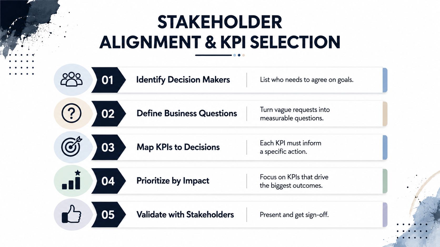
The quickest way to waste weeks is to ask for “a dashboard” before anyone has named the decision. Start with the decision owner, write down the business choice they need to make, then select the page's headline metrics. Better Evaluation recommends starting from the decision and the minimum viable metric, defining plain-language questions, and keeping the dashboard tight enough to avoid visual clutter (Better Evaluation dashboard method).
A working alignment sequence
Start by naming the people who will use the page. A product lead, a growth manager, and an operations analyst often need different answers from the same data, so one dashboard rarely serves all three well. Then write three plain-language questions the page must answer, map each question to a business goal, and tie it to the meeting cadence where it will be used.
Then force the audience constraint. Microsoft's guidance to place the highest-level data at the top left matches how people scan left to right, so the page should not bury the primary answer under operational clutter. The best dashboards also respect device context, because a weekly review dashboard used on desktop can carry more detail than a mobile view checked between calls. For a product and growth team, the layout should make the revenue question visible before the supporting detail.
A quick KPI filter keeps the page honest:
- Decision linkage: can someone name the exact action this metric triggers?
- Ownership clarity: does one team own the number, not multiple teams?
- Data availability: can the source refresh on the cadence the audience expects?
- Leading vs. lagging balance: does the page show what's happening and what's likely to happen next?
- Clarity under pressure: would a busy exec understand the number in a ten-second scan?
For a SaaS growth team, the choice often comes down to churn, expansion, or feedback volume. Churn is a lagging signal, expansion can be more actionable, and feedback volume only matters if it is tied to revenue impact and prioritization. The right headline metric is usually the one that changes behavior fastest, not the one that looks most complete.
A SigOS example makes the trade-offs concrete. If product and growth are reviewing support tickets, usage data, and renewal risk together, the dashboard should show which issues are affecting revenue, which requests point to expansion, and which patterns need action today. The supporting architecture also needs to be visible enough for governance, which is why a dashboard data architecture diagram belongs in the planning conversation before the build starts.
Preparing and Modeling the Data Behind the Dashboard
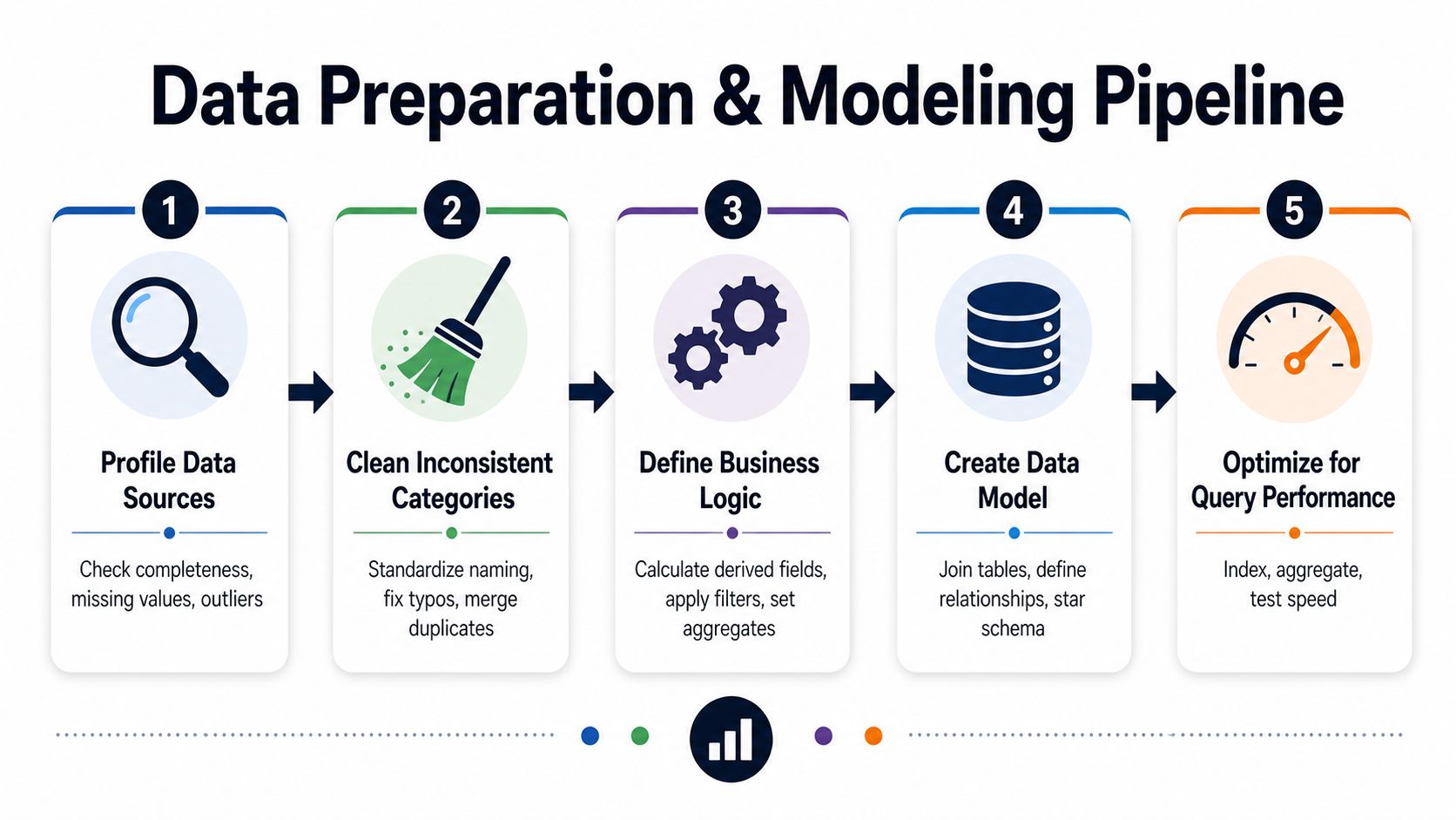
The dashboard isn't built in the BI tool. It's built in the data model that sits underneath it, and that's where a lot of teams cut corners. Toucan Toco's workflow starts with preprocessing, including data quality checks, profiling, cleaning, encoding, and feature engineering, which is the right mental model because dashboards fail when the data layer stays messy (Toucan Toco dashboard workflow).
Make the data boring first
Profile every source before you model it. Look for missing values, duplicate rows, inconsistent category names, and fields that mean one thing in one system and another thing in a different system. If “active user” means logged in this week for one team and any event in thirty days for another, you do not have one KPI, you have a definition dispute.
That's why a shared glossary matters. Put the business definition next to the field name, the grain, the owner, and the refresh cadence. If finance, product, and support all touch the same metric, the definition belongs in writing before the chart is built, not after someone spots a mismatch on a slide.
The most common modeling traps are simple and brutal. Revenue gets double-counted when joins are sloppy. Cohorts get mixed when time windows aren't aligned. Refresh-time confusion appears when one source updates nightly and another updates in near real time, but the dashboard shows them as if they arrived together.
If the metric can be interpreted two ways, someone will use the wrong one in a meeting.
A good build sequence keeps design separate from implementation. Start with low-fidelity mockups, validate the hierarchy, then build the live model with clean joins and defined relationships. The internal architecture question is worth documenting too, and a simple reference like a dashboard data architecture diagram helps teams agree on where ingestion, transformation, and presentation live.
Picking the Right BI Tool and Connecting Your Sources
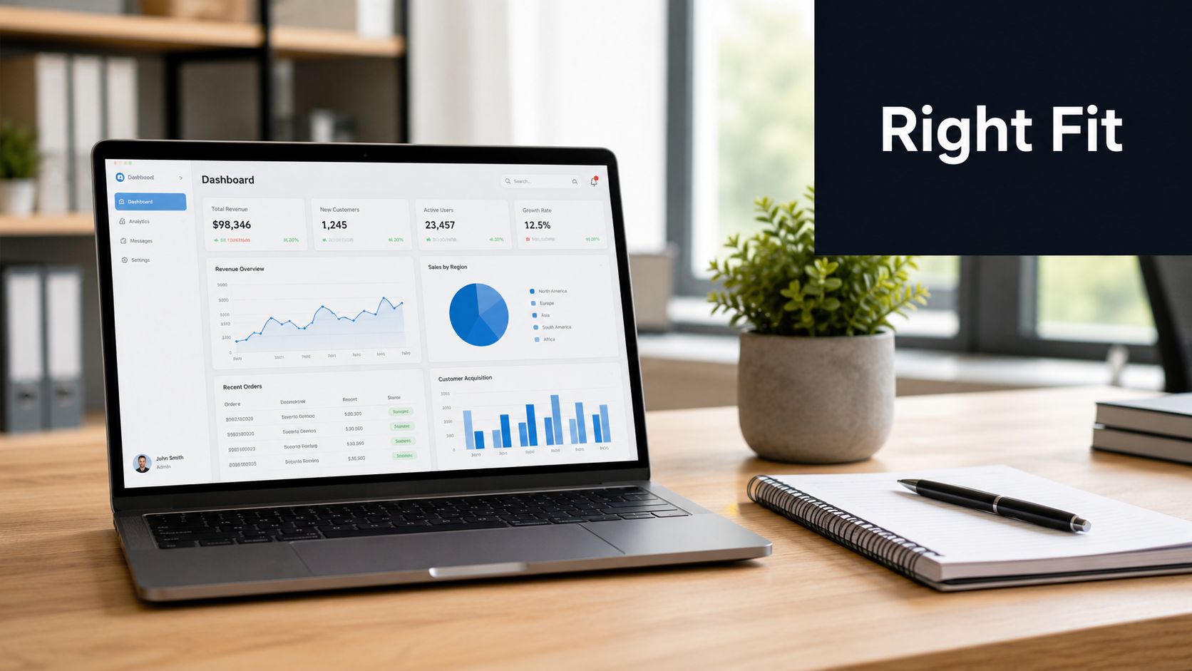
The dashboard tool should fit the operating model, not force the team to reshape it. Tableau, Looker, Power BI, Metabase, and Mode can all support solid dashboards, but each one suits a different mix of governance, technical comfort, and day-to-day ownership. A team building executive reporting with strict metric definitions will make a different choice than a team that needs quick internal exploration and frequent iteration.
Match the tool to the job
Tableau is often a strong fit for teams that need broad charting flexibility and careful visual exploration. Looker works better in environments that want a shared modeling layer and tighter control over metric definitions. Power BI is common in Microsoft-centered organizations where adoption across business teams matters. Metabase fits teams that value speed and simplicity over elaborate modeling. Mode is useful when analysts want SQL, notebook-style analysis, and dashboard delivery in one workflow.
The selection process is usually more straightforward than vendor marketing makes it sound. First, identify who will maintain the model, who will consume the dashboard, and how much control the team needs over definitions. Then choose the smallest tool that can handle the data stack, permissions model, and refresh requirements without turning every change into custom glue code.
Product and growth teams usually need one more layer: customer feedback. Zendesk, Intercom, Linear, Jira, and GitHub can all feed the dashboard stack, but the goal is not to pour every ticket into a chart. The goal is to turn qualitative signals into a prioritized view of what is hurting revenue, what is blocking expansion, and what is creating risk. SigOS does that by bringing support tickets, chat transcripts, sales calls, and usage metrics into one morning view, then routing high-priority issues into the workflows the team can act on.
A self-serve model only works if the data layer is built for it, which is why self-serve analytics architecture matters. If analysts have to patch every new source by hand, the dashboard becomes a bottleneck instead of a decision tool.
Practical teams also need a source-connection checklist that reflects how dashboards break in real life. Pick the owner who can add sources and approve schema changes. Standardize the join keys so the same customer or account ID exists across systems. Keep raw and modeled data separate so audits do not depend on a live feed that has already been transformed. Limit connections to sources the team can keep current. Test the edge cases, because deleted tickets, merged accounts, and reopened issues are usually what break the cleanest-looking dashboard.
If you are looking for more examples of turning data into actionable insights, source selection is part of the same discipline. The strongest dashboard stack is usually the one the team can keep alive with confidence, not the one with the longest feature list.
Designing Visualizations People Can Read
In practice, the majority of dashboard mistakes happen after the data is correct. Teams pack the page with too many charts, split attention across competing metrics, and bury the answer under decorative noise. The goal is to frame the dashboard as a decision aid. One page should support one decision, not five.
Build for scanning, not admiration
Put the most important headline metric in the top-left position, then build the page around that scan path. That order matches how people skim a screen in a review meeting, especially when no one is reading carefully. Use one chart per question, and do not make a chart do the work of both explanation and diagnosis.
Color should mean the same thing everywhere. If red means risk on one chart and a negative trend on another, users waste time relearning the legend. Accessibility matters here too, because a polished dashboard can still fail if it relies on color alone or becomes unreadable in another browser or on a different device. Recent government guidance on dashboard design stresses testing with real target users, checking cross-browser compatibility, and accounting for visual and cognitive accessibility needs (dashboard design guide).
| Question you want answered | Best chart type | Common mistake to avoid |
|---|---|---|
| Is the metric trending up or down? | Line chart | Packing too many series into one view |
| How do categories compare? | Bar chart | Sorting inconsistently between pages |
| What parts make up a whole? | Stacked bar | Using pie charts for too many slices |
| Where are the biggest outliers? | Scatter or dot plot | Hiding variance behind averages |
| What changed by segment over time? | Small multiples | Forcing one busy multi-axis chart |
If you want another reference on turning data into actionable insights, Zilo AI's overview is useful because it treats the dashboard as a decision aid, not a display surface (turning data into actionable insights).
A dashboard that takes more than a few seconds to parse is usually trying to tell too many stories.
Keep the copy inside the chart short, use labels that match the business language, and remove anything that does not help a decision happen faster.
For teams building product and growth dashboards in SigOS, the visual layer often breaks. The metrics may be right, but the page still fails if the layout forces people to hunt for the current state, compare unrelated time ranges, or guess whether a dip came from acquisition, activation, or a data-quality issue. When a chart looks off, check the underlying data before you redesign the page, since noisy joins and inconsistent event naming often show up first in the visualization layer. If that is a recurring problem, the patterns in common data quality issues are usually the place to start.
Testing, Validation, and Building Trust in the Numbers
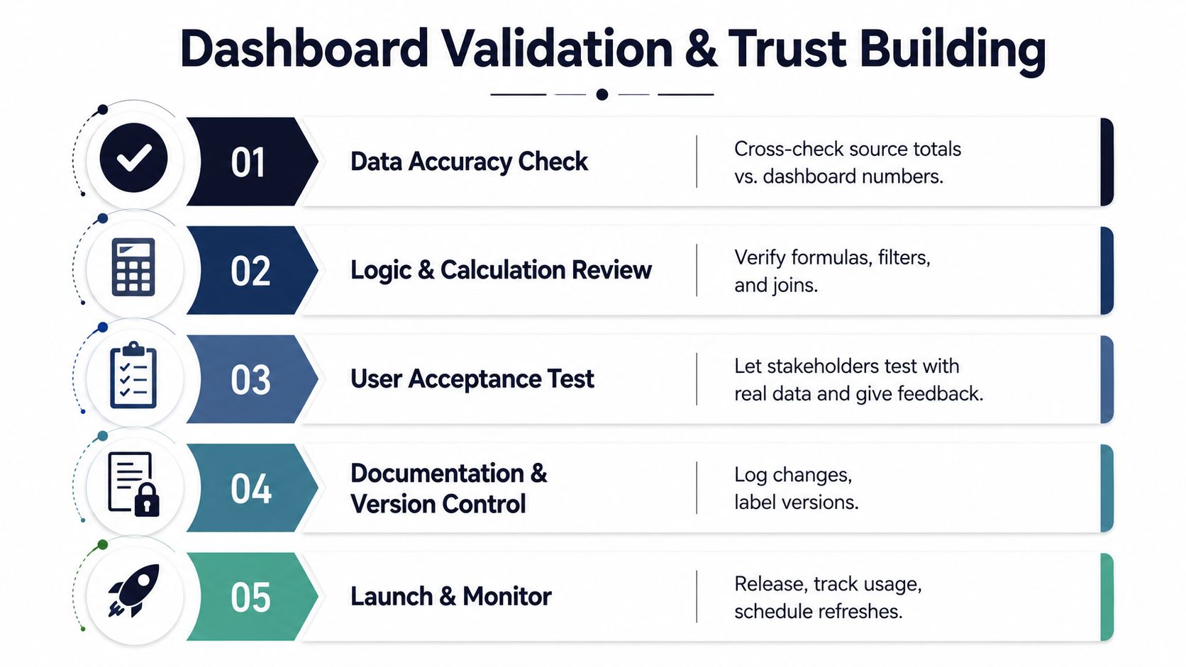
A dashboard launch should feel a little boring. If the team is surprised by the numbers on day one, the validation step was too thin. The strongest trust signals are simple, visible, and hard to fake, and they matter because the number on the screen is only useful if people believe it enough to act on it.
Run three test passes before launch
Start with a data accuracy check against the source of truth. That means comparing totals, not just eyeballing charts, and confirming that joins, filters, and formulas behave the way the business expects. Then run a task-based user test with two or three target users, giving them real decisions to make on the page. If they can't find the answer, the dashboard is not ready.
After that, do a think-aloud session. Watch where users hesitate, misread labels, or infer the wrong direction from a visual cue. Those moments usually expose problems that internal reviewers miss because they already know what the chart is supposed to mean. A 2026 JMIR dashboard playbook emphasizes defining who the dashboard is for, what they need to infer, where it will be published, when it must refresh, and how it will be governed, which is exactly the set of questions these tests should pressure-check (JMIR dashboard playbook).
Trust also comes from visible signals in the interface. Show a refresh timestamp. Label the source. If the page contains forecasts or projected values, include confidence cues that make uncertainty visible instead of hiding it. That kind of transparency reduces the chance that someone treats an estimate like a fact.
For a concrete example of what goes wrong when quality slips, data quality issues in dashboards is worth a look because it maps the operational failures teams usually discover too late.
What to do when a number is wrong
Own it fast, freeze the bad version, and post the corrected logic with a short explanation of what changed. If the issue affects decision-making, notify the users who saw the wrong number and tell them which downstream action, if any, needs to be reversed. Dashboards don't earn trust by being perfect, they earn trust by being correctable.
Maintaining, Alerting, and Closing the Feedback Loop
The best dashboards don't just report what happened. They create a rhythm where teams notice change early, route issues to the right owner, and connect customer behavior to the next action. That operating rhythm depends on maintenance, because even a great dashboard goes stale if no one audits refreshes, deprecates old metrics, or rechecks ownership when the org changes.
A smart maintenance cadence is plain. Review the dashboard owner and metric definitions on a regular schedule, remove charts that no longer drive decisions, and verify that source refreshes still match the audience's expectations. If the dashboard is used for revenue or churn decisions, alerting should be tied to thresholds the team has already agreed to act on, not just thresholds that look dramatic in a meeting.
That's where tools like SigOS fit naturally. Its real-time alerts notify stakeholders when emergent patterns point to churn risk or high-value opportunities, which closes the loop between feedback and action instead of leaving the dashboard as a passive view. For a useful cautionary read on misleading numbers, Excellorix's guide on vanity metrics explained by Excellorix is a strong reminder that a metric can look impressive and still be useless.
A quick adoption check for this week:
- Open rate: are the intended users checking the page?
- Decision trace: can someone point to one action that came from the dashboard?
- Freshness check: are timestamps current enough for the meeting cadence?
- Alert quality: do alerts trigger work, or just noise?
- Metric drift: has any definition changed without sign-off?
If the answers are weak, the fix is usually governance, not more visuals. Keep the dashboard small, keep the logic explicit, and wire it to a response path so the next insight leads somewhere useful.
If you want to turn customer feedback, usage signals, and support data into a dashboard your product and growth teams can trust, visit SigOS and see how it ranks revenue-impacting issues, routes them into your workflow, and keeps the numbers decision-ready. SigOS is built for the exact problem most dashboards fail at, translating noisy feedback into a clear operating view.
Keep Reading
More insights from our blog


Ready to find your hidden revenue leaks?
Start analyzing your customer feedback and discover insights that drive revenue.
Start Free Trial →