What Is Cohort Analytics and Why It Matters
Discover what is cohort analytics and how it unlocks deeper user behavior insights. Learn to track retention, improve products, and drive real business growth.

If you've ever looked at a high-level metric like "monthly active users" and felt like you were missing the real story, you're not alone. That's where cohort analytics comes in.
It’s a powerful way to understand user behavior by grouping people into "cohorts." Think of a cohort as a class of students who all started school in the same year. Instead of looking at the entire student body as one giant, messy average, you follow each class over time to see how they perform.
Going Beyond Averages with Cohort Analytics

Relying solely on aggregate data is like trying to diagnose a problem by only looking at the final score. Imagine your overall user engagement drops by 5%. Was it because of a buggy feature you shipped last week? Or was it a poorly targeted marketing campaign from two months ago? With a single, blended number, it's almost impossible to tell.
Cohort analytics gives you the focus you need. It lets you break your user base into smaller, more meaningful groups based on a shared experience—most commonly, when they started using your product.
Uncovering Hidden User Behavior
By isolating these groups, you can finally move past vague averages and ask much sharper questions. For instance, we know that roughly 75% of new users might drop off within their first week if their onboarding experience is confusing. Cohort analysis helps you see this happening in near real-time, pinpointing exactly where the experience is failing for a specific group of sign-ups.
To get these kinds of insights, you first have to group your users effectively. This is where techniques like audience segmentation come into play, forming the foundation for sound analysis. And to make sure the differences you see between cohorts are real and not just random noise, it helps to understand the basics of statistical significance. You can learn more about that here: https://www.sigos.io/blog/what-is-statistical-significance.
The real magic is in the kinds of questions cohort analysis empowers you to answer.
Cohort Analytics vs Traditional Analytics
To see why this is such a game-changer, let's compare cohort analysis with the traditional metrics most teams track. The table below breaks down the fundamental differences.
| Aspect | Traditional Analytics | Cohort Analytics |
|---|---|---|
| Focus | Looks at all users together as a single group (e.g., total monthly active users). | Groups users by a shared start time (e.g., users who signed up in January). |
| Insight | Provides a snapshot of overall health, like "user engagement is down 5% this month." | Reveals trends over time, like "users from January are 20% more engaged than users from February." |
| Actionability | Makes it hard to pinpoint the cause of changes. Was it a bad feature update or a poor marketing campaign? | Directly links outcomes to specific events, product changes, or user groups, enabling precise action. |
As you can see, traditional analytics tells you what is happening, but cohort analytics starts to tell you why. It connects user behavior to specific moments in time, giving you the clarity needed to make smarter product and marketing decisions.
Why Cohort Analysis Is a Growth Engine
While a lot of metrics give you a quick snapshot of what's happening right now, cohort analytics plays out the entire movie of your user's journey. It helps you stop guessing what happened and start understanding why it happened, turning your data into a clear roadmap for growth.
This is how you finally get proof that your product improvements are actually working. Instead of just hoping for the best, you can see exactly how a specific change—like redesigning your onboarding—affected the retention of the users who went through it. That direct feedback is the key to making smarter decisions that build a healthier, more sustainable business.
Pinpointing Your Most Valuable Channels
Let's imagine a SaaS company is running campaigns across three channels: organic search, paid ads, and email marketing. On the surface, the paid ads are bringing in the most new sign-ups. Looks like a clear winner, right?
But then they run a cohort analysis. It tells a completely different story. The users who came from the email marketing cohort actually have a 40% higher customer lifetime value (LTV).
Armed with that knowledge, the team can confidently shift their budget. They start investing more in the channel that brings in loyal, high-value customers, not just a high volume of sign-ups. This isn't just a theory; a 2023 survey found that e-commerce companies using cohort analysis saw 15-25% higher customer retention than those that didn't.
One of the biggest levers for growth is simply keeping the customers you have. By using cohort analysis to see how users behave over time, companies can implement actionable strategies to reduce churn rate. It provides the perfect framework for understanding user behavior, which you can explore further in our guide on cohort retention analysis.
Alright, let's get into the heart of cohort analysis: picking the right group of users to study. The answers you get from your data are only as good as the questions you ask, and that all starts with how you define your cohorts.
You can slice and dice your user base in a million different ways, but most of the time, it comes down to two main types: acquisition cohorts and behavioral cohorts. Each one gives you a completely different lens for understanding what’s happening in your product.
Think of yourself as a detective. Your choice of cohort is like choosing which set of clues to follow.
Acquisition Cohorts: The "When"
The most common starting point is with acquisition cohorts. This is simply grouping users by when they joined. For example, everyone who signed up in January, or everyone who downloaded the app during the first week of March.
This approach is your go-to for measuring the impact of things that happen at a specific point in time.
Let's say you rolled out a slick new onboarding flow in February. To see if it actually improved first-week retention, you can compare the February sign-up cohort directly against the January one. The data will tell the story.
Use acquisition cohorts to answer questions like:
- Marketing Impact: Did the users we got from that big summer ad campaign stick around longer than the ones from our spring promotion?
- Onboarding Changes: Are people who signed up after we simplified our tutorial finishing the setup process faster?
- Seasonal Effects: Do users we acquire during the holidays behave differently in their first 30 days compared to those who join in a quieter month?
Behavioral Cohorts: The "Why"
Acquisition cohorts tell you when a change happened, but behavioral cohorts help you understand why. Instead of grouping by a date, you group users by what they did (or didn't do) within a certain window.
For instance, you could create a cohort of every user who used a specific, high-value feature within their first 24 hours.
This is how you pinpoint those "aha!" moments—the key actions that turn a casual user into a loyal fan. If you find that users who invite a teammate during their first session have a 50% higher retention rate, you've just discovered a massive lever for growth. Now you know you need to get that "invite" button in front of every new user, pronto.
How to Run Your First Cohort Analysis
You don't need a Ph.D. in data science to get started with cohort analysis. At its core, running your first analysis is a simple, four-step process that helps you turn a mountain of user data into a clear story. Let’s walk through it.
Step 1: Frame Your Business Question
Before you even think about spreadsheets or analytics tools, you need a solid question. What are you actually trying to figure out? A sharp, focused question is your compass; without it, you'll just get lost in the data.
For instance, a great question to start with is: "Did our new onboarding flow improve user retention in the first week compared to the old one?" This question immediately gives your analysis purpose and direction.
Step 2: Define Your Cohorts and Key Metrics
With your question in hand, the next step is to define the two pillars of your analysis: who you're grouping (the cohorts) and what you're measuring (the metric).
Using our onboarding example, the setup is straightforward:
- Cohorts: We'll need two acquisition cohorts. The first group will be users who signed up before the new onboarding went live. The second will be everyone who signed up after.
- Metric: The success metric here is user retention. We'll track the percentage of users from each cohort who came back on Day 1, Day 2, Day 3, and so on, all the way to Day 7.
This infographic breaks down the two main ways you can group users—either by when they joined (acquisition) or by an action they took (behavioral).
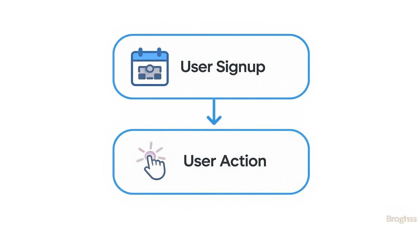
Choosing the right type of cohort is crucial. It’s what allows you to isolate the impact of a specific change, like our new onboarding flow.
Step 3: Gather Data and Visualize
Now it's time to pull the data and organize it. The classic way to visualize this is with a retention table.
A retention table is a simple grid that shows what percentage of each cohort sticks around over time. Each row represents a different cohort (e.g., users who signed up in January), and the columns track their activity over subsequent weeks or months.
Here’s a simplified example of what that looks like:
Example Cohort Retention Table
| Signup Month | Month 1 | Month 2 | Month 3 |
|---|---|---|---|
| January | 100% | 45% | 32% |
| February | 100% | 48% | 35% |
| March | 100% | 52% | 41% |
As you can see, the March cohort is performing better than the previous two. This is the kind of insight that pops right out of the data once it's organized.
Step 4: Analyze and Take Action
Looking at the table, you can start to see the story. The numbers tell you whether your changes are having the desired effect. In our example, we'd compare the Day 1 through Day 7 retention for the "old onboarding" cohort against the "new onboarding" cohort.
If the new cohort shows higher retention, you have evidence that your changes worked. If not, it’s a signal to go back to the drawing board. This is where cohort analysis truly shines—it turns data into a clear feedback loop for your product decisions. If you want to dig deeper into the specific numbers to track, our guide on essential user retention metrics is a great next step.
Cohort Analytics in Action Across Industries

Theory is great, but seeing how cohort analytics solves real business problems is where its power truly clicks. When companies look past broad, surface-level metrics, they start finding specific, actionable insights that actually drive growth and improve their products.
Let's walk through a couple of real-world scenarios that follow a simple arc: a company spots a problem, uses cohort analysis to dig into the "why," and gets a meaningful business result.
How SaaS Companies Pinpoint Product Issues
Imagine a SaaS company rolls out a major feature update in June. In July, they notice that the overall user engagement metric has dipped a little, but not enough to ring any alarm bells. A cohort analysis, however, tells a much more urgent story.
- The Problem: While the top-line numbers looked okay, the team saw a sharp drop in 30-day retention, but only for users who signed up in June. Users who joined before the update were sticking around just fine.
- The Analysis: By isolating this "June Sign-up" cohort, the product team figured out that the new feature accidentally introduced a subtle bug into the onboarding flow. This bug only affected brand-new users.
- The Insight: The glitch was making new users so frustrated that it led to a 25% higher drop-off rate within their first week.
- The Business Impact: Armed with this incredibly specific insight, developers jumped on the bug and patched it fast. As a result, the July cohort's retention rate bounced right back, saving thousands of new users from churning.
How E-commerce Brands Optimize Ad Spend
Here’s another one. An e-commerce brand was pouring money into social media ads, which brought in a ton of first-time buyers. Based on initial sales alone, the campaign looked like a runaway success.
But when they looked at the data through the lens of cohort analytics, the picture changed completely.
The company grouped its Q1 customers into cohorts based on how they were acquired.
- The Problem: The brand wasn't sure which marketing channels were bringing in the most valuable customers over the long haul, not just driving one-off sales.
- The Analysis: They started tracking the lifetime value (LTV) of each cohort over the next six months. They discovered that the cohort from social media ads almost never came back to buy again. Meanwhile, customers who came from organic search had a 60% higher LTV and made repeat purchases consistently.
- The Business Impact: The marketing team quickly shifted a big chunk of its budget away from the low-LTV social media campaigns and doubled down on SEO. This move made them more profitable without having to spend more to acquire new customers.
Common Questions About Cohort Analytics
Once you start digging into cohort analysis, you’ll inevitably run into a few common questions. Getting these sorted out is what takes you from just understanding the concept to actually using it to make smarter decisions.
Let's clear up some of the most frequent hurdles product and growth teams face when they first get their hands dirty with cohort data.
What's the Difference Between Cohorts and Segments?
This is a big one, and it's easy to get them mixed up. Both are about grouping users, but the "how" and "why" are completely different.
- Segments group users by their attributes or actions, without any time constraint. Think of groups like "free users from Canada" or "everyone who used the new dashboard feature." The key thing here is that users can move in and out of a segment. A free user today might become a paying user tomorrow, leaving that segment behind.
- Cohorts, on the other hand, are locked in by time. They group users based on when they performed a specific action, most often when they signed up. Someone who joined in January 2024 is part of the "January 2024 Cohort" forever. They can't leave it.
What Tools Can I Use for Cohort Analysis?
The good news is, you don’t need a fancy, expensive setup to get started. Many teams begin with tools they already have on hand.
- Spreadsheets (Google Sheets, Excel): For a basic, no-frills analysis, you can simply export your user data and build retention tables yourself. It's a fantastic way to really understand the mechanics of how cohorts work.
- Product Analytics Platforms: This is where things get powerful. Tools like Amplitude, Mixpanel, and Heap have dedicated cohort analysis features built right in. They do the heavy lifting for you, creating clear, visual reports in just a few clicks.
- Business Intelligence (BI) Tools: If you need more custom or advanced visualizations, platforms like Tableau or Looker can connect directly to your data warehouse, giving you complete control over your analysis.
How Often Should I Run Cohort Analysis?
There's no single right answer here—it all depends on the pace of your business.
For a SaaS product that's shipping new features and running campaigns all the time, a weekly cohort analysis is probably your best bet. It helps you see the immediate impact of your work.
But if your product has a longer adoption cycle, a monthly or even quarterly check-in might make more sense. The most important thing is to pick a cadence and stick with it. Consistency is what allows you to spot meaningful trends over time.
SigOS transforms your qualitative customer feedback into a clear, revenue-driven roadmap. By analyzing support tickets, sales calls, and usage data, our platform identifies which bug fixes and feature requests will have the biggest impact on churn and expansion, helping you build a product customers truly value. Learn how to prioritize with SigOS.
Keep Reading
More insights from our blog


Ready to find your hidden revenue leaks?
Start analyzing your customer feedback and discover insights that drive revenue.
Start Free Trial →