What Is Stickiness and How It Predicts SaaS Revenue
Confused about what is stickiness in SaaS? This guide explains the key metric (DAU/MAU), how to measure it, and proven strategies to increase user retention.

You know that feeling when you reach for your phone to check a specific app without even thinking about it? Maybe it’s your team’s chat, a project board, or even your email inbox. That reflexive, habitual action is the very essence of product stickiness.
It’s not just about getting users to sign up. It’s about becoming an indispensable part of their daily or weekly routine. Stickiness measures whether your product is a fleeting curiosity or a fixture in your users' lives.
What Is Stickiness and Why Does It Really Matter?
Imagine you just launched a new project management tool. Your first month is a huge success with 1,000 new sign-ups. The numbers look great on paper, but they don't tell the whole story. How many of those users are actually using it?
Are they creating tasks every morning, collaborating with their teams throughout the day, and truly embedding your tool into how they work? Or did they just log in once, poke around, and disappear? That’s the critical question stickiness answers. It shifts the focus from one-time acquisition to ongoing, repeat engagement.
Stickiness is the dividing line between a product users simply have, and a product they truly need. It’s the clearest signal we have that a habit has been formed.
A sticky product isn’t one that needs constant marketing reminders to pull users back in. People return because it reliably solves a real, recurring problem for them. This kind of habit is the bedrock of any healthy, growing SaaS business.
From Casual User to Daily Habit
Think about the apps you use. Some are probably collecting digital dust, opened once and then forgotten. Others are your go-to tools, the ones you open instinctively to get something done. Those are the sticky ones. They've earned their spot in your routine by consistently delivering value.
Too many product teams get caught up chasing vanity metrics like total downloads or sign-up numbers. While exciting, those metrics don't predict longevity. Stickiness cuts right through that noise and tells you what’s really going on:
- Recurring Value: Do users find a compelling reason to come back over and over?
- Habit Formation: Has your product become the default solution for a specific task in their workflow?
- Product-Market Fit: Are you genuinely solving a persistent need for your target audience?
For example, a platform like Slack is incredibly sticky. Teams depend on it for moment-to-moment communication, making it essential to their workday. Its value is directly tied to high-frequency use. On the flip side, a tax preparation tool has naturally low stickiness because most people only need it once a year. The context of your product is everything when you're deciding what "good" stickiness looks like.
The Business Case for Stickiness
Getting a handle on stickiness is far more than a product management exercise—it has a direct, powerful impact on the bottom line. When users are habitually engaged, they are far less likely to churn. Why would someone cancel a subscription for a tool that’s become essential to their job?
This deep engagement also paves the way for expansion revenue. Users who rely on your product daily are your best candidates for upgrading to a higher tier, adopting new features, and becoming your most vocal champions.
In short, a sticky product is a profitable one. It builds a loyal user base that drives down churn, increases customer lifetime value (LTV), and creates a stable foundation for predictable growth.
The Core Formulas for Measuring Stickiness
Talking about stickiness is one thing, but to actually improve it, you have to measure it. The good news is that you don't need a data science degree to get started. A few straightforward formulas can turn the fuzzy concept of "habitual use" into a hard number you can track.
The go-to metric for most product teams is the DAU/MAU ratio. It’s the classic way to get a pulse on user engagement. The formula is simple: you take your Daily Active Users (DAU) and divide them by your Monthly Active Users (MAU) over a 30-day window.
Let's make that real. Say your product has 1,000 users who log in at least once a month (your MAU). On an average day, 250 of them are active (your DAU). Your stickiness score would be 25% (250 / 1000). This tells you that your average user shows up on about a quarter of the days in a month—roughly once a week. That's a solid sign of a weekly habit forming.
The DAU/WAU Ratio for Short-Term Insights
While DAU/MAU is great for tracking the long-term health of your product, sometimes you need to see what’s happening right now. That's where the DAU/WAU ratio comes in. By dividing your Daily Active Users by your Weekly Active Users (WAU), you get a much more sensitive, short-term view.
This weekly snapshot is perfect for measuring the immediate ripple effects of your work:
- Launching a new feature: Did the DAU/WAU ratio jump the week you shipped it?
- Running a marketing campaign: Did that email blast actually get people to log back in more frequently this week?
- Encountering a bug: Did a critical performance issue cause a sudden dip in the ratio, pointing to user frustration?
Think of DAU/WAU as your early-warning system. It helps you react quickly, while the DAU/MAU ratio provides the stable, big-picture diagnosis of how deeply your product is embedded in your users' lives.
What Does a Good Stickiness Score Look Like?
Okay, so you've calculated your ratio. Is it good? The honest answer is: it depends. The benchmarks for a daily-use social media app are worlds apart from a B2B tax reporting tool someone might only need once a quarter. Context is everything.
In the world of B2B SaaS, the DAU/MAU ratio is king. According to an in-depth analysis by Kissmetrics, the average stickiness here is around 13%. This makes sense, as many B2B workflows are weekly, meaning users might log in about four days a month.
The chart below gives you a nice visual breakdown of where different percentages fall on the spectrum.
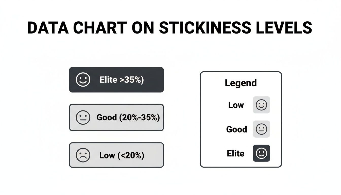
As you can see, breaking the 20% barrier is a great sign that you're moving from a "nice-to-have" tool to an essential part of your users' work week.
To put more concrete numbers to these tiers, we've broken down what these benchmarks typically mean for a B2B SaaS product and the user behavior behind them.
SaaS Stickiness Benchmarks (DAU/MAU Ratio)
| Stickiness Level | DAU/MAU Ratio | Typical User Behavior |
|---|---|---|
| Low | <10% | Users log in a few times a month, often reactively. The product is not a core part of their workflow. |
| Average | 10%-20% | Users engage about once a week. The product is useful but not yet a daily habit. |
| Good | 20%-35% | Users are active multiple times a week, indicating the product is integrated into their regular tasks. |
| Elite | >35% | Users are active nearly every other day, showing the product has become an indispensable daily tool. |
Looking at this table helps you move beyond just a percentage and start understanding the story your data is telling about user habits. An elite score means your product has become a reflex for your users when they sit down to work.
Going Beyond the Numbers with Cohort Analysis
Your DAU/MAU ratio is a fantastic high-level pulse check on user engagement. But a single number, no matter how good, is just a snapshot. It tells you what’s happening right now, but it can’t tell you the story of how your users behave over their entire journey with your product.
This is where you need to get your hands dirty with cohort analysis. Instead of lumping all your users into one big, anonymous bucket, you group them into "cohorts," usually based on when they signed up. Think of it like a graduating class—you have the "January 2026" class, the "February 2026" class, and so on.
By tracking each of these groups as a separate unit, you start to see how their relationship with your product evolves. Does stickiness climb as they find their footing? Or does it nosedive after the first 30 days? This simple act of grouping turns a flat metric into a powerful diagnostic tool.

Uncovering Trends Hidden in the Average
Let's say your overall stickiness score is holding steady at a respectable 15%. On the surface, that might seem okay—not amazing, but not a five-alarm fire either. The problem is, an average can easily mask a dangerous trend.
Here’s a story that cohort analysis could tell:
- The "October" Cohort: These are your veterans who signed up six months ago. They started with 25% stickiness during their first month, but their engagement has now withered to just 8%.
- The "January" Cohort: This group, now in their third month, also started strong at 24%. But they're following the same downward path, now at 12%.
- The "March" Cohort: These are your brand-new users. Their initial 26% stickiness is artificially propping up your overall average, making everything look better than it really is.
Without cohorts, you’d miss the fact that your product is bleeding engaged users over time. It’s a classic "leaky bucket" problem. This insight is gold because it tells you exactly where to look: something is going wrong with long-term value discovery or mid-lifecycle engagement.
For a deeper dive into this method, we've put together a full guide on what a cohort analysis is and how to run one yourself.
Diagnosing the Impact of Product Changes
Cohort analysis isn't just for finding problems; it’s one of the best ways to measure if your solutions are actually working. Did that slick new onboarding flow you shipped in February really make users stickier for the long haul? By comparing the "February" cohort to the "January" one, you get a clear, undeniable answer.
Cohort analysis lets you run a "before and after" experiment on your entire product strategy. You can directly tie feature launches, UI redesigns, and retention campaigns to changes in long-term user behavior.
If your February cohort shows a higher stickiness rate in their third and fourth months than any group before them, you’ve got solid proof that your changes are a hit. On the flip side, if a new feature release coincides with a sudden drop in engagement for that cohort, it’s a major red flag that you may have made things worse.
This approach helps you answer the questions that product managers live and breathe:
- Onboarding Effectiveness: How good are we at turning curious new signups into deeply engaged, habitual users?
- Feature Adoption: Did that big feature we spent a quarter building actually move the needle on engagement for the users who got it?
- Lifecycle Engagement: Where does the magic wear off? At what point in the user journey (Month 1, Month 3, Month 6) do we consistently lose people?
By breaking down your user base, you graduate from simply knowing what your stickiness score is to understanding why. This granular view is what empowers you to spot issues before they become catastrophic and to double down on what truly creates lasting value for your users.
The Undeniable Financial Impact of Product Stickiness
Let's be honest: "stickiness" can sound like just another buzzword a product team throws around. But in reality, it’s one of the most powerful financial indicators you can track. When you measure how often users come back, you're getting a sneak peek into the future health of your revenue.
High stickiness means your product has become an essential, non-negotiable part of your customers' daily lives. And that has a massive impact on the bottom line.
The most direct connection is to churn. Users who have woven your tool into their daily habits simply don't leave. Why would they? Abandoning a product that saves them time and headaches every single day is a tough sell. This habitual use builds a powerful moat around your customer base, making them far more resilient to shiny new competitor offers or price increases.
Turning Engagement Into Expansion Revenue
But playing defense and reducing churn is only half the story. The real offensive power of stickiness comes from its direct link to expansion revenue.
Think about it: your most engaged users—the ones who practically live in your product—are your absolute best audience for growth. They're the first to try new features and the most obvious candidates for an upsell.
Who is more likely to upgrade to a premium plan? The person who logs in once a month, or the power user who is constantly bumping up against the limits of their current tier? It’s a no-brainer. High stickiness creates a built-in, receptive audience for a bigger, better version of the product they already rely on. This is how you see Monthly Recurring Revenue (MRR) grow from your existing customers—a much cheaper and more efficient engine for growth than constantly chasing new ones.
A fantastic metric for tracking this, especially in SaaS, is Net Revenue Retention (NRR). This measures your total revenue from a group of customers over time, factoring in upsells and expansion while subtracting any churn or downgrades. High stickiness is the fuel for a strong NRR.
The Clear Link Between Habits and Revenue
Stickiness isn't a vanity metric; it's a direct predictor of your financial performance. In fact, metrics like the DAU/MAU ratio often tell a more accurate story about deep engagement than raw retention numbers alone.
The data backs this up. Top-quartile SaaS companies with an average stickiness of around 22% often report 15-20% lower churn rates. Even better, they see 30% higher expansion revenue because sticky products naturally create upsell opportunities. For product leaders, the pattern is crystal clear: when people find repeatable value, they stick around, spend more, and even become more self-sufficient, reducing support tickets by up to 25%.
This tight connection between daily habits and financial outcomes is what elevates stickiness from a simple product stat to a crucial business metric.
A small, sustained increase in stickiness doesn't just lead to a small bump in revenue. It has a compounding effect on customer lifetime value (LTV), creating a more profitable and predictable business model over the long term.
By focusing on making your product more indispensable, you're actively investing in your company's long-term financial stability. Sharpening how you calculate customer lifetime value in a SaaS context will help you see this impact even more clearly. Every decision that makes your product stickier is a direct contribution to a healthier bottom line.
Actionable Strategies to Improve Product Stickiness
Knowing your stickiness score is one thing, but turning that number into real-world results is where the magic happens. Improving stickiness isn't about luck; it's about intentionally designing your product to become an indispensable part of your user’s daily routine. This is your playbook for making that happen.
These aren't just abstract theories. They are concrete tactics that high-growth SaaS companies use to build fierce loyalty and keep users coming back, day after day.
Perfect the First Five Minutes
Your user's first session is the single biggest lever you have for long-term stickiness. If those initial moments are confusing, cluttered, or overwhelming, you've likely lost them for good. The goal is simple: get them to their first "aha!" moment as fast and frictionlessly as possible.
This is that lightbulb moment when a user truly gets how your product solves their problem. For a project management tool, it might be creating a task and assigning it to a teammate. For an analytics platform, it’s seeing that first insightful chart render from their own data.
Your onboarding shouldn't be a feature tour. It should be a guided mission to an initial, tangible win. Focus on the one or two critical actions that unlock immediate value.
Once you’ve identified that key activation event, your job is to clear the path. Get rid of unnecessary form fields, use simple in-app prompts, and make sure to celebrate that first small victory.
Build Natural Engagement Loops
The stickiest products are masters at pulling users back in for the right reasons. They create engagement loops—cycles where one action naturally prompts another, often triggered by something outside the app. The secret is to make these triggers feel helpful, not like spammy marketing.
Here are a few ways to build these loops:
- Context-Aware Notifications: Ditch the generic "We miss you!" emails. Instead, send alerts tied to specific, valuable events. A notification like, "Your teammate just completed a task you were waiting on," gives a user a genuine reason to log back in.
- Collaborative Features: Build features that are simply better when used with other people. Think about tagging colleagues, assigning approvals, or sharing reports. These actions create a social pull that encourages others to log in and participate.
- Workflow Integrations: Turn your product into a hub that talks to the other tools your users depend on. When your app can push updates to Slack or pull data from a CRM, it becomes a central command center rather than just another isolated tool.
Understanding how these loops drive behavior is a core part of many conversion rate optimization best practices, which often focus on perfecting the user journey.
Embed Your Product Into Daily Routines
The ultimate goal here is to make using your product a reflex. This happens when it becomes the default, no-brainer solution for a recurring task. To get there, you have to identify the high-frequency "jobs to be done" in your user's day and then solve them better than anyone else.
For instance, a sales CRM could offer a feature that automatically logs call notes from a user’s calendar invites. Suddenly, your tool is woven directly into their daily routine of prepping for and following up on sales calls. They no longer have to remember to open your app; their workflow pulls them in naturally.
This level of insight only comes when you use behavioral analytics to uncover what your users are actually doing, not just what they say they do.
By focusing on these strategies—a flawless first run, smart engagement loops, and deep workflow integration—you can systematically transform your product from a "nice-to-have" into a "can't-live-without" tool. Every small improvement builds the user habits that are the very foundation of stickiness.
How SigOS Helps You Uncover the Why Behind Your Stickiness Metrics
Most analytics platforms are great at telling you what's happening. They’ll chart your DAU/MAU ratio and spit out beautiful cohort retention curves. But when you ask them why a number suddenly dipped, you’re usually met with silence. That’s when the real work begins—the frantic hunt for answers.
This is precisely the gap we built SigOS to fill. We go beyond the dashboard to connect the dots between your usage data and all the conversations happening around your product. We don't just flag a drop in stickiness; we surface the exact reasons behind it.
From a Vague Problem to a Specific Diagnosis
Picture this: your weekly stickiness report lands, and you see a sudden 5% drop. Is it a bug? A confusing new feature? A competitor's slick marketing campaign? Without a clear signal, your team gets stuck in a frustrating cycle of guesswork, meetings, and manual data digging.
SigOS is designed to cut through that noise by automatically analyzing every signal your customers are giving you.
- Support Tickets: We find the patterns in your Zendesk or Intercom conversations, spotting when different users are hitting the same bug or point of confusion.
- Sales Calls: Our platform listens for frustrations or feature gaps mentioned during sales and renewal calls, linking them directly to product weaknesses.
- User Feedback: We ingest and group comments from all your feedback portals and surveys, turning a flood of individual complaints into clear, themed issues.
- Usage Metrics: Most importantly, we tie all of this qualitative context back to actual user behavior and revenue data.
This means you can go from knowing "engagement is down" to knowing "engagement is down for users on the Pro plan because a bug in the new report exporting feature is blocking their workflow." It’s the difference between a mystery and a diagnosis.
Putting a Price Tag on User Frustration
Identifying a problem is only half the battle. To get buy-in from leadership and engineering, you need to show which problems are actually worth solving first. This is where SigOS completely changes the game by attaching a real dollar value to every issue it uncovers.
SigOS turns qualitative feedback into a prioritized, revenue-driven roadmap. It stops you from guessing what matters and starts showing you what’s costing you money.
For product and growth teams, this is a huge deal. You finally have the data to prioritize fixes and features that will genuinely boost daily use. Data analysts, in particular, love how SigOS merges messy, unstructured support data with hard metrics. This synthesis leads to 87% accurate churn forecasts, showing you exactly which issues are eroding real revenue—like a stickiness dip that’s quietly costing your company $50,000 in MRR from a single buggy feature.
By tracking stickiness weekly via the DAU/WAU ratio, teams can iterate faster and turn qualitative insights into a plan that builds lasting habits. To learn more about setting benchmarks, you can discover insights on good stickiness metrics from Mixpanel.
Ultimately, connecting user friction directly to financial outcomes empowers your team to make confident, data-backed decisions. Instead of arguing for a fix based on a handful of complaints, you can walk into a meeting with a clear business case: "Fixing this bug is projected to save $15,000 in monthly churn and improve stickiness for our highest-value customers." You’re no longer just reacting to a metric; you’re using it to protect revenue and drive growth.
Your Top Questions About Product Stickiness Answered
Once you get the hang of the basic concepts, a bunch of practical questions always pop up. Let's walk through some of the most common ones I hear from product teams who are just starting to put these metrics into practice.
What's a Good Stickiness Ratio for B2B vs. B2C?
That's the million-dollar question, isn't it? The honest answer is: it completely depends on what your product is built for. There’s no magic number, but we can definitely talk about some solid benchmarks.
- B2B SaaS: If your tool is part of a user's daily grind, like a CRM or a team chat app, you should aim for a DAU/MAU ratio of 20% or more. For products used less frequently, like a weekly reporting tool, a target of 10-15% is a much more realistic and healthy goal.
- B2C Apps: The bar is set way higher here. Think about social media or mobile games—their entire business model hinges on grabbing your attention every single day. For them, a stickiness ratio of 50% or even higher is the name of the game.
How Often Should We Measure This?
You should be looking at stickiness as often as you make decisions. I find that a two-track approach works best for most teams.
For your weekly check-ins, the DAU/WAU ratio is your best friend. It’s a sensitive, early-warning system that gives you a quick read on how a new feature or marketing campaign is landing.
But for the bigger picture, lean on the DAU/MAU ratio during your monthly and quarterly reviews. It smooths out the weekly bumps and shows you the real, underlying trends in how people are forming habits around your product.
What Are the Biggest Mistakes People Make When Measuring Stickiness?
The single biggest mistake is looking at the overall stickiness number and calling it a day. A single, blended metric for your entire user base can easily hide some very ugly problems.
Averages are dangerous. A "good" overall stickiness score might be artificially inflated by a small group of die-hard fans, completely masking the fact that new users are churning out almost immediately.
This is why ignoring segmentation is such a critical error. You have to slice and dice your stickiness data. Look at it by user cohorts, subscription plans, different personas, or by who uses which key features.
Doing this transforms a simple number into a powerful diagnostic tool. It tells you exactly who is sticking around and, more importantly, why.
Ready to stop guessing and start knowing exactly what drives stickiness in your product? SigOS analyzes every user signal—from support tickets to usage data—to pinpoint the exact issues and opportunities that impact your revenue.
Keep Reading
More insights from our blog


Ready to find your hidden revenue leaks?
Start analyzing your customer feedback and discover insights that drive revenue.
Start Free Trial →