Your Guide to Analytics for Mobile Apps
Master analytics for mobile apps. Learn to track key metrics, understand user behavior, and connect data directly to revenue for sustainable app growth in 2026.

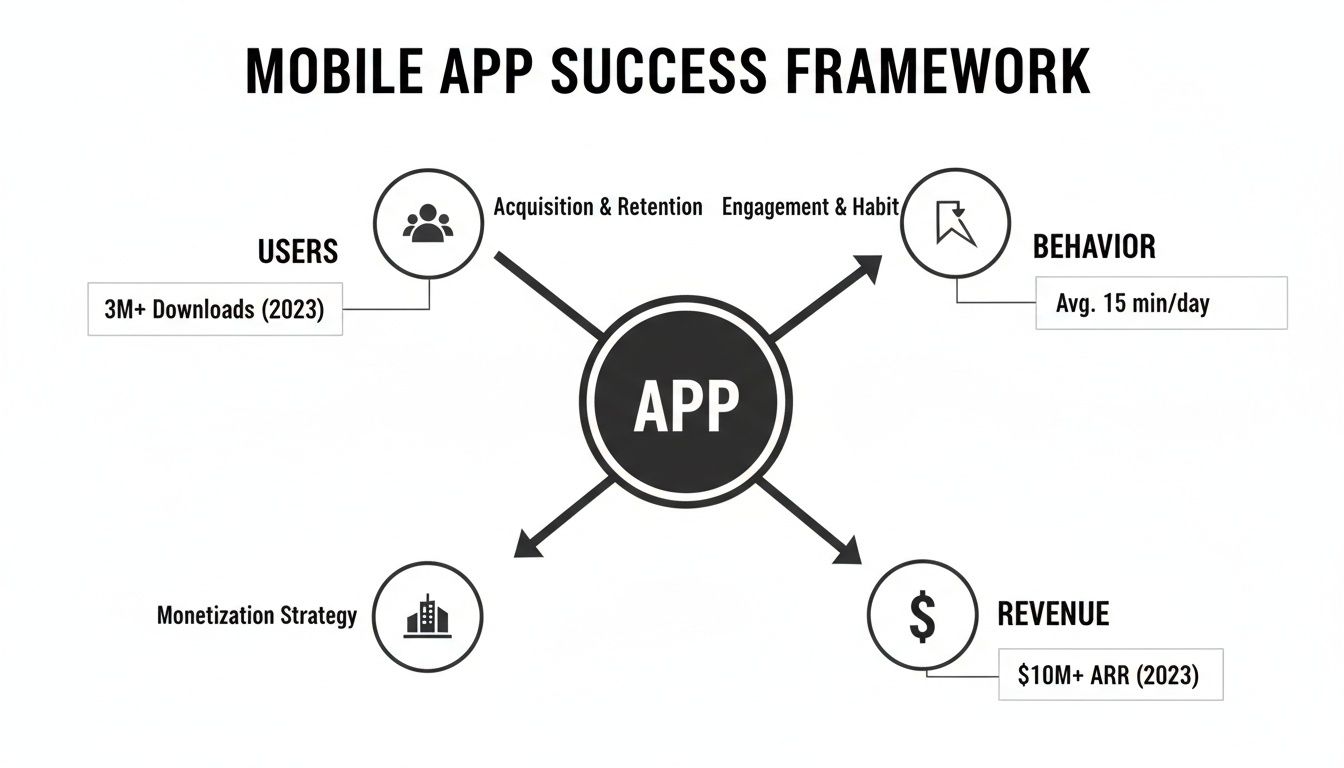
Mobile app analytics is about so much more than just counting downloads. It’s the practice of digging into user data to understand the why behind their actions—what features they love, where they get stuck, and ultimately, why they decide to stay or leave.
The Unseen Engine Driving Mobile App Success
Think of your app as a bustling city. Every day, thousands of users arrive, each with their own goal. Some head straight for the main square (your home screen), others wander down quiet side streets (niche features), and a frustrating number get caught in traffic jams (bugs or confusing UI) before leaving town for good.
Without a map, you have no real idea what’s happening. This is where mobile app analytics comes in, acting as your city’s master planner and GPS all in one. It’s the unseen engine that turns all that chaotic movement into clear, understandable patterns. Suddenly, you're not just looking at your city's population (downloads); you can see the most popular routes, pinpoint the exact bottlenecks causing frustration, and discover which neighborhoods are thriving.
Beyond Counting Downloads
In the early days of mobile, success was often measured by a single, simple metric: the total number of downloads. But that number tells you almost nothing about the actual health of your app. An app with millions of downloads but only a few thousand active users isn't a thriving metropolis—it's a ghost town.
Modern analytics forces a shift away from these "vanity metrics" and toward actionable insights. It helps you answer the crucial questions that actually drive growth:
- Feature Adoption: Which features are people genuinely using, and which ones are just taking up space?
- User Frustration: Where exactly are users dropping off during onboarding or at checkout?
- Retention Drivers: What specific experiences make users come back day after day?
- Revenue Impact: How do specific bugs or points of friction affect your bottom line?
The goal is to move from "what happened?" to "why did it happen?" and, most importantly, "what should we do next?" This is how you build an app that not only attracts users but keeps them loyal and engaged.
As we dive deeper, we'll be exploring several core concepts that form the foundation of mobile app analytics. The table below gives you a quick snapshot of what they are and why they're so critical for any product or growth team.
Core Mobile App Analytics Concepts at a Glance
| Concept | What It Tells You | Why It Matters for Growth |
|---|---|---|
| Events | Specific user actions, like button_click or purchase_complete. | The basic building blocks for understanding all user behavior. |
| Funnels | The steps users take to complete a key goal (e.g., signing up). | Shows you exactly where users are dropping off and abandoning key flows. |
| Retention | The percentage of users who return to your app over time. | The ultimate measure of product-market fit and long-term viability. |
| Attribution | Which marketing channels brought users to your app. | Helps you optimize your ad spend and focus on what's working. |
| Cohorts | Groups of users who share a common characteristic (e.g., signed up in the same week). | Allows you to compare the behavior of different user groups over time. |
Each of these concepts gives you a different lens through which to view your users, and together, they paint a complete picture of your app's performance.
The Scale of the Mobile Economy
In today's crowded market, understanding user behavior is simply non-negotiable. With the global mobile app economy soaring past $289 billion, the fight for user attention is more intense than ever. It's no surprise that the mobile app analytics market is growing so quickly, as teams work to make sense of the nearly 300 billion annual app downloads.
For the 6.3 billion smartphone users around the globe, the choice is endless. Data is what sets successful apps apart from the ones that get deleted. You can explore more about these trends and their impact on the mobile ecosystem from recent industry analysis.
Ultimately, analytics for mobile apps is about making smarter, data-informed decisions. It empowers you to prioritize bug fixes that are costing you real money, double down on features that drive retention, and create a user experience so seamless that your app becomes an indispensable part of your users' lives.
Understanding the Language of Your Users
To get real value from your app analytics, you need to go beyond just counting downloads. It's about understanding the story your user data is telling you. Think of it like this: raw data shows you how many people are in your app, but understanding the core concepts of analytics is what lets you see what they're doing, why they're doing it, and where they're running into trouble.
Let's break down the handful of key concepts that turn raw numbers into a clear roadmap for growth.
Events: The Building Blocks of User Behavior
First up, we have Events. An Event is simply a specific action a user takes inside your app that you've decided to track. It's the fundamental unit of analytics.
These aren't just random clicks. They are the meaningful interactions that make up the user experience. You get to define what matters. Common examples you might track include:
user_signupadd_to_cartlevel_completephoto_uploaded
A single event, like one person completing a level, doesn't tell you much. But when you start looking at thousands of these events together, they begin to form a clear narrative about how people are actually using your product.
Funnels: Mapping the Path to Key Goals
This is where things get interesting. A Funnel is a series of events you expect a user to complete to reach an important goal, like signing up or making a purchase. It’s your tool for visualizing the user journey and, more importantly, seeing where people drop off.
Funnel analysis is all about finding friction. Imagine your onboarding funnel looks something like this:
- App Open: 100% of new users start here.
- Create Account Button Tapped: 85% proceed.
- Email Verified: Only 60% complete this step.
- Profile Setup Complete: Just 40% make it all the way through.
That 25% drop-off between creating an account and verifying an email is a huge red flag. It tells your product team exactly where the problem is. Is the verification email not sending? Is it landing in spam? Without a funnel, you’d just see that signups are low, but you'd have no idea where to start looking for a fix.
Retention and Cohorts: Measuring Stickiness and Loyalty
Retention is the measure of how many users come back to your app over time. It’s probably the most critical metric for your app's long-term health. Great retention means you’ve built something people genuinely find valuable.
To measure retention effectively, you need Cohort Analysis. A cohort is just a group of users who all did something at the same time, most commonly signing up in the same week or month (e.g., the "July Week 1" cohort). By grouping users this way, you can compare apples to apples.
This lets you ask powerful questions. For example, did the users we acquired from that big marketing campaign last month stick around longer than the ones who found us organically? If the paid users churned out quickly, you know that channel might be delivering low-quality traffic, even if it brings in a lot of installs. This is a core part of effective behavioural segmentation, which helps you understand the different types of users your app attracts.
Attribution: Knowing Where Your Best Users Come From
Finally, there’s Attribution. This is the process of connecting a user's install (or any other key action) back to the specific marketing channel or campaign that brought them in. Was it that Facebook ad, a search result, or a mention from an influencer?
Without solid attribution, your marketing budget is a complete black box. You're spending money without knowing what's actually working.
With proper attribution, you can see exactly which channels are delivering your most valuable, long-term users. It empowers you to stop wasting money on campaigns that don't perform and double down on the ones that do. It’s the final piece of the puzzle, connecting your marketing spend directly to the user behavior and business outcomes you’re tracking.
Building Your Analytics Foundation
Once you’ve got a handle on the core concepts, it's time to roll up your sleeves and get to the real work: wiring up your app to actually collect data. This process is called instrumentation, and frankly, it’s the most important step you'll take. Get it right, and you'll have a reliable source of truth. Get it wrong, and you’ll be making decisions in the dark.
Think of instrumentation as installing your app’s nervous system. You’re strategically placing sensors to feel what users are doing—where they’re succeeding, where they’re getting stuck, and where they’re finding value. This isn't about logging every single tap. It's about being deliberate and tracking the handful of actions that truly matter.
What Should You Actually Track?
One of the most common pitfalls is tracking either too little (and missing the story) or too much (and drowning in noise). The key is to start with a focused plan that covers the entire journey, from the moment a user first opens your app to their most critical actions.
Your initial tracking plan should feel focused. Aim to cover these areas:
- Core User Actions: These are the non-negotiable events that deliver on your app's promise. For a social app, this is something like
photo_uploadedorfriend_request_sent. For an e-commerce app, it’sadd_to_cartandpurchase_completed. - Onboarding Funnel Steps: Map out every single step a new user takes, from
account_createdandprofile_setup_startedtotutorial_completed. This is the only way to see exactly where you're losing people right at the start. - Critical Error States: Successes are great, but friction is where you learn the most. Tracking events like
login_failed,payment_error, andapi_timeoutgives you a direct line into user frustration and potential churn.
Before a single line of code gets written, get everyone—product, engineering, and marketing—to sign off on a shared tracking plan. This simple document is your blueprint for data collection, ensuring everyone is aligned on what you’re tracking and why. For a deeper dive, you can learn more about how to track app usage effectively.
Prioritizing Data Quality and Security
Here’s the thing about data: "garbage in, garbage out." If your data is messy or inconsistent, your insights will be worthless. Data quality starts with something as simple as a clean, consistent naming convention. If an event is called user_Signed_Up in one place and signup_complete in another, your funnels will break and your reports will be a mess.
Beyond clean data, privacy and security are no longer optional. In 2026, user trust is a massive competitive advantage. It's about being upfront with what you collect and how you use it.
A strong analytics foundation requires more than just good data; it demands user trust. Your privacy policy isn't just a legal document—it's a promise to your users that you are handling their information responsibly and securely.
The market data backs this up. In 2025, when global app marketing spend shot past $109 billion, the entire industry shifted its focus to user experience. We learned that while 55% of consumers now prefer apps over mobile websites, a staggering 50% of developer teams say performance monitoring is their biggest headache. More importantly, 90% of users now check an app's security permissions before even giving it a try.
To get started on the right foot, you need to choose the right tools for the job. Exploring the best tools for mobile product managers is a great place to begin, as analytics platforms are a core part of any modern product stack. By investing time in a thoughtful instrumentation plan and making data integrity and security a priority from day one, you’ll build a foundation that delivers reliable, actionable insights for years to come.
Turning Raw Data Into Actionable Dashboards

All that raw data you're collecting is like a pile of bricks. It has potential, sure, but on its own, it’s not building you anything. To create something useful, you have to arrange those bricks into a structure that tells a clear story. That’s exactly what a good dashboard does—it transforms streams of isolated numbers into a visual narrative that your product and growth teams can actually use to make decisions.
An effective dashboard is never just a random collection of charts. It’s a curated, at-a-glance view of the metrics that directly impact your goals. Without this focus, teams quickly fall into "analysis paralysis," drowning in data but starved for actual insight.
The trick is to build dashboards for the people who use them. Your product manager has a completely different set of worries than your growth marketer, so their data views should absolutely reflect that.
Tailoring Dashboards for Product and Growth
Product teams are obsessed with the user experience. Their dashboards need to shine a light on how people really use the app and, more importantly, where they're getting stuck. The whole point is to find friction and build a better, more engaging product.
A Product Manager's Dashboard should answer questions like:
- Feature Adoption: What percentage of our active users actually tried that new "saved search" feature we launched last month?
- User Frustration: Are people rage-clicking on certain buttons? Those repeated, frantic taps are a dead giveaway for a UI bug or a design flaw.
- App Stability: What’s our crash-free user rate? How many people get through a session without a single crash?
- Time to "Aha!": How long does it take a brand-new user to get to that magical moment where they experience the app's core value, like making their first purchase?
Growth teams, on the other hand, are focused on the business of getting and keeping users. Their dashboards need to connect the dots between marketing spend and business results.
A Growth Marketer's Dashboard will typically feature metrics such as:
- Acquisition Performance: Which ad network is bringing in the most signups for the lowest cost?
- LTV by Cohort: Are the users we acquired in May more valuable over six months than the ones from our June campaign?
- User Stickiness: How are our Day 7 and Day 30 Retention numbers looking? Are the users we're acquiring actually sticking around?
From Dashboard Insight to Immediate Action
Let's play this out. A product manager sits down Monday morning and pulls up their dashboard. The first thing they see is a big, red number: Week-over-Week Retention for new users has tanked by 15%. Ouch.
But instead of panicking, they scan the rest of the dashboard. An adjacent chart shows a huge spike in Crash Reports that started three days ago. Another widget pinpoints that 90% of those crashes are tied to a single event: feature_x_activated. And wouldn't you know it, that feature went live in last Thursday's update.
In under a minute, the dashboard told a complete story. A new feature is buggy, it's causing the app to crash, and it's directly responsible for users not coming back.
The PM can now create a high-priority bug ticket for the engineering team, armed with hard evidence of the problem's impact. That’s the power of a well-designed dashboard. It connects the dots for you, turning a vague problem ("retention is down") into a specific, actionable task ("fix the crash in feature X, now!"). For a deeper dive on setting these up, check out our guide on creating powerful data analytics dashboards.
Recent data shows just how critical this is. While mobile session duration shot up by over 300% between 2024 and 2025, error-related session exits also jumped by 254%. With 92% of our mobile time spent inside apps, knowing why people leave is just as important as knowing how long they stay. A great dashboard is what closes the gap between seeing a number and knowing exactly what to do about it.
Connecting Analytics Directly to Revenue
Let's be honest, your standard analytics platform is great at one thing: telling you what is happening. A well-instrumented dashboard will scream at you about a 20% drop-off at checkout or a 15% dip in retention for users on the latest OS. But that’s where the story usually ends.
Those numbers can't tell you why. You see the problem, but understanding the root cause is a whole other beast. And this gap is where most analytics strategies stumble.
You know users are bailing, but you’re left playing a guessing game. Is a button confusing? Is a payment API failing for one specific OS? Without that "why," your team is stuck prioritizing fixes based on hunches or who shouts the loudest, not what’s actually hurting the business most.
This is where we need to push our analytics further—by directly connecting the quantitative data (the numbers) with qualitative feedback (the human complaints) to finally measure the financial impact of every single bug or friction point.
From "What" to "Why" and "How Much"
Picture this: your analytics dashboard flags a sudden spike in abandoned carts. That’s the "what." Your team immediately starts debating—is it the new UI? A performance lag? Everyone has a theory.
Now, imagine a smarter workflow. A product intelligence platform like SigOS doesn’t just stop at usage data. It’s also digging through all the unstructured feedback you’re already collecting from users:
- Support tickets in Zendesk
- Live chats from Intercom
- App Store and Google Play reviews
- Call notes from your sales and success teams
Think of it as an AI detective. It’s hunting for patterns that link the quantitative "what" to the qualitative "why." The system starts cross-referencing the users who abandoned their carts with their support history.
And suddenly, a crystal-clear pattern emerges.
The platform discovers that 90% of the users dropping off are on a specific Android device model and have all mentioned the word "confusing" in their support chats when trying to use the "Apply Coupon" field. The root cause is found.
This moves you beyond correlation to actual causation. You're no longer just looking at two separate trends; you're seeing how one directly causes the other. You know exactly which bug is costing you customers.
But the real magic is what comes next. The platform doesn't just hand you the problem; it calculates its cost.
Quantifying the Dollar Value of a Bug
By looking at the average order value for the exact users who are dropping off, the system can put a price tag on the problem. It can tell you, with chilling accuracy, that this single, poorly-worded button is costing you $1,200 in lost revenue every single day.
This one piece of information changes everything. Your next sprint planning meeting is no longer a debate club. It's a data-driven business decision.
The Old Way: "I feel like we should fix this checkout bug. Some people seem to be complaining about it."
The New Way: "Fixing the coupon button for this Android model will immediately recover 1,200 a day, which is over ****36,000 a month. This is our highest-priority ticket, period."
This simple shift turns your analytics from a passive reporting tool into an active driver of profit. You can finally build a backlog where every task is ranked not by opinion, but by its direct impact on revenue, churn, or expansion.
Building a Revenue-Driven Roadmap
This same logic applies beautifully to feature requests, too. Instead of just tallying votes for a feature, you can see which requests are coming from your highest-value customers or are repeatedly mentioned as blockers in enterprise sales calls. To really grasp the bigger picture here, learning the core principles of revenue attribution can give you a solid foundation for connecting all these dots back to the bottom line.
When you tie every piece of data—from a click event to a support ticket—back to its potential revenue impact, you create an incredibly powerful feedback loop. Your product roadmap stops being a wish list and starts being a strategic financial plan. You can ensure every hour of development is spent on the work that will grow your business the most. This is the real goal of mobile app analytics: turning user behavior into measurable financial results.
Got questions about mobile app analytics? You’re not alone. It’s a field packed with jargon, complex tools, and a dizzying number of metrics. It's easy to feel like you're drowning in data before you've even started.
Let's cut through the noise. This isn't an academic lecture; it's a straightforward Q&A to tackle the most common hurdles teams face, from figuring out day-one priorities to navigating the tricky waters of user privacy.
What Are the First 5 Metrics I Should Track in My New App?
When your app is brand new, the temptation is to track everything. Don't. You'll just create a lot of noise and analysis paralysis. The real goal is to get a quick, clean read on your app's vital signs.
Focus on these five essentials to see if you're building something people actually want:
- Daily Active Users (DAU): This is the heartbeat of your app. How many unique users are showing up each day? It’s your most basic measure of audience size and daily relevance.
- User Retention Rate: The real test of value isn't just getting users to show up once, but getting them to come back. Specifically, watch your Day 1, Day 7, and Day 30 retention. If people stick around, you've built something worthwhile.
- Session Duration and Frequency: Okay, they're coming back—but for how long, and how often? These two metrics together paint a picture of engagement. Are they quickly checking something, or are they deeply immersed?
- Crash Rate: Nothing kills an app faster than a bad technical experience. A high crash rate is a one-way ticket to an uninstall. You should be obsessed with your crash-free users percentage.
- Key Action Conversion Rate: Every app has a core purpose. Maybe it's finishing onboarding, sharing a photo, or booking a class. Pick that one critical action and track how many new users actually do it. This tells you if they're finding that "aha!" moment you designed.
How Do I Choose the Right Mobile Analytics Tool?
Forget trying to find the single "best" analytics tool on the market. That's a fool's errand. A better approach, especially for a mature team, is to build a "stack" where different tools handle different jobs. But if you're just starting out, keep it simple.
The question isn't "what's the best tool?" but rather "what's the most important problem I need to solve right now?" Is it understanding marketing ROI, diagnosing in-app behavior, or prioritizing bug fixes? Let the answer guide your choice.
Think about your biggest blind spot and choose a tool that illuminates it. Here’s a simple way to break down the options based on what you're trying to achieve:
| Goal | Tool Category | Example Platforms |
|---|---|---|
| Understanding User Behavior | Product Analytics | Amplitude, Mixpanel |
| Measuring Marketing ROI | Attribution Platforms | AppsFlyer, Singular |
| Connecting Data to Revenue | Product Intelligence | SigOS |
| Starting with a Tight Budget | Free & Integrated | Firebase Analytics |
For instance, if you see users dropping off but don't know why, a product analytics tool like Mixpanel is your go-to. If you’re pouring money into ads and need to know what's working, you absolutely need an attribution platform like AppsFlyer. And if you need to tie all that data—plus user interviews and support tickets—back to its impact on the bottom line, a product intelligence platform is the missing piece of the puzzle.
Can I Use Analytics Without Violating User Privacy?
Yes, and you must. In 2026, building a privacy-first analytics strategy isn't just good ethics; it's fundamental to building trust and a business that lasts. The paranoia that you can't track anything is misguided. The key is to be transparent, intentional, and respectful of user control.
Here’s how you do analytics the right way:
- Be Radically Transparent: Write your privacy policy in plain English, not legalese. Explain what you collect and why it helps the user. A simple "we track crash reports to make the app more stable for you" goes a long way.
- Practice Data Minimization: Don't just collect data for the sake of it. If you don't have a clear plan for how a piece of data will help you improve the app, don't track it. Steer clear of sensitive or personally identifiable information (PII) entirely unless it's absolutely essential.
- Prioritize Security: Work with analytics partners that take security seriously. Look for features like data encryption and anonymization to protect both your users and your company.
- Give Users Control: Embrace platform rules like Apple’s App Tracking Transparency (ATT). Giving people a clear, honest choice to opt in or out doesn't just comply with rules; it builds confidence.
At the end of the day, the long-term trust you build with a user is infinitely more valuable than any single data point you could sneak by them.
By focusing on the right metrics, choosing tools that solve real problems, and rooting your strategy in user trust, you'll turn analytics for mobile apps from a source of stress into your most powerful driver of growth. To see how you can connect all your user feedback directly to revenue impact, explore what an AI-driven product intelligence platform like SigOS can do for your team at https://sigos.io.
Keep Reading
More insights from our blog


Ready to find your hidden revenue leaks?
Start analyzing your customer feedback and discover insights that drive revenue.
Start Free Trial →