Churn Analysis Dashboard: Build It for Retention
Build a churn analysis dashboard that drives retention. Learn key metrics, signals, and a practical step-by-step guide to turn data into action.
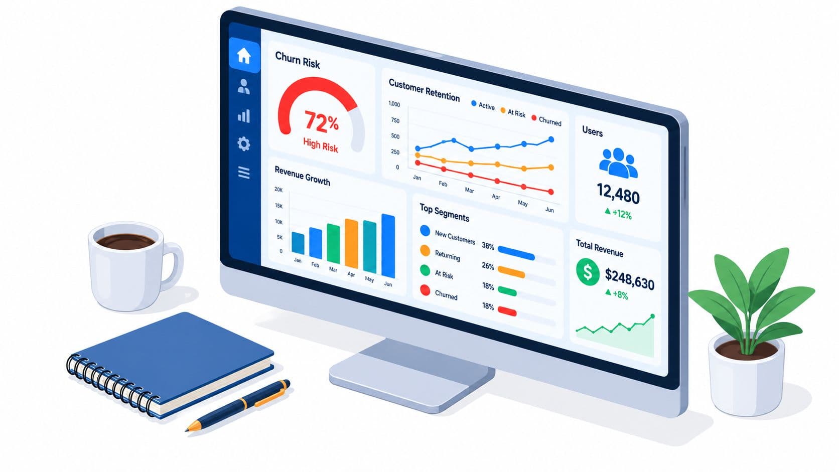
A churn analysis dashboard isn't a display of cancellation counts. It's a decision system for identifying customers likely to leave early enough for intervention, and the strongest predictive benchmark in the available research reached 0.93 ROC-AUC, 0.93 PR-AUC, 0.98 recall, and 0.91 F1.
That distinction changes what belongs on the screen. A monthly churn percentage can tell you what already happened, but it can't tell a customer success manager which account needs attention this morning, why engagement is falling, or whether a retention action worked. The dashboard earns its place when it connects behavior to revenue, ranks risk, and gives the team a clear next move.
Why Most Churn Dashboards Miss the Point
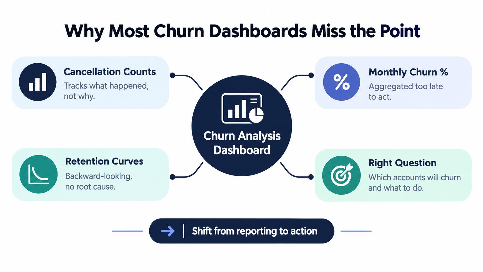
Teams that treat a churn dashboard as a reporting surface end up with cancellation counts, monthly churn percentages, and retention curves. The charts can be accurate, yet still arrive too late to guide action. By the time an aggregate number changes, the customers behind it may already be gone.
A useful churn analysis dashboard follows a different sequence:
- Which accounts are becoming disengaged?
- What changed in their product use, support experience, or commercial relationship?
- How much recurring revenue is exposed?
- Who owns the next intervention, and by when?
Research on SaaS churn describes churn analysis as identifying customers who may leave early enough for marketing or retention precautions. In an enterprise-resource-planning SaaS study involving 1,951 customer records, researchers evaluated 10 customer and product-related features with multiple machine-learning methods. Product breadth and customer characteristics carried relatively high importance in identifying churners. That supports combining account attributes with adoption signals instead of relying on a single rate (the SaaS churn analysis study).
Replace the scorecard with a risk queue
A retrospective scorecard belongs in executive reporting. Retention teams need an operating view with customer-level records, recent signal changes, expected renewal timing, revenue exposure, current health, and intervention status.
Practical rule: If a team member cannot move from a chart to an accountable action without opening three other systems, the dashboard is reporting, not operating.
Aggregate churn, GRR, NRR, and cohort movement still provide useful context. Their value increases when account-level evidence explains the movement and helps teams choose the response, whether that means fixing onboarding, resolving a product defect, recovering a failed payment, or addressing a commercial concern.
Outreach should follow the same logic. If payment failure is driving the risk, a targeted workflow such as SMS automation to recover customers may fit better than a generic win-back campaign. The dashboard should distinguish payment problems from genuine dissatisfaction, weak adoption, and unresolved support issues, then rank the associated accounts by revenue exposure and urgency.
Key Metrics Every Churn Dashboard Needs
A churn dashboard should answer two questions quickly: how retention economics are changing, and which accounts require action now. Leadership needs reliable aggregate measures. Operators need account-level evidence, ownership, timing, and a clear reason for intervention.
Start by separating customer churn from revenue churn. Logo churn counts lost customers. Revenue churn measures recurring value lost through cancellations, downgrades, and other contraction. One lost enterprise account can matter more than several small cancellations, so a risk queue should rank accounts by revenue exposure, not logo count alone.
Expansion can hide deterioration in the existing base. The 2025 SaaS Capital survey of more than 1,000 private B2B SaaS companies reported median GRR of 91% and median NRR of 101% (the SaaS benchmark workbook). NRR includes expansion, while GRR shows what the existing base retained before expansion. Both belong in the dashboard, but they support different decisions.
Use the top panel for decisions
| Dashboard layer | Metrics to show | Why it belongs there |
|---|---|---|
| Executive summary | Logo churn, cancellation revenue, contraction revenue, GRR, NRR | Shows whether customer count and recurring revenue are moving together |
| Risk queue | Account risk, recurring revenue at risk, segment, renewal timing, risk reason | Ranks work by consequence and urgency |
| Account detail | Usage breadth, engagement change, support themes, unresolved defects, billing status | Gives owners evidence for the next conversation |
| Intervention view | Owner, action type, status, date, outcome | Connects risk detection to retention execution |
| Cohort view | Acquisition cohort, plan, size, contract length, implementation stage | Exposes deterioration hidden by blended averages |
Track customer-level risk, usage breadth, engagement changes, and intervention status beside aggregate KPIs. These fields drive decisions. A health score without contributing signals, an owner, or a next action is decorative reporting.
Separate leading signals from lagging results
Churn rate confirms an outcome after the account has already left. Add signals that can change before cancellation:
- Usage breadth: Whether the account relies on one narrow workflow or several meaningful product capabilities.
- Engagement trajectory: Whether active use, key events, or stakeholder participation is rising, stable, or falling.
- Support themes: Repeated problems, unresolved defects, and escalating frustration.
- Renewal timing: The time available to address a warning before the next commercial decision.
- Intervention status: Whether someone contacted the account, what they offered, and what happened.
A useful dashboard connects each signal to an owner, an action, and an outcome. If reduced usage coincides with a billing failure, the response differs from a product-adoption problem. If several risk signals appear near renewal, the account should rise in the queue even when blended retention metrics still look healthy.
For definitions and formula choices, the Arlo Inc. retention guide provides background. The SaaS churn metrics reference offers another way to review metric design. Keep the top panel focused: a metric belongs there only when its movement changes a decision.
How Behavioral Signals Connect to Revenue Risk
A usage decline isn't automatically a churn event. A support ticket isn't automatically a revenue risk. The dashboard becomes valuable when it links a behavior change to an account outcome, then estimates which response deserves attention first.
Start with an event timeline for each account. Place product activity, feature adoption, support conversations, sales interactions, billing events, renewal dates, and revenue changes on the same view. This prevents teams from treating isolated signals as explanations. A drop in usage after an unresolved defect means something different from a drop during a seasonal pause or an agreed implementation transition.
Build a signal-to-risk chain
A practical chain looks like this:
Behavior change → business context → revenue exposure → intervention → outcome
For example, a customer uses fewer core workflows, opens a support conversation about the same issue repeatedly, and approaches renewal with a large recurring contract. The dashboard shouldn't merely label the account “at risk.” It should show the contributing signals, the exposed revenue, the owner, and the action that addresses the problem.
Behavioral data matters here. A behavioral data framework from SigOS can help teams think beyond isolated events and examine patterns across support, conversations, and usage. The important design choice is to preserve the evidence behind a score. A black-box “health: red” badge encourages debate about the badge. A visible sequence of declining adoption, unresolved friction, and renewal proximity creates a basis for action.
Prioritize expected value, not complaint volume
Support volume is a poor ranking system on its own. A small account may create many low-impact tickets, while a strategic account reduces usage without opening a ticket. Rank the queue using a combination of:
- Revenue exposure: The recurring value attached to the account or segment.
- Signal strength: The number and consistency of meaningful behavioral changes.
- Urgency: Renewal proximity, payment timing, or an active escalation.
- Intervention fit: Whether the team has a credible action for the identified cause.
- Evidence quality: Whether the signal comes from observed behavior, explicit feedback, or an unverified assumption.
The expected value of intervention is a prioritization aid, not a promise of recovered revenue. It asks where a team can plausibly change the outcome, given the account value, risk evidence, timing, and available response. That keeps product leaders from chasing the loudest issue and directs them toward the issue costing the business the most.
Building the Dashboard Structure and Layout
The interface should support two speeds of work. An executive needs a concise view of retention movement. A customer success or product team needs to scan a queue, investigate an account, and assign an action during a standup.
Start with the top row. Put GRR, NRR, logo churn, cancellation revenue, and contraction revenue together, then add filters for segment, plan, contract type, and cohort. Don't bury the distinction between customer loss and revenue loss in a secondary tab. If expansion is masking contraction, leadership needs to see that immediately.
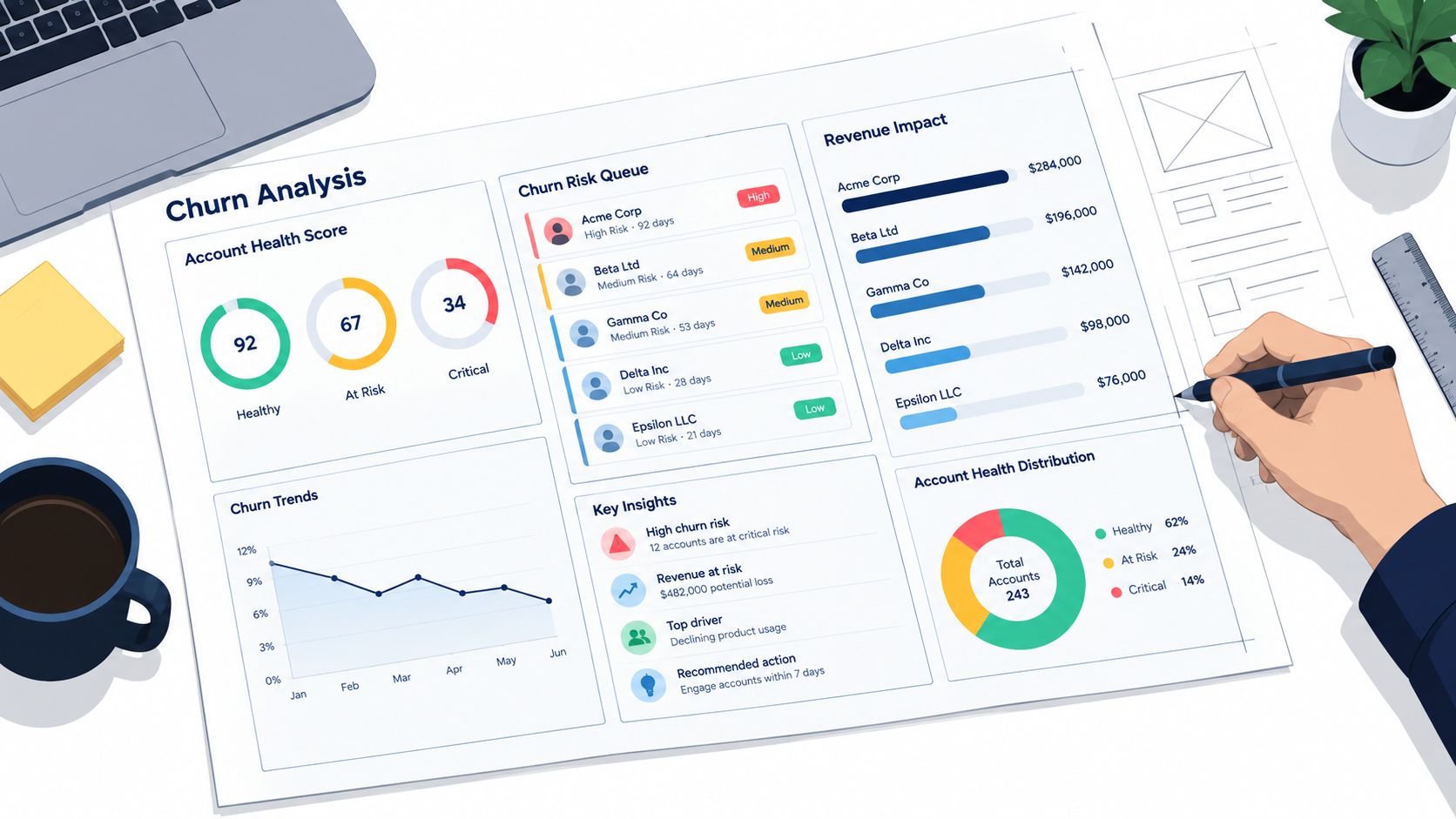
Make the risk queue the operational center
The central panel should be a sortable queue, not a decorative chart. Each row should include:
- Account and segment
- Current risk state and change from the previous period
- Recurring revenue at risk
- Primary contributing signals
- Renewal date or next commercial milestone
- Assigned owner
- Recommended action
- Intervention status and latest outcome
Use progressive disclosure. The queue stays compact, while clicking an account reveals the event timeline, usage trend, support themes, stakeholder coverage, and billing history. A product analytics dashboard design reference can help teams think through the relationship between high-level patterns and account-level investigation.
Design filters around decisions
Filters should answer operational questions, such as “show high-value accounts with falling adoption and renewal soon,” not merely provide every available attribute. Useful controls include segment, plan, account owner, risk reason, renewal window, intervention status, and cohort.
Set thresholds with care. If the system alerts on every small behavioral fluctuation, users will mute it. If it waits for several severe signals, the intervention window may close. Start with transparent rules, review false positives and missed risks, and adjust thresholds with the people who act on the alerts.
Data integration also needs restraint. Connect CRM, product analytics, support, billing, and conversation data, but don't display every field. The dashboard should surface the evidence that changes an action. Store the full record behind the detail view, where analysts can investigate without overwhelming the daily workflow.
Why Predictive Quality Matters More Than Accuracy
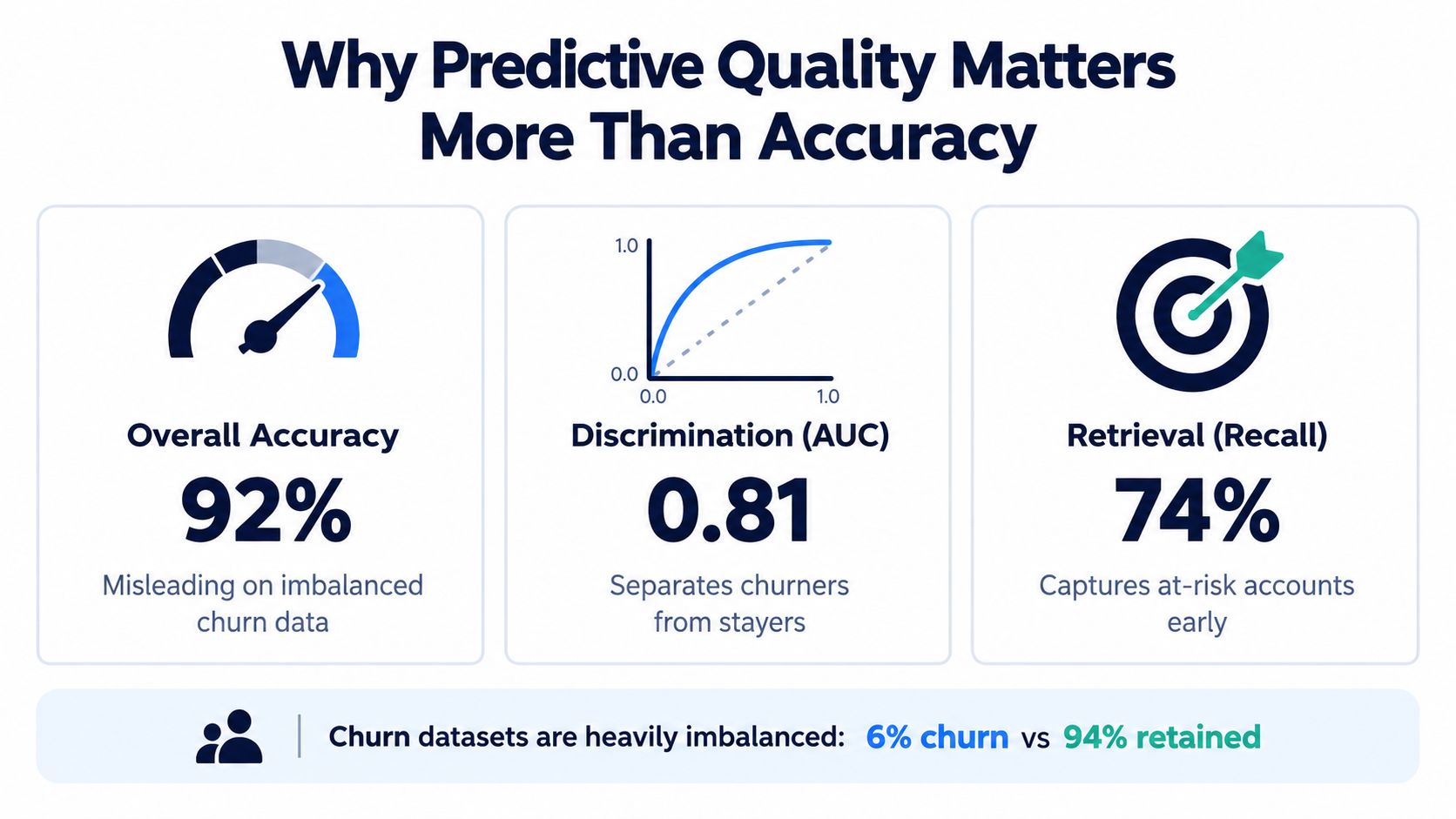
A churn model can report impressive accuracy while missing the customers the team most needs to find. Churn datasets are commonly imbalanced, meaning non-churners can substantially outnumber churners. A model that favors the majority class may look statistically comfortable and operationally useless.
The dashboard should therefore display ROC-AUC, PR-AUC, recall, F1, and F2, not accuracy alone. ROC-AUC measures ranking separation. PR-AUC is especially informative when the positive class is relatively rare. Recall shows how many actual churners the model detects, while F1 balances precision and recall.
Show the trade-off behind every threshold
A benchmark using 18,491 small and medium-sized business customers from an Indonesian SaaS platform evaluated logistic regression, decision trees, random forests, and XGBoost. XGBoost achieved 0.93 ROC-AUC, 0.93 PR-AUC, 0.98 recall, and 0.91 F1 in that evaluation (the SaaS churn prediction benchmark).
Those figures aren't a universal performance promise. They demonstrate why a serious dashboard exposes multiple views of quality. A model can rank accounts well while a particular operating threshold creates too many false positives, or it can preserve precision by missing customers who needed intervention.
Add threshold controls with visible population counts and precision-recall trade-offs. Show how many accounts enter the queue, how many are confirmed churners after the observation window, and what happened after intervention. Monitor performance by segment and cohort, because a model can generalize well in aggregate while weakening for enterprise accounts, new customers, or a particular plan.
Model review should end with an operating decision: How many accounts can the team contact, which risks are acceptable to miss, and what evidence will prove the threshold is working?
Predictive quality also depends on data freshness and label discipline. Define the outcome window consistently, prevent post-churn events from leaking into training inputs, and review whether new product behavior changes the meaning of old signals. A dashboard that monitors only model scores will eventually become another vanity surface.
Turning Insights Into Retention Action
A churn dashboard earns its place when it changes what the team does before cancellation. An account that narrows product usage, stops involving a regular stakeholder, raises a recurring support concern, and approaches renewal should enter a prioritized queue. Rank it by revenue exposure, show the signals behind the risk, and assign a response owner.
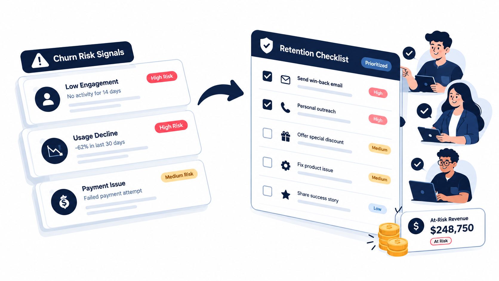
The owner needs a specific response, not a generic request to save the account. A product adoption problem may call for a focused enablement session. An unresolved defect needs product and engineering ownership. A commercial concern may require a value review. A failed payment belongs in a recovery process, not a feature roadmap discussion.
Route work with explicit playbooks
Create a small set of intervention paths. Give each one an owner, a response window, and a measurable outcome:
- Adoption decline: Review the customer's workflow, identify the missing capability, and agree on a usage milestone.
- Support friction: Group related tickets, confirm the root issue, and communicate an accountable resolution plan.
- Product defect: Attach affected revenue and accounts to the engineering issue, then track whether behavior recovers.
- Renewal risk: Give the account team an evidence pack covering adoption change, stakeholder coverage, open risks, and commercial timing.
- Payment failure: Route the account to billing recovery and separate involuntary churn from dissatisfaction.
Record the intervention itself in the dashboard. Capture who acted, which action they chose, when the customer responded, and whether the risk score, usage, or revenue outcome changed. This feedback loop shows which playbooks produce results and whether the model identifies risks that teams can address. A queue that measures only outreach volume will reward activity even when customers continue to leave.
A product intelligence platform such as SigOS can analyze support tickets, chat transcripts, sales calls, and usage metrics for patterns associated with churn and revenue impact. Used with CRM, billing, and product systems, that signal layer can connect qualitative feedback to the account-level queue instead of leaving it in conversation logs.
Place the following walkthrough after the team has reviewed the workflow and intervention logic:
Review outcomes, not activity
A completed task does not equal a retained customer. Review intervention outcomes by segment, risk reason, owner, and playbook. Compare the original signal with subsequent account behavior, then remove alerts that create work without improving decisions or customer outcomes.
Cohort analysis provides the strategic check. Segment customers by plan, size, contract length, implementation stage, usage behavior, and cancellation mechanism. Keep the starting group fixed in revenue-cohort analysis so later expansion cannot hide deterioration among customers who entered together.
Compare GRR with NRR each quarter. A widening gap indicates that expansion may be masking erosion in the existing base. That pattern should redirect investment toward the source of the loss, such as reliability, onboarding, support, payment recovery, or expansion qualification.
Start by auditing the dashboard against three questions: does it rank accounts by revenue risk, does it show the behavioral evidence behind each risk, and does it record what happened after intervention? Connect missing data sources, define the first retention playbooks, and review the queue with product, success, support, and revenue owners. SigOS can help teams turn customer conversations and usage signals into prioritized churn and expansion insights, so visit SigOS to assess whether its product intelligence workflows fit the retention operation.


Ready to find your hidden revenue leaks?
Start analyzing your customer feedback and discover insights that drive revenue.
Start Free Trial →