Customer Service Analytics Dashboard: 2026 Build Guide
Learn how to build a customer service analytics dashboard in 2026. Track key metrics, pick the right tools, and turn support data into smarter decisions.
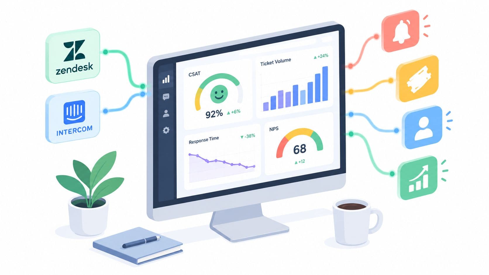
Your support dashboard says response times are healthy, CSAT is acceptable, and the backlog is under control. Yet enterprise expansion has slowed, renewal conversations feel harder, and the same customers keep contacting support about issues marked “resolved.” That's not a reporting problem. It's a resolution-quality problem.
A useful customer service analytics dashboard should help a support or revenue leader decide what to do next. It should show which customers are waiting, whether their problems were resolved, and where service friction creates churn or expansion risk. Speed matters, but speed without durable resolution can make the numbers look healthier while the customer experience deteriorates.
Why Most Dashboards Miss Resolution Quality
The first dashboard I'd distrust is the one with the most polished scorecards. It reports ticket volume, average handle time, first-response time, CSAT, and perhaps FCR, but it doesn't show whether customers had to come back. A closed ticket is an operational event, not proof that the customer succeeded.
A stronger view joins first-contact resolution with reopen rate, repeat contacts, escalations, product usage, and account value. It separates self-service sessions from verified resolution and distinguishes AI-resolved, human-resolved, and prematurely closed cases. That distinction matters because deflection can mean either “the customer solved the problem” or “the customer never reached an agent and gave up.”
Practical rule: Never accept a positive service metric without asking which customer behavior would prove it wrong.
Response expectations make this more urgent. HubSpot data summarized by Help Scout's customer service statistics reports that 90% of consumers consider an immediate response important or very important, while 60% define immediate as 10 minutes or less. A fast acknowledgment can protect trust, but it doesn't guarantee a useful answer or a lasting fix.
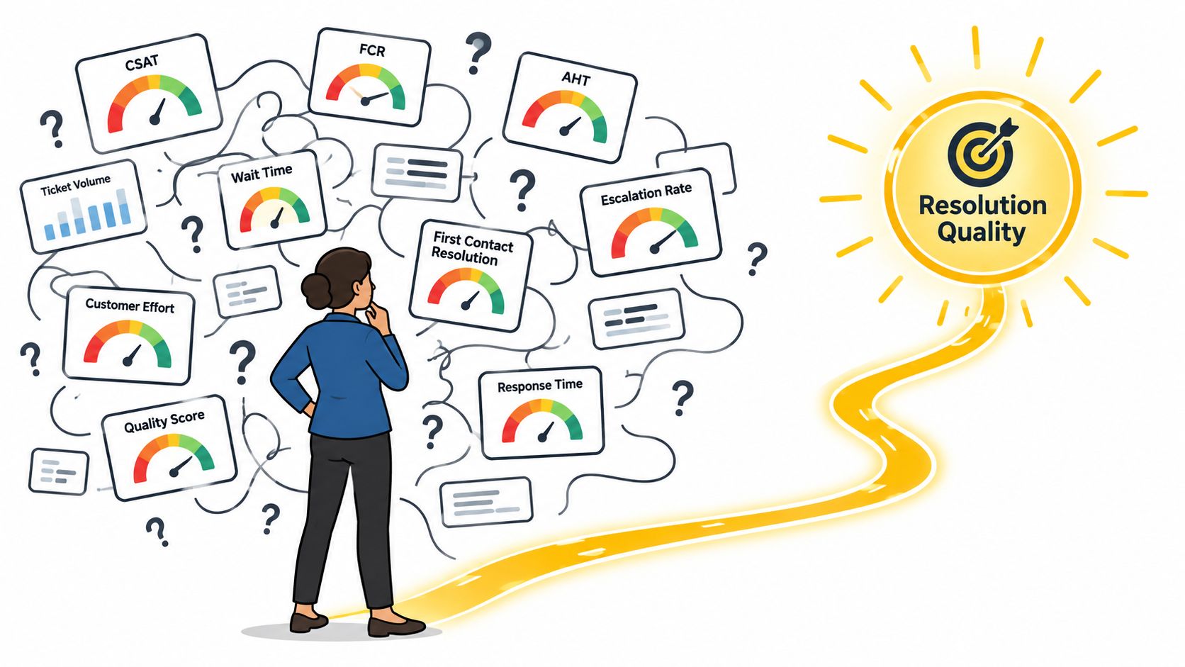
Data fragmentation makes this harder. Adobe's research on data and insights reports that 76% of practitioners say siloed data blocks real-time personalization, with two in five describing the problem as significant or critical. If the ticketing system, CRM, billing platform, and product analytics use different customer identities, the dashboard can produce precise-looking conclusions from incomplete evidence.
Picking the Right KPIs and Counter-Metrics
Start with the decision, not the chart. Staffing decisions need queue volume, backlog age, first-response time, and SLA compliance. Coaching decisions need resolution quality, escalations, reopenings, and customer feedback. Retention decisions need account-level issue patterns connected to usage and renewal context.
Build a small metric set, then pair every important KPI with a counter-metric. Teams will optimize whatever leaders put on the scorecard, including metrics that reward premature closure or short interactions. A useful KPI strategy guide from Kagool can help formalize ownership, definitions, and decision links. For support-specific definitions, see the SigOS guide to customer support metrics.
| KPI | What it measures | Counter-metric to pair with it |
|---|---|---|
| First-response time | How quickly a customer receives an initial reply | Repeat contacts and CSAT |
| Resolution time | How long an issue remains open | Reopen rate and escalation rate |
| FCR | Whether the issue appears resolved in the first interaction | Customer-confirmed resolution and repeat contact |
| CSAT | Satisfaction with a support interaction | Response rate and verbatim feedback |
| NPS | Relationship-level advocacy or loyalty | Retention and account activity |
| Ticket volume | Demand entering the service operation | Issue severity and customer value |
| Average handle time | Active handling effort per case | Resolution quality and CSAT |
| Deflection | Contacts avoided through self-service or automation | Verified problem resolution |
For FCR, document the denominator and observation window. A customer-confirmed result shouldn't be blended casually with a system-inferred result based on the absence of another ticket. Segment results by plan tier, region, channel, issue category, tenure, language, and queue. A global average hides operational differences that leaders can address.
Integrating Zendesk, Intercom, and the Rest of Your Stack
Connect the support systems in a deliberate order. Begin with Zendesk tickets, statuses, assignees, tags, macros, custom fields, and event timestamps. Then bring in Intercom conversations, chat tags, bot activity, handoffs, and agent replies. Don't merge records until you've agreed on what counts as a contact, case, conversation, resolution, and reopen.
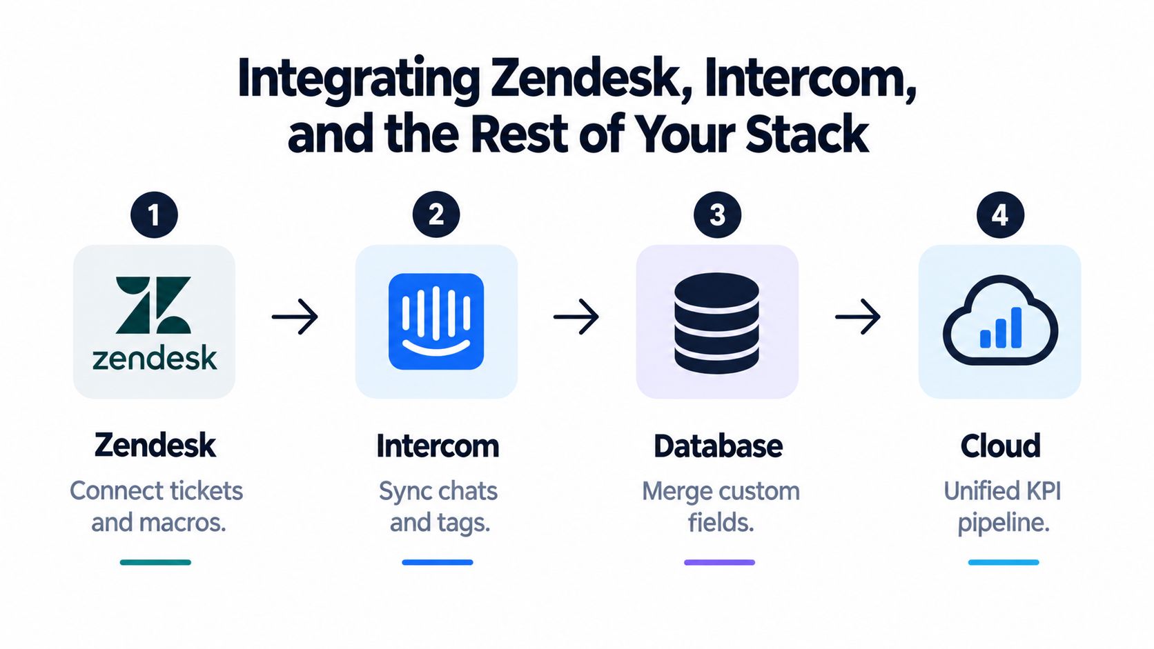
Next, add the CRM account and contact model, billing status, plan tier, renewal date, product usage, and survey responses. Product events tell you whether usage recovered after support interaction. CRM and billing data show whether unresolved friction affects a valuable account. Survey data adds customer voice, but response bias means it shouldn't stand in for the entire customer base.
The most reliable pipeline has three explicit rules:
- One canonical customer ID: Map email addresses, account IDs, workspace IDs, and contact records to one governed identifier.
- One issue taxonomy: Maintain a controlled set of issue categories and map Zendesk tags, Intercom tags, and product categories to it.
- One timestamp source: Normalize time zones and distinguish event time, assignment time, first response, resolution, and survey submission.
Identity stitching is where many dashboards fail. A customer may appear under several emails, an enterprise account may contain multiple workspaces, and a chat may become a ticket without preserving the original conversation ID. Document the matching logic and expose unmatched records instead of dropping them without visibility. Teams working through a broader multi-source data integration approach should treat lineage and exception handling as part of the dashboard, not as backend housekeeping.
A clean pipeline is more valuable than a crowded visualization.
Connecting Support Signals to Churn and Expansion
Revenue risk rarely appears as a single “churn score.” It emerges through combinations of behavior: repeat contacts about the same workflow, unresolved escalations near renewal, declining product usage after a support interaction, or a feature limitation mentioned by several users at one account.
Slice the dashboard by plan tier, industry, region, customer tenure, renewal stage, and workflow usage. A large queue from self-serve accounts may require operational attention, but a smaller group of unresolved issues affecting enterprise customers can carry greater commercial urgency. Volume tells you where work accumulates. Account context tells you what deserves priority.
Attach a transparent impact record to each issue. Include the affected account, plan, renewal timing, workflow usage, issue severity, number of related contacts, escalation status, and whether usage changed afterward. This isn't a black-box prediction. It's an evidence trail that lets support, success, product, and revenue teams discuss the same risk.
Waiting time also deserves a customer-outcome view. CallMiner's summary of Toister Solutions research reports that live-chat satisfaction was 83.4% when customers waited 0 to 30 seconds, falling to 71.4% when the wait reached 10 minutes or more. Use that relationship to investigate high-value queues, but don't assume faster replies solve complex product problems.
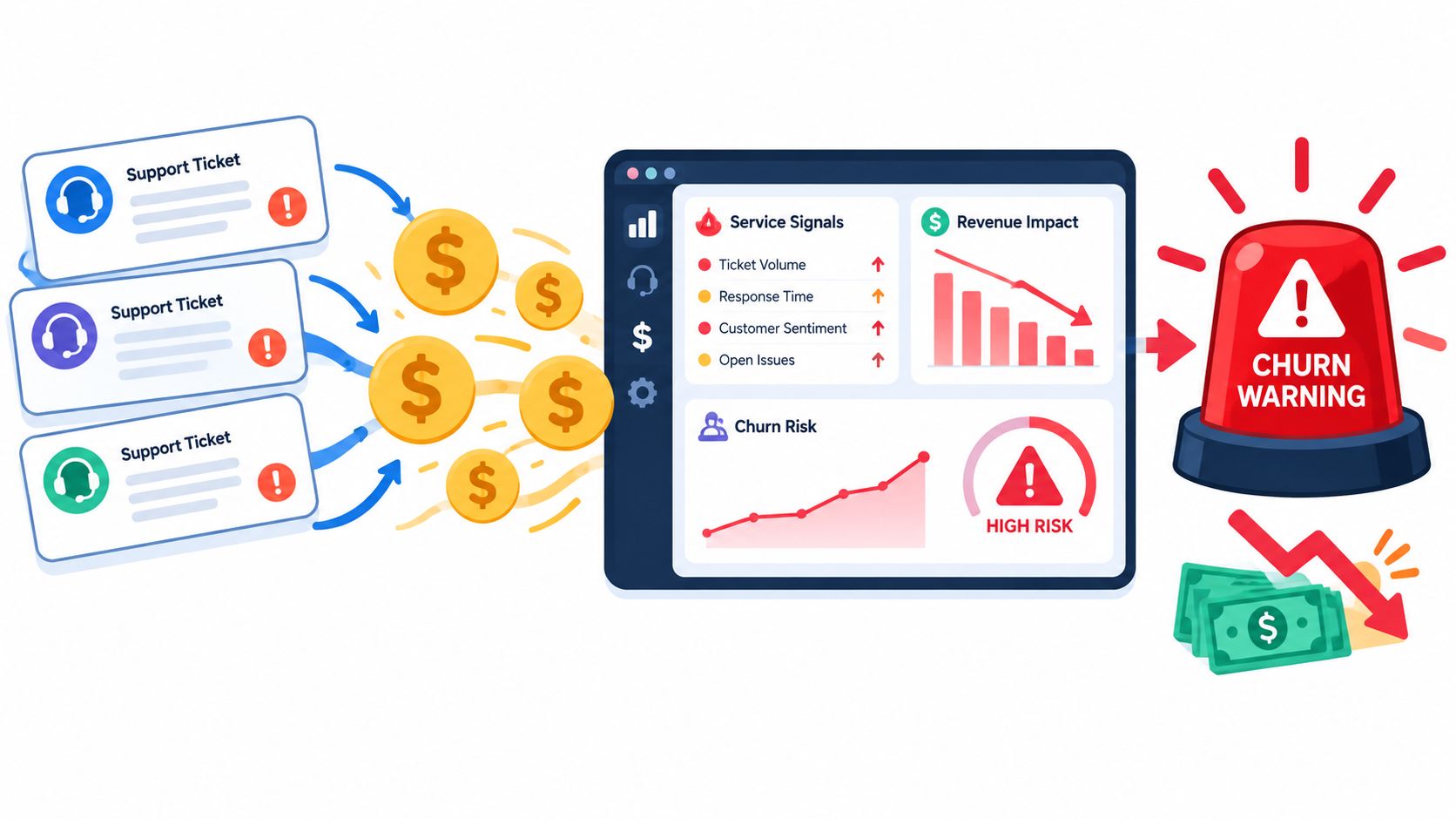
A support analytics product such as SigOS can combine support tickets, chat transcripts, sales calls, and usage metrics to identify recurring issues associated with churn, expansion, and revenue impact. For operating principles around these decisions, a practical guide to retention and expansion from Captiwate provides useful customer-success context. You can also use support ticket analysis from SigOS to structure issue patterns before assigning commercial significance.
The dashboard row should answer one question: what customer outcome or revenue motion could this issue affect, and what evidence supports that conclusion?
Alerting, Prioritization, and the Weekly Operating Cadence
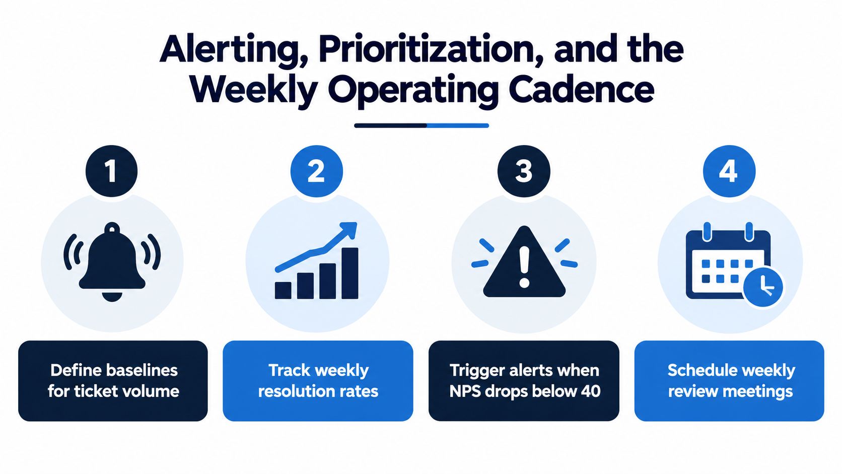
A dashboard becomes operational when it tells someone who needs to act, why the alert matters, and when the decision is due. Start with internal baselines for ticket volume, backlog age, response time, resolution time, reopen rate, escalation rate, and CSAT. Compare rolling weekly performance with a trailing baseline, then alert on meaningful deviations rather than every fluctuation.
Use this triage sequence:
- Verify the definition: Check the formula, denominator, observation window, excluded records, and refresh latency.
- Inspect the counter-metric: If FCR rises, check reopen rate, repeat contact, escalations, and CSAT before celebrating.
- Find the affected cohort: Break the change down by account tier, channel, region, issue type, and queue.
- Estimate customer impact: Prioritize unresolved work by account value, workflow importance, renewal context, and severity.
- Assign ownership: Name the support, success, product, or engineering owner and record a deadline.
Conflicting alerts should trigger investigation, not an automatic policy change. If average handle time falls while reopen rate rises, the operation may be closing cases too quickly. If deflection rises while product usage drops, customers may be abandoning the workflow rather than solving the issue.
Use a simple cadence. Leaders can glance at queue health and urgent account risks daily, review cohort movements and owners weekly, and recalibrate thresholds against actual outcomes monthly. Every intervention should have a counter-metric that must remain stable. If it doesn't, reverse or redesign the intervention.
Keeping the Dashboard Trustworthy After Launch
A dashboard stays useful only when someone maintains its definitions and challenges its conclusions. Keep five habits in place:
- Document formulas: Record metric logic, denominators, observation windows, and exclusions.
- Show evidence quality: Display sample size, survey response rate, missing data, confidence, and refresh latency.
- Audit the model: Watch identity matching, taxonomy changes, automation behavior, and model drift.
- Rotate review ownership: Let support, success, product, and revenue leaders challenge different blind spots.
- Govern access: Control sensitive conversation data, consent status, permissions, and privacy-safe aggregation.
The operating standard is simple: every number should be reproducible, every alert should have an owner, and every improvement should survive a counter-metric.
SigOS helps teams combine support tickets, chat transcripts, sales calls, and usage signals to identify unresolved patterns linked to churn, expansion, and revenue impact. If your current dashboard reports activity but doesn't explain which customer problems deserve action, visit SigOS and evaluate the decision signals your teams need.
Keep Reading
More insights from our blog

Ready to find your hidden revenue leaks?
Start analyzing your customer feedback and discover insights that drive revenue.
Start Free Trial →