Build a Product Analytics Dashboard That Drives Decisions
Learn practical steps to design, build and optimize a product analytics dashboard. Covers KPIs, visualization, alerting and real SaaS examples.
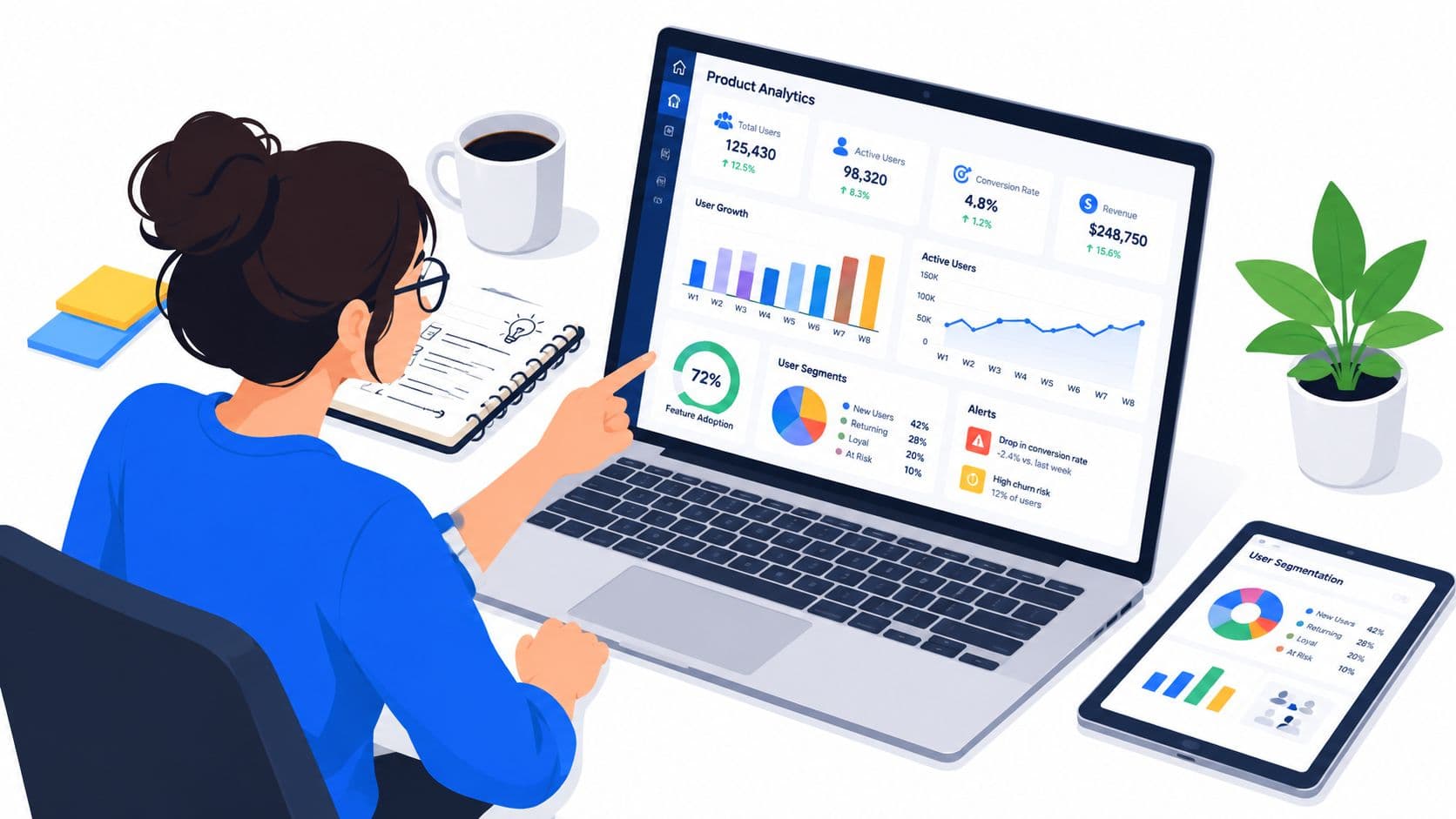
You open your product analytics dashboard before stand-up and find a wall of charts. Activation is down, feature usage is uneven, support tickets are rising, and revenue looks flat. The dashboard tells you what changed, but it doesn't tell you whether to fix onboarding, investigate a broken workflow, contact at-risk accounts, or ignore a harmless segment shift. By the time you find the answer, the meeting is over and the decision has moved to next week.
That failure is common because teams treat dashboards as data collections instead of decision systems. A useful dashboard connects behavioral signals to business consequences, then routes the resulting insight toward a specific action. The objective isn't to display every event your product captures. It's to help a product manager decide what deserves attention today.
Why Most Dashboards Fail Before They Start
You open a dashboard with twenty charts and immediately start filtering. One chart shows sign-ups, another shows sessions, several show feature events, and a final row shows revenue metrics with no visible connection to user behavior. Nothing is technically broken. The problem is that the screen was designed around available data rather than the decision someone needs to make.
That distinction explains dashboard fatigue. Teams add a chart whenever a stakeholder asks a question, then preserve it long after the question stops mattering. The result is a reporting archive that demands manual interpretation. Guidance from SigOS on dashboard creation points toward the better approach, start with the audience, purpose, and decision before choosing the visual components.

Data availability isn't decision utility
A metric earns space when it changes what someone will do. Page views may help diagnose acquisition, but they shouldn't sit beside retention and revenue without a clear interpretation. Likewise, raw event counts can look healthy while users fail to reach the product moment that creates recurring value.
The most reliable product analytics dashboards are built around a small group of lifecycle KPIs rather than metric sprawl. Industry guidance recommends 5 to 10 core KPIs for fast scanning, while dashboards with 20 or more charts or 30 or more metrics can overwhelm users and reduce actionability, as documented in Amplitude's product analytics guide.
Practical rule: Every chart must answer, “What decision does this support, and what action follows if it moves?”
Replace passive reporting with operational intelligence
A reporting dashboard says, “Activation fell.” An operational dashboard adds the affected cohort, the likely behavioral change, the revenue exposure, and the owner responsible for investigation. It turns a number into a work item.
Before building anything, write the decisions your team makes repeatedly:
- Onboarding decision: Which step is preventing new users from reaching value?
- Adoption decision: Which feature is used once but not incorporated into a recurring workflow?
- Retention decision: Which behavior precedes disengagement for valuable accounts?
- Revenue decision: Which usage pattern predicts expansion, downgrade, or churn?
If a proposed chart doesn't support one of those decisions, leave it out. A smaller product analytics dashboard with clear ownership will outperform an extensive dashboard nobody trusts or opens.
Selecting KPIs Aligned to the User Lifecycle
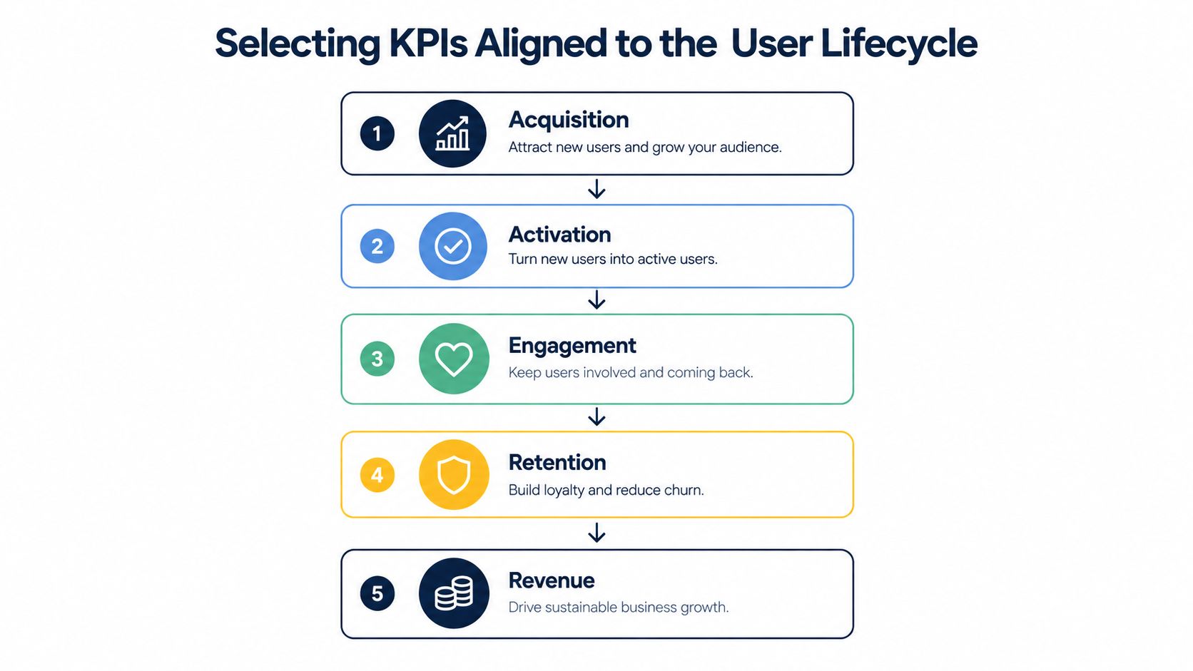
Start with the user lifecycle, not the database schema. A product analytics dashboard should follow the path from acquisition to activation, engagement, retention, and monetization, because each stage exposes a different failure mode and requires a different response.
Map each stage to a decision
| Lifecycle stage | KPI focus | Decision it should support |
|---|---|---|
| Acquisition | Qualified conversion rate | Which sources bring users who start the product journey? |
| Activation | Activation rate | Which first-use step creates an early value moment? |
| Engagement | Feature adoption and DAU/MAU | Which behaviors indicate recurring product value? |
| Retention | Retention rate and churn | Which cohorts are disengaging, and when? |
| Monetization | MRR and LTV | Which usage patterns connect to commercial outcomes? |
These dimensions appear consistently in modern dashboard guidance, including Amplitude's analytics dashboard overview. The point isn't to display every metric in each category. Pick the measure that answers the immediate business question, then add only the supporting indicators needed to explain movement.
Choose a north star and supporting signals
Your north star metric should represent repeated customer value, not internal activity. For a collaboration product, that might be a completed team workflow. For a data tool, it could be a recurring analysis that reaches a useful output. The exact definition depends on the product, but the selection test is consistent: users should perform the behavior because it solves a problem, and sustained performance should relate to retention or revenue.
Build the dashboard in layers:
- Primary outcome: The business or product result leadership cares about.
- Behavioral driver: The user action most closely associated with that result.
- Friction indicator: The step where users fail, pause, or abandon.
- Segment context: The cohorts, plans, channels, or accounts driving the change.
- Commercial consequence: The relationship to churn, MRR, LTV, or expansion.
Don't confuse correlation with causation. If frequent feature users retain better, the dashboard should prompt investigation into what the feature enables, not automatically claim that the feature caused retention. That distinction keeps your product decisions honest.
Make every KPI earn its position
Remove metrics that create curiosity without creating a next step. A rising traffic number may be good news, but it isn't useful if the new visitors don't activate. A high DAU/MAU ratio may suggest habitual use, but you still need to know which workflows create that habit and whether valuable accounts participate.
Keep the top view deliberately narrow. Put diagnostic detail behind filters, drill-downs, or linked reports. Your dashboard should let an executive understand the health of the product quickly, while giving a PM enough behavioral context to investigate without exporting data into another tool.
Technical Steps to Build Your Dashboard
A dependable dashboard begins with an event model that people can explain without opening a data dictionary. Define the business objects, user actions, account attributes, and revenue fields before connecting visualizations. If “project_created” means one thing in Amplitude and another in the warehouse, every funnel and cohort built on that event becomes suspect.
Build the data foundation first
Use a shared event naming convention. Store properties with stable types and definitions, identify whether an event belongs to a user or an account, and record the release or product area associated with important changes. Add ownership to tracking plans so someone knows who validates an event after an interface or workflow changes.
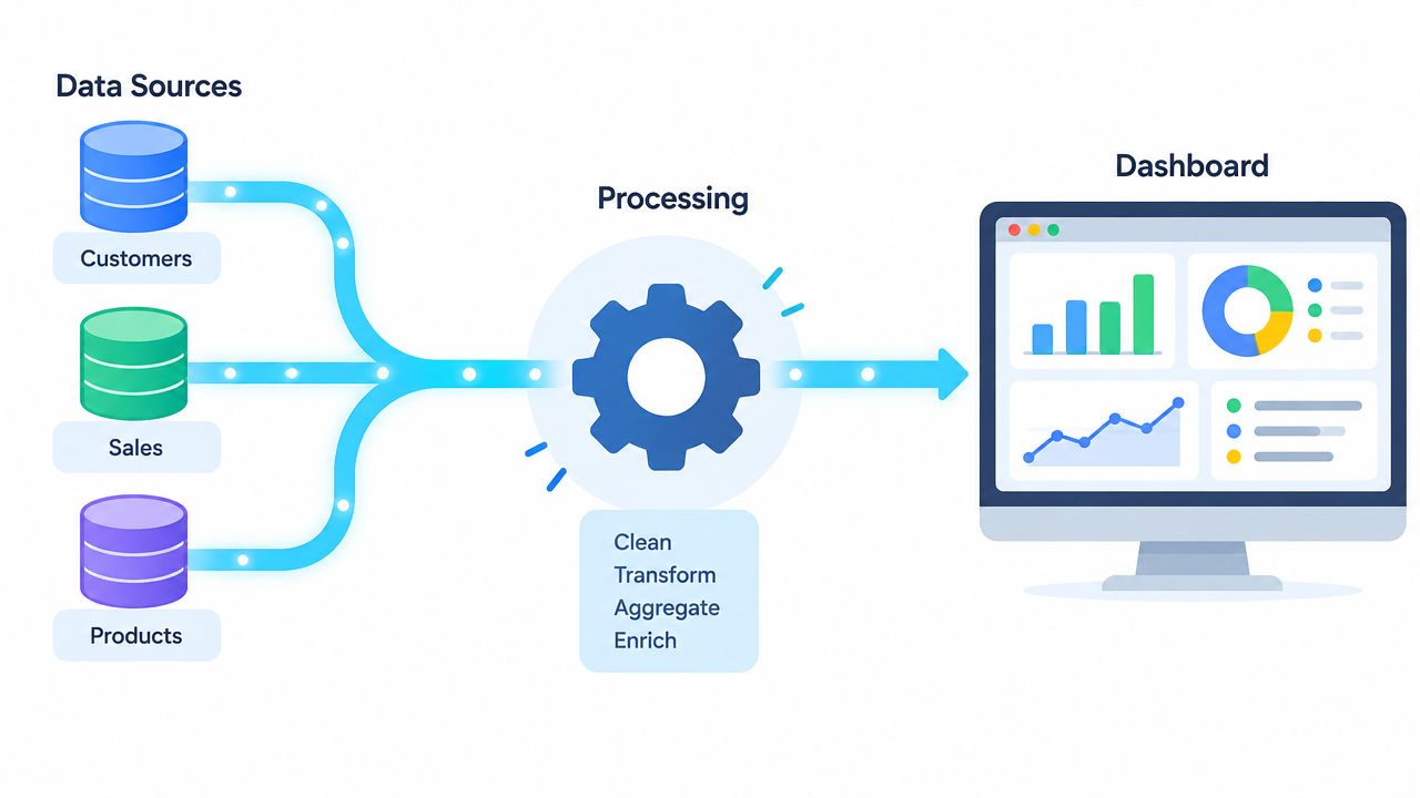
Then connect the sources that explain the same customer journey:
- Product events show what users did.
- Account and billing data show plan, MRR, renewal status, and LTV context.
- Support data shows friction that users may not express through clicks.
- CRM data shows sales stage, expansion opportunity, and account ownership.
A pipeline should standardize identity across those systems. User-level activity needs a reliable relationship to the account that pays, otherwise the dashboard can show engagement without revealing which commercial relationship it affects. Teams building this layer can use SigOS's guide to data pipelines as a practical reference for thinking about ingestion, transformation, and delivery.
Validate tracking before trusting the output. Compare event volumes against known product behavior, inspect missing properties, test identity joins, and verify that a release didn't create duplicate events. Add automated checks for freshness and schema changes, then document what happens when a source fails. Automated refreshes, benchmark lines, and shared definitions matter because stale or inconsistent data quickly destroys confidence in the entire dashboard.
A technical pipeline still needs a human operating rhythm. Assign owners for instrumentation, data quality, metric definitions, and dashboard maintenance. Without those roles, the dashboard will drift as the product evolves.
Here is a visual explanation of how the pipeline can support a business-facing view:
Finally, make the dashboard role-specific. A support leader needs usage changes tied to open issues. A PM needs funnel and path detail. A finance stakeholder needs reliable connections between behavior and recurring revenue. One dataset can serve all of them, but one default view usually won't.
Moving from Reporting to Exception-Based Monitoring
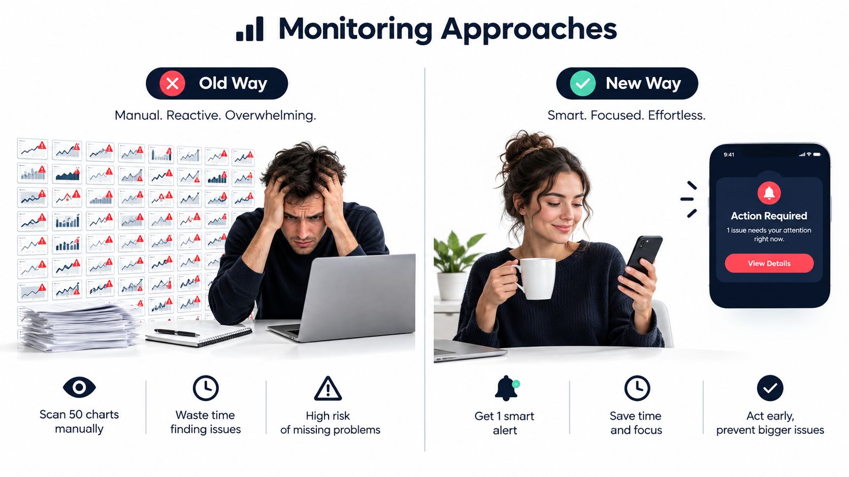
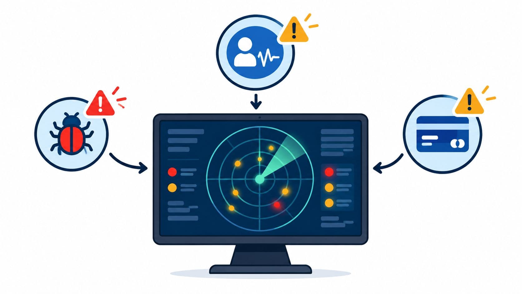
Static reporting asks people to inspect every chart on a schedule. Exception-based monitoring asks the system to identify a meaningful deviation, attach context, and notify the person who can investigate it. The second model is better because human attention is scarce and most metrics don't require intervention on every review cycle.
Static review versus targeted alerts
| Static reporting | Exception-based monitoring |
|---|---|
| The team scans every chart | The system highlights threshold breaches |
| A change appears without explanation | The alert includes segment and behavioral context |
| Investigation starts manually | The alert links to the next diagnostic view |
| Ownership is often unclear | The notification names an owner and action |
| Attention follows the dashboard layout | Attention follows business risk |
The strongest alerts watch leading indicators, not only lagging outcomes. A churn report tells you customers have already left. A meaningful decline in the core workflow, a failed activation step, or a sharp reduction in valuable account activity gives the team a chance to investigate earlier.
Set thresholds around normal operating ranges and business impact. Don't alert on every fluctuation. An alert should include the affected segment, comparison period, confidence in the signal, likely contributing events, and a recommended first investigation. If the system can't provide that context, it should send fewer alerts rather than create notification fatigue.
Route detection into diagnosis
A useful cadence combines automation with deliberate review. Guidance from UserGuiding on product analytics dashboards recommends weekly dashboard reviews, bi-weekly feature or segment deep-dives, and monthly stakeholder readouts. Use alerts for immediate exceptions, weekly reviews for patterns, deep-dives for diagnosis, and monthly readouts for decisions that need wider alignment.
The same principle applies outside product analytics. Teams building social media reporting for developers also need to distinguish routine reporting from signals that warrant action. Your product dashboard should do the same by linking an anomaly to a funnel, path, session, support conversation, or account list.
An alert isn't an insight until someone can understand the cause and assign the next move.
A PM who receives “activation down” still has work to do. A PM who receives “activation down for accounts using the new import flow, concentrated at permission setup, with affected accounts linked to open support conversations” can start a focused investigation immediately. That is the difference between notification and operational intelligence.
Visualization Best Practices for Clarity
Visual design should reduce interpretation time, not decorate the dashboard. Put the primary outcome at the top, the behavioral drivers beneath it, and the diagnostic detail behind an interaction. A reader should understand the current state before exploring the reason.
Choose chart types according to the question:
- Line charts show movement over time and reveal changes after launches.
- Funnel charts expose conversion loss between defined steps.
- Cohort tables show whether behavior persists across groups and periods.
- Path views reveal what users do before or after a key event.
- Bar charts compare segments when the ranking matters more than the trend.
- Scatter plots help examine relationships between usage and commercial outcomes.
Don't use a pie chart to show a long list of segments. Don't use a line chart for unrelated categories. Don't force a single visualization to answer both “what changed?” and “why did it change?” Those questions need separate layers.
Design for scanning and investigation
Use color sparingly. Reserve one strong color for an alert, risk state, or selected segment, and keep normal values visually quiet. Red should mean something specific, not just “this metric is lower than the previous period.” Include a benchmark, target, or comparison line where it helps the reader interpret movement.
Write titles as conclusions or questions rather than database labels. “Activation falls after workspace invitation” gives direction. “Activation funnel” merely names an object. Add short notes beside unusual metrics to define the calculation, scope, and owner.
Keep interactions predictable. Filters should apply consistently, dates should be visible, and drill-downs should preserve the selected segment. Test the view on smaller screens, but don't compress important charts until their labels become unreadable. A mobile layout can prioritize alerts and outcomes while leaving deeper analysis to desktop.
For teams evaluating alternatives to standard reporting workflows, this comparison of options beyond Looker Studio Search Console offers useful context on choosing tools around analysis needs rather than familiarity.
The final test is simple: give the dashboard to someone who didn't build it and ask what they would do next. If they can describe the metric but not the action, revise the hierarchy, labels, or context.
Integrating Actionable Insights with Platforms
A dashboard becomes valuable when it shortens the distance between detection and execution. If a product manager sees a retention risk but must copy the account list into a spreadsheet, write a ticket, notify customer success, and explain the evidence manually, the insight will decay before anyone acts.
Create an action contract for every alert
Define four fields for each operational signal:
- Trigger: The behavioral or commercial condition that deserves attention.
- Evidence: The cohort, events, account attributes, and revenue context supporting it.
- Owner: The team or individual responsible for the first investigation.
- Destination: The system where the work will be tracked, such as Jira, Linear, Zendesk, or a customer-success workspace.
For example, a decline in activation after a release can create a Jira issue with the affected event, cohort comparison, session examples, and release identifier. A high-value account showing reduced use of a core workflow can create a customer-success task instead of an engineering ticket. The destination should match the remedy.
Reverse ETL can help operationalize this pattern by moving modeled data from analytical systems into the tools where teams already work. SigOS's explanation of reverse ETL provides helpful background on that delivery layer.
Add AI where interpretation is expensive
AI should summarize evidence and propose investigation paths, not independently make product decisions. A useful assistant can group related anomalies, compare affected cohorts, connect usage changes to support themes, and draft a recommendation with the underlying evidence attached. The product manager still decides whether the recommendation is credible and whether the proposed intervention is worth the cost.
The opportunity is especially clear because dashboards often stop at “what happened.” Coverage of dashboard limitations reports that 40% of respondents said dashboard data doesn't sufficiently support decision-making, 37% said the data wasn't clear or actionable, and 51% said they couldn't meaningfully interact with it, based on a survey of more than 200 SaaS respondents in Luzmo's analysis. Those findings point to a workflow problem, not a chart problem.
Privacy must remain part of the architecture. Use consent-aware collection, minimize sensitive fields, define access by role, and preserve an audit trail for automated recommendations. A fast system that exposes customer data carelessly isn't operational maturity.
SigOS is one option for teams that want to connect support tickets, calls, usage metrics, and revenue context, then route prioritized product issues into systems such as Jira, Linear, and GitHub. Treat it as an action layer alongside your analytics platform, not as a replacement for a well-defined event model.
Your Roadmap to a High-Impact Dashboard
Don't begin with a polished layout. Begin with one recurring decision that currently takes too long or depends on conflicting reports. Interview the person who owns that decision, document the inputs they trust, and identify the behavioral evidence they still have to find manually.
Build in deliberate stages
Stage one, define the decision. Write the audience, business question, primary outcome, and acceptable response time. If the question is “why are new accounts failing to activate?”, don't add revenue expansion charts just because finance data is available.
Stage two, establish the metric contract. Define events, properties, identity rules, calculation logic, refresh expectations, and owners. Test the output against known examples before inviting stakeholders to rely on it.
Stage three, launch the smallest useful view. Start with the primary KPI, its behavioral drivers, the main friction point, and one commercial consequence. Put supporting detail behind filters and drill-downs rather than crowding the first screen.
Stage four, attach actions. Add threshold alerts, owners, investigation links, and destinations for work. A dashboard without an action path is still a report, regardless of how modern the interface looks.
Stage five, review and remove. Use weekly reviews to find recurring issues, deeper feature or segment sessions to diagnose them, and monthly stakeholder readouts to align on larger decisions. Delete charts that no longer influence behavior.
Treat the dashboard as a product
Your users are the people making decisions, and their feedback should shape the interface. Watch which filters they use, where they leave the view, which alerts they dismiss, and which questions they still answer in spreadsheets. Those behaviors reveal whether the dashboard is earning trust.
A stakeholder-facing view may need a different presentation from an investigative workspace. Resources such as the MyMentions dashboard for stakeholders can help teams think through audience-specific reporting without forcing every role into the same screen.
The product analytics dashboard should evolve when your product, pricing, customer mix, or instrumentation changes. Revalidate event definitions after releases, revisit thresholds when behavior shifts, and keep qualitative feedback near the quantitative signal. Usage shows what happened, customer language often explains why, and revenue context tells you what deserves priority.
The standard to keep: A dashboard is successful when it helps a specific person make a better decision faster, then records what happened after that decision.
Start this week with one dashboard, one audience, and one decision. Remove every chart that doesn't support it, validate the underlying events, add a clear alert path, and review the result with the people expected to use it. That small operating loop will teach you more than another month spent designing a perfect reporting surface.
SigOS helps teams connect customer feedback, usage behavior, and revenue impact so product signals lead to clear priorities instead of another passive report. Visit SigOS to see how its integrations and product intelligence workflows can help your team route dashboard insights into action.
Ready to find your hidden revenue leaks?
Start analyzing your customer feedback and discover insights that drive revenue.
Start Free Trial →