SaaS Churn Metrics: A Complete Retention Guide for 2026
Master SaaS churn metrics to reduce customer loss. Learn the key retention analytics and strategies to boost revenue in 2026.

A 3.22% median annual SaaS churn rate can look reassuring, especially beside a higher internal number. But that benchmark describes a population, not your customer base. It can conceal an SMB segment losing accounts quickly, an enterprise segment renewing reliably, or a small number of large cancellations that matter far more than dozens of low-value departures. Recurly's 2025 benchmark places top-quartile SaaS performers at 1.78% annual churn or below, which makes the more important question operational: which customers are leaving, how much revenue do they represent, and what signal appeared before cancellation? (Vena Solutions' 2025 SaaS churn benchmark)
A useful retention system therefore treats SaaS churn metrics as a diagnostic framework, not a leaderboard. You need consistent formulas, segment-specific baselines, cohort curves, voluntary and involuntary classifications, and leading indicators connected to product usage, support activity, and billing events.
Why Blended Churn Benchmarks Mislead SaaS Teams
Public churn benchmarks describe different customer populations, contract structures, and revenue bases. One 2025 benchmark reports median annual SaaS churn at 3.22%, software businesses overall at 3.04%, and top-quartile SaaS companies at 1.78% or below. Another reports average B2B SaaS annual churn at 3.5%, including 2.6% voluntary churn and 0.8% involuntary churn. These figures are not necessarily contradictory. They use different samples and answer different measurement questions. (Recurly benchmark summary; Vitally benchmark summary)
Segment economics create a larger problem. One benchmark set reports monthly churn of around 0.5% to 1.0% for enterprise, 1% to 2% for mid-market, and 3% to 7% for SMB-focused products. A blended rate averages customers with different contract lengths, onboarding demands, switching costs, and account values. (Segment-specific SaaS churn analysis)
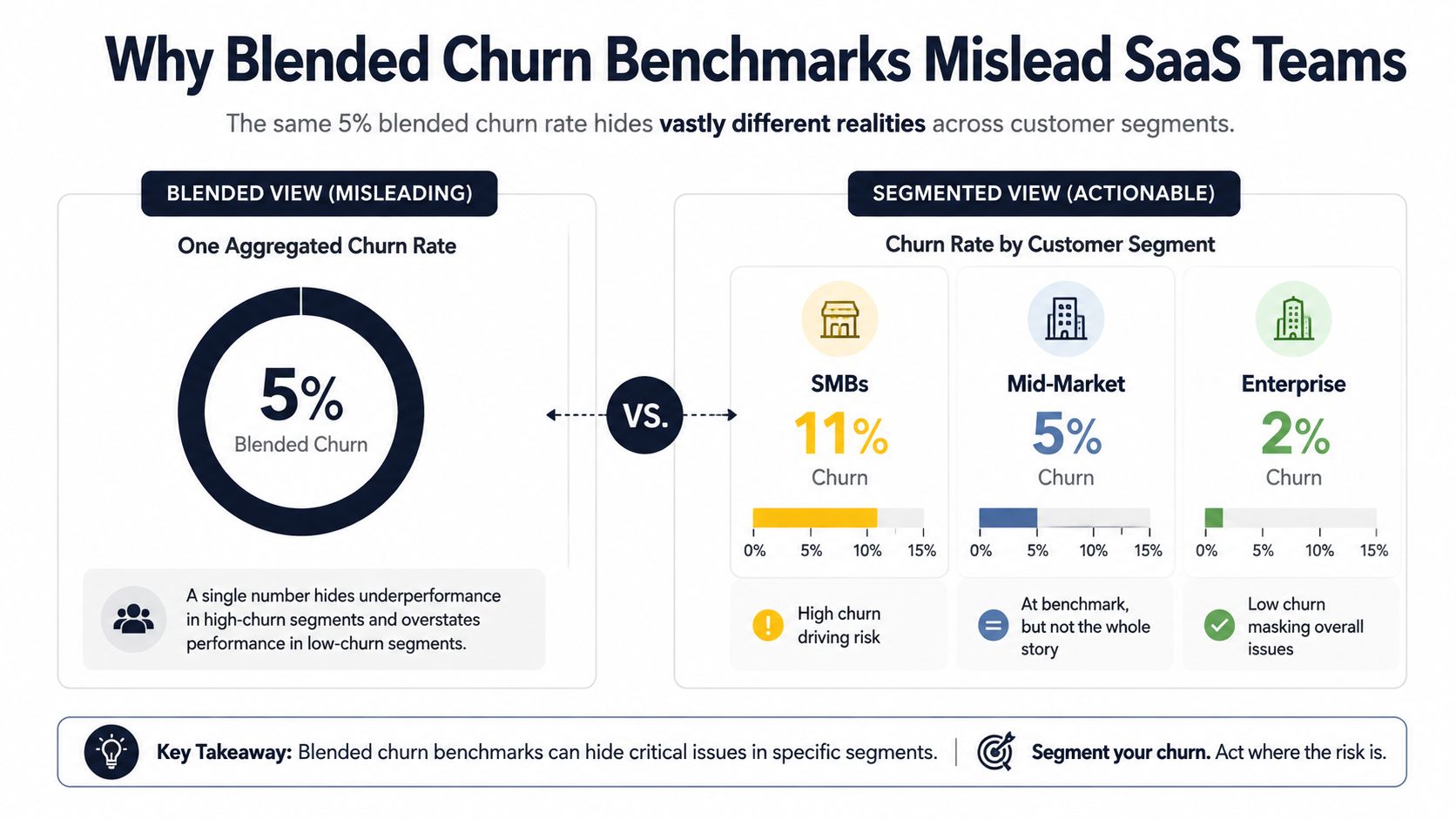
The average can hide opposite realities
A company serving all three segments may report a stable aggregate rate while its SMB onboarding experience deteriorates. Reliable enterprise renewals offset weak SMB activation, leaving leadership without a clear view of the failing motion. The average satisfies neither team because it does not identify where retention risk is concentrated.
Contract structure distorts timing as well. Annual prepaid contracts reduce the number of immediate cancellation points in a month, so observed monthly logo churn may appear low. The result may reflect deferred cancellation at renewal rather than stronger product satisfaction.
A useful dashboard gives each important segment its own:
- Baseline: Compare enterprise, mid-market, and SMB customers with their respective historical starting points.
- Trend line: Track whether churn is improving or deteriorating within the segment.
- Revenue view: Weight losses by recurring revenue so a large-account departure is not treated like a small-account cancellation.
- Diagnostic layer: Connect churn to adoption, support volume, onboarding completion, and payment events.
Leading indicators often move before the blended headline rate. A drop in activation for new SMB cohorts, rising support demand among mid-market accounts, or failed payments in an enterprise renewal window should trigger investigation before the aggregate metric changes.
Practical rule: Use an industry benchmark to create a question, not to close an investigation.
Teams can review the SaaS churn rate benchmarks methodology, then select a comparison group with similar pricing and contract terms. Companies that need help turning segment analysis into retention work can reduce churn with expert help.
Core SaaS Churn Metrics and How to Calculate Them
A churn dashboard can report an improving headline while the underlying customer base weakens. The risk appears when a few expanding accounts offset cancellations elsewhere. Separate customer loss from revenue loss, define a fixed measurement period, and use the opening customer or MRR balance as the denominator. Exclude new business from retention calculations, or new sales will make retention appear healthier than it is.
Four metrics with different jobs
Gross revenue churn measures recurring revenue lost through cancellations, non-renewals, and downgrades before expansion offsets the loss.
Gross revenue churn = Lost MRR from existing customers ÷ Starting MRR × 100
It answers: How much of the installed revenue base did we lose? Use it to assess base leakage and customer success performance. Strong expansion can make net retention look healthy while gross revenue churn remains high, which is precisely why both measures belong on the dashboard.
Net revenue churn subtracts expansion revenue from lost and downgraded revenue.
Net revenue churn = (Lost MRR + Downgrade MRR - Expansion MRR) ÷ Starting MRR × 100
It answers: Did the existing customer base shrink or grow financially? Negative net churn means expansion exceeded losses. That result supports forecasting, but it can conceal widespread cancellations when a small set of accounts expands.
Logo churn counts customer relationships rather than revenue.
Logo churn = Customers lost during period ÷ Customers at start of period × 100
It answers: How effectively are we retaining accounts? The metric helps when customer count reflects market reach or accounts have similar economic value. It becomes difficult to interpret across mixed segments because a small account and a large account each count as one logo.
Dollar-based net retention, often called net revenue retention, measures recurring revenue at period end from the opening customer cohort after churn, downgrades, and expansion.
NRR = (Starting MRR - Churned MRR - Downgraded MRR + Expansion MRR) ÷ Starting MRR × 100
It answers: How much recurring revenue did the original customer base retain and generate? NRR combines retention and expansion in one measure, while a simple churn rate isolates loss.
| Metric | Formula | Best Used For | Key Limitation |
|---|---|---|---|
| Gross revenue churn | Lost existing-customer MRR ÷ starting MRR | Measuring pure revenue leakage | Ignores expansion |
| Net revenue churn | Lost and downgraded MRR minus expansion MRR, divided by starting MRR | Diagnosing the financial change in the installed base | Expansion can hide cancellations |
| Logo churn | Lost customers ÷ starting customers | Tracking account attrition and market reach | Treats small and large accounts equally |
| NRR | Ending cohort MRR ÷ starting cohort MRR | Evaluating retention plus expansion | Requires clean cohort and revenue movement data |
Calculate each metric with the same currency basis, time period, and customer eligibility rules. Then split results by segment, plan, acquisition channel, and cohort. A blended result is a starting signal, not a diagnosis. Billing systems, CRM records, and product analytics must also agree on customer identity before analysts trust the output.
After diagnosis, teams can apply customer success automation tactics to repeatable onboarding, renewal, and billing workflows. This connects the metric to an operating response without allowing automation to hide the segment where churn is rising.
Logo Churn Versus Revenue Churn
Logo churn tells you how many relationships disappeared. Revenue churn tells you how much recurring economic value disappeared. Neither metric replaces the other because they describe different failure modes.
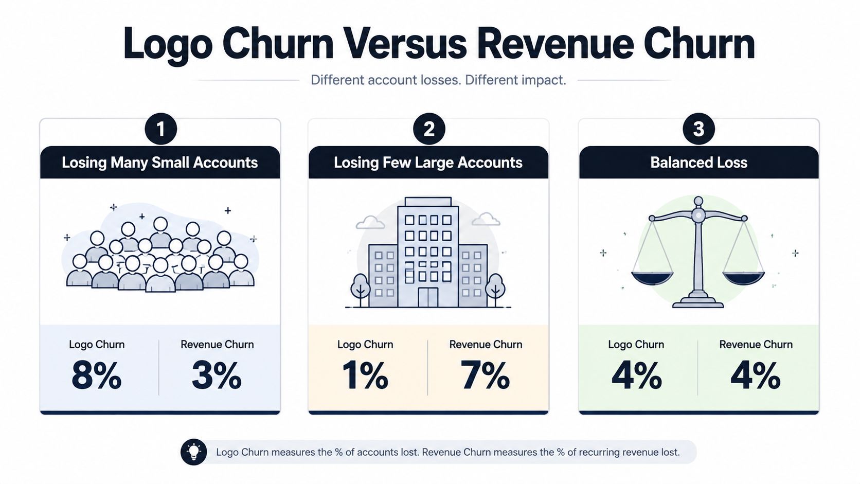
Three patterns leaders should recognize
Many small accounts leave, while large customers stay. Logo churn rises sharply, but revenue churn remains comparatively contained. This pattern usually points analysts toward SMB activation, pricing fit, onboarding friction, or a low-commitment acquisition channel. The financial response may be measured, but the product and growth response can't ignore the erosion of future market coverage.
A few large accounts leave. Logo churn stays low, while revenue churn jumps. The company hasn't lost many logos, yet the forecast has a serious problem. Analysts should investigate executive sponsorship, competitive displacement, unresolved product gaps, implementation quality, and renewal dependencies in the enterprise segment.
Both metrics deteriorate together. This is the clearest sign of a broad retention problem. Weak onboarding, product dissatisfaction, support failures, poor-fit acquisition, and billing friction may be affecting multiple segments at once. Leaders should avoid launching a single universal retention program before identifying the contribution of each cause.
Revenue-weighted churn should guide financial planning, while logo churn reveals whether the company is losing reach and customer diversity.
A useful diagnostic is the revenue-to-logo churn relationship. If revenue churn is materially higher than logo churn, large accounts are driving the loss. If logo churn is materially higher, smaller accounts are departing more often. Track that relationship by segment, not only as a company-wide ratio, because a blended relationship can hide a severe enterprise problem behind stable SMB revenue.
Expansion creates another trap. Surviving customers may upgrade, offsetting revenue lost from cancellations. Net revenue retention can therefore remain healthy while the base becomes less stable. Pair NRR with gross revenue churn, logo churn, and the number of cancellations by segment. The combination shows whether expansion is genuine account health or merely compensation for avoidable leakage.
Voluntary and Involuntary Churn Breakdown
A cancellation and a failed payment can create the same headline churn event, but they require different interventions. Voluntary churn occurs when a customer actively cancels or does not renew. Involuntary churn follows payment failure, expired payment details, or a breakdown in the billing process.
A B2B SaaS benchmark separates annual churn into 2.6% voluntary and 0.8% involuntary churn, within a total annual churn rate of 3.5%. The split suggests that dissatisfaction and weak value delivery account for most lost revenue in that sample. Billing operations still represent a recoverable category, but the benchmark should serve as a hypothesis rather than a target for every segment. (Vitally's B2B SaaS churn benchmark)
Treat each category as a separate queue
For involuntary churn, preserve the payment event that caused the loss. Separate expired cards, insufficient funds, bank declines, duplicate-payment disputes, and account-configuration errors. Each category supports a different recovery workflow, including payment-method updates, retry sequencing, account-owner notifications, or a controlled grace period.
Voluntary churn needs a different evidence trail. Store the stated cancellation reason alongside the account's plan, segment, recent usage, unresolved support issues, feature adoption, renewal timing, and customer-success activity. “Missing capability” becomes a more useful diagnosis when analysts can see whether the customer used related workflows or abandoned the product during onboarding.
Use this prioritization sequence:
- Recover clear billing failures first. The cause is operational, affected accounts are identifiable, and product changes are not required.
- Isolate preventable voluntary churn next. Examine poor activation, unused core workflows, unresolved support friction, and declining engagement before renewal.
- Test structural churn last. Customers who leave despite strong adoption and effective support may indicate problems with pricing, market fit, or competitive position.
| Churn Type | Typical % of Total | Primary Causes | Recovery Strategy | Expected Recovery Rate |
|---|---|---|---|---|
| Voluntary | 2.6% annual B2B churn in the cited benchmark | Product dissatisfaction, weak adoption, poor onboarding, non-renewal | Cancellation interviews, adoption interventions, product fixes, renewal plans | Depends on cause and timing |
| Involuntary | 0.8% annual B2B churn in the cited benchmark | Failed cards, expired payment methods, billing issues | Smart retries, payment updates, dunning, grace-period workflows | Depends on failure type and customer response |
Do not assign an assumed recovery target to either queue. Measure recovered MRR, recovered logos, time to recovery, and the original failure reason. Compare those measures by customer segment and failure type. A blended benchmark can indicate the relative size of each queue, but it cannot show which intervention will change retention for your company.
Cohort Retention Analysis by Customer Segment
A period-based churn rate tells you what happened during a reporting window. A cohort retention curve shows whether customers acquired under similar conditions stay active as they age. That distinction exposes onboarding failures, channel-quality problems, and product changes that a monthly average can hide.
Build cohorts by one primary dimension at a time. Useful dimensions include:
- Acquisition channel: Compare paid acquisition, referrals, partnerships, and sales-led accounts.
- Plan tier: Separate free, entry-level, professional, and enterprise motions where applicable.
- Company size: Keep SMB, mid-market, and enterprise customers on different curves.
- Onboarding status: Mark whether the customer completed the activation milestones tied to value.
- Geography: Use region when implementation, support coverage, or compliance requirements differ.
Read the curve, not just the endpoint
The first part of a curve often reveals whether customers reach value quickly. A steep early decline suggests onboarding or acquisition-quality friction. A gradual decline after initial activation can point to weak ongoing usage, limited expansion paths, or renewal risk that emerges only after the first business cycle.
A curve that flattens is often more actionable than a high endpoint by itself. Once the early-risk population has been separated, the remaining customers may show durable retention. That pattern supports targeted intervention rather than a broad program aimed at every account.
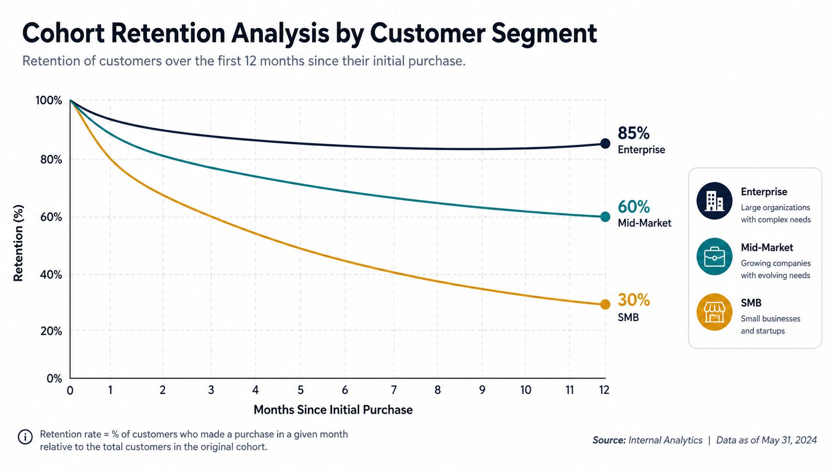
Compare recent cohorts with historical cohorts using the same segment, contract type, and maturity window. Don't compare a new annual enterprise cohort with a mature monthly SMB cohort and call the difference a product improvement. Annual contracts delay observable cancellation, while enterprise implementations may require a longer path to adoption.
Cohort size should be large enough for the result to be decision-useful, but there is no universal minimum that applies to every product. Show the underlying account count, flag small cohorts, and use qualitative confidence labels when a curve is unstable. More important than an arbitrary threshold is consistency: keep inclusion rules fixed, retain early churners in the table, and document every change to cohort definitions.
Connecting Churn to LTV and Expansion Revenue
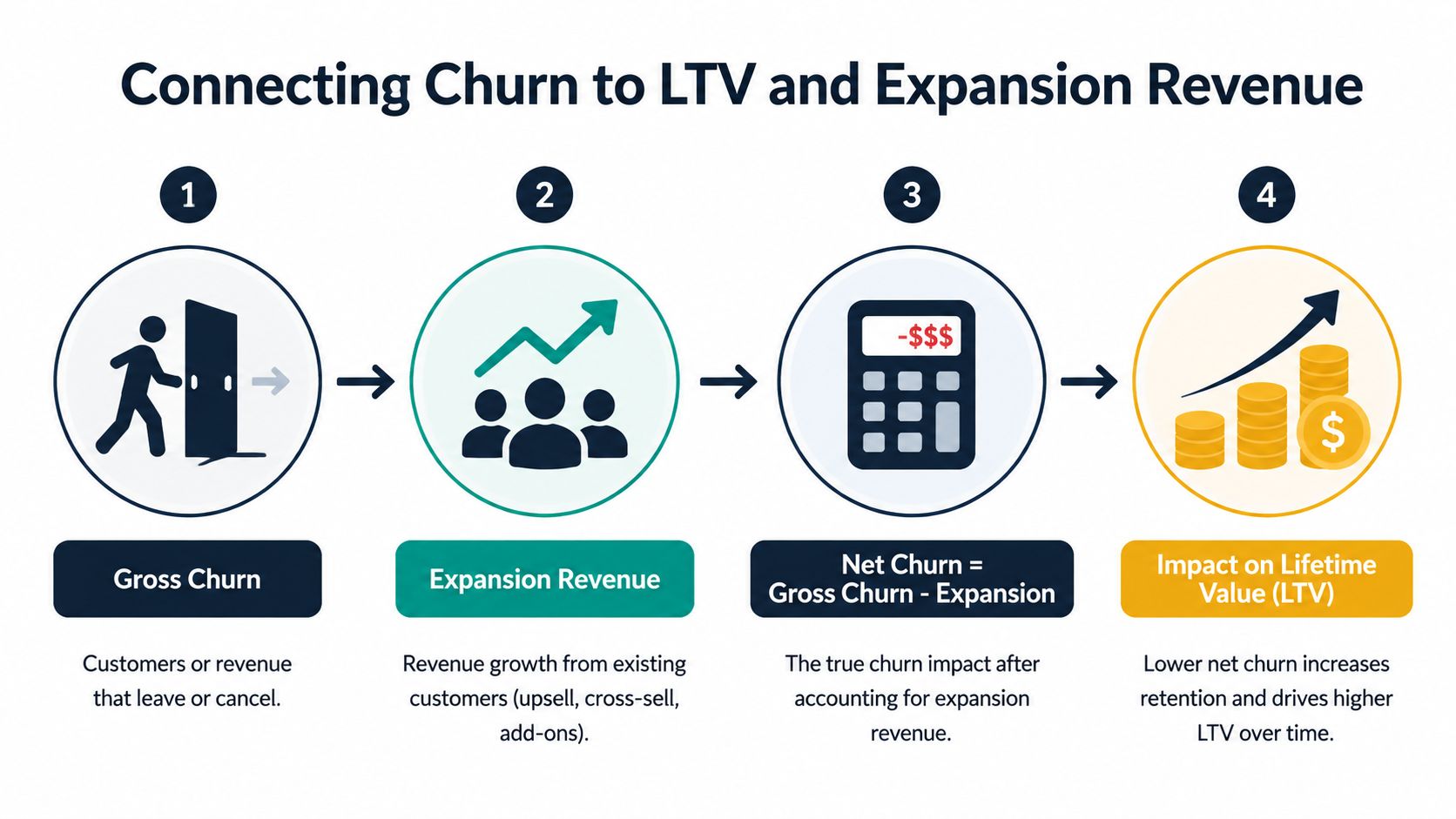
Churn affects customer lifetime value, acquisition efficiency, and the amount of new business required to sustain growth. Gross revenue churn measures recurring-revenue leakage, while expansion revenue records what retained customers add. Net revenue retention combines both movements within the opening customer base.
The inverse-of-churn shortcut gives a rough directional estimate but breaks down when churn varies by segment, customer age, contract length, or revenue band. It also excludes expansion, reactivation, downgrades, and different customer survival patterns. A blended rate can therefore produce a plausible LTV estimate for no real segment.
Use survival curves for realistic LTV
Calculate revenue survival by cohort instead. Start with each cohort's original recurring revenue, measure the amount remaining at each customer age, and connect those observations to gross margin and acquisition cost. This approach reflects observed customer behavior rather than assuming one constant churn probability across the business.
Segment the calculation by plan, customer size, contract structure, and revenue band where the economics differ. A single company-wide LTV can conceal a high-retention enterprise motion subsidizing weak SMB retention, or a low-value segment whose churn is masked by larger account expansions.
Expansion changes the interpretation of retention. A company with positive gross churn may still grow its installed base when expansion revenue exceeds losses. Stable logo counts can still conceal declining economic value if customers downgrade or large accounts contract. ChartMogul's benchmark data reports median monthly new MRR churn ranging from 6.2% in smaller SaaS businesses to 1.4% to 2.3% in larger segments, with top-decile performers in larger ARR bands reaching near-zero or negative churn. (ChartMogul customer churn benchmark)
Decision test: If expansion is doing all the work, test whether that motion can withstand a weaker renewal period.
NRR is a central growth diagnostic because it combines retention and expansion within the starting customer base. Read it beside gross churn, never as a substitute. Strong NRR can coexist with broad low-value customer loss. Weak NRR can reveal that a few large downgrades outweigh successful account growth.
Use this SaaS lifetime value calculation guide for the underlying unit economics, then model retention initiatives by segment. Show how lower gross churn or stronger expansion changes cohort revenue, LTV, CAC efficiency, and payback assumptions.
Building a Churn Dashboard with Leading Indicators
Headline churn is a lagging measure. By the time a customer cancels, the most useful intervention window may have closed. A practical dashboard layers revenue outcomes, account context, and behavioral signals so teams can identify deterioration before the cancellation event.
Start with the base layer:
- Revenue retention: Gross revenue churn, net revenue churn, NRR, and downgrade MRR.
- Segment context: Plan tier, company size, acquisition channel, contract type, and customer age.
- Event classification: Voluntary cancellations, involuntary failures, renewals, expansions, and reactivations.
Then add signals that may precede churn. Track declining login frequency, stalled adoption of core workflows, unresolved support themes, negative support sentiment, lower stakeholder participation, renewal proximity, and changes in usage breadth. Don't assume any signal predicts churn universally. Validate each one against your own historical cancellation events.
Turn signals into account action
A composite health index can combine behavioral, support, commercial, and billing inputs. Keep the components visible. A single opaque score makes it difficult for a customer-success manager to know whether to schedule an adoption review, escalate a product issue, or repair a payment method.
Set alerts around changes rather than static labels. A customer whose usage is falling steadily deserves attention even if the account still sits above a general health threshold. Rank alerts by revenue exposure, renewal timing, segment, and the evidence supporting the risk classification.
The data stack typically needs product telemetry, billing events, CRM account ownership, support conversations, and contract records linked to a stable customer identifier. Teams can use a warehouse with SQL and a BI layer, or a product analytics platform connected to customer-success workflows. The important design choice is not the brand of dashboard. It's whether the system preserves event history and lets analysts trace a risk alert back to observed behavior.
SigOS is one option for this signal-detection layer. It analyzes support tickets, sales calls, and usage data to identify patterns associated with churn, adoption, and revenue impact, then provides churn risk scores and product-intelligence signals for teams to investigate. Its dashboard approach can complement rule-based alerts when analysts need to examine behavioral patterns across multiple data sources.
Teams designing the measurement layer can also consult this guide to a dashboard for SaaS metrics, then test every proposed indicator against known churn and retained cohorts before making it part of an operating score.
Common Churn Measurement Mistakes to Avoid
Churn dashboards usually fail through definitions, not visualization. A polished chart can still mislead executives if it mixes customer segments, contract structures, and revenue events.
Test the measurement before changing the product
| Mistake | Diagnostic Test | Corrective Action |
|---|---|---|
| Blending SMB, mid-market, and enterprise churn | Recalculate churn by segment and compare trend direction | Give each segment its own baseline, cohort view, and owner |
| Treating annual contracts like monthly contracts | Compare cancellation timing with renewal windows and contract term | Report renewal churn separately from in-term monthly churn |
| Letting expansion mask base leakage | Place gross revenue churn beside NRR and expansion MRR | Review retention and expansion as separate operating motions |
| Excluding early cancellations from cohorts | Reconcile cohort membership with the original acquisition list | Keep every eligible customer, including early churners |
| Combining voluntary and involuntary loss | Match cancellation records to billing failure events | Create separate product, success, and billing recovery queues |
A benchmark is useful only when the comparison population resembles your own. Public data shows substantial variation, including a Recurly-based median annual SaaS churn rate of 3.22%, while other benchmark summaries report annual B2B churn near 4.9% or broader SaaS figures near 3.8% to 4.1%, depending on methodology and segment. (Recurly benchmark summary; Benchmark methodology comparison)
Run a quarterly churn audit whenever pricing, packaging, acquisition channels, or market focus changes. Confirm the denominator, revenue basis, customer identity rules, contract treatment, segment definitions, and voluntary versus involuntary classification. The audit should end with a short list of decisions, not another blended number.
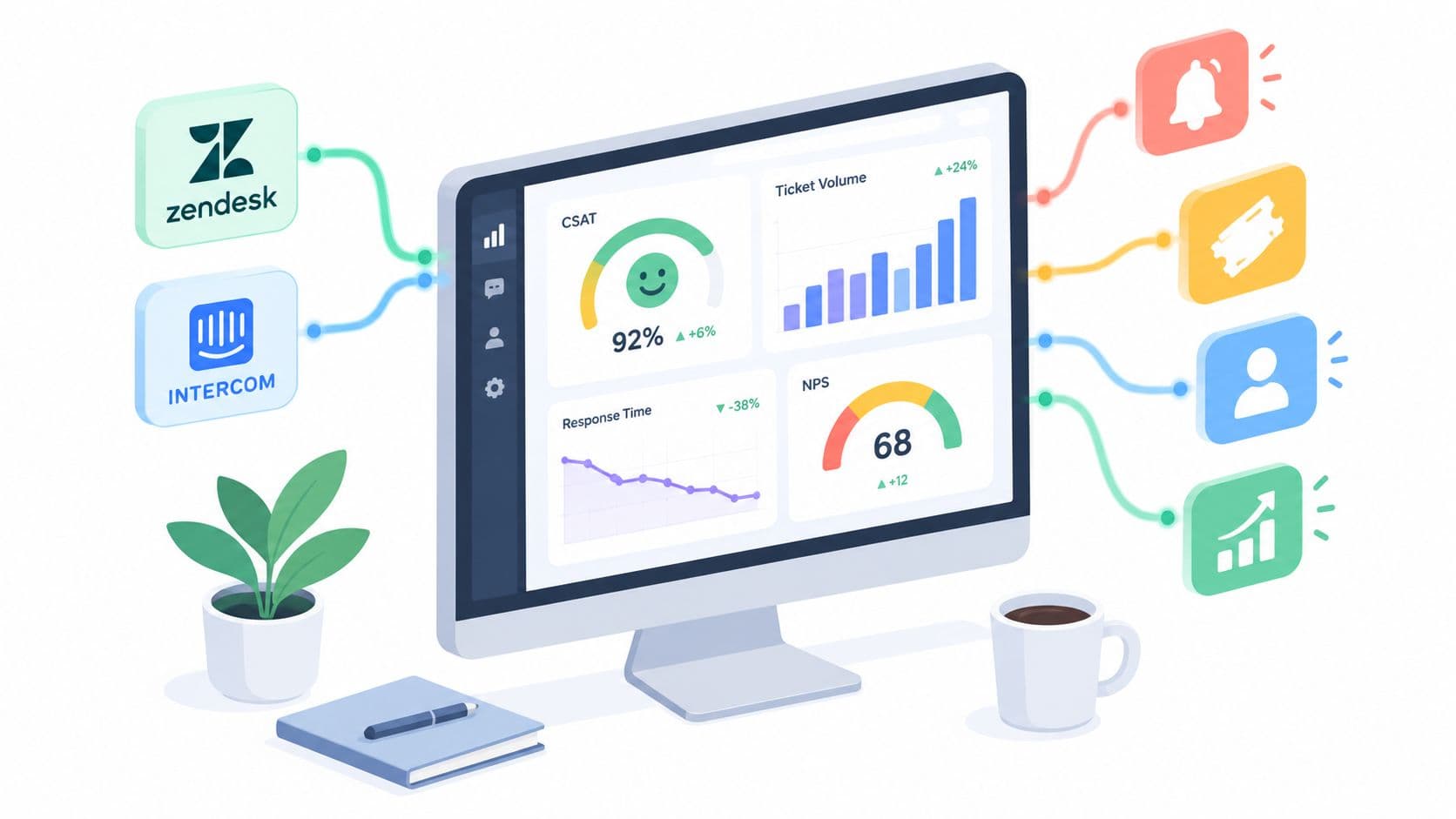
SigOS helps SaaS teams connect support tickets, sales conversations, and product usage signals to churn risk and revenue impact, so analysts can investigate leading indicators before cancellations appear in the headline metrics. Visit SigOS to see how its product-intelligence workflows can support a segment-aware churn diagnostic system.


Ready to find your hidden revenue leaks?
Start analyzing your customer feedback and discover insights that drive revenue.
Start Free Trial →