Churn Prediction Dashboard: A Practical Guide for SaaS
Learn what a churn prediction dashboard does, which metrics matter, how to design one, and how to turn risk scores into real retention wins for your SaaS team.
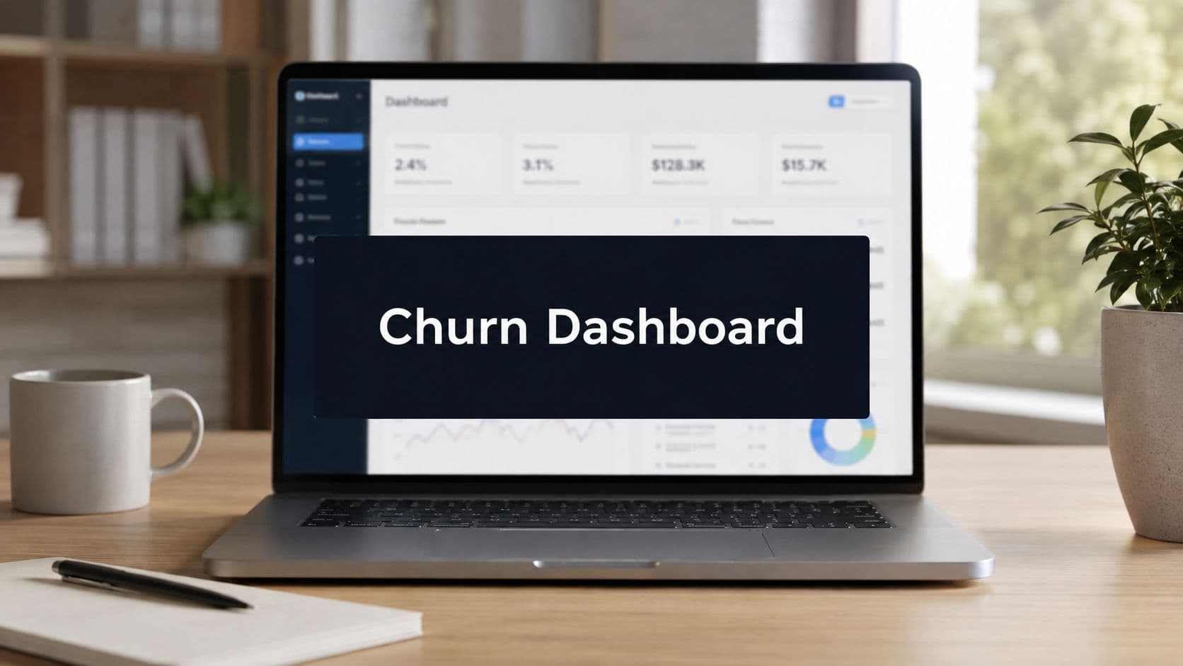
Priya has ninety minutes before Northwind Logistics' renewal call. In the old workflow, she'd open the CRM, scan product usage in one tool, search support tickets in another, check billing status, and rely on memory to decide whether the account needed attention. By the time she assembled the story, the meeting would already be close.
A well-designed churn prediction dashboard changes that morning. It puts Northwind near the top of a prioritized queue, shows declining usage and an inactive executive sponsor, identifies the signals behind the risk, and tells Priya what action is due next. The dashboard doesn't save the renewal by itself. It gives a named person enough context and time to do the work.
Why Your SaaS Team Needs a Churn Prediction Dashboard
A retrospective churn report answers an important question, but it answers it too late: which customers did we lose? A quarterly business review can reveal that an account stopped adopting key features months ago, yet that discovery arrives after the customer has already formed an opinion about the product. Retention teams then spend their time investigating history instead of changing the next outcome.
Churn is commonly defined as the share of customers lost during a fixed period, often tracked monthly, quarterly, or annually. That definition makes the metric useful for planning, but it doesn't tell Priya which account needs a conversation this morning. A churn prediction dashboard adds the operational layer, translating usage, support, billing, and relationship events into a live view of account risk. A foundational SaaS churn benchmark places median monthly churn at 4.79% across SaaS companies, with 4.67% for B2B SaaS and 5.06% for B2C SaaS. The same reference describes annual benchmarks of 3.8% overall and 4.9% for B2B SaaS, showing why the exact churn definition used in a dashboard matters for planning.
From account review to intervention queue
The practical benefit isn't another chart. It's prioritization.
A CSM can use the dashboard to answer four questions quickly:
- Which accounts need attention? Rank customers by risk, renewal proximity, and business importance.
- Why are they at risk? Show the leading signals rather than hiding them behind a score.
- Who owns the response? Assign the account to a CSM, account executive, support lead, or product partner.
- What happens next? Attach a playbook, deadline, and follow-up review.
This shifts retention from reactive firefighting to a repeatable operating rhythm. Product managers can spot a feature adoption problem across accounts, customer-success operations can monitor queue health, and account teams can prepare for renewals with evidence instead of instinct.
Operational rule: A risk score that doesn't create a task for a real person is a report, not a retention system.
The strongest dashboards also help teams quantify exposure before renewal dates arrive. Because recurring-revenue businesses depend on continuing subscriptions, early visibility into customers, seats, or revenue at risk gives teams room to address adoption, service friction, relationship gaps, or payment problems while those issues remain fixable.
What a Churn Prediction Dashboard Actually Is
Think of a churn prediction dashboard as weather radar for customer relationships. Product events are the atmosphere, support conversations are pressure changes, billing events are warning signals, and the churn model acts like the meteorologist. The dashboard is the radar screen that helps the pilot decide which route to change before the storm arrives.
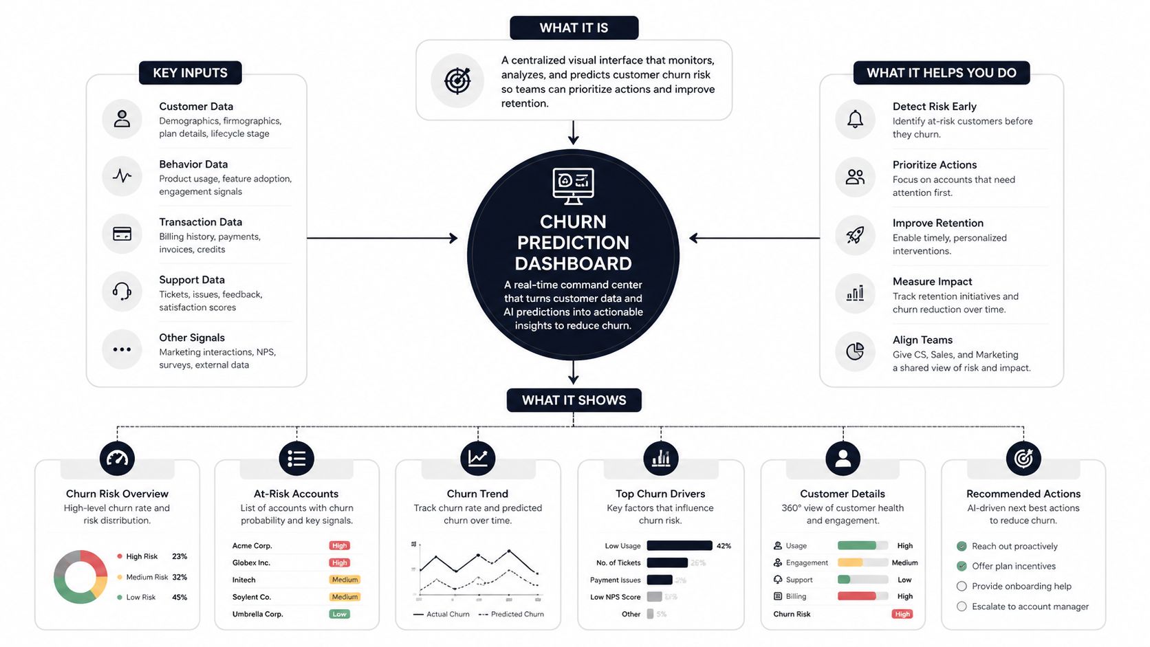
A useful system has three layers:
- Inputs: product logins, feature usage, activation events, support tickets, sentiment, renewal dates, stakeholder changes, plan changes, and payment events.
- Modeling: rules, statistical analysis, or machine learning turns those signals into an account-level risk estimate.
- Actionable output: the interface shows the account, risk level, contributing factors, owner, deadline, and recommended intervention.
That last layer separates a churn dashboard from a generic retention report. A retention report might show that five accounts canceled last month. A predictive dashboard might show that an account's core workflow usage is declining, several unresolved tickets are accumulating, and its renewal is approaching. One describes the storm after it passed. The other helps someone change course.
The score needs an explanation
A probability score alone creates false confidence. If a customer sees “high risk” without knowing whether the driver is adoption, support friction, billing, or a relationship change, they can't choose the right response. Explainable-model research has identified contract type, tenure, technical support, dependency status, monthly charges, and total charges among important churn predictors, which supports showing feature-level attribution alongside the score in recent explainable churn-model research.
CSMs, customer-success operations teams, account executives, and product managers may all use the same dashboard, but they won't take the same action. The CSM may schedule a value review, support may escalate a defect, and product may investigate a workflow that several accounts are abandoning. Teams looking to connect retention views with broader operating metrics can also use SaaS growth dashboards explained as background when designing their reporting environment.
Core Metrics and Signals Worth Tracking
A dashboard should tell four different stories about an account. Don't place every available metric on the same canvas. Give each panel a distinct job, then make the account-level view combine the evidence.
| Panel | Key Signals | What It Reveals |
|---|---|---|
| Usage decay | Login frequency, active users, feature depth, workflow and integration usage | Whether customers are still receiving value from the product |
| Support signals | Ticket volume, severity, unresolved issues, CSAT and NPS comments | Whether service friction is rising or customers are disengaging |
| Billing risk | Failed payments, overdue invoices, downgrade requests, plan changes | Whether revenue is threatened by payment or commercial pressure |
| Account risk score | Composite prediction plus top contributing signals | Which accounts deserve attention and why |
Usage decay catches silent abandonment
Usage signals usually provide the earliest warning. Research on SaaS churn indicators identifies declining login frequency, feature adoption depth, active-user counts, and workflow or integration usage as especially valuable leading indicators. Usage-based models may provide a 3 to 8 week lead time, while support-signal models may provide 2 to 6 weeks, according to the SaaS churn-signal synthesis.
The panel shouldn't only show current weekly active users. It should show the direction of travel against the account's own baseline. For example, an account may still have many active seats, but if core workflow completion and integration use are falling across the recent period, the account may be losing practical value before anyone mentions cancellation.
Support and billing need different responses
A sudden rise in severe tickets suggests service friction, but silence can also matter when a previously communicative account stops asking for help. Display ticket trends with resolution status and account context, not as an isolated volume number. A CSM can then distinguish “the customer is asking for more help” from “the customer has stopped engaging altogether.”
Billing signals are more visible, but they still need interpretation. A failed payment calls for a recovery workflow. A downgrade request may call for a value conversation, usage review, or commercial adjustment. The composite panel should show the top three drivers, so a CSM doesn't mistake a payment problem for a product-adoption problem.
Data Sources and Modeling Considerations
Start with data that describes what customers do, then add data that explains the relationship around that behavior. Product event streams should capture logins, meaningful feature usage, workflow completion, integration activity, and adoption milestones. CRM data adds the renewal date, account owner, plan, stakeholder history, and relationship notes. Support systems contribute ticket volume, severity, resolution status, escalations, and qualitative feedback. Billing systems add payment failures, overdue invoices, downgrades, and plan changes.
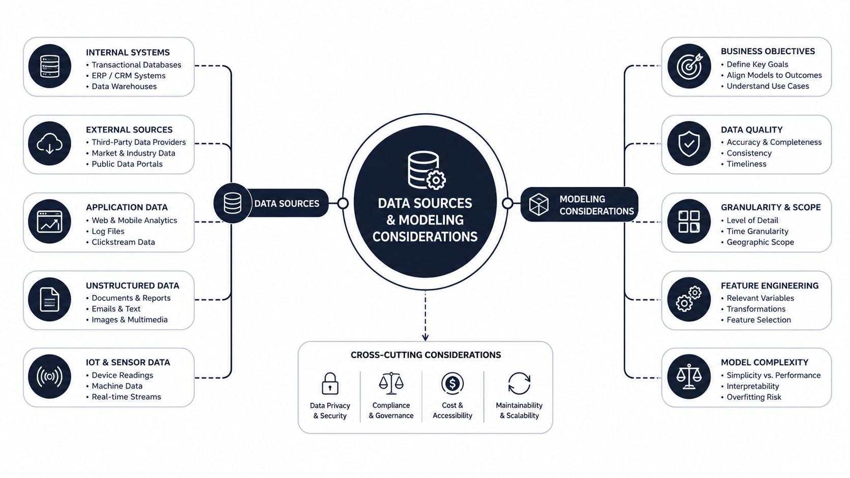
Don't begin with algorithm selection. Begin by defining churn consistently. Decide whether the target event is cancellation, non-renewal, contraction, or payment-related lapse, and make sure the billing, CRM, and analytics teams use the same definition. If the label changes between systems, the model may learn administrative differences rather than customer risk.
Handle imbalance and changing behavior
Churn is often the less common outcome, which creates a class-imbalance problem. A model can appear accurate by favoring the larger retained group while missing the accounts your team needs to find. The 2025 survey of churn-prediction research highlights class imbalance, limited explainability, correlational features, and the danger of relying on accuracy alone. Evaluate precision and recall, then tune thresholds according to the cost of a false alarm and the cost of missing a genuine risk.
Watch for leakage. A cancellation-flow event shouldn't be used to predict cancellation if it occurs after the customer has effectively decided to leave. Monitor event schemas too. If a tracking change removes feature events without notice, the dashboard may interpret missing data as declining adoption.
Modeling principle: Retraining cadence should reflect how quickly your product, customers, and commercial policies change. A sophisticated algorithm can't rescue stale or broken inputs.
Keep a feedback loop. When a CSM saves an account, records the intervention, or marks an alert as irrelevant, capture that outcome. Those labels help the team improve features, thresholds, and playbooks over time.
A practical technical walkthrough can complement this process, especially for teams deciding how to structure the first model. See the SigOS churn prediction model guide for an additional implementation reference.
Use the following video as a conceptual companion before choosing a modeling approach.
UI and UX Patterns That Make Dashboards Usable
The first screen should answer, “Who needs help, and what should I do?” Put a ranked account-risk list above the fold. Include the account owner, renewal date, risk state, key segment, and the most important contributing signals. A retention curve can provide context, but it shouldn't compete with the work queue.
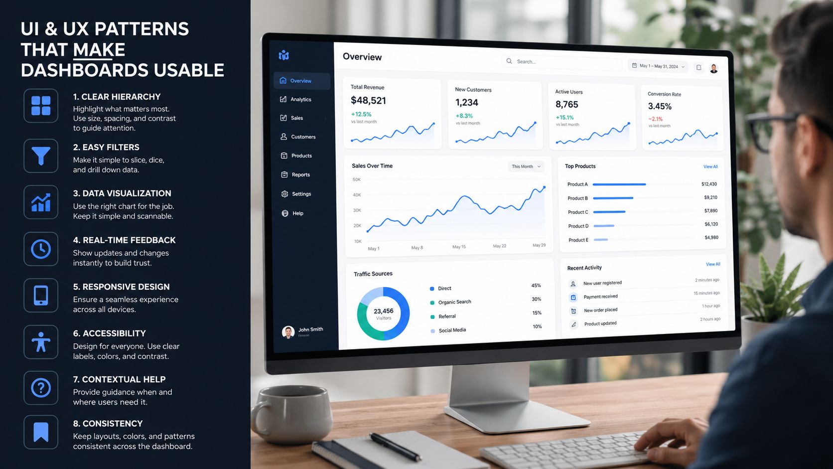
Clicking an account should reveal the evidence behind the score. Show the three to five signals that changed most recently, such as declining core-feature use, a ticket spike, an executive sponsor departure, or a billing event. Include a timeline, because a CSM needs to know whether the risk is new, persistent, or already addressed.
Design for decisions, not inspection
Cohort overlays help the team separate an account-specific problem from a broader product issue. If new customers on one plan show the same adoption drop, product may need to investigate onboarding. If one account deviates from otherwise healthy peers, the CSM may need a relationship or implementation conversation.
A single probability score also hides important differences. Segment views by persona, plan tier, lifecycle stage, and time since activation. A low score for a recently activated account may mean incomplete onboarding, while the same score for a mature enterprise account may point to declining value or stakeholder change.
Remove friction from everyday use
Good interface details determine whether the dashboard becomes part of the team's routine:
- Persistent filters: Keep team, segment, owner, renewal window, and risk filters available while users drill into accounts.
- Saved views: Let each CSM team open a queue custom-built to its portfolio instead of rebuilding the same filter every morning.
- Mobile-friendly cards: Make the highest-priority account, reason, and next action readable during a customer call.
- Clear empty states: Say when data is missing, delayed, or unavailable. A blank panel shouldn't look like healthy behavior.
- Visible ownership: Display who owns the next action and when it is due.
For broader principles on presenting operational metrics, the dashboard data analytics guide offers useful context. The design test is simple: can a CSM move from alert to informed action without opening several other systems?
Alerting and Workflow Integrations That Drive Action
A dashboard without workflow integration is a status report. Retention is won when a risk signal reaches the right person, creates a specific task, and remains visible until someone records an outcome.
Alerts should fire on meaningful changes, not every isolated event. A single failed login may be noise. A sustained usage decline combined with an approaching renewal deserves attention. Thresholds should account for owner context, account segment, existing tasks, and quiet hours so the system doesn't train people to ignore it.
Match each signal to a system of action
| Integration | Trigger | Outcome |
|---|---|---|
| Salesforce or HubSpot | Risk crosses a defined level or renewal context changes | Update the account and assign a customer-success task |
| Zendesk or Intercom | Support friction becomes a leading risk driver | Create or escalate a ticket with account context |
| Slack or Teams | A high-priority account needs team visibility | Notify the owner and relevant escalation group |
| Outreach or Salesloft | Relationship or adoption risk needs structured outreach | Start a targeted sequence tied to the risk reason |
| Calendar | A renewal or value review requires preparation | Create a meeting task with an owner and deadline |
Every alert needs a playbook. The playbook should name the intervention, owner, service-level expectation, and expected outcome. For example, declining feature adoption might create a product-training task, while a failed payment should route to billing recovery rather than customer education.
Practical rule: Don't alert someone to a problem unless the recipient can see the next action and its deadline in the same workflow.
Integration quality matters because missing account IDs, delayed events, and duplicate tasks can undermine trust. Teams evaluating a seamless engineer integration should ask how the connection handles identity matching, event timing, retries, permissions, and failure visibility.
The system should also record what happened after the alert. Did the CSM contact the customer? Did usage recover? Was the alert a false positive? Connecting the dashboard to real-time data analytics helps teams see current risk, but the operational design determines whether anyone responds to it.
Turning Risk Scores Into Real Retention Wins
A high-performing model on a historical test set isn't the finish line. It shows how well the model recognized past patterns. It doesn't show whether a CSM contacted the account, chose the right intervention, or changed the customer's decision.
One SaaS analysis of 67 companies reported that advanced models identified at-risk customers 30 to 60 days before cancellation, with 82% accuracy and a median 45-day lead time, compared with 7 days for manual indicators. The same analysis reported a 34% median decrease in churn after proactive intervention, as documented in the NIH-hosted churn analysis. Those findings make lead time valuable, but only when the operating process uses it.
Define success around behavior
For every high-risk account, record:
- An owner: one person accountable for the response.
- A deadline: when the first human touch must happen.
- An intervention: training, escalation, value review, payment recovery, or another signal-specific action.
- A follow-up: a date to reassess the account and record the result.
Measure the system at the workflow level. Track median time from alert to first contact, save rate among flagged accounts, and renewal movement for flagged accounts that received intervention. Where possible, compare those outcomes with a suitable non-intervention group, while recognizing that assignment and selection can affect the comparison.
The common failure is familiar. A risk dashboard appears in a weekly leadership deck, but the CSM opening their laptop on Monday never sees the account. In that setup, the model may be correct and the program may still fail.
Teams that want to connect operational signals with broader retention measurement can review resources designed to boost customer loyalty metrics. The true win isn't a better-looking score. It's a renewal that changed because someone acted while the customer still had a solvable problem.
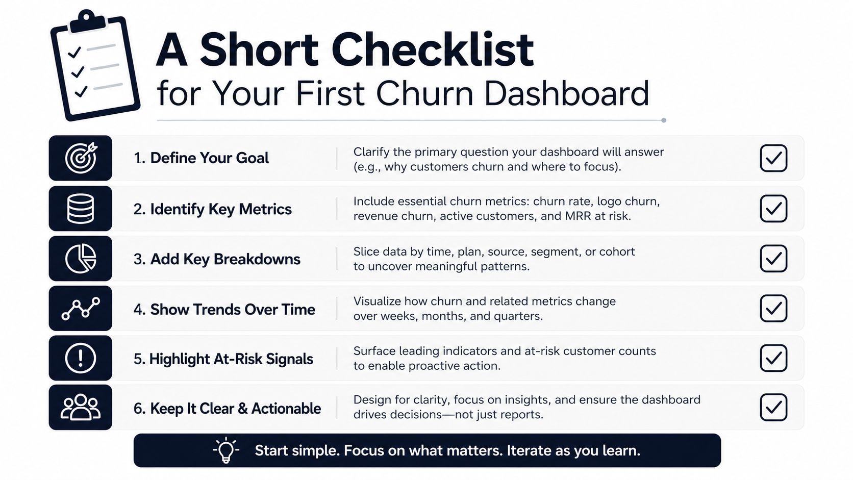
A Short Checklist for Your First Churn Dashboard
Start small enough that the team can trust the first version. A useful dashboard gives every account a risk view, an explanation, and a path to action without pretending that the model knows more than the evidence supports.
Build
- Composite risk view: Show one account-level risk score with the top three contributing signals.
- Action queue: Sort accounts using risk and renewal proximity together, rather than relying on either field alone.
- Owner routing: Send each alert to a named CSM, account executive, support lead, or billing owner.
- Risk-tier playbooks: Give every risk tier a defined intervention, deadline, and follow-up state.
Skip
- Vanity retention charts: Don't place aggregate trends ahead of accounts that need action.
- Unexplained features: Exclude any model input a CSM can't describe in one clear sentence.
- Monthly-only reporting: Aggregate churn can support planning, but it shouldn't hide account-level decisions.
- Unrouted alerts: A notification without ownership creates noise instead of accountability.
Validate
After launch, watch three operational measures:
- Median time from alert to first human touch.
- Save rate for flagged accounts.
- Renewal difference between high-risk accounts that received intervention and those that didn't.
These measures won't prove causality on their own, but they'll show whether the dashboard is reaching people and creating follow-through. The dashboard works when the team trusts it enough to act before the renewal date, not when the report looks impressive after the customer has left.
SigOS helps SaaS teams combine support tickets, chat transcripts, sales calls, and usage signals to surface customer problems associated with churn and attach revenue-impact context to those issues. Visit SigOS to explore how its dashboards, alerts, and integrations can connect churn signals to the product and customer-success actions that follow.
Keep Reading
More insights from our blog
Ready to find your hidden revenue leaks?
Start analyzing your customer feedback and discover insights that drive revenue.
Start Free Trial →