Code Quality Metrics That Actually Predict Risk
Discover the code quality metrics that reliably predict bugs, churn, and delivery risk, with thresholds, trade-offs, and revenue-aware prioritization.

Most advice about code quality metrics starts in the wrong place. It tells engineering leaders to collect complexity, coverage, duplication, smells, debt, defects, and a long list of delivery indicators, then promises that a larger dashboard will produce better software. It won't. A dashboard becomes valuable only when it changes which work a team starts, delays, reviews, or funds.
The useful question isn't, “How many metrics can we track?” It's, “Which signals reliably identify code that threatens delivery, customers, or revenue?” That shift turns quality measurement from an engineering scorecard into a prioritization system. The strongest programs connect structural risk to what customers experience, what support teams handle, and where the business earns or loses money.
Why Most Code Quality Programs Fail Before They Start
More metrics don't automatically create more control. They usually create more interpretation work, more alerts, and more opportunities for teams to optimize a number rather than improve the system. Static-analysis platforms can expose dozens of indicators, but an engineering organization rarely has enough shared context to act on all of them consistently.
The result is familiar. One team watches coverage, another watches smells, and a third tracks unresolved debt. Leaders see a polished dashboard during quarterly reviews, yet sprint planning still relies on the loudest customer complaint or the most visible technical request. Engineers quickly learn which measures affect performance conversations and which ones can be ignored. The ignored metrics become dashboard decoration.
Practical rule: A metric that never changes a planning, review, testing, or release decision isn't an operating metric. It's telemetry.
Pick signals that predict decisions
Start with a small set of signals tied to explicit actions. A rising complexity trend in a customer-facing service might trigger design review. High churn in a low-coverage module might trigger targeted testing. Increasing defect density in a release stream might change release readiness or allocate capacity to regression work.
This is also why teams should study delivery relationships before buying another dashboard. The predicting delivery speed with metrics resource offers useful context for thinking about metrics as indicators of delivery performance rather than isolated engineering grades.
A practical selection test is simple:
- Ownership: Name the team that can respond to the signal.
- Decision: Define the action the team should take.
- Trend: Track movement over time, not just the current snapshot.
- Business exposure: Identify the customer workflow or service affected.
- Validation: Compare the signal with defects, rework, incidents, or support demand.
The goal isn't to prove that one metric explains software quality. It can't. The goal is to find a compact combination that helps teams spot risk early enough to act while remediation remains affordable. Quality metrics should narrow attention, not distribute it evenly across every file and repository.
The Seven Code Quality Metrics Worth Tracking
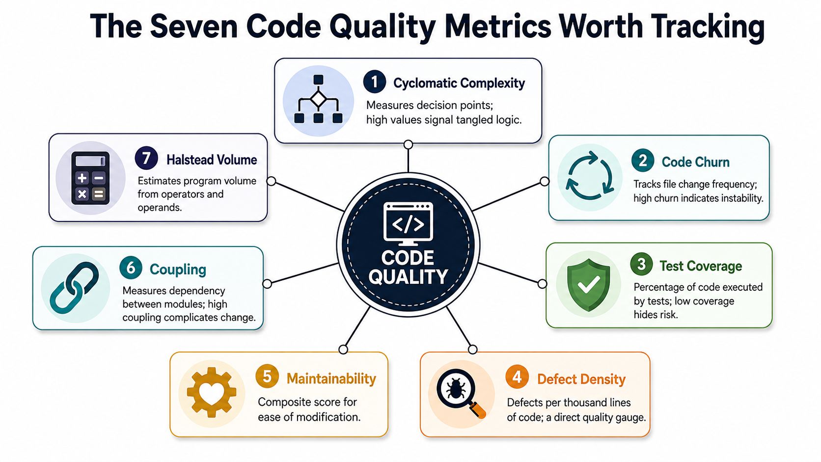
A useful metric set covers structure, change behavior, testing, defects, and remediation effort. These seven signals give teams a practical starting point, provided they read them together rather than treating any one score as a verdict.
Structural signals
- Cyclomatic complexity counts linearly independent execution paths through a function. Decision points such as
if,for,while, andcaseincrease the score. Microsoft describes it as a proxy for error likelihood and a measure of decision logic, while IBM's explanation of cyclomatic complexity traces the metric to Thomas J. McCabe Jr.'s 1976 paper. Higher complexity generally means more paths to test, understand, and troubleshoot. - Maintainability index combines structural properties into a directional view of how difficult a unit is to modify. It helps leaders find code that may deserve refactoring, but it shouldn't replace the underlying complexity, volume, or duplication signals. A composite score is useful for triage, not for hiding its ingredients.
- Code smells identify patterns that often indicate maintainability problems, such as oversized methods, repeated logic, or confusing control flow. A smell isn't automatically a defect. It is a prompt for review, and its importance depends on location, change frequency, and customer impact.
Change and verification signals
- Code churn measures how often code changes across a chosen history window. High churn can indicate active product investment, instability, rework, or an unresolved design problem. Churn becomes much more useful when segmented by service, module, authoring workflow, and customer-facing capability.
- Test coverage shows which code executes during automated tests. It answers whether tests reach a path, not whether those tests assert the right behavior. Line coverage alone can look healthy while branches, integrations, failure handling, and critical workflows remain weak.
- Defect density expresses confirmed defects relative to code size, commonly as defects per thousand lines of code, or KLOC. Technical guidance on defect density describes values below 0.5 defects per KLOC as excellent, 1.0 to 2.0 as acceptable, 2.0 to 5.0 as needing attention, and values above 5.0 as high risk. The value comes from consistent counting, not from comparing teams with different defect definitions.
- Technical debt estimates the remediation effort created by shortcuts, violations, duplication, or deferred design work. Treat it as an effort and prioritization signal, not as a moral judgment about a codebase. Debt matters most when it blocks change, increases defect exposure, or affects a valuable customer workflow.
For a broader practical reference, the code quality guide by Wonderment Apps is useful when teams need to organize these measures into a working quality practice.
The strongest hotspot signal is usually a combination. Complexity tells you how difficult the logic is. Churn tells you how often people disturb it. Together, they identify code that is both hard to reason about and actively consuming engineering attention.
How Each Metric Is Calculated and Validated in Practice
Calculation is the easy part. Validation is where quality programs earn credibility. Each metric answers a different question, so the tool that produces it must match the type of evidence required.
| Metric | What it measures | Primary tool class | Validation step |
|---|---|---|---|
| Cyclomatic complexity | Independent execution paths and decision logic | AST-based static analysis | Review high-complexity functions alongside defects, review effort, and test paths |
| Code churn | Frequency and volume of source changes | Git history mining | Compare churn with rework, reverted changes, and incident history |
| Test coverage | Code reached by automated tests | Test-runner instrumentation | Pair coverage with mutation testing and critical-path review |
| Defect density | Confirmed defects normalized by code size | Issue tracker plus repository data | Standardize defect taxonomy, severity, and KLOC calculation |
| Maintainability index | Composite maintainability direction | Static analysis | Inspect the component metrics and compare the trend with change effort |
| Code smells | Potentially problematic structural patterns | AST rules and linters | Review findings in context and suppress rules that produce noise |
| Technical debt | Estimated effort to remediate known issues | Rule engine plus effort model | Calibrate remediation estimates against completed engineering work |
Static analysis is best for structure. SonarQube, Semgrep, and CodeQL can inspect syntax trees and identify complexity, smells, duplicated patterns, and policy violations. Microsoft's cyclomatic complexity documentation is a useful reference for understanding what the measure captures and what it doesn't.
Coverage requires behavioral validation. Istanbul, JaCoCo, and coverage.py report execution reach, but they can't tell you whether assertions would fail when behavior breaks. Mutation tools such as Stryker and PIT deliberately alter code to test whether the suite detects meaningful changes. If mutations survive in a critical workflow, the coverage number is overstating protection.
History metrics need clean repository data. Churn derived from additions, modifications, and deletions is only comparable when teams use a consistent time window and exclude generated artifacts. Defect density also needs disciplined issue classification. If one group records support-reported defects and another records only production incidents, the resulting rates shouldn't share a dashboard.
Technical-debt estimates deserve the most skepticism. Rule severity and estimated fix time provide a starting model, but teams should compare estimates with actual remediation time and recalibrate regularly. A metric becomes trustworthy when its prediction is tested against an outcome.
Thresholds That Actually Map to Risk
Universal red lines are attractive because they simplify governance. They also fail when teams apply them without context. A function with high complexity in an experimental tool doesn't carry the same risk as a similarly complex function that calculates invoices, permissions, or customer entitlements.
Use thresholds as review triggers, then validate them against local defect and delivery history. The NIST guidance cited by IBM recommends a maximum cyclomatic complexity of 10 per function as a useful threshold, and common references classify complexity from 1 to 5 as low risk, 6 to 10 as moderate, 11 to 20 as high, and above 20 as critical. Those bands are starting points, not release laws.
| Metric | Low risk | Medium risk | High risk | Recommended action |
|---|---|---|---|---|
| Cyclomatic complexity | 1 to 5 per function | 6 to 10 | 11 to 20, with above 20 critical | Review branching logic, split responsibilities, and expand path-focused tests |
| Churn | Stable, intentional change | Repeated change in one area | Persistent change with rework or reversions | Pair the module with a senior review and investigate design friction |
| Coverage | Strong protection on critical paths | Uneven path or branch protection | Important behavior lacks meaningful tests | Add tests around business rules, integrations, and failure paths |
| Defect density | Below 0.5 defects per KLOC | 1.0 to 2.0 defects per KLOC | Above 5.0 defects per KLOC | Inspect release practices, regression gaps, and defect classification |
| Maintainability index | Improving or stable | Declining in active components | Low and declining in high-change components | Fund targeted remediation instead of broad cleanup |
| Duplication | Limited repeated logic | Repetition across related modules | Repeated business logic across services | Consolidate carefully and protect behavior with regression tests |
| Revert rate | Rare, explainable reversions | Reversions cluster around a component | Repeated reversions after release or merge | Examine review quality, test gaps, and change isolation |
The defect-density bands above come from the software quality metrics guidance. Additional industry guidance describes commercial software before testing as averaging roughly 15 to 50 defects per KLOC, while high-quality commercial software after testing and release typically runs below 1 defect per KLOC, as summarized by this code-quality metrics analysis.
Don't turn the table into an automated rejection machine. A red value should create a conversation with a named owner, a due date, and a risk explanation. The action column is the program. The threshold only opens the ticket.
Common Misuses That Distort Every Dashboard
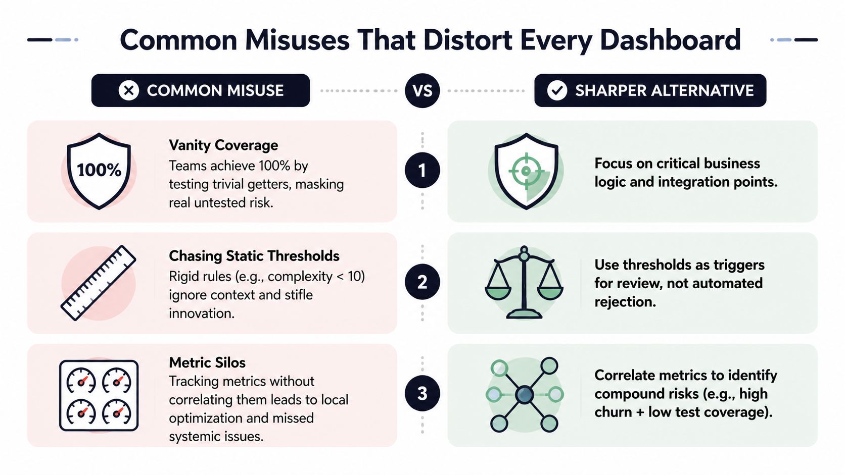
The most damaging quality failures come from sensible metrics used to reward activity instead of reliability. Coverage, defect counts, and static rules can improve quarterly reports while leaving customer-facing risk unchanged.
Vanity coverage
Teams can raise coverage by testing trivial accessors while leaving billing logic, permissions, and failure paths weakly verified. The badge turns green, yet production risk remains.
Use coverage to direct engineering attention:
- Prioritize changed paths: Review branch and integration coverage around modified code.
- Test important behavior: Focus on billing rules, permissions, data transformations, and external dependencies.
- Use mutation testing: Verify that tests detect meaningful behavioral changes rather than merely executing statements.
Defect-count gaming
A defect dashboard loses credibility when teams relabel bugs as feature work, maintenance, or technical improvement. The quarterly chart looks cleaner, but release decisions lose the signal they need.
Define a defect taxonomy, apply severity consistently, and connect each class to a service-level expectation. Managers should investigate missing or unusually low defect capture instead of praising it without context. A consistent process matters more than an attractive chart.
Ignoring churn
A module with a clean static snapshot can still become a delivery hotspot when engineers repeatedly change it. Review and test effort should follow recent change behavior, especially where churn overlaps with low coverage or high complexity.
Equal weighting creates another distortion. A minor smell in an internal utility should not rank beside a defect trend in a workflow used by paying customers. Use risk-weighted scoring based on customer exposure, severity, blast radius, and remediation cost. Connect those signals to support volume, retention risk, and expansion blockers through product intelligence, rather than treating them as an isolated engineering score.
The data quality issues perspective from SigOS applies directly: unreliable inputs can corrupt every downstream dashboard, including models that connect code hotspots with support cost or customer churn.
A dashboard should make poor decisions harder. If teams can improve the score without improving reliability or revenue outcomes, change the metric design.
What Changes When AI Writes More of the Code
AI-assisted development changes the measurement problem. It can increase the amount of code produced while making classic snapshots less informative. A function may pass complexity rules today, yet add duplication, expand churn, and create review work across neighboring modules.
Independent coverage of 2025 AI-code research reported code churn rising from 3.1% in 2020 to 5.7% in 2024 across 211 million lines of code, and noted that copy-and-pasted code increased faster than updated, deleted, or moved code, as summarized in this analysis of AI code quality metrics. Those figures point to a specific risk: output volume can rise faster than codebase coherence.
Add signals that react to change
AI-generated patterns often look plausible in isolation. The risk appears across the repository, where similar error handlers, hooks, adapters, and validation blocks accumulate. Teams should therefore add:
- Churn velocity: Identify areas receiving unusually rapid change.
- Duplication trend: Track repeated logic across files and services.
- Revert rate: Watch whether accepted suggestions are quickly undone.
- Time to first revert: Detect changes that fail soon after adoption.
- Review-comment density: Find diffs that require unusually heavy human correction.
Down-weight single-snapshot complexity when a module's change rate is accelerating. Complexity still matters, but it lags the behavior that often reveals AI-related risk. A stable complexity score doesn't mean a stable design if engineers repeatedly replace, copy, and revert neighboring code.
The AI for product development discussion provides useful context for treating AI adoption as an operating-model change rather than a simple productivity feature. The right response isn't to ban generated code or add arbitrary gates. It's to measure whether faster production creates more rework, duplication, and operational exposure.
Connecting Code Quality to Revenue and Churn
Engineering dashboards lose budget when they can't answer the business question, “What happens if we leave this risk alone?” Static code signals become financially useful only after teams connect them to customer behavior.
Start with a shared join key, usually a service, module, feature area, or workflow. Then layer in support-ticket severity, usage of the affected capability, expansion opportunities, renewal or churn cohorts, and revenue exposure. The analysis doesn't need to claim that complexity caused churn. It needs to show where technical risk overlaps with valuable customer activity.
| Code metric | Business signal | Correlation use | Prioritization weight |
|---|---|---|---|
| Complexity | Defects, support severity, affected workflow | Find difficult logic in customer-facing paths | High when severity and usage are high |
| Churn | Rework, reversions, delivery delays | Locate unstable areas consuming capacity | Higher when change affects renewals |
| Coverage | Regression tickets and release incidents | Test whether critical behavior has protection | High for revenue-critical workflows |
| Defect density | Support load and incident frequency | Compare reliability across services or releases | High when defects affect paying accounts |
| Duplication | Inconsistent fixes and recurring requests | Identify repeated business logic | Medium to high based on blast radius |
| Technical debt | Remediation effort and delivery delay | Compare investment cost with customer exposure | Weight by impact divided by cost |
A useful prioritization formula is:
Risk score = customer-impact severity × blast radius ÷ remediation cost
That formula forces a better conversation. A technically ugly internal component may wait, while a modest defect in a heavily used billing workflow moves ahead because its blast radius and revenue exposure are larger.
Don't manufacture causal certainty from correlation. Use support conversations, product telemetry, account history, and engineering data to form a decision hypothesis, then validate whether the prioritized fix changes the relevant outcome. The software delivery metrics guide offers helpful background for connecting delivery indicators to broader operating decisions.
Product-intelligence platforms such as SigOS can help teams combine support, usage, sales, and engineering context so Jira or Linear work reflects customer impact rather than team preference. The metrics and reporting perspective reinforces the operational requirement: reports should help a specific person make a specific decision.
A 30-60-90 Day Plan for a Quality Metrics Program
A metrics program should launch as an operating change, not as a dashboard project. Assign one owner, define the decisions the program must support, and publish the first baseline before debating elaborate scoring.
Days 1 to 30, instrument the system
Connect static analysis through SonarQube, CodeScene, or an equivalent tool. Add coverage collection to CI, and export repository history, issue data, and release information into a shared warehouse or reporting layer.
Choose a few production services that represent different risk profiles. Record complexity, churn, coverage, defect density, duplication, maintainability direction, and debt estimates. Document how the organization defines a defect, a change, a service, and a customer-facing workflow.
Days 31 to 60, validate and simplify
Create initial risk bands for complexity, coverage, and defect density. Compare them with actual rework, incidents, support issues, and release friction from the baseline services. Remove every metric that lacks an owner or a decision.
Run a review with engineering, QA, support, product, and customer success. Their job isn't to approve a prettier dashboard. Their job is to challenge whether the signals identify the work customers feel.
Days 61 to 90, connect quality to business impact
Join support-ticket volume, issue severity, usage telemetry, account segments, and revenue exposure to the engineering view. Give each high-risk component a named owner and a remediation hypothesis. Publish a monthly quality-to-revenue report that shows risks found, actions taken, and outcomes observed.
Your minimum integration checklist should include:
- CI hooks: Collect coverage and static-analysis results at change time.
- Repository history: Calculate churn, reversions, and ownership consistently.
- Issue tracker: Link defects and remediation work to services and releases.
- APM: Compare code hotspots with runtime failures and customer impact.
- Support platform: Connect ticket volume and severity to workflows.
- Product analytics: Identify usage and revenue exposure by capability.
Keep the program small enough to survive leadership changes. If a new owner can understand the definitions, reproduce the data, and see which decisions the metrics changed, the system has a chance to last.
SigOS helps teams connect engineering signals with support feedback, product usage, churn risk, and expansion opportunities, so code quality work reflects real customer impact. Visit SigOS to see how revenue-aware product intelligence can help your team prioritize the defects and delivery risks that matter most.
Keep Reading
More insights from our blog

Ready to find your hidden revenue leaks?
Start analyzing your customer feedback and discover insights that drive revenue.
Start Free Trial →