Customer Insights Dashboard Guide for SaaS Teams in 2026
Build a customer insights dashboard that turns feedback into revenue. Learn KPIs, layouts, AI automation, and rollout tips for SaaS teams in 2026.

Monday morning starts the same way in too many SaaS teams. Zendesk is full of fresh tickets, Intercom has a red badge, Slack has three threads arguing about the same bug, and someone has pasted a half-finished Notion table into a channel nobody trusts. A customer insights dashboard exists to stop that drift, not by showing more charts, but by turning scattered support, product, and revenue signals into a ranked queue of what matters right now.
The strongest dashboards I've shipped never behaved like a reporting artifact. They acted like a decision surface, where the team could see which customers were slipping, which features were creating friction, and which patterns were worth engineering time. That shift matters because the modern dashboard is now built around operational metrics like incoming cases, active cases, escalated rate, average resolve time, average CSAT, average survey sentiment, and engagement measures such as click rate, all of which are defined in Microsoft's customer service and customer insights analytics documentation Microsoft Dynamics 365 Customer Service summary dashboard.
Why SaaS Teams Need a Customer Insights Dashboard
On a typical Monday, a product manager doesn't need another pretty chart. They need to know whether the export bug is affecting high-value accounts, whether the churn-risk list is growing, and which complaint theme should go into the standup first. A customer insights dashboard gives that person a single surface where support load, customer sentiment, and revenue exposure sit together instead of in separate tools.
That's why the category has matured beyond CSAT widgets and NPS snapshots. Modern guidance now groups dashboard measures across product usage frequency, journey drop-off, retention rate, churn risk score, account growth rate, support volume, resolution time, customer satisfaction score, and escalation trend, which reflects a shift from isolated service reporting to lifecycle analytics Fanruan customer insights dashboard overview. Microsoft's own customer service dashboard pattern also formalizes the same operational spine with case volume, escalation percentage, average resolution time in hours, and average CSAT Microsoft Dynamics 365 Customer Service summary dashboard.
Reporting dashboard versus decision dashboard
A reporting dashboard answers, “What happened?” A decision dashboard answers, “What should we do next?” That distinction sounds subtle until a team is under pressure, because reporting tools often encourage passive review while decision dashboards force prioritization.
Practical rule: if a dashboard doesn't change who gets alerted, what gets fixed, or which account gets called first, it's probably just a reporting layer.
The working definition I use is simple. A customer insights dashboard is a live, layered view of customer behavior, sentiment, and revenue signals that turns qualitative feedback into a ranked action queue. That means the dashboard should surface service health, product friction, and commercial risk in one place, so support, product, and growth teams stop making separate guesses about the same customer.
It also changes the meeting rhythm. Instead of debating whose spreadsheet is right, teams can look at the same operational picture and ask better questions about stability, churn exposure, and expansion readiness. That's the calm version of Monday, and it's the version that helps retention and expansion teams move faster.
The Layered Architecture Behind a Strong Dashboard
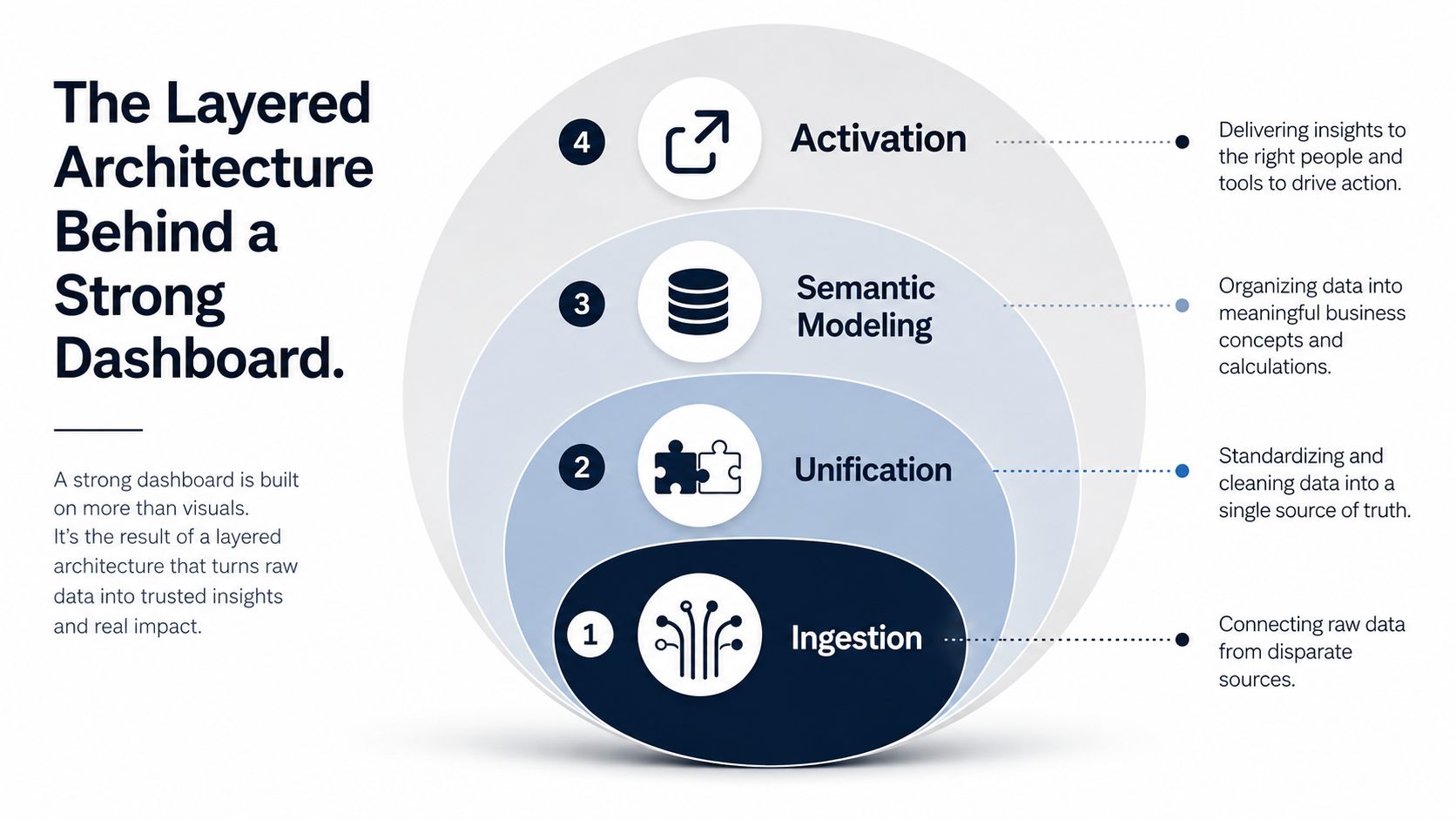
A useful dashboard is not a chart pile. It's a layered system, and the reason that matters is simple, if you mix cleaning, business logic, and presentation in the same place, every field rename turns into a fire drill. The architecture that holds up in practice starts with ingestion, moves through unification, then semantic modeling, and ends with activation HeadToNet customer growth intelligence platform.
Ingestion and unification
At the ingestion layer, raw data comes in from systems like Zendesk, Intercom, product analytics, CRM records, and call notes. The point here isn't elegance, it's reliability. If your support and product events can't land consistently, nothing above this layer will be trustworthy.
Unification is where the first real value appears. Siloed CRM, ERP, social, and product usage data are consolidated into a single customer view in the architecture Microsoft describes for customer insights platforms, so analysts don't spend their time reconciling versions of the truth Microsoft customer insights architecture training. That consolidated profile is what lets a team recognize that a feature complaint, a refund request, and a slowdown in usage belong to the same account.
Semantic modeling and activation
Semantic modeling is a layer many underbuild. You define what churn risk, expansion readiness, and customer health mean in your business, instead of hoping a generic score will magically fit your motion. The value of separating this logic from raw data is that segmentation, retention analysis, and behavioral metrics can scale without being rewritten every time a source changes.
Activation is the outer layer, and it's where the dashboard stops being passive. The definitions power alerts, task creation, and downstream actions in tools like Linear, Jira, and internal workflow apps. If a support cluster appears around a broken workflow, that theme should not just sit on a chart, it should trigger a visible issue and route to the right owner.
A good build treats the dashboard as the front end of a closed loop. Data comes in, the model interprets it, the dashboard ranks it, and the team acts on it. That loop is what keeps the product, support, and growth functions aligned on the same customer reality.
Essential KPIs and Data Sources to Wire Up
The fastest way to ruin a dashboard is to cram every available metric into it. The better approach is to group KPIs by the business question they answer, then wire each group to the sources that can support a decision. That gives the team a shortlist they can defend in a roadmap review instead of a wall of vanity metrics.
| Family | Example Metrics | Typical Data Sources |
|---|---|---|
| Operational | Case volume, escalation rate, average resolution time, active cases | Zendesk, Intercom, service desk logs, staffing data |
| Behavioral | Product usage frequency, journey drop-off, activation rate, feature adoption | Product analytics, event streams, web and app telemetry |
| Sentiment | CSAT, survey sentiment, theme-tagged tickets, qualitative comments | Surveys, support tickets, chat transcripts, call notes |
| Revenue | Churn risk score, account growth rate, expansion readiness, renewal signals | CRM, billing, usage history, account health models |
Operational KPIs tell you whether the service engine is healthy. Microsoft's customer service dashboard pattern explicitly uses case volume, escalation percentage, average resolution time, and average CSAT, which is a good reminder that support performance can be quantified in real time Microsoft Dynamics 365 Customer Service summary dashboard. If case volume rises but resolution time also stretches, the dashboard should flag workload pressure before customers feel abandoned.
Behavioral metrics matter because they show whether customers are getting value from the product, not just opening tickets. Journey drop-off and usage frequency are often the first signs that a feature is confusing or that onboarding has stalled. A headless activity feed component like this one can help teams display event chronology cleanly when they need a reviewable activity trail alongside the scorecard.
Sentiment data is the layer many teams romanticize and then underuse. CSAT and survey sentiment are useful, but only when they're paired with the themes in support text, chat transcripts, and call notes. Microsoft's dashboard summary also includes average survey sentiment, which reinforces that qualitative feedback becomes more actionable when it's tied to the operational view Microsoft Dynamics 365 Customer Service summary dashboard.
Revenue metrics complete the picture. Churn risk, growth rate, and expansion readiness belong on the dashboard because they connect customer behavior to money. If a product team can't explain how a ticket cluster affects renewals or expansion, they're still working from a service report, not a revenue instrument.
Dashboard Layouts That Match Real Use Cases
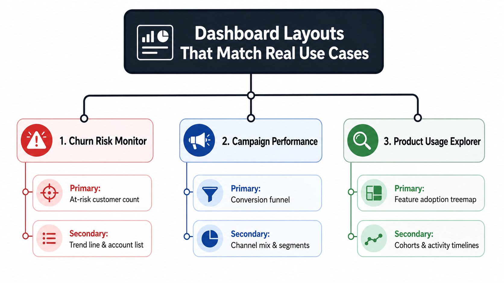
Most dashboard templates assume one generic grid fits every team. That usually fails in practice because a support manager, a PM, and an exec want different levels of detail, different refresh rhythms, and different thresholds for action. The cleaner approach is to start from use case, then design the layout around the decision that needs to be made.
The morning standup view
This version is for triage. It should show the top revenue-impacted issues, the new churn-risk accounts, and the dominant theme from the last 24 hours, with a short account list that a support lead can work through quickly. What stays out is anything that slows response, deep cohort charts, dense trend panels, and long-form commentary that belongs in a follow-up doc.
The product deep-dive view
A PM view needs context, not just status. Put feature-area retention, friction points, and pinned qualitative excerpts next to the quantitative chart so the team can connect behavior to feedback without leaving the page. That layout works well when paired with a charting approach that follows actionable chart design tips, especially when the team needs to decide whether a problem is a UX issue, a bug, or a messaging failure.
The executive revenue view
Executives don't need the raw trail. They need a compact health readout that rolls churn risk, expansion pipeline, and feedback volume into one visible score, with a short explanation of what changed. The screen should avoid operational clutter and keep the emphasis on account movement, risk concentration, and whether the team is acting on the top issues.
A good reference point for layout discipline is the logic used in dashboard web analytics, where the view has to serve a specific decision rhythm rather than every possible observer. The same principle applies here, the screen should be narrow enough that someone can use it in a meeting, not just admire it in a demo.
The main mistake I see is trying to make one layout satisfy all three jobs. That usually creates a dashboard nobody owns, because every persona feels like the view was built for someone else. Pick one layout first, make it indispensable, then build the other views from the same semantic definitions.
AI-Driven Automation and Revenue-Impact Scoring
AI earns its place on a dashboard when it reduces prioritization work. A support cluster on its own is just noise, but when AI groups tickets, tags the theme, links it to a churn-risk segment, and pushes the issue into Jira or Linear with a revenue-impact score, the team suddenly has something actionable. That is the difference between an alerting surface and an operating system.
A concrete example helps. A broken export flow starts generating tickets, chat complaints, and call transcript mentions. The model can identify that cluster, connect it to customers with higher expansion potential, and then rank the issue based on likely revenue exposure so engineering doesn't have to argue about anecdotal severity.
That kind of workflow is where product intelligence becomes useful. SigOS is one option in this category, since it ingests support tickets, chat transcripts, sales calls, and usage metrics, then generates a daily dashboard with issue prioritization and estimated dollar impact. If you compare it with AI for product development, the practical pattern is the same, use AI to turn a pile of customer signals into a ranked action list.
What good automation actually does
The output should be specific, not magical. It should identify emergent themes, attach a confidence-weighted business score, and route the problem to the right tool or owner. If it only summarizes text, it's a reporting layer with a mascot.
Models should support decisioning, not replace it. If the score can't explain why a bug matters to churn or expansion, the team will stop trusting it.
Privacy also matters here. Teams should be careful about how models are retrained on customer data, especially when the dashboard includes support text, calls, or sensitive account context. The safest setups keep security controls tight, preserve provenance, and avoid retraining on customer data unless governance is explicit and approved.
Real-time alerts are the other half of the story. When emergent patterns point to churn risk or a high-value opportunity, the dashboard should trigger a fast path, not a weekly summary. That's how the dashboard becomes a revenue instrument instead of a passive analytics page.
Data Freshness, Coverage, and Trust as the Hidden Differentiators
A dashboard can look advanced and still mislead the team if the data is stale. I've seen teams trust a nightly refresh because it covered more sources, only to miss a customer issue that was already affecting renewal conversations. In practice, a dashboard with fewer trusted sources and faster refresh often beats a sprawling one that updates too late.
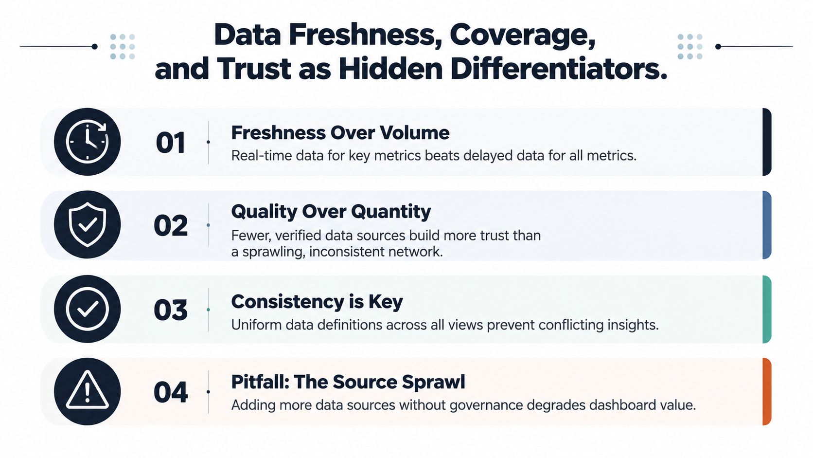
The best neutral guidance now treats timestamp discipline as part of the product, not an implementation detail. It also warns that a dashboard with missing touchpoints, like voice, social, or in-product behavior, can leave holes in the customer journey, and that combining behavioral, operational, sentiment, and friction metrics with evidence links and release annotations is the new floor for credibility Sprinklr customer experience dashboard guidance.
Freshness over volume
Near real-time updates matter most for active risk and opportunity signals. If a dashboard is used in standup, the team needs to know whether the score reflects this morning's activity or yesterday's backlog. That is why freshness SLAs should be explicit, not implied.
Coverage and trust checks
Coverage rules help teams understand what a partial view looks like. If the voice channel is missing, or if chat transcripts arrive but product events do not, the dashboard should say so plainly. Cross-checks matter too, because conflicting signals should be visible, not hidden under a single blended score.
For teams focused on operational speed, real-time data analytics is the right lens to use when deciding which metrics need instant handling and which can wait. The question isn't whether every number should be live, it's which ones affect decisions fast enough to justify tighter handling.
The most useful trust questions are blunt. Which sources are current, which are incomplete, and which scores are based on partial data? If a dashboard can't answer those questions clearly, it's not ready for roadmap decisions.
Rollout Plan and Common Pitfalls to Avoid
The rollout should feel boring on purpose. In the first 30 days, instrument the highest-value sources, define the semantic layer, and ship one use-case view that one team will use. That first version should be small enough that you can trust it and opinionated enough that it gets attention.
In days 31 to 60, connect the dashboard to action. Wire alerts into Linear or Jira, use the view in standups, and watch what people ignore. If the team keeps asking for the same missing context, that feedback is a signal that the model or layout needs work, not that the dashboard needs more tiles.
In days 61 to 90, lock down trust. Add freshness SLAs, source coverage checks, and a review cadence for every KPI that remains on the screen. A metric should stay only if it still drives a decision, otherwise it becomes dashboard clutter.
A simple checklist helps keep the build honest.
- Start narrow: Choose the one decision that needs to happen faster.
- Define terms: Make sure churn risk, expansion readiness, and health mean the same thing everywhere.
- Include text signals: Don't ignore call notes, chat transcripts, and ticket themes.
- Set freshness rules: Decide what must be near real time and what can batch.
- Review KPI value: Remove metrics that don't change action.
The biggest pitfall is trying to track everything from day one. The second biggest is treating the dashboard like a project with an end date instead of a product that needs governance. Teams that avoid those traps usually end up with something people open every morning instead of something they show at board meetings.
Frequently Asked Questions About Customer Insights Dashboards
Should we build or buy? If your customer data model is unique and tied tightly to revenue decisions, build or heavily customize. If the main need is standard reporting, buy. The trade-off is control versus speed.
How often should data refresh? Use near real time for churn-risk, support, and revenue-triggered signals. Batch refresh is fine for slower-moving trend views.
Who should own it? Product intelligence, analytics, or customer operations usually owns the definitions. Support, product, and growth are the primary users.
How do we prove ROI? Track whether the dashboard shortens time to action, improves issue routing, and surfaces revenue-impacting patterns earlier. Leadership cares that the team acted sooner on the right problem.
SigOS helps SaaS teams turn customer feedback, usage signals, and support data into a live prioritization surface instead of another static report. If you're building a customer insights dashboard that needs to connect churn risk, expansion opportunity, and revenue impact, visit SigOS and see how that workflow can fit into your stack.
Keep Reading
More insights from our blog

Ready to find your hidden revenue leaks?
Start analyzing your customer feedback and discover insights that drive revenue.
Start Free Trial →